Welcome to the e-Book Cover Design Awards. This edition is for submissions during August, 2016.
This month we received:
115 covers in the Fiction category
16 covers in the Nonfiction category
Comments, Award Winners, and Gold Stars
I’ve added comments (JF: ) to many of the entries, but not all. Remember that the aim of these posts is educational, and by submitting you are inviting comments, commendations, and constructive criticism.
Thanks to everyone who participated. I hope you enjoy these as much as I did. Please leave a comment to let me know which are your favorites or, if you disagree, let me know why.
Although there is only winner in each category, other covers that were considered for the award or which stood out in some exemplary way, are indicated with a gold star: ★
Award winners and Gold-Starred covers also win the right to display our badges on their websites, so don’t forget to get your badge to get a little more attention for the work you’ve put into your book.
Also please note that we are now linking winning covers to their sales page on Amazon or Smashwords.
Now, without any further ado, here are the winners of this month’s e-Book Cover Design Awards.
e-Book Cover Design Award Winner for August 2016 in Fiction
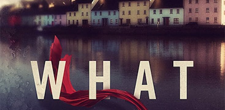
James Egan submitted What She Fears designed by James T. Egan of Bookfly Design.
JF: Dizzyingly poetic and evocative of the story inside, all at the same time. Many subtle touches throughout this design. The expert typography, inviting scene, and mysterious red ribbon, fully integrated into the title, combine to create an irresistible cover. Don’t you want to read it?
e-Book Cover Design Award Winner for August 2016 in Nonfiction
Cathi Stevenson submitted The Dating Mirror designed by Cathi Stevenson at Book Cover Express. “Such a pleasure to work on this cover. The image and font treatment offer many layers of symbolism that reflects the books’ content. Each person will interpret it in his or her own way.”
JF: Delicacy and balance are part of the attraction of this cover, and the one touch of color skillfully directs us to the emotional heart of the message.
Fiction Covers
Aaron L Speer submitted Day Dreamer designed by Book Mock-up Generator. “A true love/romance story that takes place in the midst of a drug war. “Dream State” is developed by the vampires of Sydney to help them dream, but is used with the only substance that can wake activate their brain during the day: werewolf blood. But the pack has yet to find out…”

JF: I like this cover, although the bottom illustration is a bit complex, and the series branding surrounding the title is way too strong, minimizing the effect of the title.
Alexa Segur submitted Goldentracks designed by Alexa Segur. “Because the main character falls into a coma, and we follow her as she journeys through her subconscious mind, I wanted the cover to reflect the dreamlike quality of the story. I wanted it to be a bit mysterious, yet bright at the same time.”

JF: I think you had a really strong concept but a lot of its potential remains unrealized.
Alicia Wright submitted Agent Colt designed by Alicia Wright. “This story takes place in Venice, Italy, and one main scene makes use of the canals and gondolas. The money at the top gives an idea to the main motive of the bad guy being investigated. He needs cash. And the rainbow effect lets on to the “gay” romance elements at play throughout the story.”

JF: All that might work if we could get past the truly alarming and discordant type everywhere.
Alison Hoffman submitted Incite designed by Alison Hoffman. “The protagonist takes many trips down a winding, dirt road. I chose this pic due to the fog indicating the unknown beyond. The curve bends the imagination leading the viewer wondering what lies ahead.The design is clean and uncluttered, the title striking, while the eye is drawn down the road.”

JF: There may be an incongruence between the title, which is active and almost aggressive, and the placid visual. The typography is also weak.
Amanda Taylor submitted Escape from Ancient Egypt designed by Mallory Rock. “The MC Neiko is a Native American warrior from the hidden land of Hawote. She is holding a green time crystal in her hand–the one she was sent back in time with against her will. Two worlds, two peoples who have never met before in history (Native Americans and Egyptians) meet for the 1st time.”

JF: That’s a real challenge for a designer, but this one succeeds, helped by the effective title treatment, and one in which the embossed effect is used to make the type stand off from the background.
Andrew Claymore submitted Rebels And Patriots designed by A.G. Claymore. “Modelled and rendered in Blender. A story involving Imperial Space Marines but focused more on the efforts of individuals than on large fleets.”

JF: A very strong sci-fi illustration combined with lackluster typography.
Andrew Dawson submitted Alien Love Story designed by Andrew Dawson.

JF: Pretty funny, but it does grab your attention. Do aliens like beanies?
Andrew Harvey submitted ON designed by Jon Puckridge. “The cover reflects the cold, inhuman world that ON (One Network) will offer humanity.”

JF: A graphically sophisticated cover that, unfortunately, falls down on the job of communicating the appeal of the book.
Andrew Harvey submitted Frontier Defiant designed by Jade Zivanovic. “The cover shows Shana (the young heroine of the series) with her two star cats.”

JF: A strong illustration and layout compromised by the gratuitous and distracting treatment of the title.
Bard Constantine submitted The Darkest Champion designed by Shen Fei. “It was important to keep the same artistic style as the first novel, so I went with the same artist. Additionally, I wanted the fonts to maintain the same theme as well. They were designed by a different artist, who I retained for the second book as well. Overall, I’m very pleased with the results.”
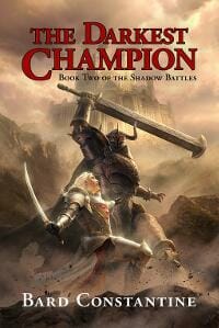
JF: I agree, and I think you should be pleased.
Bard Constantine submitted The Eye of Everfell designed by Shen Fei. “I wanted a classic look for my fantasy series, a throwback to the novels I read growing up. Shen Fei did a fantastic job capturing the look and feel of what I had in mind.”
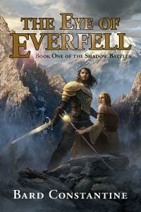
JF: This illustration is even more dramatic and engaging, but the title could use a bit more contrast with the background.
Basil Bacorn submitted Sealing Death designed by Basil E. Bacorn.

JF: No idea what this book is about or, frankly, why one should care.
Ben Faroe submitted The Dream World Collective designed by Ben Y. Faroe. “With this design I wanted to capture the passions of the main characters–writing, painting, building, gardening–and represent their path from dream to reality, which involves both creative vision and concrete planning.”

JF: Nice concept of the building evolving, but you do realize none of the characters actually appear on the cover, right? Although the title is unique, it lacks impact and is basically being crowded out by the illustration.
C. M. Boers submitted Obscured designed by Sylvia Frost. “My cover designer captivated a dream sequence in my book perfectly for the book cover.”

JF: I especially liked the warm colors used on this cover. Along with a delicate texture in the background and the always-intriguing “woman walking away from us” meme, a very nice cover.
Charlotte Young submitted Ora’s Gold designed by Damonza. “My brief was the image of young woman’s face-leaving room for the reader’s imagination to fill out the details-with an image of a seascape superimposed onto the face. My inspiration was a photo of just such a face but the superimposed image was a highway. It was a great place from which to start.”

JF: Strong typography and imagery, although I find the composited images confusing, and I don’t think that’s a good thing.
Chloe Garner submitted Portal Jumpers designed by A Horse Called Alpha.

JF: Oddly incongruent typefaces and a somewhat abstract image don’t add up to much.
Curiosity Quills Press submitted Mer-Charmer designed by Amalia Chitulescu.

JF: A lovely cover with lots of story that looks like it was reduced from the paperback original.
Curiosity Quills Press submitted The Curse Servant designed by Dean Samed.
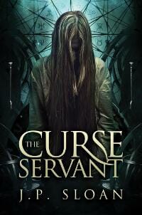
JF: Artful and effective, with distinctive typography. Note how the man’s covered face and the focusing effect of the “crown” deepen the mystery. ★
Curiosity Quills Press submitted Cogling designed by Mandie Manzano.
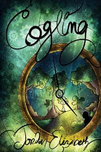
JF: Delightfully idiosyncratic.
Curiosity Quills Press submitted The Deathsniffer’s Assistant designed by Amalia Chitulescu.

JF: Great use of lighting to up the drama on this cover, very stylish.
Curiosity Quills Press submitted A Taste of Death and Honey designed by Kerry Hynds.

JF: Great combination of delicacy with a hint of menace from the skulls in the butterfly’s wings.
Curiosity Quills Press submitted Inconceivable! designed by Matt Phillips.

JF: A little confusing due to the many elements and effects all competing for our attention. And generally, punctuation is not used in titles.
Curiosity Quills Press submitted Broken Dolls designed by Eugene Teplitsky.

JF: Most of the impact of this cover is from the creative illustration that expresses the theme of the book. Great combination of art and typography to create one, unified image.
Dagny Doyle submitted From Never to Forever designed by Denise. “This is book 1 in a contemporary romance series.”

JF: A pretty basic genre cover, but with some awkward typography.
Dagny Doyle submitted Electricity designed by Denise. “This is book 2 in a contemporary romance series.”

JF: Better than No. 1 above due to better contrast and tighter focus.
Dana V. Moison submitted Dark Illusion designed by Dana V. Moison & Nir Vidas.
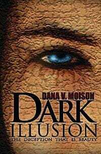
JF: The strong image isn’t actually. . . attractive, and the type is poorly handled.
Dane Low submitted Almost Midnight – Three Classic Fairy Tales Retold designed by EbookLaunch.com.
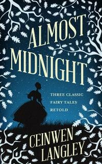
JF: Delicate and effective, leads us right down the mythic path. The title might stand out a bit more if it wasn’t so close in color to the foliage.
Dane Low submitted Parasite designed by EbookLaunch.com.

JF: Irresistibly sets the stage for the story with the combination of the spaceman image and the threatening slug-line at the top.
Dane Low submitted The Beauty in Darkness designed by EbookLaunch.com.

JF: Perfectly expresses the idea contained in the title, and perfectly focused.
Dane Low submitted A House Made of Bricks designed by EbookLaunch.com.

JF: Great example of how good design doesn’t always rely on fancy fonts, dramatic images, and weird text effects. Here again, the entire cover expresses the idea in the title in a very natural and approachable way.
David Brush submitted Induction designed by Jake Clark.

JF: A cool idea and a lot of nice details, but overall there are so many elements I’m not sure it all comes together.
David Madison submitted Ms. Spinster’s Novel Grammar: More Novel Yet Her Punctuation, Spelling, Style . . . designed by David Madison. “A marriage of fiction and nonfiction; grammar and glamour; poetry and prose; comedy and tragedy, Ms. Spinster’s overarching theme is duality. Submitted as nonfiction, I might as justifiably have submitted it as fiction. The design is my own, artfully rendered by Tatiana Vila of Vila Design.”
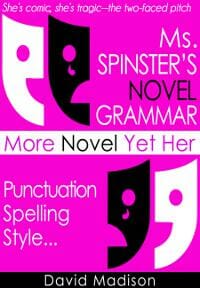
JF: It’s always hard to categorize books like this, and because it uses a fictional story as its foundation, we’ve put in the fiction category. Of course, the problem with that is the cover looks like nonfiction, not fiction. In addition the design is choppy, hard to read, and harder to make sense of. I suggest going with a professional book cover designer to come up with something that does a better job of communicating.
Dawné Dominique submitted Veterans’ Affairs designed by Dawné Dominique. “The author requested a specific design for this particular book, so I attempted to come as close as possible to his wishes, but at the same time, incorporating a touch of my own design by creating a unique perspective of intrigue through the use of color, font placement, and the photograph.”

JF: Obviously skillful, but the impact is lessened because that central image is unidentifiable. What is it?
Deb Dorchak submitted Tau’s Pride: Storms designed by Deb Dorchak, Blue Sun Studio, Inc.. “Tau’s Pride: Storms is the first book in the follow-up series to Bonds of Blood & Spirit Saga. Unlike our previous covers in the Saga, this cover takes a more illustrative direction. It’s the first time we’ve depicted an actual scene from the book.”

JF: It’s working nicely. The illustration draws us into the story, and the overall air of mystery is palpable. Series type may be a bit too attenuated.
Deborah Coonts submitted Wanna Get Lucky? (The Lucky O’Toole Vegas Adventure Series Book 1) designed by Andy Brown.

JF: A plucky bit of surrealism.
E.C. Jarvis submitted The Machine designed by amygdaladesign.net.

JF: A finely detailed design that looks just right for this book.
Elizabeth DiPalma submitted Love and Hurricanes designed by Elizabeth DiPalma. “Weather and a sense of place (New Orleans) are both very important to this book. As always, I tried to use type and art to give the prospective reader a sense of what’s in store. I hope I succeeded. Looking forward to comments!”

JF: Artful, and I love the use of perspective.
Elizabeth McCay submitted Broken Like Glass designed by Perry Elizabeth Designs. “I wanted something simple and eye-catching. I love the end result.”

JF: The broken red glass as a heart is very effective, nice job.
Elizabeth McKenna submitted Cera’s Place designed by Alisha at DAMONZA.COM. “Alisha at DAMONZA.COM redesigned the cover for my first novel, which I had sadly designed myself years ago. Cera’s Place is a historical romance set in 1869 San Francisco. I have seen DAMONZA.COM on your blog many times and was very happy with the results.”

JF: Elegant and masterful. the background texture provides a sensitive frame, and the design provides insight into both character and setting. ★
Elka Ray submitted What You Don’t Know: Tales of Obsession, Mystery & Murder in Southeast Asia designed by Milo. “I wanted a cover that felt dark and suspenseful and conveyed the message: “Obsession, mystery and murder in Southeast Asia” without looking sleazy.”
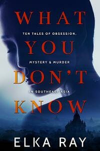
JF: Great image composite that’s well balanced, allowing both images to play together. And this is a good place to use the interlinear subtitle.
Ember-Raine Winters submitted Born To Resist designed by Nicole Wenner.

JF: The exact opposite of What You Don’t Know, above. This is confused, unreadable and in the end, ineffective.
Francine Platt submitted Cajun Justice designed by Francine Eden Platt. “My first submission — a fun cover to work on! Here are the credits: Book Cover Design: Francine Eden Platt, Eden Graphics, Inc. Illustration: Brian C. Hailes Original photo of snake: Daniel Rosenberg Fonts: Parlour (title font) and Sony Sketch EF (author font) Thank you for your consideration!”
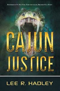
JF: A raging Cajun, eh? Strong typography and good impact.
Gilbert David Leon submitted The Frigorifico designed by Simon Avery. “The story is about a small town in Argentina that loses its main employer over night. False hope, fear, despair and anger were important themes in the story and we wanted to transport them with the cover. ”

JF: A powerful, yet subtle, cover that’s carefully balanced to achieve its effect.
Heather Gilbert submitted Out of Circulation designed by Deranged Doctor Design. “I worked with Milo at Deranged Doctor to capture the West Virginia locale of this romantic suspense series. The hopeful, yet suspenseful feel was well-captured and the gorgeous skies and mountains really tie the 3 covers together (will submit the others as published).”

JF: The scene-setting is definitely the strongest part of this cover, although the transparency of the title makes it a bit hard to read.
Intisar Khanani submitted Memories of Ash designed by Jenny Zemanek. “Memories of Ash is a YA Fantasy read, featuring a street thief with a dangerous magical secret. In this book, Hitomi is learning to cope with having burnt away her memories but is coming into her own. She also happens to meet a real phoenix. So, the cover design centered around the firebird motif.”

JF: A lot to like about this cover, but the marked difference in visual styles between the graphic and the ornamented title is distracting.
Jacklyn Wilson submitted Sunborn Rising: Beneath the Fall designed by Safronoff. “Cover art by the Chief Creative Officer of the publishing company Neoglyphic Entertainment. The cover depicts the main character’s tail hinting that she’s not human. The leaves are representative of the alien natural world and the dark swarm of insects foreshadow the evil she must battle.”

JF: A strong illustration holds its own against the overworked type, but bear in mind the main character could be anything that has a tail, for all we know.
Jade Zivanovic submitted Whiskey designed by Jade & Vlad at Steam Power Studios. “This is the first book in a series of seven books (Whiskey Sour), so we took the time in establishing the title/signs for the Burlesque Club. The background is photomanip and the basque, boa and drink are illustrated.”

JF: I don’t think objects symbolic of story elements really work unless they form some part of an overall concept, and that seems missing here.
Jade Zivanovic submitted Descent designed by Jade & Vlad at Steam Power Studios. “We worked closely with the author to illustrate her main character on the cover, and to have the symbol as an element that was interactive in the picture. The symbol will be on the cover of each book in the series.”
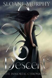
JF: And it’s well integrated here. But again, no one else knows what the symbol is or means until they read the book, so it has limited appeal except as a decorative element.
James Egan submitted The Golden Spider designed by James T. Egan of Bookfly Design.

JF: The layered texture helps to keep the elements together, including separate type elements. Hey, doesn’t that fellow look like Jeremy Piven?
James Egan submitted Powder Trade designed by James T. Egan of Bookfly Design.

JF: A strong cover that promises lots of action and excitement. Here the hero is potential energy framed by the careful type. Also note that the series branding at the bottom is both readable and legible without being distracting.
Jean Gill submitted More Than One Kind designed by Jessica Bell.

JF: I like the strongly graphical look of these covers, but the first is clearly better. The background imagery is meaningless, rendering it as merely a texture, and that’s something we don’t have to interpret. Very stylish, with nice type handling.
Jean Gill submitted No Bed of Roses designed by Jessica Bell.

JF: Here the main figure has been pushed into the background treatment and the ancillary elements are given full-strength which, honestly, makes no sense to me and creates a cover much harder to decipher.
Jean Gill submitted One Sixth of a Gill designed by Jessica Bell.

JF: I’m not quite sure what to make of this cover for a very personal collection of stories and poems, but it does stop you in your tracks, and maybe that’s exactly what was wanted.
Jeffrey Collyer submitted Dreams and Shadows designed by Jeffrey Collyer. “This is the second cover for this book. I loved the first – almost exactly how I had pictured it in my mind, and I had several comments on how good it looked. But it just didn’t look great at thumbnail size. It wasn’t eye-catching enough. So I went back to the drawing board and this is the result.”

JF: Nice job, and if you simplified the title type, it will work in thumbnails even better.
Jeffrey Collyer submitted Woven Peril designed by Jeffrey Collyer. “I spent ages trying to find a professional to design this book cover, and tested the waters with a couple. In the end, I decided to do it myself, and am really pleased with the results”

Jennifer Palmer submitted Alphabet Buddies designed by Jennifer Palmer.
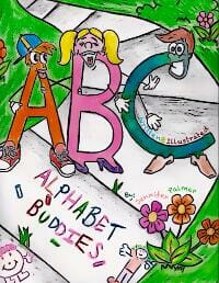
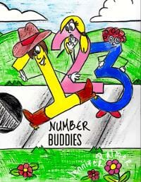
JF: These covers have a charming amateur quality to them, but they don’t look of commercial quality. By the way, we usually include the author’s name on the cover.
Jennifer Palmer submitted Number Buddies designed by Jennifer Palmer. “Number buddies is a children’s book that shows how the numbers increase from one to ten, as well as the numbers having fun doing their job.”
Jennifer Silverwood submitted Craving Beauty designed by Najla Qamber Designs. “Key credit in the image belongs to Keyper’s Cove.”

JF: I see your idea and some of the work that went into this is evident, but I find the image confusing and the title is disappearing against its background.
Jim Johnson submitted Beacon’s Spark designed by Lou Harper. “I needed a cover that reflected urban fantasy, coming of age, hope, and the DC metro area. Lou went above and beyond to fit it all in there.”
![]()
JF: She looks downright radioactive, but I think it does what you want it to.
John Byrne Barry submitted Wasted: Murder in the Recycle Berkeley Yard designed by John Byrne Barry. “Though I’ve been a designer for decades and have designed annual report covers and web banners and maps, I’d never done a book design until this one. I tried some designs with bales of aluminum, but the recycle logo just seemed to be the strongest and simplest.”

JF: This is a very common situation in which a skilled graphic designer brings those skills into book cover design which is much more tied to conventions. Obviously the designer is skillful, but the big fail is that the book looks like nonfiction or a corporate publication, and has no trace of what must be the excitement and drama in the story.
Jonna Feavel submitted This Little Piggy Wound Up Dead designed by Jonna Feavel (40 Day Graphics). “A fun caricature design for a cozy mystery! It’s book three in the series.”

JF: I tend to like these books, but here I find the difference in drawing styles between the girl and all the other drawings disturbing, and the branding has been given more prominence than it likely deserves. Why make us interpret all that before we even get to your cover imagery?
Juanita Aydlette submitted It’s In The Blood designed by Fiona Jayde. “An ancient tribe in the Brazilian jungle has the power to transform into their animal spirits.”

JF: Checks the boxes for a genre cover, but I think the splotches on the title detract more than they add.
Katie Preston submitted Idle Mojo designed by Katie Preston. “”Idle Mojo” is a novel that follows Miranda Bennett across a series of days. She is a witch, and a large part of the plot centers around her magical talents, and an enchanting garden. I wanted this cover to be eye catching, but with a classic, clean feel, with a hint of magic about it.”

JF: I really like your touch with type, and that’s not easy to do. Having said that, this cover looks a total miss to me. I don’t see a trace of magic or anything else that would interest a browser in the least. It lacks a hook.
Kevin Kane submitted Cumulus designed by Kevin Barrett Kane.

JF: Okay, let’s guess, shall we? A Rorsharch drawn by a computer? Two anvils belly to belly? A yin-yang created out of surfboards? You tell me.
Kim DDD submitted Ella Dethroned designed by Milo from Deranged Doctor Design. “Cover design for Fantasy, Fiction book series, The Boy and the Beast, Book 0”

JF: Cosmic fantasy action, nice. Notice how the designer hasn’t used lots of different fonts for the different elements, and that helps unify the entire cover.
Kim DDD submitted Her Dangerous Visions designed by Milo from Deranged Doctor Designer. “Cover design for Fantasy, Fiction book series, The Boy and the Beast, Book 1”

JF: Strong environmental covers for the series with attractive heroines who are highlighted by the light behind them, a good technique to focus attention.
Kim DDD submitted The Bridge Beyond Her World designed by Milo from Deranged Doctor Design
. “Cover design for Fantasy, Fiction book series, The Boy and the Beast, Book 2”

Kim DDD submitted The Dream Thief designed by Kitten from DDD. “Cover design for Science & Fiction, Fantasy, Sword & Sorcery book, The Way to Freedom Series, Book 2”
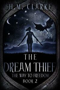
JF: Another well focused fantasy series with distinctive framing device and consistent imagery over all the titles.
Kim DDD submitted The Awakening designed by Kitten from DDD. “Cover design for Science & Fiction, Fantasy, Sword & Sorcery book, The Way to Freedom Series, Book 3”

Kim DDD submitted The Enemy Within designed by Kitten from DDD. “Cover design for Science & Fiction, Fantasy, Sword & Sorcery book, The Way to Freedom Series, Book 4”

Kim DDD submitted The Colony designed by Marushka from Deranged Doctor Designer. “Cover design for Science Fiction, Fantasy, Aliens book”
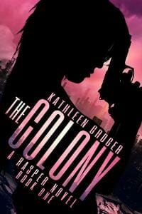
JF: A strong cover but I don’t see sci-fi or fantasy, could be a standard thriller.
Kim DDD submitted Gian designed by Kitten from Deranged Doctor Designer. “Cover design for Mystery, Thriller, Suspense book”

JF: This is an interesting and tightly designed cover, why interrupt our appreciation of the atmosphere, the brooding man, the excellent typography with that turned up page corner? It’s the brightest thing on the cover and, consequently, makes us look at it. How does that help?
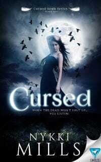
Kim DDD submitted Cursed designed by Marushka from Deranged Doctor Designer. “Cover design for Fantasy, Paranormal book”
Kim DDD submitted Defiance designed by Milo from Deranged Doctor Designer. “Cover design for Dystopian, Westerns book”

JF: Strong series design, and here, where only one word is concerned, the heavily textured title treatment contributes to the branding and style of the book.
Kim DDD submitted Defiance: A House Divided designed by Milo from Deranged Doctor Designer
. “Cover design for Dystopian, Westerns book, Book Two in The Defending Home Series”

Laken Cane submitted Killing Land (Book 8, Rune Alexander series) designed by Laken Cane

JF: A riveting image, would like to see the title with more emphasis.
Laken Cane submitted Unbreakable (Book 1, Waifwater series) designed by Laken Cane

JF: The depressed palette has eliminated almost all the contrast.
Lisa Kosier submitted Delusion designed by Flyleaf Studios “The story line of the book is set around a bar called Delusion. The author wanted the reader to feel like the characters and bar were familiar and something they could relate to. We chose to put the focus on a night setting and from the perspective of standing outside of the bar.”
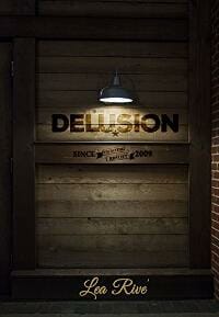
JF: I love the atmospheric quality to this cover, it really draws you in.
Loren Walker submitted Eko designed by Deranged Doctor Designs. “This cover is for the first of a four-part fantasy/science-fiction series – the “spiral” symbol is the author’s creation, and the designers incorporated the requested vivid blue and metallic themes into the design.”

JF: Cool industrial look.
Mark Carver submitted Nikolai the Penitent: A Novel of the Brotherhood of the Cross designed by Ramon Puasa, Jr.. “I (the author) came up with the concept and sent a simple sketch to the designer, who knocked it out of the park. The book is set in medieval Germany during the Black Death plague, and the cover captures the grim atmosphere and brutal violence of the story.”

JF: The violence is evident. Interesting choice to use yellow—a “spiritual” color—for the typography.
Marniy Jones submitted The Seal of Throkar designed by Marniy Jones

JF: Composition might be improved by focusing more on the girl, and the type needs to be stronger.
Matt Mikalatos submitted Capeville: The Death of the Black Vulture designed by M.S. Corley.
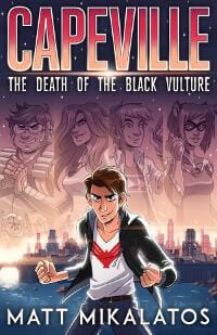
JF: A fun and on-target cover. Solves the problem designers face in trying to portray a whole crew, yet keeps the cityscape and hero in balance. ★
Melanie Munton submitted Playing for Kinley (Cruz Brothers #1) designed by Mayhem Cover Creations.

JF: A solid genre cover that makes its appeal obvious.
Meredith Bond submitted Falling designed by Kim Killion. “This is a past-life romance (blending two stories set in medieval England and contemporary Washington, DC) and I think Kim depicted that beautifully in this cover”

JF: A tough challenge, but the image does make you stop, and that’s half the battle.
Michael Munz submitted A Dragon at the Gate designed by Amalia Chitulescu.

JF: Might have worked better if the top element was smaller, allowing the 2 figures at the center to capture our attention.
Michael Z submitted The Six Samurai of the West designed by Michael Z.

JF: Visually confusing bordering on headache material.
Michelle Oaks submitted Missing Angel designed by Michelle Oaks “When trying to come up with an idea for the cover of our book I realized that the woman’s life was shattered when her daughter was stolen. I thought of the look of a shattered windshield and liked the look of the colors.”

JF: Overall the cover weak, and the type at top and bottom is unreadable.
Michelle Rene Goodhew submitted World 4 – Awakening designed by Michelle Rene Goodhew.

JF: Solid sci-fi cover with a nice feeling of impending doom.
Mihail Uvarov submitted Path to Enlightenment designed by Ecover.pro. “Cover which for a fiction book about the girl, who drifts off into another land through magic portal.”

JF: Intriguing, even cosmic, but I keep wishing they didn’t put that lion there, it would be so much better without it. Throw the symbolism under the bus!
Mike Reeves-McMillan submitted Hand of the Trickster designed by S.A. Hunt. “I gave Sam a free hand with this sword-and-sorcery novella cover, and I’m pleased with the result, which has garnered spontaneous praise from several people.”
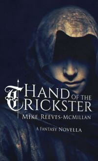
JF: An accomplished and moody cover with type that fits perfectly. ★
Mike Travis submitted Faded Jeans to Army Greens designed by Mike Travis, Ph.D. “I based the cover off the picture I took when I was entering Kuwait during Operation Desert Storm. It was the middle of the day, but the smoke from the burning oil wells made it look like night.”

JF: Mike, I bet a professional cover designer could use your photo as the basis of a novel cover, but it isn’t this.
MJ La submitted Nowey Discovers designed by MJ LaCroix.

JF: Cute and fitting. At this size the type in the bottom left is very hard to read.
Pippa DaCosta submitted Hidden Blade #1 Soul Eater designed by Rebecca Frank Art. “The brief was simple. Tough guy urban fantasy with ancient Egyptian elements in a contemporary setting. At least, my designer made it look easy. This cover encompasses the gritty, darker feel of my urban fantasy portfolio, but also promises action/adventure, and of course, magic.”

JF: Good, but still hard to contain all that symbolism, and the complexity of the type isn’t helping.
Rae Lori submitted A Sunrise in Rio designed by Rae Lori. “Since this was a summer beach read, I wanted to bring a warm, vibrant feel to the cover to draw readers in. I had hoped to bring everything that presented what the book was about and display it like a postcard or a snapshot in time.”

JF: The colors are good, but we can’t really engage with the couple, who are too remote, and the title type isn’t holding up well.
Rena Hoberman submitted Reign of Ashes designed by Cover Quill.

JF: The framing device would work much better if it was toned down. There’s no logical reason to make the least important element the brightest, too.
Rhys Hagan submitted Hunting Taylor Brown designed by Rhys Hagan.

RS McCoy submitted The Killing Jar designed by Kit Foster Design. “Thanks!”

JF: Strong concept well executed makes a great cover. The perspective is ominous, and the splash of color in the butterfly’s wings gives a hint of the reality shift inside. ★
Ruchira Khanna submitted Voyagers into the Unknown designed by Balboa Press

JF: A completely inappropriate look for a book promising voyages into the unknown, because this is one of the best known sites in the world (Taj Mahal) and one of the most-often used views of it.
Sára Mikkelsen submitted Alheimsins einglar (angels of the universe) designed by Sára Mikkelsen.

JF: I don’t know about your market, but in our market this would be a nonfiction cover.
Shannon Brown submitted Rock”n’Roll in LockerSeventeen designed by Shannon Brown “A funny YA title. Main character works at a self storage place so I wanted to convey how he discovers something really important inside on of the lockers.”

JF: Good art, layout, and typography. But the palette desperately needs at least a splash of color to bring it to life. How about red sneakers?
Steven Whibley submitted 6th Grade Revengers: Cat Crimes and Wannabes designed by Pintado. “The series is about two 11-year-old boys who want to be professional ‘fixers’ and how might go too far from time to time. I asked Pintado for a design structure that could both point to the target audience (9+ year olds) and have replicated elements across all the books in the series.”

JF: Much more suited for 12+ than 9, I like the cinematic feel of the illustration, but that series brand feels like it’s squashing the title.
Tammy Seidick submitted Hold On designed by Tammy Seidick. “Thanks for your review!”

JF: Pretty cool, but how come you didn’t tilt the title to match the red band? It’s like a beacon.
Tanya Freedman submitted First and Only Destiny designed by Creative Hummingbird Results. “When envisioning and designing this two book series I wanted to capture the youthfulness and multicultural feel of the story.”

JF: You certainly got that, but what happened to the bottom? The script type is at war with the other 3 fonts used in a small space, and also at war with the indecipherable imagery crammed into that long box. Doesn’t makes sense, because the rest is quite good.
Tatiana Vila submitted Bane County designed by Tatiana Vila. “A good, old-fashioned cover for a Werewolf story.”

JF: Spooky.
Tatiana Vila submitted The Wayfaring Swan designed by Tatiana Vila. “Simple yet fun and eye-catching!”
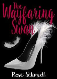
JF: The image could work, but the cover looks oversimplified and there’s usually a readability problem with dark red type on a red background.
Tatiana Vila submitted The Sinner’s Saint designed by Tatiana Vila.

JF: Sweet, everything on this cover lines up. The elongated type mirrors the tall buildings and the man hanging from a wire. The dark urban mood matches the noir style. ★
Thomas Burchfield submitted Now Speaks the Devil designed by Cathi Stevenson. “Again, Cathi Stevenson did a great job for me, capturing I think, capturing the dark comedy underlying the noirish suspense.”

JF: The disjointed and slightly surreal images contrast deliciously with the evil lurking above.
Thorn Osgood submitted The Reclamation designed by Designs By Rachelle.

JF: Amusing considering the dystopian environment.
Timothy Manley submitted The Witch in the Woods (Tales From Wheat Hollow Book 2) designed by Timothy Manley. “Purchased use of the image then “doctored” it up until I got the effects I wanted. I used picmonkey to modify the image and Microsoft Publisher to build the cover.”

JF: And yet book cover design is a specialty that’s often critical to a book’s acceptance, and sales. This doesn’t look like a book cover.
tony dargis submitted Hide and Panic Stations ( Super Speed Sam Book 1 of 12) designed by Tony Dargis “I have a very shy illustrator. I receive the separated components from them, which I then use to compose the cover “sketch.” This is #1 in a series of 12 books – each book has the same “stamp” – but the cover “sketch” and colour of each cover is different, giving a glimpse into the story”

JF: You know, it does have an assembled look, and many of the elements remain unintegrated with the rest of the cover.
Tracy Bryan submitted Put Away Your Phone! designed by David Barrow (Illustrator). “In the cover, David has illustrated what the book is about, an up close shot of what the main character looks like and he has also and given a little teaser of what action is to come. I believe all of these elements prompt the reader to want to turn the page to see more.”

JF: Exactly. And compared to the title above, this one, although still a bit raw, is fully integrated and illustrates the main action of the book.
William Bahlke submitted Popular Demand designed by Lothar Speer. “The book cover features a washed up, small town, TV talk show host, Wally Wannabe, his flamboyant girlfriend, Manny Thymes, and their pretentious cat, Nookie. I wanted the cover to reflect the light-hearted nature of this political satire and create an intrigue that would lure potential readers.”

JF: I like your description better than the result. Your cover lacks impact and is sending lots of mixed signals. For instance, the red object I believe is a car, is the strongest element on the cover, and yet one of the least important. Why?
Yohanes Haile submitted The American Way designed by Yohanes Haile. “I wanted to capture the identity of the main character and the unfortunate circumstances he faces on his journey to success.”

JF: Graphically appealing, needs a border to look like a . . . book.
Nonfiction Covers
Angie Stegall submitted Make Some Room: Powerful Life Lessons Inspired by an Epic 16-day Colorado River Rafting Trip Through Grand Canyon designed by Pixel Studio “The photo was taken by my husband during our 2013 Grand Canyon trip (which is what the book is about). Instead of using a generic GC photo, we felt it added a personal element to the book to use his photo. I also had a chapter contributed by a non-profit advocacy group and wanted to give them credit”

JF: It works, and the photo gives it verisimilitude.
Ben Emesowum submitted Police Violence: Understanding Its Basic History, Causal History, Health Consequences, and Prevention Strategies designed by Benedict Emesowum. “Although police violence affects mostly African Americans, the cover image depicts a Caucasian. The “O” in police is nicely substituted with a police hat; a Baton represents the ” L”; and rain drops of “blue” bullets represents the overkill suffered by many victims in a rain of police bullets.”

JF: Gives the (accurate) impression of being “designed” by an amateur. Is that the impression you’re trying to create?
Christian Matlock submitted The Truth Hurts designed by Christian Matlock.

JF: What would happen if you gave the same design brief as “The Dating Mirror” to someone untrained in design.
Christopher Scott submitted A Course In Miracles In Sight: A Guide For The Visual Learner designed by Christopher R Scott “The two figures (by Robert Scott, illustrator of hand-drawn artwork) are depicted as if they are viewing the ego mind’s dreams of separation from Heaven. Included is a quotation (in italics) from “A Course In Miracles” such that the cover is a typical example of the many diagrams in the book”

JF: Remarkably awkward, inartful, and ineffective for a book on “visual learning.”
Janice Cumberlidge submitted Clean Eating Recipes For Strength And Fitness designed by Janice Cumberlidge “I designed this cover in Photoshop. The heart-shaped food bowl is a cut-out from one of the recipe photographs in the book and the fitness couple a stock photo. I used a bold font to ensure the main title was readable at Amazon thumbnail size and went through a few iterations to end up with this.”

JF: A very good author-designed cover that makes its point well. You would do well to emphasize the author name more, part of what these books do is build a brand for the author. ★
Matthew Miller submitted Movement: A 40 Day Spiritual Journey designed by Matthew S. Miller “Movement is a 40 day spiritual devotional which opens readers to their journey of faith by challenging them to choose compassion and movement in a complex and apathetic world. The book inspires and equips readers to journey away from self and nearer the heart and mission of God.”

JF: Well suited to the task and inspiring in itself. ★
Mindy Shelton submitted Serial Murderers designed by Mindy M. Shelton “Book three in a series of five true crime books. Each one is textbook formatted and ready for any criminology class. It truly is a compilation of research on the title topic. Thank you for your feedback.”

JF: The color and texture variations aren’t handled smoothly, and the overall effect never comes together.
Mindy Shelton submitted Siblings who Murder designed by Mindy M. Shelton “Book four in a series of five true crime books. Each one is textbook formatted and ready for any criminology class. It truly is a compilation of research on the title topic. Thank you for your feedback.”

JF: Better because it’s simpler, but still fighting with itself.
Philippa Thomson submitted A Hole in My Life. Battling Chronic Dizziness designed by Janet Hansen. “The photograph is by Eric Rose in Oregon. A striking image that beautifully sums up how one might feel with the conditions described in the memoir. It has a haunting look to it.”

JF: A beautiful cover with a unique visual, but one that would be most effective for a print book, not an ebook because all that little type is going to disappear.
Raj Badal submitted Systems: Brains of Corporations designed by Raj Badal. “This book cracks the mysteries of maintaining complex systems using evolution of systems, business fundamentals, secrets of Investment Banking trading systems, complexities of the brain and immune systems, and 200+ creative artworks. The cover summarize the book’s content with brain & corporations.”

JF: The descriptions sounds like it’s exciting to potential readers, but the cover is uncommunicative and dull.
Ray Charbonneau submitted Wind in the Fire designed by Ray Charbonneau. “A redesign of Bobbi’s 2011 book to celebrate the 50th anniversary of her becoming the first woman to run the Boston Marathon. It’s about running, but it’s also about Bobbi’s spiritual journey (thus the whole Wind/Fire thing).”

JF: The feeling of running into the wind is palpable, and the natural reading order with the title at the left feels like it will put some “wind under her wings.” ★
Scott LaPierre submitted Marriage God’s Way: A Biblical Recipe for Healthy, Joyful, Christ-Centered Relationships designed by Scott LaPierre.

JF: The image is so ghosted out it has little impact, and the rest is uninspired and pretty boring. Marriage and God are both rich topics, but that doesn’t show on this cover.
Sybe Starkenburg submitted The Tightrope of the Absurd designed by Sybe Starkenburg “The background is taken from the ‘OwlHouse’ in Nieuw Bethesda, South Africa. The title of the book underscores the absurdity of life and the balancing act required to live that life. The owl depicts our consciousness.”

JF: The unmistakable “self-published” look.
Tanya Freedman submitted Love, Care and Share designed by Creative Hummingbird Results & Woven Red. “Tom Herstad commissioned Paul Morin for a painting which we then designed into a warm and inviting cover. The butterflies represent the author’s protagonists; his parents, and the generous souls and the stories which the author now shares with the world.”

JF: The image isn’t bad but the typography would have to be a whole lot better to make something attractive out of this.
Tanya Freedman submitted Getting From Hello To Forever Together designed by Creative Hummingbird Results & Woven Red. “Yvonne Finn wanted to have a warm and clean feel to the cover to capture her romantic yet honest how-to-help-relationships style.”

Well, that’s it for this month. I hope you found it interesting, and that you’ll share with other people interested in self-publishing.
Use the share buttons below to Tweet it, Share it on Facebook, Plus-1 it on Google+, Link to it!
Our next awards post will be on October 24, 2016. Deadline for submissions will be September 30, 2016. Don’t miss it! Here are all the links you’ll need:
- The original announcement post
- E-book Cover Design Awards web page
- Click here to submit your e-book cover
- Follow @JFBookman on Twitter for news about the E-book Cover Design Awards
- Check out past e-Book Cover Design award winners on Pinterest
- Subscribe to The Book Designer Blog
- Badge design by Derek Murphy

