Welcome to the e-Book Cover Design Awards. This edition is for submissions during August, 2013.
This month we received:
81 covers in the Fiction category
13 covers in the Nonfiction category
Comments, Award Winners, and Gold Stars
I’ve added comments (JF: ) to many of the entries, but not all. Remember that the aim of these posts is educational, and by submitting you are inviting comments, commendations, and constructive criticism.
Thanks to everyone who participated. I hope you enjoy these as much as I did. Please leave a comment to let me know which are your favorites or, if you disagree, let me know why.
Although there is only winner in each category, other covers that were considered for the award or which stood out in some exemplary way, are indicated with a gold star: ★
Award winners and Gold-Starred covers also win the right to display our badges on their websites, so don’t forget to get your badge to get a little more attention for the work you’ve put into your book.
Also please note that we are now linking winning covers to their sales page on Amazon or Smashwords.
Now, without any further ado, here are the winners of this month’s e-Book Cover Design Awards.
e-Book Cover Design Award Winner for August 2013 in Fiction
Khanjan Mehta submitted The Kochia Chronicles: Systemic Challenges and the Foundations of Social Innovation designed by Jan Sunday. “This is a fiction book based on several years of research into development challenges in East Africa.”
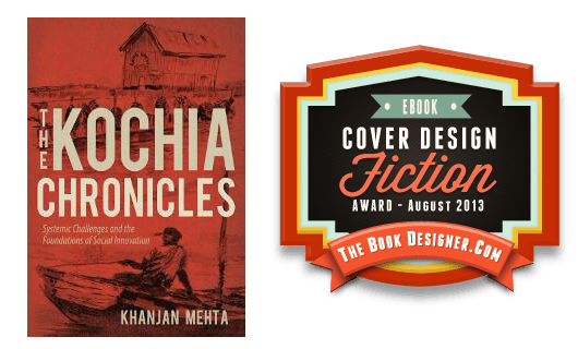
JF: An outstanding ebook cover for a set of stories with a most unlikely subtitle for a work of fiction. I love the way the designer has combined evocative artwork with strong typography to achieve a very unified look. The simple illustration contrasts perfectly with sophisticated typography, and note how careful the designer was with the colors used throughout.
e-Book Cover Design Award Winner for August 2013 in Nonfiction
Jason Harvey submitted Achieve Anything In Just One Year designed by Damon Za. “This is a new cover to replace the existing one that garnered a few bad remarks and comments. This time I wanted a cover that was traditional and would clearly convey what my book was about. Plus I wanted something that would really pop on amazon. My last cover was white, so this was a total change in that regards. This is a non-fiction personal development book, so I wanted a cover that matched other books in that genre. My first cover I tried to be unique and artistic, but that only confused potential readers and hurt sales. This time around I just wanted something that readers would look at and immediately know it is a non-fiction book, and then after reading the title they would have a pretty good idea if it is something they might want to learn more about. I think Damon really did a great job in doing this regards.”
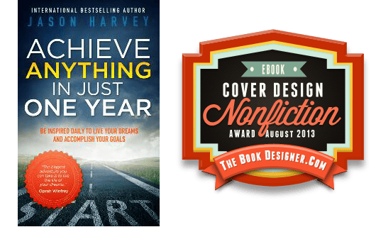
JF: You made a great and mature decision to hire a pro, Jason. I would be quite interested in how this redesign affects your sales. Damon, a multiple winner here, knows exactly what this type of book should look like, and delivers exactly the right cover for this book. A great nonfiction cover.
Fiction Covers
Adam Bender submitted We, The Watched designed by Belinda Pepper, Red Swallow Design. “Belinda Pepper of Red Swallow Design created this cover based on a concept design I had drawn. My original cover featured a CCTV sign, but Belinda had the great idea of replacing the camera with the graffiti symbol of the Underground, a revolutionary group from the novel. And I’m still blown away by the level of detail. Needless to say, I’m very glad I hired a professional!”

JF: Yes, everything about this works together to thrust you into the story.
Amira Makansi submitted The Sowing designed by Kevin Weitzel and K. Makansi. “We chose a cover with a dark green, jungle-colored background to emphasize the book’s focus on agricultural themes. The design is scratched metal, which highlights that the book takes place in a post-apocalyptic future, where the world we live in today is crumbling. The symbol is an artistic rendering of the lotus flower, which becomes important thematically and from a plot perspective in the middle of the book. The gold font is done to symbolize the extravagance and luxury of the elite classes over the agricultural workers. Thank you very much for your consideration of our book cover for your design awards.”

JF: It’s all too easy for a cover to get weighed down by “symbolic elements” but in this case the task has been well managed. Although the precision of the design work might argue against the “world is crumbling” idea, this is an effective cover well suited to its genre.
Angela Cleland submitted Sequela designed by Angela Cleland. “Sequela is a literary science fiction novel. My design was inspired by the cover for my copies of Ken Macleod’s ‘Intrusion’ and Geoff Ryman’s ‘Air’.”

JF: Beautiful if a bit cold.
Angela Oltmann submitted Lifelines: Kate’s Story designed by Angie-O Creatioins. “Women’s Fiction”

JF: I’m afraid this very truncated view of a woman also cuts off most of the interest in what might lie inside. Disembodied legs are not that big a draw.
Angela Oltmann submitted September 7th designed by Angie-O Creatioins. “Psychological thriller”

JF: A cover that works pretty well and which uses color as a highlight to tie the elements together.
Ani Alexander submitted Highfall designed by don’t know – it was pre-made cover. “The previous cover of Highfall was pale and unattractive. This one worked much much better. I can even provide a comparison of the two in case you would like to :)”

Benjamin Grahl submitted 27 Nights designed by Nathan Scheck. “My manager at work designed the cover for my first novel.”
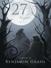
JF: You’re working for the right guy, apparently. A real winner with great control and fantastic atmosphere.
Bridget McKenna submitted Harry the Crow designed by Bridget McKenna for Zone1Design.com. “Harry the Crow, by John Kratman. A Native American chief ventures to introduce his robot son to his tribe. Now Harry must follow the traditional route to manhood–counting coups.”

JF: The illustration idea has merit, but it’s undone by the awkward typography.
Bridget McKenna submitted Patriot Girls designed by Bridget McKenna for Zone1Design.com. “Patriot Girls is a near-future science fiction story about a young girl whose innocent eagerness to serve her country leads her into a strange and ominous situation.”

JF: Despite some good art, this cover is oddly incongruous with no indication I can see that’s within the sci-fi genre.
Calvin C. Cahail submitted Prophet Quest designed by Calvin C. Cahail. “Many details keep your eye interested, jumping between focal points. I live in Costa Rcia where several Spanish-onlyspeaking people asked if the book would be in their language as well. The cover alone sold them on the book.”

Camille LaGuire submitted The Adventure of Anna the Great designed by Camille LaGuire. “This is a redesign of an old cover I could never get quite right. When I did another cover for an upcoming book, I realized that it’s style — swirled clouds against light blue with a white horse silhouette knock out — might work for this.”

JF: Another interesting cover treatment from Camille Laguire. This one features great conceptual art, but it isn’t helped by the type that’s tortured into an artificial shape to fit the cover, and I might have skipped the Copperplate for the author’s name and used something with less detail in it to concentrate attention on the rest of the cover.
Carlos Moreno submitted Nephilim Awakened designed by Carlos Moreno. “Illustration by Maureen Schockey, cover design by Carlos Moreno. Nephilim Awakened is a sci-fi novel with New Age and biblical references in which an unlikely heroine finds herself chosen to destroy the anti-Christ, a perfect hybrid creature developed by aliens living beneath our world in tunnels.”

JF: Nice concept but the illustration is much too primitive to carry this off.
Cassy Campbell submitted A Despair of Demons designed by Cassy Campbell. “This is the first in a scifi series with just a touch of romance.”

JF: Every month we see various attempts to composite images together, and here you can see that it’s not as easy as it looks. And it’s not helped by the weak typography. Needs a re-do.
Chrinda Jones submitted Darkness Knows Me designed by April Gann. “April Gann created this cover for my crime novel, Darkness Knows Me. She used a photograph of the area in Dallas, TX where the novel takes place, (Deep Ellum) and created a graphic design over top of it. I really think she captured the grittiness of the area and the look and feeling of a crime/thriller cover.”
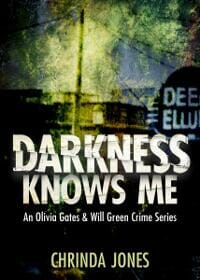
JF: Well, April really knows what she’s doing, doesn’t she. This cover is deceptively simple with remarkable texture, a controlled palette of colors, and evocative typography. Well done.
Christopher Ruz submitted Rust designed by Helen Pinkney.

JF: Fantastic cover for a horror series compilation, showing just how much can be accomplished to create interest and focus it, with a simple set of elements. ★
Daniel Harvell submitted The Survivors designed by Christoph Michaud of 7Reed Design. “Thanks for the opportunity to enter! My friend and designer did such an amazing job with this cover – he deserves all of the recognition he can get!”

JF: It’s great to try to tell a story with your cover, but some of these elements are clearly not right, like the airplane erupting from that fellow’s head. Also needs a rule around it to prevent “bleeding” onto white backgrounds.
Deb Dorchak submitted Bonds of Blood & Spirit: Reclamations designed by Deb Dorchak—Blue Sun Studio, Inc.. “Reclamations is the third book in the Bonds of Blood & Spirit Saga (one more cover to go!). I have to say, of all the covers I’ve done for this series, this one is my personal favorite.”

JF: I can see why, Deb. This one is creepy and inviting, all at the same time. Nice.
Eleni Papanou submitted Jessie’s Song designed by Goone richard. “I’m curious to hear your remarks. I got this cover made at 99design after giving up on my own design as it was to dark for the theme of my book. The artist managed to capture the key scene from my book and give it the spiritual/otherworldly feel I was looking for. The typography was done by me.”

JF: I find it very difficult to “read” the image, even after a good, long look.
Emily Freeman submitted Unraveled designed by Barry Freeman. “Unraveled, by Viola Barry, is the inspirational journey of a woman whose life is turned upside down when her husband moves her across the world from Washington, D.C. to Moscow, Russia. It is the story of a woman, uprooted from her home, her family and her friends who in spite of every obstacle, overcomes. Thanks for your consideration!”

JF: A beautiful piece of art and an interesting and well-balanced title treatment. But the building is so far away, it creates a kind of barrier to really entering the scene. I bet if you zoomed in significantly on the building it would improve the cover.
Frank Nappi submitted Echoes from the Infantry designed by My assistant – Sophia Fintz. “My novel Echoes from the Infantry was published by St. Martin’s press in 2005. Years later it went out of print and I recently decided to publish it myself on KDP after readers kept contacting me that they heard about the story and wanted to read it themselves. This meant formatting my original text document etc., but most importantly creating a catchy cover. My assistant initially created a simple cover and we uploaded the book and “brought it back to life.” But after a short time, she realized she could do even better! The new cover gives a glimpse into the story; a man returning home after war with PTSD – a man whose son learns about his past through the photos and letters he finds in the attic of his father’s home. The addition of the dog tags superimposed on the letters/photos adds depth and gives the reader a lens. I certainly think the cover will draw readers to the novel. I’m pleased with how the final version of the cover turned out. Thank you… Frank Nappi”

JF: Interesting story, and I suggest if the book continues to sell that you hire a cover designer to create a cover for it, you might be surprised at the difference it can make.
George Eccles submitted The Oligarch: A Thriller designed by Tabitha Eccles. “Following his controversial election for a third term amid widespread protests and allegations of vote rigging, the Russian President is determined to destroy the oligarchs before they destroy him. Set in Moscow, Ingushetia (Chechnya’s neighbour), and Tyndersk, a Siberian mining town inside the Arctic Circle and geographically cut off from the rest of Russia, this thriller’s plot twists and turns within an authentic and disturbing background.”

JF: We see here again the very common situation of an interesting piece of artwork paired with ineffective typography and little design sense.
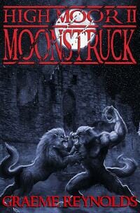
Graeme Reynolds submitted High Moor 2: Moonstruck designed by Stu Smith.
J. G. McNease submitted The Woman in the Zebra Hat: A Short Story designed by J. G. McNease.

JF: A good concept and a cute piece of art just crying out for better type treatments to really come to life.
James Garrison submitted The Great Cow Invasion designed by James Garrison.

JF: Love the cows, the rest is awkward and distracting.
Jennifer Lewis Williams submitted A Murder Among Friends designed by Irea Designs and Donnie Light (eBook76.c0m). “This book is a crime fiction novel. The original cover was designed by a student who wanted me to credit Irea Designs, but Donnie Light completed the cover by changing the word Murder to red, cleaning up the image, and carrying the image forward (around) to the back-of-the-book blurb.”

JF: A cover that, on the surface seems capable, but really doesn’t work since it’s much too delicate, and in the completely wrong colors, for this genre.
Jessie Donovan submitted Blaze of Secrets designed by Regina Wamba of Mae I Design. “This is the cover for my adult paranormal romance featuring elemental magic.”

JF: Adequate and well-positioned, but I don’t think this typeface works well on your cover.
JG Parker submitted Stone and the Flower Dragon designed by Martin Parker (Stonewood Press). “Stone and the Flower Dragon is a story from a science fantasy series called the Elementals (the first being Dark Peak: The First Elemental.”

JF: Hot and busy but without a central focus, and the type isn’t helping.
Jim Roberts submitted Olympus Rises designed by Alex Martinez. “This is the cover for my first book, “Olympus Rises”, a action/adventure with a slight science fiction element. It was designed by ebook designer Alex Martinez, who has also designed books for sci-fi author Robert Silverburg, among others.”
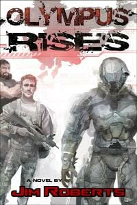
JF: Might have been more effective if the title treatment wasn’t competing with the illustration.
JJ Marsh submitted Appearances Greeting a Point of View designed by JD Smith. “The aim was a clean and enticing image with a serious font to convey the literary fiction angle. I also wanted something culturally broad, for international appeal. Between us, JD Smith and I came up with this.”

JF: A bit quiet. And why is that “a” in the title lower case?
Jo Michaels submitted Borrowed Things designed by Jo Michaels. “I’m entering this on behalf of the author, Doris Schneider. I was the designer on the job. Doris already had a book cover and sought me out at INDIE Books Gone Wild to improve upon it and format the book for print. This is what we decided upon for the final version. Harrington was chosen for the title font and Georgia was used for the subtitle. The author painted the original image used for the cover. We’re eager to hear your thoughts and opinions. Thank you so much for the opportunity.”

JF: I like the colors, but not the fussy title type or the very small subtitle. Just seems to be lacking impact.
Joanna Penn submitted One Day In Budapest designed by Derek Murphy, https://bookcovers.creativindie.com/.

JF: Another winner from previous winner Derek Murphy, who shows how to combine images to get a result that’s more than the sum of its parts. You have to think that a cover this evocative will help to sell this ebook. ★
Jordan Castillo Price submitted Spook Squad designed by Jordan Castillo Price.

JF: This cover attempts to combine three layers to give the overall image more depth, and despite a clean design with an engaging figure, it’s pretty tough to tell what’s going on in those background images.
JT Lindroos submitted Getting Ugly designed by JT Lindroos. “Mike McCrary’s book is a modern pulp action thriller with a sense of humor. The cover attempts to convey all that.”

JF: Both the danger and the humor come through in this graphically strong cover.
Julie Frayn submitted Suicide City, A Love Story designed by Dane Low, EbookLaunch.com. “This is an edgy YA love story with realistic portrayals of teen homelessness, prostitution, drug use, sex and death.”

JF: Good genre cover, but with so much going on in the illustration you probably could have let go of the “cityscape” incorporated in the lettering and made it even better.
June Stevens submitted Voodoo Moon designed by DJ Westerfield. “I am DJ Westerfield, I write as June Stevens. I designed this cover.”

Karen Mayer submitted The Kinshield Legacy designed by T.M. Roy.

JF: A beautiful cover from a whole series of them with particularly strong type treatments and just enough illustration to whet our appetite.
Katie W. Stewart submitted Tollesbury Time Forever designed by Katie W. Stewart. “This is a cover I designed for British author, Stuart Ayris. The book is a literary novel and I’d read it last year and wished that I could do a cover for it. It was a dream come true to actually be asked.”

Kimberley Graham submitted The Rocking Horse of Tuscumbia designed by Kimberley G. Graham.

JF: An interesting idea that falls down in the execution, with type that’s fighting the background and some unnecessary elements at the bottom.
Kyoko M submitted The Black Parade designed by Gunjan Kumar. “I commissioned this cover on CrowdSpring and Gunjan knocked it out of the park. There were a ton of good entries, but I had my fans vote and this one was unanimously chosen as the best. Really happy with how it turned out.”
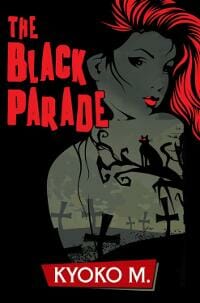
JF: Makes a bold statement, but I’m not a fan of blurry type unless there’s a reason for it, and I don’t see one here.
Laura VanArendonk Baugh submitted Smoke and Fears designed by Laura VanArendonk Baugh. “This project was part of Konrath’s 8-Hour Challenge, so the cover had to be hurried, too! I purchased a stock photo and began playing with font and color. I blogged the entire process here: https://lauravanarendonkbaugh.com/8-hour-book-challenge/ My strength is not in images, so I was pleased to have accomplished this at all. Thanks in advance! I always enjoy the commentary and learn something new.”

JF: The type for the title looks weak against the rest of the cover, and there’s not too much of a “hook” here since the smoke is all we have to go on.
Laurence Patterson submitted Expected designed by Crooked Cat Publishing Ltd.

JF: What a great use of illustration, this cover really does a terrific job of drawing us in and communicating a bit of the style and tone of the novel. Odd that the “blurb” at the top has no attribution, though. ★
Laurence Patterson submitted Friendship Cemetery designed by Crooked Cat Publishing Ltd.

JF: An interesting design that relies heavily on “negative space.” Also note the use of the cover to locate this book in a subgenre.
Laurence Patterson submitted Kaleidoscope designed by Crooked Cat Publishing Ltd.

JF: An interesting attempt at atmosphere that doesn’t seem to have much appeal.
Laurence Patterson submitted Painting By Numbers designed by Crooked Cat Publishing Ltd.

JF: Photo + type overlay = covers by numbers.
Laurence Patterson submitted Someday Never Comes designed by Crooked Cat Publishing Ltd.
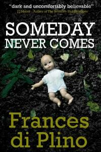
JF: Creepy and effective, a much better solution than the cover directly above.
Laurence Patterson submitted The Quiet Life of Marta G. Ziegler designed by Crooked Cat Publishing Ltd.

JF: Whimsical art that matches the subject, but suffers from so much busyness it makes it hard to tell what’s the focus.
Len Seaver submitted Kingsman’s Wood designed by Len Seaver. “Kingsman’s Wood is about the revelation of the murder of a young woman whom powerful interests wished to be forgotten. When I first saw this picture of a cemetery angel statue, I knew it was her. I found designing my own cover to be extremely fun, and I envy everyone who does it for a living. It took me a very long time, the learning curve was steep, the software grumpy, and I can definitely testify that it’s not as easy as it looks. Still, I’ll do it again (and again), and all comments are welcome if they’ll keep me from hurting myself in the future.”

JF: What’s the hook? Not sure that image can carry everything you’re asking this cover to do.
Liz Seach submitted The Book of Beings: Beginnings designed by Liz Seach. “This is the first volume of a young adult paranormal serial narrative.”

JF: I think this works because the designer has given it such a strong “series” look, along with the ornate treatment of the series title, and a carefully controlled palette that keeps the whole thing from being too busy.
M. Lauryl Lewis submitted Grace Lost designed by M. Lauryl Lewis. “Thank you!”

JF: Excellent example of knowing what genre readers are looking for, and delivering it.
Mallory Rock submitted The Serendipitous Shop Keeper designed by Mallory Rock.

JF: Although the appeal of this image is pretty obvious, I think the cover could be improved with a more rational approach to the typography.
Marius Adams submitted The 2552 Summer Olympics designed by Marius Adams. “The athlete depicted on the cover is from “Sprinter powering off the starting line. © Koh Sze Kiat | Dreamstime.com”

Mark Niemann-Ross submitted Patches Catches the Sargo County Cattle Rustler designed by David Brandt. “David Brandt was the illustrator for the book. Vivid images – proven kid favorites.”
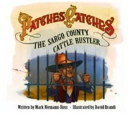
JF: Solid illustration and complementary lettering make this cover stand out. Needs a border.
Megan Cary submitted TEN DAYS designed by Megan Cary. “TEN DAYS by Olivia Mayfield is a New Adult/YA crossover romance novel, based on the sci-fi short story “The Machine Stops” by E.M. Forster ”

JF: Another designer who knows how to combine images to good effect. Alluring.
Michael Kingswood submitted Passing In The Night designed by Michael Kingswood. “Passing In The Night is the prelude to my new novel, The Pericles Conspiracy. In preparing for the novel’s release, I went back and redesigned the original cover to match the font and general layout of the novel cover.”

JF: Sorry, but you seem to have ended up with something quite murky and dull.
Michael Kingswood submitted The Pericles Conspiracy designed by Michael Kingswood. “This is the cover to my new novel, The Pericles Conspiracy. It went through a lot of interations, but I’m very pleased with the final result.”

JF: Good contrast to the one just above, in the same series. Here, there’s human interest and enough color to liven the cover up.
Micheal Rivers submitted The Black Witch designed by Ryan Bibby. “This is a short blurb of the book. Into the realms of illusion and pure evil the ship and its compliment sailed never knowing the fate awaiting them!”

JF: Nice concept, but the colors are running amok and the yellow type is cheering them on.
Michelle Rabe submitted Hard-Luck Harry designed by Steifer Photography, PLAGUESWORTH. “Hard-Luck Harry is a modern noir short story with a supernatural twist.”

JF: Pretty effective, although I wish the title had more oomph.
Nancy Roe submitted Secrets Can Be Deadly designed by Leslie K. “My first mystery novel. I used 99 Designs for the cover. Leslie K was the winner of 489 designs.”

JF: Clearly one of the best covers of the month. Atmosphere, confident typography, genre-specific and intriguing, this one has it all. ★
Natasha Brown submitted An Unfortunate Beginning designed by Illustrator, Larissa Clause (typeface by Natasha Brown). “Larissa illustrated the cover beautifully, perfectly displaying the tone of the book. I layered on the titling and typeface. She created an effective branding for the series that can be reused and modified with each book. I’m pleased with the outcome. Thanks!”
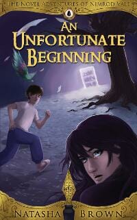
JF: Not sure how it happened, but you’ve ended up with the dreaded “paste-on” look, which is never a good thing. And considering how strong your framing element is, I don’t think you also need that pen protruding pointedly into the scene as well.
Noreen Mayer submitted Murder at Roach Hotel designed by Spittyfish Designs. “The cover captures the glamour and the seediness of a rural Irish hotel.”

JF: Unfortunately the type is way overdone and awkward.
Orestes Ramos submitted The Keeper: Revenge designed by O.L. and Kathy Ramos. “This is the second book of the ‘ Keeper Series’ ” The Keeper: Revenge”, A supernatural romance with the excitement of a strong plot and lots of adventure. The cover from book one, feachured in the June 2013 cover awards contest, showed the veil curtain was whole and drowning out the colors from behind. The veil is now in tatters to symbalise the barrier between the supernatural and human world is being erroded away. In reading the books you will come to see and understand much of the imagery contained in the graphics. Please enjoy”

JF: Unfortunately, you’ve pointed out the weakness of a cover that won’t make sense until you’ve already read the book. This is common with covers weighed down by symbolic imagery.
Pam Crooks submitted The Spyglass Project designed by Cathi Stevenson at BookCoverExpress.com. “Not only did Cathi Stevenson at BookCoverExpress.com design the cover for THE SPYGLASS PROJECT, she also did the graphic for my website,www.pamcrooks.com, to launch my new 1920s romantic suspense series, The Secret Six. I love the tie-in to the series, both website and cover. A simple glance reveals time period, genre, and with the shadowy images in the background, the suspense. A reader will know exactly what kind of book she’s buying.”

JF: I like the series branding at the bottom, and the type, which is perfectly chosen for this era.
Pamela Kelt submitted Half Life designed by Marion Sipe.
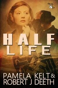
JF: This cover has a lot going for it, but note how the author names at the bottom are suffering from being set so close together that the spaces between words are much larger than between the lines, leading to some unintentional confusion.
Pascal Editions submitted Final Mercy designed by David Pascal. ” Dr. Jack Forester, director of the New Canterbury University Hospital emergency department, is struggling to modernize the ED despite fierce office politics, national media coverage, and the obstruction of the power-hungry new Dean, Bryson Witner, when someone tries to murder Jack’s Nobel Prize-winning ally and mentor, former Dean James Gavin, and make it look like a suicide attempt.”

JF: A confident and effective cover for a medical thriller.
Patti R Albaugh submitted The Ups and Downs of Miss Margaret Landings designed by Cheryl Carter. “As familiar a story in the 1950s as it is for women today, this intimate journey of self-discovery is a page-turner of suspense, humor and poignancy from the opening unveiling of secrets to the final shocking revelation.”

JF: Not sure why you need those bands at the top and bottom, might be better off without them.
Paul Allen submitted Negro Fort designed by Jeroen ten Berge.

JF: Jeroen ten Berge, a previous winner here, once again displays a mastery of the cover, creating texture, scene, tone, and focus with a riveting image that demands to be read.
Pete Morin submitted Diary of a Small Fish designed by Dean Rohrer. “SHoulda done this long ago”
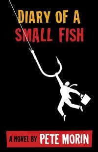
JF: An amazingly effective design carried out with complete assurance in a graphic style that’s hard to imitate.
Phil Redhead submitted Show-Off designed by Phil Redhead. “This is a reworked design for my recent debut novel, and I think a VAST improvement over the original. Design was by myself, but full credit should go to photographer Moik McCullough for his excellent and moody picture, which just happens to suit my story perfectly.”

R.J. Spears submitted Sanctuary from the Dead designed by R.J. Spears. “I went through fourteen separate designs for this cover starting with more realistic and complicated treatments and moving to a more abstract and less complicated approach. I feel with the zombie genre, you have to be sort of blunt and unambiguous. I selected the font with the cross-motif because it goes with the title and the fact that the survivors in this book take refuge in a church. My primary goals were to keep the title readable when it is at thumbnail size and the genre clear to prospective readers.”

JF: Great job, I think you hit exactly the right tone here, and it says “zombie” loud and clear.
Robert Scanlon submitted Sarina’s Nightmare designed by Jana Rade (Impact Studios). “My first novel (yeehah!) and our designer, Jana Rade of https://www.impactstudiosonline.com/ did a fabulous job in a very short period of time.Audience is Middle Grade 9-12 (and up, adults have liked it too so far). Genre: Children’s Science-Fiction & Fantasy.Amazing when so many decisions are based on a 130px high thumbnail!Thank you for the Design Awards competition, I’d love Jana to get the recognition ;)”

JF: A beautiful and effective image combined with a skillful and appropriate type treatment. Checks all the boxes.
Rosanne Dingli submitted The Hidden Auditorium designed by Rosanne Dingli. “Yes, there are feathers, a pendant, music sheets and a yellow curtain in the story. It’s a literary adventure that’s fast paced – amateur sleuths solving puzzles about music, history, and art – all in European locations.The fiction is wrapped around a wealth of verifiable facts.All this author’s books have similar typography for the author name, with running script for the title. This is the eBook cover – the paperback has a slight yellow all-over wash. For readers who love Daniel Silva, AS Byatt, Carol Goodman, Lev Grossman, and Iain Pears.”

JF: I think it works, but I would watch that active background doesn’t overpower the typography.
Sandra Livingston submitted The Secret of the Mummy’s Tomb designed by S.D. Livingston. “This is the first book in the Madeline M. mystery series, a middle-grade series for readers 8-12. A standard set of elements will be used on each cover: the gold borders, the book number inside the oval, and a strong head-and-shoulders image (the next book features a knight in medieval armour). The font colour will change to go along with the new background image – to be updated for each new adventure in the series!”

JF: Looks just right for its intended audience.
Seeley James submitted Trench Coats, Episode III: Bring It designed by Seeley James. “This is the third cover in a serial that will have 6 episodes. To maintain a theme, the business woman with a gun behind her back remains a constant in every episode. The background is episode-specific. In this, the third published episode, her fortunes are rapidly changing, the gathering storm, and she ends up the victim of CIA waterboarding. The gun-behind-the-back represents the protagonist’s character. A young woman who inherited a large security company, and is the corporations’ public face, but she fights injustice behind the scenes. I am the photographer, the model is former-pro body builder Angela Terlesky. The background photo is a public domain offered by the US Navy (your tax dollars at work) taken by Mass Communication Specialist 2nd Class Daniel Barker from the deck of the USS Bunker Hill, near Uruguay. Peace, Seeley”

JF: The background image may be a bit too strong, especially with all the day-glo yellow type. The net effect is a bit confused.
Stefanie Graham submitted Tropical Storm designed by Tammy Luke. “Watch out a Storm is coming! Contemporary Romance at its hottest! Looking forward to the feedback.”

JF: Curious if putting the genre on the front (this is the second one this month) is becoming a trend?
Tina Chan submitted imperfect designed by Kit Foster. “I had Kit Foster design the cover for this book. This novel is aimed towards teens and falls in the YA sci-fi genre. I had a basic idea of how the cover would look like and Kit brought it to life :-)”

JF: A strong image that will help to brand this book. Clever and simple, always a good combination.
Tom Bradley Jr. submitted The Kona Shuffle designed by Deborah Bradseth at Tugboat Design. “Deborah’s design conveys all I could ever hope for my novel: a cool vibe, just the right amount of Hawaiiana, a neat font, and eye-catching colors. Deborah even threw in rubies for the tiki’s eyes, which harken to the stolen, lost jewels at the heart of the novel’s plot. It’s also a far cry from my own, amateurish effort; just because a writer has a good digital camera, a photo light box, and access to Photoshop Elements, does not mean he or she knows what they’re doing when it comes to creating cover art.”

JF: Amen to that, Tom. And so smart of you to hire Deborah, who has produced a real winner that’s pitch perfect and typographically solid. Nice job. ★
Tom Brosz submitted Castle Falcon designed by Tom Brosz. “With little talent in painting, digital or otherwise, I used rendering tools and 3D models to produce this.”

TR Goodman submitted Abigail Abernathy: All-Night Analytical Engine Analyst designed by TR Goodman. “This is the cover for my first short story, a humorous look at the world of tech support in a steampunk Victorian Bristol.”

Tristan Bowersox submitted Cinnamon Girl Explains it All designed by Tristan Bowersox. “Though I’ve had little experience designing book covers previously, I learned a lot very quickly in the production of this one. The book is a crime thriller romance.”

JF: Unfortunately, the cover does not say “thriller” and the individual pieces just don’t come together. This is not helped by the silhouette of the girl, something we don’t associate with this genre.
Van Krishna submitted The Last Strand designed by Van Krishna.

JF: I get the idea, but between the dark photo and unreadable title, I don’t think you’re quite there yet.
Nonfiction Covers
Brian LeTendre submitted Making Ear Candy: The Audio Confectioner’s Guide to Podcasting designed by Jeff Rodgers / Brian LeTendre. “Making Ear Candy is a guide to starting your own podcast, and I wanted to use a cooking/recipe theme for the cover. Jeff had the great idea of taking inspiration from the chalkboard signs at sandwich shops and delis.”

JF: I bet the book’s a lot more interesting than this somewhat dull and hard-to-read cover. And what’s with those huge margins?
LaVonne Ellis submitted Getting Sh*t Done: How to Stop Procrastinating, Let Perfectionism Go, & Harness Your Creative Superpowers designed by LaVonne Ellis. “I used a crumpled, torn legal paper background to humorously give the feeling of a complete flake struggling to get sh*t done.”
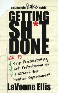
JF: Funny and effective.
Len Filppu submitted PRIME TIME DADS: 45 Reasons to Embrace Midlife Fatherhood designed by Kris Loew; www.loewco.com. “This book was published through Michele Gibson’s Bright Lights Press (www.brightlightspress) in both print and ebook versions.”

JF: Everything an ebook cover should be, perfectly combining the title, illustration, and composition to make its point. I love the way the limited colors and design really focus our attention right where the designer wants it. ★
Leo Ostapiv submitted HOME FINANCES for COUPLES. Resolve Money Problems in Marriage and Learn Easy Steps to Manage your Family Budget designed by Oleg Sheremet. “We were experimenting with the cover, the main question whether it should be just a couple or a couple + 2 kids. Leo”

JF: There’s a lack of congruence between the title (“couple”) and image (“family”) that I would try to avoid if possible. The typography on this cover is bland, inviting disinterest.
Leo Searle Hawkins submitted Break Out of Your Mind! designed by Myself, Kat Day, Jennifer D’Aubigny. “”This book points the way to your freedom from what is false and unreal. You’ll discover how the principles of Quantum Inquiry remove from you all that is meaningless and unnecessary, actions and thoughts the come only from habit or conditioning. It’s a practical guide that shows the way to return to your core, where you will find the no-thingness of real peace and love. Several people had input into the cover, which I wanted to be clean and simple. I wanted it to graphically express the freedom that is possible for us all when we fly free from automated, conditioned thinking.”

JF: Well, yes, but it’s so confused that I fear it’s not communicating much of anything that readers will be interested in. And adding an exclamation point to your title doesn’t really add any emphasis
Mark Matthews submitted Chasing the Dragon: Running to Get High designed by Mark Matthews.

Mary Rosenblum submitted Copyright and Contracts: What You Need to Know designed by Mary Rosenblum. “This is a handbook series, the first book, all branded The Literary Midwife Presents.”

JF: The weak color scheme and weak typography are not broadcasting “success” as far as I can see. And what, exactly, does the “thumbs up” have to do with book publishing?
Michael N. Marcus submitted Self-Editing for Self-Publishers: What to do before the real editor starts editing — or if you’re the only editor designed by Michael N. Marcus. “I didn’t design this cover to win any beauty contests. I wanted it to be visible and impactful when viewed as a tiny online thumbnail, and the eye is a perfect icon for editing. Apparently the strategy worked. This book was on three Amazon bestseller lists within one day after publication, outranking many other books in its field. I’ve always liked macrophotography, and when viewed on a Kindle or iPad, the eye on this cover is much larger than life. The photo is highly detailed, revealing individual pores and eyelashes that are seldom seen this large. I matched the title text color to the eye’s iris, and the subtitle to the skin tone. The purple band at the bottom is “trade dress” used for all Silver Sands books about publishing, and it also complements the skin tone.”

JF: While we all want our covers to have impact, clearly the author/designer has gone right off the edge here, delivering a rather gruesome image completely unrelated to the book’s subject matter. Nice branding stripe, though.
Noel Powell submitted Money Honey designed by Noel Powell.

Pascal Editions submitted How To Become A Poet Today designed by David Pascal. “How To Be A Poet Today is marxist literary criticism as its most incisive and most arch.”

JF: Very effective, just love this one. Clever imagery, black and white that alludes to the Marxist era, and severe typography make this a successful ebook cover. ★
Pascal Editions submitted The Little Tax Lien Tax Deed Book designed by David Pascal. “This quick short and easy-to-read glimpse inside the real world of tax lien and tax deed investing is a must-have book for any serious tax deed or tax lien real estate property investor.”

JF: Good use of elements from U.S. currency, and pitched just right to its audience. Odd though that the title varies from the one on the book. Type is also a bit too attenuated, and its legibility will suffer with reduction.
William Ash submitted Translations: Bates International Poetry Festival, 2011 designed by William Ash. “The design and photography are both by the designer. Translations: Bates International Poetry Festival 2011 documents this creative event featuring eight poets from around the world.”

JF: This iPad only poetry ebook cover works much better at a larger size, while the images really suffer at this small size. Larger, it’s quite interesting.
Well, that’s it for this month. I hope you found it interesting, and that you’ll share with other people interested in self-publishing.
Use the share buttons below to Tweet it, Share it on Facebook, Plus-1 it on Google+, Link to it!
Our next awards post will be on October 14, 2013. Deadline for submissions will be September 30, 2013. Don’t miss it! Here are all the links you’ll need:
The original announcement post
E-book Cover Design Awards web page
Click here to submit your e-book cover
Follow @JFBookman on Twitter for news about the E-book Cover Design Awards
Subscribe to The Book Designer Blog
Badge design by Derek Murphy
Amazon links contain my affiliate code.

