Welcome to the e-Book Cover Design Awards. This edition is for submissions during April, 2013.
This month we received:
60 covers in the Fiction category
14 covers in the Nonfiction category
Comments, Award Winners, and Gold Stars
I’ve added comments (JF: ) to many of the entries, but not all. Remember that the aim of these posts is educational, and by submitting you are inviting comments, commendations, and constructive criticism.
Thanks to everyone who participated. I hope you enjoy these as much as I did. Please leave a comment to let me know which are your favorites or, if you disagree, let me know why.
Although there is only winner in each category, other covers that were considered for the award or which stood out in some exemplary way, are indicated with a gold star: ★
Award winners and Gold-Starred covers also win the right to display our badges on their websites, so don’t forget to get your badge to get a little more attention for the work you’ve put into your book.
Also please note that we are now linking winning covers to their sales page on Amazon or Smashwords.
Now, without any further ado, here are the winners of this month’s e-Book Cover Design Awards.
e-Book Cover Design Award Winner for April 2013 in Fiction
Simon Jenner submitted Ethan Justice: Origins designed by Ares Jun. “I originally designed my own cover – big mistake. I’m so much happier with this pro version – I think it fits well with the thriller genre and the skyline gives readers a clue that the book is set in London”
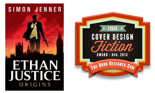
JF: Smart move! An excellent ebook cover that touches all the bases. Strong and recognizable imagery, dead center aim on its genre, and a sense of excitement that draws readers in.
e-Book Cover Design Award Winner for April 2013 in Nonfiction
Sonia Marsh submitted Freeways to Flip-Flops: A Family’s Year of Gutsy Living on a Tropical Island designed by 1106 Design. “Before deciding on one of the 3 concept covers designed by 1106 Design, I took my covers to a Barnes & Noble Manager and asked for their opinion of which would “sell my book.” I did the same at a local Indie bookstore in OC, California, and they both piked the one I chose. Thanks Joel.”
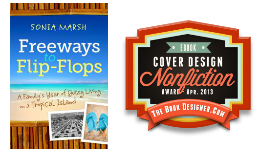
JF: Just the right kind of cover for a lighthearted family adventure. I love the way the designer has used all the tools at her disposal, from type styles to color to the framing device that focuses us on the message the book has to deliver. A clear bulls-eye for this genre, delightful.
Fiction Covers
Aaron Overfield submitted Veil designed by Aaron Overfield, Megan Wunder (Makeup), Jenna Thall (for Killer Imaging), Misha Grace (model). “I’ve been close friends with the makeup artist, Megan Wunder, (you could call her my doppelgänger) for over half my life. When I told her the overall theme of my book and an idea as to what I was thinking for the cover, she gladly accepted the challenge. She’s a freelance makeup artist in Las Vegas and has relationships with many models and photographers. She choose Jenna Thall as the photographer and model Misha Grace. What the three of them were able to produce went beyond anything I could’ve imagined or hoped for. Megan’s makeup is elegant yet surreal, Jenna’s shot is stunning and eye-seducing, and Misha’s pose is alluring yet defiant. I knew I had to frame the shot in a way that didn’t detract from any of those aspects, so I carefully chose the typeface and position. I also applied a gradient to the font (usually a huge no-no from my experience), which mirrored the balance between the makeup and flesh and I think it ended up being quite mesmerizing. I hope you agree and enjoy! Thank you for the opportunity to submit it to your eyes.”

JF: A riveting and unique cover for an ebook, really well done. To my eye the gradient on your title is too extreme, and I really don’t like the way the bottom of the letters is starting to disappear, it just distracts from the visual you went to such trouble to create. ★
Bill D’oa submitted The Ice cream man designed by Bill D’oa. “first book, first attempt at a cover. Hope it works”

JF: Keep trying—look at the covers that stand out this month for starters.
Brian LeTendre submitted Private Showing designed by Jeff Rodgers / Brian LeTendre. “This cover was designed for my short story private Showing, which went live on April 28th. The story involves an old house that harbors an evil secret, so I wanted the cover to creep readers out a bit. I wanted the house to create a sense of foreboding, and I think Jeff really captured that in the cover. I discussed the design process for this cover in more detail in a blog post last week: https://www.seebrianwrite.com/2013/04/i-am-not-artist-why-you-should-get-help.html”

JF: Despite all that, the end result is a weak ebook cover. Most of the cover, in fact, is background. This has the effect of “pushing” the image and title farther away from us, and it’s hard to make out what exactly is happening. Combined with light colors it just doesn’t work.
C.S.R. Calloway submitted Peculiar, INC designed by Kit Foster Designs. “Kit created this cover for me, friendly, professional and understanding every step of the way. We went through a few versions, and this is the one I settled on and love.”

Carla Herrera submitted Nexus designed by Carla R. Herrera. “I’ve went through three different covers for Nexus and I’ve decided on this image. Keeping my fingers crossed on this one.”

JF: A good, simple approach to a sci-fi cover that does the job nicely.
Carlos Silva submitted Urbania designed by Ana Ferreira.

JF: Nice attempt at an atmospheric cover, somewhat undone by the long quote at the bottom of the cover. At what size would we have to see this cover so that the type would be readable?
Cynthia Luhrs submitted Lost in Shadow designed by CreativeIndie Covers. “thanks!”

JF: Another strong cover from Derek Murphy, who shows exactly how a talented designer can draw you into a book, provide a hint of the atmosphere you’ll find there, and make a promise to the reader all at the same time. ★
D.M. Cherubim submitted Mary Baker and The Eye of the Tiger designed by D.M. Cherubim. “Thank you for the opportunity to enter. I hope you love it! Sincerely, D.M. Cherubim”

Damon Za submitted After The Purple Heart designed by Damonza.

JF: Beautiful job combining images to create a cover that holds its various pieces together well, a sensitive and effective design. ★
Damon Za submitted Ashes and Ice designed by Damonza.

Damon Za submitted Beyond the Shadows designed by Damonza.

JF: I love the type on this cover, but not sure I really “get” the image. Creepy? I guess, but what the heck is going on?
Damon Za submitted Dark Horse designed by Damonza.
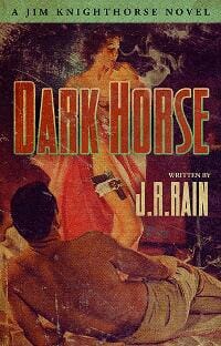
Damon Za submitted Hail Mary designed by Damonza.

JF: I love the retro look the designer has given to this series, and this one most of all. Everything on these covers contributes to the series branding, even the color treatments that repeat on each cover.
Damon Za submitted The Mummy Case designed by Damonza.

Damon Za submitted Shadow Hunters designed by Damonza.

JF: Strong, perfectly balanced. And there’s no ambiguity here, like there was on the first book in the series.
Damon Za submitted The Benefits of Line Dancing designed by Damonza.

JF: A lovely paperback cover that just becomes too indistinct and hard to read at typical ebook sizes.
Dan Maurer submitted Snow Day designed by John M. Maurer. “Here is a link to the cover for my novella, “Snow Day”. I would like to have it considered for the eBook Cover Design Awards.”

Daniel Smith submitted Storykeeper designed by Littera Designs. “Storykeeper is a historic/literary novel. Thank you”

JF: It would be much better for all designers and authors who submit covers to use ones without badges, seals of approval, award notices, and anything else “stuck on” the cover because it just makes it difficult to evaluate the cover design, which is what this contest is about. Here, despite some nice textural touches, the artist hasn’t achieved a cohesive balance in combining the images, and the pieces never really come together.
Dustin Langan submitted Freedomization designed by Joe Wray.

JF: The book cover as a unified piece of artwork, here on a satirical novel. Admirable in the way that every element on the cover contributes to the overall effect, the importance of the lettering of the title to the whole tone of the cover. Excellent. ★
Eric Lorenzen submitted Fallen King designed by Eric Lorenzen. “The book is an epic fantasy novel. Cover design by Eric Lorenzen, Cover photo copyright by Ragne Kabanova/ Dreamstime.com”

JF: Very solid.
Erik Pepper submitted Hopeful Anarchy designed by Erik Pepper.

Erin Keyser Horn submitted River’s Edge designed by Rod Karmenzind. “This is my Young Adult Paranormal/Horror. It’s not a gory or graphic story, but it does have a few creepy scenes. I told my amazing designer, Rod Karmenzind, that I wanted the cover to be spooky enough to warn my more conservative readers. He somehow created a cover that is both spooky and beautiful. The blue tint alludes to the mythology in the story. Plus the illusion of river and trees ties in to the nature theme. I couldn’t be happier with this cover!”

JF: Nice, just the right amount of creepy.
Genese Davis submitted The Holder’s Dominion designed by Fabio Barretta Zungrone. “The cover art was designed by Fabio Barretta Zungrone with Eric Kieron Davis as the Creative Director. Thank you.”

JF: Another excellent example of how combining images—when done with care—can create a unique effect. A fine and multi-layered look.
H.B. Bolton submitted The Trickster’s Totem designed by Elisabeth Alba.

Ioana Visan submitted Sweet Surrender designed by Ioana Visan. “Sweet Surrender is a bonus story in my new vampire series The Impaler Legacy.”

JF: I like both these covers, Ioana, and the very strong branding colors, textures, and exotic knives. Sticking to a few elements is a great strategy that yields good results on this series.
Ioana Visan submitted The Impaler’s Revenge designed by Ioana Visan. “The Impaler’s Revenge is the first novella in my new vampire series The Impaler Legacy.”

James Bagworth submitted Out of the Limelight designed by James Bagworth. “I wanted to combine a feeling of foggy Victorian London with the idea of theatre, and this is what I came up with.”

Jason Aydelotte submitted Greystone Valley designed by Jessica Grundy. “”Greystone Valley” is the first YA Fantasy offering from indie publisher Grey Gecko Press. We’re very proud to feature the stellar artwork from the very talented Jessica Grundy, whose work really brings through both the whimsical and every-so-slightly adult nature of this young adult title. You can find more of Jessica’s work on her Etsy shop at www.etsy.com/shop/solocosmo, and great indie books Grey Gecko books including “Greystone Valley” at store.greygeckopress.com. Best of luck to all the contest entrants!”

JF: An absolutely charming illustration nicely suited to this genre, and notice the way the designer controls your eye path with the pathway leading up the right side. On the other hand, not too happy with the way the title has been relegated to a little banner which, even given the composition, could have been much larger and added a strong element this cover would benefit from.
Jean Oram submitted Champagne and Lemon Drops: A Blueberry Springs Chick Lit Contemporary Romance designed by Cali MacKay. “Thanks for holding these awards. They are great for watching trends–and the coolest part is seeing how much indie book covers have improved over the past year!”

Justin Swapp submitted The Magic Shop designed by Arthur Wang. “Cover by Arthur Wang Art”

JF: Beautiful and engaging artwork really helps hook the browser, as this cover demonstrates. Well-balanced with a nice type treatment, I wish there was more effort to incorporate the all white type with the rest of the palette here, but that’s nitpicking.
Kathlena L. Contreras submitted ThAUTOmaturgy designed by Ronnell D. Porter.

JF: Not sure where that purple is coming from, but it’s not helping this very disjointed cover.
Keith Shaw submitted Neworld Papers: Series 1 designed by Keith Shaw.

JF: I often recommend a limited palette to help create a cover in which the parts work together, but I think we’ve gone off the cliff with this one. It’s so monotone, the cover ends up just being murky, and that’s not good.
Ken Mooney submitted Godhead designed by Designforwriters.com. “For this contemporary fantasy involving the Greek gods, I had very clear ideas what I wanted; something magnificent but also dark; something that had a serious adult tone while still as striking and eye-catching as the genre needs to be. Of course, my MS Paint skills didn’t really cut it when it came to capturing that on the page. Andrew at designforwriters.com helped me to build an outstanding brief that got behind my “I think this looks cool” drive and got to something that the book was really about; loss, death and decay. On top of all that, I think it truly captures what I wanted to achieve…possibly even more than I ever imagined possible.”

JF: Beautiful and effective, with nice typography that’s appropriate to the design, textures, drama, the lot. Well done. ★
Kerstin Rachfahl submitted Hannas Wahrheit designed by Kerstin Rachfahl. “Romantic, Distracting, something is not okay, not so nice at it seems, a Little suspensful -> this Feelings I want to get, when you look on the cover :-) Kerstin”

JF: The feeling I get is disturbing, probably from the combination of the floating baby head and the one that looks like it’s already been buried and is looking back up at the world. Disturbing in all the wrong ways, I’m afraid.
Kristen Kindoll submitted Queen’s Autumn Gambit designed by Karen Spidare. “The cover design concept was derived out of wanting to reflect the key elements within the book. The autumn tree, growing from the black and white chess board, is highly graphic and pretty, simple even in design. However, beneath the surface of the chess board, the tangled roots lurk and intertwine with one another. I liked the idea of utilizing the color of blood red. The characters in the book are related to each other, blood relations and many have a dangerous past. In “Queen’s Autumn Gambit”, there is much more than meets the eye.”

JF: Unfortunately, the book you’re describing, which sounds like an interesting story, doesn’t seem to have anything to do with this cover. Here’s my suggestion, go look at the top 100 books in your genre and see if you see any that look like yours. I’m betting you won’t, and that’s something to learn from.
Laurence Patterson submitted Painting by Numbers designed by Crooked Cat Publishing. “Further details on the process by which this multi-layered cover art was produced are available here: https://crookedcatpublishing.com/2012/05/30/1225/”

Manny Birch submitted Pandemonium Justified designed by Manny Birch and Tajiisartphotography. “The cover for my second book Pandemonium Justified the sequel to my first book.”

Maree Anderson submitted Seer’s Hope, Book One of The Seer Trilogy designed by Rob Anderson. “Book One of The Seer Trilogy: our aim was to try and brand all three books as an obvious series by using similar artwork. Our hope is that the covers successfully convey the genre (fantasy) to readers. When choosing artwork, we try our best to find stock photo “cover models” that encapsulate the main characters – in this case a young blind woman who’s been transformed into a golden-eyed Seer.”

JF: Rob Anderson is back with another great series of covers. I love the way these mirror each other so well over the series, the sensitive type choices, and the consistency of vision. Nice work. ★
Maree Anderson submitted Seer’s Promise, Book Two of The Seer Trilogy designed by Rob Anderson. “Book Two of The Seer Trilogy: We hope that when viewed in conjunction with Books One and Three, readers will be curious as to why this character is different (i.e. no golden eyes like the other Seers) but the cover still brands this book as being part of a trilogy.”

Maree Anderson submitted Seer’s Choice, Book Three of The Seer Trilogy designed by Rob Anderson. “Book Three of The Seer Trilogy”

Martin Greening submitted Azure Keep Quarterly – Issue 1 – Spring 2013 designed by Martin Greening.

Masha du Toit submitted The Broken Path designed by Masha du Toit. “This is the sequel to “The Story Trap” so I had to keep the colours, typography and mood similar enough to show the relationship, but still make an eye-catching design. The book is about two water-witches, which is where the cover image comes from. I did the illustration myself in the same style as the interior illustrations.”

JF: Another great cover from a previous winner here. When the same hand can draw the artwork, create the lettering, and compose the cover, as Masha du Toit does, you end up with almost a kind of artisnal design product, all in her inimitable style. ★
Matt Sinclair submitted The Fall designed by Calista Taylor. “The cover by Calista Taylor was designed to convey not only a sense of abandonment and neglect but also hope and shelter, albeit temporary. The red-orange tinge to the clouds is meant to suggest a new dawn — or is it fires burning in the distance? The stories in The Fall reflect visions of apocalypse from thirteen authors.”

JF: I think given everything else going on, the distressed title isn’t adding to the overall effect.
Meredith Collins submitted Fangsters designed by Scott Carpenter.

Meredith Collins submitted Spank Me, Mr. Darcy designed by Scott Carpenter.

JF: Love the artwork and layout of this cover, but I find the title a bit hard to read. Saucy.
Meredith Collins submitted Warlock Masters designed by Scott Carpenter.

JF: Notice how this cover has basically the same elements as the one above, a torso and arm. But this one has none of the verve of the previous cover. It’s hard to make out, very heavy with type for a work of fiction, and generally communicates very little.
Michelle Halket submitted The Kid Who Missed The Bus designed by Andreas Weidemann, Michelle Halket.

Mira Prabhu submitted Whip Of The Wild God designed by Abhilash Sivadas. “The genre of the book is Spiritual/Visionary/Metaphysical Fiction.”

JF: Cool art, would be better if we could read the type near the bottom, and it’s not that hard to fix.
Nick Auclair submitted Steel’s Treasure designed by Streetlight Graphics. “Streetlight Graphics did a great job with this cover (as well as the internal formatting) — I will use them for all future projects. They have captured the feel of the book. This is definitely a case in which you can tell a book by its cover.”

JF: *Sigh.
Nicole Kelly submitted Dark Sleepers designed by Ruth Gunning. “Great young adult fantasy book”

JF: The illustration looks lovely, and someone had a good time playing with type, but the two never come together, there’s no connection at all.
O.L. Ramos submitted The Keeper:Awakening designed by K.P. Harrell. “This is an original cover designed for my Paranormal fiction novel.”

JF: Nice job, the type is careful and nicely positioned.
Rebecca Berto submitted Drowning in You designed by Okay Creations.

JF: Yep, it’s Okay.
Rob McCleary submitted Diary Of A Skyway Woman designed by Connor McCleary. “This book is currently available for FREE for a limited time on itunes.”

JF: Images that are difficult to make out, simplistic typography, and unnecessary elements like the very strong oval shape combine to ill effect.
Rudy Mazzocchi submitted EQUITY of EVIL designed by Alexander Von Ness. “Alexander Von Ness recently designed the covers of Book ONE and TWO of The EQUITY Series. Please let me know if you require additional images. Best regards, Rudy Mazzocchi www.rudymazzocchi.com”

Scott Rhine submitted Dreams of the Fallen designed by Renee Barratt (the cover counts). “This cover prompted 7000 downloads and bumped me to #16 on the epic fantasy list, just under Game of Thrones. Renee did a fantastic job. I’ve used her exclusively for all my books.”

JF: I’m happy for your success. On the other hand, I’m not sure why the design seems to consist of pieces glued together and a title that’s almost intentionally hard to read?
Stephanie Fowers submitted With a Kiss designed by Jacqueline Fowers. “This is a paranormal romance with a comical twist. We looked at other covers in the genre and noticed that many of the models wore elegant dresses with bold splashes of color. We tried to emulate that look, but then, unlike the other books, gave our main character a more comical expression. This is the first book in the series, and the other books have a similar feel as this one. While this girl looks cross, the next girl looks overwhelmed, and the final girl has a bit of an airhead feel . We’d love to hear your take on the cover, as we’re always looking to improve. Thank you!”

JF: I like the concept and the drawing, but I prefer the type on the cover that’s on Amazon, and I’m not sure why you took the series identification off the one you submitted, it actually helps “ground” the cover. The combination of your border with the wings and the geometrical figure in the background are overloading the cover with unnecessary and distracting information, leading us away from the charming young woman. This also applies to the dark colored anklets, which distract for no purpose. But you’re close!
Stephen Kelly submitted Mark Star – Alien Induction designed by Karen Pappin and Ruth Gunning. “Excellent cover for a YA sci-fi”

JF: Title’s too small for me, otherwise very nice.
Steven Whibley submitted GLIMPSE (The Dean Curse Chronicles, #1) designed by Pintado. “This is the eBook cover to my MG/YA novel, GLIMPSE. It is book one in The Dean Curse Chronicles. For more information about this book or the series, please visit www.stevenwhibley.com”

JF: Another great ebook cover that shows how color control, typography, and layout can come together to create real excitement and energy that draws readers in. ★
Tony LaRocca submitted False Idols and Other Short Stories designed by Tony LaRocca. “Made with a combination of 3ds Max and Photoshop.”

JF: This is a good effort, but the type, although well set, feels claustrophobic since it has no space at all to breathe, and you’ll have a stronger overall cover if you can find a way to integrate the type and graphics into a cohesive whole. But you’re on the right track, look forward to seeing more.
Nonfiction Covers
Andrea Chapman submitted Cold Canapes designed by Andrea Chapman. “Hi, These are all my designs, I am also the author.”

JF: Nicely done, with a lovely photo. Typography is a bit naive but works well for this subject.
Dana Sitar submitted A Writer’s Bucket List designed by Dana Sitar. “An inspirational guide to the writing life. This Kindle edition cover is an update of the original PDF design. I’d love to see how it stacks up and apply your feedback for the paperback edition.”

JF: You have good elements, and the strong association of typewriter-like type with writing subjects, and a refreshingly simple style. But the cover suffers from a typical design flaw, since all three elements—the title, the illustration, and the block of type of the subtitle, are all about equal. It would be stronger if the elements were in a more dynamic balance.
Daniel Goldhar submitted The Power of Giving and How it Leads to Success and Happiness designed by Daniel Goldhar.

JF: It’s remarkable that this author, with a background in distributing toys and sporting goods, could produce the ebook cover we see here. Beautiful typography and a well-balanced cover. ★
David Perlmutter submitted Wrong Place Wrong Time designed by John Perlmutter-Earth, London.. “This is the cover for my book, Wrong Place Wrong Time, my true story that became a bestseller in True Crime on Amazon in US, Spain, France and top 20 in UK. My brother designed the cover which is currently in a book cover contest. Hope you like it! David P Perlmutter”

JF: Nice genre cover, and one of a number this month with a variety of images composited together in an attempt to make a compelling narrative.
Maria Novillo Saravia submitted A twisted faith designed by BEAUTeBOOK. “Another book from the series of Gregg Olsen´s True Crime”

Maria Novillo Saravia submitted If Loving You Is Wrong designed by BEAUTeBOOK. “This is the story of Mary Key Letourneau…”

JF: A formula can be very strong when it unites a series of books in an intelligent way that emphasizes their branding while still featuring the subject of each volume. But when a formula is applied whether it works or not, you get things like this title that’s desperately trying to be seen against an unfriendly background.
Matthew Trinetti submitted Tales of Iceland or “Running with the Huldufólk in the Permanent Daylight” designed by Benjamin Orsborn. “We wanted the cover of Tales of Iceland to highlight the vastness and beauty of Iceland, while alluding to the fun ‘tales’ and somewhat racy language used in the book. I think Benjamin captured this perfectly. The background photo is an actual photo I took while traveling through Iceland.”

JF: It’s amusing, but you may have gone too far with the primitive lettering that comes across as awkward and overbearing.
Meredith Collins submitted Un-Philtered: Life On and Off the Rock’n’Roll Tour Bus designed by Scott Carpenter.

JF: Very cool, and I love the type choice, but do yourself a favor and remove the colon from the title, it’s unnecessary.
Meredith Collins submitted What Every Gay Man Needs to Know About Prostate Cancer designed by Linda Kosarin, The Art Department.

JF: Like many covers, this is a layout rather than a design. One element needs to dominate, take charge of the “message” of the book. This looks like the cover of a report.
Meredith Collins submitted Who is Katie Holmes? An Unauthorized Biography designed by Scott Carpenter.

JF: Clean and effective.
Michele Burke submitted …And I Will Heal Their Land designed by Self Designed.

JF: No idea from this cover what the book is about or why anyone would want to know.
Michelle Halket submitted Slightly Dented Halos designed by Michelle Halket.

JF: Although I like the simplicity of this cover, it really does look like fiction and I wonder if your readers wouldn’t have been better served having more information about the book on the cover.
Nikki Parkinson submitted Unlock Your Style in 14 Days designed by Kelly Exeter, Swish Design.

JF: Needs a border around it.
Well, that’s it for this month. I hope you found it interesting, and that you’ll share with other people interested in self-publishing.
Use the share buttons below to Tweet it, Share it on Facebook, Plus-1 it on Google+, Link to it!
Our next awards post will be on June 17, 2013. Deadline for submissions will be May 31, 2013. Don’t miss it! Here are all the links you’ll need:
The original announcement post
E-book Cover Design Awards web page
Click here to submit your e-book cover
Follow @JFBookman on Twitter for news about the E-book Cover Design Awards
Subscribe to The Book Designer Blog
Badge design by Derek Murphy


