


You’d think that audiobook covers were simple to make. Just crop the original cover down into a square and move around a few words, right? Not exactly.
First impressions always matter, especially when it comes to books. Treating your book’s cover design like an afterthought will only derail potential book sales.
Before a potential buyer hears a single word from your audiobook, what they think about your cover looks can be the difference between them listening to a sample and making a purchase or bypassing your book for the next one in line.
In this article about audiobook covers, we'll review:
The Case for Improving Audiobook Cover Design
Over the last 5 years, sales revenue for audiobooks has increased by 50% in the U.S.; 43% in the UK, and 18.61% yearly growth in the UK since 2018. As our lives become busier, maximizing our time is everything.
For many, audiobooks have become the go-to format for spending time with the words we love because they are convenient, entertaining, and flexible. On your device, they are as portable as books, but unlike books, they take up less space and don’t require you to flip pages.
As the interest in audiobooks grows, and more audiobooks are produced, finding ways to make your audiobook stand out becomes even more important. A professional-looking cover is a great place to start.
If you’re interested in learning more about audiobook covers, how to format yours properly, and see some interesting examples, keep reading.

A Brief History of Audiobook Covers
When thinking of audiobooks, it’s easy to forget that they didn’t just start with the digital downloads that are available today. In the 60s and 70s, audiobooks came in cassette tapes. Multiple cassettes were packaged together in a vinyl case with a plastic interior casing to hold each individual cassette. Whenever you wanted to listen to a chapter, you’d just pull out a cassette, pop it into your cassette player and listen.
Cassette tapes were later replaced by CDs in the 80s. The small discs were housed in individual square, plastic cases (5x5”) called jewel cases with a single or folded square of cover art that slid into the front of the case.
Interestingly, the square shape of the CD carried over to digital media. So, today, many companies require that digital audiobook cover art be square.
How to Design Audiobook Covers
Whether you record your book’s audio yourself or hire a professional, getting your book ready for sales and distribution has its own set of requirements—including cover design. You can’t just upload your book’s cover as-is. It must be reworked to fit the square template that most audiobook distributors require.
No matter the book format, cover design matters. Just as you consider composition (e.g. proportion, placement, and elements) in a standard book cover, the same areas deserve attention with audiobook covers.
- Proportions - When adjusting an image from a rectangle to a square, perspective can shift. As shown in The Wagner audiobook cover below, when the cover image is expanded horizontally, the scale of the ship to the water changes. It looks smaller. Part of a professional book designer's job is to determine the best use of proportions in a cover's composition.
- Placement - Graphic element placement (and size) may need to be shifted in order for the cover to make sense. In the Life We Bury (example below), the house was turned to its side. In Dungeon Crawler Carl (example below), the cat was moved up so that it wasn't cut out of the shot.
- Names/Titles- The narrator should be mentioned on the audiobook cover, even if the author is the narrator. Cover fonts should remain true to the original design for brand cohesiveness, unless, like in the case of Before We Were Yours (see below), adjusting the font style to something more delicate offers a better balance of elements since the young girls take up most of the cover space.
- Imagery - The cover image should be the full width and height of the square—no vertical borders on the side.
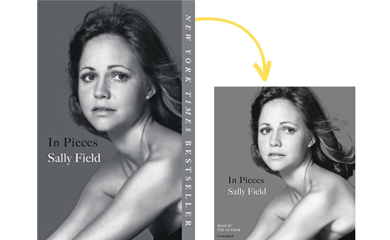
For Sally Field’s memoir, In Pieces the choice to use a headshot from her earlier days of acting makes a powerful statement. The typography transfers well to the audiobook cover. Cropping photos can be challenging when working with above-the-waist shots. Cutting off the top of her hair was likely not their desire but a necessary one to get the right portions and the narrator's information included in the bottom left corner. Note: The audiobook cover is not an exact square. There are small vertical white borders on each side of the image. This was likely a compromise to avoid cropping too much of the author’s head off.
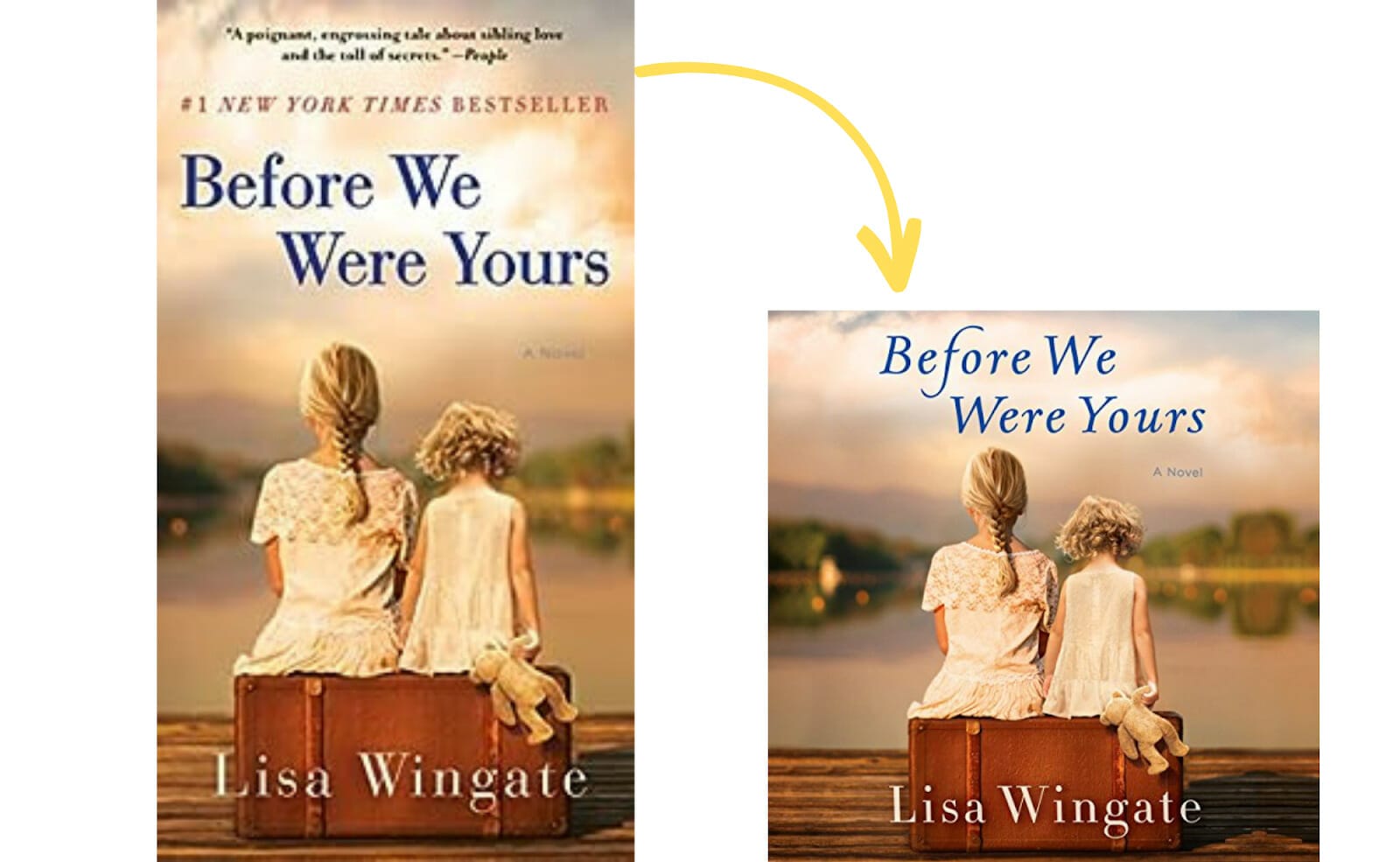
As you’ll see in some of the books listed below, designers often expand the view of the image horizontally and crop the top so it will work with audiobooks. For Before We Were Yours the designer changed the title font for the audiobook. Perhaps they chose something more delicate because of the close crop of the image and the focal point of the young girls.
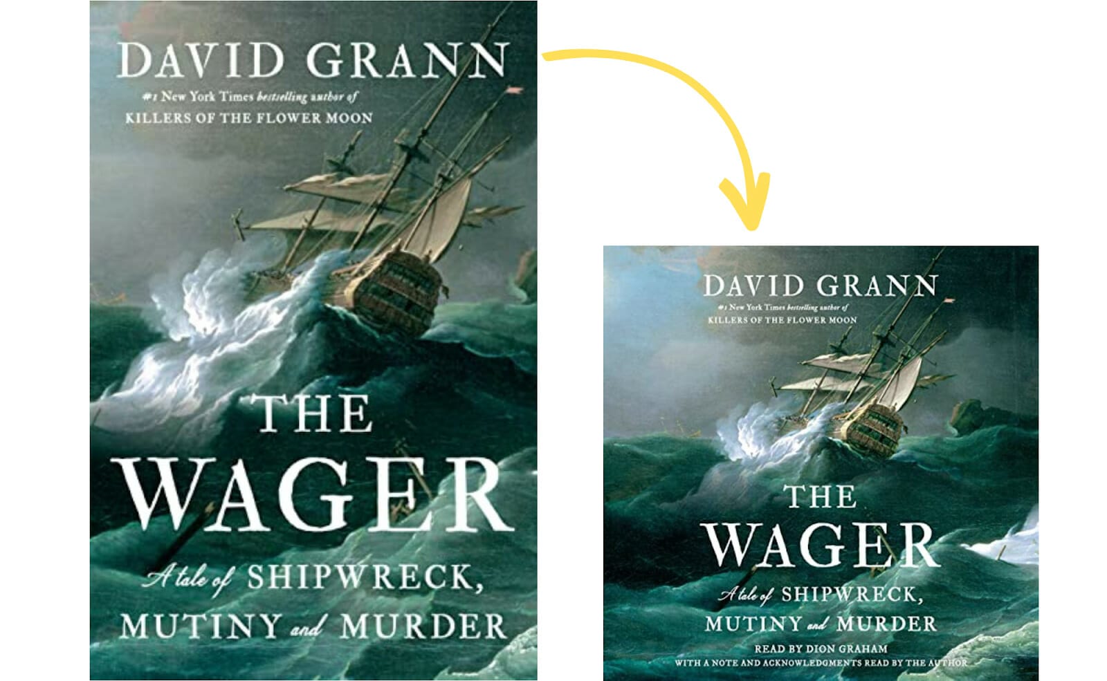
For The Wagner, the transition from the hardcover to the audiobook appears seamless. While the hardcover view of the boat is brash and in your face (fight and struggle). The widened perspective of the image gives more of a feeling of being lost and alone at sea.
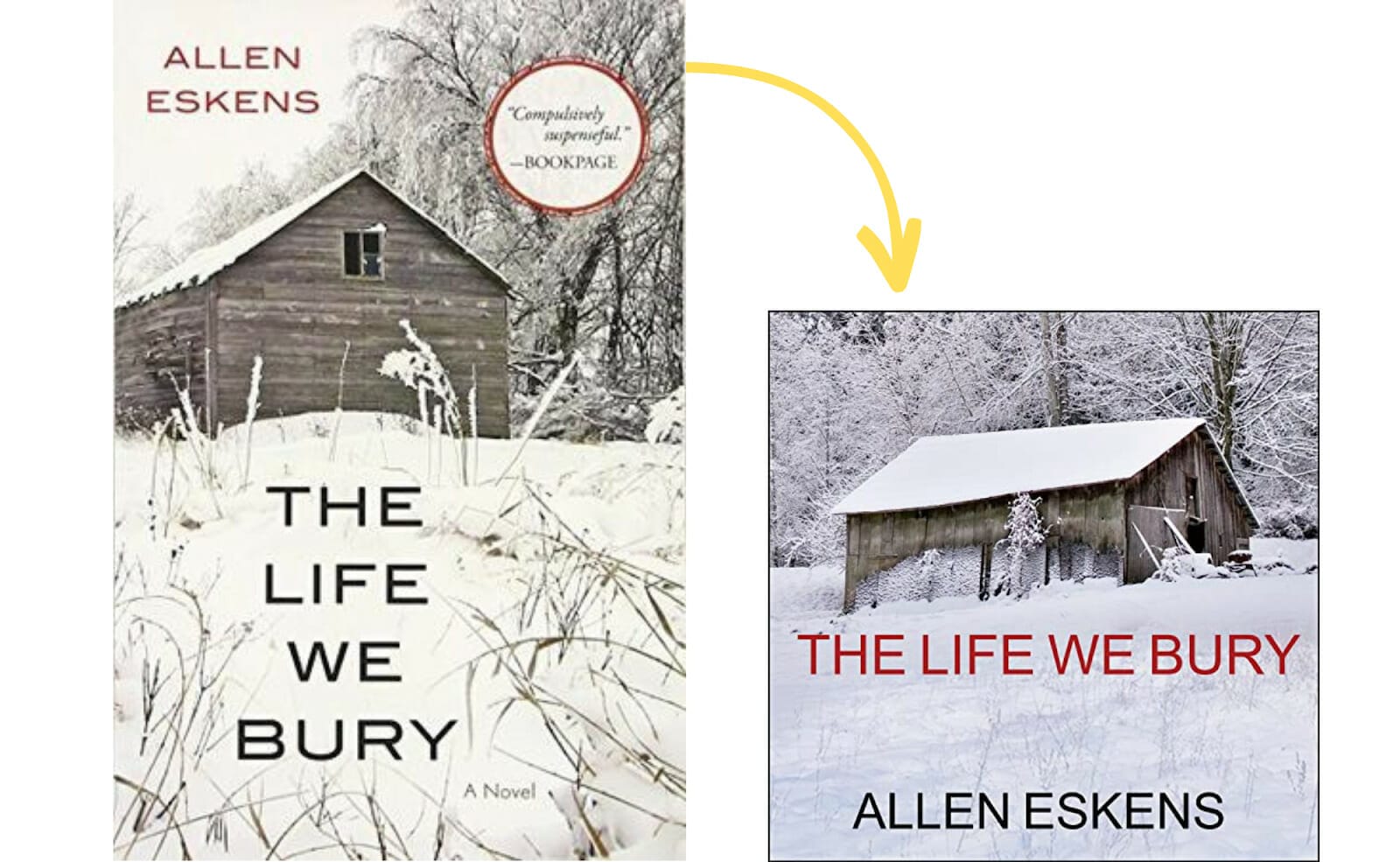
The cover design of Allen Esken's novel, The Life We Bury, is chilling. Using a side view of the house in the audiobook was a smart design choice; however, because of the extra white space in the lower half of the audiobook cover, it feels like something is missing. There’s no hierarchy of elements like in the original cover where the title is larger than the author's name, but the author’s name is shown prominently at the top of the book. In the audiobook, all of the elements seem to hold the same value.
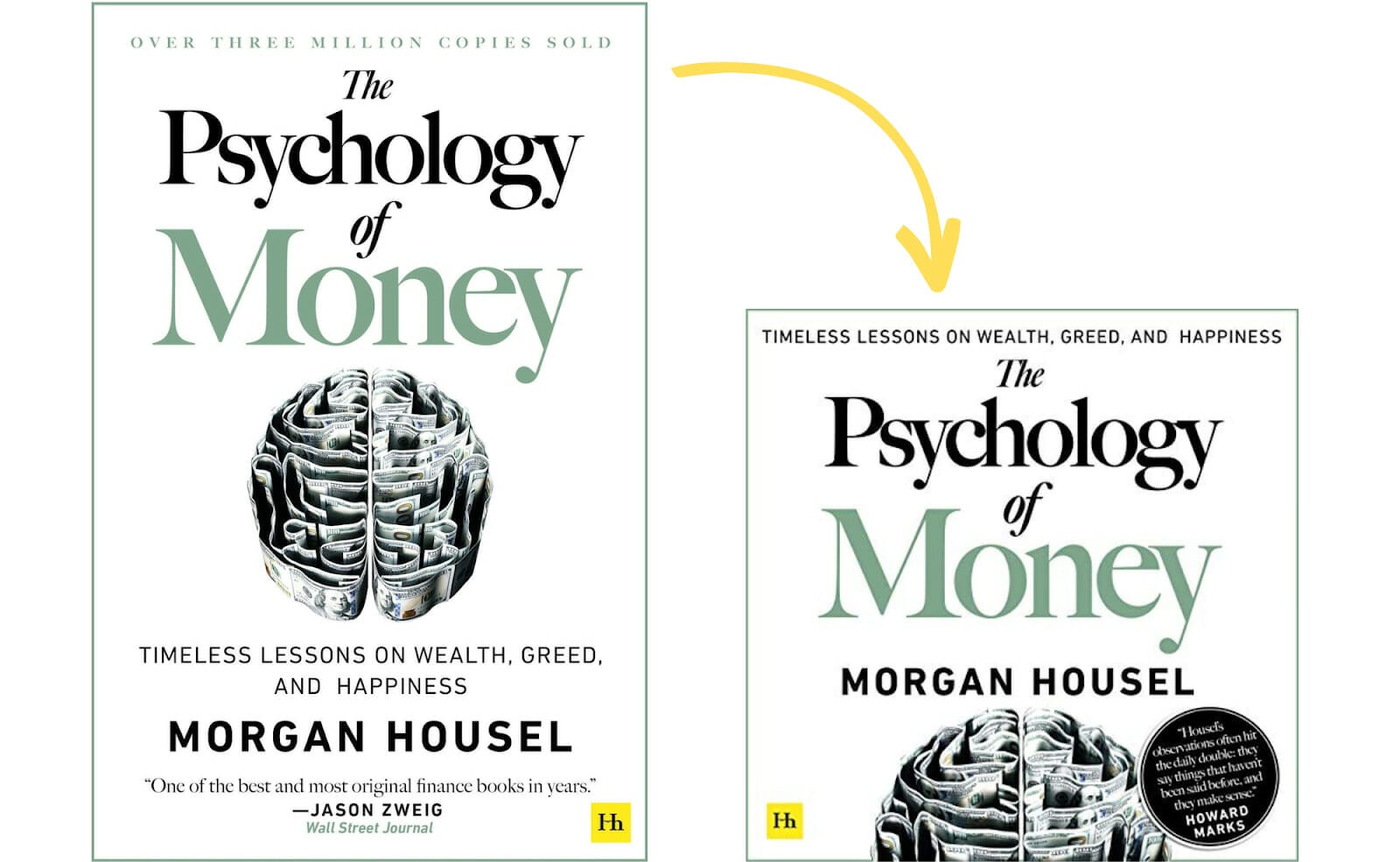
For The Psychology of Money audiobook cover, the choice to chop the “money brain” in half and make the title the main focal point is not my favorite; however, if the only other option was to reduce the size of the image to make it fit, the image’s impact would be lost. Unfortunately, sometimes elements of a great book design have to be sacrificed when the space you have to play with is limiting.
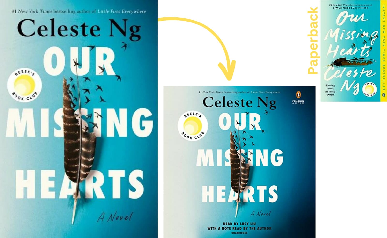
When there is more than one cover design like in the case of Our Missing Hearts, working with the cover that requires the least amount of manipulation to look great, is best. In this case, the audiobook mimics the hardcover.
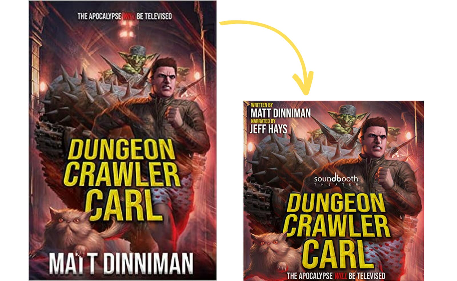
The LitRPG/Gamelit adventure, “Dungeon Crawler Carl” is an example of using the audiobook space thoughtfully. As mentioned in previous examples, designers often widen the view of the image to create audiobook covers, causing a shift in perspective. For this LitRPG/Gamelit adventure, the designer chose to keep the perspective the same by tightening the shot and shifting the cat image up so that it is not cropped out of the picture. The words almost bleed to the edge, but since audiobooks are not being printed, it still works.
Note: If you only have an audiobook without a print or ebook cover to pull from, you can follow the same guidelines for creating a book cover from scratch to create an audiobook that gets noticed.
Audiobook Cover Specifications by Distributor
The basics for cover design are the same for most distributors. Here’s a sample list of audiobook distributors and their requirements.
| Distributor | File Type | File | Resolution | Color | Color Specs |
| ACX (Audible) | JPG, PNG, TIF | 2400 x 2400 pixels or higher | 72 dpi or higher | RGB | 24-bit (True Color) minimum |
| Google Play | JPG, PNG, PDF | Minimum 1,024 pixelsMaximum7,200 pixels | 72 dpi or higher | – | – |
| FindAwayVoices | JPG, PNG, TIF | 2400 x 2400 | - | - | - |
| Kobo | JPGJ, PEG, PNG | 600 x 600 pixels minimum | - | - | - |
| PublishDrive | JPG | 1400 x 1400 pixels minimum | 72 dpi minimum | RGB | - |
Final Thoughts about Audiobook Covers
Audiobook covers are part of your book’s catalog, so just as much attention should be paid to making sure they look as amazing as the original cover. The gift with audiobooks is that you don't have to start from scratch. If you get the focal point, image size, and element proportions right, you’ll have a great audiobook cover that compliments your hardcover and paperback.
Whether print, ebook, or audiobook, every book cover design matters. It’s the first thing buyers see before they download a sample or click the BUY button. Getting a potential reader (or listener) interested in your book starts with the cover. If you can grab their attention, you’ve won half the battle. The rest of the work rests on the quality of your book’s content.
A professional book cover designer has the experience and expertise to design a cover based on your genre, current trends, and audience expectations. If you’re new to design but want to design the cover yourself, go for it, but level up first. Study print books and their corresponding audiobook covers. Learn design software. Visit graphic design and typography websites, and learn as much as you can about great design before taking the leap. Remember that a book is judged by its cover. Make it the best one possible!
