


If you’ve been writing for any length of time, you’ve probably encountered the dreaded writer’s block. While there are countless tips out there that claim to help you get over writer’s block, there’s one tried-and-true technique I’ve used to get past my own writer’s block: the Comic Sans trick.
Your first thought might be, “Why are we talking about Comic Sans in an article about cool writing fonts?” I completely understand that sentiment. Comic Sans is not what I would ever consider a “cool” font.
But there’s some science behind why switching to Comic Sans for your writing can help you get over writer’s block quickly and effectively!
Here’s what you need to know about the Comic Sans trick and some actual cool writing fonts:
A Quick Primer on Fonts
There are literally millions of fonts available now. It’s a stark contrast from the early days of the printing press when only a handful of typefaces were available. With all of that choice comes a whole bunch of terminology you might not be familiar with.
There are a few keywords you’ll want to understand up front:
- Typeface refers to lettering design that can also have variations in size, weight, slope, width, and more. Some examples include Arial, Times, and Garamond.
- Font refers to the exact style of typeface you are using. For example, Roboto is a typeface, but Roboto Bold is a particular font.
- Serif refers to the little "tail" on the end of some letters that some fonts have. Some examples include Times New Roman, Georgia, and Garamond.
- Sans serif means literally "without" the serif. So, the font does not have the little tail at all. Some examples of this include Arial, Helvetica, and Futura.
- Script fonts have that almost cursive-writing look to them. Some examples include Dancing Script, Parisienne, and Lobster.
One thing you may have already noticed is that I’ve used the terms “font” and “typeface” pretty interchangeably in this article. In common language, the terms have come to mean the same thing. Just note that if you’re talking to a designer, they’ll often use them to mean different things.
What is the Comic Sans Trick?
The Comic Sans trick is simple to implement. All you need to do is switch to using Comic Sans for your writing (just for the writing process—NOT for publishing your work). That’s it. That’s the entire trick.
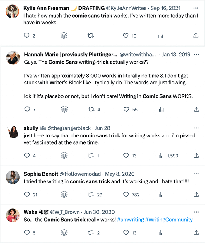
“How could that possibly work?” you might be asking yourself. I was a skeptic initially, too. But countless people on social media and elsewhere have claimed that it works for them every time. Here are some examples from X:
While theories abound about why this works, the general idea is that by using a less serious font, you can trick the perfectionist part of your brain that wants to do things the “right” way. Times New Roman, Arial, and other “serious” fonts we’re used to seeing all the time tell our brains that we need to take seriously the thing that we’re writing.
Comic Sans, on the other hand, is not even remotely a serious font. It was created by Vincent Connare as part of Microsoft Bob to be used in cartoon character speech bubbles. It was never intended for any kind of serious communications. And so our brains don’t take it seriously and we can just have fun with what we’re writing. That’s how it helps us get past writer’s block.
But What if I Hate Comic Sans?
I’m right there with you. Comic Sans is probably among my least favorite typefaces in existence. The good news is that any “non-serious” font will work for this trick. Personally, I think handwriting fonts tend to work best. Here are a five of my favorite cool writing fonts, all available for free from Google Fonts—which means you can use them directly within Google Docs without having to download anything. (Enjoy the Cat Ipsum placeholder text in the following examples!)
Mali
Mali is a simple handwritten font with some minimal flourishes. The upright letterforms make it easy to read while also being just casual enough to overcome any perfectionist tendencies.

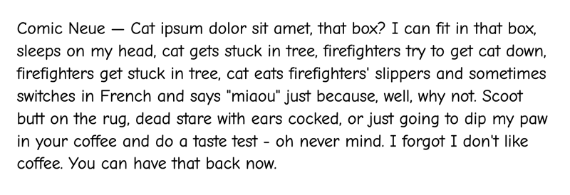
Comic Neue
Think of Comic Neue as the classier cousin of Comic Sans. It’s still a casual, comic book-style font, but it’s got more regular letterforms and looks less like a child’s handwriting.
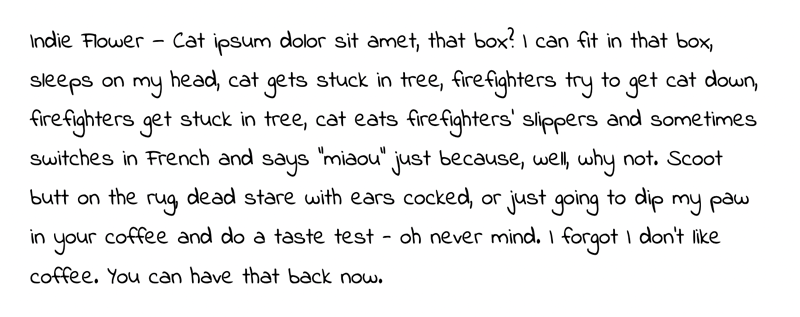
Indie Flower
Indie Flower is one of the more whimsical cool writing fonts on this list, with some letterforms having a slight left-leaning slant. The tall x-height makes it easier to read at small sizes, too.
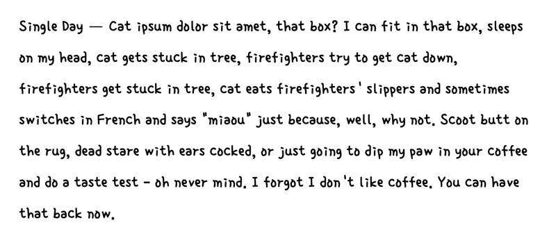
Single Day
Single Day is a bolder handwriting font that looks similar to a child’s handwriting. It’s got somewhat irregular letterforms, making it a perfect choice to replace Comic Sans.
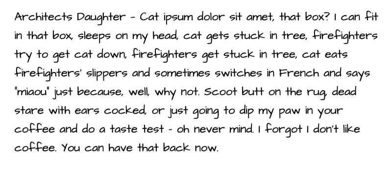
Architects Daughter
If you’ve ever looked at the writing on architectural blueprints, Architects Daughter make look familiar to you. It has wide letterforms with somewhat blocky shapes, giving it more visual weight on the page.
Which Font Should I Choose?
There are tons of cool writing fonts out there to choose from. Pick the one you like best to start with—you can always change it later! And you may find that as your brain adjusts to one font that you need to switch it up for another one to get the same writer’s block-busting effect.
One thing to be sure to keep in mind: before you share your work with an editor, beta reader, agent, or publisher, make sure you change the font back to something more professional, like Times New Roman! You definitely don’t want to submit your work in Comic Neue if you want to be taken seriously!
