

By Joel Friedlander
Welcome to the e-Book Cover Design Awards. This edition is for submissions during May, 2020.
This month we received:
46 covers in the Fiction category
8 covers in the Nonfiction category
Guest Judge
 We are once again pleased to welcome Tanja Prokop to The Book Designer as a guest judge this month. Tanja was born in Germany, but lives and was raised in Croatia. Her three beautiful daughters and her amazing husband are her biggest inspiration in life. She has an MA degree in German language and literature and philosophy. A few years ago she started her own design company and became a professional book cover designer. She designs covers, and is constantly creating new visual experiences for her clients. Tanja is also a multiple winner of various book cover design contests and has created thousands of covers. You can find her pre-made covers at Book Design Templates, or visit her site at www.bookcoverworld.com.
Comments, Award Winners, and Gold Stars
I’ve added comments (TP: ) to many of the entries, but not all. Remember that the aim of these posts is educational, and by submitting you are inviting comments, commendations, and constructive criticism.
Thanks to everyone who participated. I hope you enjoy these as much as I did. Please leave a comment to let me know which are your favorites or, if you disagree, let me know why.
Although there is only winner in each category, other covers that were considered for the award or which stood out in some exemplary way, are indicated with a gold star: ★
Award winners and Gold-Starred covers also win the right to display our badges on their websites, so don’t forget to get your badge to get a little more attention for the work you’ve put into your book.
Also please note that we are now linking winning covers to their sales page on Amazon or Smashwords.
Now, without any further ado, here are the winners of this month’s e-Book Cover Design Awards.

e-Book Cover Design Award Winner for May 2020 in Fiction
Jonathan LaPoma submitted The Soul City Salvation designed by TheBookDesigners. ” This novel is about a young aspiring actor and writer who explores the limits of his creativity, heart, and psyche as he confronts his previously undiagnosed OCD. This cover depicts the extreme muscular tension that deformed him as a kid, and it also shows the rays of hope as arrows moving forward”
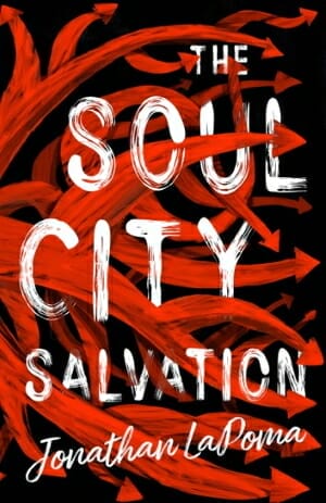
TP: I love this cover design. Amazing work, a true winner if you ask me.
e-Book Cover Design Award Winner for May 2020 in Nonfiction
Becca Syme submitted Dear Writer, Are You In Writer’s Block? designed by Kostis Pavlou.
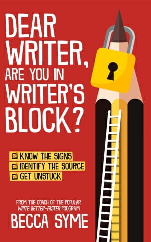
TP: Great work! Nicely balanced, informative and very well done!
Fiction Covers
A.R. Henle submitted Water for Blood designed by A.R. Henle.

TP: I have to say that the combination of colors isn’t working here. If the designer had used white instead of red, that would work much better and the focus wouldn’t be on the color, but the wording.
Amala Benny submitted Living Lime designed by Amala Benny.

TP: Beautiful colors! The typography should be more prominent. Blending in images can be a challenge sometimes, so take your time with that.
Amala Benny submitted ExtraNormal Rising designed by Amala Benny.

TP: A nicely balanced cover design.
Ana Grigoriu-Voicu submitted The Last Shadow Gate: The Shadow Gate Chronicles Book I designed by Ana Grigoriu-Voicu. “My intention with this cover design was to take the core of the fantasy genre and turn it into a dynamic, mysterious cover art with a focus on the title.”

TP: Amazing and breathtaking! ★
Beena Khan submitted The Name of Red designed by Les German. “The woman in the red dress significance the title and question, what is the name of Red? The color palette is blue and red. The starry, blue night represents her first appearance on a winter, starry night at the restaurant.”

TP: I really like how the designer has handled the typography. Nice work.
Beth Camp submitted The Seventh Tapestry designed by Angie Zambrano. “Images of tapestries at Cluny in Paris were not for commercial use, so the background is actually my shot of a pillow purchased in France! I thought Angie Zambrano brought the flavor of medieval times with her choice of font.”

TP: I’m sure that the designer did his best to work alongside this background, but I would still like to see a different typography approach here.
Brandon Keaton submitted Transference designed by Damonza. “The book has a spiritual element that’s prevalent throughout, and I wanted that to come through in the cover art. Other themes in the story revolved around duality, so I wanted that to show in the “split” cover design.”

TP: I love this cover design. Beautiful work! ★
Carrie D. Miller submitted Copper Pennies designed by Lance Buckley.

TP: Nicely balanced and appealing.
Catherine Downen submitted The Markings designed by Unanimous. “The two hands are my main characters, Alexander and Adaline. The key birth marks are mentioned near the end of novel, referencing the title “The Markings”. These markings are a symbol that Alexander and Adaline are the key to the rebellion. Purple is the color of the kingdom, also signifies royalty.”

TP: I would suggest a stronger font choice that would accompany such an image.
Charles Darner Jr submitted Narco-Submarine, Cartel’s Silent Service designed by myself & SelfPubbookcovers.com. “I wished the design to be clean and simple. The cover provides ideas about the book as the Mexican Flag represents the cartel’s location. The biohazard symbol and the shadow submarine are to provoke curiosity to the body of the novel while the title promotes an overall picture of the novel.”

TP: I’m afraid that there are too many colors and symbols on this cover, so the reader gets distracted by all that. If the background is busy, then the typography needs to stay simple.
Darby Harn submitted Ever The Hero designed by Alia Hess. “Thank you so much for considering the cover of my novel Ever The Hero for the contest!”

TP: A beautiful illustration and nice title treatment. Gradients in typography are usually not my cup of tea, but it somehow works here. Nice job!
David Burton submitted Girl at Sea designed by Design Consult. Girl at Sea is a dark, slightly paranormal, coming of age tale. The Albatross represents Death who guides the Girl and her crew mate as they sail the S. Pacific seeking solace for their grief. The Girl, the bird and the boat are three of the main “Characters”.

TP: What I always say is that you definitely shouldn’t use more than two fonts in one cover. The cover would be more appealing if there weren’t so many colors in the title. The covers also lacks a professional touch. The imagery should be composed better.
Deborah Makarios submitted The Wound of Words designed by Evelyn Doyle (typography). “It was always a cold blue sort of story in my (D.M.’s) mind, with winter playing a significant role. I prepared the cover – minus typography – from an appropriate public domain image by ArtTower. Evelyn Doyle then added the typography: manipulations of both Trajan Pro 3 and Carrig DC.”

TP: A very nice cover design.
Eszter Molnar submitted The Cow Who Didn’t Like the View designed by Anita Bagdi.

TP: A very interesting illustration. In order to make it look as a book cover, the typography should be redone.
Hampton Lamoureux submitted Dark Winds designed by Hampton Lamoureux.

TP: There is not much you can say here but “WOW”. Beautiful! ★
Hampton Lamoureux submitted The Uncommon Thread designed by Hampton Lamoureux.

TP: Amazing work. Beautiful!
Hampton Lamoureux submitted Macario’s Scepter designed by Hampton Lamoureux.

TP: I love the imagery and I love the typography. Amazing! ★
Hayley Chow submitted Odriel’s Heirs designed by Dominique Wesson. “With light there is always shadow.”

TP: I love the colors here. Nice work.
Heather Cuthbertson submitted Ever Alice designed by Nick Roetto. “Since it’s a retelling of Alice in Wonderland, we wanted the cover to be simple as a juxtaposition to the Wonderland madness inside.”

TP: Very simple and nice. I would suggest to emphasize the author name a little bit more.
Ihor Tureha submitted Garbage in, Demon Out designed by MiblArt.

TP: Very well done and genre appropriate. Nice work! ★
Jennifer Rackham submitted Strawberry Jam designed by Jennifer Rackham.

TP: A nicely balanced cover design.
Jennifer Silverwood submitted Stay (Cursed Gods #1) designed by Najla Qamber Designs.
")
TP: I love the typography treatment here! Nice work!
Jovana DDD submitted Toil and Trouble designed by Marushka from Deranged Doctor Design. “Cozy Mystery book cover design, Geeks and Things Cozy Mysteries Book 0”

TP: I’m no fan of such covers, but this is very well done and appealing.
Jovana DDD submitted Forgive and Forget designed by Marushka from Deranged Doctor Design. “Cozy Mystery book cover design, Geeks and Things Cozy Mysteries Book 2”

TP: All sequels are nicely designed! Great work. This one is my favourite of all three. ★
Jovana DDD submitted Saints and Sinners designed by Marushka from Deranged Doctor Design. “Cozy Mystery book cover design, Geeks and Things Cozy Mysteries Book 5”

TP: The colors work well together and everything is well placed.
Jovana DDD submitted Seeking Safety designed by Milo from Deranged Doctor Design. “Post-Apocalyptic book cover design, Gateway to Chaos Book 1”

TP: Great title treatment! Beautiful!
Jovana DDD submitted Seeking Refuge designed by Milo from Deranged Doctor Design. “Post-Apocalyptic book cover design, Gateway to Chaos Book 2”

TP: Another great sequel. Great work!
Jovana DDD submitted Seeking Justice designed by Milo from Deranged Doctor Design. “Post-Apocalyptic book cover design, Gateway to Chaos Book 3”

TP: It isn’t always easy to show such scenes. Very well done!
Karri Klawiter submitted Liars Pact designed by Karri Klawiter.

TP: Appealing and vibrant. Nice work.
Kevin Sivils submitted Dolls, Dames, and Danger designed by Robin Ludwig. “Typography is similar to Thomas Sullivan Thrillers for this spin-off series giving backstory of main characters. These novellas are all “futuristic crime noir” stories written in that genre’s classic style. The red head is the femme fatale and the moon and black background imply the scifi elements.”

TP: A nice cover design. Try not to use images that are frequently used by others (like this one). Other than that, nice job.
Kevin Sivils submitted The Young Detective designed by Robin Ludwig. “Typography is tied into the main series of Inspector Thomas Sullivan Thrillers. The story is written as a futuristic crime noir and the detective’s image fits the genre with the suit and fedora hat. The moon and dark background imply the scifi elements of the story and fit with the noir genre.”

TP: A nice cover design. I’m not too crazy about the title treatment, but everything works well together.
Kevin Sivils submitted The Price of a Lie designed by Robin Ludwig. “The Price of a Lie is the seventh installment in the Thomas Sullivan future noir crime thriller series and uses similar typography for all seven covers. The society depicted in the story is dystopian in nature, thus various shades of colors and the distorted view of the city.”

TP: Very nice and the obvious features are instantly recognizable.
L. M. Coulson submitted Ether-Touched designed by L. M. Coulson. “Every element in the cover has some significance in the story. The color blue, the silhouetted trees, the moon, the highlighted dagger—each element is carefully selected to foreshadow the story within.”

TP: A beautiful illustration combined with nice typography. Good work.
Leon Stevens submitted Lines by Leon: Poems, Prose, and Pictures designed by Leon Stevens. “The illustration called “Hopes, Dreams, and Wishes”, represents how these elements in our lives can often seem to out of our control. Often, it may seem that they are at the mercy of the winds, but chasing them sure is fun.”

TP: I really like this cover design. It is very simple and unique.
Mark and Max Binder submitted The Fuck Ups designed by Mark Binder. “Groston is a New England fictional hometown. The heroes spend much of their time trying to get away, but when they do they find that they miss home. The title and byline font (IBM Plex Mono) was chosen as a modern font to replace an initial draft design.”

TP: This cover needs a professional touch.
Melony Paradise submitted Wolf of Choice designed by Melony Paradise.

TP: The illustration is beautiful! My suggestion would be to remove the embossed effect and the satin on the title. It would probably look a little bit more professional.
Michel Dioubate submitted Laughter of a Crazy Man designed by Cade S. London. “Cover depicts the turmoil, uncertainties and horror of the times covered in the book”

TP: A very unique cover design, however, it should be a little bit redone in order to look professional.
Michele DeFilippo submitted False Assurances designed by Michele DeFilippo.

TP: A nice cover design at first glance, but there are too many different fonts in one place.
Michele DeFilippo submitted Threat Bias designed by Michele DeFilippo.

TP: Again, very nice at first glance, but I strongly recommend not to use that many different fonts.
Norman Whaler submitted Oink and Gobble and the Missing Cupcakes designed by Mohammad Shayan. “Mohammad Shayan’s sense of fun and humor for this children’s adventure-mystery can be seen in this cover image. The look on the pig’s face about the tipped over bucket and his missing cupcakes for the cover image is hilarious!”

TP: A nice illustration and appropriate typography for the genre.
Patrick Samphire submitted Shadow of a Dead God designed by Patrick Samphire / 50 Seconds North.

TP: A nice and appealing cover, however it would be best to reduce the satin and inner shadows in the title.
Patrick Smith submitted Leaving Fire designed by Elizabeth Zimmerman. “The photograph on the cover was taken at the author’s home.”

TP: Eye-catching, but could use a bit more work.
Sam Kench submitted The Fall of Polite designed by Kaylee Adams.

TP: I would recommend a different font for the title. All in all, very balanced.
Sheryl Frazer submitted When She Touches designed by Zizi. “The cover reflects the magic that happens when the main character touches someone. I chose the mosaic design to resemble a colorful “feeling” wheel and when she touches upon those feelings things begin to stir!”

TP: I would recommend a different font, or a combination of this one and another one that would make a statement. Also, given that the background is this colorful, the typography should be simple.
Tejas Shinde submitted The Curse Of Scariest Shadow: A Haunted Camping Trip designed by Tejas shinde.

TP: I really like the minimalism in this cover design. The author name should be a little bit larger and maybe all caps.
Nonfiction Covers
Bruce Wolf submitted Leave Work Early And Go To The Bar: Surprising Management Secrets To Create Highly Productive Teams In Any Business designed by Bruce Wolf.

TP: The cover contains too many fonts and the typography need a professional touch.
Gi Gi O’Brien submitted The Quarantine Handbook designed by Gi Gi O’Brien. “The intention of the cover was to stimulate an uplifting insight into the pandemic and minimise the mental health repercussions of self-isolation and a world in crisis by delivering playful, positive and inspiring energy.”

TP: The idea behind the cover is good, but the execution isn’t too good. The cover should be redone by a professional.
JULIE WALLACE submitted The WordStorm: Collected Poetry (1976-2006) designed by Danielle Smith-Boldt. “This cover captures the intensity, passion, and mystical quality of my writing. The colors and fonts are dynamic. The lightning inside of the words suggests there may be more lightning strikes, little enlightenments, and poetic turns on the inside.”
")
TP: The cover doesn’t look like a poetry book and is transmitting a wrong message.
Mike Kowis submitted Texas Off-road Racing: A Father-Son Journey to a Side-by-Side Championship designed by Rob Williams. “I asked Rob to design a cover that captures the adrenaline rush that comes from off-road racing as well as the colors of Texas (red, white, and blue). I’m very pleased with the results and hope readers will instantly recognize this cover as a book about off-road racing.”

TP: I would suggest some slight typography changes to make the cover more appealing.
Patrick Smith submitted Leaving the Life: A true story of love, loss and gratitude designed by Elizabeth Zimmerman. “The photograph on the cover is of the author looking out over the lake where he lives, with the house he and his late-wife Claudia bought on the opposite shore.”

TP: I would recommend a professional redesign of the cover, while keeping the image. It would be much more appealing without the blue frame around the image.
Simeon Davis submitted The Tao Teh King for Awakening: A Practical Commentary on Lao Tzu’s Classic Exposition of Taoism designed by Brother Simeon Davis. “The Yin-Yang symbol is associated with the philosophy of Taoism. As it is very simple, some subtle ornamentation was added to the cover to make it more appealing. The vermillion color is associated with China. Overall, the attempt was to make the cover simple yet striking.”

TP: A nice cover design. I would just recommend making the imagery slightly smaller, so that it doesn’t touch the wording. ★
Wageedah Salie submitted Back Pain Relief designed by Wageedah Salie – One Story Creative.

TP: Very eye -catching, but I would still like to see fewer fonts. ★
Well, that’s it for this month. I hope you found it interesting, and that you’ll share with other people interested in self-publishing.
Use the share buttons below to Tweet it, Share it on Facebook, Link to it!
Our next awards post will be on February 19, 2018. Deadline for submissions will be January 31, 2018. Don’t miss it! Here are all the links you’ll need:
- The original announcement post
- E-book Cover Design Awards web page
- Click here to submit your e-book cover (See New Submission limits)
- Follow @JFBookman on Twitter for news about the E-book Cover Design Awards
- Check out past e-Book Cover Design award winners on Pinterest
- Subscribe to The Book Designer Blog
- Badge design by Derek Murphy
