

Book cover design never stands still. After all, the purpose of a book cover is to catch the eye. To attract the reader. To make a particular book stand out on the shelves. But book cover trends change throughout time.
For lovers of books, it’s fun to look back through the decades and see how times have changed. This is similar to browsing a slightly haphazard vintage bookstore. Rather than the clean, homogenized selection found in today’s book chains, we’re treated to a smorgasbord of design delights.
If you’re a fan of book covers with character, read on. Let’s take a look at some treasured books from decades past, as well as the design trends they showcase.
Below, we’ll go over book cover trends throughout the decades:
Vintage Illustration in the 1950s
If you think of the concept of vintage book cover trends, you will probably picture something similar to the style found in the 1950s.
We’re talking carefully handcrafted illustrations, the type of cover you may well find framed in one of our current era’s hipster cafes.
Let’s delve back in time and explore some of the best books that showcase the 1950s vintage illustrated style.

Catcher In The Rye by J.D Salinger
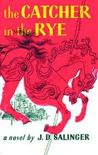
Catcher In The Rye by J.D Salinger is widely regarded as one of the all-time classic tales of angst and alienation.
It’s particularly interesting as Salinger is famed for being opposed to cover art for many of his works.
The image itself uses the contrast between yellow and red to eye-catching effect. Fans of Salinger’s story will notice the art references the famous carousel scene, as well as the horse motif that occurs throughout.
The cover’s color progression from white at the bottom, up through red, to the yellow text at the top, ensures the cover works aesthetically as well as symbolically.
Lord of the Rings by J.R.R Tolkien
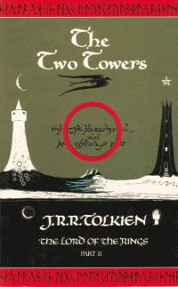
The composition of The Two Towers first edition cover is truly something to behold.
The covers for Tolkien’s trilogy work as a cohesive set, thanks to the use of color and the central circular image as the focal point in each case. However, The Two Towers also works as a stunning standalone cover.
The images of the towers themselves, with their monochrome contrast, are beautiful. They also effectively symbolize the dual notions of evil explored by Tolkien.
The final point of interest is how well the vintage style of illustration works with Tolkien’s runes, seen at the top and base of the cover.
East of Eden by John Steinbeck
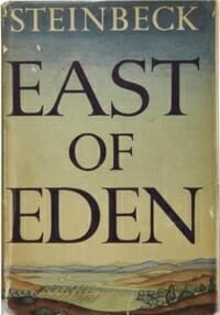
The final selection from the 1950s is John Steinbeck’s East of Eden.
This book cover is particularly interesting, as it mixes large title text and an illustrated background in an effective way.
Steinbeck’s story alludes to the Biblical tale of Cain and Abel while being set in the Salinas Valley. The cover reflects the setting beautifully.
Prominent Text in the 1960s
As we move from the 50s into the 60s, we notice that the intricate illustrations become less common, in favor of large, eye-catching text.
Let’s check out three book covers from the 1960s which used the trend for bigger text to great effect.
Franny and Zooey by J.D Salinger

Remember the mention of Salinger disliking cover images? Franny and Zooey is an excellent example of this!
Franny and Zooey were originally published in The New Yorker as separate stories, but the tales of the Glass siblings are combined here into a single tome.
The only trace of color is the green, found on the spine. It’s been theorized that the background symbolizes the purity and authenticity of the Glass siblings, one of their key character traits. The style of the title text is most likely due to Salinger’s love of calligraphy and brushwork.
The Prize by Irving Wallace
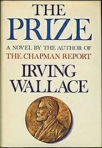
To many, the cover of The Prize looks a lot more modern than it is.
The Prize’s cover stands out for its prominent text, the Nobel Prize image recreation of Aldred Nobel, and the contrasting color used in reference to The Chapman Report.
Wallace’s heavily researched work focuses on the process and aftermath of The Nobel prize, so the cover’s emphasis on this in both image and text form is more than appropriate.
The Group by Mary McCarthy
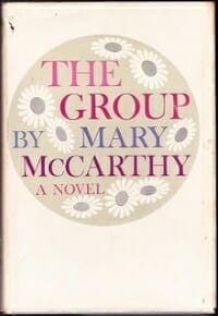
For a novel and book cover that typifies the 1960s, look no further than The Group by Mary McCarthy.
McCarthy’s story centers on a group of eight female friends and their lives after graduation. The eight friends are represented by the eight flowers, and their bond is symbolized by the circle enclosing them. This is appropriate considering the plot itself explores the challenges the group face from the outside world.
An attractive and appropriate cover, superbly suitable for the flower power 1960s.
Vibrant Graphics in the 1970s
With the progress of technology, many of the book cover images found in the 1970s became more vibrant and vivid. Although they look dated by today’s standards, they were a big step up from the timeless, illustrated style of decades prior.
Crystal Cave by Mary Stewart

For a decade known for its vivid book covers, it’s appropriate that our first example is The Crystal Cave by Mary Stewart.
Stewart’s story is based on the legend of King Arthur, and the title and cover image refer to a cave to which protagonist Myrddin retreats.
The dark section of the cover, providing the backdrop for the title text, adds to the sense of mystery evoked by the image and name of the book.
The Exorcist by William Peter Blatty

If you thought The Exorcist film was unsettling, this book cover is unlikely to bring you much peace of mind.
The eerie, distorted image of the possessed girl’s face is genuinely disturbing. For some reason, the fact that the image is off-center somehow adds to the sinister vibe exuded by this book cover.
Tinker Tailor Soldier Spy by John le Carré
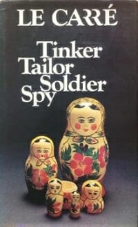
Without spoiling the exact reason for the Matryoshka dolls on the cover, they serve a symbolic purpose for readers of Carre’s spy tale.
Fans of Tinker Tailor Soldier Spy who have seen the BBC adaptation will be well aware that the dolls work just as well in motion as they do as a still book cover image.
Aside from the dolls, the descending, indented layout of the title text symbolically represents the layered nature of Le Carre’s book.
Larger Text in the 1980s
It’s interesting to note that the 1950s emphasized illustrated images on book covers, while the 60s more prominently featured text. The 70s made use of large, vivid images, and the alternation continues in the 1980s with the return of larger text.
Let’s check out some examples of beloved 1980s book covers, and explore the ideas underpinning them.
Hollywood Wives by Jackie Collins
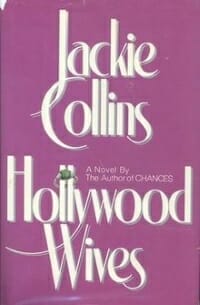
The book cover for Hollywood Wives by Jackie Collins is a superb example of the larger text trend of the 1980s.
Both author and book title name are displayed prominently, with the letters J and C, and y and W creating a visually pleasing interlink.
The only graphic is a ring placed around the double l in the word Hollywood, showcasing how image and text can interact attractively.
The Talisman by Stephen King and Peter Straub
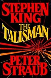
If you want an example of a quintessential bold, in your face, 1980s large text cover, The Talisman would be it.
Having two author names, as well as a prominent book title, means there is little other than text on this cover. The orange and red font colors contrast strongly against the black background, and the overall impactful feel is added to by the vivid lines radiating out from the center.
The words ‘King’ and ‘Peter’ are centered pleasingly against their larger, six lettered counterparts. The final arresting contrast is provided by the wavy shape of ‘The Talisman’, centered between the blocky and straight author names.
Patriot Games by Tom Clancy

The final example of a bold 1980s book cover with larger text is Patriot Games by Tom Clancy.
The white author and title text contrast superbly against the blue background. As well as working on a purely visual level, the choice of red, white, and blue is a symbolic nod to the title and theme.
Which Decade’s Book Cover Trends Delight You The Most?
Thanks for journeying with us through our decades of book cover design trends.
Do you have a particular era of book covers that holds a fond place in your heart? Is there a particular style of book cover you prefer?
It would be a pleasure to get your thoughts in the comments!
