Today you’re in for a real treat, as I interview master calligrapher and illustrator Georgia Deaver. You’re already familiar with her work, although you probably don’t know it, since she has created lettering and illustrations for a variety of famous products. Georgia has also worked on many books, and I was glad to have the opportunity to ask her about the role of lettering in book and cover design, and how self-publishers might make use of it. Although I’ve included a lot of samples of Georgia’s work, you’ll get a much better view by visiting her website.
Georgia, you’ve been creating distinctive and beautiful illustrations and hand lettering for book covers and other products for quite a while. How did you get into the field, is it something you dreamed of doing when you were young?
Yes, I have been interested in the arts since I was very young. I seriously studied textiles, graphic design, fine art and art history. I briefly studied accounting in an attempt to follow a sensible career path. But I eventually focused on letterforms — primarily hand lettering and calligraphy. I’ve operated my own design studio in San Francisco since 1984 and have taught classes and workshops for more than 25 years.
Who would you say have influenced your work the most?
I have been influenced by several European calligraphic masters – Rudo Spemann, Friedrich Neugebauer, Irene Wellington and Karlgeorg Hoefer, as well as many contemporary American lettering artists and calligraphers such as Thomas Ingmire, Tony DiSpigna, and Rick Cusick. You can see original works by many of these calligraphers in the Special Collections Dept of the San Francisco Public Library, Main Branch, 6th Floor.
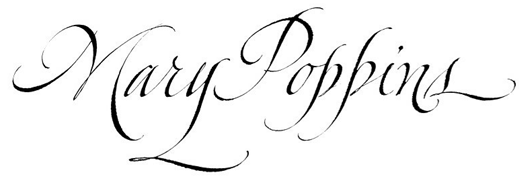
I draw inspiration from so many different places – from a piece of music or the shape of a piece of pottery, posters, patterns in fabric, mosaics, paintings, or from other letterforms; for example, beautiful Germanic gothic letters or Italian italic letterforms, among others. I sometimes focus on a specific line or stroke, then build an entire alphabet and words from just this one design element.
Your lettering and calligraphy seem to use a wide variety of lettering styles, from formal to very impressionistic. Have you intentionally tried to teach yourself lots of styles of lettering?
Yes, I have intentionally stretched myself to create new forms over the years. Art directors and graphic designers often give me very specific direction related to their project and I work at giving them unique, custom hand lettering or illustrations that fit their project well … so this has resulted in being versatile at creating a wide range of lettering styles.
There doesn’t seem to be a book that can’t be enhanced by hand lettering or calligraphy.
Are there books that seem to particularly lend themselves to using hand lettering as a part of the cover design? If so, why is that?
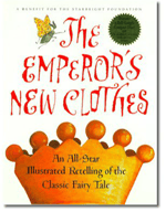
I have created book titles for all categories of books — including children through adult, cookbooks, religious, inspirational, gift books, vanity publications, self help, etc. There doesn’t seem to be a book that can’t be enhanced by hand lettering or calligraphy. Well crafted letterforms that stand alone beautifully on a book jacket work well but it’s also wonderful to work with the other elements on the cover – to create letterforms that harmonize or contrast beautifully with an illustration or photograph.
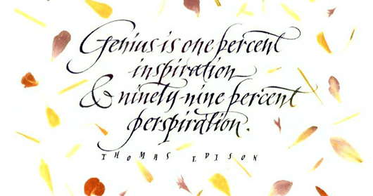
I work on packaging, logos, and wine labels among other projects, but I especially love working on book design. My experience with art directors/graphic designers in publishing companies has been very good. We’re both working together to make the jacket as good as we possibly can with lettering or an illustration that fits the subject matter well and enhances any other images on the cover.
One of the recent changes in publishing is that authors are being called on to do more of their own marketing and publicity. In that context, there’s a lot of talk about authors branding themselves and, from a graphic point of view a hand-drawn or lettered logo or other element can be a powerful brand identifier. Are you seeing any individual authors using your skills for personal branding?
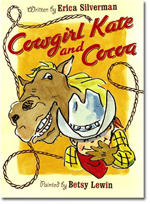
 I haven’t worked with any individual authors yet on this but I have worked with a publishing company doing branding. I developed a hand lettered logo for a children’s book series – “Cowgirl Kate and Cocoa”. So this logo is printed on each book along with the title of each individual story.
The 8 Harry Potter books each have a distinctive hand lettered logo that was used on each of the books published in the US. Each of these books also have a pastel illustration to suit each individual book. The “Hunger Games” trilogy is also a great example of branding. Each book has the title in the same typeface, but the consistent black covers and large colorful metallic logos create and easily identifiable brand.
 Georgia, most readers here are independent publishers or self-publishers. Is calligraphy something they should consider for their book covers or branding?
Yes, I think so. Calligraphy / hand lettering would work out well in many circumstances. Hand lettering / calligraphy can add so much expression and character to a book jacket. People often approach me wanting a more proprietary project — a wine label or book jacket with a unique and exclusive design which makes it really stands out.
I bet everyone reading this has at some point in their lives seen a horror film title with blood looking ink dripping from the hand-drawn letterforms. Imagine how different the title would look in plain Helvetica Bold!
 I was once asked to create something seaweed-like. This didn’t mean that I had to make the letterforms look exactly like seaweed — only to give the viewer the feeling of seaweed flowing in water. It was exciting to see how many ways I could make this work — and then which one the art director felt was the best. Hand lettering is so much more expressive than using a more common computer type font, and gives the reader an idea of what the book is about. I’ve worked on dozens and dozens of projects like this over the years and always find them interesting.
Lots of self-publishers are using skilled cover designers to give their books the look of a quality publication. Do you market your services to freelance cover designers? How would an author communicate their desire to incorporate hand lettering on their cover, or should they just leave the whole project to the designer?
There’s nothing out of line with talking to your graphic designer about possibly incorporating hand lettering/calligraphy into the design. In practice, the author could simply furnish the designer with a range of samples he likes, to supply some initial direction. Samples could be from web sites, or movie posters, or other books. The author or graphic designer could ask the lettering artist for different original samples to choose from but a skilled calligrapher can also base a new design on the old sample.
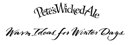
Can you give readers some idea of what this type of lettering costs, and what makes one project more or less expensive than another?
This varies depending on how time consuming the specific lettering style is for the lettering artist, as work is usually charged by the hour. In general, many formal flourished scripts take a lot of time. Also hand lettering with a lot of special effects (such as drop shadows) can be time consuming. It’s difficult for me to generalize, but I would be as direct as possible and simply ask for a quote. I’m always happy to furnish quotes in advance.
Before we end, I wonder if you have any tips for readers who are getting ready to publish their own books and trying to navigate the often confusing waters of getting their book designed and produced in a way that will really benefit their publication?
I would use designers whose work you like a lot. And discuss the project with them before committing to one. Make sure they’re someone you feel you can easily work with and who listens to your concerns. Keep an open mind to their thoughts and ideas as well. Since they aren’t as close to the project as the author, they’ll have fresh thoughts and ideas and could offer some good insight. And remember the “branding” comments, especially if there will be future books.

 Georgia Deaver is a San Francisco hand-lettering artist, calligrapher & Illustrator with over 25 years of experience. She has worked with well known clients in book and magazine publishing, packaging, branding, television and film as well as creating one-off art pieces. Georgia has designed book titles for Harcourt, Chronicle Books, Sterling Publishing, Scholastic, Simon and Schuster and Neugebauer Verlag.
As an instructor, Georgia has taught at workshops and conferences across the United States, Canada, Europe and Japan. Her many published works appear in several typography annuals of the Type Directors Club, Communication Arts, the Creative Stroke Books, Modern Scribes and Lettering Artists II, Letter Arts Review and Step by Step and HOW Magazines. Samples may be viewed at her web site, https://georgiadeaver.com/ and you can email her for additional samples.

