

By Joel Friedlander
Welcome to the e-Book Cover Design Awards. This edition is for submissions during March, 2019.
This month we received:
35 covers in the Fiction category
11 covers in the Nonfiction category
Guest Judges
![]()
![]() I’m very pleased to once again welcome the team at Deranged Doctor Design to The Book Designer as guest judges this month. Deranged Doctor Design is a media and graphic design studio that has specialized in book cover creation since 2014. With five senior cover designers (each specialized in a specific genre), three supporting designers (in charge of promo materials) and two project managers (in charge of project management, booking and client communication), they have designed over 2,000 book covers and more than double that number of promo items.
I’m very pleased to once again welcome the team at Deranged Doctor Design to The Book Designer as guest judges this month. Deranged Doctor Design is a media and graphic design studio that has specialized in book cover creation since 2014. With five senior cover designers (each specialized in a specific genre), three supporting designers (in charge of promo materials) and two project managers (in charge of project management, booking and client communication), they have designed over 2,000 book covers and more than double that number of promo items.
In addition to book cover and promo material design, from 2018 they also provide book cover animation. To read more about the company and what they offer, you can visit them at www.derangeddoctordesign.com, and follow them on Facebook, Twitter or Pinterest.
Comments, Award Winners, and Gold Stars
I’ve added comments (JF: ) to many of the entries, but not all. Remember that the aim of these posts is educational, and by submitting you are inviting comments, commendations, and constructive criticism.
Thanks to everyone who participated. I hope you enjoy these as much as I did. Please leave a comment to let me know which are your favorites or, if you disagree, let me know why.
Although there is only winner in each category, other covers that were considered for the award or which stood out in some exemplary way, are indicated with a gold star: ★
Award winners and Gold-Starred covers also win the right to display our badges on their websites, so don’t forget to get your badge to get a little more attention for the work you’ve put into your book.
Also please note that we are now linking winning covers to their sales page on Amazon or Smashwords.
Now, without any further ado, here are the winners of this month’s e-Book Cover Design Awards.

e-Book Cover Design Award Winner for March 2019 in Fiction
Silke Stein submitted Sleep, Merel, Sleep designed by Silke Stein
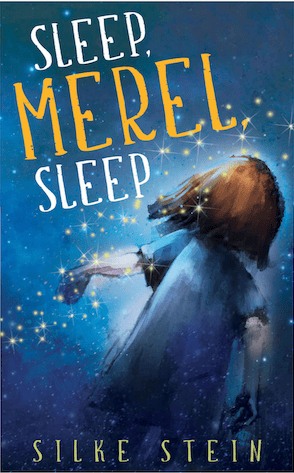
DDD: Beautiful art and great typography. Gives of a bit of an eerie feel, and makes you wonder what the story is about. Would definitely pick up the book and read the blurb.
e-Book Cover Design Award Winner for March 2019 in Nonfiction
Brian Meier submitted The Adventure-Driven Life: Awaken the Bear designed by Doublenaut. “The concept and color scheme was inspired by old field guides and auto repair books. The images themselves are drawn from the book’s primary theme: Living a wilderness-inspired and adventure-driven life. Thank you for considering my book. Cheers.”
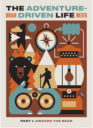
DDD: We love this! Interesting, unusual, and very “hipster” because of the vintage style/feel. People of all ages will be drawn to this cover.
Fiction Covers
Amala Benny submitted The Art collector of Le Marais designed by Mayflower Studio. “The story is set in Paris and revolves around a mysterious art collector. I really love how all the elements came together in the end. Initially the cover was blue but I wasn’t satisfied and kept on experimenting and ended up with this beautiful shade. I am really happy with the final result.”

DDD: Love the vintage feel of the cover. It really works great with the title and the story theme. The text should have been stronger, however. It’s not very readable.
Anya Stassiy submitted Eyes of Amber designed by Ebooklaunch team. “The image on the cover is of a dream where the main character finds an amber, it signifies finding a soulmate. In real life her love interest has the eyes the color of amber.”

DDD: Great font choice and lovely scene. The chosen colors work great with the title.
Bradley Camapbell submitted Antisocial designed by Lofty. “Social Media has changed what it means to be a social Butterfly. This shows a breaking away, leaving the digital realm. Coming back to the real w”

DDD: Great composition and overall idea, but we wonder if a reader can get what the book is about without reading the blurb first.
Christopher Rutledge submitted ASCLEPIUS designed by Christopher M. Rutledge.

DDD: Loving the elements used, but notice that this looks like non-fiction cover (like Egyptian history textbook maybe?). If that’s the case, great! If not, you should reconsider the concept.
Christopher Rutledge submitted Murder at Venegoni’s designed by Christopher M. Rutledge.

DDD: Very bold and minimalistic composition. Usually, “less is more,” but in this case we feel that this is too plain. Maybe adding some texture on the white part and using more interesting text treatment would make the cover less plain.
Cy Wyss submitted Dimorphic designed by Cy Wyss. “The font is Vanguard from Fontspring. Thanks go to Stuart Bache for an awesome course on creating covers that sell. The image reflects Parkour flourishes.”

DDD: Loving the composition and the feel of this cover. Great font choice, very nice blending. Looks very professional. ★
D. Lieber submitted In Search of a Witch’s Soul designed by Section 28 Publishing. “The designer expertly captured my detective and her client (even changing facial features when asked). The palette reflects the 1920s setting. He even created posters in the background (going so far as to ask world-building questions that weren’t in the book, so he could get it just right).”

DDD: Very film noir! Based on the cover, we’re not sure if there are paranormal elements in the book. (Based on the title and the green thing, it looks like there are.) And great technical execution.
Daniel Thomas MacInnes submitted Daltrey at the Park designed by Daniel Thomas MacInnes. “Photo taken with iPhone 6, text assembled in DTP program Scribus. Shot was inspired by Seattle grunge-era photography.”

DDD: Both covers (see the one below) have a very dated feel in concept and style, as well as chosen font. Unless you are publishing the book only for your sake, if you plan to sell some of them, we would advise hiring a professional cover designer who could “wrap” your book in something more modern and appealing and therefore easier to sell.
Daniel Thomas MacInnes submitted Keith Haring: Chicago Mural designed by Daniel Thomas MacInnes. “Photo was taken on iPhone 6, text was assembled on Scribus, a freeware DTP program.”

Derek Keeling submitted Nomad’s Island designed by Brent Diskin. “The graphic designer thought about a minimalist style that goes against the grain of most book covers. It’s striking and lets the reading get a glimpse into the story. The vibrant cascade of color, the subtle addition of a second set of footprints and the framing of the dune grass.”

DDD: There is too much of the “empty” space, and the text is too weak (barely visible).
Divine Michelle submitted What the Flower Says of Death designed by Yonderworldly Design. “The author wanted a moody, minimalist cover. The jumping off point was the stock image which she chose. The few letterforms subtly tucked under the leaves were an aesthetic choice to add some interest, while making sure the title is still easily readable even as a small thumbnail.”

DDD: Loving this idea! Great balance between the image and the text, and the way the designer made some of the leaves go over the text is awesome.
Ebook Launch submitted The Grave Dancer designed by Ebook Launch

DDD: Really strong genre cover, visibly done by a professional. This is a great example of a great minimalistic cover. With only 3 colors and few elements, “less is more” really works here.
Ebook Launch submitted The Tests designed by Ebook Launch

Ebook Launch submitted The Shadows of Summer designed by Ebook Launch

Hampton Lamoureux submitted Ropes in the Attic designed by Hampton Lamoureux

DDD: Expertly done. Very genre appropriate, interesting and technically flawless. ★
Hampton Lamoureux submitted Fearless: Guardians of the Scroll designed by Hampton Lamoureux

Hampton Lamoureux submitted Amethyst in Ashes designed by Hampton Lamoureux

Ihor Tureha submitted Silver Mage designed by MiblArt. “The cover design created absolutely from scratch by our team. In the foreground is shown a silver brooch illustrated by our artist such as it is the main attribute of the story.”

DDD: Strong and bold. Both the logo and the text are visible, even in small sizes. ★
Kate Rauner submitted Titan designed by Kate Rauner. “The background image is a free-use NASA illustration of the surface of Titan (one of Saturn’s moons)”

DDD: Clearly self-published. This cover needs help, both in technical way (looks like it was designed in Paint Net) and composition (too many elements making it too busy).
Keith Dixon submitted The Lonely Grave designed by Keith Dixon. “The image takes an idea from the book and dramatises it. The photograph was originally in black and white but has been colourised with a blue filter for more impact.”

DDD: Solid genre cover.
Laurie Stevens submitted The Mask of Midnight designed by Scott Templeton. “The use of red represents the theater (the villain is theatrical) and matches the blood on the stage. The outline of the body ties in with a detective mystery”

DDD: While the idea is good, it needs serious adjustments. There are too many elements and too many different fonts, which makes the cover busy and non-professional looking. Dark red and dark grey text is not visible.
Michael Leese submitted Going Underground designed by Simon Avery. “The book is a crime thriller, which features a young autistic detective. We wanted a cover that would fit into this genre, but also be different at the same time. The cover really works well when you see it on a thumbnail.”

DDD: Strong thriller cover. Great choice with text layout and color choice.
Michaelbrent Collings submitted Predators designed by Michaelbrent Collings

DDD: Not sure what’s going on with all white text that’s all over the place.
Nomita Khanna submitted LUCKY COSTASAURUS and the Golden-Winged Vultures designed by Vivian Mineker

DDD: Beautiful illustration. The title and author name should be significantly larger.
Phillipa Nefri Clark submitted The Christmas Key designed by Steam Power Studios. “The dog is an important character in all the books in this series, as is the red ribbon and key.”

DDD: Loving the composition and title font choice. However, the deep red background makes the cover too serious and kind of dark. Lighter color might have been a better choice.
Reyna Favis submitted Soul Search: A Zackie Story of Supernatural Suspense designed by Reyna Favis

DDD: Has self-published look. The dog looks just pasted on, like it’s some kind of a sticker (and not a part of the scene).
Rick Holland submitted Set Apart designed by Rick Holland – Vision Press. “This political thriller takes place in both Washington D.C. and the sleepy town of Dorsey Pennsylvania. The cover centers around the two settings and the main character who is a detective on the trail of a government conspiracy.”

DDD: Appropriate concept for political thriller.
Robert Cole submitted The Falcons of Gebtu designed by Robert Cole. “Each image on the cover is part of the plot. The pectoral is a full restoration, done by myself in all ancient Egyptian stone, of Paser’s Pectoral. The original, an empty shell in the Louvre.”

DDD: It looks like someone put several random images on white background without a particular composition in mind. A lot of elements that don’t work together at all.
S.E. Page submitted A Fair Account of the Traitors Snow White and Rose Red designed by Audrey Bagley

DDD: While the illustration is beautiful , typography needs help. Black color makes the text too strong and doesn’t work with the illustration. Choosing the bold fon t is OK, but not for all the text on the covers, especially not for a title that long.
Sierra Patheal submitted The Stray Hare designed by Sierra Patheal. “The first story in this series is a lighthearted, D&D-esque romp with a romance and some fight scenes, so I wanted to set the scene with the tavern moment at the start of so many roleplaying adventures. Thanks in advance for your critique!”

DDD: Interesting illustration and good font choice.
Stephen Dixon submitted The Gingerbread Man 2: What Happened Later? designed by Stephen Dixon. “The Gingerbread Man 2 is a fun, rhyming sequel to the traditional folk tale. The cover features bold complimentary colours, hand drawn lettering and a hand illustrated painting of the fox with his freshly baked batch of gingerbread men, giving a hint of the tale inside.”

DDD: Good color combo and great illustration.
Stephen Knight submitted Earthfall 2 designed by Marc Lee, art; Jeroen ten Berge, design. “Earthfall 2, featuring original artwork by Marc Lee with finishing by the ineffable Jeroen ten Berge. I wanted something hard-hitting and gritty, and both of these talented individuals were able to deliver just what I was looking for.”

DDD: Love the PC game look. Not sure what’s going on in the bottom part of the cover. Also, the amount of orange is a bit overwhelming.
Theodor Ventskevich submitted Buy or Die designed by CHRYSTYANRomero

Tiana Warner submitted Aries 181 designed by Artrocity. “The story is about two interns at an aerospace company, and I wanted a font that reflects the company’s logo. I thought this choice was perfect and I like how the shape resembles a rocket. The positioning of the two women facing away from each other nicely symbolizes their antagonism.”

DDD: Great color contrast and interesting text layout. Not sure we can “get” the genre from the cover alone.
Yvonne Less submitted Daughter of Wolves designed by Art 4 Artists. “I designed this cover for the author Lia Patterson. It’s a romantic fantasy story with historical Asian background. The cover shows the main character with traditional clothing and weapon. I chose the color palette and the light glow to show the romantic part.”

DDD: Magnificent illustration. The title feels a bit too simple (weak) for this beautiful art.
Nonfiction Covers
ANDREA MILLER submitted Terror to Triumph designed by Belind Pollard. “It has the sense of moving from darkness to light, from the clinging forest into the brightness of possibility, and there’s a sense that the person is moving up the hill in a resolute and determined way”

DDD: Nice image and color, but the overall feel is a bit depressing. Also, the composition doesn’t communicate the theme very well. It looks like a book about hiking or nature.
Cathi Stevenson submitted Why We Dream designed by Cathi Stevenson. “Had a lot of fun with this cover.”

DDD: Interesting concept. Artist is visibly skilled. However, dreams are often disturbing enough, so we are not sure we would feel good discussing them with a skeleton fish acting as a boat.
Colin Dunbar submitted Goal Setting 101: The Value of a Goal Setting System designed by Bronson Dunbar

DDD: Good image choice but typography (both font choice, as well as layout) need help.
Daniel Collins submitted My Cartoonist Is Not Funny designed by Dan Collins. “Loved the Merriweather font for the balloon text as soon as I saw it. An Adobe font which I also embedded into the interior content. The cover strip was the very first one done for AM Universal and Gocomics. The background textures were created and utilized through the teachings of Von Glitschka.”

DDD: Good idea, but it looks a bit outdated.
Daniel Thomas MacInnes submitted Chicago Brown Line designed by Daniel Thomas MacInnes. “This cover photo was shot with an iPhone 6 and the text was assembled in Scribus, a freeware desktop publishing program.”

Ebook Launch submitted Glam Italia! How To Travel Italy designed by Ebook Launch

DDD: Positive, funny concept. Simple but modern. Great for a travel book targeting women. ★
Jonathan Baldie submitted The 24 Laws of Storytelling designed by Damonza. “As a book intended to be a practical handbook for storytellers, I wanted a fresh and impactful cover to attract readers and represent the book’s message. I was thrilled with Damonza’s cover design!”

DDD: Visibly professional cover design. Composition, colors, and text choice are appropriate for non-fiction. ★
Martha Louise submitted Married to Merlot: A Memoir With a Message of Hope designed by in collaboration with Sagaponack Books & Design. “Married to Merlot: A Memoir With a Message of Hope includes a true account of the author’s personal journey with an alcoholic spouse. hence the image and the color palette choices (cover art by Carol Watson).”

DDD: Great illustration, but the unfortunate text treatment choice (font choice and text color) makes the cover look unprofessional.
Matt Hinrichs submitted The Happy Prostate: A Journey to Orgasmic Bliss designed by Matt Hinrichs. “After a few years of just designing and illustrating others’ books, I decided to put out my own book – a handy guide to the prostate and how to maximize it for better orgasms (it’s healthy, too). This was done with some fun, and a coy sense of humor, so I had to treat it that way for the cover.”

DDD: The composition is kind of strange with that semi-transparent stripe at the middle. To be honest, we find the illustration slightly disturbing. Is that a smiling face there?
Monique Lynch submitted Build Your Confidence Workbook: A Guide for BBW designed by Delroy McPherson. “I selected the image as I am finally proud of myself, I see myself as beautiful, I am now confident about who I am. So I used me as the cover. The significance of the colour yellow is the represent the radiance, the shining beauty of my presence.”

DDD: Good text layout and great photo choice. Author is visibly confident in herself and happy.
Well, that’s it for this month. I hope you found it interesting, and that you’ll share with other people interested in self-publishing.
Use the share buttons below to Tweet it, Share it on Facebook, Link to it!
Our next awards post will be on May 27, 2019. Deadline for submissions will be April 30, 2019. Don’t miss it! Here are all the links you’ll need:
- The original announcement post
- E-book Cover Design Awards web page
- Click here to submit your e-book cover (See New Submission limits)
- Follow @JFBookman on Twitter for news about the E-book Cover Design Awards
- Check out past e-Book Cover Design award winners on Pinterest
- Subscribe to The Book Designer Blog
- Badge design by Derek Murphy
