

By Joel Friedlander
Welcome to the e-Book Cover Design Awards. This edition is for submissions during January, 2019.
This month we received:
64 covers in the Fiction category
8 covers in the Nonfiction category
Comments, Award Winners, and Gold Stars
I’ve added comments (JF: ) to many of the entries, but not all. Remember that the aim of these posts is educational, and by submitting you are inviting comments, commendations, and constructive criticism.
Thanks to everyone who participated. I hope you enjoy these as much as I did. Please leave a comment to let me know which are your favorites or, if you disagree, let me know why.
Although there is only winner in each category, other covers that were considered for the award or which stood out in some exemplary way, are indicated with a gold star: ★
Award winners and Gold-Starred covers also win the right to display our badges on their websites, so don’t forget to get your badge to get a little more attention for the work you’ve put into your book.
Also please note that we are now linking winning covers to their sales page on Amazon or Smashwords.
Now, without any further ado, here are the winners of this month’s e-Book Cover Design Awards.

e-Book Cover Design Award Winner for January 2019 in Fiction
Alexandra Brandt submitted Eloia Born designed by Alexandra Brandt. “Young Adult soft sci-fi (or potentially “science fantasy”). The cover depicts both the alien planet of Eloia and (symbolically, at least) the partially-blind heroine.”
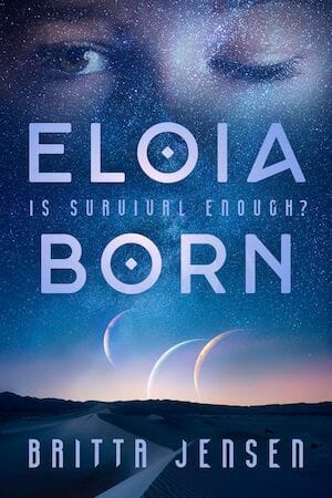
JF: A gorgeous cover that artfully gives us insight into the story within a cool sci-fi look. Complemented by great type choices and the intrigue of the one-eyed woman, and with beautiful textural elements that enhance the design.
e-Book Cover Design Award Winner for January 2019 in Nonfiction
Lynn Michelsohn submitted Young Billy, Old Santa Fe (Billy the Kid in Santa Fe Series, Book One) designed by Lisa Burroughs. “Thank you, in advance, for your consideration and comments.”
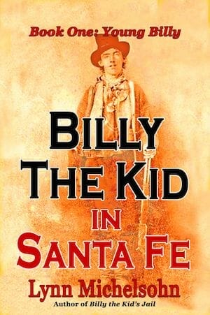
JF: The strong title treatment and colorful background image work together to give this cover excellent impact, especially as a thumbnail.
Fiction Covers
A R Kennedy submitted Saving Ferris designed by Karen Phillips.

JF: Shows that an effective way to use a dog on your cover is to focus on the emotions stimulated by the canine/human interaction.
Alexandra Brandt submitted Along These Lines designed by Alexandra Brandt. “Science fantasy with ley lines, portals, Japan, and interdimensional space travel. I tried to keep the cover a bit simpler than that, but wanted both the sci-fi and fantasy aspects to come through.”

JF: Frenetic energy emphasized by expert type handling.
Alexandra Brandt submitted Friends designed by Alexandra Brandt. “A gritty dystopian/post-apoc short story with a hopeful ending–tricky to try to get both tones across, especially with author branding to consider. Curious if I managed it.”

JF: Relies on a strong focus on the physical environment, and it works because it makes whatever story is happening here paramount in our interest.
Andrea Pearson submitted The Shade Amulet designed by Andrea Pearson. “Font used for the title: bu Oscar Diggs Font used for author and series: Felix Titling Head swap, hair swap, added the necklace. Title was rasterized then set as an overlay. Stock photos from Neostock, Shutterstock, Deposit Photos.”

JF: A nice effort. You might try to differentiate the title color by not making it quite so similar to the gold in the background.
Andrew Leon Hudson submitted Welcome to Pacific City designed by Andrew Leon Hudson.

JF: Lovely artwork, but it looks more appropriate to a print book because of the lack of contrast and impaired legibility at this size.
Aundriel Washington submitted Palera Dawn designed by Shelbi James. “The font’s name is Ruritania. The colors were chosen to show the depiction of the main character’s new world. The dragon is blue because rarely do we see blue dragons. They may have a hint of blue, but not completely. The image also represents two saviors, a human and her mighty beast.”

JF: “Primitive” art can be very effective, but the impact is weakened by the ornate font choice. (“…rarely do we see blue dragons.” Really? What color are the dragons you usually see?)
clyde McCulley submitted Panther Creek Mountain: The Haunted Pond designed by clyde McCulley. “The designer used the silhouette look to capture kid’s attention, and in some ways relate to the Harper Lee “To Kill A Mockingbird” woodcut style of the past, yet colors relate to today’s kids.”

JF: Seems like contradictory goals but the cover illustration is lovely.
Craig Chapman submitted In and for the District of Desire: Short Stories from the Dark Crimes-Of-The-Heart Beat designed by Craig M. Chapman. “Images were licensed through Shutterstock and iStock. Background image is a photo by G.H. Chapman”

JF: Obviously the work of an amateur “cover designer.”
Cristelle Comby submitted Hostile Takeover (Vale Investigation, book 1) designed by Miguel A. Ereza.
")
JF: Expert artwork and typography but that big white background is confusing and seems arbitrary.
Dan Cray submitted Mother Tongue designed by Jeroen Ten Berge. “Jeroen blended two heads to express the notion that multilingual people often feel as if different aspects of their personality become more prevalent depending upon the language they’re speaking. For texture, he added a background grid of ‘Mother Tongue’ in a variety of languages.”

JF: An inventive concept, but perhaps a stronger or brighter title could help balance the overall dark and somewhat gloomy artwork.
Dan Van Oss submitted A Happy Bureaucracy designed by Dan Van Oss.

JF: A mordantly funny cover that hits just the right note for this humorous post-apocalyptic story. ★
Darja DDD submitted Love Me Once More designed by Marushka from Deranged Doctor Design. “Contemporary Romance book cover design, Mystic Point Book 0”

JF: A strong romance series design (see the two following) that relies on expert image compositing, contrasting type fonts, and coordinated color schemes. Interesting how the relationship between the two characters is quite different on this cover, and I do prefer the beautiful green and gold colors here.
Darja DDD submitted Love Me Now designed by Marushka from Deranged Doctor Design. “Contemporary Romance book cover design, Mystic Point Book 1”

Darja DDD submitted Love Me Harder designed by Marushka from Deranged Doctor Design. “Contemporary Romance book cover design, A Mystic Point Novel”

Darja DDD submitted The Secret Apocalypse designed by Milo from Deranged Doctor Design. “Post-Apocalyptic book cover design, A Secret Apocalypse Story, Book 1”

JF: This series uses clean block type and an image with the main character on the cusp of action, highlighted by a flash of light at the center, and turned away from the viewer. On target genre design throughout the series (see the next two).
Darja DDD submitted Extinction Level designed by Milo from Deranged Doctor Design. “Post-Apocalyptic book cover design, A Secret Apocalypse Story, Book 2”

Darja DDD submitted Land of Dust and Bones designed by Milo from Deranged Doctor Design. “Post-Apocalyptic book cover design, A Secret Apocalypse Story, Book 7”

Darja DDD submitted Game of Nations designed by Milo from Deranged Doctor Design. “Mystery, Thriller & Suspense book cover design, A Game of Nations Thriller”

JF: Exactly what we want for a contemporary thriller cover: impact and a sense of the kind of story within.
Dee J Holmes submitted An Inheritance of Curses designed by Deana J Holmes. “I wanted to strike a balance between modern and fantasy elements. To do this, I combined a close-up portrait of my main character with a softer setting and world-specific symbols. I painted first in sepia tones, then layered in colors. I ended up finding the right font in Cenzo Flare.”

JF: Love the style of this illustration, but the title isn’t working so well, its shadow is distracting, and some of the type is disappearing entirely.
Donald Jacobsen submitted Mighty Mommies and Their Amazing Jobs designed by Graham Evans. “The cover for this children’s book was designed to evoke a comic book / superhero feel. Primary colors were selected to make the cover eye-catching to kids and the poses of the diverse characters are intended to imply confidence. MacGuffin font was used because it is dyslexia-friendly.”
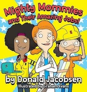
JF: Love the illustration, it really works. For a two-word title, probably better to choose a font that suits the cover, but this one functions okay.
Doug Walsh submitted Tailwinds Past Florence designed by Doug Walsh. “It was important that the book convey a literary feel while maintaining a softer, romantic tone. The bicycle is an important clue to help explain the word “Tailwinds” in the title. The prominence of the color blue plays a large role in the book’s magical elements. The watercolor reveals the setting.”

JF: Both artful and literary.
Gina Smith submitted Plumb Twisted designed by Double J Book Graphics. “A lot of symbolism in PT. Cole is alone-a cancer survivor & distances himself from people. Title: heroine is a plumber’s daughter and a tornado hits the town. The weather is gloomy because of the darker elements of the story-a stalker, kidnapping, a natural disaster that destroys property & lives.”

JF: While this one does its duty as a genre cover, helped by a simple photo and short title, the one below is hard to decipher. Why is a hat so prominent, and why did the designer leave a big empty space right in the middle of the cover?
Gina Smith submitted The Double D Ranch designed by Double J Book Graphics. “The Double D Ranch is a romantic comedy set in Texas. The flowers are bluebonnets the state flower of Texas.”

Grace Blair submitted Einstein’s Compass a YA Time Traveler Adventure designed by 1106 Design. “Symbols on the cover show pyramids for the images of Egypt and Atlantis, the origin of the supernatural compass that directs a dreamy Einstein through time and his discovery. The brown and orange palette give the sense of being lost in the desert and a metaphor for his life’s journey.”

JF: Dramatic lighting, expert image combinations, and pro-level typography make this cover stand out.
Hampton Lamoureux submitted Black Magic’s Prey designed by Hampton Lamoureux. “Kristin came to me with her dark fantasy novel, telling the tale of a young woman plagued by the curse of a Mexican black magic practitioner. The cover design features a portrait of Tess, the victim, with an Aztec rune cast on her face. The powerful antagonist is seen below her, cast in shadow.”

JF: Creepy, scary, menacing, sexy, and darkly attractive, this cover has it all. The “architecture” of the composition helps in the effect by creating a shape the eye naturally follows to highlight the relationship between the heroine and her adversary. ★
Ihor Tureha submitted Rexus designed by MiblArt.

JF: The complete weirdness of this cover looks like its greatest selling point as it highlights a “misunderstood chiropractor turned gamer.”
Jade Kerrion submitted Cursed Tides designed by Rebecca Frank. “This Little Mermaid retelling needed a non-mermaid cover (since it focuses on her evolution as a daughter of air) but still needed strong visual ties to the sea and other mermaid-like elements (e.g., trident, etc).”

JF: Looks like a home run to me. Lots of luscious details, plenty of sea and mystery elements, and a fetching heroine with awesome abs.
James Egan submitted Destroyer of Legends designed by James T. Egan of Bookfly Design.

JF: A strong illustration and hand-tooled type work great except where they overlap, slightly impeding readability.
James Egan submitted The King’s Assassin designed by James T. Egan of Bookfly Design.

JF: The off-kilter composition adds to the tension and drama of this cover, perfectly accessorized by the distressed font.
James Egan submitted The Lost Letter designed by James T. Egan of Bookfly Design.

JF: An exquisite piece of artwork lovingly matched to type allusive of the period, a great cover for this Victorian novel. ★
James Murdo submitted Fractured Carapace designed by James Murdo.

JF: Black and white can provide a lot of drama, and you can see that here, but what are we looking at?
Jasmine Antwoine submitted The Fruits of the Earth designed by Jasmine P. Antwoine. “It is first in a YA fantasy series about a world where children are nothing but commodities.”

Jeff Bolinger submitted Sea Raiders designed by Jeff Bolinger. “Illustrated by Omar Aranda. I wanted to create a sense of tension and danger for the cover of this children’s Middle Grade book- the third in a trilogy.”

JF: Good style, interesting “wavy” treatment for the title. The only problem I have with this cover is that the bottom is so murky the characters are hard to make out, and that’s where the interest is.
Jemma Hatt submitted The Adventurers and The Cursed Castle designed by Andrew Smith.

JF: Lots of style here too, between the illustration and all the customization of the title/logo. Oddly, although the figures are intended to be running, they look quite static. Love the dog, though.
JJ Johnson Johnson submitted Army of the Dog designed by Woody Myers. “In order to capture the look of the dog in “hunting” mode, we took hundreds of pictures while hiking the Rocky Mountains of Northern Colorado. Of these hundreds of images, two rose to the top of this magnificent Foxhound that is an integral part of the book.”

JF: It’s a great photo, and it is attention-getting. Not sure, however, if this is really the best representation of what appears to be a modern action novel based on ancient Greek philosophy.
John Foley submitted Begotten Not Made designed by John Foley. “Font is Tala by John Harrington, Shandon type”

JF: Charming and clever cover for a modern “fairy tale.”
Jonathan LaPoma submitted Hammond designed by Jonathan LaPoma. “In the beginning and end of the novel, the protagonist is lying on a basketball court and staring up at a hoop with a rim that’s so gray, it’s fading into the thick clouds above. The white in the image captures the bleakness of winter in Buffalo, NY where the story is set.”

JF: I remember that snow very well from a few years I spent in Buffalo. The unusual perspective on the basketball hoop directs our attention right to the title.
Joseph Melesh submitted White or Black … Grey designed by Eight Little Pages. “A Psychological Thriller, that follows our Protagonist, a troubled teenage girl and her chance encounter with an opportunistic predator. The shipping containers with doors open as she walks into the unknown. A dark story, a flash of red on the cover a subtle hint of impending danger.”

JF: A good story-based design that invites us to follow the heroine into a dangerous spot.
K.M. Weiland submitted Wayfarer designed by Damonza.

JF: An artful design with implications of magic, but I don’t care for the way the top image is so divorced from the bottom one, which seems to contain almost no content at all. Why is it even there?
Katharine Wibell submitted Crocotta’s Hackles designed by Olivia Pro Design. “Crocotta’s Hackles is the third book of The Incarn Saga, a New Adult series, that deals with a race of shapeshifters during a time of war for their kingdom.”

JF: An arresting image and carefully controlled colors help make an impact.
L.J. Engelmeier submitted A Shard of Sea & Bone designed by L.J. Engelmeier. “I wanted a design with a strong central image (in this case, my character Saedra) and a design that reflected the watery/somber atmosphere that crops up in the book.”

JF: It does the job, and I say that despite whatever it is that’s on the girl’s head, and the “fire” circle has not been very well integrated with the rest of the cover.
Lark Barlow submitted Nina: The Livingston Estate designed by Lark Barlow. “Cover is an image detailed in the mystery.”

JF: A very common type of solution to the problem of design from a non-designer. Does not compare well to most of the other books in this collection.
Laurie Loveman submitted The Farm Fires designed by Ben Bolt.

JF: An interesting image just crying out for a decent type treatment.
Laurie Loveman submitted The Quarry designed by Ben Bolt.

JF: Awkward.
Laurie Price submitted The Mask of Midnight designed by Scott Templeton. “The killer in this story has a background in theater so the stage set for murder. The tragedy mask appears alone because this is no comedy. The smoky beam of light warns us that something sinister behind the richness of the curtain is about to be revealed.”

JF: Questionable font choices; hard to read dark red type on a black background; too many unconnected images to make a unified message.
Lesli Richardson submitted The Great Turning designed by Lesli Richardson. “I love old sci-fi (Bradbury, etc.) and looked to vintage books in that genre for the feel I wanted to evoke.”

JF: Well put together and with a great font choice for the title, but I’m not sure this landscape really says “sci-fi” or “post apocalyptic”.
Leslie Manning submitted i am Elephant, i am Butterfly designed by Jay Kenton Manning. “YA contemporary. I purchased the photo on Shutterstock and cropped the model’s face. The designer used a cursive script to represent the feminine handwriting found in the diary. It was not until right before the book went live that I realized those are butterflies on her shirt. Nice coincidence.”

JF: Looks just right for the intended audience.
Lisa Reads submitted Bad Dad designed by BTP Designs. “I am super proud of this cover. The color scheme fit the almost dystopian fighting world that the love story takes place in. I used the sepia stained filter and grained it up a bit to give it some visual texture.”

Lyss Em submitted Making It Better designed by Lyss Em.

JF: An affecting cover using a sensitive black and white image for this gay BDSM romance.
Marian Blue submitted Quantum Consequences designed by painting: Dean Gibson Design: Marian Blue. “The cover painting was original artwork by Dean Gibson.”

JF: The unmistakable “self-published” look.
Mark Williams submitted Joe Phenix, The Bat of the Battery designed by John Coulthart.

JF: These series (see two following) are a great solution to how to stand out. These historical mysteries have been given a design that alludes to the “steampunk” era and the unique design really sets all these covers apart while instantly alerting fans that they are related stories.
Mark Williams submitted The Frisco Detective designed by John Coulthart.

Mark Williams submitted Daring Desmond, The Elevated Railroad Detective designed by John Coulthart.

Masha du Toit submitted The Strange designed by Masha du Toit. “Fonts: Alte Haas Grotesk and Arvo. The book deals with biological warfare and genetic manipulation. The textures are cross-sections of a human lung as well as various types of bacteria.”

JF: A bit creepy, which gives it interest, and the background is used quite effectively.
Mike Crowl submitted Grimhilda! – a fantasy for children, and their parents designed by Mike Crowl.

JF: Seems like a good font choice for the title, but the entire cover comes across as a bit … grim. Not sure that’s right for a children’s story.
Phillip McCollum submitted Fantastic Shorts: Volume One designed by Phillip McCollum. “This collection of 26 short stories covers a multitude of genres, but all of the stories contain elements of fantasy or science fiction. Each tag pasted onto one of the stacked books highlights a key element from one of the stories.”

JF: A good concept, but it looks like it would take more design skill to carry it off.
Rachel Sawden submitted Runaways designed by Caroline Teagle Johnson. “The protagonist is an aspiring travel photographer so it was vital that the cover’s aesthetics reflected that. I wanted vivid colours, a youthful feel, and tropical vibe. It had to look like an adventure. I’m in love with the work that my designer produced and would love for more people to see it!”

JF: Well, lots of people will see it here. It has the “island” colors and vibe, but the type seems underwhelming, sometimes to the point of irrelevance.
Rena Hoberman submitted Half Cut designed by Rena Hoberman of Cover Quill.

JF: Cool and stylish.
Rena Hoberman submitted Some Can See designed by Rena Hoberman of Cover Quill.

JF: An expert combination of images that’s evocative of the atmosphere of this gothic novel, with beautiful textures and lots of appeal. ★
Sarah Begg submitted Laura the Explorer designed by Hazel Lam.

JF: The cut-paper art is fanciful and attractive; I wish the title was a bit stronger.
Shaul Behr submitted Ari Barak and the Free-Will Paradox designed by Carlo Marco Alfonso. “Kanisah font is designed to look similar to Hebrew lettering”

JF: Yes, the font is just right! These guys mean business! Lots of action! People running!!
Sheryl Beaumont submitted The Carlswick Mythology designed by Jessica Bell. “The moody sky on the cover reflects the overall mystery genre and the image is a reference to both the mythology / archaeology themes and to one of the key locations in the book. The use of the curly font on the word Carlswick is a nod to the romance elements in the story.”

JF: Strong photo, although the tilted image doesn’t match too well with the classical and symmetrically aligned type. And the title word “Carlswick” has been so overworked with effects and shadows it’s almost unreadable. Just a few adjustments would make this a really good cover.
Theresa Read submitted Ranger Nader & The Sunstruck Phantom designed by Kam Karem. “The cover image depicts Ranger and his sister Milly eclipsing the sun, symbolic for their triumph over Gilgamesh, a sun-god.”

JF: I like the energy and intensity of the design and colors, but I’m not sure the silhouettes work very well, they seem unfinished.
Nonfiction Covers
April Chapman submitted An Extreme God for An Extreme Life designed by April Chapman. “I found this picture online and was able to track it down to a photographer in Greece, Voula Vatsinea, and license it for use. I then added in the light from the clouds and used pink for the font because the book is written for women, and wanted to convey that clearly.”

JF: Nice photo, but I don’t think these elements come together well.
Fiona Brichaut submitted Writing for Mobile designed by Fiona Brichaut.

JF: A good nonfiction cover that’s clear, to the point, and lets us know in both words and images what the book is about. ★
James F. Brown submitted The Men’s Attire Answer Book designed by James F. Brown. “This book was created entirely by me: content, cover, and blurbs. The front cover photos are me, taken by a photographer friend. I used PhotoShop to tweak these photos and create the front and rear covers and spine. My goal was to show the book’s subject and make a legible thumbnail cover image.”

JF: Hey, you could have taken the photos too! A good example of why we need cover designers if we want to produce covers for our books that measure up to the content. This one falls far short of the mark in both concept and execution.
MARION W OMALLEY submitted Shopping With Mama: Write ‘Til the End designed by Juanita Wrenn.

JF: Not sure I ‘get’ the title, but a good job of stitching together these images to create a cover that gets its message across.
Renata Lanzoni submitted Shattered Moon designed by Renata Lanzoni. “The image is of the place the book is set in and the eye conveys the theme of the story, which is horror and fear. This is also conveyed by the red color palette chosen.”

JF: Looks a lot more like a novel, and that disembodied eye is creepy.
Robert J Power submitted The Little book of Lies designed by Les at Germancreative. “The Little Book of Lies is a humour book filled with fictitious, yet genuine sounding, facts to fool your friends with. Les did great work making my pocket-sized illustrated companion book look bright and fun. I couldn’t be happier with it.”

JF: Clean, simple, and effective.
Simeon Davis submitted The Bhagavad Gita for Awakening: A Practical Commentary for Leading a Successful Spiritual Life designed by Brother Simeon Davis. “The cover art shows Krishna and Arjuna, the main figures of the Bhagavad Gita, the epic classic of Indian religion. I aimed for simplicity, trying to make the type simple yet distinctive and readable, and letting the image carry the cover.”

JF: The illustration is used well, although it might have been interesting to zoom in more on the two figures and the ornate workmanship of the carriage.
Well, that’s it for this month. I hope you found it interesting, and that you’ll share with other people interested in self-publishing.
Use the share buttons below to Tweet it, Share it on Facebook, Link to it!
Our next awards post will be on March 31, 2019. Deadline for submissions will be February 28, 2019. Don’t miss it! Here are all the links you’ll need:
- The original announcement post
- E-book Cover Design Awards web page
- Click here to submit your e-book cover (See New Submission limits)
- Follow @JFBookman on Twitter for news about the E-book Cover Design Awards
- Check out past e-Book Cover Design award winners on Pinterest
- Subscribe to The Book Designer Blog
- Badge design by Derek Murphy
