Welcome to the e-Book Cover Design Awards. This edition is for submissions during August, 2017.
This month we received:
72 covers in the Fiction category
15 covers in the Nonfiction category
Guest Judge
 I’m very pleased to welcome Jeniffer Thompson to The Book Designer as a guest judge this month. Jeniffer is a personal branding expert and Internet Marketing strategist. She is the Founder and Principal at Monkey C Media, an award-winning design firm specializing in book packaging, author websites, and Internet marketing strategy. She is an author and speaker, and serves on the board of Publishers and Writers of San Diego and San Diego Memoir Writer’s Association. With more than 20 years experience in publishing and marketing Jeniffer is passionate about helping authors navigate their publishing journey, elevate their brand and establish their author platform.
Read her marketing blog at JenifferThompson.com; visit her company website at monkeyCmedia.com.
Comments, Award Winners, and Gold Stars
I’ve added comments (JT: ) to many of the entries, but not all. Remember that the aim of these posts is educational, and by submitting you are inviting comments, commendations, and constructive criticism.
Thanks to everyone who participated. I hope you enjoy these as much as I did. Please leave a comment to let me know which are your favorites or, if you disagree, let me know why.
Although there is only winner in each category, other covers that were considered for the award or which stood out in some exemplary way, are indicated with a gold star: ★
Award winners and Gold-Starred covers also win the right to display our badges on their websites, so don’t forget to get your badge to get a little more attention for the work you’ve put into your book.
Also please note that we are now linking winning covers to their sales page on Amazon or Smashwords.
Now, without any further ado, here are the winners of this month’s e-Book Cover Design Awards.
e-Book Cover Design Award Winner for August 2017 in Fiction
Satin Russell submitted Secret Need designed by Chrissy at Damonza. “This is the second book in a series and I wanted to make sure it kept the same overall look and feel of my first book, Secret Hunger. I love how it turned out! Chrissy at Damonza was wonderful to work with.”


JT: Stunning. When placed alongside other covers, it stands off well and grabs your attention.
e-Book Cover Design Award Winner for August 2017 in Nonfiction
Ruth Schwartz submitted The Guilt Trap and Other Tales of Psychotherapy designed by Ruth Schwartz. “The original concept with just the sofa as the only graphic actually came from the author. I searched for just the right sofa and of course did the typography.”


JT: Strong cover with a Malcolm Gladwell feel. Simple visual works well. Title stands out. Fits squarely in the genre. I’d like to see a different typeface for the author name.
Fiction Covers
Alexandra Rivers submitted Tightrope designed by InkblotImages. “Set in Spain after the civil war and during WWII the cover hints the era (stamps), the place (Arch of Triumph in Barcelona, the red of the flag) and genre (romance). Letters are just one more element of the story in this historical novel.”
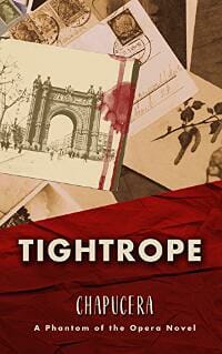
JT: I like the colors and the feeling that the postcards convey combined with the red. It appears that the designer was going for a sense of romance, however, the typeface does not match that tone, it feels disconnected from the overall feeling. I would have preferred a serif. The typeface used for the author name is awkward.
Allison Garcia submitted Vivir el Dream designed by Allison K. Garcia. “My husband, Julio Cesar García de Alba, painted the picture for the cover, and I scanned it onto the computer and designed everything on Canva.”

JT: The title is pretty small, but I like the placement and the way it stands out against the cityscape. I think I get the foreground scene, but I’m not sure it works – it feels dated and muddy.
Amie Irene Winters submitted Strange Luck designed by WATCH THIS! (Humbert Glaffo). “Thank you!”

JT: I like the overall feeling of this cover. Good typeface and visuals.
Amie Irene Winters submitted The Nightmare Birds designed by WATCH THIS! (Humbert Glaffo). “Thanks!”

JT: Nice use of color, fits squarely in the genre.
Angelina Kalahari submitted Under A Namibian Sky designed by Sharon Brownlie. “The couple looks exactly like my characters – athletic and strong. They’re in silhouette as there is no light source in this real night sky picture over the Namib Desert. The purple tint hints at the spirituality behind the fact that they’re soul mates. The elephants are significant in the story.”

JT: Poor use of typeface, I’d like to see something more visually appealing. Missed opportunities here. Lot’s of dead space in the center of this book, which is your prime real estate.
Ann Creel submitted The Uncertain Season designed by Rachel Adam Rogers. “I think it’s beautiful, especially the color palette. The background image is from the waters of Galveston, and the staining at the top of the cover is unique, I think.”

JT: Visually appealing, interesting visuals. I’d like to see a more fitting typeface, though this choice reads well as an eBook.
Anne Mercier submitted Kadence designed by Sara Eirew.

JT: Works well for its genre, good colors, interesting type.
Anthony R Howard submitted Devil’s Diary: The Coming designed by Black Fox Imprint.
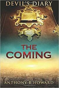
JT: “Devil’s Diary” type sits too close to the top of the book and is disconnected from the rest of the title, making it appear to have two competing titles. Similar typeface choices would have helped with this. Nice colors.
Arizona Tape submitted Awakening designed by Arizona Tape.

JT: I’d like to see the series type in a completely different typeface and perhaps smaller so that it doesn’t compete with the actual book title. I can’t tell if this book is called “My Winter Wolf,” or “Awakening.” Remember that at this small size, people will not be able to read the smaller type. Nice visuals.
Arjay Lewis submitted The Muse designed by Marianne Nowicki. “This design was for a horror novel where an ancient parasite actually makes you a better writer, while pushing you towards violence. The idea of the Grim Reaper at a laptop and the amazing dark colors really work to suggest the aspects of the story.”

JT: I’m not getting feeling of terror. The type is interesting, but the visual is boring.
brett diffley submitted Black Dawn designed by Ani. “This is the fourth book in the series, and my favorite cover yet. An assassin…a gun…a locket…and old grave stones, which are all key to the story.”

JT: I would have preferred some color to create intensity. I get what you were going for, but it’s lacking something as a black and white cover. It will get lost in the mix.
Brhi Stokes submitted CALIGATION designed by Brhi Stokes. “I originally had a very different cover but when I was re-designing my website I realised how much better that style looked. I re-worked the cover into what you see now and I’m quite pleased with how it turned out.”

JT: I like the feel of this cover, a little more color in the city scene might have helped draw attention to this cover in general. The skyline is great. The typeface gives it a sense of mystery, but I might have tried to stack the word in two or three lines, just to make the type larger and to give it more presence, it gets a little lost.
Christopher Hart submitted Molly and Corry: Boot up! designed by C. Hart. “Main illustrations produced by Scott Leyland, freehand scans and digital colouring. Composition and editing performed by Chris Hart”

JT: This cover fits squarely in the genre, but feels a little dated.
Cynthia VanRooy submitted Cinderella and the Major designed by Dar Albert. “This is a contemporary romance about a computer geek and a wounded warrior Marine Corps officer.”

JT: This cover is bottom heavy and messy with so many competing type styles.
Dan Van Oss submitted Dracula’s Demeter designed by Dan Van Oss.

JT: Nice blend of visuals. Feels earie and scary like you would expect from a Dracula title – nice touch with the splash of red.
Dan Van Oss submitted The Joker designed by Dan Van Oss.

JT: Nice blend of visuals and use of color (feels cold and sci-fi). Good choice of typeface for the title – creates the right feeling and tone, and places it squarely in its genre.
Dan Van Oss submitted Behind the Iron Curtain designed by Dan Van Oss.

JT: Well done. Great colors, nice choice of typeface. I might have moved the title up slightly. ★
Dan Van Oss submitted The Stones of Earth and Air designed by Dan Van Oss.

JT: Title type is well-done and easy to read. The visuals get a little lost as a whole, but I think it works well for the genre.
Darja DDD submitted Regret designed by Marushka. “Romantic Suspense cover design by Marushka from Deranged Doctor Design. Shattered Secrets Book 1.”

JT: Works well for the genre – the type chosen for the author’s name feels out of place and is not fitting with the overall tone. Clever use of red to add color and tie the series together.
Darja DDD submitted Torment designed by Marushka. “Romantic Suspense cover design by Marushka from Deranged Doctor Design. Shattered Secrets Book 2.”

Darja DDD submitted Bonded In Blood designed by Milo. “Fantasy cover design by Milo from Deranged Doctor Design.”

JT: Great cover. Nice balance and strong visuals. Colors stand out. ★
Darja DDD submitted A Sticky Inheritance designed by Kitten. “Cozy Mystery, Thriller & Suspense cover design by Kitten, Deranged Doctor Design”

JT: Successful series design, successful typeface. The pill bottle isn’t very appealing visually and is a stark contrast to the leather-bound frame and the title itself. Odd visual choice.
Darja DDD submitted Bushwhacked: Maple Syrup Mysteries Book 2 designed by Kitten. “Cozy Mystery, Thriller & Suspense cover design by Kitten from Deranged Doctor Design. Maple Syrup Mysteries, Book 2.”

Darja DDD submitted Almost Sleighed (Maple Syrup Mysteries Book 3) designed by Kitten. “Cozy Mystery, Thriller & Suspense cover design by Kitten from Deranged Doctor Design. Maple Syrup Mysteries, Book 3.”

JT: Odd choice of visuals: feels cheesy with the horseshoe and money stack.
Darja DDD submitted The Genesis Conspiracy designed by Milo. “Alternative History cover design by Milo from Deranged Doctor Design.”

JT: Successful cover. Nice use of colors and visuals, places you in the moment. Great type treatment and use of DNA symbol in place of the I. Author name stands out but doesn’t compete with the title. Well done. ★
Darja DDD submitted Operation Mobius designed by Milo. “Science Fiction cover design by Milo from Deranged Doctor Design. Chronicles of Rah.”

JT: Nice colors. Fits well in the genre. Not sure the horizontal lines are needed as they are kind of distracting.
Darja DDD submitted CROWN OF ICE designed by Milo. “Fantasy cover design by Milo from Deranged Doctor Design. The mirror of immortality, Book One.”
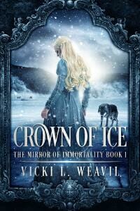
JT: Well done. Colors and visuals work well to create the feeling. This cover might be stronger without the frame, but I get that you are tying in the series.
Darja DDD submitted SCEPTER OF FIRE designed by Milo. “Fantasy cover design by Milo from Deranged Doctor Design. The mirror of immortality, Book Two.”

JT: Nice visuals. Good use of color.
David Kennedy submitted Costa Brava designed by Paul Modet. “The book is a thriller involving murder, cliff-top action, pretty girls and all set on the wild mediterranean coast”

JT: This cover could have been executed more successfully. The placement and type used for author name feels unfinished. The title sits too low on this cover creating a bottom-heavy feeling and leaving too much sky. Poor use of real estate. It’s not quite there yet.
Deb Pines submitted Beside Still Waters: A Chautauqua Murder Mystery designed by Paul Riney. “Murder centers on Chautauqua Lake, in western New York State, and its docks.”

JT: I’m conflicted with regard to this cover. I can appreciate the feeling of simple imagery and text, but it feels somehow unfinished and dated. The type treatments (all uppercase letters are too similar and the author name competes with the title. This does not fit in its genre – I would have guessed this to be a poetry or literary fiction title, but certainly not a murder mystery.
Divine Michelle submitted Making Bad Choices designed by Yonderworldly Design.

JT: ★
Emmy Wu submitted A Broken Peace designed by Deranged Doctor Design.

JT: Successful cover. Nice choice of visuals, color and type. Showing only the lower half of the face was a nice choice.
Jade Zivanovic submitted #YOLO designed by Steam Power Studios.
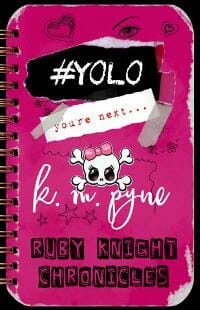
JT: Lots of competing visuals that make it difficult to know where to look first. This cover fails to lead the readers eye and instead creates a feeling of chaos. Too many type faces and treatments and I’m not sure what the title is, let alone who the author is. I like the colors and the concept, I think some small changes could make this a great cover that fits squarely in the genre.
James Egan submitted Hunter of Legends designed by James T. Egan of Bookfly Design.
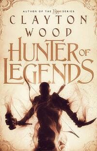
JT: Works. Nice type treatment for title, but I’d like to see something that complements the title for author name, as opposed to competing with it. Great visual for the character charging forth with mystical essence.
James Egan submitted Center Stage designed by James T. Egan of Bookfly Design.

JT: Nice cover. I like the placement of the title, and colors, but the series element and vertical line of yellow doesn’t fit exactly, feels like romance and mystery competing.
James Egan submitted The Skeleton Key designed by James T. Egan of Bookfly Design.

JT: Great color contrast. Great choice of typeface for title and author name. I like the use of visuals as a frame and the mystical, exotic feeling it creates.
Jean Hoefling submitted Gold in Havilah: A Novel of Cain’s Wife designed by Lane Brown. “Lane captured perfectly the ethereal quality I wanted for this ancient world novel. My lead character is a child of Paleolithic Adam and Eve, yet her appearance is contemporary enough to draw a reader into her aura and make one believe that she is like all of us, which is the point of my story.”

JT: Dated. Too much of the same font.
Jeremy Thomas Fox submitted Crossover: Book two of the Bureau 7 thriller series designed by fourteenfortymedia.

JT: Good use of typeface for title. Colors stand out well.
John Doyle submitted The Healer’s Curse designed by Alisha Moore. “Many thanks to Alisha at Damonza.com for crafting this eye-catching cover! My main character, Alex, reaches out directly to the reader. The palm is divided into quadrants, symbolizing the injuries (red) and diseases (green) he removes and the healing (blue) and restoration of cells (white) he gives.”

JT: Feels self-published. The Photoshop work feels unpolished, like a first-draft concept. Author name competes with title. I’d like to see more of the colors come off the hand (similar to the green, which has a nice mystical feeling).
Josip Romac submitted Love Sprung From Hate designed by Romacdesigns.

JT: Author name competes with title. I’m not sure the visuals work with the title, but it plays well within the series. I like the upside-down city.
Kate Jonuska submitted Transference designed by Timm Bryson. “I wanted a design reminiscent of vintage comic books for this cover since the story involves superpowers and makes references to 1960s comics. For the art, I contacted the cartoonist I worked with on my HS newspaper, who was always so talented and still is. The result is exactly what I had in mind.”

JT: A play on Lichtenstein, which I like, I think this creates a sense of snarky, anything can happen, tongue in cheek fiction. If that is the case, then this is a successful cover. Even so, the design feels slightly dated.
Kent Gaskill submitted The Devil’s Backbone designed by L. Kent Gaskill. “Thanks!!”

JT: I’d like to see a subtler font for the author name.
Lea Schizas submitted The Darker The Night designed by Eerilyfair Design. “The designer captured the essence of my emotionally torn Lost Angel, Chase James, and the world he feels will eventually drown him out.”

JT: Nice photo composite, fits well within the genre. I’d like to see the title lower on the cover. Maybe swapping the title with the author name and series info so that the title takes center stage.
Lira Brannon submitted A Different kind of Black Belt designed by Steven Novak. “This is the second in my para-athlete series. It is Christian YA dealing with suicide, self harm, bullying, racism, and ultimately, triumph.”

JT: I’d like to see a splash of color. Title needs to move up a bit, however, it does feel like it’s slipping off the bottom of the cover, which might be the intent. Nice choice of type.
Lou Harper submitted Deadly Revelations designed by Lou Harper. “Deadly Revelations is a collection of mystery/thriller short stories. My goal was to convey the theme of crime and passion in an understated fashion.”

JT: Good cover. Fits squarely in genre. Like the smoke hovering around the rose – nice touch.
LyLena Estabine submitted On the Bridge designed by LyLena D. Estabine. “I took one of the free photos on Canva and gave it a blue filter to match the tone of the book. The word “Bridge” is central because it’s the main word in the title and central to the book’s theme. The other words are right aligned so they can fit into “Bridge” and create the feel of one unit.”

JT: Good cover. Nice typeface and placement.
Marlow Kelly submitted Sun Storm designed by Melody Simmons.
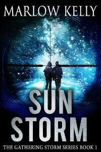
JT: Works well for genre. Nice large type for title.
Matthew Jones submitted Year of the Brute designed by Sam Bridge.

JT: Interesting choice of color, it certainly contrasts with the title. I like the collage of ghoulish faces, which create a sense of chaos. The title typeface feels collegiate. Combined, these elements create a fairly disjointed visual effect. I’d like to see more color, a more interesting typeface, and a better sense of the genre.
Meg Anne submitted Mother of Shadows designed by Lori Follett.
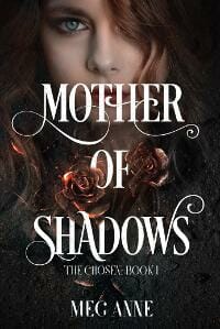
JT: Arresting imagery and interesting typeface, feels like romance meets mystery.
Melissa French submitted Lasagna and Successes designed by Melissa French. “Domestic suspense is a hard genre to pin down. The yellow potholder was chosen to try to bring out the quirk in the writing, with grunge layers added to give it more of a suspense feel.”

JT: The typeface is amateur and needs a lot of work, both kerning and leading. The image has potential, but the title treatment kills it.
Michael Garvin submitted Aunt Sookie & Me designed by Michael Scott Garvin. “This book cover was created with the hopes of portraying the mischevious, craziness, and Southern aspects of the book. The goat plays a small role in the novel, however a memorable one.”
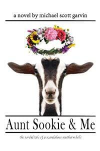
JT: Author name should stand alone (without by), “a novel” should be on a separate line. Horizontal lines of text as well as lines breakup and distract from the otherwise simple elements. This cover has a lot of potential but needs some polishing.
MJ Greenan submitted Sins of Omission designed by Naomi Taylor. “I would like to thank Naomi for creating this magnificent cover design for me.”

JT: Poorly executed photo composite. Looks amateur. Everything seems to be competing for attention.
murray leffers submitted He Dreams: The Wayland Proposal designed by Murray Jones Leffers. “The novel He Dreams: The Wayland Proposal is my debut. It is designed by me as well. The cover image is a painting I did in 2001. All art and design is my work”

JT: Dated typeface and overall look.
Nandita Godbole submitted Not For You: Family Narratives of Denial & Comfort Foods (Book One) designed by Nandita Godbole. “The colors red and yellow are symbolic in Indian culture, representing balance & the essence of Life. They also represent unchallenged frontiers that challenge the identity of a woman. Does the definition of womanhood change? The book is about all of these issues through a fiction-cookbook hybrid.”
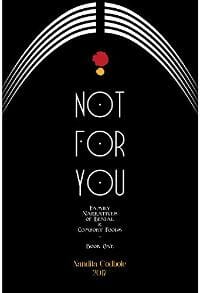
JT: Would have liked to see a stronger typeface with more presence.
Natli VanDerWerken submitted Red Dragon’s Keep designed by Natli VanDerWerken. “I started this design in MS Publisher and Inkscape, then transitioned to Affinity Photo after much research into anything but Photoshop. It took about 60 hours and 16 designs before I got what I wanted. I used free jpegs and vectors where possible. The dragon manipulation took the most time.”

JT: Amateur type and visually flat. Has potential.
Rachelle Shaw submitted The Eyes That Moved designed by Rachelle M. N. Shaw.

JT: The doll works well to create a creepy feeling, but the green falls flat and makes it look cheap (feels like a 1970s C-rated movie poster). I would make the title larger and moved up slightly (it’s squished into a small space). Like the type treatment.
Rebecca Lemke submitted The Shadow Queen designed by Lauren at The Cover Collection. “The cover is a scene from inside the book where the Queen’s curse is lifted.”
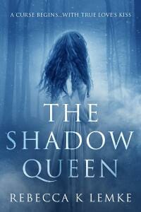
JT: Very nice cover. Good use of type and visuals. A little red might have been nice. ★
Robert Christman submitted Like a Witch’s Brew designed by Robert Christman / Todd Engel. “I provided the licensed images from various websites to design the front, back, and spine of my novel. A template of the design was given to my publisher. Todd Engel put together the design file. I wanted a simple representation of what the story was about and believe I accomplished this.”

JT: Unsuccessful cover. Looks amateur. Poor choice of typeface and treatment. Visuals are poorly composited. Title is too small. I like the look of the trees very much, this could be great with some professional help.
Rory Warwick submitted The Dial: A collection of science fiction short stories designed by Rory Warwick. “I wanted this collection of science fiction short stories to have a retro feel reminiscent of the pulp era of the 50’s and 60’s. I toyed around with the image and colour based on the theme of the many worlds theory. I’m pretty pleased with the results.”

JT: Dated.
Sally Turner submitted The Arcane Heir designed by Beti Bup from The Book Cover Designer. “The cover represents one of the main characters and the abilities she possesses. The blue, yellow, red and orange colors embody the powers the character has. I felt that the cover gave insight to the story without giving too much away.”

JT: Very nice composite, great colors. Ok typeface, works for this genre. I would play with making the title slightly larger and move it up a tad.
Sanja Gombar submitted Monsters Behind the Gates designed by Sanja Gombar.

JT: Nice foreground lighting and visuals. I’d remove the human shadow image in the background as it doesn’t add much and distracts from an otherwise clean cover.
Scott Rezer submitted Love Remembreth Not: A Novel of the Civil War designed by Author. “For the second book of this series, I wanted a cover that helped brand the series, drawing once more upon images that captured the spirit of the story and its characters, a Confederate soldier and the woman he loved. Hopefully, the cover accomplishes that goal.”

JT: Too many competing elements and styles. Not a successful cover.
Sienna Blake submitted The Scent of Roses (Dark Romeo 2) designed by Romacdesigns. “Book 2 of a Romeo & Juliet retelling romantic suspense trilogy.”

JT: Well done. Visually appealing. Feels romantic and seductive.
Sienna Blake submitted Hanging in the Stars (Dark Romeo 3) designed by Romacdesigns. “Book 3 of a Romeo & Juliet retelling romantic suspense trilogy.”

Skye MacKinnon submitted Call of Winter designed by Arizona Tape.

JT: Fine cover. Typefaces could be mixed a little to create less monotony.
Susan Holt submitted Catching the Last Tram designed by Tessa Baty.

JT: Well done. Very successful cover. ★
Tara Botel Doherty submitted Bread for the Table designed by Simon Avery. “The lotus image is symbolic in the story because the main character loses a sister at the lotus filled lake of Echo Park in Los Angeles. “Despite being born to dark, murky conditions, where hope for such beautiful life seems dubious, the lotus grows, and rises above adversity.”

JT: Well done. Very successful cover. ★
terri bertha submitted Spooky Twisties I designed by Charlotte Volnek.

JT: Too much of the typeface happening. Something simpler for sub-title and author name would help as well as highlight the title effectively, which is a great choice of typeface and matches the tone of the cover.
Will Overby submitted Murder at the Old Fox Inn designed by Will Overby. “I incorporated four pieces of stock artwork into this cover – the signpost, the fox painting, the house, and the sky background. I used several filter effects on the house and sky photos to give it the illusion of a painting, taking as my inspiration the paperback gothic mysteries of the 1960s.”

JT: I like the sign, and the fox, and the background a lot, but the typeface chosen for the author name competes and makes it seem amateur.
Windsor Queensborough submitted Free: My Abuse Is Over designed by Windsor Queensborough. “A collection of stories submitted under Christian Fiction connected by the subject of domestic violence and abuse. Main photo bought from Shutterstock with a blue filter added. Bottom picture is of my home city taken by a friend.”

JT: Looks too much like non-fiction. I would change the title and choose a different typeface. The reading line: “When it’s time…” belongs in the description (or on the back of a print book).
Windsor Queensborough submitted Why God? A Dream A Fantasy A Nightmare designed by Windsor Queensborough. “A story taken from my collection of Christian Fiction stories, Free: My Abuse Is Over. No changes made to photo from Shutterstock apart from cropping the image.”

JT: Visuals do not match title; feels like non-fiction. Poor choice of everything.
Nonfiction Covers
Cathy Turney submitted Get 10,000+ Twitter Followers – Easily, Quickly, Ethically designed by Killer Covers.

JT: Works fine for the genre. Feels dated. ★
D. Provance submitted Meet Odie designed by A. J. Stawarz. “This is a case where the covers for the e-book (Amazon only) and print (many sources) are the same. Ms. Stawarz designed the book to be fine for print and digital. Photo is mine. The round author box is also used for captions throughout the book.”

JT: No need to use “By” before author name. Typeface is amateur. Too much yellow.
Darja DDD submitted Voiceless Customer designed by Kitten from Deranged Doctor Design.

JT: Unappealing visuals and colors. Too much of same typeface.
Dionnea Seals submitted I AM: Discovering God When Life Doesn’t Go As Planned designed by Dionnea Seals (Gabuchi Publishing House). “The color purple is symbolic for royalty in God. In Christianity, God is known to be the King of Kings. In addition, this single flower -specifically the petals represents characteristics of God. I believe that God is like a beautiful flower, in which we would never come to the end of His attributes”

JT: Main title feels undone, as if placed temporarily and then forgotten. A thicker, maybe serif typeface would help. Has two subtitles; pick one so that you do not have so much competing text. Love the flower. With work, this could be great.
Ian Anderson submitted How to be Handy [hairy bottom not required] designed by Ian Anderson. “Made in getpaint.net. Aim: simple and bold. I used Montserrat from Google and The Architects Daughter, with Downcome for the ‘stamp’ (fontsquirrel). The design wraps around the whole cover for the physical book, a quirk lost on the Ebook cover obviously. The ‘use me’ was already on the tape measure!”
![How to be Handy [hairy bottom not required] How to be Handy [hairy bottom not required]](https://www.thebookdesigner.com/wp-content/uploads/2017/09/How-to-be-Handy.jpg)
JT: Well-done. Works well for genre. ★
Jan Sikes submitted Discovery Poetry and Art by Rick and Jan Sikes designed by Donna Osborn Clark. “The beauty of this cover is that Donna took original artwork from Rick Sikes (who passed away in 2009) and used it to design the cover. This added meaning to the book.”

JT: Amateur in every way. Too many visuals. Poor use of type. Colors don’t work.
Jimmy Tomczak submitted Lakeside and Tide designed by Jimmy Tomczak.

JT: I was drawn to the simplicity of this cover. However, this design looks like it belongs in the fiction category, not non-fiction. It’s important that a cover fit squarely within its genre.
Linda Hoopes submitted Prosilience: Building Your Resilience for a Turbulent World designed by Linda L. Hoopes. “This book provides guidance on proactively building your ability to deal with life’s challenges (proactive + resilience = prosilience). We chose the cover picture to capture the sense of facing turbulence with ease and confidence.”

JT: Amateur. A professional designer could take these same elements and build a successful cover.
Mansfield Mukuchamano submitted World War You – How To Overcome Yourself designed by Freda Jaya. “The book is about how we can use the analogies of war to better our own lives, and i believe the cover depicts that.”

JT: Looks like a fantastic fiction title. Does not fit the genre.
Michelle Thielen submitted Stretching Your Faith designed by Michelle Thielen. “Stretching Your Faith is an exploration of internal and external stretching; relatively and figuratively.”

JT: ★
Nicol Nixon Auguste submitted Rome’s Female Saints: A Poetic Pilgrimage to the Eternal City designed by Nicol Nixon Auguste. “Ciao! Thank you for taking the time to review my cover for the e-Book Cover Design Awards. The statue represents Saint Francesca, the Patron Saint of Rome (also included in the book). The photo was taken at Santa Maria Nova in Rome, Italy, in 2016. Have a pleasant day! Best, Nicol”

JT: Strong visuals. Would like to see the centered sub-title left justified. Outline around main title is distracting.
Rebecca Lemke submitted The Scarlet Virgins designed by Thomas Lemke. “This is a book on purity culture and is about how children are spiritually and emotionally abused into thinking they are sexually defiled over having crushes, holding hands, and of course having premarital sex. The design is intended to show a hidden “scarlet letter” on the wedding day.”

JT: Poor use of type. Visually this looks like a cheesy romance novel with some horror thrown in, and somehow it all takes place near a cow pasture.
Steven Reilly submitted The Lord of the Infield Flies designed by Damonza.com. “The story is about a baseball team (hence the glove). It contains tones of seriousness(hence the deep red, also team’s color) and lightheartedness(hence smiling ball with team’s city)Bottlecap hints involvement of beer & small fly matches book name.Use of bats & leather fonts adds to baseball theme.”

JT: Does not fit the category. Looks like a fiction title. Otherwise a successful design with great typeface choices and strong visuals, and compelling colors.
W. Andranette Anderson submitted My Journey with Infiltrating Carcinoma (Breast Cancer)” designed by Self. “White cover- symbolizes being “washed or cleansed” from breast cancer( in remission). The pink ribbon- specify breast cancer. The diamond in the center of the ribbon-symbolizes resilience. Ribbons around the pink ribbon- a kinship with all cancer patients”

JT: Amateur. Poorly executed. Title too small. Frame of ribbons crowds everything in. A professional designer could take all of these elements and create a successful cover.
Well, that’s it for this month. I hope you found it interesting, and that you’ll share with other people interested in self-publishing.
Use the share buttons below to Tweet it, Share it on Facebook, Plus-1 it on Google+, Link to it!
Our next awards post will be on October 23, 2017. Deadline for submissions will be September 30, 2017. Don’t miss it! Here are all the links you’ll need:
- The original announcement post
- E-book Cover Design Awards web page
- Click here to submit your e-book cover
- Follow @JFBookman on Twitter for news about the E-book Cover Design Awards
- Check out past e-Book Cover Design award winners on Pinterest
- Subscribe to The Book Designer Blog
- Badge design by Derek Murphy


