


Welcome to the e-Book Cover Design Awards. This edition is for submissions during December, 2016.
This month we received:
71 covers in the Fiction category
19 covers in the Nonfiction category
Comments, Award Winners, and Gold Stars
I’ve added comments (JF: ) to many of the entries, but not all. Remember that the aim of these posts is educational, and by submitting you are inviting comments, commendations, and constructive criticism.
Thanks to everyone who participated. I hope you enjoy these as much as I did. Please leave a comment to let me know which are your favorites or, if you disagree, let me know why.
Although there is only winner in each category, other covers that were considered for the award or which stood out in some exemplary way, are indicated with a gold star: ★
Award winners and Gold-Starred covers also win the right to display our badges on their websites, so don’t forget to get your badge to get a little more attention for the work you’ve put into your book.
Also please note that we are now linking winning covers to their sales page on Amazon or Smashwords.
Now, without any further ado, here are the winners of this month’s e-Book Cover Design Awards.

e-Book Cover Design Award Winner for December 2016 in Fiction
J. Philip Horne submitted Joss the Seven designed by Justin Stewart. “The novel is a middle grade contemporary fantasy wrapped in a crime caper. I wanted a cover that captured a specific scene and expressed motion and emotion. Justin nailed it, and provided an extremely high-res PSD that I’ve used for all sorts of marketing material, from posters to t-shirts.”
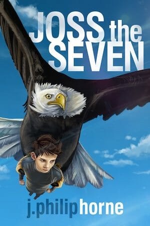

JF: A cover that works because it focuses on the action and relationship at the heart of the book. The strongly graphic style and simplified, strong colors are all perfectly suited to an ebook.
e-Book Cover Design Award Winner for December 2016 in Nonfiction
Christina Smith submitted Joseph’s Journey: When Dad Left and Never Came Back designed by Helen Measures. “If you consider the title of the book and then look at the cover image, one can infer that the person holding the heart is a child.That heart was damaged but a way was made for that child to bandage it up in order for it to heal. This book is not sad but meant to promote healing in the young reader.”
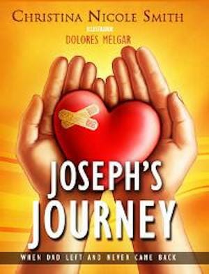
JF: The art makes the point beautifully, and the entire cover is well thought out and perfectly balanced. Shows how to make creative use of a stock piece of art.
Fiction Covers
A.V. Bach submitted Eisenstein’s Monster designed by Phillip Gessert. “Phillip created a radial pattern of rings centered around a tile comprised of a stick-figure Vitruvian man flanked by the ouroboros twisted into an infinity symbol. The rings give the impression of an iris comprised of psychedelic colors.”

JF: I like the big mandala, but the title doesn’t seem strong enough to balance with it.
Alexis Inboden submitted Moms first picture day designed by Alexis Inboden.

JF: Looks like a concept sketch for a cover, not a book cover.
Amanda Wills submitted Flick Henderson and the Deadly Game designed by Rachel Lawston. “Flick Henderson and the Deadly Game is aimed at young teens and my brief for designer Rachel Lawston was to design a cover that was eye-catching, cool and contemporary. Rachel’s design is aspirational yet friendly and accessible, with a hint of YA cool.”

JF: Nicely drawn and well targeted, although I’m not sure why the designer choose such a cool palette.
Anila Syed submitted Simon Cup’s Box designed by Photolamus. “At first, the creature – the Mid Numph – was supposed to be a big secret, but then I thought, ‘What’s the usp of this book?’ Answer: the Mid Numph. So he was placed onto the front cover in all his glory. The book is aimed at 8-10 year olds. Thank you”

JF: An amusing drawing, but everything else on the cover seems extraneous, with lines pointing in every direction, very distracting.
Camryn Rhys submitted Of Spells and Shadows designed by Milo at Deranged Doctor Designs.

JF: Beautiful textures and expert typography.
Cerece Rennie Murphy submitted To Find You designed by Anna Dittmann art/Kea Taylor cover design. “Thanks so much. I look forward to your comments! Best, Cerece”

JF: The outstanding illustrations carries the weight for this cover.
Charley Marsh submitted Slow Walk designed by Marsha Kessler. “First book of a post-apocalyptic trilogy.”

JF: The treatment of the author’s name, with its extreme contrast, is a distraction on all these covers, as is the while panel under the title on the last 2 covers.
Charley Marsh submitted Edge of Reality designed by Marsha Kessler. “Book 2 of post-apocalyptic trilogy.”

Charley Marsh submitted Solstice Moon designed by Marsha Kessler. “Book 3 of post-apocalyptic trilogy.”

Christy Nicholas submitted Legacy of Hunger designed by Cora Graphics. “This is book one of The Druid’s Brooch series, historical fiction with a bit of fantasy, set in Ireland in 1846.”

JF: Some nicely crafted elements, but they fail to come together, and that’s partly because of the obstacles to legibility the designer has built into the design. Why make the title so difficult to read agains the backgrounds?
Christy Nicholas submitted Legacy of Truth designed by Cora Graphics. “This is book two of The Druid’s Brooch series, historical fiction with a bit of fantasy, set in Ireland around 1800.”

Cindy McDermott submitted Working with Really Stupid People: The Relatives designed by Danny O’Leary. “The beat-up suitcase and washed out lettering signify the tough life the owner lived in her rural hometown, but now she’s back for a visit. The yellow gravel road won’t take her out of Oz but back to the those who inhabit her gnarly stick of a family tree.”

JF: Although this cover is artfully drawn, it gives the unmistakable impression of a “template.” I mean you could put any lettering you want on that suitcase, right?
Darja DDD submitted Blind Spot designed by Marushka from Deranged Doctor Design. “Romance Paranormal book cover design”

JF: Nicely atmospheric and well put together. By using the same typeface for the title and author, the designer allows us to focus on the art, which contains the message for the interested reader.
Darja DDD submitted Behind The Lens designed by Marushka from Deranged Doctor Design. “Romance New Adult book cover design, Sexy Series Book 1”

JF: Artful, but I’m not sure it says “romance.”
Darja DDD submitted Behind The Book designed by Marushka from Deranged Doctor Design. “Romance New Adult book cover design, Sexy Series Book 2”

JF: Works better than the first in this series (above) because the layout is simpler.
Darja DDD submitted Shade designed by Milo from Deranged Doctor Design. “Science Fiction & Fantasy Paranormal Mystery book cover design, Shade Series, Book1”

JF: Another strong and atmospheric series design with fantasy elements and an attractive heroine.
Darja DDD submitted Shade and the Skinwalkers designed by Milo from Deranged Doctor Design. “Science Fiction & Fantasy Paranormal Mystery book cover design, Shade Series, Book2”

David E. Gates submitted The Wretched designed by David E. Gates. “I found this image which perfectly reflected the interface with the sea, showing a harbour and the ghostly apparition which adds weight to the intrigue and spookiness of the cover, to entice the reader to find out more.”

JF: But it really has nothing going for it, there’s no “hook” or anything else to stimulate our interest.
David Loofbourrow submitted Through Button Eyes: A Collection of Short Fiction designed by David Loofbourrow. ” The anthology collects 15 stories across 13 genres. Each story includes a button as a plot element. Editors Patrick Witz (photographer of the button image) and David Loofbourrow (cover designer) worked to create a non-specific genre, intriguing cover that said “interesting stories” and NOT “sewing”.”

JF: A very strong ebook cover that hits all the bases. The cover is both charming and mysterious, with a hint of menace via the needle. Well done.
Deborah Jay submitted The Prince’s Son designed by Ravven. “Epic fantasy in which the horses are as much characters as the people, and the series covers reflect that with each portraying a mounted rider. I gave Ravven a fairly detailed idea of the components I wanted on this one, and I’m delighted with her design.”

JF: Gorgeous and dynamic. Looks like a winner. ★
Delfy Hall submitted The Warlock and the Wolf designed by L.A. Watson. “The image overlying the ground is from a 17th-century map of The Hague, where the story takes place.”

JF: My urge with covers like these is to simplify them, but I can’t deny this collage of elements its charm.
Denise Deegan submitted Through the Barricades designed by Rachel Lawston of Lawston Design. “I love this cover. The model, my daughter, Aimee, has the look of defiance I needed to represent my main character, Maggie, who is a revolutionary. It was the amazing designer Rachel who chose that image – I’d gone for a dreamy shot. I love the way Rachel merged this image with a genuine one of WW1 ”

JF: A very sensitive, well drawn and well balanced cover.
Divine Michelle submitted A Veil of Stars designed by Yonderworldly Design. “This is for the first book in a Middle Eastern-inspired fantasy series.”

JF: Despite the fact whatever’s at the bottom is too indistinct to be seen, this gorgeous design uses textures in an inventive way to make the title treatment stand out.
Elayne Griffith submitted Suitcase Charlie designed by Elayne Griffith. “Not one of my favorite covers, but thought I’d throw it in anyway to find out if it’s better or worse than I perceive it to be.”

JF: Never doubt yourself.
Ferris Robinson submitted Making Arrangements designed by ferris robinson. “The chaos in the background and the seemingly serene woman arranging flowers made this painting a good fit.”

JF: That may be, but what kind of book this book remains a mystery.
Guy Keen submitted Slayers of the Dark Web designed by Guy Keen. “The design brief was to capture the key theme in the book, a vigilante hero taking on the evil dark web. The colour scheme was selected to create the sense of evil in a tech underworld (emphasised by the malevolent skull), whilst the hero stands strong despite the enormity of his task ahead.”

JF: A terrific piece of art that really communicates, but I think this cover would be better with a much stronger title treatment integrated with the art.
Harald Johnson submitted 1609 designed by Harald Johnson. “I wanted to evoke a vintage mood of setting and time period for this historical fiction. The image is an accurate simulation of Manhattan in 1609, and those in my primary target audience understand the contrast of the island’s early emptiness (on the eve of change) with what we know it now to be.”

JF: The photographic nature of the art seems a bit incongruent, and the cover lacks contrast.
Heramb Sukhathankar submitted The Last Nomad designed by Heramb Sukhathankar. “Hello, Thank you for offering this opportunity to budding self-published authors like me. I’m really excited to see the results. To talk about the cover page, I chose to personally design it as I wanted each element on the cover to be intimately related with the core of the story in me. Thanks!”

JF: Ordinarily, I would say that’s the worst way to design a book cover, but yours works.
JA Andrews submitted A Keeper’s Tale: The Story of Tomkin and the Dragon designed by Dane from Ebooklaunch.com. “A Keeper’s Tale is an epic fantasy novel. Credit for the gorgeous dragon eye art goes to Christos Karapanos at www.christoskarapanos.com.”

JF: A gorgeous cover where the textures help to frame the story at the same time we are being drawn into the story. Expert ornamentation and typography, too. ★
James Egan submitted Snake Skin designed by James T. Egan of Bookfly Design.

JF: Great combination and a subtle illustration make this cover stand out. Again, using the same font for author and title has allowed the art to speak clearly. ★
James Egan submitted Whispers of the Walker designed by James T. Egan of Bookfly Design.

JF: Masterful design and execution. Notice how easily we are lead eventually to the ghostly building in the background, and how all the textures contribute to the overall effect.
James Egan submitted Be Mine designed by James T. Egan of Bookfly Design.

Jeanne McNamee submitted My Sister’s Secrets designed by E.B. Brown. “The cover design is a perfect representation of the book. The book courses between a grown up relationship of a brother and sister- while reflecting back on their relationship as children, while the brother is losing his sister to cancer.”

JF: Very affecting.
Jessica V. Fisette submitted Fire and Ice (The Aldurian Chronicles Book 1) designed by Jessica V. Fisette. “Fire and Ice is a sci-fi/fantasy with midieval origins so I wanted the font to express that. Saph is an elemental with a preference to frost (and a bit of a self-control issue) so I wanted to give the idea that her power is overcoming her as she holds the symbol of her tragic past in her hands.”
")
JF: She looks depressed. Was that intentional?
John Palmer Gregg submitted Some Glow Brightly designed by Tony Sobota/John Palmer Gregg. “The cover for this YA paranormal fantasy was painted by Tony Sobota and designed by the author.”

JF: Strong notes of mystery and fantasy, well done.
Jonathan Giddinge submitted The Kings of Braxton: Born Unto Trouble designed by Jonathan Giddinge. “Grips on the revolver were hand carved from maple. The K and flying crown also hand carved.”

JF: Nice carving, and the photo is good too, but the typography could be stronger.
Judy Weir submitted Forbidden designed by Extended Imagery. “Police Captain Sharif is on the hunt for the organization that murdered 15 Americans. He tracks down forensic evidence and his informant in back alleys while being hunted by a CIA agent and hitmen.”

JF: Lots of juicy story elements, although the spectral highlights are a bit distracting.
Kee Turk submitted ARTICULATED SHORT STORY ANTHOLOGY FOR 2016 designed by Kee Turk. “Thank you for your consideration. Sincerely, Kee Turk”

JF: Looks like an amazing piece of art, but the type is completely getting lost.
Kee Turk submitted PROCYON SCIENCE FICTION ANTHOLOGY FOR 2016 designed by Kee Turk. “Thank you for your consideration. Sincerely, Kee Turk”

JF: Even stronger art makes this cover more compelling but I would still like the type to be a bit easier to read at this size.
Kyle Slade submitted All The King’s Horses designed by Damonza Book Covers. “All The King’s Horses is a mystery book about conspiracy, experimentation, returned veterans, and the fragility of memory. The cover design features flowers layered into a knight, with a reddish-tinged background, and is purposefully minimalist.”

JF: Intriguing artwork, I’m surprised the title is as quiet as it is.
Leah McClellan submitted Colors: A Novel designed by Leah McClellan. “The cover represents themes and symbolism present in the novel including darkness, destruction, and fear but also beauty, passion, and light. The protagonist is a struggling artist and a visual synesthete, and she paints something like this cover, which is symbolic of her success.”

JF: It’s colorful, and the simple approach you’ve taken helps.
Lewis Jones submitted An Empire of Dreams designed by Lewis J Jones. “Thank you for reviewing my work.”

JF: Steampunk time travel? Just guessing. The image is interesting but the title treatment could be stronger.
Lydia Staggs submitted Shamar designed by Melissa Carrigee. “The cover art was done by Ashley Gaia.”

JF: It works, and that steely gaze is like a tractor beam drawing us in.
Maya Mirza-Gill submitted Fate designed by Maya Mirza-Gill. “I designed the cover myself as the author.”

Maya Mirza-Gill submitted Lost designed by Maya Mirza-Gill. “I designed the cover myself as the author.”

JF: All three covers in this series suffer from overwrought type and a lack of cohesion.
Maya Mirza-Gill submitted Struck designed by Maya Mirza-Gill. “I designed the cover myself as the author.”

Michael Carter submitted ex silentio designed by Michael Ray Carter.

JF: Begs the question, are “Michael Carter,” “Michael Ray Carter,” and “michael r carter” all the same person? This cover is elegant, but the title is on the edge of disappearing at smaller sizes.
Mitch Reinhardt submitted Wizard’s Key designed by Streetlight Graphics. “We wanted to keep it simple with the magical key in the foreground, ominous wolf eyes in the background, and the title below.”

JF: Great illustration combined with the splash of highlights, wolf in the background, and a perfectly suited type treatment work wonderfully together.
Nathan Wilson submitted Arsenic for the Soul designed by Nathan Wilson.

JF: Very attractive, although the type at the bottom is very low contrast, and the title could be pumped up a bit to better balance the art.
Nathanael Green submitted Out of the Fire designed by Design for Writers. “Part of our direction with Design for Writers was to try to capture both a contemporary thriller feel and incorporate the magical element of urban fantasy. I think they did a great job!”

JF: An exciting cover that drives interest in the story.
Nick Bezuidenhout submitted How Not To Run Away designed by Nick Bezuidenhout. “The image of someone with a backpack walking away from the viewer in what is clearly a remote and mountainous area supports the main title and sub-title. The handwriting style typeface of the main title is a nod to the fact that the novel is in the format of the main character’s handwritten diary.”

JF: I think you accomplished your goal, but the cover does not have a “professional” look to it, and that title font is very weak.
Nicole Campbell submitted When the Time Comes to Light a Fire designed by Taylor Cross and Nicole Campbell. “This character receives the necklace pictured within the story, and it is a symbol of her mother’s acceptance.”

JF: A weak and ineffective cover. The image is hard to see, the woman seems to be bleeding off the binding edge, and the title is not particularly readable.
R.D. Stones submitted Method of Choice designed by R.D. Stones. “Cover was hand drawn. Letters were handwritten. I used a computer program to put the letters on the drawing and adjusted the contrast and saturation and that’s it.”

JF: The illustration is good, but everything else has been pushed aside as if it’s of no value.
Rena Hoberman submitted M.I.A. designed by Rena Hoberman of Cover Quill.

JF: An atmospheric and attractive cover perfectly suited to its subject, but the flourishes in the corners seem a bit lighthearted here.
Richard Sutton submitted The Gift: Voyages designed by Richard Sutton. “The Gift begins a new series which highlights the conflicts in the Roman World beginning in 48BCE. The Mediterranean Sea is the setting for most of this first book and the steel sword is the gift given to change a young man’s life. The ancient triple spiral, blends in the Celtic tradition.”

JF: It’s attractive, but the white border seems gratuitous. What does it add?
Richard Sutton submitted The Yukon Illusion designed by Richard Sutton. “A story of change and making a break in the hopes of creating that change. Sailing off to the gold fields, putting it “all in” seems very courageous to me and inspired the cover design. Of course, with potential rewards comes great risk…”

JF: More chaotic and hard to decipher than the first cover, above.
Robert Cooke submitted Darkest Peru designed by Kit Foster. “Darkest Peru is a travel/adventure novel exploring one man’s search for meaning in the wilds of Peru.”

JF: I love the depth and dimensionality of this cover, and the slightly off-kilter type adds to the sense of mystery. ★
Rodi Szoke submitted Our Young Guardians: Seven & Two designed by Hiram Cruz.

JF: Not sure I “get” it, and what’s that stuck on the hand?
Rosemary King submitted The Volunteer designed by Dane. “Dane did a wonderful job trying to make an ambulance, an ambulance officer and rocks interesting and moody. Very pleased with the result.”

JF: Heroic.
Sanja Gombar submitted Cinders: The Untold Story of Cinderella designed by Sanja Gombar.

JF: Very attractive and effervescent, but I can’t help worrying that she’s going to have trouble actually picking up that sword, it’s rather larger.
Sean Fletcher submitted In the Depths of Darkness designed by Natasha Brown.

JF: Terrific sci-fi cover that does everything you want for this genre, very attractive and full of promise. ★
Stacy Claflin submitted Lost Wolf designed by Rebecca Frank Art.

JF: The constrained palette helps the atmosphere of this cover.
Stephen Lomer submitted Stargazer Lilies or Nothing at All designed by Stephen Lomer. “I wanted to keep the design simple but elegant, and with Stargazer Lilies in the title, I thought placing said lilies against a blue sky background fit the bill nicely.”

JF: Unfortunately it’s very static and lacks interest. Although the flowers occur in the title, is that really what attracts people to your stories?
Suzannah Rowntree submitted Once: Six Historically Inspired Fairytales designed by Suzannah Rowntree. “ONCE is an anthology of fairytale retellings including steampunk, WWII, romantic suspense & western entries. Fitting all the necessary text on without unbalancing or cluttering the composition was a challenge I’m not convinced I met. But at least it’s pretty.”

JF: The black and white approach looks harsh here, and I can’t read all that text at this size anyway.
Tammy Seidick submitted The Highest Stakes designed by Tammy Seidick. “Thanks for your review!”

JF: I like the way the fog adds a layer of mystery to this cover.
Teresa Carter submitted Curio: Kingdom of Light Chronicles Book 1 designed by Teresa Carter.

JF: In that a tattoo, or an image composite, on his cheek. And what’s that indecipherable shape in the background. And why did you pick the one spot on the cover that would make the title hard to read?
Terry John Barto submitted Nickerbacher designed by Kim Sponaugle. ” Nickerbacher is a re-invented, new, early chapter edition inspired by the Picture Book, Nickerbacher, the Funniest Dragon. When designing the new cover, we took into consideration the constructive criticism received by The Book Designer previously, and focused on making the lead character stand out. ”

JF: Now you just have to work on that title, it’s pretty rough.
Travis Hale submitted Dream No Little Dreams designed by Brian DonCarlos. “It’s a book set on the South Plains in West Texas. Brian’s use of the pump jack and cotton bolls is a haunting depiction of scenery found in the region.”

JF: Looks more like a report cover, and has the unmistakable “pasted-together” look.
V.R. Stone submitted PsychoAnalysis designed by Kit Foster. “The book is a thriller about a female serial killer who tries to quit and sees a psychoanalyst.”

JF: Evocative, with graphic impact.
Waverly Fitzgerald submitted Notes From Hell designed by Aaron Weholt.

JF: A bit heavy-handed, but it makes its point.
Nonfiction Covers
Al DeCesaris submitted Running The Coast For A Cure designed by Jenna Butler and Elizabeth DeCesaris. “We thank you for your consideration.”

JF: The weakness of confining everything into horizontal bands is that the elements never really relate to each other or come together in one, unified whole.
Christine Ellis submitted The Happiness Switch designed by Christine Ellis.

JF: Not a particularly “happy” looking cover, is it? And the type is unreadable.
Clay Rivers submitted The Food Safety Book: What You Don’t Know Could Kill You designed by Clay Rivers. “The Food Safety Book offers answers to just about every food safety, quality, and storage-related question consumers might have. The tomato symbolically represents a food people have questions about—is it a fruit, is it a vegetable? The green plaid is a nod to the Better Homes and Gardens cookbook”

JF: I like what you’ve done, but the title could be a lot stronger, and it would be nice to have a nod to “safety” somewhere in addition to the cookbook and tomato allusions. After all, what the book is really about is safety, right?
Drew Huffman submitted Screw This! Let’s Be Real! designed by Mary Alexander, MSN.

JF: Mystifying.
Eric Gaden submitted The Adventure Nickel designed by Russell Thornton. “The design harkens back to the mystery genre of years past. Bright splashes of color are designed to catch the eye in even thumbnail form.”

JF: Nice colors, little impact. Are we supposed to be able to tell what the book is about?
Floyd Larck submitted Surrogacy A Parent’s Point of View designed by Floyd Larck. “I wanted a stark contrast with our daughter’s life before and after our grand baby was born. That’s all I can put without giving away the text.”

JF: The art is graceful enough that it would probably work in the right setting, but this isn’t it and the type desperately needs help.
Katie Harrison submitted Dance Diaries: Ballroom Budgeting – How I Afford to Dance designed by Self.

Katie Harrison submitted Dance Diaries: Learning Ballroom Dance – What I Wish I Had Known designed by Self. “I designed this cover using a photo of myself and my dance teacher. I purposely chose a photo that hid our faces, so the dancers on the cover could theoretically be anyone, including readers of the book.”

JF: The photograph looks like a snapshot, which is probably what it is. The figures are so far back and “fenced” by the light forms we can’t really interact with them. Although the title is interesting, the rest of the typography is awkward.
Kee Turk submitted THE LAST EXOTIC PETTING ZOO designed by Kee Turk. “Thank you! Kee Turk”

JF: I like the layout and high perspective, and the title treatment has possibilities, but the background is so wild with color and pattern it’s hard to decipher easily.
Kim Hemphill submitted I Remember the Time… designed by Cathi Stevenson. “The railroad tracks changed my life. It carried the train that hit me at 3 years old. Cathi created a powerful scene with the tracks and bloody kids tennis shoe. The journey that was created by these tracks lasted decades.”

JF: Nicely composed, with expert type, but the image is so dark it’s hard to make out any detail, and the amount of type on this cover, which would work fine for a print book, just disappears on this ebook cover.
Lene Andersen submitted Chronic Christmas: Surviving the Holidays with a Chronic Illness designed by Aimee Coveney. “Aimee’s cover design perfectly captured the spirit and content of Chronic Christmas, with an emphasis on relaxation and enjoyment of the holiday season by people who live with chronic illness, as well as the whimsy and humour included in the book. I’m especially fond of the bunny slippers!”

JF: Who doesn’t like bunny slippers? This is a delightful graphic cover with lots of pop and humor. Well done. ★
Lisa Are Wulf submitted Enfolded in God’s Arms: 40 Reflections to Embrace Your Inner Healing designed by Jennifer Burrell. “The cover is simple, peaceful, calm and restful to the eye in keeping with the subject of spiritual inner healing and devotional reflections. The cover was designed to appeal to older women – my target audience. The serenity of the cover also reflects the series name – Silent Moments with God.”

JF: This cover excels in many ways, the careful type, the choice of the flowers, and the cool and peaceful composition. So that one paragraph of type hanging out on the right is especially bothersome because it throws the whole thing out of balance.
Mitchell P McCrady submitted Pittsburgh To Cadiz What’s The Difference? Part One designed by Jshan. “The author is getting his picture taken as the van he got a ride to work in is engulfed in flames.”

JF: That flaming vehicle brings a lot of excitement and interest to the cover, and works well with the careful typography.
Nataliya Yakushev submitted Marketing for CEOs: Death or Glory in the Digital Age designed by Daniel Mihajlovic.

JF: I guess the stuff at the bottom are the products that have crashed and burned? I’m not sure I understand this cover, the empty floating clouds, the city in the background, and the pattern behind the fellow. What does it all mean? The designer was skillful, but the concept doesn’t communicate.
Nick van der Leek submitted The Craven Silence designed by Nicolas van der Leek. “The cover is meant to convey the loss of truth and justice regarding the murder of child beauty queen JonBenet Ramsey. The title words are intentionally designed to “disappear” into the blonde curls. The ransom note is intentional “noise” intended to represent the 40 000 pages of the case file.”

JF: Unfortunately, the fact that it’s intentional doesn’t mean it was a good idea, which it wasn’t. The picture at the bottom makes no sense, and the main part suffers from all the type and images you decided we didn’t need to be able to see or read. Bit of a mess.
Ryan Thexton submitted Tarantula Don’ts: 20 Things You Should NEVER Do With A Giant, Hairy Pet Spider designed by ismism.

JF: Great title, and in fact this cover works really well except for one thing: the much-too-dark blue background, which is depressing the impact of the whole cover. Easy fix!
Stef Smulders submitted Living in Italy: the Real Deal designed by Henno Drop.

JF: We saw earlier that subtle misalignments of type can help communicate a mood, but here the “dancing” letters seem gratuitous. The background photo adds nothing, and the insistence on using the red/green colors of Italy is clearly overdone. Doesn’t help to plop what’s basically a snapshot in the middle.
Winnie Anderson submitted Faith From 9 to 5: How to Overcome the Seven Deadly Sins and Live Your Faith at Work designed by Sue Brettell. “I love my cover and hope you do too.”

JF: Another cover that looks more like something else. Although a clock face is about the most clichéd image you could associate with “9 to 5” that’s okay. But why is the type inside the clock shoved all the way to the bottom? Here’s another thing that I find distracting: the cover contains the numbers 9, 5, and 7, but the image is showing 4 boxes. Am I too literal? For a book on a topic as intimate as faith, I find this cold and uninteresting.
Well, that’s it for this month. I hope you found it interesting, and that you’ll share with other people interested in self-publishing.
Use the share buttons below to Tweet it, Share it on Facebook, Plus-1 it on Google+, Link to it!
Our next awards post will be on February 20, 2017. Deadline for submissions will be January 31, 2017. Don’t miss it! Here are all the links you’ll need:
- The original announcement post
- E-book Cover Design Awards web page
- Click here to submit your e-book cover
- Follow @JFBookman on Twitter for news about the E-book Cover Design Awards
- Check out past e-Book Cover Design award winners on Pinterest
- Subscribe to The Book Designer Blog
- Badge design by Derek Murphy
