


When you hear someone talking about a 1984 book cover, you have quite a good idea about how it looks. You probably imagine a bold red background, clear, large letters, and images like eyes or cameras that make you think of being watched. These aren't just random choices; they're a big part of what makes 1984 so recognizable, even on posters and in art.
Nineteen Eighty-Four has been a standout book since its release in 1949, not just for its story but for its covers, too. These designs are more than cool looks; they show the book's main ideas about constant surveillance and living under strict rules. Over the years, these covers have kept the book in people's minds.
In this article, we'll explore the major design elements and themes that appeared on 1984 book covers from its first publication till today:
Early Simple Designs
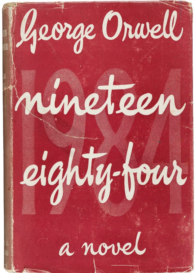

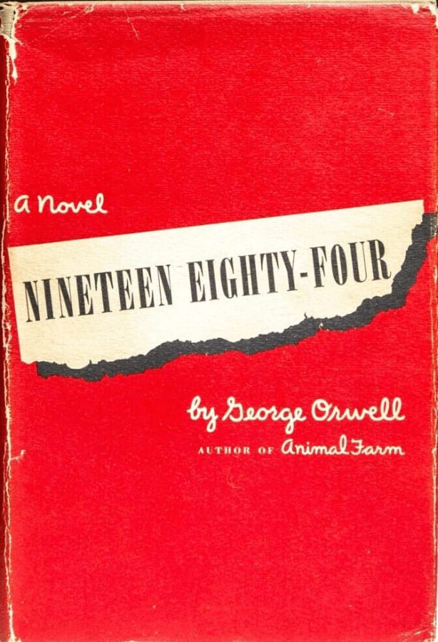
When 1984 first came out, the book covers were quite straightforward. They featured large, stark typography that dominated the space—the title and George Orwell's name took center stage. This minimalistic style sent a clear message: the story inside was serious and important.
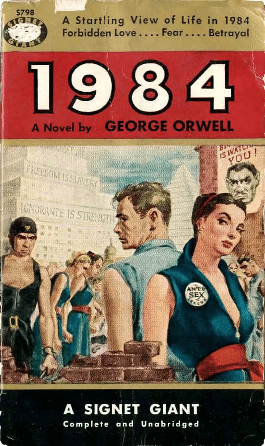
Early Penguin paperbacks are a good example of this design. They had a plain, bright orange cover with just the book title. American publishers like the 1954 Signet Classic took a different approach. They went for more colorful and detailed pictures to grab readers' attention on newsstands, where books were mostly sold. In the UK, the covers didn't need to be as loud because books were sold in quieter bookstores.

Eye-Centric Designs
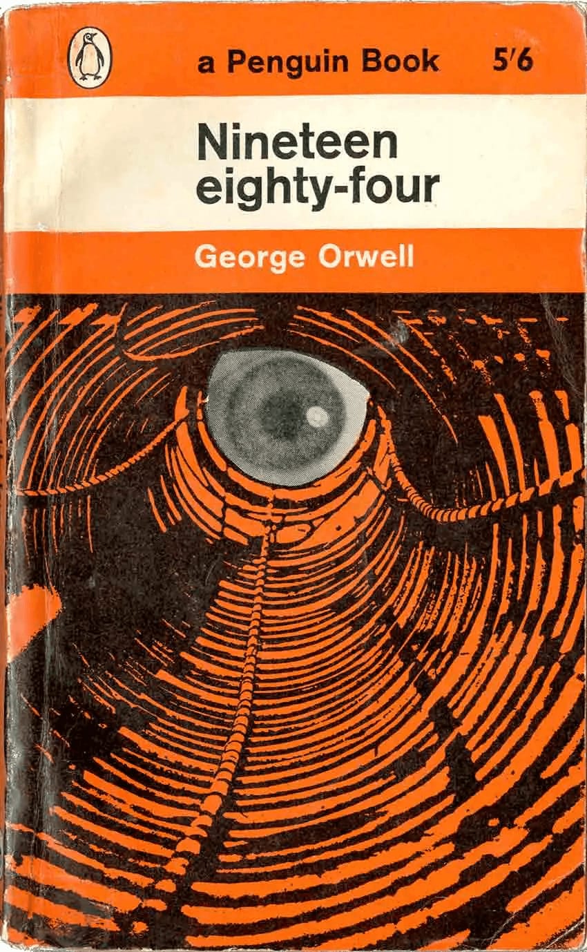

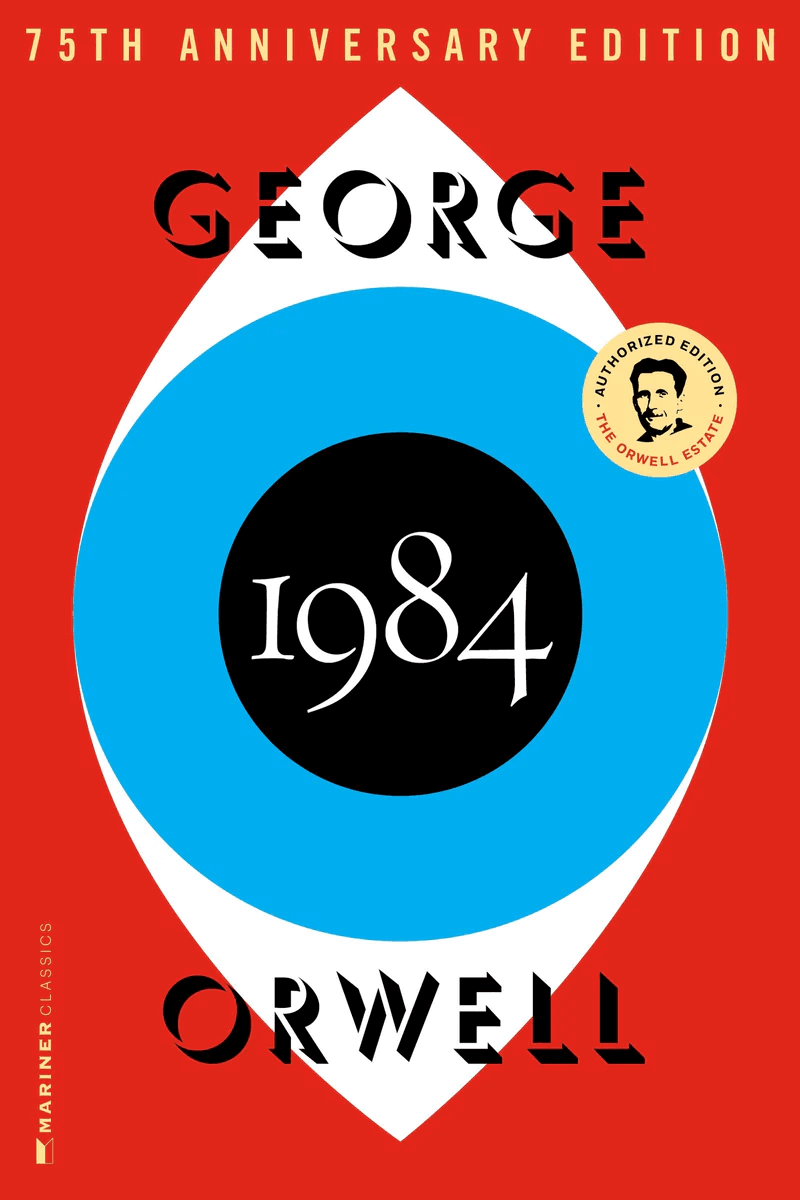

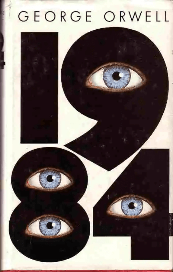
On many 1984 book covers, you'll often see a big eye or a pair of eyes. This isn't random; it's about the book's main point, where everyone is being watched all the time. The covers that show these eyes do it differently, but they all make you think of being spied on.
Some covers show a single eye that's big and stands out. It's like it's saying, "Big Brother is watching you." This simple but strong picture catches your eye right away. Other covers might have the eye looking like it's part of a camera or a bunch of lines spreading out like they're watching every move you make.
Whether it's one eye staring at you or a more artsy design, these book covers show off what 1984 is all about without saying many words. When you pick up the book, you already feel the theme of surveillance just from the cover.
Political Imagery in 1984 Covers


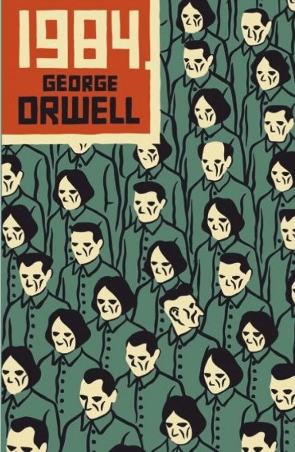
Many covers of George Orwell's 1984 are filled with images and slogans that echo totalitarian regimes' propaganda. These covers often use stark and simple designs to make a strong statement. For example, some resemble Soviet or Chinese posters, with Big Brother's face resembling portraits of dictators like Hitler or Stalin. This powerful imagery drives home the book's message about the dangers of oppressive governments.
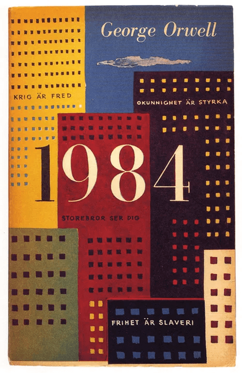
Another common design element is slogans that sound like they could come from a totalitarian state. Phrases like "War is Peace" and "Freedom is Slavery" are written in bold letters, mimicking propaganda banners. Other covers feature a lone figure speaking through a megaphone with a watchtower looming in the background, reminiscent of the Iron Curtain and the Berlin Wall. These covers make readers think about history and the importance of freedom and truth.
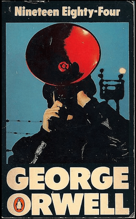
Artistic Interpretations


1984 book covers often go beyond pictures and words; they dive into art to catch the eye and stir the mind. Looking at such covers is like stepping into a gallery where each piece tells a story without saying a word. One cover may show a city with towering buildings and no people, painting a picture of loneliness in a big, controlled world. Another one with a distorted face may suggest the fracturing of self under Big Brother's watch. The beauty of such covers is that they are open for interpretation.
These covers pull you into George Orwell's world with strong, silent messages. They use art to make you feel the chill of a society where everything you do is watched, and every thought is told to you.
Typography-Focused Designs


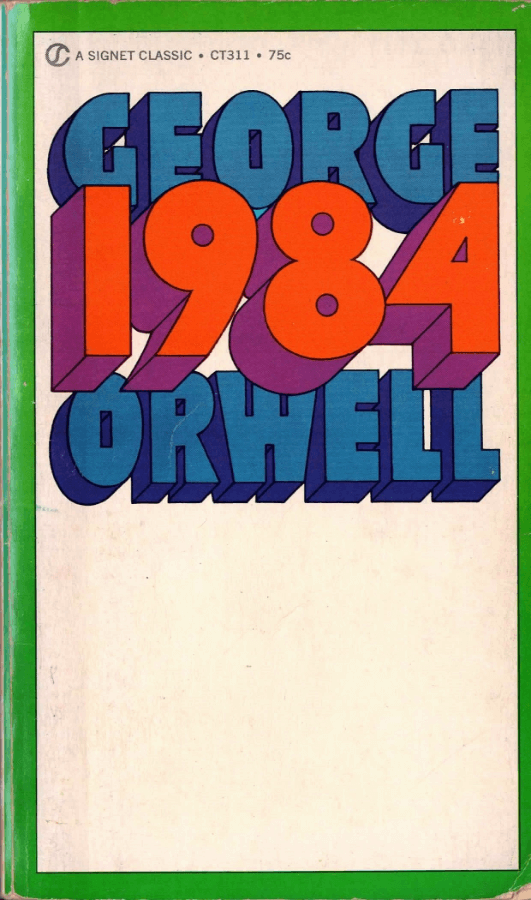
1984 book covers that focus on typography show how words can be as powerful as what they say. These covers grab your attention with big, bold letters and numbers. They use simple but strong colors like red or black to make you think of danger and control. The big "1984" on some covers feels like Big Brother is always there, showing the book's theme of being watched constantly.
Other covers mix up the letters and numbers. This also makes readers feel mixed up, like the book's story about what's true and what's not. The plain design makes the books' and authors' names stand out. These covers are not just about the book's name; they evoke reflections about power, truth, and how to stand up to control.
Integration of Technology Elements

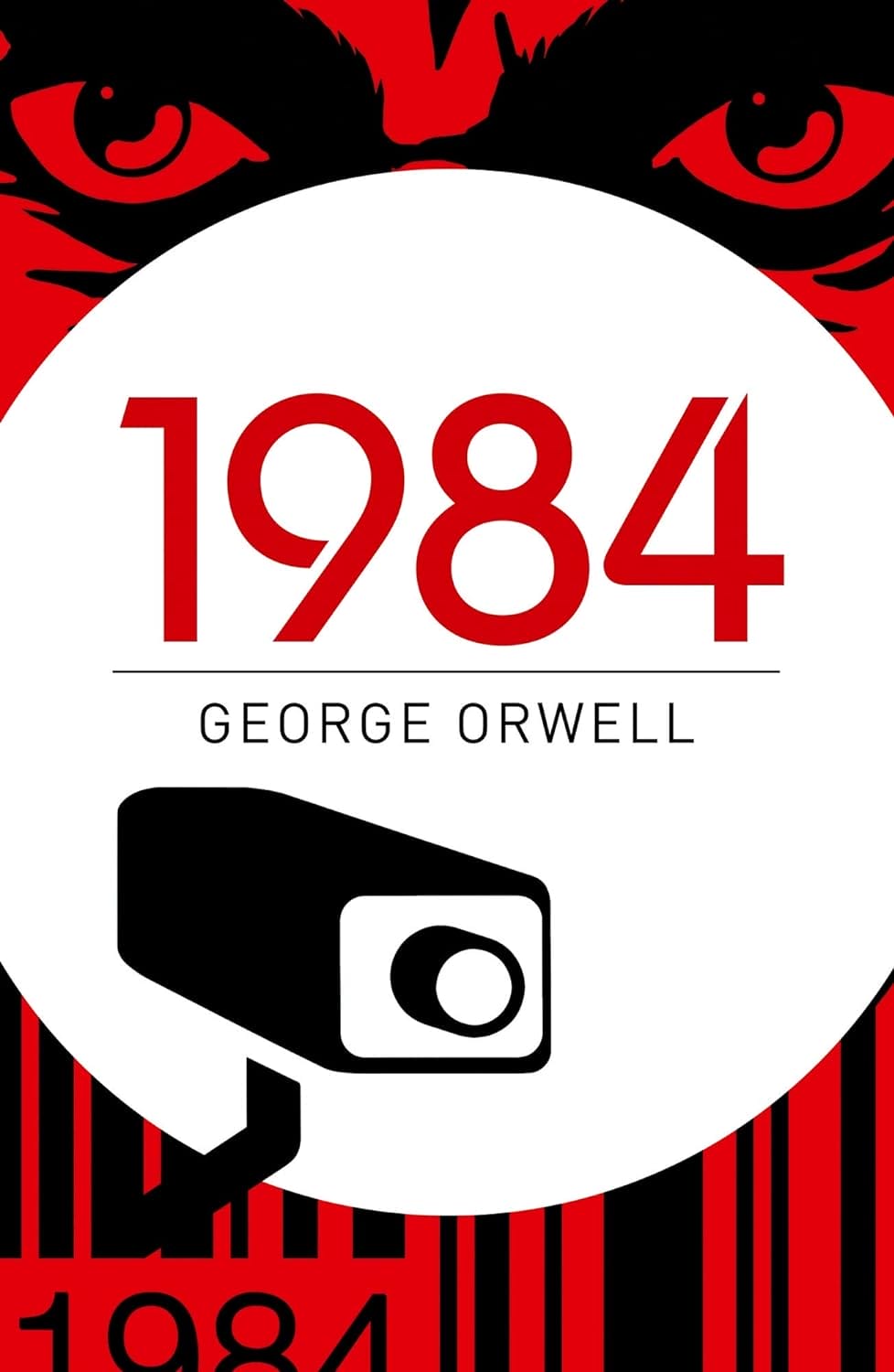
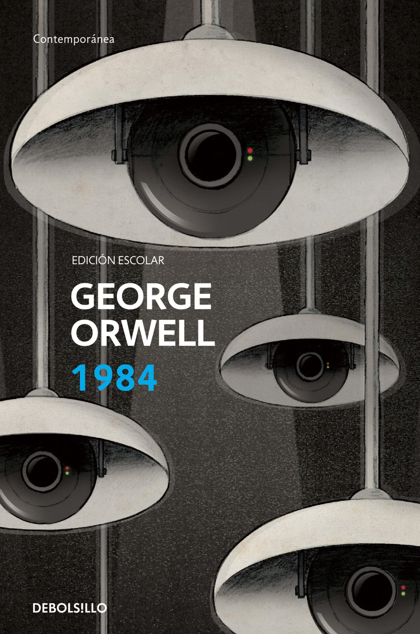

The recent designs of 1984 book covers have been very creative in including images of technology. They show us how the story's message about watching and controlling people fits into today's world, where we use many digital tools. The covers do this in a way that catches the eye and makes people curious about the book. They use pictures of cameras, screens, and other technology to remind us that the story's warning about too much control is still important today.
For example, some covers have a big eye made of cameras or screens. This makes us think about how much governments or companies can watch us. Other covers might show people wearing headsets or sitting in front of old TVs. This can immerse readers in the book's world, where the truth is twisted and being watched is normal. These designs connect the book to the present, showing how its ideas about power and freedom are still something we should think about.
Crafting Timeless Book Covers: Insights from 1984
1984 book covers are a masterclass in visual storytelling. They use recurring motifs and artistic techniques to immerse readers in the book's themes at first glance. Stark colors, foreboding eyes, tech elements, and bold typography help convey the message of surveillance and the loss of individuality. These powerful designs linger in the memory, capturing the book's essence without a single word.
For authors, these iconic covers offer valuable lessons. Consistency in motifs can maintain a connection between your book's various editions. As your work grows in popularity, you'll develop new cover designs. It's important to balance the familiar with the new, ensuring that the latest design trends still reflect your book's identity.
When creating a book cover, think about the message you wish to convey. A good cover doesn't just decorate; it communicates and resonates. The 1984 covers show us that even the simplest design can be profound, influencing potential readers to delve into the story.
