Two recent projects have reminded me of just how much attention book designers have to pay to details. With a complex book, every detail counts.
What makes a book “complex”? It could be very long manuscripts, books with footnotes, endnotes, annotations, massive amounts of front matter and back matter, separate text streams, lots of tabular composition, sidebars, pull quotes, graphics incorporated into the text, material in several languages, or any combination.
Both of these projects are from well-established authors, and at a glance, they don’t seem to be your average self-published book.
But the range of books authors can publish themselves is much larger than Kindle romances and print on demand paperbacks.
In these cases, these are substantial, scholarly works that might have come from university presses. But in both cases, the authors decided their best course was to publish their own books.
From the point of book design, they both represent challenges typical of long and complex manuscripts.
Here are the books I’m talking about, and how each reached a balance between the demands of complex manuscripts and the needs of the readers who would eventually hold them in their hands.
Opera as Opera

This collection of writings by noted writer on opera Conrad Osborne was a massive undertaking.
The manuscript was long, and the author wanted to create a single, readable volume from the disparate pieces that make up the book.
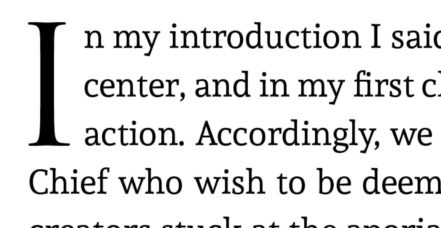
One of the ways I saved space in this book was by use of a font with a large “x-height“, Andada. This allows you to use a smaller than normal point size without sacrificing readability.
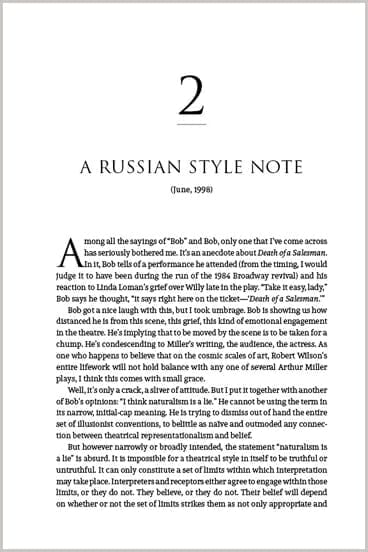
Here’s a chapter opener from the book, which ended up with a pretty classical design:
In this two-page spread you can see the overall density of the pages, as well as the extensive footnoting. In fact, this book has both bottom-of-the-page footnotes and numbered chapter endnotes in the same text. Interesting challenge.
Also note the “A” level heads have been designed to stand out for the reader without taking up too much vertical space. In an 840-page book, this can be critical.
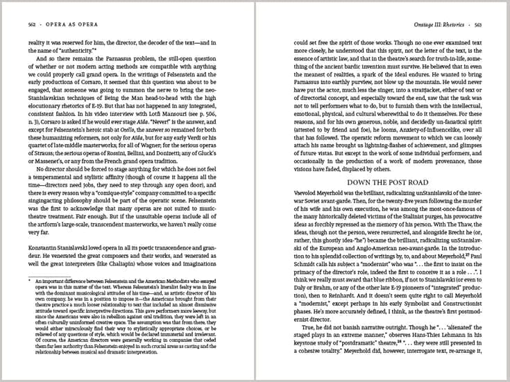
With the selected fonts we achieved 40 lines per book page, so each page has 460+ words on it.
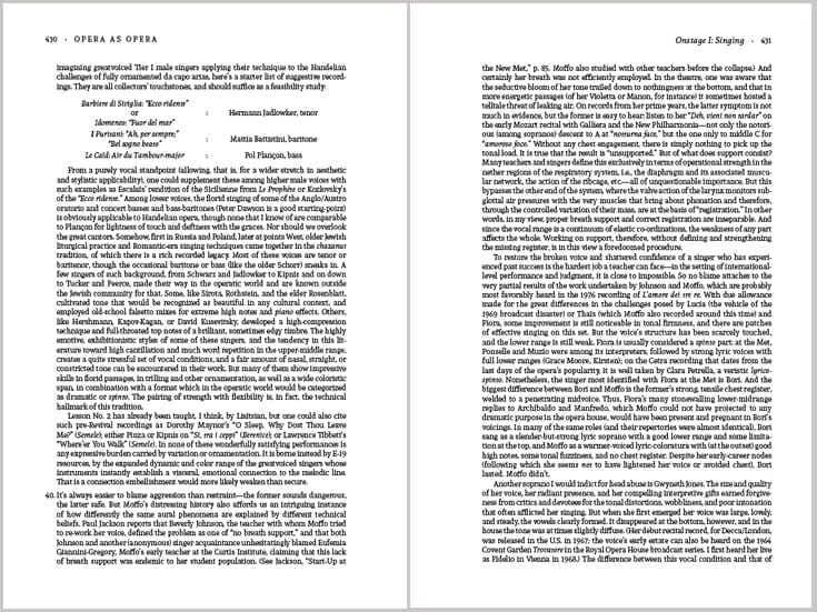
Pages of notes are much denser, as this spread indicates. Here we achieved 53 lines per page, or over 730 words per page:
This marvelous book was offset printed and has already sold out its first printing, gaining rave reviews in the opera press.
Data
Opera as Opera: The State of the Art by Conrad L. Osborne
840 pages casebound, offset printed
6″ x 9″
Fonts used: Andada, Trajan
Find out more: Opera as Opera

Jesus’ Death in New Testament Thought
What do you do when a client hands you a manuscript that’s 723,839 words long? Yes, that’s almost three-quarters of a million words.
In this case author David Brondos, who had previously published several books in the same genre with traditional publishers, knew what he wanted.
We ended up with a two-volume work of prodigious proportions. Like similar books, there are a variety of reader aids included for the academic users of the book, including 3 indexes, a bibliography, 117,000 words of notes, and more. The back matter alone accounted for over 100 pages.
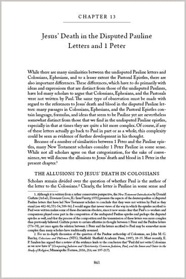
Again, space was at a premium, so I increased the trim size to a slightly larger than normal 6.14″ x 9.21″. I used a standard book font that looks great no matter what size it’s been set in: Adobe Caslon Pro. Here’s the chapter opening, which uses a minimum amount of space:
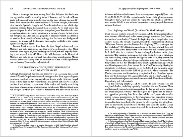
On the text pages, we managed to get 44 lines per page that is quite readable, yielding over 560 words per page. That’s a lot! Again, you’ll see that although the “A” and “B” heads are distinct, they use a minimum amount of vertical space:
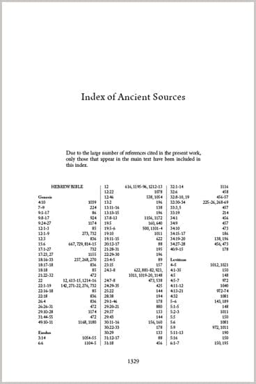
Just one of the interesting indexes supplied by the author for the benefit of academic readers:
These books totaled 1400 pages and were printed as jacketed hardcovers by Ingram Spark. Although the unit cost for these books is quite high, the retail price, which will largely be paid by libraries and other institutions, is high enough to cover the production costs.
Data
Jesus’ Death in New Testament Thought: Volume 1: Background, and Volume 2: Texts by David A. Brondos
1366 pages (both volumes) casebound, digitally printed
6.14″ x 9.21″
Book fonts used: Adobe Caslon Pro, Poppl-Laudatio
Find out more: Jesus’ Death in New Testament Thought: Volume 1: Background, and Volume 2: Texts
It’s amazing to me to see these kinds of books migrating to self-publishing, and very encouraging too, I think. I’ve designed award-winning technical books, textbooks, coffee-table books, and just about every other kind of book for authors in recent years. Isn’t that great?
These long, complex books are very satisfying to work on. If you’ve got a project that looks problematic or is just so big you don’t know what to do with it, let me know and I’ll see if it’s something we can accomplish together.


