

Editor’s note: There was a “glitch” in the processing this month, resulting in The Awkward Ozarker being miscategorized. This was not detected until after publication. To make up for this we’ve decided to award 2 “best of” awards in nonfiction this month, since they are both worthy, and instead have promoted Take Back Tomorrow from earning a gold star to being our e-Book Cover Design Award Winner for May 2016 in Fiction.
Welcome to the e-Book Cover Design Awards. This edition is for submissions during May, 2016.
This month we received:
123 covers in the Fiction category
23 covers in the Nonfiction category
Comments, Award Winners, and Gold Stars
I’ve added comments (JF: ) to many of the entries, but not all. Remember that the aim of these posts is educational, and by submitting you are inviting comments, commendations, and constructive criticism.
Thanks to everyone who participated. I hope you enjoy these as much as I did. Please leave a comment to let me know which are your favorites or, if you disagree, let me know why.
Although there is only winner in each category, other covers that were considered for the award or which stood out in some exemplary way, are indicated with a gold star: ★
Award winners and Gold-Starred covers also win the right to display our badges on their websites, so don’t forget to get your badge to get a little more attention for the work you’ve put into your book.
Also please note that we are now linking winning covers to their sales page on Amazon or Smashwords.
Now, without any further ado, here are the winners of this month’s e-Book Cover Design Awards.

e-Book Cover Design Award Winner for May 2016 in Fiction
Richard Levesque submitted Take Back Tomorrow designed by Duncan Eagleson. “Set in 1940, this novel follows a pulp science fiction writer who discovers the secret of time travel. I asked my designer, Duncan Eagleson, to come up with an image that captured the feeling of the old pulp magazines, and I am very pleased with what he came up with.”
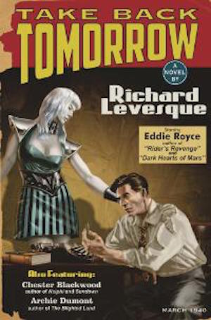
JF: Fantastic. This is some serious pulp. Notice the severe lighting and looming darkness, this cover is spot on.

e-Book Cover Design Award Winners for May 2016 in Nonfiction
James Egan submitted The Love of One designed by James T. Egan of Bookfly Design.

JF: Both conceptually and visually arresting. A poetic cover for this memoir.

Blant Hurt submitted The Awkward Ozarker designed by Dane Low.
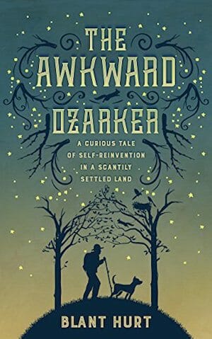
JF: A brilliant combination of ornament, typography, and illustration really makes this charming cover stand out.
Fiction Covers
Adam Simmons submitted Protecting Nahir designed by Adam Simmons. “I wanted to capture the setting as well as the story line in the cover. The lettering is in red to indicate danger. The character’s name is on a white background to show presumed innocence but, with darkness creeping in. The word “Protecting” is in a gray area intentionally to describe the role.”

JF: A weak design with little impact.
Aimee Coveney submitted Mini Skirts and Laughter Lines designed by Aimee Coveney.
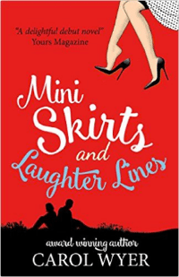
JF: A charming and effective design, with a couple of quibbles: the meaningless “award winning author” doesn’t belong on any book, and I have to say, it doesn’t look like your lady is wearing a miniskirt.
Aimee Coveney submitted Small Lives, Big World designed by Aimee Coveney. “Small Lives, Big World is a quirky and inventive collection of short stories that will appeals to well-travelled readers and those with an interest in different cultures, something that was interesting to convey in a cover design.”

JF: I like some of the details on the title, but the cover seems colorless, which is odd for a very colorful subject.
alan sproles submitted Billy Bedivere in the Quest for the Dragon Queen designed by Emily Hare.

JF: This is an exciting, action packed cover, but I wonder if it would be even more emphatic without that “branding stripe” running like a fence along the bottom.
alan sproles submitted The Train from Outer Space designed by Emily Hare.

JF: Very nicely drawn cover with drama and story. Looks like it was inspired by Dune.
Alberto Hazan submitted The League of Freaks: Series Box Set (Books 1-4) designed by Margo Murphy. “The cover of “The League of Freaks: Series Box Set (Books 1-4)” is a compilation of the four covers designed by Margo Murphy.”
")
JF: I can appreciate the appeal of this approach, but I prefer the boxed sets with one, unified cover.
Alfredo De Braganza submitted Matar a Dawood designed by Prakash Soni. “Hi. It is a pleasure for me to submit my book cover for your competition. I am from Spain and my designer is from India. Thank you very much for your attention. Best. Alfredo”

JF: The colors and style make this emphatic, although the visual is a bit confusing.
Alicia Wright submitted Hartman House designed by The Cover Collection. “One big magic house, that holds all manner of supernatural beings.”

JF: Very cool and alluring, draws us right in.
Alina Sayre submitted The Illuminator’s Gift designed by Jenny Zemanek of Seedlings Design Studio. “Jenny worked with me to rebrand my young adult fantasy series. I asked for a “visionlike” cover with rich colors and soft textures, she blended photographic and illustrative elements to create this magical confection. I couldn’t be more thrilled!”

JF: It’s obvious that a lot of careful work went into this cover, but it doesn’t dome together for me into one, cohesive whole.
Alison Stuart submitted Her Rebel Heart designed by Fiona Jayde. “I wanted a (historically accurate!) cover that conveyed the story of two strong willed people caught in the midst of the English Civil War. The heroine won’t cede the command of her home easily to the man her father has sent to ‘help’ her. It is a battle of equals.”

JF: Lots of story and the pregnant motion of the man clasping the woman’s arm power this cover, which also has some lovely touches on the title typography.
Amy Wasp submitted With Her Boots On: A Cradle to Grave Mystery designed by Stewart Williams. “I didn’t give Stewart much direction for this beyond telling him I was looking for a classic Lesbian Pulp feel, with a touch of Thelma and Louise. I also let him know one of the characters is Thai. I think he did an amazing job capturing the feel of the book. I love his typography.”

JF: Great stuff, an idiosyncratic style that really stands out. It aces the “classic lesbian pulp” look beautifully. ★
Aneirin Flynn submitted Sea of Lies designed by Aneirin Flynn. “Based on the fictionalization of real events, this espionage thriller required a cover that was realistic, dramatic and enigmatic. The artwork features documents, stamps, and photographs that allude to the central plot of the book.”

JF: Nice job.
Angela Hudson submitted Mark of Betrayal designed by AM Hudson. “The third book in the Dark Secrets series. I wanted something dark and deeply sad. What works better than the depths of a stormy ocean, with the offer of hope (in the form of a lighthouse) somewhere on the horizon? All story elements on the cover are featured moments in this book.”

JF: The visuals are strongly incongruent, since the peaceful figure could never exist within the stormy sea, and the title type is similarly mismatched. Nice colors, though.
Avie Adams submitted Incanta | Soul-Catcher designed by Avie Adams. “Cover design for dark fantasy novel for new adults.”

JF: A decent cover, but I don’t think the red flourishes add anything at all.
Belinda Beeck submitted Kitty Cat and the New Pet designed by Belinda Beeck (aka B. J. Beeck). “‘Kitty Cat and the New Pet’ is the first in the picture book series ‘Millie’s World’. I have another two books in the series. On all the covers I have kept the same font, the same branding of Millie’s head in the left top corner and carefully chosen the background colour- bright and no distractions.”

JF: A charming and appropriate illustration that needs much better lettering or typography.
Bill Powers submitted The Pharm House designed by Bill Powers and DonnaInk Publications. “The Pharm House is set in an international pharmaceutical company. The cover shows a metro skyline with hypodermic needles as the skyscrapers.”

JF: A really good concept, but a weak an ineffective execution.
Bill Powers submitted The Torch is Passed designed by Bookbaby. “The cover is a visual metaphor for the story. The cover shows a father protecting his young daughter, but the story is actually about a daughter protecting her father and family.”

JF: (Inevitable) reappearance of the silhouettes. A good composition, dragged down by overworked type and cut-outs that look like they are floating.
Bob Goddard submitted Mother Moon designed by Esther Lemmens. “Front and back covers relate to the two strands/timelines/locations of the story.”

JF: An effective sci-fi cover, and I like the way the designer draws our attention to the little spaceman figure, that really puts us in the scene.
Brandon Mattinen submitted Six Minutes designed by James Schmelzer. “I really wanted to have a cover that was gritty and realistic to reflect the sport of wrestling, which plays a major role of in the story! We had two weeks until my book came out, so I prepped for the shoot, and James and I did it one early Friday morning! (yes that is me, and yes I am a wrestler)”

Bryan Higby submitted The OzValt Grant Collection designed by Scott Higby. “Scott Higby is my brother, a fine arts painter, photographer, and teaches high school art in Afton NY. He has done many of my eBook and print book covers. Mostly he does my crime thriller series, The OzValt Grant stories.”

JF: An interestingly gritty illustration style, but the typography needs a lot of help.
Bryan Higby submitted Pizza Man designed by Jim Webb. “Jim Webb is a professional comic book artist and teaches at Pratt Institute in NYC. He has done several of my eBook and print book covers. I have used Jim’s look to help brand my DenMark Chronicles Horror/Action Adventure series of boooks. He is a freelance artist and doesn’t have a website.”

JF: I love the comic book art for this cover, it’s fantastic. Title would balance the rest better if it was a bit larger.
Caron Pescatore submitted The Doll Dilemma designed by Jeanine Henning.

JF: A little rough looking, and why does it have to say “Kid’s Court” twice?
Charles Johnson submitted The Ammolite Adventures Redstone designed by B-Ro. “An epic cover for an epic adventure”

JF: A lovely drawing and classic typography, not sure it wouldn’t be stronger without the dog staring at us.
Cindy Skaggs submitted Live By The Team designed by L.J. Anderson, Mayhem Cover Creations. “L.J. designed a cover and concept for a new romantic suspense series. We collaborated well–much back and forth–to get the right image for this novel and the remaining Team Fear series. When you see all the series covers in a row, you can see she completely rocked it!”

JF: This is a strong and effective cover that sells its story well, with nice touches like the doglegs on the title and the textured background. But it has one serious typographic problem, and that’s the space between the words “Live” and “By” and between the words “The” and “Team” is much, much larger than the space between the lines, and that simply doesn’t make sense. At a glance, it reads “Live the by team.”
Clive Culverhouse submitted The Legend Of Heliodor: Tales From The Realm designed by Matt Maguire. “Stunning clarity and intrigue. The sinister face of a beast frighteningly human and ripped by a savage claw to reveal a dazzling crystal as crystals form the basis of the book. A cover that is difficult to stop looking at! Matt has done a superb job on this design.”

JF: Except for the disappearing dark-red-on-black subtitle, it’s pretty good.
Cora Graphics submitted Frozen Dreams designed by Cora Graphics.

JF: This sci-fi cover has many story elements plus the earnest man, but manages to keep them all in balance with an attractive look.
Cora Graphics submitted Terminus designed by Cora Graphics.

JF: While this cover is every bit as effective as the one above, you have to question to one type element that isn’t on a diagonal; it’s a bit incongruous.
Cora Graphics submitted L’erede di Tahira designed by Cora Graphics.

JF: There’s an interesting aura of mystery here.
Cora Graphics submitted The MirrorMasters designed by Cora Graphics.

Cora Graphics submitted Sei il mio respiro designed by Cora Graphics.

JF: I don’t know the significance of the beads in the woman’s mouth, but it makes for an arresting image.
Dane Low submitted Genie designed by Dane at CreativIndie.com.

JF: Stylish and mesmerizing, very effective.
Dane Low submitted LUC: A Spy Thriller designed by Ebook Launch.

JF: The shadow covering part of the title is enough to cast an ominous spell on this scene.
Dane Low submitted A Pacific Murder designed by Ebook Launch.

JF: A bloody good genre cover with a great sense of place and lots of juicy details.
Dane Low submitted Breaking the Ice designed by Ebook Launch.

Dane Low submitted Tangled Up In You designed by Ebook Launch.

JF: Adeptly combines the visual and the verbal to emphasize the “tangle.”
Dane Low submitted Sand Angel: A Time Travel Romance designed by Ebook Launch.

Dane Low submitted Dystance: Winter’s Rising designed by Ebook Launch.

Dane Low submitted The Fell Hound of Adversity designed by Ebook Launch.

JF: Very classy with a strong feel of the 1930s. Note how the background has been manipulated to allow the title to stand out.
Dane Low submitted The Heart’s Shrapnel designed by Ebook Launch.

JF: The designer has made a strong effort to combine two incompatible things (“heart” and “shrapnel”) and mostly succeeded.
Dane Low submitted Twisted designed by Ebook Launch.

JF: A strong cover that promises lots of action. Again we see how the figure walking away from us can lead us into the story.
Dave Rogers submitted Shut Up and Drive designed by Dave Michael Rogers. “Rarely do customer book reviews comment on the cover, so the following review on Amazon was a nice surprise:- “… I have to say how much I love the cover, there is something really intriguing about it and after reading the book it totally suits the story.””

JF: Always nice to please your fans, but I’m not cheering, this looks pretty raw to me.
Delilah Alvares submitted The Maze designed by Christopher Matthews Publishing. “A crime novel, with a psychological hook, leaving you tapped, haunted and questioning everything you have ever known.”

JF: It leaves me wondering why the designer thought we would be able to decipher whatever is inside the title type mask.
Diane McGyver submitted Scattered Stones designed by Diane Lynn McGyver. “This is the second book in The Castle Keepers series, so I kept the font style for the title and author name the same as the first. My goal was to provide the feeling of travelling within a fantasy world.”

JF: Would have been stronger with a better typeface for the title, this one is very wishy-washy.
Donatella Atzori submitted IL PROGETTO designed by Donatella Atzori. “The cover is a collage made by myself. Thank you for your attention. Donatella Atzori”

JF: Congratulations, but I still don’t know what “The Project” is about.
Donna Lindahl submitted The Favors Game designed by Donna Lindahl.

JF: Proves that simply applying type to a photo does not confer any meaning whatsoever.
Dusty Holloway submitted Dragon Dreams designed by Cheri Schmidt. “Dragon Dreams is an epic fantasy romance book. The main character, Auri, is the girl on each cover. Each cover in the series centers around the magnificent castle that also plays a central role in the series. We’ve also, as time has progressed through the storyline included that on the covers.”

Ed Hammond submitted Regime Change for Beginners: Dictator Edition designed by Mark Ecob. “Mark Ecob’s design is based around the central theme of the darkly satirical story, namely the use of an Artificial Intelligence as a tool to aid in the overthrow of a regime. The gas-mask image was overlaid with text to produce a hybrid, with hints of the Matrix and V for Vendetta.”

JF: Love the title, and I think this could be a really effective way to represent your story on the cover, but I wish it was easier to see.
Elizabeth Mapstone submitted The Amazon’s Girdle designed by Ana Grigoriu. “The cover has been the one key element that people love before they buy the book. I think it is beautiful.”

JF: A nice layout, but I find the woman oddly passive.
Frankie Bow submitted The Invasive Species designed by Hawaiian Heritage Press. “In Invasive Species, the amateur sleuth MC gets dragged into in the GMO controversy. But as a mainlander living in Hawaii, the title also refers to her. Her hair is a mass of glowing biohazard symbols. The fern and monstera background are a menacing red. Her jaunty stride shows her naive confidence.”

JF: And a book cover that, due to its strongly graphic style and highly contrasting color combinations, achieves a big helping of “Pow!”
Gary Nilsen submitted Alfheim designed by Gary Nilsen. “The cover design of the book captures a setting feature from the book…”

JF: It’s gorgeous and evocative, and the typography suits your subject perfectly, but I do wish the title and author’s name were a bit larger, I think they would balance that great illustration better.
Gita V. Reddy V. Reddy submitted Super-Duper Monty designed by Abira Das.

JF: Super-duper fun!
Heidi Kneale submitted Her Endearing Young Charms designed by Heidi Kneale. “Wanted a cover that suggested Fantasy Romance, but not a bodice-ripper.”

JF: Proof that simply applying type to a photo doesn’t automatically result in a book cover.
Jade Zivanovic submitted Betrayals of Another Kind designed by Jade & Vlad at Steam Power Studios. “We wanted to do a high quality illustration for the book cover to represent all the hard work the authors for the Anthology put into their writing. We did three concept sketches and the compiler and editor of the anthology chose this one.”

JF: Great illustration, but the title is suffering in comparison, it needs to be larger and/or brighter.
James Cherry submitted 2048: A Diary designed by Mark London & James Cherry. “This novel set in the future, is a first person narrative that takes readers inside the head of its funny, entertaining protagonist. The cover image, painted by its author, evokes a futuristic feel while it expresses the angst and anomie of the book’s hero.”

JF: I hope he writes as well as he draws, because this is a delightful cover that deftly signals the kind of book to be found within. (And a great font choice, too.) ★
James Egan submitted Oracle Resurrection designed by James T. Egan of Bookfly Design.

JF: The dramatic type treatment helps to highlight the incipient violence of the scene, revealed.
James Egan submitted Ladies Man designed by James T. Egan of Bookfly Design.

JF: The cosmopolitan font highlights the somewhat androgynous central figure. Perfectly in balance, this cover makes a strong statement. (Note that if you actually are a bestselling author, this is the way to say that on your cover: you have to be specific.) ★
James Hoch submitted Fracked: Earth’s warning! designed by James S. Hoch. “The seismic waves overlaid onto the picture of the planet relate to how the oil industry might just be cracking open the planet. In the last several years, Oklahoma and Texas have seen a substantial rise in man-made earthquakes.”

JF: Unmistakably home made, and not like a tasty pie, either.
James Vance submitted Without Yesterday: Mona’s War designed by Trisha Fitzgerald-Jung. “As author, I suggested to the cover artist that I would like the cover to portray the novel’s theme & to also include an image of the novel’s hero, ‘Mona’. Our collaboration produced a cover reflecting the horrors of WWII & the hero’s expression of defiance in the face of adversity.”

Jayd Alex Ingram submitted A Shadow Full Of Sapphires designed by Jayd Alex Ingram. “The cover design depicts the main character’s alter ego, The Pierrot. I wanted to represent the dark-fantasy feel of the novel using one of my own illustrations on the cover. I like that it doesn’t follow typical contemporary cover design, and it took a long time to make. I hope you like it :D”

JF: I like the distinctive style, but be careful the darkness doesn’t overwhelm the rest of the cover.
Jeff Nine submitted Traitor’s Masque designed by Jeff Nine.

JF: An interesting design with lots of ways to tell this is historical romance, from the costume to the architecture, to the flourishes. The designer seems to be leading our eye to the woman’s derriere, more of a modern fixation? An attractive cover nonetheless.
John Mimbs submitted Numbers of Redemption designed by John Christopher Mimbs.

JF: This appears to be an illustration with a bunch of little silhouettes applied to it, but frankly, they are very small and I can’t figure out what this book is about.
Jordon Greene submitted They’ll Call It Treason designed by Creative Paramita. “The cover captures the mood and determination of the story’s main character, Ethan Shaw. Determined even in the face of the prospects he faces.”

JF: A solid genre cover with an attractive protagonist.
Karen Aminadra submitted The Uncanny Life of Polly designed by Karen Aminadra. “Chick-Lit, tongue-in-cheek modern romance.”

JF: Colorful, with a light touch.
Karl Drinkwater submitted They Move Below designed by Karl Drinkwater. “I wanted an ambiguous image that could represent a number of stories. Blue for night, cold, death, dreams. Could be yearning dead, below the sea or trapped underground (matches a few stories), or a person paralysed by blue light (from a tale about aliens). Part of a full wraparound print cover.”

JF: It all works well, but I think the yellow for the title is off-key. Try a colder color there.
Katrina Archer submitted The Tree of Souls designed by Heather McDougal. “This cover captures several aspects of the book. The purple conveys its darker tone. The smoke: a key fantastical element. The mandala: a brand and identifying symbol. The duality of the tree represents the tree in the title & the story’s themes of life & death, good & evil, love & jealousy.”

JF: A nice layout, but there’s nothing to focus on, where it should be: at the center of the mandala.
Keith Shaw submitted Neworld Papers: The Warriors’ Tale designed by Dug Nation. “The artist was charged with creating an image that harkened back to the bold colors and dynamic action of covers from the era of classic pulp magazines.”

JF: Well done, and the upward-looking perspective on the strange scene makes it all the more dramatic.
Kelli Fajardo submitted K The Awakening designed by Christine Powell Gomez. “K The Awakening is a paranormal/fantasy book and the main character K is who is pictured on the front cover. I originally hired Christine to do book 2’s cover, which she did, but when she was finished I was so happy with the final result, I had her redo this cover and absolutely love it.”

JF: A beautiful cover with lots of style, but I really object to the way the author’s name is pushed almost off the top edge. A quibble? Maybe, but it creates an unpleasant tension and the rest of the cover is quite good.
Kim DDD submitted Hush designed by Marushka from DDD. “Cover design for Murder, Mystery, Thriller book, Mason Black Series, Book 1”

JF: A very strong series design for these contemporary thrillers. Strong type, abundant texture, and a signature visual add up nicely.
Kim DDD submitted Lady Luck designed by Marushka from DDD. “Cover design for Murder, Mystery, Thriller book, Mason Black Series, Book 2”

Kim DDD submitted Nighthawks designed by Milo from DDD. “Cover design for Urban Fantasy book”

JF: Lovely type treatment, the visual is indistinct.
Kim DDD submitted Rogue Agent designed by Marushka from DDD. “Cover design for Mystery, Thriller, Suspense book”

JF: The square defined by the man’s face, their shoulders, the gun, and her hand is odd and very distracting. The point at which the gun barrel and her finger meet is highlighted but illogical.
Kim DDD submitted Into Aether designed by Milo from DDD. “Cover design for Steampunk Fantasy book, The Trinity Key Trilogy Series, Book 1”

JF: A spectacular series design for steampunk fantasy. The unique title treatment combined with subtle colors glimpses of title-identifying environments. ★
Kim DDD submitted Escape Aether designed by Milo from DDD. “Cover design for Steampunk Fantasy book, The Trinity Key Trilogy Series, Book 2”

Kim DDD submitted Save Aether designed by Milo from DDD. “Cover design for Steampunk Fantasy book, The Trinity Key Trilogy Series, Book 3”

Kim DDD submitted The Ten designed by Marushka from DDD. “Cover design for Mystery, Thriller, Suspense book”

JF: A little heavy-handed.
Kim DDD submitted Ghosting designed by Milo from DDD. “Cover design for Urban Fantasy, Paranormal, Fiction book”

JF: This title treatment seems just right to me. Not sure about that hair, though.
Kim DDD submitted Songstruck designed by Kitten from DDD. “Cover design for High Fantasy, Magic book”

JF: The gold ornamental filagree is an appropriate framing device that works well for this fantasy title. Not sure you needed the “highlight” behind the title, it actually makes it a bit more difficult to read.
Kris Bowser submitted Spirit Notes Fading designed by Kris Bowser. “My challenge was to represent four fantasy stories that mainly have tone in common. I tried to create the effect of fading into a foggy afternoon, while using type that works for both contemporary and secondary world fantasy. I keep wondering if I left too many branches near the letters.”

JF: Well, yes. The image is interesting, but the similarity in weight between the branches and your delicate font make it difficult to read and muddies the design message. Fewer branches, different colors, or a stronger font might each solve the problem.
Kristin Gleeson submitted In Praise of the Bees designed by JD Smith Design. “The image came from a design for a stained glass window by Harry Clarke. The design is in the Corning Museum and the stained glass is at Honan Chapel Co. Cork, Ireland. It depicts St Gobnait, patron saint of bees who figures in the story.”

JF: This fine design looks more suitable to a paperback.
Laura Hile submitted Darcy By Any Other Name designed by Damonza. “I’m excited to share this wonderful cover for my Pride and Prejudice body swap romance. (Yes, that’s podgy Mr. Collins in the mirror!) The designers at Damonza took my timid concept and ran with it. (I found Damonza through this contest and The Book Designer’s interior templates too. Thanks!)”

JF: Lovely. Does a clever job of getting straight to the point of the “body swap” and all the visual signals position it perfectly. ★
Leo McBride submitted Quartet: A short story anthology designed by Leo McBride. “My own design for my short story anthology – which mixes fantasy elements with the modern day. Cover created by mixing different stock images. Indesign and Photoshop used in the process.”

JF: Kind of working against itself—it looks very modern.
Levi Cheruo submitted The UglyBeautiful Tale of a Stupid, Stupid Heart: When Mother Hen Eats her Grownup Chicks designed by Levi Cheruo Cheptora.

JF: Speechless.
Lisa Caskey submitted The Farmed designed by Meredith Lagerman. “This contest is so cool! Thanks for hosting!”

JF: The double helix is a great and recognizable graphic, but the cover looks unfinished, more like a draft.
Lori Robinett submitted Diamond in the Rough designed by Jaycee / Sweet & Spicy Designs. “This book has a darker feel than my previous book, so I asked the designer to capture that in the cover. The setting of the book is the Diamond J, a cutting horse ranch. I think the designer did a good job of incorporating the setting and the feel of the book into this cover.”

JF: The designer knows exactly what readers of these books are looking for, and delivers.
Luke Ahearn submitted Gravitational Forces designed by Luke Ahearn.

JF: Pretty cool, but what are those, purple snakes?
Luke Ahearn submitted Robyn’s Rock designed by Luke Ahearn.

JF: Yeah, no. That really doesn’t work, lots of stuff that doesn’t belong together kind of dumped onto the cover.
Luke Ahearn submitted Sixty Seven Salamanders designed by Luke Ahearn.

JF: These two people are not convincing, and the type needs help.
Luke Ahearn submitted Conguise Chronicles Volume One designed by Luke Ahearn. “Hand painted eye. Notice the reflection. This was a cover redo.”

JF: I like the figure reflected in the snake’s eye, but the type looks like it was borrowed from a neon sign factory.
Luke Ahearn submitted Stories of the Confederated Star Systems designed by Luke Ahearn.

Luke Ahearn submitted Unhappily Ever AFter designed by Luke Ahearn. “Great fun to design this cover.”

JF: A remarkably awkward piece of artwork. I can save you the trouble of looking closer: the queen does not have a beard, those are shadows. Painful.
Mark Cameron submitted Goodnight Sunshine designed by Kristin Summers. “This cover uses original artwork by a painter who lives in the author’s community of Gibsons, BC (Canada), based on his reading of the novel.”

JF: Surprisingly affecting, its deep peacefulness is quite appealing.
Mia McKimmy submitted The Sacrifice designed by Noelle Pierce. “This cover is a visual image of a scene from the book. I described it to my up and coming designer, and she matched it perfectly. I’m very pleased with the outcome and would love for her to get recognition.”

JF: Gives the impression the fellow is something of a giant.
Michelle Gilliam submitted Roman Rescue designed by Jonathon Laing. “This picture is of the protagonist Maggie, a nineteen-year-old girl, running on the streets of Rome to find a secret villa to hide away from men ransacking their apartment. Found halfway through the novel, a dress she wears for three days symbolizes the fear and state of her heart towards love.”

Michelle Laurie submitted The Bargain Bin and other short stories designed by Inspired Cover Designs.

JF: The simplicity and cleverness of this cover really set it apart. ★
Michelle Rene Goodhew submitted The Romanovsky Stain designed by Michelle Rene Goodhew. ““The Romanovsky Stain” is the first of a series of five spy thrillers coming from an expert in the field. The book’s setting is contemporary, but also has that old school charm, so illustrated the cover with an old school feel and stressed it’s setting and genre.”

JF: Definitely old school, that title is almost jumping off the cover.
Mike Reeves-McMillan submitted Auckland Allies designed by Chris Howard. “I gave Chris one of the key scenes to illustrate, and I think he’s captured a dynamic moment.”

JF: Why make the title so hard to read? The visual lacks a clear focus or much of a point.
Mike Russell submitted Strange Medicine designed by Mike Russell. “Mike Russell is the author and artist for Strange Medicine. You very kindly gave us a Gold Star Award for the previous book, Nothing Is Strange.”

JF: Fun! Needs a border to keep it from bleeding onto the page.
MJ Kobernus submitted Salvage designed by Ashraf Shalaby. “Salvage is the first of three stories that precede a sci-fi novel, expected to be released in 2018. It shows a shuttle approaching the Argoss, a giant habitat built to travel the vast interstellar highway.”

JF: With an image this strong, overworking the type with lots of shadows and glitz really works against you. Tone down the type and let the image shine.
Monica Pierce submitted The Shadow & The Sun designed by Scott Pierce. “The book’s genre is romantic fantasy (sword & sorcery) and the illustrator is Qistina Khalidah.”

JF: It’s always a challenge to try to picture magical elements, and here I’m not sure all the light forms actually help us appreciate the interaction between the man and the woman, and that’s what the focus of the cover is meant to be, right?
Neil Rochford submitted The Blue Ridge Project designed by ebooklaunch.com. “I found this cover on ebooklaunch and it just hit me as the perfect style and image for my book. Apparently it doesn’t always happen like that, so I realize how lucky I was to find a premade cover that does the job so well.”

JF: Brain, we have liftoff!
Nicole Collet submitted RED: A Love Story designed by Eleanor Bennett. “This is a love story so the book title and the dominant color on the cover (red for passion) convey that. The butterfly is a symbol of transformation, freedom and lightness, translating the novel’s essence. I cropped it to make it more interesting, less obvious–organic sensuality, dialog of curves.”

JF: Very nice imagery, the type doesn’t “sing” for me.
Oscar Hutson submitted The Flight of the White Dove designed by Oscar Hutson.

JF: The self-published look in all its glory.
Paula Berinstein submitted Amanda Lester and the Pink Sugar Conspiracy designed by Anna Mogileva.

JF: A good concept for the targeted audience, but the two central figures seem to have no connection to each other either visually or emotionally.
Regina Clarke submitted The Visitors designed by Brenda Clarke. “I found the artist a few months ago. She is in Australia. (Thanks be to the Internet!) The similarity of our last name is entirely a coincidence–unless there is an ancient U.K. connection…”

JF: An aura of eeriness, but I wish I could read the author name better.
Rena Hoberman submitted Killing Game designed by Cover Quill.

JF: A basic genre cover, with lots of energy.
Ricardo Victoria submitted Tales from the Universe designed by Ricardo Victoria.

JF: One of the weakest title treatments I’ve seen.
Ron Herron submitted Blood Lake designed by R. L. Herron. “An historic image of a Cherokee prophet in the Smoky Mountains of eastern Tennessee in 1838 … just prior to the forced migration that would become known as “The Trail of Tears.””

JF: Combining images is always a challenge, and here, that setting sun is wildly out of place on an otherwise interesting cover.
Sarena Ulibarri submitted Char designed by Sarena Ulibarri and Eileen Wiedbrauk.

JF: Not sure I know what’s going on here.
Shea Swain submitted Invidious Betrayal designed by Michelle. “This cover represents a major scene in the book and how the hero will protect and care for my female lead.”

JF: Smooth.
Siera London submitted Catching Rebecca: A Bachelor of Shell Cove Novel designed by Maroon Ash Publishing.

Silvia Wadhwa submitted Rules of Engagement designed by Silvia Wadhwa. “I wanted something that said: mysterious, erotic, hot, suspense …. So I went for the black and white with a touch of vamp red.”

JF: It’s very difficult for amateur authors to compete in designing book covers, and they have put their books at a disadvantage in the marketplace.
Susan Kiernan-Lewis submitted Reckless designed by Susan Kiernan-Lewis. “Not sure of the photo choice–or the type. I have a long and clunky last name that I’m not sure whether to stack or stretch out.”

JF: Better, but see my note immediately above.
Suzanne Parrott submitted Eyewitness, a nautical murder mystery designed by Suzanne Fyhrie Parrott. “The illustration emulates an old wood-carving illustration, printed on “linen cloth”. Derived from the main character’s desire to sail solo to Bermuda like mariners of the past. He encounters a hurricane as well as a humpback whale ~ a key witness, likened to Moby Dick.”

Tam Francis submitted The Girl in the Jitterbug Dress designed by Karen Phillips. “No copyright free images of swing dancing were available that captured, the youth, energy, and sensuality I wished to convey on the cover. I orchestrated my own photoshoot with models in vintage garb. I sent the pictures to my cover designer Karen Phillips. She made vintage, nostalgic magic. Whoosh”

JF: I love the energy and sensuality of this cover, and it adds several historical notes along with the distinctive title.
Tammy Seidick submitted A Thousand Yesteryears designed by Tammy Seidick. “Thanks for your review!”

JF: The sense of mystery in the illustration is mirrored in the type treatment.
Timothy Doyle submitted Faces in the Mist: A Jacob Turner Chronicle designed by Timothy C Doyle.

Tracy Korn submitted AQUA designed by James Korn. “Thank you!”

JF: Nicely done, and the stylized look suits the underwater theme well.
Turner Tomlinson submitted The Shooter Act designed by Elle Ternes/Turner Tomlinson. “Elle and I worked on a cover that we wanted to meet some typical industry cover conventions, but also play to the Instagram generation. Our goals were simplicity, tone of the story, and also eye-catching appeal, and I think we struck a nice balance of it all.”

JF: The cover is fun and will stand out in the crowd.
Victor Davis submitted The Gingerbread Collection designed by Paul Copello. “The title story Gingerbread is inspired by the Hansel and Gretel fairy tale. I love that at first glance the cover looks innocuous, just a girl walking in the woods. Looking closer, the eerie tunnel and half-eaten gingerbread cookie draw the viewer in, as I hope the stories within also do.”

JF: You may be asking too much of browsers, and the typography really needs to be stronger on this cover.
Wendy Holley submitted A Matter of Courage designed by Paper & Sage. “The road image conveys the journey of self discovery and the Montana setting. The image of the character is true to what she looks like and her eyes reveal fear and uncertainty. Red tones speak to danger and the courage to face her fears. I believe we achieved all of our goals with this cover.”

JF: Serviceable.
Z. A. Coe submitted The Inventor’s Slave designed by Z. A. Coe.

JF: Although it has an interesting look, this cover just doesn’t hold together.
Nonfiction Covers
A.G. Billig submitted I Choose Love! designed by Felix Barca.

JF: Another red on black subtitle that’s hard to read. And there are so many shapes to deal with and interpret, adding the “peak” at the top seems gratuitous.
Aimee Coveney submitted How Not to Murder Your Grumpy designed by Aimee Coveney.

JF: A charming cover with good illustration, making it all the more unnecessary to add the “award winning author” line. If you’re unwilling to say which award you won, please just leave it off the cover, thanks.
Andrea Dean submitted Fifty Days to 50: A Mini-Memoir of My Midlife Crisis designed by Andrea Dean. “I tried to communicate visually that my book is about turning fifty years old, and that it is a pictorial memoir. I put some cover ideas out on Facebook when I was conceptualizing, and my friends made really good suggestions that helped me to finalize the design.”

JF: It does make it clear what kind of book it is, although I’m sure you realize it’s not a “professional quality” book cover.
ARLENE DAYRIT submitted The Voice of Divine Love designed by Bibsy Ann Torio. “The artwork in the book cover is an image of a path to a secret garden. In the ebook, God invites each of us to this secret garden, a quiet place inside us, where we can take intimate walks together with him. In this secret garden where we can be alone with him, our joy will be complete.”

JF: Well suited to the abstract nature of the content.
Darren Hibbs submitted 10 Week Bible Study Series designed by Darren Hibbs. “This is the second in a growing series of Bible Studies. For each volume, the text and artwork changes. The artwork is always a work of sacred art that fits with the study with a b&w filter applied for uniformity.”

JF: A solid design for this series of instructional works.
David King submitted A Prisoner of Christ designed by David Avoura King. “Kept it simple to illustrate the point”

JF: Not very good, I’m afraid. Compare to the one above.
David Moore submitted 10 Minute Guide to Bogota Colombia designed by David Moore. “This is my first ebook.”

JF: Congratulations! This cover is good, and would be better if you got rid of the outline on the word “Colombia.”
Frances Caballo submitted The Author’s Guide to Goodreads: How to Engage with Readers and Market Your Books designed by Kit Foster. “Looking forward to your remarks!”

JF: Although it’s clear, this cover is pretty generic.
Heather Ellis submitted Ubuntu: One Woman’s Motorcycle Odyssey Across Africa designed by Peter Long. “As the author, I photographed this image of a group of giraffes by chance on my ride to the Maasai Mara Game Reserve, Kenya. I was travelling across Africa by motorcycle in 1993/1994. Book designer Peter Long’s design skill is exceptional in capturing the true essence of my story – that of ubuntu”

JF: A terrific cover that puts us right in the scene. Combined with the lettering that reminds us of the craftwork we see throughout Africa. Beautifully done. ★
Jenifer Joy Madden submitted How To Be a Durable Human designed by Patty Wallace. “This book is part of a series. Both covers designed by Patty Wallce. ”

JF: Clear and well designed, the expert typography helps to legitimize the use of silhouettes. ★
Jessi Andricks submitted The Smoothie Life designed by Jessi Andricks.

JF: The model is attractive, but the cover is ineffective.
Jonah Imeson submitted ANGELS and Other Inspirational Verse designed by Jonah Imeson.

Kim DDD submitted I Am Woman: Surviving the Past, the Present, & the Future designed by Kitten from DDD. “Cover design for Non-fiction, Biographies & Memoirs book”

JF: A striking cover that goes directly to the question, “Am I interested in this author’s story?”
Kristen Ethridge submitted Storm Surge designed by Kristen Ethridge. “Storm Surge is my memoir about living through 2008’s Hurricane Ike and it is the real-life “story behind the stories” of my Port Provident: Hurricane Hope inspirational romance series. This image is actually of the fishing pier a few blocks from my home that was destroyed by Hurricane Ike.”

JF: The designer’s very good work with type can’t hold all the disparate elements together, and I think that’s the fault of the composition itself.
Lois Hoffman submitted Write a Book Grow Your Business designed by Lois Hoffman.

JF: An extremely quiet approach for a dynamic subject.
Phil Mayes submitted How Two: Have a Successful Relationship designed by Damonza. “We used the June 2015 results to pick covers we liked. Damonza was disproportionately represented, so we chose them and worked with the wonderful and very responsive Alisha. She offered 5 drafts, and we combined elements and requested changes until we had exactly what we wanted.”

JF: Sensitive.
Sandra Warren submitted We Bought A WWII Bomber designed by Kimberly Rae. “The photo on the cover is of the actual B-17 bomber dedication ceremony on April 6, 1943–the bomber purchased by the Michigan High School students. It is a patriotic story, hence the red, white & blue colors, and silhouetted B-17 bombers.”

JF: Visually it’s a bit chaotic.
Sharonflor the Love Bos submitted For the love of Mother Earth designed by Sharon Bos.

Teddi Black submitted Psalm of my Heart designed by Teddi Black.

JF: A gorgeous cover that perfectly mirrors the religious content. Even the long swash running through the title helps to emphasize the emotional nature of the book. ★
Trevor MacDonald submitted Where’s the Mother? Stories from a Transgender Dad designed by David Simpson. “The “50s housewife” featured on the cover was more than just a model – the book tells the story of a transgender man who had dozens of women donate breastmilk for his babies, and she is one of the donors. Far from being a clueless and oppressed wife, she is an ivy-league PhD candidate.”

JF: Amusing, and the model’s look and pose are perfect.
Weam Namou submitted Healing Wisdom for a Wounded World: My Life-Changing Journey Through a Shamanic School designed by Kristi Webster. “The front cover reflects a woman, the author, reflecting on life’s complexities. The universe, through spiritual means, provides her with a new perspective on life. The moon, smoke, candles, and earth tone colors on the cover mirror the warmth and mystery that the reader finds inside the book.”

JF: An affecting image, although overall it appears a bit dark.
Well, that’s it for this month. I hope you found it interesting, and that you’ll share with other people interested in self-publishing.
Use the share buttons below to Tweet it, Share it on Facebook, Plus-1 it on Google+, Link to it!
Our next awards post will be on July 25, 2016. Deadline for submissions will be June 30, 2016. Don’t miss it! Here are all the links you’ll need:
- The original announcement post
- E-book Cover Design Awards web page
- Click here to submit your e-book cover
- Follow @JFBookman on Twitter for news about the E-book Cover Design Awards
- Check out past e-Book Cover Design award winners on Pinterest
- Subscribe to The Book Designer Blog
- Badge design by Derek Murphy
