


Welcome to the e-Book Cover Design Awards. This edition is for submissions during March, 2016.
This month we received:
86 covers in the Fiction category
18 covers in the Nonfiction category
Comments, Award Winners, and Gold Stars
I’ve added comments (JF: ) to many of the entries, but not all. Remember that the aim of these posts is educational, and by submitting you are inviting comments, commendations, and constructive criticism.
Thanks to everyone who participated. I hope you enjoy these as much as I did. Please leave a comment to let me know which are your favorites or, if you disagree, let me know why.
Although there is only winner in each category, other covers that were considered for the award or which stood out in some exemplary way, are indicated with a gold star: ★
Award winners and Gold-Starred covers also win the right to display our badges on their websites, so don’t forget to get your badge to get a little more attention for the work you’ve put into your book.
Also please note that we are now linking winning covers to their sales page on Amazon or Smashwords.
Now, without any further ado, here are the winners of this month’s e-Book Cover Design Awards.

e-Book Cover Design Award Winner for March 2016 in Fiction
Mike Iverson submitted Vigil designed by Mike Iverson. “Since the book is an urban vampire story, I used a concrete wall texture as a base. The overlaying blood texture communicates the vampire theme without the obvious fangs for blood running down the chin.”
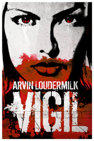

JF: A strong, graphic look that’s just perfect for this vampire thriller, and which expresses the strong typography and branding of the series of novellas that lead up to it.
e-Book Cover Design Award Winner for March 2016 in Nonfiction
Dane Low submitted Somehow I Am Different: Narratives of Searching and Belonging in Jewish Budapest designed by EbookLaunch.com.
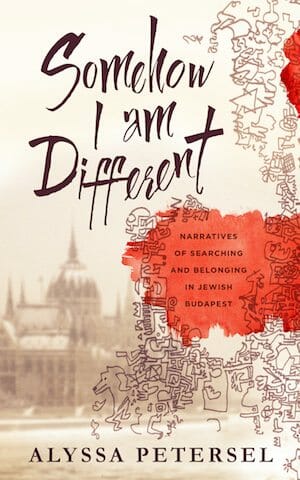

JF: A beautiful and sensitive cover that brings together disparate elements in a careful balance. It’s personal, historical, artful, and multi-layered all at the same time.
Fiction Covers
Aidan Reid submitted Pathfinders designed by Design For Writers.

JF: I don’t think this works particularly well as an ebook cover because the artwork doesn’t “read” well at a small size and the entire cover lacks impact.
Alan Parkinson submitted Idle Threats designed by Craig Turnbull. “The design is based on a Mexican death mask and Craig has added some detail with pound signs, phone numbers etc. The story is based in a call centre hence the headset on the mask. It’s a dark comic tale so we tried to get the colour scheme to reflect this.”

JF: If it wasn’t so hard to make out the image, and if the title wasn’t so attenuated, it would work better. Black on dark gray doesn’t provide much contrast or legibility.
Alan Parkinson submitted Leg It designed by Craig Turnbull. “Craig redesigned my original cover and tried to keep it light hearted in keeping with the book’s theme. The graffiti and football are in reference to a large part of the story being in the protagonist’s childhood. He has also hinted at romance with the love heart on the sign.”

JF: Unreadable and pretty raw.
Aldrea Alien submitted Golden Dawn designed by Aldrea Alien.

JF: A decent effort.
Anne Roberts submitted The Twisted Diary- Obsession designed by Scarlett Rugers.

JF: A compelling image with some issues because so many fonts are used, the title is a bit obscure, and the “brand” icon looks like it’s dripping off her lips.
Brenda Hickey submitted Through the Door designed by Brenda Hickey. “This was my first attempt at cover design, and more than anything, I’d like to know if it is noticeable in a sea of wonderful covers. Or should I leave it up to the professionals?”

JF: You did a good job, but a professional would take it to an entirely new level. As it is, it’s a bit weak, especially the typography, and that’s were a real designer will make a big difference.
Brenda Hickey submitted Winter’s Blood designed by Brenda Hickey. “I wanted to portray a snowy forest, although beautiful, deadly if taken for granted. The blood-red top banner is separated by the title. This short story/novelette’s genre is supernatural horror/paranormal.”

JF: The top banner is detracting from the cover, not adding to it.
Brian Stillman submitted The Lipless Gods designed by Jenny Dayton.

JF: An effective noir-ish cover, although those lips look pretty full to me.
Bruce Judisch submitted Quimby Pond designed by Lynnette Bonner. “”Quimby Pond” is a mystery/suspense–with a nice dose of romance–that focuses on a young woman trying to escape her past. I think Lynnette did a fantastic job setting an aura of the genre with the background, and the depiction of the model’s face perfectly captures the heroine’s angst.”

JF: Although it’s got good finish, this cover misses for me because the image compositing makes the girl look like she has a skin condition, and using 4 totally dissimilar fonts for the four lines of type seems unfocused.
Carol Thomas submitted Wollemi designed by Michelle Reid. “The cover uses a photo from Sydney’s Blue Mountains area. Its use for the cover donated by the photographer. Photo editing and typography by Michelle Reid of Reidesign Space. Cover blurb (an incitement to read that many contemporary YA books have) by the author.”

JF: A dynamic photo but the cover ended up very dull and unremarkable.
CB Archer submitted Vambrace: Keaton Clarke’s Tale designed by CB Archer. “This is the first short story in the Tails of Gentalia Series… er… I mean the Tales of Gentalia Series! The Novelettes are set inside parodies of retro video games so I am basing the covers off of the games they spoof (with a dash of sexy to remind the reader that this is Elfrotica)!”

JF: “Elfrotica,” gotta love that. The video game allusion is strong, but I wish we could see the characters more clearly, that would add to the appeal.
Chad Strong submitted High Stakes designed by Charlene Raddon. “High Stakes is a Western Historical Romance set in the west coast port city of Victoria, BC, Canada in 1877.”

JF: The “pasted together” look in all its glory.
Christopher Morgan submitted Forestium designed by Mihaela Voicu. “This cover design was constructed from the ground up based on an extremely detailed brief I wrote for the artist. There is just 1 stock image (the trees). The cover artist has done an amazing job of bringing my vision to life.”

JF: I love the way this cover sucks us right into the story, a very nice piece of work.
Curtis Mischler submitted Trinity designed by Thor Takano. “Trinity is a journey through space and time tied to the early days of the United State’s nuclear testing program.”

JF: The image is awesome, but the title should better stand out from the background, and the treatment of the author’s name is unnecessarily fussy.
Dane Low submitted An Angel Within designed by EbookLaunch.com.

JF: Very effective, invites our curiosity about the characters, and I especially liked the subtle framing. ★
Dane Low submitted THE PICASSO PROVENANCE designed by EbookLaunch.com.

JF: Clever and apt. Likely a print book cover.
Dane Low submitted Paragons: Age of the Awakening Volume I designed by EbookLaunch.com.

JF: Strong illustration matched with appropriate typography results, as it does here, in a solid cover treatment.
Dane Low submitted Mother designed by EbookLaunch.com.

JF: Deliciously creepy, it made me wince just looking at those stitches.
Diana Stevan submitted The Rubber Fence designed by Jun Ares. “As this story takes place largely on a psychiatric ward, I thought that Jun Ares’s book design spoke about the desperation of those seeking treatment, as well as of the helplessness of the psychiatric intern who has to fight the hospital system that’s as stuck as the patients it treats.”

JF: Restrained yet emotional, with carefully controlled colors and typography, this cover excels at portraying the issues in the book within and reusing a stock photo in a creative way. ★
Diana Stout submitted Grendel’s Mother designed by Jes Richardson. “My vision was to create a solitary figure next to the mere with her shadow in the water along with some trees in black and white. This submission is the designer’s original vision, including the purple, which I liked far better than my vision where she used the images.”

JF: Simple but effective.
Divine Michelle submitted Under the Trees designed by Yonderworldly Design. “The book is a historical romance which reviewers describe as a realistic fairy tale. The final cover art perfectly encapsulates a romantic scene in the book according to the author.”

JF: Lovely, with a mysterious aura.
Dusty Grein submitted The Sleeping Giant designed by Dusty Grein. “I have been a graphics designer for many years, and after writing my first novel, decided to do my own cover. It has been a big hit so far :)”

JF: Dusty, I’m sure you’re a fine graphic designer, but a cover designer you’re not. Otherwise you would know that putting an uncredited “Best-seller!!” sticker on your cover is the sure sign it was produced by an amateur.
Ed Duncan submitted Pigeon-Blood Red designed by Voyage Media. “The rarest rubies have the hue of a freshly killed pigeon’s first drop of blood. The cover is framed with the silhouette of the antagonist, whose prey have come to possess such a ruby necklace. Inside the silhouette, they flee against the back drop of palm trees bordering the pacific ocean.”

JF: An artful and interesting cover that needs a stronger title treatment.
Elisabeth Grace Foley submitted Lost Lake House: A Novella designed by Jennifer Quinlan. “LOST LAKE HOUSE is a retelling of the fairytale “The Twelve Dancing Princesses” set in the Jazz Age. I wanted a cover that evoked the time period and was also thematically linked to my first fairytale retelling CORRAL NOCTURNE, and Jenny Quinlan designed one that was even better than I’d hoped for.”

JF: A wonderful composition (I especially liked the careful placement of the author’s name) that’s seriously weakened by the fussy and attenuated title treatment.
Ellisa Barnes submitted A Sister’s Imposition designed by E.K. Barnes.

JF: A cover with no impact and no “hook.” Why would anyone be interested?
Emiliano Molina submitted Bound in Blood designed by Emiliano Molina.

JF: A carefully constructed cover that suffers from a void at the exact place—the end of that walkway—the designer is pointing us toward.
Fanny Lee Savage submitted Four Days: Book 2 designed by Fanny Lee Savage.

JF: Pretty elements combined with seemingly no rhyme or reason to their placement.
Hanne Arts submitted Just Perfect designed by Hanne Arts. “Thanks for considering my novel! I’ve worked on it for over two years in order to share important messages with my audience (regarding bullying, depression, and eating disorders). Therefore also the depiction of two feet standing on a scale. I appreciate your efforts in organizing this contest :-)”

JF: Nice job, Hanne, I like the strong, graphic look to your cover.
Ian Sutherland submitted Social Engineer designed by Stuart Bache. “1st of 2 submissions. Cover redesigned with a more contemporary crime thriller look to appeal to a broader audience.”

JF: These covers do a great job of thrusting us into the story, and everything works to that effect, including the figures walking away from us and into the story, the strong perspective effect leading our eye into the distance, even the text “teases” at the bottom of the cover. Very effective.
Ian Sutherland submitted Invasion of Privacy designed by Stuart Bache. “2nd of 2 submissions. Cover redesigned with a more contemporary crime thriller look to appeal to a broader audience.”

JF:
Ioana Visan submitted The Night between Heaven and Hell designed by Vega Mandalika. “This is the second installment in The Devil You Know series. It features an angel and a demon and the setting is Paris.”

JF: It’s angelic, but the typography and overall composition need help.
Ioana Visan submitted The Strength of a Heart designed by Vega Mandalika. “This is the second book in The Stolen Wings series. It features a fairy whose wings have been chopped off and now are growing back wrong.”

JF: She does look a bit tormented, but the cover communicates pretty well.
Isabella Bleszynski submitted A Dance Called Africa designed by JDSmith Design. “In this first book of a trilogy, the blend of images and colour was designed to illustrate two important themes which form an inherent part of the narrative; the spectacular lightning storms and the mystical prophesies linked to them.”

JF: A strong cover that uses both the images and the abbreviated color palette to give us a real look into the story.
Jack Giesen submitted Hand of Mars (Starship’s Mage Book 2) designed by Jack Giesen. “Cross-genre fiction has to tell the reader what to expect upfront. We aim for a spaceship and some magic on each book cover, but because the main character was planet-bound for most of this book, that didn’t make sense. In its place: a futuristic helicopter from one particularly action-packed scene.”
")
JF: A very cool illustration, but I wonder at the choice you made to pick a font right from classical times, it seems out of place on this cover.
James Egan submitted Shadow Play designed by James T. Egan of Bookfly Design.

JF: A cover that’s chock full of story and atmosphere. What are those fellows doing, anyway?
James Egan submitted What We Set in Motion designed by James T. Egan of Bookfly Design.

JF: It’s not easy to achieve the beautiful balance of this cover, with its carefully set type and simple illustration style. Focused and calm, yet with a clear line into the novel’s story. ★
Jo Michaels submitted Emancipation designed by Jo Michaels. “Psychological Thriller. Wanted dark and creepy, yet simple and compelling.”

JF: You need to bump up the title to balance with the sufficiently creepy photo. And make the subtitle easier to read, too.
Jonathan LaPoma submitted Developing Minds: An American Ghost Story designed by theBookDesigners. “Developing Minds is about a group of recent college grads who struggle with alienation and addiction as they try to survive teaching at dysfunctional Miami public schools. The cover shows a teacher’s desk with an apple that’s been made into a bong on it, depicting this struggle.”

JF: A high-quality cover that touches all the right notes, works best as a paperback cover.
Karina Kantas submitted Illusional Reality designed by Sharon Lipman. “I knew exactly what I wanted and Sharon quickly bought my vision to life. If you read the book you will see how perfect the cover is”

JF: Unfortunately, that’s the exact opposite of the test we use to evaluate covers. In this case, with so many visuals to process, making the title overly fussy and hard to read doesn’t help.
Keefe R.D submitted Royal Arcanum designed by Keefe R.D. “The cover design is inspired by European medieval, fairy-tales, myth and legend. The atmosphere is strong that it projected the story from inside.”

JF: I find the color band at the top distracting, and although the concept is skillful, the cover lacks contrast making the illustration harder to decipher than it needs to be.
Kevin Brennan submitted Town Father, Or Where Graceful Girls Abound designed by Max Scratchmann. “My designer, Max Scratchmann of Edinburgh, Scotland, did a remarkable job here in making the cover look like an old, well-worn vintage book. Paper folds are visible, along with a taped-over tear in the dust jacket.”

JF: Yes that’s all lovely, but the cover lacks the kind of impact it would need to sell in today’s world.
Kim DDD submitted Blowout designed by Kitten from DDD. “Book cover design for Thriller book”

JF: A solid and well executed thriller cover.
Kim DDD submitted Witch You Well designed by Marushka from DDD. “Book cover design for Cozy Mystery book, Westwick Witches Series”

JF: Way, way too busy and visually chaotic.
Kim DDD submitted Grigory’s Gadget designed by Milo from DDD. “Cover design for Fantasy, Steampunk book”

JF: A solid genre cover, and that title treatment is sumptuous.
Kim DDD submitted If I Should Remember designed by Kitten from DDD. “Cover design for Contemporary Romance, Mystery, Romantic suspense book”

JF: Confused.
Kim DDD submitted Prisoner Mine designed by Kitten from DDD. “Cover design for Contemporary Romantic Suspense book”

JF: Visually strong, typographically weak.
L.D. Beyer submitted An Eye for An Eye designed by Lindsey Andrews. “To capture the themes of the war against terror and the reprisals that follow, I chose the New York City skyline at dusk, set below a dark, menacing sky. There is a sense of a storm brewing, a sense that something bad is about to happen. It is ominous and conveys a sense of foreboding.”

JF: I’ll say. The cover is designed to heighten our interest in the story, and it focuses us right where the action is—that helicopter and all that it implies. Well done.
L.D. Beyer submitted In Sheep’s Clothing designed by Lindsey Andrews. “The White House represents the seat of power and the image selected was shot at dusk so that the building would be cast in shadows. With the overlay of a dark, menacing sky, there is a sense of a storm brewing. It was meant to be ominous and to convey a sense of foreboding.”

JF: Just as good as the one above, and equally exciting. ★
Lacey Dearie submitted Omelette On The Rampage designed by Michael King McGee. “The cover is by Michael King McGee, an experienced designer from Kansas. He and I decided on an image that was sharp, modern and not obvious, i.e. not an omelette. Instead he opted to add egg shapes to the font. The ketchup on the knife represents blood, being playful rather than frightening.”

JF: Clever, clean, and inviting.
Leone Annabella Betts submitted A Visit from the Easter Bunny designed by Keith Dando. “This is a picture book about the Easter Bunny delivering chocolate on the night before Easter, so we wanted the cover to look magical. We also wanted to create something cinematic and old-fashioned, reminiscent of black and white film. Colour is for used magical objects, such as the bunny’s basket.”

JF: While I admire your intent, you’re still going to be competing (especially for a picture book) with covers that are much more colorful and attention-grabbing.
Lexi Revellian submitted TIME RATS 1 The Trouble with Time designed by Lexi Revellian.

JF: A simple but effective genre cover.
Linda Laforge submitted Ashes designed by Linda Laforge. “I was aiming for something dark and compelling. I like creating things with textures. People pick it up just to feel it. I took a photo of black powdered sculpting material on a metal sheet, using flashlights for effects, then photoshopped to add smoke and more lighting effects. Hope you like it.”

JF: Interesting process.
Lisa Vasquez submitted A Stitch Of Madness designed by Lisa Vasquez.

JF: The title treatment works well, but despite enlarging this image, I can’t really make out if that’s a man inside the jar with an insect? Hard to tell what’s going on, although the Kafka-esque dream state is strong.
Liv Hadden submitted In the Mind of Revenge designed by Ebook Launch.

JF: A cover that achieves a lot of power with minimal elements, and the unseen character is a strong hook. ★
Lou Harper submitted Tailor Made designed by Lou Harper. “Since tailoring is at the center of the story, I was lucky to find a model whose body type and stiff pose resembled a tailor’s dummy.”

JF: An artful cover that reflects the action in this gay romance.
Luca Cozzi submitted L’alpino che giocava ai dadi designed by Francesca Rangone. “This is a tale set in Russia, so the cover design wanted to explain the landscape where the Italian army, during the second world war, was making war.”

JF: The photo is good, but the font choice seems odd for a book about war.
Lynnette Bonner submitted On the Wings of a Whisper designed by Lynnette Bonner of Indie Cover Design. “I always like a cover that portrays a feeling of tension and has a lot of texture, and that’s what I aimed to incorporate here for this inspirational romance set in Africa in the late 1860’s.”

JF: There are many great story elements here including the map, the violin, the animals in the background, but given all that, it would be better if the title wasn’t so hard to read against the busy background.
Maggie Larche submitted The Ghost with the Green Thumb designed by Maha Khatib. “This cover and the next are books 2 and 3 in my True Girls series, middle grade books for girls ages 8-12. Thank you for your feedback!”

JF: Both covers are attractive and well targeted to your audience. This one works much better for me, since the cover of Stepping Up centers on the empty space behind the girl.
Maggie Larche submitted Stepping Up designed by Maha Khatib.

Mallory Rock submitted The Crow Prince designed by Mallory Rock.

JF: I have no idea what the shape or pattern is in this illustration, but it hardly matters because the gaze of the man is intense and hypnotic, and nicely balanced by the careful, classic typography.
Manuel V. Nieto submitted C.A.T. – Cat Agent Team designed by Manuel V. Nieto. “It shows some of the good guys and bad guys from the story.”

JF: The cats are adorable, I’m a sucker for cats. But the cover isn’t, and looks exactly the way you would expect a self-published book to look.
Mark Evans submitted Mrs God: Trinity designed by Jason O’Gorman. “The brief I gave Jason was to portray three different characters from three different worlds and somehow effectively show that all three are linked. He succeeded brilliantly in revealing character, tone, and genres with a single image.”

JF: Great illustration, very clean. Would have liked to see the title a bit larger.
Michele Faison submitted Surreal designed by Stephanie Paschall.

JF: Looks like a Photoshop error, as if the dark gradient at the bottom was laid over instead of under the type.
Michelle Massaro submitted Grace in the Flames designed by Kirk DouPonce and Michelle Massaro. “Thank you for considering my cover. =) I worked with Kirk DouPonce for this design. It took a bit of back-and-forth on the elements but I simply adore the outcome!”

JF: A skillful cover that still seems to have some unresolved tensions, mainly centering around the girl in the bottom right. what is she looking at, and why don’t any of the characters interact in any way?
Mike Iverson submitted A New World designed by Mike Iverson. “The combined planet and eye represents both the colonists and the mystery of their new home.”

JF: Cool, and the title could have used some color contrast with the rest of the cover.
Mike Iverson submitted In a Flash designed by Mike Iverson. “For this updated edition cover, I wanted to move in a completely different direction. The falling woman nicely represents both the mindset of the main character as well as some actual events in the story. The font and the overlaying texture imply a science fiction theme without being overt.”

JF: Lots of action and expectation from the falling woman’s figure.
Moreen Scott submitted Detonate designed by Moreen Scott.

JF: Nice use of spot color, but the title’s readability is less than optimal.
Nancy Baez submitted Enter the Human Realm designed by ebook launch. “I wanted a cover that captured the idea of shows faeries venturing from the world of nature to the realm of humans. The wing design is specific to the Tulip Sisters, and the small sparks of light also represent the faeries. The story’s location, the city of Tampa, is shown in the distance.”

JF: Delightful art and a cover that evokes the magic of nature.
Natasha Snow submitted Black Blood designed by Natasha Snow.

JF: We can’t seem to shake the characters with their backs to us, and here it works well to display the lively colors and textures that are the real star here. ★
Natasha Snow submitted The Life Engine designed by Natasha Snow.

JF: Another example of careful and effective image compositing, accompanied with careful type that stands off the background most elegantly.
Nicola Italia submitted Seasons of Love designed by Marvin Henriquez.

JF: Another character fro the back, here on a cover that’s weakened by its typography and layout.
Penny Greenhorn submitted Fledge designed by S. Evans.

Randy Attwood submitted The Notebook designed by Randy Attwood. “I met the photographer Jared Wingate on line because we both hail from the same small town in Kansas. Looking through his images I found this photo manipulation he had done of his wife and thought the image was perfect for “The Notebook.””

JF: Disturbing and arresting, a great cover for this horror story.
Rena Hoberman submitted It Runs At Night designed by Cover Quill.

JF: Good, dramatic use of a silhouette.
Renee Barratt submitted The Odin Inheritance designed by The Cover Counts.

JF: Cover for a steampunk novel, but there’s something out of place about the placement or style of the author name, wonder if it wouldn’t be better at the bottom.
Rich Harvey submitted Cancelled In Red designed by Rich Harvey.

JF: Not sure what to make of this, but it doesn’t look like it was “designed,” rather assembled. A bit raw.
Richard Levesque submitted The Somniscient designed by Duncan Eagleson. “Duncan Eagleson came up with this design for my latest cyberpunk release.”

JF: I like it, but did you really need the hand pointing in from the bottom? There’s a lot to take in already on this cover.
Rob Hicks submitted Cornelia Avila designed by Rob Hicks. “This cover was designed using the actual pages of the manuscript I had hand-written. If you zoom in closely, you’ll find the first draft, unedited pages actually included within the book.”

JF: An interesting conceit, but the execution doesn’t even come close to making this look like a real book cover. Maybe give your idea to a professional designer and see what they come up with.
S. E. Summa submitted Much of Madness designed by Seedlings Design Studio. “The designer did an excellent job incorporating elements from this Southern Gothic Horror story into the cover (dahlias, skull, red/blue curse color theme) and setting a strong Gothic tone.”

JF: Spot on, with a nice hint of humor.
Samantha Munt submitted The Given Garden designed by S.K Munt.

JF: This type of title treatment, with different styles for every line, interrupted with gratuitous “flourishes” really detracts more than it enhances.
Susan Kelly submitted Endgame designed by Barb. “After the Rapture virus, entrepreneur Ben Gardiner is not sure it’s even the same world. His survival skill is that he’s a skilled and resourceful gamer. Intense blue light features in the plot, and there are themes about the nature of reality and the power of suggestion. The image evokes these.”

T. R. Schumer submitted Death Catch designed by Damonza. “The design needed to say three things in a powerful way: the story takes place on the sea, involves sharks in some way, and these sharks are deadly. I chose to focus on the dorsal fin because it is often this part of the predator that is seen first; a visceral image that instantly telegraphs danger.”

JF: It does communicate danger, and along with the effective title block, makes a memorable cover.
Tammy Seidick submitted Broken Resolutions designed by Tammy Seidick. “Designed under contract to Lyrical Press / Kensington Publishing. Thanks for your review!”

JF: Well, let me say I love the idea of a series of romantic comedies around “Lovestruck Librarians”! And these designs seem just right for the genre, and create genuine interest in the stories within (although I’m a bit puzzled by that red heart that seems to be floating in air).
Tammy Seidick submitted My Reckless Valentine designed by Tammy Seidick. “Designed under contract to Lyrical Press / Kensington Publishing. Thanks for your review!”

Tatin Giannaro submitted “Die gelbe Perlenkette” (Translation from German: “The yellow pearls”) designed by Tatin Giannaro. “Contemporary realistic fiction with love story and some suspense. The pearl necklace symbolizes the protagonist’s goal in her quest for happiness, love, and self-determined life against obstacles in German society as a foreign young woman not speaking any German in Berlin in the 1970s.”

JF: Pearls are very symbolic, but I fear that this cover has so little impact or interest that it’s not going to portray such a colorful story very well.
Victoria Goddard submitted Stargazy Pie designed by Victoria Goddard. “The book is a comedy of manners/cozy mystery set in a fantasy world inspired by Regency England crossed with something like the fall of the Roman Empire. For the cover, I wanted something simple, elegant, and slightly quirky I could use as series branding with different images and border colours.”

JF: Probably the most interesting title of the month, and I love your cover solution to the Regency/Rome conundrum, just the surrealistic flying fish would have won me over anyway. Nice job.
Nonfiction Covers
Dane Low submitted Write That Novel! designed by EbookLaunch.com.

JF: Direct and to the point, pretty much what you want in an instructional book.
Daniel Forster submitted Child Training Boot Camp designed by Masha Shubin. “I’ve enjoyed your cover design awards for years, and you inspired me to hire a professional designer after 25 years of self-publishing with our own covers. I’m happy with the results!”

JF: Glad to hear that Daniel. Visually, this cover works quite well, although the title looks a bit attenuated to me and a stronger approach might better balance the boots.
David Bergsland submitted The Wife of Jesus designed by David Bergsland. “This is a book about taking seriously the idea that the church is indeed the bride of Christ. I needed an image which would convey the complexity of this bride, and how she loves the Lord. This one just works for me.”

JF: The emblem is lovely, but it looks like your border is shifted too far to the left, thus off center.
Dennis Green submitted Shark Pitch designed by Dennis Green. “Shark Pitch is about selling physical products to retailers. We started with a complicated image then removed every design element and sales copy that wasn’t necessary to express what the book is about and who it is for.”

JF: The second dorsal-fin-oriented cover this month. This one does the job.
Derek Padula submitted Dragon Soul: 30 Years of Dragon Ball Fandom designed by Javier Secano. “Dragon Soul: 30 Years of Dragon Ball Fandom is a grand celebration of the world’s most recognized Japanese anime and manga series. The cover is of the 4-Star dragon ball held in the hand of Son Goku, the main character. This particular dragon ball is one of seven, and represents Son Goku’s spirit.”

JF: A terrific cover that will be instantly recognizable to all Dragon Ball fans, but it will look better on the web with a subtle border around it to keep the white background from “bleeding” onto white web pages like this one. ★
Eric Bowers submitted Meet Me In Hard-to-Love Places: The Heart and Science of Relationship Success designed by Jun Ares. “My ebook explains why intimate relationships can be so difficult–why we get lost and stuck and come up against the places in ourselves that are hard to love. My book also shows how, with awareness and support, there are treasures to find within the hard-to-love places.”

JF: A clean and typographically strong cover that plays off the title to great effect. ★
Fernando Ariel submitted Writing in circles. A writers’ group handbook designed by Fernando Ariel. “A jumble of letters waiting for inspiration to strike combines with a visual pun on writing in circles: basic elements of creativity familiar to any writer; the stain left by a wine glass is a nod at the social element of writers’ groups. The effect is an appropriate mix of messy, fun and functional”

JF: Some nice elements, but they don’t seem to come together into one unified whole.
Ferris Robinson submitted Dogs and Love – Stories of Fidelity designed by Ferris Robinson. “The dog on the cover is my dog, Bubba. I will never let my husband and sons name a dog again, but Bubba found us and brought much love to all of us. About 12 years old, he’s slowing down a little but runs like a puppy when he gets to walk on the rails.”

JF: I’m sure both the book and the dog are lovely, but this barely qualifies as a book cover, and will be instantly recognizable as the work of an amateur publisher.
Jane Tabachnick submitted Business Leadership Blueprints designed by Jane Tabachnick. “Thank you for considering my book Joel!”

JF: Here’s an author with strong graphic design skills, and the cover shows it. Although you might have some incongruence between “blueprints” and “mazes” the cover still conveys its subject quite well.
Jean Gill submitted A Small Cheese in Provence: cooking with goat cheese designed by Jessica Bell.

JF: A lovely paperback cover that doesn’t translate very well to display as an ebook cover, since the fine details of the type are getting lost agains the wood texture, and the photos are far too complex at this size to have much impact.
Jean Gill submitted How Blue is my Valley designed by Jessica Bell.

JF: A nicely designed cover in which the type (similar to above) loses impact at this small size.
Jean Gill submitted Someone To Look Up To designed by Jessica Bell.

JF: A gorgeous, intelligent-looking dog is a great attraction, and the mountainous landscape lets us know we’re in for an adventure. Looks like the designer had fun with the typography, too. ★
K.M. Weiland submitted 5 Secrets of Story Structure: How to Write a Novel That Stands Out designed by K.M. Weiland.

JF: A serviceable cover for this instructional book, but a more assured hand with typographic design could have improved it.
Matt Hinrichs submitted 31 Ghost Novels to Read Before You Die designed by Matt Hinrichs. “Several rough covers were prepared for this reference guide – the author chose this spooky design, which happened to be my favorite as well.”

JF: Spooky and fun.
Matthew Werner submitted How Sweet It Is: the 1966 Elston Red Devils designed by James Robertson. “I’m the author. I gave the designer, James Robertson, the following direction:
The theme should be red and white and it would really be cool to incorporate a devil on it somehow. Then I sent him some photos to play with. His design was much better than anything I had in mind.”

JF: I just don’t think you can create a decent book cover by pasting a photo onto an illustration background, and this one is no exception.
Tatiana Vila submitted Ketogenic Diet designed by Vila Design. “A good Diet book never gets old :)”

JF: Very true, but are you saying people on the Keto diet are big bacon eaters? (It’s true.) This is a strong and effective cover that works well, although I’m mystified why there’s a clock face in the background (and if it’s supposed to look like a scale, it looks way more like a clock). ★
Well, that’s it for this month. I hope you found it interesting, and that you’ll share with other people interested in self-publishing.
Use the share buttons below to Tweet it, Share it on Facebook, Plus-1 it on Google+, Link to it!
Our next awards post will be on May 23, 2016. Deadline for submissions will be April 30, 2016. Don’t miss it! Here are all the links you’ll need:
- The original announcement post
- E-book Cover Design Awards web page
- Click here to submit your e-book cover
- Follow @JFBookman on Twitter for news about the E-book Cover Design Awards
- Check out past e-Book Cover Design award winners on Pinterest
- Subscribe to The Book Designer Blog
- Badge design by Derek Murphy
