Maybe you’ve never heard of Hermann Zapf, the legendary type designer and calligrapher who passed away this summer after a long and fruitful career. But that doesn’t mean you haven’t come in contact with his work.
Zapf was more famous than many other type designers, whose work is usually known only to graphic artists of various kinds. But Zapf was unique both in the designs he produced and in the longevity of his career.
When I was learning typography and design, Zapf’s typefaces were some of the best known and most used in the world, and because of that they influenced me quite profoundly.
Optima, Graceful and Elegant Modernism
For instance, the very first long document I ever designed, a literary magazine while I was in college, was set in one of Zapf’s most famous typefaces, Optima, originally issued in 1958.

Although Optima was not the most famous or the most widely used of Zapf’s typefaces, I think it has a claim to be the one that will last the longest.
It’s an amazing achievement. Zapf was trying to create a design with elements of both sans serif and serif faces. He wanted to create an almost universal design that could be used just as easily for running text as for headlines and other display purposes.
From roman fonts that show the traces of the calligrapher’s pen, Zapf borrowed the gradually thickening and thinning strokes that give letterforms grace and elegance.
But Optima is a sans serif typeface, modern and spare in design. When used correctly, it can be forceful, quiet, even monumental.
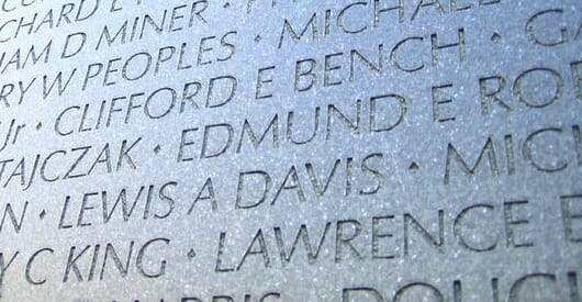
Although I stopped using Optima some time ago, it still plays an important part in printed and other typographic displays. The photo at the top of this post is from the Vietnam Veterans Memorial in Washington, D.C. Architect Maya Lin used Optima to carve the names of the soldiers who died in that war on the massive wall that forms the bulk of the monument, and she couldn’t have made a better choice.
Palatino, Humanistic Old Style for a New World
“Named after 16th century Italian master of calligraphy Giambattista Palatino, Palatino is based on the humanist fonts of the Italian Renaissance, which mirror the letters formed by a broad nib pen; this gives a calligraphic grace. But where the Renaissance faces tend to use smaller letters with longer vertical lines with lighter strokes, Palatino has larger proportions, and is considered to be a much easier to read typeface.”—Wikipedia

Probably the font that Zapf is best known for is Palatino, and that’s part of what killed this font for many designers.
Why? Because it was included in the original 35 Postscript system fonts that formed the basis of the desktop publishing revolution. It was the only oldstyle face and it seemed that every single person who wanted to produce an invitation, a newsletter, an advertisement, an annual report, or anything else believed that Palatino would give their product a touch of “class.”
Of course, with all these amateur designers hacking away at the early and still somewhat primitive tools we had, it soon seemed that we were living in a sea of atrocious looking designs created with Palatino.
I don’t think that’s true any longer.
One of the interesting things about Hermann Zapf’s career is that he started when books were typeset with hot metal type and printed letterpress.
When the industry moved on to “cold type” and photolithography after World War II, Zapf adapted and became the leading type designer of his day.
And he kept right on working when graphic arts entered the digital era, and was still producing variants of Palatino as late as 2006, almost 60 years after its introduction.
More Memorable Typefaces from Hermann Zapf
Zapf designed many typefaces over his career, here are three more that have played a big part in my design work over the years.
Melior, a serif type designed for newspapers including The Village Voice, which used it for years.
Melior is sturdy and masculine, to my eye. It can create great looking book pages, but also works quite well in corporate materials and other collateral.

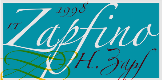
Zapf created Zapfino right from his own calligraphy notebooks. It’s a sweeping calligraphic font that ships with every Macintosh computer, so I’m sure you’ve seen it. When used well, and with the many alternate characters available, it can create some dazzling effects.

Here’s an example that shows off the capabilities of this remarkable script face:

Zapf Dingbats is a collection of symbols. Like Palatino, it gained incredible popularity because it was built into an Apple laser printer in the 1980s.
I’ve got dozens of book files from years ago that include Zapf Dingbats, often for only one character in the book. Like the square bullet, an indispensable bit of graphic elegance.

“These symbols were designed by Hermann Zapf in 1978 to complement contemporary typefaces and visually enhance communication. They can be applied to a wide range of documents, from invitations to technical manuals.”—Myfonts.com
As a designer, I’ve spent many hours with these typefaces, they are the raw materials I use to create books, book covers, and more.
And when I’m working on a book layout, I recall that the majority of Zapf’s own design work was as a book designer for many of the publishers of his day, and I see in the page something of his rational and humanistic spirit.
I hope learning a little bit about Hermann Zapf will inspire you to try his typefaces, too. To find out more, check the resources.
Zapf Resources
Hermann Zapf, a classical master of Type Design by Nicholas Fabian
Hermann Zapf profile on Linotype.com, with a complete linked list of Zapf’s type designs
Hermann Zapf at Myfonts.com
Hermann Zapf, 96, Dies; Designer Whose Letters Are Found Everywhere, obituary in the New York Times
Wikipedia entry on Hermann Zapf
Photo: Evan Bench


