

By David Kudler
Over the last couple of months, I’ve been talking about just what an ebook is, and four basic methods for creating them.
This month, I’m going to get a bit more into the nitty-gritty — how best to prepare your manuscript for conversion.
Whichever of the methods you use to create your ebook, it’s essential to have the original file be as clean as possible.*
What do I mean by that?
Basically, it comes down to one thing:
Keep It Simple with Styles
The most important thing you need to do to your text is to make sure that all of the formatting is simple and consistent. By simple and consistent, I don’t mean minimalist — I just mean that:
- all of the body paragraphs look the same
- all of the chapter titles and section heads look the same
Most manuscripts that come to me don’t look that way. Sometimes, they look as if they’ve been fed through a wood chipper.
As we write, we pull text from various sources:
- quotes from the internet
- snippets of text that we typed into the phone
- chapters written in different apps
Or perhaps we play around with how the text looks:
- sometimes paragraphs begin with an indent
- sometimes with a tab, sometimes with four spaces
- sometimes with two returns in a row
Maybe we try out different fonts to see how they look; if a project has taken a long time, our tastes may change and the typeface we used for the body text may have changed, sometimes more than once: Palatino, Times, Times New Roman, Cochin, Helvetica, Comic Sans.
Maybe you found that your eyes were getting tired and so you upped the font size from the standard 12 points to 14; maybe a line was too long and so you decreased it to 11 points. I’ve seen all of this.
Unless you’re looking closely, this can make your book look like a crazy quilt.
Here’s the thing: we don’t want our font changes to be local. We want them to be global — uniform throughout the book. And so we don’t want to tag each paragraph with a typeface, size, and weight (i.e., bold, semi-bold, regular, or light).
If we do that, once it gets imported into the ebook, if we want to change how the text looks, we have to make the change for each individual paragraph — even if most of the paragraphs are the same, if just a few are different, they’ll stand out like the proverbial sore thumb.
Styling with Styles
The way to avoid this is by using the Styles function in whatever app you’re using to get the manuscript ready. †‡
In Word, the Styles tool is part of the pop-up Toolbox:
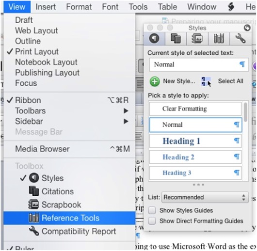
See that list on the right? Each one of those items is a style — a global set of choices about what kind of font to use where. If you’ve worked with HTML at all, this is something like a stylesheet.§
- The first thing we are going to need to do is to make sure that all of the text is the same typeface and size, with the same margins.
Yeah, I know: painful. You spent hours getting those Zapfino captions looking just right.
Sorry.
Here’s the truth: none (or close to none) of the formatting that you’ve done will translate properly to an ebook.
Remember: there’s no way to predict what size screen your reader is going to be reading on. And if whatever conversion technique you choose does manage to make the ePub version of the text look more or less like the Word (or Pages or OpenOffice or InDesign or…) document, if you’ve used local formatting, the text will be difficult to style later, and won’t display consistently across different platforms — on a Kindle Fire, say, or an iPhone, or a 27” monitor.**
So we’re going to strip back the text to the bare studs. The only formatting you’ll want to keep is italics and boldfacing. ††
- Before we destroy all of your beautiful fonts, save. Now save the file again under another name — add clean at the end of the filename, or something to let you know which version to use.
- Select the whole manuscript (press ctl-A in Windows and command-A on Macs). In the Styles tool, select the Normal style.
Yeah. Sorry.
This will have gotten rid of most of the formatting — though not those character style changes I talked about: italics, bold, etc.
- Select the whole text again and make sure that it’s all the same font and size — choose a common font like Times or Helvetica so that it will display all of the character styles correctly.
- Click on the New Style… button at the top of the Styles tool, and name the style something like Body or Text.
- With all of the text still selected, click on the Body style button that has appeared in the Style tool, so that the entire manuscript is formatted as Body paragraphs.
Why have we done this? Because the huge majority of your book is going to be regular body text. We’re going to add the other styles back in a minute.
You probably don’t need to worry about the way that the style looks. If you want to play with the side or bottom margins or the first-line indent, go for it‡‡ — but don’t get too fine about typefaces, letter-spacing, line-spacing, etc. We’re probably going to have to set a lot of those after the conversion anyway — and here’s a difficult truth: many of the styles you specify will be overridden by the reader’s user preferences.
The typeface and size, the background color — unless you know what you’re doing (and sometimes not even then), the font display preferences that a reader chooses will trump many of the design choices you’ve made.
Adding Styles Back In
Now, you’re going to need to go through your whole book and set the style for each paragraph that isn’t a body paragraph. Word has some of those styles built in:
And so on.
- To help you find paragraphs that you want to style, open your old version of the manuscript. (This is one reason that folks like me like to have two monitors.)
You may find that there are styles that aren’t accounted for in Word’s standard style library — perhaps you want extended block-quotes (aka extracts) where the font size is smaller and the side margins wider. Perhaps you have call-out quotes or sidebars. Perhaps you need captions, or your characters exchange letters, or there are text conversations and you want to make them look as if they’re being conducted on an iPhone: **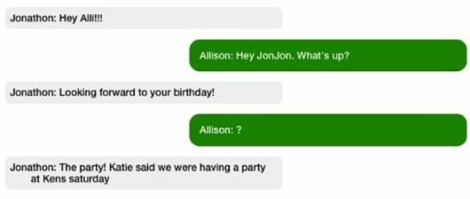

- Select the paragraph you want to add the style to.
If it’s something simple (a wider margin and smaller font-size, for example), make the change. Don’t get too typeface-happy! If you use more than a couple of basic typefaces (one family — typically a serif typeface — for the body text and another — typically sans-serif — for the headers, not only will they probably disappear after the conversion, but if they don’t, your book will look like a ransom note.
- Click on the New Style… button, name your style, apply the style to the current paragraph (don’t forget this step!), and move on.
The next time you find a paragraph that needs to fit that style, just select the text and click on the new custom style in the Style tool. Voilà! Your paragraphs are now formatted consistently.
- Once you’ve gone through the whole manuscript, go through it again — make sure that all of the block-quotes have the Block-Quote style applied, that you haven’t styled any chapter titles as Heading 2 instead of Heading 1, and that the whole thing looks consistent. (You may also see some errors now that the typeface is different.)
You know what? If you have the time, it’s okay to go through it a third time. ;-)
Squeaky Clean
The last step in cleaning up your manuscript and getting it ready to become a book is to get rid of extraneous white space. We’re going to use styles to create indents and margins.
- Use the Find and Replace dialog to change every double space to a single space. If you had more than two spaces in a row, there will still be some there. Do it again and again until Word tells you it can’t find any.
- Do the same for double paragraph breaks: enter “^p^p” in the Find dialog and replace them with single breaks (“^p”). If you tended to add indents to your paragraph with the tab or space bar, replace “^p “ and “^p^t” with “^p”
- Repeat until clean.
There you go. Your manuscript is now consistent and ready for conversion — congratulations!
We’ll be discussing how to use HTML stylesheets after conversion so that your text displays correctly in coming months.
But next month: images.
*By the way, all of these suggestions apply to preparing your manuscript as a print book. Just saying! It will save you lots of time — or, if you’re hiring a designer, lots of money.
†I’m going to use Microsoft Word as the example, but just about every piece of text editing software, from barebones apps like TextEdit to high-end apps like InDesign has some variation on this tool. If you can’t find it, go to the software developer’s website, find the support area, and do a search on Styles — directions to how to add styles to your document should be there.
‡If you’ve already been using styles consistently, congratulations! You’ll still want to go through and make sure that all of your styles have been applied properly. Skip down to Adding Styles Back In.
§This is not precisely true. HTML styles (CSS) cascade — the style of each paragraph inherits any undefined formatting from the section that it’s in. In Word, the formatting for one Body paragraph is the same as any other Body paragraph.
**And that’s not even mentioning different apps.
††Not usually underlines! Typesetting fact: in printing, an underline simply denotes make this italic. In computer documents and ebooks, it means this is a hyperlink. So consider changing all of your underlined text to italics. If you’re used to marking book titles, etc. with underlines… I’m sorry. But unless you’re using the style for extreme EMPHASIS — and probably not even then — avoid underlines. Use italics instead.
‡‡Just don’t try both a bottom margin (a space after a paragraph) and text indent. They both mean new paragraph. Using both is redundant and a bad look
§§This was all done using HTML styles in the ebook. The left and right blocks are two different style with different margins and background colors. The author had styled the paragraphs so that it made creating the look we wanted relatively easy. (I don’t recommend this particular trick by the way — it’s difficult to get to work consistently!)
 David Kudler is a Contributing Writer for TheBookDesigner.com. He is also an author, an editor, an ebook designer and a writer for the Huffington Post.
You can learn more about David here.
Photo: bigstockphoto.com
