

Welcome to the e-Book Cover Design Awards. This edition is for submissions during August, 2015.
This month we received:
104 covers in the Fiction category
8 covers in the Nonfiction category
Comments, Award Winners, and Gold Stars
I’ve added comments (JF: ) to many of the entries, but not all. Remember that the aim of these posts is educational, and by submitting you are inviting comments, commendations, and constructive criticism.
Thanks to everyone who participated. I hope you enjoy these as much as I did. Please leave a comment to let me know which are your favorites or, if you disagree, let me know why.
Although there is only winner in each category, other covers that were considered for the award or which stood out in some exemplary way, are indicated with a gold star: ★
Award winners and Gold-Starred covers also win the right to display our badges on their websites, so don’t forget to get your badge to get a little more attention for the work you’ve put into your book.
Also please note that we are now linking winning covers to their sales page on Amazon or Smashwords.
Now, without any further ado, here are the winners of this month’s e-Book Cover Design Awards.

e-Book Cover Design Award Winner for August 2015 in Fiction
James Egan submitted If Angels Fall designed by James T. Egan of Bookfly Design.

JF: Compare the design mastery here with the many “get-a-photo-and-slap-some-type-on-it” covers submitted this month. Dramatic, with great intimations of the story to be found within, the purposeful focus that leads us to the action in the background, and a title treatment that integrates completely with the art. I feel like I’m floating into a city on fire, with all the urgency that implies. Doesn’t get much better in this genre.
e-Book Cover Design Award Winner for August 2015 in Nonfiction
Tamian Wood submitted On Care for our Common Home designed by Tamian Wood. “An appeal from Pope Francis that humans have made “irresponsible use” of the Earth, that climate change affects most people living in poverty, and that we must unite to protect the planet. Symbolically, I felt that the children’s hands represented our future, growth, community, and coming together”
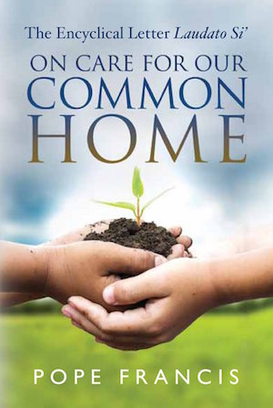
JF: This exquisite cover embodies the message of the book within, and the children’s hands communicate our duty to future generations. Combined with careful and classic typography, this is clearly a home run.
Fiction Covers
Alexandra Engellmann submitted Sky Ghosts: Marco designed by Alexandra Engellmann. “I wanted to make this cover darker than the first one, mirroring the mystery of Marco’s past. I think I managed to do that without making the thumbnail too dark and illegible.”

JF: I think it works pretty well, Alexandra.
Amelia Faulkner submitted Through Adversity designed by Jenna Fowler.

JF: A professional-looking cover but one that has too many conflicting elements all trying to be heard/seen, and that includes the somewhat confusing branding at the top of the cover and the font shifts within the 2-word title.
Kerry Ellis submitted Darshan designed by Kerry Ellis. “I happen to own a beautiful, antique trunk that I thought would be perfect for Amrit Chima’s story, so I lit and photographed the trunk to highlight its texture and patina, then added the design elements and typography to make the title pop without taking away from the photo.”

JF: Nicely textured and well laid out, a “quiet” cover that can intrigue readers.
Amy Astorga submitted WATERS OF CHANGE: GWENDOLYN FALLING designed by THE COVER COLLECTION. “I fell in love when I stumbled across THE COVER COLLECTION. Their covers are as beautiful as they are reasonably priced. My book, WATERS OF CHANGE: GWENDOLYN FALLING, involves mermaids of a different sort. I asked them to change the sky to water and I think they did so successfully.”

JF: Some nice typographic touches on this pre-made cover.
Angela Yuriko Smith submitted The Braid designed by Kyra Starr. “The braid referred to by the the story title is a braid of rope and involves a child who sees the ghost of a woman who has hung herself.”

JF: The illustration is strong, but the title almost looks like an afterthought and the author’s name looks cramped.
Catherine Rubino submitted Emmet’s Storm designed by Catherine Rubino. “Emmet is from the 1880’s (period clothing), from Iowa (farm behind him), with eyeglasses from that era (no nose pads), and because of his interest in science and inventions, the “O” is from Edison’s lightbulb patent drawings.”

JF: I admire your attention to detail but it really looks pasted together, and not in a good way.
Ashley Holzmann submitted The Laws of Nature: A Collection of Short Stories of Horror, Anxiety, Tragedy and Loss designed by Ashley Franz Holzmann. “Thank you for your time and consideration!”

JF: Some very nice design work, but overall it’s confusing, and the widely letterspaced title doesn’t go very well with the rest of the typography.
Aubrey Gross submitted Big Girls Need Love Too designed by Aubrey Gross.

JF: A beautifully light touch that’s perfectly in tune with its market, well done. ★
Aurora Springer submitted Captured by the Hawk designed by Aurora Springer. “I liked the retro style of this cover.”

JF: I think I would have focused more on the 2 figures, and the type desperately needs help, it’s very weak.
Tom Saine submitted Midnight Oil designed by Tom Saine. “This is an anthology, made up of short stories, and novel exerps from the Blank Slate Writers Group of Valparasio, Indiana. I am the leader of the group as well as the cover photographer and cover designer.”

JF: I admire your versatility, but not this cover. The strong light/shadow works best when there are very few elements for the browser to decipher, and I would be a happy blogger if I never saw another book cover that used the Papyrus font in any way.
Tom Saine submitted Night Light designed by Tom Saine. “The book is an anthology of short stories, and novel excerpts published by the Blank Slate Writers Group of Valparaiso Indiana. I am the leader of the group as well as a contributor and cover designer. The cover was designed around a stock photo that conveyed the sum of the title as well as content.”

JF: This one is better because it gives us a clear point of focus (the woman) but makes us wonder why she’s being crushed by whatever that big shape is. Weak typography, not a lot better than Papyrus to be frank.
Braxton DeGarmo submitted Indebted designed by Braxton DeGarmo. “The intent of the cover was to portray the two main plot lines in the book while also capturing the locations and mood of both.I chose the graphics and layout but had a graphic artist friend put it all together for me.”

JF: An interesting approach, since most designers would integrate these images rather than just put them next to each other, but the clean design helps.
C.H. Norwood submitted Scion of Sin designed by George Evangelista and Victorine Lieske. “This cover is the depiction of a scene where the MC arrives at his city during an invasion. I wanted his glowing red eyes and red hair to stand out against the darkness of the night and burning city. I wanted his blades to signify the violence of the story. The smirk is a signature of the character”

JF: Well, I think the cover works pretty well for this genre due to the energy and drama of the art and design, but FYI I can’t even see the character’s eyes or smirk.
Kim DDD submitted The Camouflaged Cross designed by Marushka from DDD. “Cover design for Post Apocalyptic action adventure”

JF: A bit dark overall, but I like the way the designer has highlighted the “story” elements of the gun and cross.
Munroe Cunnigham submitted An Engagement is Announced designed by Munroe Cunningham. “We were asked to design a cover for an English romance, set in the country and the heroine was an artist. The author didn’t want people on the cover she preferred her readers to imagine them for themselves.”

JF: Light and appealing.
Chris Datta submitted Touched With Fire designed by Mallory Rock. “Thank you.”

JF: Good type, and the flags tell us instantly that it’s a civil war story, while the rider gives us a human scale. Nice.
Tamian Wood submitted Rebel Nation designed by Tamian Wood. “With all the controversy surrounding the rebel flag these days, this one was a timely release. The story is an alternate history in which the South won the war, but involves a modern day assassination.”

JF: Another civil war novel, and here the typography that alludes to the 19th century is combined with a targeting scope that’s very 20th century, and that encapsulates the theme of the book well.
Cindy Thomson submitted Brigid of Ireland designed by Kim Draper.

JF: In this approach you really bet everything on the photo illustration. Will it be enough to carry the message of the book and make an impact with the right people? Some nice touches on the typography, meant to allude to the book’s setting.
Claire Mansfield submitted Whispers in Corridors designed by Leanne Mansfield. “My daughter drew the book cover for me on what I suggested. I wanted the girl in silhouette”

JF: Works as a drawing, not so much as a book cover. Also, covers like this need to have a border added so they don’t “bleed” onto the white pages they are usually found on.
Julie Rodriguez submitted The Time Telephone designed by Julie Rodriguez.

JF: Simple and effective, with a pleasant illustration style and plenty of story elements.
James Egan submitted The Killing Floor Blues designed by James T. Egan of Bookfly Design.

JF: Wow. If you’re going to go demonic, you might as well go all the way. Combines with expert typography and the small touches that make all the difference.
Crystal Marcos submitted BELLYACHE: A Delicious Tale designed by Cat Marcs Publishing.

JF: And a deliciously amusing cover.
Crystal Marcos submitted HEADACHE: The Hair-Raising Sequel to BELLYACHE designed by Cat Marcs Publishing.

JF: Not so crazy about this one, with its hard to read type and low contrast title.
Crystal Marcos submitted Novus (The Cresecren Chronicles, Book 1) designed by Crystal Marcos.
")
Cynthia Vespia submitted Demon Huntress: Destiny Unleashed designed by Original Cyn Creative Services. “I am the cover designer and the author. This is a fantasy novel, the first in a series.”

JF: I like the dynamic art, but the type would be improved and the art would have more effect if you went easy on all the special effects on your type.
Christopher McCulloch submitted The Temple Legacy designed by Christopher McCulloch. “I wanted to go for something dramatic using a very flat graphical style. I was looking for simplicity when viewed at small sizes while still intriguing enough to warrant interest. The story has elements set in the past but I inferred a mainly modern context by placing a crane in the skyline.”

JF: I love the idea of using a flat style on the cover, and this is a good attempt. Not sure you’ve nailed the typography, and what I see is the sword, I’m never going to notice the tiny stuff in the background.
Daniel Adorno submitted Thy Kingdom Come designed by Daniel Adorno. “I designed this cover myself using art I created in DAZ3D Studio and the postworked in Photoshop. My aim was to create a bleak landscape with a grungy font that would fit the post-apocalyptic genre.”

JF: Pretty cool.
David Parker submitted A Mystical Bond For Two designed by David Parker-Alicia Young. “The first contributor for our eBook cover is Elena Schweitzer for the background titled enchanted dark forest at the spring. The second contributor is our go to digital illustrator for pixie portraits Alicia Young. My own credits to the finished eBook cover are cropping of images and title text.”

JF: I think you know exactly what you’re doing, and I would only encourage you to find a way to make your title larger, more emphatic, or both.
David A. Lindsay submitted Gaspar And The Fantastical Hats designed by David A. Lindsay. “I bought the image from a stock library and put the cover together myself. The cover is exactly what the story is about. The cover is frequently commented upon favourably on Twitter, etc.”

JF: Well, it does stop you, and that’s half the battle. But you sure you didn’t write the story after you saw the illustration?
Mallory Rock submitted The Children of Darkness designed by Mallory Rock.

JF: Clean and dramatic, draws you into the story.
Dora Badger submitted Lemonade Songs designed by Luke Spooner. “I asked the designer to create something that reflected the juxtaposition of innocence and menace in the story. He did a wonderful job depicting the story’s dead not only in the shadowy background figures, but in the child’s drawings.”

JF: Carrying the hand-drawn look throughout every part of the cover creates an unusual unity and really transmits a pure, human-scaled message. Well done.
Kim DDD submitted Cargo designed by Milo from DDD. “Cover design for Leine Basso series Crime thriller / Women’s fiction, book1”

JF: I like the design work on all three of these covers, but this one puts everything together the best. With the strong woman, cityscape, and promise of action, it works really well.
Kim DDD submitted Serial Date designed by Milo from DDD. “Cover design for Leine Basso series Crime thriller / Women’s fiction”

JF: With two figures, it’s visually more confusing, and we now have to deal with a two-line title.
Kim DDD submitted Bad Traffick designed by Milo from DDD. “Cover design for Mystery/Thriller series “Leine Basso”, book2″

Ed Godwin submitted Rite of Exile designed by Anita B. Carroll. “Anita was great to work with, and did covers for the entire trilogy. She’s one of those rare cover artists that read the book before brainstorming any ideas. I’ll definitely be hiring her again for my next book!”

JF: I’m sure April appreciates the testimonial, Ed. Especially because it’s for this dynamite cover with beautiful, luscious textures and quite a bit of menace at the same time. ★
Linda Wood submitted Wedge the Percheek designed by Tracey Taylor Arvidson. “A story about fitting in, and why you might not want to.”
JF: Very charming, but seriously lacking in contrast.

Elisabeth Staab submitted Acts of Creation designed by Babski Creative Studio (Photography by Michael Stokes). “Acts of Creation is a new adult contemporary novel featuring a “bad boy” boxer who is tortured by abuse in his past. It’s a romance, but the new adult genre frequently features only the hero, and this image by Michael Stokes felt powerful.”

JF: The designer’s adept use of color and style on the title, and the way the type is set to reflect the angle of the boxer’s arms helps to pull elements together that otherwise might have looked fairly two-dimensional.
Ellison Blackburn submitted Regeneration X designed by Ellison Blackburn. “The design was meant to capture a rebirth of sorts, relative to time and how uncertain the outcomes of change can be.”

JF: Even though you found a lovely image, the other parts of the cover just don’t measure up.
Enikő Uzonyi submitted Decision designed by Ferenc Uzonyi.

JF: Tidy, but it doesn’t give us much to go on.
Ernie Vecchione submitted Devil’s Catch designed by Phillip Anderson. “Hi Joel! Your site has been an inspiration and guide to me! I found Booknook.biz through your site and got much helpful advice! They’ve already written an article about the cover! But it would be a greater honor to be included on your site! Thanks as always!”

JF: The honor’s mine, Ernie. And you have a nicely creepy cover that’s perfectly designed for today’s marketplace. ★
Grace Hudson submitted FERTS designed by Sanura Jayashan. “I wanted something that screamed ‘dystopian’ without the urban or high-tech scenery. The requirement was to represent a lack of freedom and a sense of oppression.”

JF: Although I like the art, not sure I’m getting the dystopian/controlled message, it’s all a bit hazy.
Elizabeth DiPalma submitted The Education of Joey G. designed by Elizabeth DiPalma. “This is a coming of age story set in the late 1950s-early 60s, so I looked at a lot of jackets from the period before starting to think about what I wanted to do here. The colors and typography came out of the ‘wayback machine’, and the photos hint at Joey’s growing up.”

JF: Hey, I was a teenager back then, and I recognize those weird color panels and crappy type. You got it, although with the three images, it looks a lot more like a memoir.
Heather Brooks submitted Red August designed by Weatherhill. “Manipulated photograph evocative of Red Riding Hood”

JF: Firmly in the type-on-photo category, not that there’s anything wrong with that.
Hanna Peach submitted Angelfire designed by Romac Designs. “Book one of five”

JF: A beautiful and mythic series design (see the next 4 below) that promises epic entertainment. Very consistent through all 5 covers, and put together with care.
Hanna Peach submitted Angelstone designed by Romac Designs. “Book two of five”

Hanna Peach submitted Angelsong designed by Romac Designs. “Book three of five”

Hanna Peach submitted Angelblood designed by Romac Designs. “Book four of five”

Hanna Peach submitted Angeldust designed by Romac Designs. “Book five of five”

Dane Low submitted The Dreamshifters: Parallel One designed by Dane & Brittany at EbookLaunch.com. “Book 1 of 3 for this contemporary fantasy series. I wanted this cover to have a dreamy feel with a hint of nightmare. As the series progresses, the covers will get darker and the red will take over more.”

JF: The whole series is well thought out and beautifully executed, with both lightness and a mysterious dread.
Dane Low submitted The Dreamshifters: Parallel Ties designed by Dane & Brittany at EbookLaunch.com. “Book 2 of 3 for this contemporary fantasy series.”

Dane Low submitted The Dreamshifters: Parallel Lies designed by Dane & Brittany at EbookLaunch.com. “Book 3 of 3 for this contemporary fantasy series.”

JF: The ghostly figures are ambassadors for the story in this delicate and effective fantasy cover.
J.B. North submitted Icebound (Legends of the Shifters Book 2) designed by Widhi Saputro. “Another original painting. As always, Widhi was amazing to work with, going above and beyond what I’d expected for this book cover.”
")
JF: Strong and perfectly focused.
Cathy Helms submitted Flight of the Black Swan designed by Cathy Helms. “Flight of the Black Swan is an action/adventure novella from the Birds of Flight series. I was asked to include wings, a female figure and the skyline of Paris if possible.”

JF: Looks like you touched all the bases, and the black/gold design stands out.
John Paul Parrot submitted Analog designed by J.P. Parrot. “The book is meant to be a comical adventure, so I was going for a somewhat outlandish cover. I tried using a font that resembled a “pixelated” style to hint to the technological theme of the story.”

JF: Love the art, not so much the type. Check out the cover of Analog Magazine, a sci-fi classic.
Jack July submitted Amy Lynn, Golden Angel designed by Kia Heavey. “I hired the model and took the photo myself. Kia Heavey designed the cover and did the layout.”

JF: Gets the job done, I’m not a fan of that ghosted panel the type is on, there are better ways to integrate type into a cover like this.
Jack Kearney submitted Inside Out designed by Jack Kearney. “I am the designer of my cover and Page Publishing even gave me credit on the copyright page”

JF: Does it make sense? Is it a theater marquee? Why does the title have like 5 different effects?
Jan Hurst-Nicholson submitted Mystery at Ocean Drive designed by Vanessa Burger. “Thanks for the opportunity to receive your comments on my new cover. The story is a teen action adventure in the Hardy Boys style involving the rescuing of a kidnapped girl.”

JF: A good idea but with awkward colors and basic type.
JB Schroeder submitted Runaway designed by Julie Schroeder.

Jeff Striker submitted The Last Recruit designed by Peter O’Conner. “The cover features the main character of the story, with a close-up of his arm in the foreground. In his hand he holds a smoking pistol pointed upward symbolizing the external struggles he is going through, while nano-bots contained within the base of the arm relate to his internal struggles.”

JF: Seriously, I don’t think it makes sense to have the apparition and his chopped off arm in the same frame, it’s just bizarre.
Munroe Cunningham submitted Semper Eadem designed by Munroe Cunningham.

JF: This is a strong cover, but if it’s based around a supposed autobiography by Elizabeth I, why doesn’t the woman look like Elizabeth I, since there are so many portraits of her?
Joseph Jackson submitted Salvation’s Dawn designed by Adam Wayne. “My designer-artist crafted this cover from a 1-paragraph description of the main character (the winged female) and a single chapter detailing the fight between main character and one of the villains (the naga).”

JF: Interesting artwork, typography doesn’t stand up to it well.
Judy Croome submitted a stranger in a strange land designed by Melissa Williams Design. “The cover designer chose a stark, simple format. The deserted chair reflects the poetic themes of loneliness & loss, as well as the alienation of our humanity in today’s technological world. The stream of light shining on the chair hints at the faith and hope underpinning the poems.”

JF: Perfectly and sensitively suited to a book of poetry, the interplay between the title and the photo is very satisfying.
Kim DDD submitted The Witch Tree designed by Milo from DDD. “Cover design for Mystery/Thriller series “Anna Denning”, book1″

JF: Another terrific series design with great mood and a strong but simple composition, although the series identifier is disappearing in some spots.
Kim DDD submitted Sparrow House designed by Milo from DDD. “Cover design for Mystery Suspense series Anna Denning Mystery, book2”

JF: Looks like the trail that’s showing behind the “S” in “Sparrow” could have been darkened to make this title stand out as well as the others in the series.
Kim DDD submitted The Sacrifice designed by Milo from DDD. “Cover design for Mystery Suspense series Anna Denning Mystery, book3”

Katie Li submitted Somewhere In Between designed by Colleen Cole. “Somewhere In Between is a metaphysical, coming-of-age story for YA and New Adult audiences. Designer Colleen Cole crafted a cover that is an exploration of the book’s setting, and serves as a nod to the characters’ attitudes on the nature of time.”

JF: An interesting approach, but I’m not sure where the focus of the big spiral is supposed to be, because right now it’s on the word “In” and that doesn’t make much sense to me.
Kenn Bivins submitted the Wedding & Disaster of Felona Mabel designed by Kenn Bivins.

Kristin D. Van Risseghem submitted The Guardian, a Sword, & Stilettos designed by Marya Heiman. “I emailed 4-5 pictures to Ms. Heiman and after 2 rounds of tiny changes, the cover was completed! She really knows her stuff on how to design based on a few comments and sample graphics!”

JF: Visually confusing and the too-fancy title doesn’t help.
L.R. Bäuml submitted Love is a journey designed by L.R.Bäuml.

JF: Very 60s-ish and a bit surreal.
Kim DDD submitted Poison designed by Milo from DDD. “Cover design for Dystopian YA”

JF: Strong typography and cleverly combined images lend an air of drama to this good looking cover. ★
Laura Fitzgerald submitted Lost In America designed by Oceana Garceau.

JF: The varying use of type elements creates confusion on this cover that also needs a better composition. Interesting to compare to Poison immediately above since there are a lot of similarities, but Poison brings everything together in one focused whole, while this one clearly does not, it’s a bunch of pieces trying to hang together.
LJ Cohen submitted Ithaka Rising designed by Chris Howard. “Chris Howard also designed the cover for book 1 of the series (DERELICT) and it was important to carry over the thematic elements of a space backdrop and a single main character from the cast. Each cover uses the same typography, with a different color palette.”

JF: I like the clarity of the type.
Luis Ordonez submitted Play designed by Olivia Liendo. “Play is a short stories collection. All stories has in common one word: Play. On a stage, on a volleyball court, on the street, even in an old VHS recorder, always there is someone inviting us to see the Play. This book is written in Spanish but published in the United States.”

JF: Might work for a print book, but not so much as an ebook cover, where the slim and not very playful title may get lost.
Maren Caulfield submitted Benjamin Ringer and the Lost Sock designed by Leigh Tuckman.

JF: Indecipherable.
Mark David Gerson submitted The MoonQuest: The Q’ntana Trilogy, Book I designed by Richard Crookes. “The image is a representation of the story’s Wall of Traitors. In The MoonQuest, stories are banned and storytellers are put to death. The Wall of Traitors is where the severed heads of bards and other traitors are staked.”

JF: Spooky and inviting, nicely done.
Martina Zeitler submitted How to make an alien designed by Martina Zeitler. “Being a children’s book I wanted a fun and colourful cover. It’s a space story, so I used a black background for context and contrast and softened its harshness with the white inner circle. I added a subtle glow around the aliens to make them pop out as well as giving them an alien like look”

JF: I like the idea but you never said what the purpose was of the bullet list of dot leaders, which distracts more than it adds.
Matt Knott submitted The Sane King designed by James T.Egan. “It was an absolute pleasure working with James. The tone of the book is heroic fantasy in a grim world and he sold that completely. He inspired me to really work on how things look inside and if you glance at the sample it shows. I took his nails motif and used it for the section separators.”

JF: Hypnotic and dramatic, great stuff. Note how the ray of light adds dramatic contrast to thrust the figure at the viewer. ★
Yvonne Less submitted Im Reich der Verborgenen – Die Auserwählte designed by DiversePixel. “This is a book cover for the German author Meliqua. It is a fantasy story about a young woman who is entering a fantasy world in her dreams.”

JF: I think the play with depth of field highlights the fantasy element nicely.
Melissa Addey submitted The Fragrant Concubine designed by Streetlight Graphics. “Streetlight Graphics did a great job of taking a photo of a modern girl and completely transforming her through accessories, the background and font for this novel in the historical fiction genre.”

JF: An effective cover that relies heavily on the impact of the woman’s gaze at the reader.
MJ Gardner submitted Evelyn’s Journal designed by MJ Gardner. “I was going for spookiness and wanted to suggest nightfall (the book is about a vampire) but not gory or graphic horror.”

JF: I think keeping it simple is almost always a good solution for covers like this.
Tammy Seidick submitted A Crossworder’s Delight: A Holiday Novel designed by Tammy Seidick. “One in a series of twelve covers with a crossword theme. Designed under contract with Open Road Media. Thanks for reviewing!”

JF: The low contrast between the title and background is really hurting the design.
Nicky Penttila submitted The Spanish Patriot designed by John A. Spillane. “Writer known for romance novels wrote a straight historical, so cover had to say history and adventure, definitely not romance”

JF: A bit cold for my taste, maybe it’s the big silhouette.
Paloma Meir submitted Heartbreaker Breaks (A Bittersweet Lottery Love Story) designed by Stephen Sumney.
")
JF: Pretty basic design that really doesn’t look like a “love story.”
Pamela DuMond submitted The Assassin designed by Regina Wamba at Mae I Design. “Regina Wamba did a photoshoot and designed the covers for my Mortal Beloved YA time travel series. The Assassin takes place in medieval Portugal and the background is from a photo I took years ago of a castle in Madrid. I think Regina did a terrific job branding this series.”

JF: I love the drama and strong perspective of the design, but the flourishes everywhere look a bit like a bacterial invasion threatening to take over the entire cover.
Reginald Atkins submitted Four designed by Reginald Atkins. “It was a fun design to work on, enjoyed it immensely. Reg.”

JF: Glad you enjoyed it, but I have no idea what this cover is trying to communicate. And what’s that strange shape chomping on her neck?
Randy Speeg submitted The Night Has Teeth designed by Randy Speeg.

JF: Oversimplified, and it might have worked better if you had switched the fonts used for the title and author, and made the title a lot larger.
Rebecca Diem submitted From Haven to Hell (Tales of the Captain Duke #2) designed by Steve Armstrong.. “This is the second book in a steampunk adventure series about airship pirates. The artwork at the center is a painting of the Haven (the pirate’s hideout) by artist Sarah Dier-McComb, and my designer, Steve Armstrong, played with a number of different tones that speak to the setting.”
")
JF: A lovely cover with nice attention to detail but the hazy effect on the isn’t helping the overall effect.
Richard Horsley submitted Static Push designed by Richard Horsley.
“As this is my first book and I couldn’t afford professional design services I decided to have a go myself. Everything is original and created in Photoshop (using a mouse!). It took a very long time and a lot of revisions, but I am pleased with the results and how well it stands out as a thumbnail.”

JF: An excellent effort, keep going, and keep your designs as clear as this one.
Robert McGee submitted Annie and the Senator: A Story of Vigilante Justice designed by Angie.

JF: A strong composition and great image from one of the top designers on Fiverr.com. Very effective. ★
LeVar Ravel submitted Big Brother designed by LeVar Ravel.

JF: While this is an excellent concept, the execution is awkward and appears to be the work of an amateur.
Sharon Joyce submitted CATCHING SNOW DANDELION BLOW designed by Carol Ann Cartaxo. “I wanted something soft and warm with a bit of mischief.”

JF: I think you got the soft and warm part, not sure about the mischief.
Simone Pond submitted The Torrent designed by Damon Za. “This is the four and final book in my dystopian fiction series. I wanted to tie all of the covers together, but also go out on a high note with something eye catching.”

JF: Explosive and interesting, although I’m surprised at the font choice for the title, it seems a bit “classic” for this use.
Smita Bhattacharya submitted Vengeful designed by Alexandra Engellmann. “I am a fan of minimalist art and thought the image matched the whimsical tragic tone of my murder mystery novella.”

JF: It’s eye-catching for sure.
Susan Hasler submitted The Flat Bureaucrat designed by Susan Hasler. “The Flat Bureaucrat has elements of satire and the supernatural. I went for a cartoonish feel. I didn’t want it to look like a typical CIA novel. I borrowed the blue-green coloring from the glass of the New Headquarters Building. I did the artwork in Illustrator. Thanks for your consideration.”

JF: You’ve done a good job. I have no idea what part the bird plays in the story, and this cover might be helped by eliminating the “crime scene” tape, then we would naturally focus on the “flat diplomat” and that’s the punch line, right?
Kim DDD submitted The Deer Effect designed by Milo from DDD. “Cover design for Psychological Thriller”

JF: I like the confident typography and overall professionalism of this cover, but find the combined images difficult to resolve easily, and that detracts from the total effect.
Sylvia Stewart submitted Seattle Rayne designed by Indie Cover Design. “I wanted a cover for a sweet, clean romance. I think my designer has done an excellent job to promote my novel.”

JF: I totally agree! A solid genre cover, in the best possible way.
Victoria Capper submitted Opal Ridge designed by Kelsey-Lee Stay. “Thank you for your consideration. Very happy with the outcome of the cover for my Australian Romance and proud of the work young designer Kelsey has done.”

JF: I love the evocative illustration of a woman on horseback beneath a stand of eucalyptus, but the typography doesn’t do it justice.
Rick Holland submitted The Unknown Element: An Action-Packed Spiritual Thriller designed by Rick Holland / Vision Press. “Cover depicts our trio of heroes in Syria, where they must… save the world of course!”

JF: Nice job on a cover for a “spiritual thriller” reminiscent of Indiana Jones because the dramatic illustration draws us into the story, the simplified color palette makes it easier to get the message, and the typography is used to further frame the main point.
Kim DDD submitted Forging Constance designed by Milo from DDD. “Cover design for Steampunk fantasy adventure”

JF: Lots of nice touches, atmosphere, and some great textures even though the title looks a size too large for the cover.
Yesenia Vargas submitted Better Off (Prequel to Changing Hearts Series) designed by Yesenia Vargas. “This series has gotten new covers and titles aligned to what is currently popular in YA romance. I’ve gone from almost no sales to selling a handful of copies a day. The permafree book 1 in this series, Without You, has been downloaded about 10,000 times in its first month.”
")
JF: You’ve achieved some overall consistency, and that’s good. The covers depend on their images for a great deal of their impact. All In suffers from being the weakest of the three, and isn’t nearly as engaging as the other two. There are some problems with type that’s hard to see, but overall they look good, and you’re a savvy author for paying attention to current trends in your niche. Good luck!
Yesenia Vargas submitted Without You (Book 1 in the Changing Hearts Series) designed by Yesenia Vargas.
")
Yesenia Vargas submitted All In (Book 2 in the Changing Hearts Series) designed by Yesenia Vargas.
")
Nonfiction Covers
Jeremy Sarber submitted Man With Two Sons designed by Jeremy Sarber.

JF: I think you have exactly the right style for this material, but somehow every time I look at this cover it makes me depressed. Might be the big black shape at the top, or the overall dark tone.
Jozzie Ray submitted Seasonal Affective Disorder Treatment: Since Humans Shouldn’t Hibernate designed by Jozzie Ray. “Thanks for your website. Great help for new Indie Authors!”

JF: Although the hourglass device is clever, the rest of the cover has been sacrificed to it, and in the end it doesn’t add up to a strong message.
Keith Kelly submitted Mrenh Gongveal: Chasing the Elves of the Khmer designed by Keith Kelly. “For the design of the cover it was only fitting to use an image of one of the standard “houses” where offerings to the Mrenh Gongveal are made. These houses are usually adorned with red clothing, so I created the Title text to take the form of a shirt that is commonly seen attached to these houses.”

JF: That may be true, and I’m sure it’s lovely, but why create a book cover intentionally makes it so hard to read the title block?
Mike Reeves-McMillan submitted The Well-Presented Manuscript: Just What You Need to Know to Make Your Fiction Look Professional designed by Matt Davis. “Matt did an excellent, fast, efficient job of designing this cover. Rather than attempting to be literal with the title, he presented an image of the problem that the book solves (an unprofessional-looking manuscript), while still making the cover itself look professional.”

JF: Despite being professionally produced, and despite your appeal to some kind of marketing logic, it makes no sense to me to try to attract people by showing them what repels them.
Nancy Hardin submitted Fabels and Foibles of the Supreme Court designed by Sherry Snider. “This cover was designed through messages between me and its creator, Sherry Snider, whom I’ve never met face-to-face. She immediately “got” my vision and put it into reality and to me that’s impressive! For my first published book I think it looks great!”

JF: Well suited to its genre, it does the job with a grin.
Rebecca Bielawski submitted Travelling Seeds designed by Rebecca Bielawski. “Cover illustrated in Artrage Pro and Photoshop. Target audience children 2-6yrs”

JF: Lovely, I think you’ve nailed the right style for your series. ★
Steve Roberts submitted Football Financial Planning designed by Brian Call.

JF: I’m all for pigskin, but that neon-green type has problems, especially in a finance-oriented book.
Susanne Blumer submitted Pip! Zip! Hatch! Love! : A Complete Kid’s Guide To Keeping Chickens designed by Susanne Blumer.

JF: So cute, I bet kids will love that little chick.
Well, that’s it for this month. I hope you found it interesting, and that you’ll share with other people interested in self-publishing.
Use the share buttons below to Tweet it, Share it on Facebook, Plus-1 it on Google+, Link to it!
Our next awards post will be on October 19, 2015. Deadline for submissions will be September 30, 2015. Don’t miss it! Here are all the links you’ll need:
The original announcement post
E-book Cover Design Awards web page
Click here to submit your e-book cover
Follow @JFBookman on Twitter for news about the E-book Cover Design Awards
Check out past e-Book Cover Design award winners on Pinterest
Subscribe to The Book Designer Blog
Badge design by Derek Murphy
