

Welcome to the e-Book Cover Design Awards. This edition is for submissions during June, 2015.
This month we received:
112 covers in the Fiction category
14 covers in the Nonfiction category
Comments, Award Winners, and Gold Stars
I’ve added comments (JF: ) to many of the entries, but not all. Remember that the aim of these posts is educational, and by submitting you are inviting comments, commendations, and constructive criticism.
Thanks to everyone who participated. I hope you enjoy these as much as I did. Please leave a comment to let me know which are your favorites or, if you disagree, let me know why.
Although there is only winner in each category, other covers that were considered for the award or which stood out in some exemplary way, are indicated with a gold star: ★
Award winners and Gold-Starred covers also win the right to display our badges on their websites, so don’t forget to get your badge to get a little more attention for the work you’ve put into your book.
Also please note that we are now linking winning covers to their sales page on Amazon or Smashwords.
Now, without any further ado, here are the winners of this month’s e-Book Cover Design Awards.

e-Book Cover Design Award Winner for June 2015 in Fiction
David Hull submitted The Man Who Remembered the Moon designed by David Drummond. “We asked designer David Drummond to devise a cover where delusion and the moon intersect. He gave us this brash pharmaceutical vision, one without a single moon in it – except for the dozen that insist on being seen.”

JF: Yes, many moons, my favorite being the silver crescent, and a great leap of creativity that typifies exceptional design communication. A real winner.
e-Book Cover Design Award Winner for June 2015 in Nonfiction
Christopher Lascelles submitted Invasion: From the Armada to Hitler designed by Maurizio Marotta. “Fantastic eye-catching non-fiction cover!”
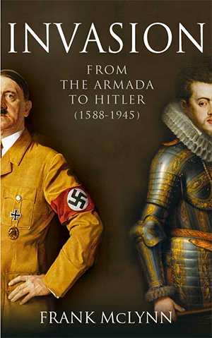
JF: A great concept brought brilliantly to life by the fantastic artwork. Works on every level, and even has a bit of cheekiness, too.
Fiction Covers
280 Steps submitted Scratch the Surface designed by Risa Rodil.

JF: A strong and “targeted” design with a spareness and energy I find quite attractive.
Aimee Alexander submitted All We Have Lost designed by Andrew at Design for Writers. “I saw this photo of a friend’s son and fell in love with it. I’d been looking for a shot for ages that represented family and the innocence of children, while at the same time being fresh, different and somehow beautiful. I really appreciate my friend sharing this with me. I love it.”

JF: Both gentle and evocative, promising a heartfelt story.
Alexandra Engellmann submitted Sky Ghosts: All for One designed by Alexandra Engellmann. “The hardest part of the picture was the wings. There are no actual wings in the book, just the ability to fly, so I wanted them to be ethereal and transparent, symbolic. I painted 6 different pairs of wings before I came up with this, and the result was just what I wanted.”

JF: Being able to both write and paint seems like an almost unfair advantage, and your art skills are well used here. The sword adds a nice note of menace to what might otherwise have been too ethereal an image.
Amanda Clemmer submitted Automaton designed by Amanda Clemmer.

JF: Typographically weak, and I don’t see any connection between the image and the title.
Amanda DeWees submitted Cursed Once More designed by James T. Egan of Bookfly Design. “Since Cursed Once More is a sequel, James was tasked with visually linking the cover to the one he created for the previous book while adapting the design to the new book’s setting (Yorkshire in 1873) and mood (gothic romantic suspense). This is one of my favorites of the covers he has done for me.”

JF: And I can see why. The designer’s strong composition, careful typography and attention to detail are on full display.
Amanda Elizabeth Villafane submitted A.Heart’s Destiny; Dark Hearts Arise designed by Amanda Elizabeth Villafane. “”Dark Hearts Arise”, the first of the “A. Heart’s Destiny Saga” is a Dark Heroine Romance, and the cover photo is the image that originally inspired the story. With the help of my brother, we added the mask and blur to create the comic book/superhero(ine) feel.”

JF: But it still lacks all the defining characteristics of actual comic book art, and the type is pretty much a disaster if you can’t even read it.
Amy Copadis submitted Finding Lucy designed by Amy Copadis. “Finding Lucy is a story of self-discovery set in the south of Spain, so I wanted to convey the idea of my main character’s search for herself and her past while including the essence of the place she has traveled to.”

JF: But it’s so dreary I would assume she’s contemplating a walk into the sea.
Amy Kuivalainen submitted The Eagle Key designed by Scarlett Rugers.

JF: Well, we do want a sense of the mysteriousness for this book, but some of the elements are pretty weak and don’t show up well, especially at small sizes.
Andrea Pearson submitted Bezza’s Book of Enchantments designed by Andrea Pearson, James Curwen. “James Curwen did the artwork and Andrea Pearson did the typography. The book was a collaboration between the two of them and a local elementary school, where the students were given the right to veto or accept and offer input into nearly every aspect of the book, including the cover.”

JF: Getting feedback from elementary school students is a charming idea, and I think the cover came out quite nice. Although I like the design of the “branding” band at the top, it’s quite strong compared to some of the other elements on the cover.
Anita Moore submitted The Swamps of Jersey designed by Anita Dugan-Moore. “My goal with this cover was to represent the feel of the dark, down-trodden town that is an integral character in this murder mystery. The author is quite pleased with the end result.”

JF: That would be great if we designed book covers to please the author. But we don’t. Covers should have one audience only: prospective readers. Keeping that in mind I don’t think you would have ended up with a cover this murky or with such tortured type.
Ashley Farley submitted Her Sister’s Shoes designed by Damonza.

JF: Shows how, in the hands of a good designer, your cover can do all the jobs it’s intended to and appear effortless at the same time.
Audrey Driscoll submitted Hunting the Phoenix designed by Alisha at Damonza.com. “The final book in the series. Thanks for the opportunity to share these images!”

JF: The whole series (see the 3 covers below) works very well. Each is recognizably part of the same series and that’s accomplished without extraneous badges and branding bits, solely through the design. And making the 2 volumes in the middle match in style and color was a smart move. However, the author should reconsider the way the series has been broken up because volume 1 of book 2 followed by volume 2 that’s actually book 3 is just way too confusing.
Audrey Driscoll submitted Islands of the Gulf Volume 1, The Journey designed by Alisha at Damonza.com. “Since this is the first of two volumes that are Books 2 and 3 of the Herbert West Series, I wanted them to feature similar colours.”

Audrey Driscoll submitted Islands of the Gulf Volume 2, The Treasure designed by Alisha at Damonza.com. “This image reveals the divided nature of the central character of the series.”

Audrey Driscoll submitted The Friendship of Mortals designed by Alisha at Damonza.com. “This book is a mashup of genres: supernatural, psychological and literary. I wanted a striking cover image that would reflect this mixture. It’s also the first of a four-book series, so I wanted a style that could be carried over to the others.”

C.B. Stone submitted Rehabilitation (Unbelief I) designed by Book Cover by Design. “Genre- Teen and YA/Dystopian Cover is the first in a trilogy and subsequent covers graduate with warmer colors, the snow melting, and the greenery in the background showing through. Thanks for your consideration!”
")
JF: Drab colors and weak type undermine the careful image compositing.
Carol Van Natta submitted Minder Rising designed by Stephen Bryant, SRB Productions. “I asked Stephen Bryant to design a cover that tells readers they’re getting science fiction, action, and romance.”

JF: The title treatment suits the genre well, but it gets severely marked down for the dreaded “pasted on” look and odd image choices.
Carrie Bailey submitted The Ishim Underground designed by Carrie Bailey. “The fact is that I panicked. I spent 5 years on the book and maybe 20 minutes on the cover, but it had to feel like silk screen and look like something that would have been popular when I was too young to read it. 1970s or so. If you have a crude vector category, enter me? :D”

JF: Was someone standing behind you with a gun to your head? What’s the rush? In the end, your “crude vector” really isn’t that bad. The composition and general idea are good, and the cover is superior in my opinion to many others here this month. Since you have some skill at this, maybe collaborate with a designer to push this to the point it really does the job well.
Chris Crawford submitted The Tuning Station designed by [email protected]. “”The Tuning Station” is a void, gray space where an atheist meets his Christian, parallel universe twin. The image reflects the duality of the characters, same yet different, the openness of the space, and an angelic aura of holiness that lends itself well to the book’s Christian nature.”

JF: A sensitive and effective cover treatment that matches the book well. From a 99designs.com designer.
Chris Ledbetter submitted DRAWN designed by Jay Aheer. “The girl on the top of the cover was hand painted by the cover designer and then stylized a bit. The bottom landscape image is a mashup of two distinct locations, Wilmington, NC riverfront and Rome, Italy riverfront. But the entirety of the landscape image on the cover includes 10 different images.”

JF: Despite the skill of the designer, the cover is disjointed and lacks a clear focus. One strong, dramatic image might have been preferable to 10 images that just confuse the viewer.
Christina E. Pilz submitted Oliver & Jack: At Lodgings In Lyme designed by James T. Egan. “Bookfly combines a Grimshaw painting with concepts from the story to create a cover that has a strong Victorian atmosphere and draws the reader in. Teal text reflects the painting; silver spoons echo the scroll border. James got it right, straight out of the box.”

JF: Who’s writing the critiques here, you or me?
CL Wells submitted Memoirs of a Girl Who Loves God designed by Zei LLamas. “I photographed the girl on my cover near my home in a basketball court. Zei’s artwork with the cracked glass wall just made my heart sing. Victorine Lieske gave my title a lift with her lovely font skills, and Carey Bradshaw gave it the final spark with image sharpening and beautiful light.”

JF: The result is a beautiful collaboration, sensitive and perfectly suited to its genre.
Cortez Law III submitted Cold Lick designed by The Book Cover Machine.

JF: Visually confusing.
Cortez Law III submitted Kremlin Tide designed by The Book Cover Machine.

JF: Including way too many elements means there’s no place to focus.
Damon Za submitted Drink Dirt Eat Stone designed by Damonza.com.

JF: Dead-straight aim and great textural style from the type treatment.
Damon Za submitted Highland Raven designed by Damonza.com.

JF: Love the image and the careful typography, but too many shapes muddle the message a bit.
Damon Za submitted Inquisitor designed by Damonza.com.

JF: Great sci-fi cover, I think the title could have been bigger.
Damon Za submitted Insylum designed by Damonza.com.

JF: Nicely creepy, and I like the way the designer has playfully integrated the title with the art.
Damon Za submitted Perigord designed by Damonza.com.

JF: Deceptively simple, notice how the low perspective creates drama in the illustration, otherwise they are just standing in the woods. And a beautiful touch on the title.
Damon Za submitted Runs Deep designed by Damonza.com.

JF: Does what a genre cover is supposed to do: this has “thriller” written all over it, from the composition to the colors to the type choices.
Damon Za submitted Sequence designed by Damonza.com.

Damon Za submitted The Color of our Sky designed by Damonza.com.

JF: An absolutely gorgeous and iconic look for this novel set in India. The two girls confronting an unnamed but chaotic landscape couldn’t be better represented. Don’t you want to read it? ★
Damon Za submitted Winging It designed by Damonza.com.

JF: I like the way this cover tells you exactly what to expect inside. This “segments” your audience, and that’s vital for any niche publisher.
Dane Low submitted Borderland designed by Ebook Launch.

JF: Dramatic and that target is a powerful focusing device.
Dane Low submitted Candidate designed by Ebook Launch.

JF: Another case where the designer has taken the care to make the typography part of the illustration, and the result here is charming.
Dane Low submitted Ebon Peril designed by Ebook Launch. “The author wanted this concept to resemble that of an Golden Age jungle genre comic.”

JF: Great job, you have to love it. And remember, you want to stand out, and this cover, with its strong graphics and bright colors, will definitely stand out from the crowd. ★
Dane Low submitted The Bordello Girl designed by Ebook Launch.

Dane Low submitted Unusual Diction designed by Ebook Launch. “The concept for this cover is abstract fantasy. Since the book contains a multitude of subjects and stories I felt that abstract was the best way to go.”

JF: A good choice. The cover, with its somewhat mysterious imagery and elegant type, is intriguing.
Daniel Beazley submitted Goblins Know Best designed by Anton Kokarev. “This incredible illustration was done by Anton and the title design by my brother, Ben Beazley. They complement each other well and Anton has done a remarkable job of capturing my protagonists!”

JF: A fantastic illustration sure to excite readers of goblin-based fiction, and the title font matches well but might have been darker to balance the strong illustration better.
Danielle Mathieson Pederson submitted Lasera designed by Deranged Doctor Design. “This is an awesome thing you do! Tried really hard with the designer to get the feel and look for the YA target audience. Can’t wait to hear what you think. Thanks”

JF: Right direction, but some of the details bother. The image will appeal to your target audience, but some of the type is very hard to read, and the outlining effect on the title just serves to compete with the image, and that’s not a good thing.
Darren Gallagher submitted Love’s Curse designed by Darren Gallagher.

JF: Both crudely done and indecipherable.
David Camacho Colon submitted Signe designed by David Camacho Colon. “The cover is based on a painting in oil and canvas called “Freedom” by artist Anna Pershyna. Signe is dressed in colorful flowers like a Russian doll and her jump symbolizes the freedom she feels traveling across Siberia and finding herself. The painting was completed specifically for this book.”

JF: Nice concept but I don’t care for the execution. The illustration is confusing, with a background fighting for attention, and an inappropriate script font for the title.
David Gittlin submitted Scarlet Ambrosia designed by Debi Bodett.

JF: An interesting and unique approach. It works well, but I’d love to see it with the title in a color that provides more contrast to the rest of the cover.
Dean Samed submitted The Evilution – Rise of the Antichrist designed by Conzpiracy Digital Arts.

JF: An effective fantasy cover with some nice drama.
Desiree Prosapio submitted Matchbook designed by Indigo Forest Designs. “I had a clear idea of what I wanted for this cover, but my attempts to design it myself were a terrible failure. When I reached out to Louis, he had a very concise and clear process. I love the cover for it’s dead on tone and clean design.”

JF: Spare and deadly effective. The matchbook itself insists on grabbing our attention, and whets our appetite for the story behind it.
Dion Lack submitted Voyage Of Truth designed by Nazir Ilman. “I told Nazir what I envisioned and he delivered. It’s an alien planet of people with three fingers and arm cannons for weapons. They carry a computer gloves on the other hand and heel rockets to fly.”

JF: The artist is obviously skillful, but as a cover design this is too confusing, and with too weak a title, to work very well.
Dixiane Hallaj submitted Cold Hard News designed by Velvet Wings Design. “Cold Hard News is a mystery featuring a reporter for her local weekly paper. The murders take place in a wooded bog near a small town in Maine very similar to the photograph. The newspaper theme will continue through the next novels in the series.”

JF: It’s a good idea, but you need one major element to command attention.
Elizabeth Carter submitted Nobody Told Me I Couldn’t designed by Elizabeth J. Carter. “When I designed this particular book cover, I was on a mission to create a vivid eye-catching image that was simple and engaging in hopes of giving off a spark of the insect adventure that this book for readers ages 8 and up are looking for.”

JF: The drawing is charming, but the type is unreadable, and the whole thing doesn’t look like a book because there’s nothing to keep it from “bleeding” onto the white page.
Ernie Vecchione submitted Devil’s Catch designed by Philip Anderson. “We were going for a central image and look that would register “horror-comedy for Young Adults”, which wasn’t as easy as it sounds! After a few rounds, I believe we got it right.”

JF: I agree. A strong and memorable cover.
Federica Sibella submitted Fat Dog designed by Federica Sibella. “The cover idea was suggested directly by the author and I “translated” it into an image.”

JF: Unreadable and uninteresting, sorry.
Graham Downs submitted A Petition to Magic designed by Hilary Keegan. “I always knew I wanted it to be an actual painting, and I had a fairly good idea of the scene, when I first contacted Hilary. She interpreted my vision perfectly, and I’m exceptionally happy with the result. Besides being a great designer, she painted a completely, 100% original oil painting!”

Graham Downs submitted Heaven and Earth: Paranormal Flash Fiction designed by Hilary Keegan. “It was challenging to come up with a design for this one, being a collection of stories where none of them can be considered the focus. Hilary and I worked extremely close on it, she made wonderful suggestions, and I love what she came up with.”

JF: Maybe something abstract, because here we’re left with a dark road to nowhere.
Hanne Arts submitted Just Perfect designed by Hanne Arts.

JF: Nice, and I love those toes.
Helen Ryan submitted The Holeys in the Wall designed by Roderick Ryan.

JF: Good concept, the type is too weak/small.
Indigo Forest Designs submitted A Last Resort designed by Indigo Forest Designs.

JF: Attractive if a bit safe.
Indigo Forest Designs submitted Augment designed by Indigo Forest Designs.

JF: Well composed, but where’s the energy?
Indigo Forest Designs submitted Discovering Raine designed by Indigo Forest Designs.

JF: A beautiful illustration and sensitive type treatment help sell this cover.
Indigo Forest Designs submitted Dolor and Shadow designed by Indigo Forest Designs.

JF: Well done, and the dramatic lighting helps focus attention where you want it.
Indigo Forest Designs submitted Pushing Down Daisy designed by Indigo Forest Designs.

JF: Making its appeal known, twice in case you missed it the first time.
Indigo Forest Designs submitted Second Time Round designed by Indigo Forest Designs.

JF: Clever design and effective communication, a good combination.
Indigo Forest Designs submitted Under an Asian Moon designed by Indigo Forest Designs.

JF: A strong example of handling type for an ebook cover. No matter what size it is, it will clearly communicate the tone of the book. Combined with the hints we get of the story from the artwork, this is cover that really works.
James Bailey submitted Sorry I Wasn’t What You Needed designed by Dane Low. “The title refers to the suicide note left behind by the protagonist’s father, hence the handwritten font style.”

JF: A beautifully effective example of design that unifies the story and the artwork and the words into one whole that really communicates. ★
James Egan submitted Ill-Fame designed by James T. Egan of Bookfly Design.

JF: So carefully textured and full of story that it demands to be picked up.
James Egan submitted Rebirth by Fire designed by James T. Egan of Bookfly Design.

JF: I like the carefully rendered title and the effortless way we’re lead to the central figure.
James Egan submitted The Green Children designed by James T. Egan of Bookfly Design.

JF: Amazing and chilling, and yet another example of plunging the title itself right into the action. ★
Jamie Sedgwick submitted The Clockwork God designed by Jamie Sedgwick. “To launch my second steampunk series, I tried to design a cover that reflected a lot of movement and energy while maintaining the standard cues for the genre. Ideally, I wanted steampunk fans to know right away that this is an adventure and not romance.”

JF: Visually very confusing, and the squished, monotone type isn’t helping.
Jason van Gumster submitted Definitely True: Year One designed by Jason van Gumster. “This is a book of lies. The humor genre is a bit tough to design for, a lot of titles are full of flat colors and whimsical fonts. I decided to push this a bit in the opposite direction. So although it’s a bit different from others in the genre, perhaps it’s in a good way. Maybe?”

JF: Gives a whole new slant on “pants on fire” but it does stand out, and that’s half the battle.
Jennifer Geoghan submitted Purity’s Progeny: The Purity of Blood Volume IV designed by Jennifer Geoghan. “Because my series is based on my real life family tree, I integrated an actual family tree into my book cover. If you look closely at tree, you can see the names of my family members worked into the design. The sapling has the main characters designed into its leaves.”

JF: I has a kind of primitive charm about it.
Jeremy Maughan submitted Zion’s Call designed by Rebecca Weaver.

JF: A well put-together cover, but the title is being overwhelmed by the flourishes surrounding it.
Julie Guenther submitted Unearthing the Guardian, A Novel designed by Debbie Mason. “I wanted my cover to give the reader a very real glimpse into what the story was about while still maintaining some mystery. I think my designer captured it perfectly.”

JF: That’s one of us. The staid layout and ineffective type treatments don’t add up to much.
Julie Rodriguez submitted The Shade Ring designed by Julie Rodriguez. “Design inspired by the “climate fiction” content of the book – an emerging genre of sci-fi dealing with the future of our earth and its environment – making references both to the heat of the sun’s rays as well as coastal cities now immersed in the sea.”

JF: An interesting and evocative treatment, and admirable delicacy integrating the title into the semi-abstract artwork.
Karin Blaski submitted Bad Mojo designed by Kat Powell. “Kat’s artwork is perfect for our middle grade readers: just enough scare to capture a child’s attention with enough beautiful details for adults to appreciate while still being age appropriate.”

JF: Appealing.
Kim DDD submitted Anticipation designed by Kitten from Deranged Doctor Design. “Design for Romance Anthology Heart & Handcuffs part1”

JF: Skillful balance between the type elements and the illustration, ends up just right.
Kim DDD submitted Blade’s Memory designed by Marushka from Deranged Doctor Design. “Design for Lindsay’s high fantasy book where the main character in the story is the sword.”

JF: The sword seems almost alive, and the hints at the story within help make this mesmerizing cover pull us in.
Kim DDD submitted Shadows designed by Milo from Deranged Doctor Design. “Cover design for Fantasy Adventure”

Kim DDD submitted The Lord of Near and Nigh designed by Milo from Deranged Doctor Design. “Book #2 design (and series branding) for Shape Shifter MC Romance Series “Pureblood Predator””

JF: I like the consistent use of color and layout in these series covers, and the way light is used in the first two, although it wasn’t carried over to the third cover. And while large, obtrusive “branding” elements can be irritating, here the designer has used the device as a framing tool, which really helps.
Kim DDD submitted The One We Answer To designed by Milo from Deranged Doctor Design. “Book #3 design (and series branding) for Shape Shifter MC Romance Series “Pureblood Predator””

Kim DDD submitted The All Consuming designed by Milo from Deranged Doctor Design. “Book #4 design (and series branding) for Shape Shifter MC Romance Series “Pureblood Predator””

Kim DDD submitted The Seas of Time designed by Marushka from Deranged Doctor Design. “Design for Science Fiction Romance with Time travel element.”

JF: The imagery strongly suggests the sci-fi romance genre, and strong typography helps “brand” the book.
Laura Newman submitted Coherent designed by Laura Newman. “Creating a thrilling book cover is one of the funniest parts, when you publish an ebook. For Coherent I used a very popular female model and colored her hair red. :) The focus is located on the technical looking area of her neck and shoulders, to show, that the story hides some Sci-Fi.”

JF: It comes together really well, and your model is very intriguing. Nice job.
LeVar Ravel submitted The Peculiar Duty of Robert Butler designed by LeVar Ravel.

JF: The palindromic author has made an odd choice for his cover, since this is a fantasy that’s a “tragicomic tale with a touch of the surreal.” Whatever reference the cover is pointing to is likely to be too opaque for most browsers.
Liz Crokin submitted Malice designed by Liz Crokin, David Hennessey and Pat Crokin. “This book cover happened by accident. After I finished editing my manuscript I spilled some wine on it. I realized it made for a cool photo. So my boyfriend (David Hennessey) & I took some photos of it. Then my brother, Pat Crokin, & Hollywood & Vine Books tweaked it before I self-published it.”

JF: Charming story but the cover doesn’t make much sense to me.
Lorraine Britt submitted Love Always Finds Its Way (Love Knows No Bounds, Book 2) designed by J. Ben Moss.
")
JF: Ungraceful beefcake combined with inartful type.
Mark Tilbury submitted The Revelation Room designed by Lauren from The Cover Collection.

JF: Gripping and powerfully emblematic of the story within.
Mary Brock Jones submitted Pay the Piper: Hathe Book Two designed by Fiona Jayde. “Genre: romantic science fiction. This is the second cover in my Hathe series designed by Fiona Jayde. It echoes the design of the first one but uses story elements from “Pay the Piper” – a messed up, garden city and the nature of the relationship of the main characters.”

JF: A clean design, but at this size (and smaller) the sci-fi elements in the illustration disappear.
Maximillian d’Erembourg submitted Nightfall: Book One of the Nightsong Space Opera designed by Maximillian d’Erembourg. “I made SO MANY covers for this book. First designs were all too busy. Finally my adviser (my one loyal Beta Reader) and I came up with the idea of simply using the coat of arms for the fallen royal family…in a design which vaguely recalls the Hunger Games cover-style.”

JF: I think you would need a better illustration to carry this off.
Melissa Brown submitted Becoming Death designed by Scarlett Rugers. “Scarlett did a great job working around an image I was very eager to use on my cover. She made the cover look inviting to readers but still a little creepy. It completely fits the tone of the story.”

JF: Well said, the cover profits from the focus on the woman’s face and sideways glance.
Michael Nusbaum submitted Ere Aworan designed by Michael Jay Nusbaum. “I designed the cover but had a professional paint the image according to my design and specifications.”

JF: Interesting approach, and a lovely illustration. The title looks like almost an afterthought, and considering the story is about slavery and faraway travels to Africa, it seems to have used little of the pictorial possibilities that might have let people know more about what’s in the book.
Nan McAdam submitted Saving Mim designed by Chuck Bickel. “The cover is also on Chuck’s website on the first page. The book is middle grade fantasy fiction for ages 9 -12.”

JF: The drawing style is unnecessarily crude, there are too many elements to allow us to focus on what the book’s about, and the title is floating in space.
Popeye Barrnumb submitted Zombie Squad: A Taste of Future Death designed by Popeye Theophilus Barrnumb.

JF: No idea what’s going on here (or why we should care) and those black bands just make it more like a funeral.
Rebecca Washburn submitted Seraphim Ascent designed by Leah Claire Troller. “Having so many friends who are also talented artists, I really wanted to be able to support them as well! Leah Claire Troller is a very gifted artist who was also my top pick for being able to design and illustrate one of Seraphim Ascent’s main characters, Rey.”

JF: Clear and on the money. The colors work well and fire up the look, and we’re focused right where we’re supposed to be, on the heroine. Combined with appropriate and strong type, this cover clearly has it all together.
Rick Lecoat submitted The Princess And The Frost designed by Rick Lecoat. “The book is a fable or fairy tale involving a young girl’s journey through a fantasy land. The cover seeks to capture the sense of magic that accompanies a road into the unknown, and to present it with simplicity. The cool colour palette reflects the story’s title.”

JF: I can see this was done with care, but the overall effect is rather sterile, particularly for the kind of story you’ve described. Where’s the young girl, for instance?
Robert Valleau submitted Love’s Hidden View designed by Rhonda Smiga Photography.

JF: Having a good photo doesn’t by itself make a good book cover. Everything else has been pushed aside.
Robyn Roze submitted HellKat designed by Mallory Rock. “This was a premade cover that hooked me the moment I saw it. I had to have it and asked for very little tweaking of it from Mallory Rock. She’s fantastic to work with and I highly recommend her.”

JF: The color palette really helps make the tone of this striking woman’s look a big part of this cover’s appeal.
Rosanne Dingli submitted How to Disappear designed by Ravenna Bouckaert at Imbroglio Design. “This literary novel has an ethereal atmosphere, lyrical prose, and a protagonist who is lost and dissatisfied. I needed a cover to express solitude and loneliness. Ravenna at Imbroglio Design came up with some fine ideas – she understood the brief.”

JF: A fine job, wish she would have used a more robust type face for the title.
Roseanna White submitted Grace be a Lady designed by Roseanna White Designs. “The author wanted a strong genre cover (western romance) that shouted the era through the clothing. She wanted both hero and heroine on the cover, and for some bold colors in keeping with her previous series, with room for the book’s tag line.”

JF: Well, it does say “western” and “romance” although the two characters seem to have nothing to do with each other.
Roy Huff submitted Everville: The City of Worms designed by Damon. “The giant and dog like creature, known as a Fwaylan, are key characters in the story. The title and font are a continuation from prior books in the series.”

JF: Oddly awkward, I mean it really does look like that wolf is about to bite the man’s nose, doesn’t it? Does that make sense?
Roy Huff submitted Everville: The Fall of Brackenbone designed by Alisha and Damon. “The dragon, city in the sky, and environment are all key elements taken form the book. The title and font are a continuation from prior books in the series.”

Roy Huff submitted Everville: The First Pillar designed by Damon. “The man in the robe is the character known as The Keeper, and the boy in the silhouette is the protagonist, Owen Sage.”

Roy Huff submitted Everville: The Rise of Mallory designed by Alisha and Damon. “The boy featured in the cover is the protagonist, Owen Sage. The title and font are a continuation from prior books in the series.”

JF: These three, from the same series, are much stronger genre covers that make good use of dramatic illustrations and the “branding stripe” to entice readers. My favorite by far is The Rise of Mallory which has great energy and a delicious ambiguity, is he rising or falling? ★
S. J. McLaughlin submitted Echoes: City of Cobalt designed by S. J. McLaughlin.

JF: Impressive typography for this dystopian story.
Stacy Claflin submitted Destroyed designed by DIY Book Covers.

Stephen West submitted Airship City designed by Stephen West. “I created the cover using DAZ for the image and Pixelmator for the text. I wanted to show the protagonist, Joseph, to add some human interest, but I needed an airship as well, because airships are an important part of the book. I settled on Joseph standing in front of a looming airship.”

JF: Dramatic and well designed, although that last line of type has pretty much disappeared.
T S Harvey submitted Four Seasons: Summer Storm designed by Jamie Jones. “This book is the third in the series, all with a season as part of the title theme. This book is Summer Storm, hence the lightening. Also, the eyes, are vital as within the story, someone is watching the Warlocks, they sense this but don’t know who.”

JF: An attractive image, but the type treatments weaken the cover.
Tammy Seidick submitted A Hundred Ways To Sunday designed by Tammy Seidick. “Thanks for reviewing!”

JF: Arresting cover with confident use of type. Makes me want to know more about that woman and the story behind this image.
Terry John Barto submitted Nickerbacher, The Funniest Dragon designed by Kim Sponaugle. “The cover was originally going to be with Nickerbacher on stage but it felt confined. We wanted to expand the possibilities by having him outside. As you flip to the back cover, the illustration continues through the city, the enchanted forrest and finally to the castle where his journey began.”

JF: The dragon character is amusing, but it’s fighting with the background to really stand out, and the title could be much more assertive.
Terry Richards submitted The Guardian and the War designed by T. A. Richards. “Yes i do all of my own covers….all 8 publications are drawn, inked and/or Adobe crafted by me…thanks!”

JF: Rather two-dimensional, with hard to read type. Doesn’t come together as a design.
Tracy Tomkowiak submitted Bad Luck Don’t Rest: A Short Tale of a Killing designed by Tracy Tomkowiak.

JF: Amusing and idiosyncratic, I think we’ve seen others in this series and they always delight.
Vanessa Riley submitted Unmasked Heart designed by San Pao. “I wanted a beautiful brown heroine, someone who could pass for white, but still see traces of ethnicity. My heroine doesn’t know she is mulatto passing for white in Regency England. I love the details of the mask. That is Gaia revealing her secret to the world and to claim love.”

JF: It’s lovely, she’s lovely, you’ve done a good job.
Veronica Sicoe submitted The Deep Link (The Ascendancy Trilogy Book 1) designed by Adriana Hanganu. “The alien illustration was created by digital artist Tony Camehl, based on a sketch I made on paper.”
")
JF: Pretty amazing art you’ve got there, would have been interesting to see the alien interacting somehow with the woman.
Yvonne Less submitted Songbird designed by DiversePixel. “Author Colleen Helme wanted a beautiful fantasy cover for her book “Songbird” featuring a young woman who has magical powers.”

JF: Beautifully done, with typography that perfectly complements your artwork, and I just love those little songbirds flitting around the title. ★
Nonfiction Covers
Anita Moore submitted The Other Vietnam War designed by Anita Dugan-Moore. “I created this cover using an original photograph taken by Marc Cullison while stationed in Vietnam as a rescue pilot.”

JF: The photo could definitely be the basis for a great cover for this book, but the design elements here are far too weak.
Bogdan Stancu submitted Feng Shui For Writers designed by Bogdan Stancu. “How to Master your Life (Series)”

JF: Despite the bizarre visual (a manual typewriter keyboard, screen, and ribbon-bound chinese coins?) the cover does benefit from its simplicity.
Damon Za submitted Grand Collusion designed by Damonza.com.

JF: Terrific at symbolizing the concept of money in politics, then drawing our attention down to the title.
Damon Za submitted What is Really Going On? 21 Key Spiritual Questions Answered By Spirit Guides Who Tell It How It Is designed by Damonza.com.

JF: Good thing these spirit guides have a sense of humor, because that dude made me laugh out loud. ★
Indigo Forest Designs submitted Dear You, Live! Love, Life designed by Indigo Forest Designs.

JF: A classy cover treatment for a book with a title that presents a comprehension challenge.
Karina S. Henkel submitted Tame Your Shame – Three Simple Steps to Overcome Strong Feelings of Inadequacy designed by Karina S. Henkel. “Hello Joel, I designed this cover after reading hundreds of your insightful comments about book covers. I love what I learned about fonts and design. It would be great if you could give me any feedback about this cover. It was so much fun to design but does it its job? Thank you so much. Karina”

JF: Thanks for reading, Karina. I like the concept, but the similar colors of the snake and background rob the central figure of contrast, which it could use. And although I like how strong the title type is, combined with the goofy expression on the snake, the font contributes to a less-than-serious total effect, and I’m not sure that’s what you were going for.
Kevin Quinn submitted Demystifying Astronomy designed by Kevin Quinn.

JF: I can think of dozens of covers for a book on astronomy that would be more interesting than this. Basically, it’s uninteresting and lacking in any drama that would entice a reader.
Lizzie Harwood submitted Xamnesia: Everything I Forgot in my Search for an Unreal Life designed by Anna Cowie. “A memoir about movement, money, myopia, and men.”

JF: Amusing cover for a globe-hopping memoir. I guess money is a big motive in this story?
Matt Parker submitted The Real Estate Sales Secret designed by Elliot Trotter. “Thank you for your consideration!”

JF: Simple, strong, disciplined, and effective. What you want for this book.
Michael Ttappous submitted Deferred: My Extraordinary Journey to New York University Abu Dhabi designed by Michael Ttappous. “The footsteps along the track, demonstrated as symbolic mathematical equations, follow the fixed route down a seemingly unending tunnel of darkness and progress with an ambitious hope of eventually making it into the sunlight.”

JF: Looks like a cover for a steampunk adventure, doesn’t it? And why is all the type pushed to the extremities of the cover?
Mindy Klasky submitted The Rational Writer: Nuts and Bolts designed by Mindy Klasky. “My goal was to maintain a simple, clean, rational design, reflecting the title and the general approach to career management for traditional- and self-published authors.”

JF: Although it has the virtue of being somewhat simple, it also shows that you need to know how to use these design elements like the green border and bars because here they are defeating your aim to be logical. I would hire a pro.
Rick Taubold submitted Punctuation For Fiction Writers designed by Rick and Rose Taubold. “In creating this cover, we wanted a simple look that drew the viewer’s eye, conveyed the book’s purpose, and gave it the feel of a text and reference book.”

JF: I like the idea of a composition book, but the image and typography are artless and therefore, pretty lifeless, too.
Timothy Imhoff submitted There and Back Again: A Decade of Travel Tales designed by Peggy Nehmen. “The cover picture was taken by the author in Queen Elizabeth National Park in Uganda in 2012. The scrum involved a group of elephants protecting their herd from a lone male usurper, trying to infiltrate the group. He eventually was repelled and sulked away without serious injury.”

JF: A good job making that photo work, and an inviting cover for tales of travel. ★
Well, that’s it for this month. I hope you found it interesting, and that you’ll share with other people interested in self-publishing.
Use the share buttons below to Tweet it, Share it on Facebook, Plus-1 it on Google+, Link to it!
Our next awards post will be on August 17, 2015. Deadline for submissions will be July 31, 2015. Don’t miss it! Here are all the links you’ll need:
The original announcement post
E-book Cover Design Awards web page
Click here to submit your e-book cover
Follow @JFBookman on Twitter for news about the E-book Cover Design Awards
Check out past e-Book Cover Design award winners on Pinterest
Subscribe to The Book Designer Blog
Badge design by Derek Murphy
