

Editor’s Note: After many requests, I’m pleased to announce that this month, for the first time, we’ve enabled live links for each of the designers whose work is displayed here. If you find a designer you like, just click through to get to their site. This should make finding a great cover designer for your book even easier.
Welcome to the e-Book Cover Design Awards. This edition is for submissions during April, 2015.
This month we received:
119 covers in the Fiction category
24 covers in the Nonfiction category
Comments, Award Winners, and Gold Stars
I’ve added comments (JF: ) to many of the entries, but not all. Remember that the aim of these posts is educational, and by submitting you are inviting comments, commendations, and constructive criticism.
Thanks to everyone who participated. I hope you enjoy these as much as I did. Please leave a comment to let me know which are your favorites or, if you disagree, let me know why.
Although there is only winner in each category, other covers that were considered for the award or which stood out in some exemplary way, are indicated with a gold star: ★
Award winners and Gold-Starred covers also win the right to display our badges on their websites, so don’t forget to get your badge to get a little more attention for the work you’ve put into your book.
Also please note that we are now linking winning covers to their sales page on Amazon or Smashwords.
Now, without any further ado, here are the winners of this month’s e-Book Cover Design Awards.

e-Book Cover Design Award Winner for April 2015 in Fiction
simon avery submitted DogStar designed by Simon Avery.
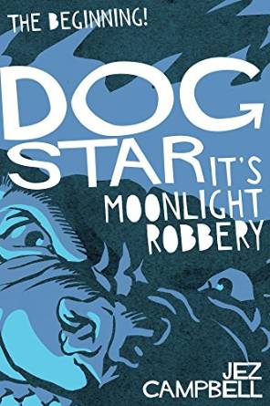
JF: Original and exciting, with great memorable artwork and a design that jumps off the page at you. A snarling beast of an ebook cover, and the other 2 books in this series are every bit as good.
e-Book Cover Design Award Winner for April 2015 in Nonfiction
Jen Fraser submitted Everyone’s a Genius designed by Jen Fraser. “Please note that I wrote, illustrated and designed the book myself, and self published. I’ve spent 15 years as a graphic designer (in my previous career) and this is my debut book. :-)”
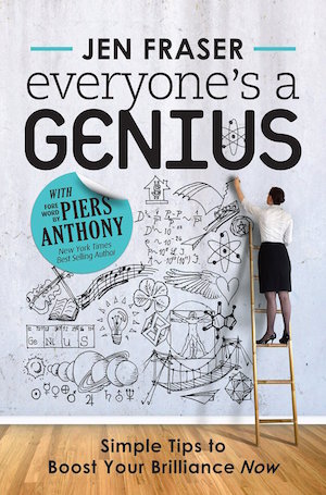
JF: Is that you on the ladder as well? I find the cover delightful and attractive. I want to peer into that illustration and there’s a fun energy about the whole thing. And I love the visual playfulness and illusions that are clever and apt, including the curling label, the ladder and the wall that becomes a canvas that becomes a background. I think I need this book.
Fiction Covers
Ahmed Mongey submitted The Refugee Sentinel designed by Ahmed Mongey. “I used a photo to represent one of the main characters of the novel the assassin. I wanted to represent the apocalyptic and draconian nature of the world depicted in the novel through the use of color and texture.”

JF: Beautifully done, and the effect looks to be exactly what you had in mind. Subtly engrossing. ★
Alex Kourvo submitted The Last Cyborg designed by pro_ebook covers. “I’ve had many stories covered by this artist. This one is my favorite of her designs.”

JF: The designer is obviously talented, and I quite like the typography, but the realistic image of a man holding a drink doesn’t say “sci-fi” to me in any way.
Alyssa Jensen submitted Unleashed designed by Kellie Dennis. “I told my cover designer that I wanted the image with the lips and bloody knife for a sensual effect and soldiers in a swamp and this is what I got. Result: Amazing.”

JF: A terrific image composite, and the lips/knife image is arresting. Nice job.
Amber Butler submitted The Burning of Cherry Hill designed by Kathryn Miller and A K Butler.

JF: Love the energy and intensity of the artwork, my only quibble would be the confusion that arises from the big “AK” which looks like it’s a continuation of the title, but it isn’t. But it’s just a quibble.
Angela Oltmann submitted The Mistletoe Run designed by Angie-O Creations.

JF: Pretty colors, but it doesn’t look like it will display well at a small size.
Arielle LeClair submitted Hollow’s Charge designed by JRSDesigns. “My book is about a young woman who has the capability to “speak” on a level with horses and they become her companions who assist her on a quest. The man standing back-to-back with her is her bodyguard and closest friend who also aids her on her journey.”

JF: Odd fonts, poor color choices and an overall awkward feel don’t help this cover.
Belart Wright submitted Average Joe and the Extraordinaires designed by Alexandra Engellmann. “This cover captures the mystery of the book’s clock tower perfectly.”

JF: An interesting composition and decent type, but I would have liked to see something to relieve the overall drab appearance.
Bella Love-Wins submitted Cabin Heat designed by Kellie Dennis, Book Cover by Design.

Bella Love-Wins submitted Chase Part 1 designed by Kellie Dennis, Book Cover by Design. “How can anyone not love this cover, this guy, and the backdrop by Kellie Dennis. Lovvvvve it.”

JF: Nice background texture, but I kind of think no one will really notice it.
BJ Hyman submitted Day Zero: The Book of Patrick designed by BJ Hyman. “I created the entire cover from scratch. The photography is also mine. I used Photoshop to give it slight blur and lens flares to mimic a little comment one of my characters says to another about how even cameras cannot clearly remember them. The cover mimics the unsure feeling of the future.”

JF: Looks more like a “concept” sketch you would provide to a designer. The typography is pretty weak and the image needs cleaning up.
Brad Ashlock submitted Zahorski’s War designed by Brad Ashlock. “My book is sci-fi, but with a strong mystery component, so I was attempting to capture mystery and science fiction–it’s been difficult because the title sounds more militaristic than the genre, so any comments are helpful.”

JF: Some nice textural elements, but overall the cover is not compelling and it’s visually indecipherable.
C. J. Darlington submitted West for the Black Hills designed by Mountainview Books, LLC. “We wanted to feature two important elements of this western on the cover, so we figured why not go bold and big with the beautiful Arabian horse and Devil’s Tower.”

JF: Works okay, would like to see the author name stand out a bit more.
C.D. Bryan submitted Never Board A Green Bus designed by Dane and Sofia of EbookLaunch.com.

JF: Although the title treatment on these 2 books makes me a bit queasy, they are fun and full of excitement for their target market.
C.D. Bryan submitted Take Me To Your Leader designed by Dane and Sofia of EbookLaunch.com.

C.N. Crawford submitted The Witching Elm designed by Carlos Quevedo. “”The Witching Elm” is the first book in a dark fantasy series for upper YA readers featuring a ‘witch-boy’ protagonist.”

JF: A great illustration with strong story elements and a distinctive title treatment make this cover stand out. ★
Calum Chace submitted Pandora’s Brain designed by Calum Chace. “Pandora’s Brain is a techno-thriller about a conscious machine being created in the near future. I wanted the cover to convey both the threat and the wonder of the ideas in the book. Working with Rachel Lawston was a delight.”

JF: Creepy and effective.
Carey Fessler submitted Foiled designed by MAPG.

JF: Lovely illustration, but I find the choice of font jarring in contrast.
Cat Nicolaou submitted When Time Comes designed by Andy McMillin.

JF: Disembodied, unrelated images and type that’s been shoved against the top and bottom trims doom this cover.
Caylen D Smith submitted Ripples designed by Ken Raney. “Ripples was first published with a lighthouse as the cover. Feedback – the cover design appeared geared toward adult women and not the YA intended audience. We enlisted graphic designer, Ken Raney, to redesign the cover. The pendant is key in the story and captures the feel of the story perfectly.”

JF: It has a nice air of mystery and lovely textures.
Chrissy Peebles submitted Crush designed by Book Cover by Design. “My sales doubled from this paranormal cover.

JF: Congratulations! There are a lot of competing elements here but plenty of atmosphere too.
Chrissy Peebles submitted The Enchanted Box Set Collection: Stories of Love & Paranormal Romance designed by amdesignstudios.

JF: Well composed to accommodate the list of author names, and the dress is what makes it all work.
Chrissy Peebles submitted The Zombie Chronicles – Book 2: Race For The Cure designed by Book Cover by Design. “When Book Cover by Design did my entire zombie series, my sales tripled!”

JF: Holy cow! That’s a great result for a cover redesign. These have just the right gritty feel with plenty of action and images at the bottom of the covers that add to the effect.
Chrissy Peebles submitted The Zombie Chronicles – Book 8 – Impact designed by Book Cover by Design. “Look at all the zombies coming out at the bottom! It’s amazing! Looks like a movie horror poster!”

Christen Civiletto submitted Green City Savior designed by Bespoke Book Covers. “After seeing a maple tree in full bloom in the middle of a January snowstorm (toxic chemicals artificially raised the soil temp, tricking the tree into believing spring had arrived), the antagonist can’t shake the feeling that he’s responsible for the spate of cancers in the city.”

JF: An interesting design, but what threw me off was not being able to figure out what’s happening in the foreground, is that sea? Clouds?
Cornelia Amiri submitted Pendragon’s Obsession designed by Julie Darcy. “What if a Warrior King want you so badly, he’d do anything to have you?”

JF: Doesn’t work for me. The type is heavy and overwrought, you can barely make out that there’s a woman standing behind the man, and some of the visual elements seem gratuitous.
Crystal-Rain Love submitted Mail Horror Bride designed by Paramita Bhattacharjee. “I am the author of this book, but it is written under my pen name, Raymond Lee.”

JF: Nice composition although the title lacks contrast. Pretty good skin tone for a zombie, eh?
Damon Za submitted Clear designed by damonza.com.

JF: Although the “frosting” covers almost too much of the underlying image, I love the way the designer used a text font for the title but makes it work beautifully.
Damon Za submitted Sing Me To Sleep designed by damonza.com.

JF: Another great cover from this designer, and not how the accent color of the girl’s lips attracts our attention, then the graceful curve of her arm leads the eye right down the cover to the title.
Damon Za submitted The Opposite of Living designed by damonza.com.

JF: A beautiful cover that integrates typography, illustration, and story elements to create a terrific and emblematic brand for this book. ★
Damon Za submitted Treasure designed by damonza.com.

JF: A clever layout that uses an image composite to great effect, focuses us on that treasure chest and the figures in the distance, and in which the effects used on the title really contribute to the whole instead of detracting from it.
Dane Low submitted Undermountain designed by Dane & Brittany at EbookLaunch.com. “Book 1 of the trilogy :)”

Dane Low submitted Afterlife designed by Dane & Brittany at EbookLaunch.com. “Book 2 of the trilogy :)”

JF: Great series design (see above and below) in which each cover has energy, action, and clear branding. Well conceived and carried out, I can’t see an improvement here. ★
Dane Low submitted Starkiller designed by Dane & Brittany at EbookLaunch.com. “Book 3 of the trilogy :)”

David Allen submitted Dream Eater’s Carnival designed by David T. Allen. “Plague doctor mask inspired by a photo by Tom Banwell and was used with permission. Made with Inkscape.”

JF: Lacks contrast and drama on a book that should be colorful and very lively.
Densie Webb submitted You’ll Be Thinking of Me designed by Fiona Jayde. “The cover depicts the celebrity stalker in the story as well as the words in a threatening note she delivers to him after threatening to set his house on fire.”

JF: I like the contrast between the elegant script font and the spooky look coming at us from below, it creates interest in the book.
Diana Nixon submitted Louise designed by Jennifer Munswami. ” The cover of Louise shows the main characters of the story, and the main idea of the book – show, intrigues and secret love. It matches the storyline perfectly, and even those who didn’t read the book’s summary can guess about the story hidden under this cover.”

JF: Love the elegant typography, but the image is muted and the figures are too far away to be engaging.
Dora Gonzalez submitted The Five Kingdoms of Severi designed by Dora Gonzalez. “I was looking for something that showed it was fantasy and appealed to the younger generation as well as the hard core fans of the genre. I wanted a pretty cover that said heroic fantasy.”

JF: The image isn’t bad, but the type is very awkward.
Emma J Homes submitted The Peridot Pendant designed by Frank Filippi. “This is a fantasy novel for middle-graders. I wanted the cover to look great as a thumbnail, so chose a simple, pivotal scene. I supplied the photos and sketched up how I wanted it arranged. I think Frank did a lovely job, especially with the colors.”

JF: Nice cat, would like to see the title more prominent.
Gabrielle Prendergast submitted Big Hair and a Little Honey designed by Gabrielle Prendergast. “The author wanted so many things on the cover that I almost got back to them to explain why that wouldn’t work. But then I thought “why not?” and went for it. The tone is meant to be satirical and I had fun with it.”

JF: With all respect, I think you should have made the call.
Gabrielle Prendergast submitted The Nines designed by Gabrielle Prendergast. “The author gave me a few existing covers in this genre which she wanted to emulate-always helpful. This is the first in a series so it was important that I develop a concept that can be replicated.”

JF: An effective cover with a color palette designed to bring it all together.
Geraldine Solon submitted Never Look Back designed by Natasha Brown.

JF: The image has interest, although the part running off the left side looks like an error, and the dark muted color lacks excitement. Three fonts for 5 words also introduces unnecessarily distracting visual elements.
Gina Kern submitted Arcanum designed by Book Cover by Design by Kellie Dennis. “After several different designs, this was the one that said Dark, ominous, and creepy. The crow was a symbol from the book, and keeps the synergy going with the second book cover already designed. The crow and the font type and color will remain consistent throughout the 6 novels in the series. ”

Guido De Palma submitted Loathing Magic designed by Guido De Palma (with advice from my street team). ” This cover was born when I got the license for the beautiful illustration “Breathe” by Lois van Baarle. It’s like My heroine is breathing magic! The actual design process went pretty quick and improved to the final version when I changed the title typography with “the marauders” by Juan Casco. ”

JF: Beautiful illustration, nice font choice, the whole thing is lovely although I’d like to see the title stand out from the background a bit more.
Ioana Visan submitted The Weight of a Wing designed by Vega Mandalika. “The Weight of a Wing is a fantasy novel about a wingless fairy so this is what the cover is supposed to portray.”

JF: And it’s well done in an interesting illustration style.
J. A. Menzies submitted Shaded Light: The Case of the Tactless Trophy Wife designed by Zoe Shtorm. “This is a contemporary mystery set in Toronto, but written in the classic puzzle style of books by authors such as Sayers, Marsh, Christie, Heyer, Tey, etc.”

JF: It doesn’t have much mystery, and the typography is crying out for help.
J. H. Bardwell submitted Tales of Lost Love designed by J. H. Bardwell.

JF: A bunch of interesting ideas that failed to materialize.
Jack Night submitted Starvation Assembly designed by Jack Night.

JF: Are we meant to be able to see what’s going on in the illustration?
Jaimie Roberts submitted Deviant designed by Clarissa Yeo.

JF: Do you think he’s pushing them down, or holding them in place? Deft beefcake.
James Duprie submitted The Thunderbolt designed by Dave Fymbo. “The Thunderbolt is Book 1 in the Carthage Rome Series. Hannibal Barca leads Carthage’s war elephants through the Alps against his nemesis Rome.”

JF: The composition uses the vibrant image to make its point emphatically, and the cover stands out because of it.
James Egan submitted Impervious designed by James T. Egan of Bookfly Design.

JF: A beautifully wrought cover with incredible detail and an image that draws us right into the world that it represents. The stylized title helps the book stand out. ★
James Egan submitted The Dying Hour designed by James T. Egan of Bookfly Design.

JF: This terrific mystery cover hits all the right notes, with colors and images that evoke violence and intrigue, hinting at story and setting.
James Egan submitted The Instruments of Control designed by James T. Egan of Bookfly Design.

JF: When you see the work that went into the detail on this cover, the careful and interesting typography, and the emblematic illustration, you recognize a really good fantasy ebook cover.
Janelle Diller submitted The Virus designed by Chris Moyer. “I asked for something simple yet compelling, and Chris delivered.”

JF: Simple and stark, but very evocative.
Jefferson Smith submitted Squeak! designed by Cody Cheung. ” Books for kids are quite a design challenge at the best of times. In our case, our hero is a princess, but neither her problem (loneliness) nor her quirky solution are gender specific, so we struggled for some time to find a cover that would represent the story but might appeal to boys as well.”

JF: Kids like lots of details, many things to look at, and bits of stories and characters to study. You’ve given them that here, and a cute title to boot.
Jennifer Soucy submitted Justice & Mercy designed by Jennifer Soucy. “This is the first of a series of mysteries, so part of the challenge was establishing a series identity. I’m also submitting the second of the series.”

JF: And we see what you’ve done there with the red and black, too. I really like the first one, it holds together well, but you’ve already got a great start to the series.
Jennifer Soucy submitted A Thousand Deadly Kisses: A Justice And Mercy Mystery designed by Jennifer Soucy. “This is the second of a series of mysteries – the series covers are all planned to be headless photos of some person that is relevant to the plot, with red as a predominant color theme.”

Jennifer Weil submitted White Raven designed by J.L. Weil.

JF: Your feathers look pretty out of scale.
Jess Owen submitted Skyfire designed by Typography, layout: T.M. Roy. Illustration: Jennifer Miller. “Thanks for checking out my entry! This book is part of a series of similar covers–I mention only since I’ve seen you link to series before to show cohesiveness. Thank you!”

JF: Very cool fantasy cover that relies on the lovely illustration of a griffin in flight and a delicate swath of colors.
Joanie Chevalier submitted Deadly Dating Games designed by Mother Spider Designs.

JF: A noir-ish design that introduces some story elements but doesn’t rely on them, also telling us explicitly what we’ll find inside.
Joceline Farrah submitted INFERNAL ICE designed by Jennifer Munswami. “Jennifer Munswami of J. M Rising Horse Creations and I collaborated to recreate a cover that would not only capture the romance but also the paranormal elements of Infernal Ice.”

JF: It’s an attractive cover that shows the work you put into it, although the two figures seem to be competing with each other for prominence.
John Dobija submitted Astrum Divinus designed by Australian eBook Publisher. “The cover represents a major theme on which the story is based.”

JF: A strong ebook cover. The title will hold up no matter how small the thumbnail, and the eerie theme is perfectly expressed by the strong illustration. ★
John Gibson submitted The Perfect Player designed by John Gibson.

JF: A really well designed cover. The decorative font suits the subject and the effects applied are appropriate and meaningful, and the whole layout has lots of juicy details and moves our focus onto the woman in the background.
Julia von Rist submitted The Lion of Palmyra designed by Julia von Rist. “Cover art by Kirael. I’m marketing this book as a yaoi novel, not regular M/M erotica. The cover art follows the genre’s convention of stylized, feminine-looking male characters. It also hints at the plot, which hinges on the uneasy relationship between two warriors on opposing sides.”

JF: You may need this as much as I did. From Wikipedia: “Yaoi (properly [ja.o.i], informally /jaʊi/), also known as Boys’ Love (BL), is a Japanese genre of fictional media focusing on romantic or sexual relationships between male characters, aimed at a female audience and usually created by female authors.” I have to admit that I have no experience with this genre, but the illustration is well done and I’ll bet you know what your readers are looking for. Good luck.
K.L. Middleton submitted Sharp Edges designed by Kellie Dennis. “I purchased this from Kellie to replace another ebook cover that wasn’t as eye-appealing. I love this one.”

JF: It’s got eye appeal, and doesn’t hide what the appeal of the book is all about.
Kalynn Campbell submitted SHE OF THORN designed by Kalynn Campbell. “Being a vanity project I got to revel in that oh-so-rare world of 100% creative freedom…”

JF: And lot some of the best vanity projects, you ended up with something delightful and unexpected. The weakest part is the script lettering, but so what?
Kate Beth Heywood submitted Anti-Social Media designed by Kate Beth Heywood.

JF: This delightful cover from the author reimagines how to use the “space” of the cover and that helps it stand out from the crowd.
Kate Thomas submitted Resounding Truth designed by Kellie Dennis. “As per usual, Kellie did a fantastic job of taking very little information from me and yet creating a perfect representation of the story. The picture is of the Alpha and the daughter of the previous one. The wolves of course represent the crux of the story and the design just blows me away. ”

Katie Stewart submitted The Time Smugglers designed by Katie Stewart.

JF: A good idea for a cover, but all the elements ended up about the same color value, so they blend into each other, robbing the cover of any drama or emphasis.
Kelli Angliss submitted Project Butterfly designed by Ria pratt/Kim Noble/ K. A. Angliss. “The artwork for the book cover is by one of famous artist Kim Noble’s alter personalities, Ria Pratt. She donated artwork towards the book series after a conversation about mind control and human experiments. She is a real-life survivor of Monarch programming, a main theme in my books.”

JF: I’d like to simply point out that most successful book covers are designed with readers in mind, not to please the author, as seems to be the case here. And for readers who don’t know any of the backstory, there’s not much of interest.
Kenneth Clark submitted A Triumph of Will designed by Kenneth Clark.

JF: This type of technique works for brochures, but not for book covers.
Kenneth Clark submitted See You in the Morning designed by Kenneth Clark.

JF: Why put the title in the one place it would (merge with the background and therefore) be hard to read?
Kenneth Clark submitted The Vampire’s Heart designed by Kenneth Clark.

JF: Bad case of the “pasted-on” look.
Kim DDD submitted Blood Empire Book Two: A Time of Fear & Flight designed by Kitten from Deranged Doctor Design. “Cover design for Book #2 in Ancient Roman Blood Empire Series”

JF: Although the type looks oddly squished inside that panel, the cover does a pretty good job overall, with the image carrying most of the weight.
Kim DDD submitted Demonsense designed by Milo from Deranged Doctor Design. “Cover design for book 1 in DEMONSENSE Series – Urban Fantasy featuring the heroine dealing with demonic possession, underground exorcist societies and magically powered organized crime.”

JF: Don’t care much for the way the face is floating in all those flames, and the halations etc on the title don’t help.
Kim DDD submitted For All To See designed by Marushka from Deranged Doctor Design. “Cover design for Romantic Suspense”

JF: The way these blended images work with the blended colors is an interesting effect and, with the title treatment, create a cover that demands to be looked at.
Kim DDD submitted Little Miss Evil designed by Milo from Deranged Doctor Design. “Cover design for Murder Thriller. (part of series)”

JF: It’s amazing how bare tree branches so reliably connote evil, isn’t it? Here the designer uses this element in combination with a strong font and an untypical cover to create a cover that works on lots of levels.
Kim DDD submitted Man by the Door designed by Milo from Deranged Doctor Design. “Cover design for Thriller with romantic elements.”

JF: A good design that looks more “thriller” than “romance.”
Kim DDD submitted Prisoners designed by Milo from Deranged Doctor Design. “Cover design for Urban Dark Fantasy”

JF: An attractive and atmospheric fantasy cover that brings the story home. Good title typography, and notice how the woman’s face looks outward, while the hallway draws us in, creating a sense of movement.
Kim DDD submitted Red Handed designed by Kitten from Deranged Doctor Design
. “Cover design for Women’s Suspense/Mystery (short story series ) – side story featuring main heroine from Color Of Money Series.”

JF: I think this is the strongest cover from the DDD crew this month, and although I wondered why the designer put the man’s lone visible eye behind the red type, it looks intentional. The texture in the background helps give it a finished look, and there’s no mistaking the appeal of this strong cover.
Kyoko M submitted The Holy Dark designed by Gunjan Kumar and Christopher Cold. “I really wanted to capture the dark, brooding tone of the novel with a really outstanding depiction of Hell, while still reminding the viewer that this is still a story driven by our main heroine, Jordan Amador. It’s Hell on Earth, and all on her shoulders.”

JF: An attractive heroine, and although the rough type and large black areas seem like they could be improved on, the cover still works.
Laurie Starkey submitted The Core, Equilibrium I designed by Kellie Dennis. “Kellie pulled the perfect model for my main character, Ellie. The city is alive and beautiful and the golden eyes and stars give way to the paranormal elements that Kellie created to perfectly represent the cover.”

JF: It’s an interesting treatment for a paranormal novel, but one that works.
Leona Windwalker submitted Sol’s Solstice designed by Book Cover by Design (Kellie Dennis).

JF: Although this design shows skill in image combining and type handling, the visual disparities (like the contradictory light sources) between the images of the two brothers are disturbing.
LeVar Ravel submitted Leo G. Carroll Fan Club designed by LeVar Ravel.

JF: Strong image, weak typography, and little idea of what the book is about.
Lindy Moone submitted For Whom the Bell Trolls designed by Lindy Moone. “My planned cover for this charity anthology about all kinds of trolls — mythological, even Internet — was a reworking of an old college etching which only represented the title story. When I decided to fully illustrate the book, I redrew the cover to better represent the interior.”

JF: Love the troll drawing, and definitely one of the best titles of the month. There’s so much going on here that I’m not sure if the sawtooth element adds or distracts from the real content. Good luck with the fundraiser.
Lizzie Harwood submitted Go See the Kids (A Quirky Family Triology Book 1) designed by Lizzie Harwood. “A quirky literary fiction trilogy of a family flying in the face of normality.”
")
JF: Another interesting image just crying out for decent typography.
Lori L Robinett submitted Fatal Impulse designed by Daniela Owergoor. “I found the basic cover on the SelfPubBookCovers.com website, which was perfect for my book – then worked with the designer on typography.”

JF: A good result that will attract readers.
Luc Goyer submitted Wellmaster: The Weeping Wall designed by H.L. Goyer. “The cover design features a zoomed-out view of the planet surface where the story takes place.”

JF: It’s a good idea but you might have pulled back even more to make the planet more obvious, and if you got rid of all the fancy type effects the cover would be stronger.
Mallory Rock submitted Frendyl Krune and the Blood of the Sun designed by Mallory Rock.

JF: Good balance and focus, and an unusual series branding device.
Marie Long submitted Scarred designed by Jenn LeBlanc (photo), Najla Qamber (design). “I wanted this cover to scream “New Adult” and “Romance”. I also wanted to convey the multicultural/diversity aspect that is present in the story.”

JF: You hit all the bases, but it’s good avoid lots of type so tiny you can’t read it.
Matt Durrant submitted Yoshida: Death of a Salaryman designed by Matt Durrant. “I’ve designed a few book covers before, but this is my first self-published novel. I designed it in Illustrator, originally trying for a film poster look, but ending up with this more abstract design. My inspiration for the character design was a British comics artist called Jamie McKelvie.”

JF: You’ve obviously got illustration skills, but the rest of the cover is a train wreck with stray elements like the grey rectangle and the gradient panel mostly distractions, and the heavy duty font choice adds to the chaos.
Michael McWilliams submitted Osama’s Angel designed by Michael McWilliams. “This is the first book of a trilogy. The typography will be common throughout with the OA device also running through as the initial letters of the title.”

JF: If you look at the professionally designed covers in this post, you can clearly see this isn’t one of them. That’s not going to help you.
Michael Rasmussen submitted The Case of the Cursed Dodo designed by Michael Rasmussen. “I wanted to create a cover that had the look and feel of an old weathered pulp novel… but for kids. I also read a number of articles on this site for pitfalls to avoid which was a huge help because I’m not a designer by trade. For the record, I’m also not a panda. ”

JF: Cute, and a nice job getting the effect you wanted, looks good to me.
Michelle Goodhew submitted Arafura: Unfinished Business designed by Michelle Rene Goodhew. “The naval ship with party lights had to be, so I wanted the bold colors to play on the surface of the steel of the boat. With the overall design being abstract, I was hoping to mirror Susan’s wit, the charm she displays in her storytelling, as well as the stories vivid depth. I hope I did it justice ”

JF: I think the vivid colors and bold composition would have worked better without the added distraction of heavily modeled type.
Natalie Birzer submitted Mission Hills designed by Heather Scott.

JF: It definitely has charm going for it, despite my dislike for big black backgrounds.
Oliver Bayldon submitted Darkly Blows The Harmattan designed by Jules T Smith. “The designer created an ambience of Saharan winds blowing down across West Africa, hinting at passions and cultural clashes where tourists and locals converge. Jules uses a heightened painting with a bold typeface for dramatic effect.”

JF: Well done. Lots of energy and texture and the bold title really stands out.
Olivia Wildenstein submitted Ghostboy, Chameleon & the Duke of Graffiti designed by Christian Fuenfhausen.

JF: I can see the designer was trying to characterize each element of the title, but it ends up confusing and working against itself. Making stuff harder to read rarely works to your advantage.
Paul D Pruitt submitted Crocs designed by Paul D Pruitt. “This children’s chapter book for beginning readers and their elders tells about a pair of Crocs shoes that journey from the discard pile of two brothers in the United States to the feet of a boy in Kenya.”

JF: It sounds like a lovely book that deserve a much better cover than it got. Unmistakably self-published.
Penelope Fernandez submitted Hypnagogic Shifters: Superposition designed by Enrica Eren Angiolini. “The cover features Cain, a character from the book, looking down at parallel multidimensional earths. This was the stage of his scientific experiments on humanity.”

JF: Terrific piece of sci-fi art, really needs a stronger title treatment.
Peter Harris submitted Miasma designed by Tone Julskjaer / Peter Harris. “The cover design combines themes of the story: double helix for genetics, eyes for the three main viewpoint characters, overall cloudy and murky colour scheme. The title is made up of data tapes, again part of the story. All the design flaws are mine, Tone’s work is excellent!”

JF: The idea is good and the illustrations are strong but some don’t look like they were properly incorporated into the larger image, and I would question the advisability of that title since it’s almost impossible to read.
Randi Everheart submitted Connor designed by Robin Ludwig. “A different color for each character’s cover sets the series book’s apart while the look and feel unifies them.”

JF: A solid genre cover that knows how to appeal to readers.
Rebecca Feldbush submitted Chef’s Table designed by Rebecca Feldbush. “We wanted something flirty & fun to reflect this lighthearted romantic story between an award-winning chef & a diner cook, so illustrator Abby Hellstrom played with a layered-paper technique to give the art a little more depth/texture. Clean shapes & bold colors give it a modern, bright feel. ”

JF: Artful and effective, just right for this genre.
Rebecca Feldbush submitted Pivot and Slip designed by Rebecca Feldbush. “We used an evocative original illustration by C.B. Messer to show one of the story’s lead characters in a potentially life-changing moment of reckoning. The title treatment is a modern nod to a turn-of-the-century boxing poster, with red echoing that of the gloves as a unifying factor.”

JF: This cover’s careful composition directs us where the designer wants us to go, straight to the gloves lying on the floor.
Robin Wolstenholme submitted The Happiness Contagion designed by WoolysWagon ePublishing.

JF: Hmm. . . doesn’t make me too happy. What is all this stuff on the cover, and why does it look more like a nonfiction book?
Samantha Atkin submitted Piece of Heaven designed by Kellie Dennis from Book Cover by Design.

JF: There’s something about the way that dog is placed that’s … disturbing.
Scott Neil submitted Dolphin Girl designed by Kit Foster. “The aim was to have a clean design with a contemporary, yet classic-looking font and a bold image that would spark curiosity. I gave Kit a few outline ideas and he came back with this combination.”

JF: It’s clean and elegant, although I have to say that the standard interpretation of “fin sticking out of water” is usually “shark,” no?
Shaneisha Dodson submitted Faux Happiness designed by Covers by Jacob.

JF: A bit brutal but effective.
Sherry Soule submitted BEAUTIFULLY BROKEN designed by SwoonWorthy Book Covers.

JF: Nicely laid out, and the interaction of the characters gives it interest.
Sierra Rose submitted My Despicable Ex designed by Book Cover by Design.

JF: Although the couple is the main focus, the cover has an overall dull look and lack of contrast.
Sierra Rose submitted Stormy Love designed by Book Cover by Design.

JF: Formulaic.
Stacy Claflin submitted Seaside Surprises designed by Stacy Claflin using DIY Book Covers.

JF: I’m guessing this is a template and, although it’s a well constructed one, don’t you think the couple should have been, well, at the seaside?
Tammy Seidick submitted Never Love A Cowboy designed by Tammy Seidick. “Thanks for your time and for this opportunity!”

JF: A handsome ebook cover, with a nice touch on the title typography.
Teresa Boswell submitted The Key is The Key designed by Teresa Boswell. “I have been collecting keys for a long time. When I wrote “The Key is The Key” I had to come up with a cover and came across a box of keys and it hit me, Place them on satin and take a Picture. I tried arranging them but they looked set up. So I grab them up and dropped the keys. So this is it.”

JF: It doesn’t add up to a book cover, and will make your book look amateurish. I’m betting that’s not what you’re after, so maybe take a look at the designers listed here and see if one can help you out.
Terry Green submitted Iced designed by Tom Edwards. “I gave artist Tom Edwards carte blanche on the cover design. With only an ultra-minimal description of the heroine and world, Tom simply took off. I was anxious to get away from the visuals in my head, and see what someone else might imagine. I found an artist I could trust, then did just that!”

JF: A solid sci-fi cover with some excitement to it, and I love the bold way the designer handled the title.
Tim McConnehey submitted Prophecy and Modern Times designed by Glen Edelstein. “This is a religious title that provide clarity to events about what the author believes will be signs of the second coming of Jesus Christ.”

JF: Sounds like an exciting event, but there’s no excitement at all on this somewhat awkward cover.
Valerie Comer submitted Pinky Promise designed by Hanna at Book Cover Bakery. “I’m thrilled with this second cover in my Riverbend romance series, and how the series branding is working out with the hand-holding couple, series header/footer waves, and the hand-lettered title.”

JF: It’s got a lot going for it, but I wish the title wasn’t hard to read because it ends up overly confusing the underlying photo, too.
Ward Salud submitted The Benghazi Affair: A Parody Novel designed by Rachel Cole. “Rachel made my cover for The Benghazi Affair: A Parody Novel about a secret agent Hillary Clinton. I wanted it to show both the parody/satire and thriller angle and Rachel made sure to show the serious side (like the stark font and shadows) and funny side (hanging R and Hillary with a gun).”

JF: Hey, I recognize that pants suit! Well done, made me laugh just looking at it.
Wendy Higgins submitted See Me designed by Jennifer Munswami. “Thank you!”

JF: Very pleasant.
Zamil Akhtar submitted Song of a Dead Star designed by Zamil Akhtar. “The cover fits the unique science-fantasy concepts presented in the book. The background is a light spectrum, a central concept in the story, blended with stained glass. The foreground is the menacing masked villain that haunts the protagonist. The typography is Middle Eastern to match the setting.”

JF: And yet it doesn’t come together into a unified whole. I don’t think the font is right for the title, and there’s so much visual “noise” in the background it’s competing with the hard-to-make-out masked man. These elements could add up to much more.
Nonfiction Covers
Alex Blaelock submitted Reclaiming the Lost Art of Delightfully Charming Dinner Parties designed by Dave. “My goal was something that looked interesting as a thumbnail. The design incorporates a Rubin vase optical illusion in an art deco style.”

JF: Very odd. The color is odd, the typography is odd, and why is the couple off-center?
Allen Taylor submitted E-book Publishing: Create Your Own Brand of Digital Books designed by Angie Ayala. “It’s about e-book publishing. What else can be said?”

JF: It looks good, clear and to the point, well suited to its category.
Beth Spencer submitted Vagabondage designed by Beth Spencer. “Vagabondage is a verse memoir about a year I lived in a campervan, so the collage seemed appropriate for a narrative told in fragments. I liked the child’s image of a van, rather than a photo, because as a search for home & belonging, it often tracks back into the past to find a way forward.”

JF: While the art is whimsical, the typography just doesn’t match up well.
Colin Dunbar submitted The Little Book of Encouragement for Aspiring Self-Publishers designed by Colin Dunbar. “My focus with this cover readability at the small size on Smashwords and Amazon.”

JF: I don’t think you achieved that since the very light lines will break up when reduced, and the images will be way too small.
Dane Low submitted No Diplomacy designed by Dane & Brittany at EbookLaunch.com.

JF: Quiet but effective.
Dave Lundgren submitted Brand New Day designed by Cormar Covers. “The book is about a journey of personal faith-related struggles and challenges that ultimately resulted in fresh perspectives and an incredible new start.”

JF: Lovely and inspirational. Not sure I would have left the title in black, though. ★
David Riley submitted Jammin’ with Steven Adams designed by joerchw. “The cover illustrates the idea that this young Kiwi has achieved his dream of making it to the NBA through his determination to overcome every obstacle.”

JF: Wow, that’s like a cosmic jam! Fans will be delighted.
Jayme Vincent submitted East in Eden designed by Jayme Vincent. ” East in Eden is the author’s humorous account of her move to New Zealand (a country that has been called the “last Eden on Earth”). Graphical elements of the cover represent the country’s culture and landscape. Bold typography for the title ensures the cover will stand out on digital bookshelves.”

JF: Totally charming and appropriate, although I’d like to see the title contrast more with the background. ★
Jeremy Podolski submitted 23 days: a memoir of 1939 designed by Charlotte May. “The book cover was made from a scan of a WW2 silk escape map and a photo of Joe in his WW2 flying jacket from his time as a P51-D Mustang pilot. The cover was made by a friend. The idea was put together by Charlotte after some discussion with us on the aged look we wanted for the photo and map.”

JF: I like the idea and this may be just fine for your needs, but for a commercial book they would have to be part of a much more adept design.
John Carvalho submitted The Crisis Of Our Time designed by AuthorHouse. “The book discusses current world problems and shows how past knowledge can help resolve them. Hence the ancient world image. ”

K.M. Weiland submitted Conquering Writer’s Block and Summoning Inspiration designed by Damonza.

JF: Clear and to the point, exactly what’s needed.
K.M. Weiland submitted Outlining Your Novel Workbook designed by Damonza.

JF: An attractive series design for these workbooks on the craft of writing.
K.M. Weiland submitted Structuring Your Novel Workbook designed by Damonza.

Katrina Thom submitted How To Start A Mom Blog designed by Urban Creative Studio. “How To Start A Mom Blog is a guide for people who what to start a blog but have no idea where to start. It is written by the bloggers of Thinking Outside The Sandbox so we wanted to have a bit of our current branding shown.”

JF: This cover gets the job done, and I like the “corkboard” look, but it seems pretty static.
Lorna Sixsmith submitted Would You Marry A Farmer? designed by Joanne Condon. ” It is hoped that the cover conveys that the book is a humourous look at what life is like married to a farmer – what she sees, she will get! His dog is his best friend, he may tempt with the big ring but his other hand is holding firmly to the sprong and shows his love of farming.”

JF: Love the illustration style, the whole thing is adorable, but I wish the title was more prominent.
Mel Smith submitted Memoirs of an Ordinary Guy designed by Mel Smith. “This is my first book released April 2015, it my memoirs of a of a boy to man in the 70’s, 80’s and 90’s”

JF: The “self-published” look in all its glory.
Melissa Addey submitted 100 Things to do while Breastfeeding designed by Streetlight Graphics. “This cover was developed to sit within the parenting genre and especially breastfeeding books, so the images, the colours and the source of quotes were all chosen accordingly.”

JF: Very successfully, too. It’s perfectly appropriate and well thought out, and lovely the way the design leads us right down to the peaceful infant. ★
Missy Giltner submitted Scaling Up: How a Few Companies Make It…and Why the Rest Don’t designed by Jun-Hi Lutterjohann. ” Scaling Up is written so everyone can get aligned in contributing to the growth of a firm- so leaders don’t feel like they are dragging the whole organization up THE S-CURVE OF GROWTH.”

JF: A workmanlike cover that will do the job.
Philip Whiteland submitted Giving a Bull Strawberries designed by John Steele & Philip Whiteland. “Burton upon Trent has a somewhat idiosyncratic view of what street art should be. A few years ago, the good burghers of the town suddenly arranged for this huge, 30 foot, stainless steel shovel to be erected in a prominent position. No-one seems to know why.”

JF: It is very large, isn’t it? I don’t think your design really comes across as a book cover.
Sherry Lance submitted 21 Tools For Discipline Without Punishment designed by Stephanie Leung. “The cover utilizes a minimalistic design with simple graphics to avoid the sense of crowdedness and gives a calm feeling. The warm and happy colours in two-tones help to convey the topic of the book of positive discipline and the warmth of relationship between parent and child. ”

JF: It looks like a throwback to the 1950s to me, and I don’t think I would describe the color scheme as “calm” or “happy” either. I suggest a trip to a local bookstore to have a look at what these types of books usually look like.
Steve Heronemus submitted Shells: Sustained by Grace Within the Tempest designed by Rob Tucker. “Life can seem like a lonely, isolated beach with violent weather all around, but there are gifts we have been given that will bring purpose and strength to rise above every storm. The oyster, scallop and conch are metaphors for disciplines that reclaim a full life from even the darkest struggles. ”

JF: It sounds like a thoughtful book, but that doesn’t come through in the ill-fitting cover. The photo is pretty ordinary and the typography just doesn’t work.
Tim McConnehey submitted True Stories from the Files of the FBI designed by Glen Edelstein. “This book is about some of the most famous FBI cases in the 1930s and 1940s.”

JF: Clever and fun, with some nice font choices.
Walt Kienia submitted The American Voter: Stupid and Ignorant designed by Richard de Meij. “The importance and patriotism of the vote shown by the font of “The American Voter” placed over the American flag, which crashes with the average “stupid and ignorant voter” with his head stuck up his ass, operating in the dark and bringing darkness upon democracy, symbolized by the black background ”

JF: And bringing up the rear . . .
Well, that’s it for this month. I hope you found it interesting, and that you’ll share with other people interested in self-publishing.
Use the share buttons below to Tweet it, Share it on Facebook, Plus-1 it on Google+, Link to it!
Our next awards post will be on June 15, 2015. Deadline for submissions will be May 31, 2015. Don’t miss it! Here are all the links you’ll need:
The original announcement post
E-book Cover Design Awards web page
Click here to submit your e-book cover
Follow @JFBookman on Twitter for news about the E-book Cover Design Awards
Check out past e-Book Cover Design award winners on Pinterest
Subscribe to The Book Designer Blog
Badge design by Derek Murphy
