

Welcome to the e-Book Cover Design Awards. This edition is for submissions during March, 2015.
This month we received:
120 covers in the Fiction category
13 covers in the Nonfiction category
Comments, Award Winners, and Gold Stars
I’ve added comments (JF: ) to many of the entries, but not all. Remember that the aim of these posts is educational, and by submitting you are inviting comments, commendations, and constructive criticism.
Thanks to everyone who participated. I hope you enjoy these as much as I did. Please leave a comment to let me know which are your favorites or, if you disagree, let me know why.
Although there is only winner in each category, other covers that were considered for the award or which stood out in some exemplary way, are indicated with a gold star: ★
Award winners and Gold-Starred covers also win the right to display our badges on their websites, so don’t forget to get your badge to get a little more attention for the work you’ve put into your book.
Also please note that we are now linking winning covers to their sales page on Amazon or Smashwords.
Now, without any further ado, here are the winners of this month’s e-Book Cover Design Awards.

e-Book Cover Design Award Winner for March 2015 in Fiction
LeVar Ravel submitted Press F5 to Load Game designed by Irina French. “Your form requires me to call Ms. French the designer. Technically, Irina French is the Cover Artist (she did the actual artwork) and LeVar Ravel is the Cover Designer (I planned the layout). Thanks!”
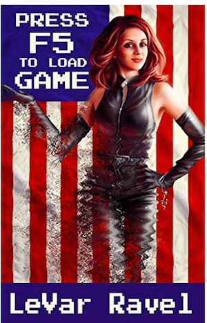
JF: This one made me smile. A creative concept perfectly executed for this sci-fi/gamer story. Everything: the title, background, and woman, are fully integrated into the cover and its messaging. Memorable.
e-Book Cover Design Award Winner for March 2015 in Nonfiction
Daniel van Straaten submitted A Little Bird Told Me designed by Daniel van Straaten. “The bird image was generated by me from a photograph in Photoshop.”
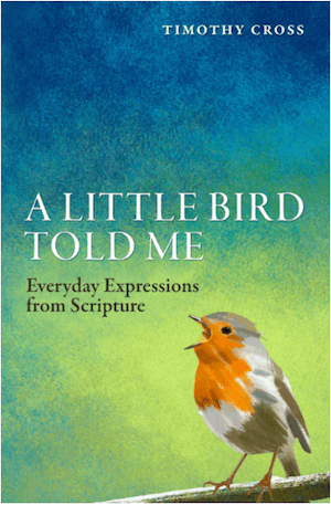
JF: Just beautifully done, a sensitive cover that expresses its content and where the charming bird reaches out to the reader.
Also available for iBooks: A Little Bird Told Me
Fiction Covers
Abel Valdivia submitted Mercury & Murder designed by Abel Valdivia. “Mercury & Murder is the second book of the Beowulf Chronicles series by Rhett Bigler. In the cover design I tried to convey the title of the book and the main plot of the story, hinting about its fictional category.”

JF: A clean design.
Adam Wayne submitted Devereux and A Question of Class designed by Adam Wayne.

JF: Atmospheric artwork combined with ineffective type treatments.
Ahmad Ardalan submitted The Gardener of Baghdad designed by Scarlett Rugers. “A fifty years old memoir of passionate gardener in Baghdad is found. This is his story.”

JF: It’s a beautiful and fetching cover, although the title could stand out a bit more and overall it really has a feminine feeling to it.
Aimee Bell submitted Ten Days in Panema designed by Aimee Bell.

JF: Adept typography and a strong, if a bit noisy, illustration.
Alan Drabke submitted Grew Up A Screw Up designed by Alan Drabke. “The background image is fresh off of Pixabay. I size my background images in GIMP. I do the lettering in Inkscape. Last, I scale the images to 1600 x 2400 pixels in GIMP and convert to jpegs.”

JF: An interesting concept and strong art can’t disguise the help the “lettering” needs.
Alexei Auld submitted Luscious Melchus designed by Michael Auld. “I wanted to have a cover that established a brand for the series and could be easily updated, hence the silhouettes. I plan to replace the ‘monster of the month’ with each volume.”

JF: It could work, you might want to try differentiating the author’s name from the title.
Alicia Rades submitted Fire in Frost designed by Clarissa Yeo. “I wanted a designer who could create a one-of-a-kind, eye-catching cover. Clarissa did a great job! The crystal ball communicates the psychic elements that my main character, Crystal Frost, faces while the eyes are somewhat shrouded in mystery. I look forward to your thoughts!”

JF: Beautiful and haunting, with an expert title treatment.
Aliza Rudman submitted Ragnar’s Daughter designed by Aliza Rudman.

JF: Pretty, but I’m not sure that I get it.
Allen Taylor submitted Limerents in the Bog designed by Angie Ayala. “Limerents in the Bog is a weird fantasy anti-romance novella.”

JF: Not sure I know much about the “anti-romance” genre, but I do like the proportions of this ebook cover. There’s no reason designers can’t take advantage of the fact that for many ebooks there is no print book equivalent, and no particular reason to make “covers” that mimic physical book covers. In fact, I’ve been hoping since beginning this competition that we would see more experiments along these lines.
Allen Wolf submitted Hooked designed by Allen Wolf. “I tried to communicate the essence of the story through the cover image.”

JF: Clean and creative, even if the pieces are a bit disjointed.
Ana Franco submitted Down The Wormhole designed by French Press Bookworks.

JF: I can see the artistry here, but I’m stumped. What kind of book would have this cover?
Andrea Cefalo submitted The Countess’ Captive designed by Andrea Cefalo.

JF: Very effective series covers (see below) that create a recognizable graphic style while relying on the attractive artwork to attract us.
Andrea Cefalo submitted The Fairytale Keeper designed by Andrea Cefalo.

Andrea Cooper submitted Cursed designed by LM Creations.

JF: I wish the title was easier to read, and that the illustrations was easier to make out.
Arthur Bozikas submitted BLACK OPS ZULU: Pivotal Velocity designed by Arthur Bozikas.

JF: You can see that trying to format three lines of type like those at the top is a challenge for most authors, but overall it does a good job for its genre.
Aurora Springer submitted Grand Master’s Pawn designed by Corinne Kilgore. “Corinne designed the cover to indicate science fiction romance.”

JF: You say romance, but it looks downright creepy to me, with a strong dose of dominance/submission.
Brandon Plaster submitted Lenalia designed by Brandon Plaster.

JF: Hard to see any message or meaning in this abstraction.
Bridget McKenna submitted The Boy in Zaquitos designed by Bridget McKenna for Zone 1 Design. “Cover for a politically-themed short story about a man who spreads plagues to destabilize third-world countries.”

JF: Gritty and effective.
Bridget McKenna submitted The Girl Who Loved Animals designed by Bridget McKenna for Zone 1 Design. “Cover for a science fiction short story about a young woman makes an extraordinary sacrifice to help save a species from extinction.”

JF: Good, but lacks the unity or contrast of the previous cover.
Bruce Louis Dodson submitted An Unhappy Medium designed by Bruce Louis Dodson.

C.D. Bryan submitted No Aliens Allowed (Flight Knights, Book 1) designed by Dane and Sofia of EbookLaunch.com.
")
JF: Well put together for its target market.
C.P. McClennan submitted Just Prey designed by Robin Ludwig.
 Awkward.
JF: The stylish art has pushed everything else, including the title, into insignificance.
Carol Ann King submitted The Portal Prophecies: A Halloween’s Curse designed by Ryan King.

JF: All three of these covers are clean, without being overburdened with story, but the title treatments seem out of balance and in need of beefing up.
Carol Ann King submitted The Portal Prophecies: A Keeper’s Destiny designed by Ryan King.

Carol Ann King submitted The Portal Prophecies: Frost Bitten designed by Ryan King.

Carrie Beckort submitted Shattered Angel designed by Scarlett Rugers of Scarlett Rugers Design.

JF: A delicate yet evocative cover.
Cathy Vasas-Brown submitted Sympathy for the Devil designed by Streetlight Graphics. “I like clutter-free covers and prefer simple, memorable images that strike an eerie note and raise questions in the readers’ minds. The small blackboard hints at a sinister classroom, one in which the captive is being reeducated by reciting her lessons on a “learning chair.””

JF: Suitably haunting, with some nice typography.
Christian Cocks submitted Monster Squad: The Iron Golem designed by Robin Davies.

JF: Love that golem!
Clarissa Yeo submitted The Mystery of the Walking Statue designed by Yocla Designs.

JF: A design full of fascination that pulls us into the book, with some delicious detail and careful type handling. ★
Cynthia D. Witherspoon submitted The Seer designed by Cynthia D. Witherspoon.

JF: So dark it’s murky, and the whole cover looks like it’s been horizontally squeezed for some reason.
Dan Sofer submitted A Love and Beyond designed by Aimee Bell. “A Love and Beyond is a romantic adventure set in Jerusalem. The key and radiating light hint at the elements of mystery and magical realism (the protagonist discovers the mystical “key” to a woman’s heart); the fonts hint at the romantic elements.”

JF: Lovely design but from the descriptions the book sounds a lot more exciting.
Dan Sofer submitted Larry and Kate designed by Steven Plummer. “”Larry and Kate” is a lighthearted story about relationship issues that arise during a romantic trip to Israel. I think the cover is very clear on the travel and Israel aspects. The gap between the characters, and the fact that they’re walking away from each other, imply growing conflict.”

JF: It works.
Dane Low submitted Android Paradox designed by Dane & Brittany at EbookLaunch.com.

JF: A strong sci-fi cover, and I love the atmospheric city at the bottom as a contrast to the strongly graphical elements above.
Dane Low submitted Angels At Last Light designed by Dane & Brittany at EbookLaunch.com.

JF: Eerily effective, and the designer’s use of light to guide our eye is very successful.
Dane Low submitted Blood Bound designed by Dane & Brittany at EbookLaunch.com.

JF: Clever and attractive, with a nice “puzzle” aspect that draws the viewer in.
Dane Low submitted Lost and Profound designed by Dane & Brittany at EbookLaunch.com.

JF: I like the idiosyncratic approach this design takes to a satirical book of “reviews.”
Dane Low submitted THE ADVENTURES OF NATHAN SAINT-CLOUD designed by Dane & Brittany at EbookLaunch.com.

JF: Beautifully laid out but a bit underwhelming.
David Burton submitted Ancient Mariners designed by Tatiana Vila. “I picked the photo, Tatiana Vila did the rest. I think she captured the dark tone of the book perfectly.”

JF: Well, it is dark, but the “photo” looks like it’s been worked over, and that seagull isn’t very convincing.
David Burton submitted Young Blood designed by Tatiana Vila. “Tatiana Vila caught the essence of the protagonist – a beautiful, Young Blood vampire.”

JF: The image is the “hook” but the title lacks contrast with the background.
David Ince submitted Bubble Goes Bang designed by David Ince.

JF: I assume this is ironic, and there’s something intriguing about London melting, but the font choice seems odd.
Dawn Kohler submitted The Invitation: A Weekend with Emma designed by Balboa Press. “Balboa Press was interested in supporting my novel and directed their graphics team to update my cover to attract consumers. We worked together to have a design that makes you feel the story of the book before you open the first pages. I now use the design theme for all my marketing material.”

JF: Visually and typographically competent, but it’s completely lacking in interest, excitement, or energy. (Readers please note the “publisher” referred to is a subsidy publisher, where authors pay for all these services. For more info: Subsidy Publishing: Proceed With Caution.)
Debra L Martin submitted Witch’s Curse designed by John Dotegowski/Terry Roy. “I had 2 graphic artists work on the cover image for Witch’s Curse. John Dotegowski drew the image and Terry Roy did the typography.”

JF: It’s a good effort, but I find the image visually confusing, with a lot of extraneous detail.
DelSheree Gladden submitted Invisible designed by DelSheree Gladden. “The main character is an invisible boy, but in order to not confuse readers by making him look like a ghost, I choose instead to represent his invisibility using the title.”

JF: But without your explanation, I would have no idea what this cover was about.
Eden Sharp submitted The Breaks designed by Boy With A Beard.

JF: A pretty cool illustration with uninspired typography.
Edward Branley submitted Dragon’s Danger designed by Lisa Graves. “Illustration by Lisa Graves, author of “History’s Witches” and “Her Majesty””

JF: A cool illustration that holds together even though there’s almost too much going on, foreground and background, and the seal doesn’t help.
Eli Nixon submitted Son of Tesla designed by Andrew Handley of Listverse.com . “Our goal was to capture recognizable, relatable imagery juxtaposed with the surreal landscape of the world described in the book, all glued together with an atmosphere of almost childlike wonder.”

JF: That was a tall order to start with, only partly successful, so the addition of 4 different type treatments on top of everything else has rendered this cover a bit of an accident scene.
Elizabeth Kelly submitted Killian designed by Ruxandra Tudorica, Methyss Design. “This cover design allows the reader to see the main character leave the world he belongs too as he entered through a portal into the human realm.”

JF: Contrast this cover to the one immediately above, trying to accomplish some of the same goals with similar visual elements, but here they are brought together into one, unified whole and make a great impact. ★
Fanny Lee Savage submitted In the Shadow of Angels designed by Fanny Lee Savage.

JF: An interesting design, but that cyan is inherently a weak color and doesn’t work well here.
Fran Nagy submitted Curtain Calls designed by Fran Nagy.

JF: Love the curtain, but it looks assembled rather than designed.
Gerome De Villa submitted The I.P.O. designed by Gerome De Villa.

JF: Stylish and intriguing, makes you want to know more.
Holly Cave submitted The Generation designed by Kit Foster. “The novel’s central themes are identity and in particular genetics. I asked Kit for a design that would appeal to traditional sci-fi readers and those branching out from commercial fiction.”

JF: A pretty good mashup, I’m surprised at the font used for the title, it’s not what you would expect from a sci-fi cover.
Ingrid Banwell submitted The Infidel’s Garden designed by Ingrid Banwell. “My first self published ebook–The Infidel’s Garden is an historical romance featuring a passionate and persecuted Muslim woman abducted to the Netherlands (hence the tulip). The image began as an acrylic painting which I photographed, tweaked and added more detail to using photo editing software.”

JF: The painting is terrific. I suggest you find a designer you can partner with and who will bring type skills to your covers, they will be awesome.
J.P. Sloan submitted The Curse Servant designed by Conzpiracy Digital Arts. “The cover highlights the possession of a young girl as the key narrative of the novel. The background is a Clive Barker-esque nod to the novel’s setting of secret hermetic societies.”

JF: Well done, focused and sure of itself, with a stylish title treatment.
James Egan submitted Every Fear designed by James T. Egan of Bookfly Design.

JF: Beautiful series design with every square inch accounted for and working toward enticing the reader. Note how the designer has swapped colors for the author/title in these two covers. ★
James Egan submitted A Perfect Grave designed by James T. Egan of Bookfly Design.

James Egan submitted Rookie Noir designed by James T. Egan of Bookfly Design.

James Malone submitted Rainbow Gardens designed by Derek Murphy. “Derek’s cover captures the novel’s essence: the protagonist’s struggle to learn how to forgive.”

JF: This cover is packed with story and imagery, yet the designer keeps it under control and all working in the same direction. Is the multicolored title too much, given everything else on the cover?
Jamie Thornton submitted Germination (Feast of Weeds Book 1) designed by Amber Feldkamp.
")
JF: Spooky and interesting, with an inventive title treatment.
Jane Cable submitted The Faerie Tree designed by Terry Compton. “The cover was designed in-house by the publisher, Matador, with a brief that it had to (a) show immediately that the book was for adults and not for children and (b) build on the visual brand started for my first book.”

JF: Nice job, it touches all the bases.
Jane Davis submitted An Unknown Woman designed by Andrew Candy. “The combination of the two women reflects the identity crisis the main character is undergoing, the fact that we rarely see ourselves the way that others see us and the complex mother/daughter relationship.”

JF: The image is so powerful, I think the whole cover works despite the uneasy relationship between the title and the author’s name.
Jill Meniketti submitted Welcome to Groove House designed by Adam Wayne.

JF: It’s almost as if the figures were made purposefully hard to see, the title intentionally difficult to read. Why?
Jillianne Hamilton submitted Molly Miranda: Thief for Hire designed by Jillianne Hamilton. “This action/comedy/chick lit novel features a professional contract burglar. I wanted to the cover to be simple but still appeal to both chick lit and adventure fans. Adore your website! Great work by everyone involved. :)”

JF: Nice job keeping it simple, Molly, but I think a lighter color palette would help.
John Davis submitted American Revenant: Settlers and Sorrow designed by Emily Royal. “A wonderful design experience with a wonderful designer. Emily Royal took my (John L. Davis IV) stick figure sketch and the few notes I gave her and created a cover that I feel is a perfect fit for my zombie apocalypse survival novel.”

JF: Great job, it says “zombies” all right. Not sure why the building is so prominent when you’ve got such deliciously gruesome zombies to focus on.
John Freeter submitted Mercy (The Last Army book 1) designed by Streetlight Graphics.
")
JF: A strong genre cover.
Karyn Patterson submitted A Dead Man’s Tale designed by Octagonlab.

JF: Very cool, love the illustration.
Kate Newburg submitted In Her Closet (The Lust Diaries: Book 1) designed by Kate Newburg, Bad Star Media. “The author needed a branded look for the first book of her sensual series. I wanted to capture the confidence of her heroine, Yves, an anonymous sex blogger-turned-author in Philadelphia.”
")
JF: I like the concept and layout, but not the colors which seem way too cool for a “sensual” niche.
Kate Rauner submitted Glitch designed by Kathy London. “I’ve read that Americans like covers with bright colors and people, while Europeans like more subdued colors and graphic elements. This cover is aimed at an American audience. The book is science fiction futurism – fairly tech-heavy, views of the near future (good and bad) as important as the plot.”

JF: Looks very “pasted together” and no idea why you would use what is basically a typewriter font for a sci-fi novel.
Kathryn Loch submitted Highlander’s Hope designed by Kathryn Loch. “I paid for an exclusive shoot by a well known cover model months in advance. One hour before deadline, I received a low quality image I couldn’t use even if I had time to send it to a cover artist. I had to put this one together myself after losing serious $$$.”

JF: I’m very sorry to hear that, Kathryn, and that’s probably why the cover has ended up a disjointed assembly of unrelated images and overworked type. I’m sure it will go better next time.
Katrina Avant submitted Duplicity designed by Katrina’sWORKS. “The cover design depicts the plot of the eBook-A murder mystery.”

JF: Oversimplified and typographically weak.
Kennedy Obohwemu submitted Frozen designed by Tatiana Fernandez.

JF: Another strong set of series covers, and the carefully controlled colors help identify the books.
Kennedy Obohwemu submitted Nightfall designed by Tatiana Fernandez.

Kim DDD submitted Big Game designed by Milo from Deranged Doctor Design. “Book #3 in Urban Fantasy (Mystery/Suspense sub-genre) “VV Inn””

JF: A competent design, but just too many things going on here for my taste.
Kim DDD submitted Hypton 14 designed by Milo from Deranged Doctor Design. “Design for SF Fantasy/Adventure set in 9012 where all men are extinct. The goal was to create cover that will very clearly communicate genre and target female audience.”

JF: Successfully genre-specific, if a bit menacing.
Kim DDD submitted Inflicted, Burdened Series book3 designed by Kitten from DDD. “Book Cover Design and Series Branding for YA PNR Series Burdened, book #3. Author’s request was to attract PNR YA fans with genre recognizable cover featuring male character.”

JF: Fits the bill. Considering the texture of the tree background, and the texture on the man’s back that seems to have some meaning, not sure the added embellishments on the title add or subtract from the overall effect.
Kim DDD submitted Not Famous in Hollywood designed by Kitten from DDD. “Design for the Book 1 in the chick lit series – “In Hollywood” . Author requested strong series branding and unique design .”

JF: Yet another strong series design. Here color is also used, and #2 and #3 are particularly attractive for this genre. Unique and unmistakable.
Kim DDD submitted Not Happily Married in Hollywood designed by Kitten from DDD. “Design for the Book 2 in the chick lit series – “Not In Hollywood”.”

Kim DDD submitted Not Talented in Hollywood designed by Kitten from DDD. “Design for the Book 3 in the chick lit series – “Not In Hollywood”.”

Kim DDD submitted Purgatory Origins designed by Milo from DDD. “Cover design for War&Military Adventure thriller Purgatory Origins: Powers of Darkness”

JF: Well targeted for its audience, although the type elements don’t seem to have achieved a good balance.
Kim DDD submitted Rebecca’s Voice designed by Milo from Deranged Doctor Design. “Horror (Ghosts) Romance with Suspense elements.”

JF: Simple and effective with a “haunting” atmosphere.
Kim DDD submitted The Living Remnants designed by Milo from DDD. “Cover Design for dystopia/horror short story about Esmeralda, one of the human survivors of an apocalyptic war.”

JF: Individually I like all the elements, but the powerful title seems to be fighting with the illustration for dominance.
Kim DDD submitted Vados, The Ujal Series designed by Milo from DDD. “Design for the first book in the series – VADOS, SF Romance. The main request by the author was to create vibrant, eye catchy cover targeting female audience.”

JF: [sighs]
Kim DDD submitted When the Crows Fly Low designed by Kitten from DDD. “Cover design for Family drama with suspense elements. The idea was to capture longing and drama/romance feel, but also to hint the suspense element.”

JF: A terrific cover with creative typography and a clear concept to reflect an emotional state in the world. It all works—except for that one big bird. Take it out and this is a real winner.
L.L. Sanders submitted Passing the Torch designed by Karri Klawiter.

JF: Would have liked to see her face, the whole thing seems a bit remote.
Lisa Mauro submitted The Place We Went to Yesterday designed by Lisa Mauro. “New York City’s High Line Park is a major plot point in the novel, so I wanted to capture the essence of it on the cover. I also wanted to create some mystery – what/where is that place we went to yesterday? Cover photo by Zsussana Tauber.”

JF: Very little excitement, not much design either.
Lisa McManus submitted Newbie Nick designed by Victoria Miller. “When 14-year-old Nick Zinsky secretly busks for money on the downtown streets, he soon learns that keeping his “job” a secret from family, friends and teachers is harder than he thought. The design is a perfect portrayal for the book. Sincerely, Lisa McManus (Lange)”

JF: I’m still going to stick to my believe that light blue is a weak color for most titles, but the composition and concept are great.
Maggie M. Larche submitted Striker Jones and the Midnight Archer designed by Nilah Magruder. “The illustration is by Nilah Magruder, while the font design is by Courtney Marcilliat. This is a middle grade mystery.”

JF: Good illustration and an appropriate use of casual script, but when you make all the type the same color (white) it flattens the potential for contrast. Even a subtle shift (toward blue, in this case) would allow the title more prominence.
Mary Anne Edwards submitted Brilliant Disguise designed by Jasmin Woodworth. “Jasmine Woodworth has designed only two book covers, both are mine. “Brilliant Disguise” was her first.”

JF: Simple and effective, and the eyes inside the blood stain are nicely done.
Masha Shubin submitted Gideon’s Children designed by Masha Shubin. “A big part of the challenge in designing an attractive cover for this book is the ambiguity of the title. As it follows the exploits of five members of the public defender’s office, I tried to come up with an image to convey the law aspect of the story without it looking like a “family will” fight.”

JF: It’s very effective, and a great way to use those ubiquitous silhouettes, while the scales allude to the legal setting.
Maya Tyler submitted Dream Hunter designed by Lori Lasswell. “This cover features my hero, Gabe, a mysterious man who appears as the star of my heroine’s dreams. I pictured him with dark hair and brooding eyes, dressed all in black so he could easily disappear in the shadows and the designer perfectly captured my vision.”

JF: individual pieces, floating in a vast sea of black.
Michael Carlson submitted Changed designed by M.J. Carlson. “Changed is a science fiction novel set in a dystopian future. The cover reflects the use of use of technology to wire processors into the nervous system without the subject’s knowledge or consent. Thanks for any comments.”

JF: The image is arresting, in a brutal kind of way, but the type desperately needs help. Better font, fewer effects, and more of an effort to integrate it with the other parts of the cover. This is generic advice for anyone to whom I’ve made a similar comment, because it’s the most common criticism I offer here. Finding a great visual is only the beginning of creating a great book cover.
Michele Barrow-Belisle submitted Fire And Ice designed by AM Design Studios. “Fire And Ice is an epic teen fantasy romance novel that’s been optioned for a movie. It’s a tale of finding yourself and forbidden love in a dangerous realm. The cover captures the ethereal wanderlust of the book perfectly. Plus that dress is to die for! AM Design Studios did a phenomenal job on it!”

JF: The illustration is full of fantasy and promise, a great hook into the book, although the type is pretty basic. If the movie gets made, it will be interesting to see how the studio portrays this same story.
Natalie Wright submitted H.A.L.F.: The Deep Beneath designed by eBook Launch (Dane). “The book is YA science fiction (aliens). I to the designer use of a symbol I created that is mentioned in the book & that I did not want photographs but graphic design. The goal was a strong graphic to draw the eye & intrigue & that could morph & change colors for the future books in the series.”

JF: Expertly done, and the basis for a consistent series. But I always wonder if the tradeoff made here is worth it. Although you have the unique symbol to tie the books together and brand them, by not including any story or environmental information, you may limit the books’ appeal.
Nicholas Bugden submitted Then Frederick Ran designed by Damonza.

JF: Notice how the designer makes it impossible to look anywhere else but where he wants you to look: at the small but telling detail in the back of Frederick’s neck. Sci-fi stories.
Nick Marsden submitted The Light of Theolan designed by Pencastle Publications. “A magical flash of light and fire off the blade of a sword. The cover wraps around the back on the print version, revealing the soldier wielding the sword.”

JF: We judge only the ebook covers here, and it looks like this one went a bit overboard, obliterating the imagery and pushing the type aside to show a big… ball of white?
Noelle Greene submitted Lover’s Intuition designed by Scarlett Rugers. “Genre readers want to know instantly if it’s “their” sort of book. The designer, Scarlett Rugers, created this to convey fast-paced romantic suspense. The design is flexible enough for future books that have a different mood.”

JF: Scarlett has won this competition in the past, but here I’m flummoxed by her font choice for the title of this book, which looks like it wants to go more romance than suspense.
Pamela Frost Dennis submitted Dead Girls Don’t Blog designed by Pamela Frost Dennis.

JF: A good job at a lighthearted cover (and definitely in the running for title of the month!) but the “Don’t Blog” line should be moved up so there’s overlap with the tail of the “G” to balance out the style of the first two lines.
Paul Ikin submitted The Other Side of Eve designed by Paul Ikin. “Big fan of your site, you helped me out infinite ways while self-publishing. Launched last week. Super excited. The Other Side of Eve is in print and both ebook formats. I designed many covers but returned to the original.”

JF: Hey Paul, that’s great to hear. You’ve got a strong concept and interesting art, but the very ornate border has reduced the space for the title and created a bit of “visual noise” with it’s ornate moldings and many angles.
Rachel Tsoumbakos submitted Unremembered Things (Book #1 in the Wood Nymph Chronicles) designed by Rachel Tsoumbakos.
")
Rebecca Rode submitted Numbers Game designed by Yocla Designs. “I decided to take a chance on this designer, a university student in Singapore. I’m so glad I did! On its second day, Numbers Game hit two Amazon best seller lists, and I attribute it solely to its eye-catching cover.”

JF: It’s got a lot going for it, and the designer has a nice touch with type. ★
Sam Rook submitted Gate designed by Sam Rook.

JF: Odd and disturbing, with weak type treatments.
Sarah Elisabeth Sawyer submitted Touch My Tears designed by Josh McBride. “Photography by Lynda Kay Sawyer of model Jon Sawyer.”

JF: A beautifully styled image at the top, although I don’t know why it’s merging into an ornate lace texture at the bottom. Looks like it was designed primarily for the print version.
Sherrill Nilson submitted Karda: Adalta Vol. I designed by Kurt P Nilson. “The original art work is a 39″ X 27″ pencil drawing. Every feather highly detailed. Kurt worked for several years as a graphic designer at the University of New Mexico. He currently lives in Brazil and devotes all the time he can to his art work which can be seen on his FB page.”

Spencer Wolf submitted After Mind designed by Damonza / Spencer Wolf. “I brought my feature-film advertising experience to the design of my debut eBook cover. I wanted a cinematic look to bring the viewer into the mind of the main character. I used color to establish mood, while mindful of “backlit” eReaders versus print and white backgrounds of online storefronts.”

JF: It does have a cinematic look, and it’s perfectly focused. ★
Stephen Arnott submitted Leofric: Sacrifice designed by James at GoOnWrite. “A short-story in the same series as ‘Leofric: Sword of the Angles’, and using the same layout and typeface. This is a murder mystery, and the cover foreshadows the plot’s inciting incident. It combines images that establish both the early medieval period and genre, and create an air of lonely dread.”

JF: Spooky and threatening.
Stephen Arnott submitted Leofric: Sword of the Angles designed by James at GoOnWrite. “This is a Dark Age adventure set in Denmark (AD 520) and I was looking for imagery that would nail both the period and the genre. After some experiments with different elements, we settled on the helmet and shields against a background of Norse stonework, together with a semi-runic Gothic typeface.”

JF: , and another strong series (with the one above). I think I prefer this cover, because the elements unite quite well.
Steve Spencer submitted Between States designed by Rhys Wootton.

JF: Another example of a powerful piece of artwork with some type “applied” but which doesn’t tell us much about the book (paranormal thriller).
Syd Gill submitted Reckless Nights designed by Syd Gill Designs.

JF: A self-assured and well targeted genre cover design, with good image compositing, too.
Syd Gill submitted Rule Breaker designed by Syd Gill Designs.

JF: Artful, strong, and on the money.
Tammy Seidick submitted Molly Harper designed by Tammy Seidick. “Thanks for reviewing!”

JF: I like the big-city allure and strong type, but the image has lots of irrelevant details and the cover would benefit from a bit of a cleanup.
Té Russ submitted Love After War designed by Alex Russ. “I try to have things that happen in the book represented on the cover. I want those objects to draw a reader in and make them wonder what the significance of those things are to the story.”

JF: Lovely texture and appeal.
Tom Leveen submitted Those We Bury Back designed by Tom Leveen. “This is my first time designing. The author name is a pseudonym. I think the title isn’t working. Thank you!”

JF: The fonts aren’t helping. Study some of the great covers in this competition for more ideas.
Tom Saine submitted The Conrad Kidnapping designed by Tom Saine. “The cover was designed by the author a retired mechanical engineer and graphics designer.”

JF: Nice concept but I don’t see the point of using that crude typeface on a cover that’s otherwise dedicated to elegance.
Valerie Comer submitted Dandelions for Dinner designed by Hanna at Book Cover Bakery. “Dandelions for Dinner is the fourth book in the Farm Fresh Romance series. The cover designer/illustrator has created a strong series brand.”

JF: A really lovely illustration but the entire cover is lacking in contrast, and so has no “pop.”
Vanessa Riley submitted The Bargain designed by Sanura Jayashan. “I wanted a brave Regency (1800’s) heroine who looks like she is contemplating a big decision. She’s even standing in the shadow of her late mistress which is integral to the story. I love how Sanura brought Precious Jewell to life.”

JF: Terrific, sets the tone, sets the stage, and gives us a character to care about.
VIRGINIA MCKEVITT submitted Fracture The Secret Enemy Saga designed by VIRGINIA MCKEVITT. “I find the cover/s of this series portray a sense of mystery and intrigue which causes interest into reading the book.”

JF: Pretty, engaging woman? Beefcake? Oh, heck, why not both? But I do like your title and author type styling.
VIRGINIA MCKEVITT submitted The Hunted – Fracture The Secret Enemy Saga designed by VIRGINIA MCKEVITT/Char Marie Adles. “Compelling and full of mystery. The eyes captivate the reader, pulling them into book.”

VIRGINIA MCKEVITT submitted Secrets – Fracture The Secret Enemy Saga designed by VIRGINIA MCKEVITT/Char Marie Adles. “The cover pulls you into the story with its intriguing design.”

Yocla Designs submitted Jurassic Dead designed by Yocla Designs.

JF: I love the strong illustration, allusion to the scary Jurassic Park, and the poster-style typography, just perfect here. Exciting. ★
Nonfiction Covers
Anida Dyah submitted The Ultimate Journey: Harnessing the Power of Storytelling for Your Business designed by Anida Dyah.

JF: A good cover concept marred by poor color/value choices.
Anthony Santen submitted The Path Within: Break Through Harmful Programming and Doctrine To Experience Happiness and Harmony In Your Reality designed by Anthony Santen. “The contrast of this image reflect the duality we all experience between what we were taught and what we feel is natural to us. Our reality vs. our thoughts and beliefs, our internal vs. our external truths.”

JF: Wow. That’s really weird and unsettling.
David Dockery submitted Looking Back: Growing Up in Middle-America in the 20th Century designed by David Dockery. “My book was designed using family photos of the town that my father and I both grew up in and our tight family bond, closeness to neighbors, and our experiences.”

JF: This type of cover—common for historical memoirs—is a challenge because it always threatens to look like a chaotic stack of photos, and that’s pretty much the result here.
Gerald Freeman submitted I Don’t Believe God Wrote The Bible designed by llpix.com.

JF: Well composed, with good clear font and type choices. ★
Grigory Ryzhakov submitted The Reader’s Mini-Guide to New Russian Books: A Catalog of Post-Soviet Literature designed by Grigory Ryzhakov. “For this cover, I have used a royalty-free artwork picturing St Basil’s Cathedral in Moscow from canstockphoto.com and a free font Kroftsman, which is similar to Russian avant-garde typography of the Soviet era. I hope the overall effect should be ‘modern’ and ‘Russian’.”

JF: An excellent job, and the title could have been even stronger.
Lowellyne James submitted Sustainability Footprints in SMEs – Strategy and Case Studies for Entrepreneurs and Small Business designed by Ade Adesina. “The book reviews the evolution and theory of Sustainability Footprints e.g. carbon footprint and examines the critical success factors and contributions to small to medium sized enterprises (SME) growth. The etching “Hope” embodies the possibility of a low carbon future through better resource use.”

JF: Pretty much what you would expect from an academic publisher. Basically a template.
Madison Woods submitted Sustainable Ginseng designed by Madison Woods. “I wanted something that would appeal to those with stewardship on the mind, rather than desire for profit alone. Seeds seem to be an archetypal symbol of sustainability, so I used that for the focal image.”

JF: I like the idea, but not how it came out. The background photo is superfluous, since we can’t see almost any of it anywhere, the author’s name has been reduced to “fine print” and you’ve sacrificed the visual identity of ginger that everyone knows and recognizes for the seeds, which no one does. I would re-think this.
Nathan Meunier submitted Self-Publishing Success Strategies: 19 Tips to Sell More Kindle Books and Grow Your Audience designed by Nathan Meunier. “This is another one I did on my own. The original cover was going to be darker, with purple and neon green. I though it was nice, but not as visually explosive. I did an a/b split test with my mailing list and social media, and folks seemed to really like this one better. Total cost: $0.00”

JF: Money just floating out of the books I publish, isn’t that a lovely idea? Starburst lovely? Hey, isn’t this about ebooks, not print books?
Newton Campos submitted The Myth of the Idea and the Upsidedown Startup designed by Danijela Mijailovic. “The book deconstructs the myth that successful startups are built upon great ideas.”

JF: I’m not a fan in general of covers with lots of big black undifferentiated space, but the image here fits the book so well it works well as a cover. ★
Nicole Cappelleri submitted Active Patience: A Simple Guide to Productive Writing designed by N.C Harley.

JF: Charming with equally charming colors, although I find the color variations in the author’s name distracting. Love that subtitle hugging the hills.
Rick Holland submitted ANTIDOTE: My Last Bardo designed by Rick Holland.

JF: A perfect cover for this book of clever, sometimes biting, cartoons. Good decision to show the book as square to emphasize it’s an illustrated book.
Talal Itani submitted Quran: Must Read Passages. For Everyone. designed by Talal Itani. “My wife thinks it was win the worst book cover award. Thank you.”

JF: No, it will not win Worst Book award, but it doesn’t have to be that boring. Study other covers that only use type, you’ll find lots of inspiration and things to try out on your own.
Yocla Designs submitted Elevate Your Diet designed by Yocla Designs.

JF: Beautiful combination of illustration and typography that looks just right for its intended audience. ★
Well, that’s it for this month. I hope you found it interesting, and that you’ll share with other people interested in self-publishing.
Use the share buttons below to Tweet it, Share it on Facebook, Plus-1 it on Google+, Link to it!
Our next awards post will be on May 18, 2015. Deadline for submissions will be April 30, 2015. Don’t miss it! Here are all the links you’ll need:
The original announcement post
E-book Cover Design Awards web page
Click here to submit your e-book cover
Follow @JFBookman on Twitter for news about the E-book Cover Design Awards
Check out past e-Book Cover Design award winners on Pinterest
Subscribe to The Book Designer Blog
Badge design by Derek Murphy
