

Welcome to the e-Book Cover Design Awards. This edition is for submissions during November, 2014.
This month we received:
116 covers in the Fiction category
25 covers in the Nonfiction category
Comments, Award Winners, and Gold Stars
I’ve added comments (JF: ) to many of the entries, but not all. Remember that the aim of these posts is educational, and by submitting you are inviting comments, commendations, and constructive criticism.
Thanks to everyone who participated. I hope you enjoy these as much as I did. Please leave a comment to let me know which are your favorites or, if you disagree, let me know why.
Although there is only winner in each category, other covers that were considered for the award or which stood out in some exemplary way, are indicated with a gold star: ★
Award winners and Gold-Starred covers also win the right to display our badges on their websites, so don’t forget to get your badge to get a little more attention for the work you’ve put into your book.
Also please note that we are now linking winning covers to their sales page on Amazon or Smashwords.
Now, without any further ado, here are the winners of this month’s e-Book Cover Design Awards.

e-Book Cover Design Award Winner for November 2014 in Fiction
James Egan submitted The Secret Heart designed by James T. Egan of Bookfly Design.
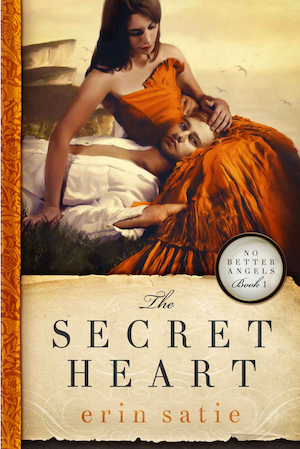
JF: An absolutely sumptuous cover in which every element, every level of detail the designer has introduced plays a part. The careful type treatments and appropriate textural elements all help to convey both the languor of the scene and the period look and feel.
e-Book Cover Design Award Winner for November 2014 in Nonfiction
Betsy Kruger submitted Aesop’s Keys to Profitable Marketing designed by 1106 Design.

JF: This delightful and perfectly targeted cover is so appealing it draws you right in. Who’s the dog and why is he on the cover? When it’s this inviting, who cares?
Fiction Covers
A.D. STARRLING submitted KING’S CRUSADE (SEVENTEEN BOOK 2) designed by GLENDON HADDIX, STREETLIGHT GRAPHICS. “Streetlight Graphics have designed the books and short stories in this thriller series with the same “dark feel” in mind. This is the brightest cover of the series so far and it fits in perfectly with the plot and the main character of the novel. I love that fiery sky.”
")
JF: Dark and attractive with a hint of mystery.
Adrijus G. submitted Affliction Z: Patient Zero designed by RockingBookCovers.com. “Book 1 in a series.”

JF: Good tension, although I initially read the author’s name as “lieutenant” probably because of the proximity to the “uniformed” figure.
Adrijus G. submitted Dead South Rising designed by RockingBookCovers.com.”Book 1 of Dead South Rising series. Both submitted. :)”

JF: Very good series concept with stylish design and a cool type treatment.
Adrijus G. submitted Dead South Rising: Death Row designed by RockingBookCovers.com.”Book 2 of Dead South Rising. Book 1 is also submitted.”

Adrijus G. submitted The Wayward Journey designed by
RockingBookCovers.com.

JF: Here the tortured title type doesn’t add anything to the cover.
Aldrea Alien submitted Golden Dawn designed by Cora Graphics.

JF: A lot of care was taken with the title and it contributes to the overall effect.
Alex Stargazer submitted The Necromancer designed by Kit Foster. “This is Kit’s design for the print cover, but I decided it was better than the eCover even at thumbnail. It is meant to showcase a prominent theme (ice) and also: the contrast between gold and blue can represent the Necromancer’s dichotomous inner thoughts.”

JF: I like the concept but it does indeed look better for a print book since the title will start to “break up” when reduced to thumbnail size.
Alice Catherine Carter submitted The Broken Poppy designed by Emma Carter. “My sister Emma Carter painted the poppy on the front cover. The title was formatted through amazon’s free designs.”

JF: Unfortunately it looks like you got what you paid for.
Ally Shields submitted Cross Keys, An Elvenrude Novel designed by Etopia Press.

JF: A very standard genre cover.
Amy Hillsberg submitted Griffin Blade and the Bronze Finger designed by Tessa Avila. “This is an epic fantasy novel about a good-hearted thief that goes on a quest to discover the secret of a series of gems that wield power when held by the right person or being. We are especially happy with the title font choice and the electric-feeling current running across the cover. Thank you!”

JF: I agree that the title is strong, but the rest of the cover just doesn’t match up very well. It’s impossible even at this size to read the background as “electric” and the way the illustration is used doesn’t help.
Andrew Browne submitted The Comet’s Tale designed by Andrew Paul Browne. “There is a system of symbols designed for the jacket and interior of this novel. The cover is designed to communicate the fantastical and cosmic qualities of this self-published work. The book stands alone but also serves to promote the travels and inspirations of the author (who is an artist).”

JF: The art is impressive although it can’t be appreciated at this size, and that’s a bit of a problem. And who is the author? Don’t know, the cover doesn’t say.
Barbara Loos submitted Disillusioned designed by Scarlett Rugers. “The book takes place in Italy. Venice is the most popular recognizable city that is uniquely Italy. The main character has his first introduction in Venice as he is a documentary producer whose goal in life is to record Italy’s past history and finds himself having to take on Italy’s future.”

JF: A clever design that looks like it’s “crushing” the title, which has not been distinguished very well from the author name. But a gorgeous visual for sure.
Barry Finlay submitted The Vanishing Wife designed by Tom Nickerson at ShokVox Productions. “The cover is representative of the storyline. The hero, an accountant, must reluctantly exchange his spreadsheets for a Glock 17 to find his wife who has disappeared. The gun is shaded to represent his reluctance. The bright colours are meant to attract attention.”

JF: Not really a fan of the large expanses of flat black, and what purpose do the orange rules serve other than a distraction?
Biju Vasudevan submitted The Contract designed by Biju Vasudevan and Partridge. “Hi ! I have been following your steady relentless progress with immense delight n satisfaction. Greetings and Respects”

JF: Biju, I thought no one had noticed my relentless progress! Thanks. This is your standard stock-photo-with-type cover, very little to attract the reader’s interest.
Brian Gonzalez submitted The Tides of Altamar designed by Brian Gonzalez. “The challenge for this cover: Fill it while still drawing the viewer into the vastness of space. I chose a modified Yin – Yang composition for balance and an orange-purple split complementary color scheme for optical punch and used many translucent layers to approximate the richness of oil paints.”

JF: The artwork has promise and I like the “worlds in collision” but the overworked type and many strong type elements are battling with everything else on the cover to no good effect.
C. Michael Lorion submitted Totem (Book 1: Scars) designed by Glendon Haddix at Streetlight Graphics. “This is the third cover I’ve done for Totem, the first one done professionally. I gave Glendon the themes of a quaint New England city, a blizzard, 1978, Native American teenagers, American teenagers, time travel.”
")
JF: Creepy and exciting, a strong cover.
Cathy Perkins submitted Cypher designed by Naomi Raine. “Unwilling to stand by while her family and world are destroyed, Cara Wainwright rips apart the secrets surrounding Cypher, the company her father built—and will take any measures to defend. I asked Naomi to focus on Cara, her determination and the company.”

JF: The girl is strong, not sure about the building, it looks a bit like apartments in Los Angeles to me.
Christina Westcott submitted A Hero for the Empire designed by Kanaxa. “I was so happy the cat made it on the cover. He plays an important role in the book; sort of a cross between Garfield and Chewbacca.”

JF: Charming featured character, and the cat is cute but I think I would have toned down the background to focus more attention on the main figure.
Christopher Gray submitted RAKER designed by Tom Edwards. “RAKER is a short story that takes place in the same universe as my novel DARK NIGHTS. This time the story focuses on an advanced android named Plato rather than on the human characters. I worked with designer Tom Edwards to fashion an anthropomorphic character with implied battlefield capabilities.”

JF: The character came out great, the type looks a bit oversimplified in comparison.
Cindy Blackburn submitted Unbelievable designed by Karen Phillips. “Hi Joel, This is the cover to my new cozy mystery, Unbelievable, which was released on Amazon in early November. The mystery is set in a rural lakeside town in Vermont and those dogs do feature prominently in the plot. I’m interested to learn what you think! Thanks, Cindy Blackburn”

JF: I’m not too familiar with the “cozy mystery” genre so it’s difficult to say if this is what readers will be looking for. There’s not much here that says “mystery” to me and the title is very weak.
Colleen Mooney submitted Rescued By A Kiss designed by Cover to Cover Designs. “The cover depicts the scene where the protagonist kisses a stranger in a New Orleans Mardi Gras parade and how entangled their lives become from an innocent kiss in exchange for a flower.”

JF: It’s not very effective because the busy background is right behind the point where we should be focusing: the kiss. The cute type can’t help and the dog seems like another distraction.
Curtis Edmonds submitted Wreathed designed by Dangerdust. “This is an entry for the November contest. Thanks.”

JF: See my comment above about big swathes of black, but here it works much better, and I love the way the title is integrated with the art.
Damon Za submitted Naomi designed by Momir from Damonza.com.

JF: Here the designer takes firm control, rendering a cover with simplicity to focus our attention but plenty of subtle detail in texture and the “reflection” motif to keep us interested.
Damon Za submitted Purity designed by Momir from Damonza.com.

JF: A nicely captured and composed moment, but I’m not sure I see the reason for the grungy title.
Dane Low submitted Bound By A Dragon designed by Dane & Brittany at EbookLaunch.com.

JF: Gorgeous detail and careful typography create a classic look, with a subtle but effective series brand. ★
Dane Low submitted Motive designed by Dane & Brittany at EbookLaunch.com.

JF: Hot and exciting. I want to read it right now.
Dane Low submitted Pier View designed by Dane & Brittany at EbookLaunch.com.

Dane Low submitted The Copy designed by Dane & Brittany at EbookLaunch.com.

JF: A hint of spookiness and terrific composition make this cover stand out.
Dane Low submitted Win Some Lose Some designed by Dane & Brittany at EbookLaunch.com.

JF: Great visual storytelling for a tough title to work with. On the other hand, with the alternating type colors in the title the red wash takes time to make sense of, and that’s not usually a good result.
David Jacob Knight submitted The Phone Company designed by David Jacob Knight. “I integrated the typography into the environment of this stock image to create the illusion of depth. The warm colors invite readers to pick up the book, while the landscape piques the mind: What’s back there in those smoky depths? The imagery also reflects some of the themes of the book.”

JF: Oddly enough, everything else on the cover works better than the title. A simpler treatment might have better highlighted the story.
Deanna Kahler submitted A Rare Gem designed by Pennie Ellis.

JF: Kind of adorable, really, although the girl’s face could be more prominent.
Diane Escalera submitted Latin Heat Trilogy designed by Gilded Heart Design. “Latin Heat Trilogy features all three stories in the collection together for the first time in one sizzling edition.”

JF: Looks like a pretty good solution to a design challenge.
Dionne Abouelea submitted The Before Now and After Then designed by Dionne Abouelela.

JF: I really like how different this design is, but not the way the noise in the background makes the title so hard to read.
Elisabeth Grace Foley submitted Corral Nocturne: A Novella
designed by Jennifer Quinlan. “”Corral Nocturne” is a short Western retelling of the Cinderella story. I was delighted with the way Jenny Quinlan brought to life my idea for something that would fit the setting and yet have a bit of a fairytale flavor too (the tumbledown fence references the title and a key scene in the story).”

JF: The image carries this cover.
Elise Stone submitted Shadow of Death designed by Karen Phillips. “Shadow of Death is the second in my Community of Faith mystery series. Cover designed by Karen Phillips with another fabulous photo by Ed Mullins.”

Elizabeth McCoy submitted Crucible designed by Elizabeth McCoy; art by Sarah Cloutier. “I’m not entirely happy with the title’s size; my spouse insisted there should be more space at the edges, while I pointed out hardcovers with narrower title margins. Author-name font is for the fantasy-romance series; title font for this book’s low romance content (like a prior same-world short).”

JF: It’s not easy to learn typography. The fonts and treatments and overall integration with the cover don’t make much sense, although the artwork could make an exciting cover.
Ella Medler submitted Trial Run designed by Patti Roberts, of Paradox Book Cover Designs. “All the books in this collection convey the same happy-in-love feeling through their story lines, and the aim of the covers was to reinforce the belief that love conquers all. I wanted to leave the reader with a warm, happy feeling, and I think Patti’s covers achieve just that.”

JF: It’s not apparent whether all the stars and swirls add to the effect or subtract from it, but it risks distracting us from the human interaction at the center of the work.
Erica Rimlinger submitted The Truth About Suzie designed by Kevin Rimlinger. “My novel tells the story of friendship, honesty, and breast cancer as seen through—and obscured by—the lens of social media. I wanted a simple cover that evoked Facebook with an enigmatic profile picture of the titular character. The photo was cropped and pixelated to convey the mystery of Suzie.”

JF: A clean design with some mystery from the tightly cropped avatar, but a professional would have kerned the title (tucked the “r” under the “T” in “Truth”) and added another element to the bare visuals.
Farina de Waard submitted Das Vermächtnis der Wölfe – Zähmung designed by Darko Tomic and Farina de Waard. “German ebook – “Das Vermächtnis der Wölfe” translates into “The legacy of the wolves” and is the title of the series, “Zähmung” is the title of the first book and will be named “Dedication” as soon as it is translated.”

JF: A creative and interesting visual although some of the type is starting to disappear into the background.
Gordon A. Long submitted Out of Mischief designed by Gordon A. Long and Dusty Hagerud. “I know you don’t like fine detail pictures, but I hope that the title and the look on the girl’s face will attract a click, on Amazon, for example. Once the larger cover image comes up, the details of the setting are quite visible.”

JF: Au contraire! I love detail and texture and anything that adds to the overall effect. What I take objection to is gratuitous or distracting elements, perfectly exemplified by the odd rule passing right through the title.
H.J. Bradley submitted Prince in Exile Book One designed by Gabrielle Prendergast. “This is a design of the MC in this book.”

JF: Attractive and appealing. Some of the type is well done although the various type elements jump around quite a bit.
Ivan Kendrick submitted Dream Date designed by Ivan Kendrick. “I wanted an appealing cover art that fit the book’s genre, romance. The heroine (a fashion model) is front and center. I altered her eye color to match her looks in the novel, and made adjustments to make the title art (a key element) more visible.”

JF: Despite your hard work the cover lacks interest and attraction for me.
J C Warren submitted Cryptic Cribs designed by Self Designed. “This cover is for Cryptic Cribs, a novel about a haunted reality TV show. The model is Katrinna Wallace and the photograph was taken by Terrence Drysdale”

JF: Nicely done, although I’d like to see these submitted with a soft border to keep the right edge from bleeding onto the background, as it does here, and the title, while well designed, seems to have been pushed almost to insignificance.
J. Alexander Greenwood submitted Pilate’s Blood designed by Scarlett Rugers. “This is the fourth book in my series, and the first time I worked with Scarlett Rugers. Previously I worked with an artist who had no experience in book covers. The covers were artistically valid, but probably didn’t do much to help me market my books. I think the Rugers direction is more effective.”

JF: Good decision, as the designer has used some powerful elements to create an exciting and interesting cover that will pull readers into the book.
J.B. Simmons submitted Unbound designed by Kerry Ellis. “The result of a fantastic 99designs competition. Thanks!”

JF: Visually interesting, but that tiny red type (can’t see it huh? I had to enlarge this cover to see it myself) is just lost.
J.Q. Davis submitted Turning Grace designed by J.Q. Davis. “Grace is turning into something she never thought existed in real life…a zombie. The cover design was created to show that the transformation is happening in a subtle, but inevitable progression. She is still partly human, but the condition is taking over.”

JF: Yeah, but no. The photo isn’t bad, but the cover fails to communicate anything other than “self-published.” Hire one of the great professionals whose covers you see here and give them the photo to work with.
Jake D. Parent submitted Only the Devil Tells the Truth designed by Michael Bunnell. “Michael is an old friend of mine. He read portions of the book I thought stood out as capturing the ethos I was going for. In the end, I think he really captured the journey and possibilities the book draws its power from.”

James Egan submitted La Fuente designed by James T. Egan of Bookfly Design.

JF: Wow, there’s so much texture, art, and story in this cover it demands a longer look. That’s a good thing, and the overall tone of menace and beauty is hard to beat. ★
James Egan submitted Winter’s Reach designed by James T. Egan of Bookfly Design.

JF: Fantastic attention to detail in a cover that strongly focuses our view on the central medallion, with it’s intimations of story. Would have like to see the type stand out a bit more at this size.
Jamie Rhodes submitted Dead Men’s Teeth designed by Christa Leask.

JF: Strong design that shows how much you can communicate with simple elements.
Jason Post submitted Songbird designed by Jason Post. “The cover was to convey history and the music of WWII. The world map blended with the sheet music from the book lent well. The full print cover features the world map wrapped all the way around to the back cover. The bird itself was inspired by a tattoo I had seen somewhere and fit the book perfect.”

JF: An interesting and attractive cover that tells a lot with economy. Although I don’t see any specific connection with the 1940s, it’s still lovely.
Jaxon Reed submitted Redwood: Servant of the State designed by bespokebookcovers.com. “The cover focuses on main elements in the book, highlighting the eponymous giant trees, the cubic city in the distance with futuristic flying objects, and overall the alien simian eyes central to the action.”

JF: The sense of menace is powerful, makes you want to know how all these things connect.
Jean Gill submitted One Sixth of a Gill designed by Jean Gill. “I used my own photos: close-up black lace material for background texture. The girl reading was solarised to give the shiny, fantasy effect. The casual insertion of author first name avoids using Gill twice and fits the personal tone of the contents. Colours and fonts hint at crime and darkness”

JF: Doesn’t work for me. The visual is confusing, the type is weak, and the device of inserting (“^”) the author’s name into the title simply adds to the confusion.
Jeffrey Anderson submitted Little God Blues designed by Phillip Gessert. “Since Little God Blues is a mystery with a rock music theme we wanted to create something visually bold, with an intriguing storyline while giving themes of guitar and mystery. Since it is a first novel we also wanted it to stand out visually in thumbnail format.”

JF: Fits the bill, nicely done although the author’s name here doesn’t seem to match the overall mood of the rest of the cover. Small letterspaced caps like these are more commonly used on interior elements.
Jennifer Tzivia MacLeod submitted Captain Steve: A story of coming home designed by fiverr cover designer. “This is a children’s story about immigration to Israel after WWII, so I figured the cover would be a challenge. All images in the book are based on photos from the period, and the artist did a good job converting these to kid-friendly illustrations. I think the cover highlights her work nicely.”

JF: But the designer had a name, didn’t s/he? I’d like submitters to credit the designer by name. Here a good concept, not so well executed. The visual in the center should be more prominent and the subtitle, sadly, is way off center.
Jennifer Tzivia MacLeod submitted No Santa! designed by self. “I like the simplicity of this for my first middle grade chapter book, about a kid whose Jewish family decides not to celebrate Xmas anymore. It’s basically two stock images, with text added. I think it’s fun and non-threatening and hints at the central conflict for the protagonist. (Hope I’m right!)”

JF: Very effective for this audience; needs a border around it.
Jessica Baverstock submitted The Letterbox designed by Jessica Baverstock. “This is the first e-book cover I’ve ever made for publication. The story is women’s fiction set in the Australian summer so I went for green and gold. I look forward to learning from your feedback.”

JF: A nice effort. Try to find a way to make the three elements here—title, author’s name, visual—actually relate to each other somehow. They are quite disjointed.
Jewel Allen submitted Ghost Moon Night designed by Mikey Brooks.

JF: A pretty cool and atmospheric design that feels cramped due to most of the content being confined to the top half. Tweaking the composition to get a better balance would pay off.
John Bowen submitted Vessel designed by John Bowen.

JF: An interesting approach for a thriller, whose covers usually run much hotter, and it’s challenging to figure out the imagery in the central object. However, it’s still an intriguing and effective cover based on the strong composition and creative type treatment.
Jordan Rivet submitted Seabound designed by James at GoOnWrite.com. “I liked this designer’s pre-made covers, especially for science fiction and apocalyptic fiction. I asked for a custom cover using this evocative stock photo of a stormy sea and a big, bold font like the ones on his other covers. I love the way he branded my name and series title!”

JF: So, you’re “riveted” by his design? Firmly attached to that foreboding piece of art? Electrified by the image?
Josa Young submitted Sail Upon the Land designed by Alison Eddy. “The cover illustration is by the British artist Lawrence Mynott. The central image of the girl’s head in silhouette is highly graphic and designed to be striking even as a thumbnail. The cover design is by Alison Eddy, who enhanced the drawing with a bold choice of typography and a touch of pink.”

JF: Strong illustration, idiosyncratic typography and a controlled palette help this cover stand out from the crowd.
Joseph Denham submitted Sometime Like Apes designed by Frances Bell. “Frances is a talented young graphic designer based in York, UK.”

JF: This is an attractive cover but one that gives no hint about the circus and its fantastical creatures that lie at the center of the story.
Josh Hayes submitted Second Star: Breaking Through designed by Josh Hayes. “Designed this cover myself for my first book.”

JF: A good first effort somewhat confused by the many shapes, colors, and elements in the very active illustration that tend to blur the focus.
KA Sterritt submitted The Holly Project designed by Scarlett Rugers Design. “My book is a contemporary romance where the main female character is an architect and the main male character is a property developer.”

JF: The designers deft combination of images makes the point.
Katy Haye submitted The Last Gatekeeper designed by JD Smith Design. “I have loved every cover by JD Smith that I’ve yet seen and I’ve had lots of compliments on it from potential readers. I’d be interested to hear what you think about it as an example of the YA fantasy genre.”

JF: Beautiful and evocative, with an especially nice type treatment for the title. A winner. ★
Kevin Wayne Williams submitted Everything I Know About Zombies, I Learned in Kindergarten designed by Kevin Wayne Williams. “A horror novel about a fourth-grader and twelve kindergarteners was hard to design a cover for, as everything kept coming out cute. This was my final pass: a crumpled paper marked with the hand of a dying child.”

JF: An excellent solution to a tough design problem. Spot on.
Kim DDD submitted Hollowed Humusara designed by Marushka from Deranged Doctor Design. “Paranormal YA adventure cover design”

JF: A good genre cover somewhat lacking in contrast.
Kim DDD submitted Tainted Blood designed by Marushka from Deranged Doctor Design. “Design for paranormal YA romance set into sea world -a place beautiful and deadly in equal measures.”

JF: Another strong genre cover, this one with much better contrast yielding more drama, too.
Kim DDD submitted The Great Bear designed by Dee from Deranged Doctor Design. “Design for book 3 in epic fantasy The Adarna Chronicles.”

JF: A great look for this fantasy series with art, typography, and composition in balance.
KL Shandwick submitted Love With Every Beat designed by Russell Cleary.

JF: The top panel has faint musical notation that, unfortunately, is so hard to see as to render the element ineffective.
L’aura K Parenteau submitted Noah’s Wife designed by Laura Katz Parenteau. “Design Challenge: a non-religious book based on a bible story. The author wanted this dichotomy reflected in the cover. You are taking a 2nd look at the infamous bible story, and taking a 2nd look at the cover—instead of mountains & water, you see a partial image of a woman’s shoulder & hair.”

JF: Skill went into this cover and it answers the design challenge, but if you didn’t tell us about the woman’s shoulder and hair, would we have “gotten” it? And submitters, if at all possible please submit covers without award seals or badges on them so we can evaluate the cover itself, thanks.
Lee Dunning submitted Exile’s Redemption designed by Lee Dunning. “First in my heroic fantasy series. I’m still trying to learn what works and what doesn’t, so any suggestions, especially concerning the typography, are greatly appreciated.”

JF: The ready availability of type effects like emboss/deboss, drop shadows, texture mapping, and all the rest doesn’t mean we have to use them, and many designs could be improved by concentrating more on balancing and integrating the type into the overall design. Here, the title is disappearing a bit into the background.
Lee-anne Wild submitted Chance The Darkness designed by Kara Farebrother.

JF: An incongruous and indistinct collection of images that don’t add up to anything coherent.
Liz Crowe submitted Good Faith designed by Mina Carter. “For the final novel of my family saga/romance Stewart Realty series I asked the designer to help me reflect the challenges faced by the characters including mature marriages, teens with addictions, crumbling & rebuilt friendships & other “real life” issues.”

JF: A highly effective cover highlighted by the designer’s use of the image and type elements to focus us directly on the telling detail, in this case the glass.
Liz Marshall submitted Seeing Eye – A day at the fair designed by Elizabeth Marshall. “A mystery about a reluctant psychic. She’s at the Arizona State Fair, posing as a cheesy fortune-teller, and now she gets dragged into a murder investigation. The cover design came from the imagination of Liz Marshall, but it was brilliantly executed by Josh Kampmeier.”

JF: I beg to differ. Doesn’t rise to the level of competence.
Louise Findlay submitted A Spy in the Sagax Vampires designed by Kathryn Jenkins. “Created using a Dracula stock image and Voodoo Vampire font.”

JF: A creepy image combined with poor font choice and a seeming lack of understanding of how to use type don’t add up to much.
LUIS MALDONADO submitted THE RIPPER designed by Ida Jansson.

JF: Moves the needle on the “creepy” scale nicely, and the understated design works to its advantage since there’s nothing to distract from the main point.
Madeline Wynn submitted DAUGHTER OF THE FALLEN designed by Creative Paramita. “The book has a mystical feel to it, a girl becoming part of a previously great unknown, and the cover just captured that feeling perfectly.”

JF: Looks like the designer had quite a battle to try to make the type legible and tame the very active background, and only partially succeeded.
Maer Wilson submitted Relics designed by M Joseph Murphy. “We wanted a cross-genre cover that would appeal to Urban Fantasy and Sci Fi fans. M Joseph Murphy delivered a concept where we see behind the curtain to find many worlds when magic returns to Earth.”

JF: A nice concept with perhaps an overly complex illustration as the point of focus.
Mallory Rock submitted Tell Me You Want Me designed by Mallory Rock.

JF: It’s almost like you can read the design brief: “Must have a football and a soccer ball on the same field” “Oh, and a high heel shoe.” “And a bra.” What does it all add up to?
Marty Safir submitted Field Anomaly designed by Marty Safir. “In the future, intrusive government surveillance has become the norm. The design reflects how people appear as stars on the surveillance monitors, and how some register as explosively bright anomalies. When viewed close, the anomalies are a torus shape, represented by the “O” in the title.”

Masha Shubin submitted For the Love of Mother designed by Masha Shubin (Inkwater Press). “A novel of eco-terrorism. Use of color restricted to direct the eye to the bleeding earth bomb.”

JF: High impact design that uses confident type handling to put all of our attention on the emblematic image of the heart. And no glows, chisels, drop shadows or any other effects are needed to get this impact. Take note. ★
Masha Shubin submitted The Liars’ Club designed by Masha Shubin (Inkwater Press). “Retired West Point grads become golf buddies then take on a revenge mission of one of their own. The image juxtaposition representing their dual lifestyles…and promising lots of action.”

Misa Buckley submitted Erasure designed by Misa Buckley.

JF: Attempts to mash together dystopian imagery with out and out beefcake, to what effect?
Nicholas M. Bugden submitted Blue Eyes Blazing designed by ebooklaunch.com.

JF: Something of a 50s-60s throwback style but a better font might have helped.
Pam Alster submitted Robin’s Blue designed by Kim Castle.

JF: I like the understated elegance of this cover that tells a story with great economy.
Paul Allen submitted The Paul Allen Reader designed by Jeroen ten Berge.

JF: The designer manages to bring a good deal of drama and promise to the challenging of this collection of excerpts.
Pauline Creeden submitted Chronicles of Steele: Raven designed by Regina Wamba of Mae I Design.

JF: There’s a lot of skill on display here in both the illustration and typography, despite a slightly confusing raven shape that frames the woman’s face.
Peter Clothier submitted The Pilgrim’s Staff designed by Amy Inouye/Gregg Chadwick. “The novel has two narrators: an 18th century English rake, and a 21st century figure painter. This is reflected in the dual aspect of the book’s cover, the artist’s studio and a painting that riffs on 18th century erotic art.”

JF: Probably started as an interesting concept but ended up with so much visual confusion that it’s rendered ineffective as a book cover.
Peter J Story submitted Things Grak Hates designed by Marie Story. “The goal with this design was to evoke thoughts of “primitive,” “bloody,” and “dark.””

JF: You hit it. Love the texture in the background combined with the primal and unique title treatment.
Rachel Cole submitted Escaping the Tiger designed by Littera Designs. “The original hardcover design was quite dark and not particularly eye-catching. The author wanted a design that featured soccer–something many kids could relate to–but still had an element of danger to it.”

JF: An outstanding example of visual storytelling that’s aided by the carefully controlled color palette. ★
Rachel Stedman submitted Inner Fire designed by Paper and Sage Design. “I purchased my book cover as a pre-made from the talented Christa Holland at Paper and Sage and was struck by her amazingly responsive service, her well-designed website and the value for money. And my book distributor took one look at Inner Fire’s cover and said ‘Oh yes, I’ll stock that.'”

JF: Well, I guess that’s a win. Not sure why the 2 word title needs 2 separate font weights.
Rasana Atreya submitted 28 Years A Bachelor designed by Manoj Vijayan from Inkbug Design. “I wanted a whimsical cover which also matched the styles of my previous books. Manoj Vijayan of Inkbug Design nailed it. The cover of The Temple Is Not My Father, which merited a gold star from you, was also designed by Manoj.”

JF: Another winner, makes me smile just looking at it.
Renee Barratt submitted Muses to Sustain the Thoughtful Life designed by Renee Barratt, The Cover Counts. “The author wanted something peaceful and inviting that allowed the reader to join him for a bit of self reflection in nature.”

JF: Just delightful and perfectly in tune with its subject. ★
Robert McGee submitted Justifiable Homicide: A Political Thriller designed by Roy Migabon. “The ebook addresses the question of when killing political leaders constitutes justifiable homicide. The cover includes a photo of the Capitol building in Washington as seen through the cross hairs of a high-powered rifle scope.”

JF: A strong cover. The tree relates to a famous Jefferson quote that’s superimposed on it and too small to read at this size, and comes very close to visually overweighting the cover.
Sandra Ulbrich Almazan submitted Seasons’ Beginnings designed by Book Cover Diva. “Maria Zannini of Book Cover Diva designed this cover. I completed a questionnaire about the book, and we discussed it further over e-mail. I did ask her to make my main character’s clothes white, but other than that, there were minimal changes.”

JF: Nice job, makes you want to know more about the story, and that’s most of the battle.
Scott Rezer submitted Shadow of the Mountain: A Novel of the Flood designed by Tamian Wood ~ Beyond Design International. “For this cover, Tamian Wood transformed the two main words in the title into images (Mountain and Flood) to create this simple, yet vivid cover. It captures the mood and setting of the story beautifully.”

JF: Congratulations. Effective image combination even if it’s a bit chilly.
Sheri Fredricks submitted Remedy Maker designed by Dawne Dominique/DusktilDawn Designs. “Dawne Dominique came highly recommended as the cover artist best able to capture the emotions of a book. Dawne’s concept matched mine and we’ll collaborate on many future titles to come.”

JF: Classy with obvious appeal to its intended target audience.
Simone Pond submitted The Mainframe designed by Damon Za. “Damon Za has designed all three books in my series. He is an amazing designer and great to work with. Thanks for your consideration!”

JF: The designer’s skill at focusing us on the main point while providing a deeply-toned environment is fully on display here.
Slobodan Cedic submitted Half-Made Girls designed by Slobodan Cedic.

JF: A cover with a strong “hook” into the story. How do these 2 figures relate to each other? Who is behind that lowered hat?
Stacy Wray submitted The Girl from the Kitchen Store designed by Scarlett Rugers Design. “This is my first book and I loved working with Scarlett. She ended up using a scene from my book, and I instantly fell in love with it. It is certainly eye-catching.”

JF: Beautifully atmospheric in both image and type.
Stephen Bryant submitted Savage designed by Stephen Bryant. “For Savage, we wanted an ominous amusement park/dock. I am a big fan of horror being about the unknown, subtlety and tonality and hoped to capture an abandoned and old carnival dock appearance. For the type, I wanted to tie into the abandoned carousel vibe with a slight askew carnival type.”

JF: It works really well, despite the imbalance between the author name and the title.
Steve Trotter submitted THE NATIONAL TRUTH: A Sensational Tabloid Thriller designed by Jeroen ten Berge. “Jeroen did a sensational job capturing the tone and mood of the story with this cover.”

JF: What we expect from Jeroen, a sensational designer. I love the way he teases us graphically on this cover, drawing us right into the story. ★
Storm Grant submitted Shift Happens designed by Willsin Rowe, Coverage Designs. “Readers tend to expect male/male books to be erotic romance. SHIFT HAPPENS is a paranormal action adventure. To address this, we used illustration rather than photos. The author name and rainbow bar are used across all my books to indicate GBLT themes and my branding.”
JF: Fantastic illustration style for an ebook cover, I’d love to see more like this one. I can understand the rainbow is important to your branding, but it’s on the border of intrusive.

T.W. Fendley submitted The Labyrinth of Time designed by Jennifer Stolzer. “For my young adult fantasy, I asked Jennifer Stolzer to create a cover with the teenage protagonists that highlighted the mystical properties of the engraved stones and crystalline Labyrinth. The shapeshifting dog was for added fun!”

Tamara Leigh submitted LADY OF FIRE designed by Ravven Kitsune. “The look my designer created for LADY OF FIRE ties it in with its predecessors, LADY AT ARMS and LADY OF EVE, yet sets it apart by beautifully utilizing the background to reflect the unique setting. As always, I’m amazed to have Ravven’s talent in my corner.”

JF: Stunning and full of promise. Carefully constructed and full of fine, small touches. ★
Tanya von Ness submitted City of the Dead Gods designed by Tanya von Ness. “My task was to create an imaginary alternative medieval city that was in a quiet period during a war, filled with canals where the only transportation were gondolas that were steered by very tall semi human beings. It was supposed to be a combination of a ghost city and a medieval city on water.”

JF: Beautiful job, and the archway was the perfect element to tie it all together, combined with the artistic treatment of the title.
Tanya von Ness submitted Tristen – The last Seeker designed by Tanya von Ness.

JF: A lot going on here, but it holds together well to visually depict an inner journey.
Ted Cross submitted The Immortality Game designed by Stephan Martiniere.

JF: Nicely detailed and evocative sci-fi cover.
Tiaan Lubbe submitted To the Stars designed by Liana Conradie.

JF: Another visually strong cover for a dystopian sci-fi tale.
Tom Savage submitted Tracks in the Smoke designed by Sai Promsri.

JF: Good idea, but trouble with the type’s legibility against the background and the odd font choice limit its effect.
Trevor Leyenhorst submitted Switch designed by Trevor Leyenhorst. “The story is set on a string of islands in the middle of the ocean. A man learns to switch—to see through other people’s eyes. He realizes how different things look with a change of perspective. I tried to capture that in a simple design that’s easy to read from a small thumbnail for my first novel.”

JF: Contrary to many of the covers we see over the months, this one has clever and interesting typography but the image simply can’t hold up its end of the bargain.
Valerie Comer submitted Sweetened with Honey designed by Hanna Sandvig at Book Cover Bakery. “Hanna Sandvig of Book Cover Bakery is the illustrator of my Farm Fresh Romance series, of which this is Book 3. This cover is in keeping with the previous novels and attracts a lot of attention.”

JF: I’m sure your readers will instantly recognize the distinctive illustration style, which takes center stage here.
Waheed Rabbani submitted Doctor Margaret’s Sea Chest designed by Lin Shih, Stonepatch Design. “Book I of a series covering India’s freedom from the British Raj. Doctor Margaret’s sea chest, containing her diaries, is discovered in a hospital in Delhi. Margaret, born in New Jersey, marries her Canadian cousin. They serve in the 1854 Crimean war, before Margaret continues her journey to India.”

JF: The many visual elements contribute to a lack of focus, especially since the woman is remote.
Wayne Elsner submitted Tannion designed by Wayne Elsner. “The cover was designed by SelfPubBookCovers.com/Shardel. Thanks Wayne”

JF: Pardon me, but I think “designed” isn’t the right word here.
Nonfiction Covers
Bill Jones submitted I Was Thinking the Other Day About… designed by Elise Warnock. “Elise developed the idea for the cover, digitized my handwriting for the title graphic, and took the photo of my “stuff” to include in the cover photo. (Bill Jones, Author)”

JF: Nicely done and so in tune with the topic.
Issy Flamel submitted Ancient Wisdom for Modern Problems designed by Issy Flamel and Jimmy Gibbs at Fiverr.com.

JF: Shows the strengths of good type handling and composition, but the juxtaposition of the two eras and illustration styles is a bit jarring. (Has a different title on it in the Kindle store.)
Jacky Donovan submitted Simon Ships Out: A heroic cat at sea designed by Dana Rizki Nur Adnan. “The idea for the cover was envisaged by author Jacky Donovan and executed by Dana Rizki Nur Adnan.”

JF: Although I like the layout, and I’m a sucker for dogs (and cats!) on book covers, the combination of a photo imposed on top of a loose illustration really doesn’t work and detracts from the cover.
Janet Roberts submitted The Power of Distant Healing designed by Mary Jo Stresky. “Mary Jo and I had many discussions about this cover, and eventually decided a rainbow was the best idea.”

JF: Rainbow or not, this is a very familiar look to covers done by non-designers grappling with how to integrate the various elements and then giving up.
Janna Graber submitted Chance Encounters: Travel Tales from Around the World designed by Sanja Spajic. “I wanted to evoke the sense of place that is a key component in each of the stories in Chance Encounters: Travel Tales from Around the World. The stories focus on how those we meet while traveling can change our experiences or even our lives. The design includes two people who will cross paths.”

JF: Communicates its subject well in a classy and atmospheric style, if a bit staid.
Jennifer Tzivia MacLeod submitted Now You Know: Chanukah for Kids designed by self. “Two simple elements combined using GIMP. Because most of my writing is fiction, I wanted the nonfiction / educational aspect of the book to really “pop” – hence the stylized speech bubble.”

JF: Could be instantly improved by simplifying the background image and making the bubble smaller and less obtrusive.
Jennifer Tzivia MacLeod submitted Now You Know: Israel for Kids designed by self. “Two simple elements combined using GIMP. Because most of my writing is fiction, I wanted the nonfiction / educational aspect of the book to really “pop” – hence the stylized speech bubble.”

Jill b. submitted How to Keep Backyard Chickens – A Straightforward Beginner’s Guide designed by David Marsz.

JF: Awesomely cute chick you’ve got there. And a design that works on every level. ★
John Blain submitted Four Easy Steps designed by John and Emilia Blain. “A simple clean design to reflect the quirky and light hearted approach that this book takes to the serious business of losing weight for the long term. The front cover cartoon, drawn by Emilia Blain, is one of many used throughout the book to highlight the challenges of dieting.”

JF: Despite the care that went into this, I think you can see by comparing to the other covers here that it just doesn’t work due to the very small and disappearing visual and typographic elements.
John Doppler submitted Drowning a County designed by John Doppler. “Drowning a County is an exposé of the Virginia Department of Transportation’s neglect of rural drainage systems. The goal was to create a simple, arresting image that works with the title to evoke the catastrophic consequences of that inaction.”

JF: Nicely displays the subject matter of the book in a controlled way, although the title might have been a bit more stylish.
Judy Lair submitted From the Other Side of the Couch designed by Judy Lair. “Photography and cover art by Tabitha Stone. I wanted the cover to draw readers into the intimacy of my counseling office with the afghan from my aunt that sits on my couch. The colors entice the eye and the organic craft work brings a sense of warmth and comfort, important counseling qualities.”

JF: A good idea, and this cover is carefully put together, but I can’t help feeling the image has been allowed to push aside the title/subtitle where the actual information is conveyed.
Kashonia Carnegie submitted Brainwashed: A True Story of Psychological Domestic Violence designed by Chris Bull and Alex Pazeto–fiverr.com/alerrandre. “The lead designer shredded the author’s head-shot for the cover, to indicate the shredded mental state of the author as a result of being psychologically abused.”

JF: The shredded image and the color scheme all work together, but I’m mystified by the type size and odd color changes, and that’s distracting.
Kay Tuckton submitted Yellowed Pages – torn from a travel journal designed by K G Tuckton. “The background is a royalty-free image of an old sheet of paper; the photo is mine, cropped and given a sepia treatment. To fit the feel of years gone by: a traditional font for title and author: a convincing handwritten font (Galeforce) for the sub-title. No risk of being taken for a guide-book.”

JF: A good idea, but the end result really lacks excitement, drama, or interest. Where’s the hook?
Kevin Parham submitted The Vineyard We Knew—A Recollection of Summers on Martha’s Vineyard designed by George Foster. “The cover design for “The Vineyard We Knew—A Recollection of Summers on Martha’s Vineyard” reflects the nostalgic story of a time gone by. What we’ve attempted to capture through the design is a feeling of a simpler time in life (1950s & 60s), all within the context of a humble existence.”

JF: What I really like about this cover is the way the designer leads us from the intimacy of the top photo, through the masterful typography in the center, down to the bottom photo with the subtitle. Makes you want to read the book to find out more. ★
Laura Roberts submitted Confessions of a 3-Day Novelist: How to Write an Entire Book in Just 72 Hours designed by Bojan at PixelStudio. “This is the first in a planned series of “Indie Confession” books (the second will be on editing, and the third on publishing), so ideally the two other books will use a similar color scheme and fonts to help with branding — so long as this cover meets with the Book Designer’s approval, of course!”

JF: I think it’s great, but needs more contrast because the whole thing is sinking into monochrome. The place for that contrast is in the title treatment, the weakest element of this cover.
Lori Schafer submitted On Hearing of My Mother’s Death Six Years After It Happened: A Daughter’s Memoir of Mental Illness designed by Lori Schafer. “I originally hired a designer to create this book cover. We agreed on a stark, simple design & on the base image-but I hated her result! It was clunky and totally unprofessional-I would have been embarrassed to use it. I was so upset that I thought I could do a better job myself, so I gave it a try.”

JF: Good job, a visually expressive design for a poignant subject.
N. J. Lindquist submitted A Taste of Hot Apple Cider designed by N. J. Lindquist. “Clarification on the category. This book is an anthology. While the majority of the content is nonfiction (true personal stories), there are also three poems and one short story (fiction.)”

JF: Just love it, from the happy orange color to the delightful apple and alluring title. ★
Rebecca Bielawski submitted Bees Like Flowers designed by Rebecca Bielawski.

JF: Charming and perfectly aimed at young children.
Renee Davis submitted Become the Best You designed by Helen Braid.

Robert McMechan submitted Allison’s Brain designed by Jennifer Ettinger.

JF: Nicely composed illustration but the poor treatment of the title throws the whole thing out of whack.
Rosa Raskin submitted Mentoring Power designed by Rosa S. Raskin. “The cover is a photograph of one of the authors sharing a book with her great-niece, first thing in the morning, before they both dressed for the day’s activities. We can find mentors close to us or in formal programs, in this case a senior, age 65, is shown with a toddler, age 22 months.”

JF: An ebook cover that only a mother could love. Overcome artlessness by hiring one of the great designers whose work you see on some of the covers in this article.
Ruby Romera submitted First Orgasm designed by Ruby Romera. “I found your awards invaluable when finalising my cover design. I knew I wanted it simple and striking and thought that for this topic, just the few colours worked best. Thanks for your website, it’s awesome”

JF: Well, thank you Ruby. I wish I could say the same about your cover. Considering how juicy this subject is, I’d love to see something that better reflects the human quality of your subject.
Sandra Chambers submitted Lord, It’s Boring in My Prayer Closet (How to Revitalize Your Prayer Life) designed by Myself–Sandra Chambers. “I did the cover photo myself and used a filter in Photoshop to make it look a little more edgy. I looked at several covers available to purchase for my book, but nothing fit my title, so I decided to try it myself. Voila!”
")
JF: Despite an appropriate stock photo, the lack of understanding how covers come together and how to work with type is very apparent.
Tim Riordan submitted Immovable: Standing Firm in the Last Days designed by Jenn Riggs. “My book is about Bible prophecy for the last days. Much of it relates to spiritual armor of Eph. 6. You will notice the letters or the title are made out of a knight’s mail.”

JF: No, actually I wouldn’t have known it was chain mail without you telling me, it just looks like a distracting texture that makes the title even harder to read than it already is. The photo is terrific, I just think you’ve overworked it, and it would be much more powerful without the extraneous detail and challenging layout.
Well, that’s it for this month. I hope you found it interesting, and that you’ll share with other people interested in self-publishing.
Use the share buttons below to Tweet it, Share it on Facebook, Plus-1 it on Google+, Link to it!
Our next awards post will be on January 12, 2015. Deadline for submissions will be December 31, 2014. Don’t miss it! Here are all the links you’ll need:
The original announcement post
E-book Cover Design Awards web page
Click here to submit your e-book cover
Follow @JFBookman on Twitter for news about the E-book Cover Design Awards
Check out past e-Book Cover Design award winners onPinterest
Subscribe to The Book Designer Blog
Badge design by Derek Murphy
