

Welcome to the e-Book Cover Design Awards. This edition is for submissions during October, 2014.This month we received:106 covers in the Fiction category23 covers in the Nonfiction category
Comments, Award Winners, and Gold Stars
I’ve added comments (JF: ) to many of the entries, but not all. Remember that the aim of these posts is educational, and by submitting you are inviting comments, commendations, and constructive criticism.Thanks to everyone who participated. I hope you enjoy these as much as I did. Please leave a comment to let me know which are your favorites or, if you disagree, let me know why.Although there is only winner in each category, other covers that were considered for the award or which stood out in some exemplary way, are indicated with a gold star: ★ Award winners and Gold-Starred covers also win the right to display our badges on their websites, so don’t forget to get your badge to get a little more attention for the work you’ve put into your book.Also please note that we are now linking winning covers to their sales page on Amazon or Smashwords.Now, without any further ado, here are the winners of this month’s e-Book Cover Design Awards.
e-Book Cover Design Award Winner for October 2014 in Fiction
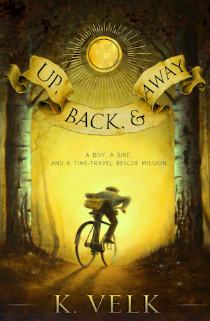
 Kim Velk submitted Up, Back, and Away designed by Juan Wijngaard and Scarlett Rugers. “Experience keeps a hard school. I’ve been to that school. Juan Wijngaard is a fine artist with A LOT of kids’ book illustration experience (and a Kate Greenaway medal). He collaborated with Scarlett Rugers to make this new cover. Importantly, he read the book first. (His requirement and mine).”
JF: Everything you want in a book cover. Fantastic illustration that virtually propels us into the story, and distinctive design and typography that can’t be mistaken for any other book. Lovely.
e-Book Cover Design Award Winner for October 2014 in Nonfiction
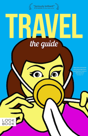
 Doug Lansky submitted TRAVEL: The Guide designed by Doug Lansky (art by Nino Keller).
JF: Humorous, dramatic, and a little frightening all at the same time. A full-on winner with great art and packing a real wallop.
Fiction Covers
Aaron Speer submitted Night Walker designed by derangeddoctordesign.com. “Very proud of this book design by these talented guys. Hopefully, any recognition can help them” JF: A good cover that’s nicely controlled, with typography that matches the genre well.
Alex Hurst submitted Darkly Never After designed by Alex Hurst. “For this cover, I went for a classic, fabric hardcover feel, using two fonts in the title and a gold satin effect to make it pop off the blue, like additional embroidery.” JF: Although the background is a bit muddy, overall I think it works.
Alex P. Berg submitted Red Hot Steele designed by Damon Za. “A mystery/fantasy hybrid featuring hard-boiled homicide detective Jake Daggers and his new psychic, half-elf partner, Shay Steele. The novel also contains elements of humor and noir.” JF: Great illustration and type handling result in an attractive cover.
Alex P. Berg submitted The Genesis Allegory designed by Damon Za. “An epic fantasy novel with a mysterious plot and a heavy dose of religious intrigue.” JF: I like the drama built into this cover, and the unique treatment of the title.
Alfred H. Porter submitted Just Like Them designed by Alfred H. Porter. “This cover represents metaphorical change in Just Like Them, a coming of age novel. The subtext is innocence vs. experience; a major theme of the story. The butterfly can easily, and almost unnoticeably, be represented as a tattoo, but it’s not; it has its own function in the narrative.” JF: Although there’s a creepy element to it, this cover succeeds at its primatry task: it’s visually arresting. ★
Allen Taylor submitted A Twitterific Year designed by Jasmin W and Allen Taylor. “A Twitterific Year features more than 1,000 original Twitter poems. Many of them were published with the #twitpoem hashtag, created by Allen Taylor. Almost 150 are original and unpublished until now.” JF: It’s a nice clean design, but really seems more suited to an instructional book rather than poetry. Maybe that’s just me.
Amy Strickland submitted Mars 01 designed by Carly Strickland. “The original illustration was commissioned from Larbesta. Concept and type were designed by Carly Strickland of Carly Strickland Art.” JF: So it’s a Strickland family effort? Good illustration, but the 3 different orientations in this cover create some visual confusion that may not be what you intended.
Anne Devina Reeve submitted WITH DEVILS DWELL designed by author’s own design. “1850 Victorian thriller Rhoda is transported to Van Diemen’s Land > murder> jeopardy> insanity” JF: None of that comes through in this attempt at a cover design.
Bob Gillen submitted Apart designed by Bob Gillen. “The film slate and the torn post card are both key elements of the story. I used the ChunkFive font. Thank you.” JF: There’s so much writing on this cover, and so many oddly intersecting planes, that it’s hard to know where to look, and that’s usually not a good result.
Brandon Zenner submitted The Experiment of Dreams designed by Sharon Cote. “The cover underwent several trial by errors. What you see is the finished product. Thank you very much, Brandon Zenned” JF: Although the illustration is very strong, the typography, especially the title, seems clearly off base and inappropriate.
C. J. Corbin submitted Eagle’s Destiny designed by Scarlett Rugers. “I didn’t want a traditional romance novel cover.” JF: Well you succeeded and, consequently, no one would know this is a romance. Is that really what you wanted?
Camilla Ochlan submitted The Werewolf Whisperer designed by Joshua Lurie-Terrell. “Original art by Rico Rodriguez. Book cover concept (Vitruvian Wolf) is integral to the overarching plot of the book series.” JF: “Vitruvian Wolf” eh? Considering the abundance of detail and texture in this cover, I think the spindly font used for the title wasn’t a good choice.
Carol Van Natta submitted Overload Flux (A Central Galactic Concordance Novel) designed by Stephen Bryant of SRB Productions. “I asked for an illustrated cover design that says science fiction, action, and balanced lead characters. Artist Stephen Bryant delivered on everything.”")
Carrie Beckort submitted Kingston’s Promise designed by Sophia Feddersen of Scarlett Rugers Design. “The color palette and silhouette was used to complement the first book, Kingston’s Project.” JF: Nicely atmospheric and understated.
Cheryl MCNEIL Fisher submitted Cindy Lou And Sammy Too Go To The mall, The Adventure Of A Guide Dog Team designed by Lisa O’Gorman Hofsomer. “Cover says it all. Lisa did a phenomenal job. This is her first book cover.” JF: Yes, that’s readily apparent. I’m sorry to say this is a very amateurish attempt.
Christina Garner submitted Tether designed by Christina Garner. “Designed by raven + crow studio” JF: Some beautifully designed elements but very difficult to read the type.
Cindy Hiday submitted Her Phoenix Heart designed by J. Hiday. “The hero in my contemporary romance owns a limo service and the black limousine plays an important role in the plot. The heroine is a tattoo artist.” JF: Decent idea marred by poor type choices and a lack of integration of the elements.
Connie Myres submitted White Horse: A Seven Seals Redux Novel (Book 1) designed by Connie Myres. ") JF: The “pasted-on look” combined with poor typography is not a recipe for success.
JF: The “pasted-on look” combined with poor typography is not a recipe for success.
Damon Za submitted Afterlife designed by Momir from Damonza.com.  JF: These three titles (including the two below) present an interesting variation on author branding. While each of these well-designed covers uses a strong visual and consistent typography for the author’s name, each book gets its own distinctive title treatment. An interesting way to escape from the usually rigid confines of this kind of branding.
Damon Za submitted The Children’s Hour designed by Momir from Damonza.com. 
Damon Za submitted The Hour Before Dark designed by Kate from Damonza.com. 
Damon Za submitted An Etiquette Guide to the End Times designed by Momir from Damonza.com.  JF: Damon does it again. Both classy and hilarious at the same time, what’s not to like? ★
Dana Leipold submitted Burnt Edges designed by Dana Leipold. “Thank you for the opportunity! :-)” JF: Keeping it simple and making good choices produce a cover with impact.
Dane Low submitted Black as Night designed by Dane at Ebook Launch.  JF: The luscious background is a perfect foil for the sophisticated title typography. ★
Dane Low submitted Daughter of the Sun designed by Dane at Ebook Launch. “This cover features the eyes of a young Egyptian woman looking confident and inquisitive. She is surrounded by papyrus paper depicting a temple and a hieroglyphic picture.” JF: A masterful image composite that probably doesn’t need the overwrought type effects.
Darke Conteur submitted The Watchtower designed by Calista Taylor. “The emblem on the front is prominent on all the books in my series. I wanted something to connect the books together, a single item or theme that would denote it was a series.” JF: Although most designers attempt to “brand” related books in a less obtrusive way, this symbol will definitely connect all the books together.
Davonna Juroe submitted Seeing Red designed by Scarlett Rugers.  JF: Nice, almost a cut paper look, and that wolf is a great “hook” into the story.
Dean Blake submitted The Things We Do For Those Who Don’t Love Us designed by Dean Blake. “This book cover was designed by the author himself on Photoshop.” JF: Please advise the author to put a rule around the cover so it doesn’t look like it spilled onto the white background, as it does here.
Diana Stevan submitted A CRY FROM THE DEEP designed by Ares Jun. “When Catherine Fitzgerald, an underwater photographer, buys an antique Claddagh ring, she is troubled by nightmares that set her on a path to fulfill a promise of love made centuries before. The woman on the cover could be the one in her dreams. Catherine also sees her when she dives. Thanks.” JF: Well thought out, with the focus clearly just where it’s supposed to be, this cover succeeds on many levels and draws us straight into the story.
Dr. Barry Nadel submitted Seeking the Light of Justice designed by Yifat Yerushalmi. “This is the first book of the Hoshiyan Chronicles.” JF: The light from the window is a nice concept but, overall, this is an awkward effort, with disconnected pieces that never come together.
e a lake submitted WWIV – Kids at War designed by Laura LaRoche. “Please note: This book has absolutely nothing to do with arming a group of ten-year-olds with high powered weapons and sending them off to fight. The farmhouse, and porch, you see in the picture is the location this book is based upon.” JF: But don’t you think it’s the responsibility of whoever named the book and chose that “WWIV” typeface that it has to be explained? Covers that need explanations are basically not working.
Eden Connors submitted Dark Cavities designed by Eden Connos.  JF: Besides being a strong contender for title-of-the-month, this is a deliriously silly design. The mashup of beefcake, flames, and gleaming molars just made me laugh out loud, not sure that’s what you were going for. Does anyone think molars are sexy or interesting? Maybe a dentist.
Elaine Jackson submitted The Journey & Other Short Stories designed by Harold Saxon. “I asked Harry to design something which reflected the dual time-zone nature of the titular story and the difference between the two worlds in this science-fiction story – and this is what he came up with, which I love. The level of detail in the advert hoardings is really interesting, too.” JF: The level of detail in the ads is irrelevant, this cover is awkwardly executed, and the typography is whispering too quietly to be heard.
Elise Stone submitted Faith, Hope, and Murder designed by Karen Phillips. “The Arizona desert plays a strong role in my mysteries and I wanted a cover that reflected that. I was fortunate enough to discover Ed Mullins, a local photographer, who was willing to work with cover designer Karen Phillips to take just the right photo.” JF: A strong design that will be highly “readable” at every size.
Emory Skwara submitted Numinous designed by Lane Brown. “I commissioned Lane Brown to design this cover. The title and the owl character are directly related. I enjoyed this drawing by Lane because the owl was smiling, which scared me a little. Also, I liked that the owl was perched up high in a commanding posture.” JF: An intriguing piece of art and title treatment that really complements it well. The way the designer has limited the color range helps, too.
Fernando Ariel submitted The cat’s miaow designed by Fernando Ariel. “Illustration by Martin Jones. A dark color pallete and bold typography were selected in order to be as most legible as possible and to grab children’s attention. Also published as an enhanced ebook, narrated by Alex Owen Hill in iBook format.” JF: Artful and effective, and that background texture is the perfect backdrop.
Fran Pickering submitted The Haiku Murder designed by Design for Writers. “For this East-West fusion murder mystery I asked for cool Japanese elegance that fitted the style of other books in the series and reflected the season when the murder takes place.”
Francesco Fagnani submitted Il gigante invisibile/The Invisible Giant designed by Francesco Fagnani.  JF: It’s a difficult challenge to portray something that’s supposed to be invisible.
Francesco Ficarra submitted Dominion of Man designed by Scarlett Rugers. “Design was to visually show the reader that the book was based in modern times, helicopters and guns while ancient and mythology was introduced with a Dragon and sword wielding warriors. The desert setting is common throughout the novel and was a key component to bring the reader to this landscape” JF: Not sure that all of that comes through, but with a strong composition and beefy title, it works anyway.
Frederick Wysocki submitted A Timely Revenge designed by James at GoOnWrite.com. “A TIMELY REVENGE is a crime fiction thriller. The pocket watch is a significant object from chapter 1 and throughout the story. It is also part of a series, hence “An Anthony Rizzo Novel”” JF: Clean design, but I for one don’t care for the font switch within the title.
H.D. Knightley submitted Fly designed by H.D.Knightley. 
Heiko Hoffmann submitted White Pumpkin Seed designed by Heiko Hoffmann and Annie Wang. “The cover shows the main character, Vanessa, together with her adapted parents on their goose farm in Taiwan.” JF: A lovely illustration that can lead us into the story, but it could use stronger typography.
Hisham Abed submitted Anni Moon & the Elemental Artifact designed by Hisham Abed. “This is the first in a series and we wanted to start the Anni Moon brand off with a distinct title and a strong image that, hopefully, generates interest to the readers of the genre.” JF: I love the drama in this cover, and the way lighting has been used to heighten the overall effect. It’s perfectly positioned for its target audience, too. Nice job.
J.C. Fann submitted The Queenschair designed by J.C. Fann. “I wanted my book cover to give off the air of a classic old-fashioned epic, and I thought the family emblem design would accomplish that.” JF: I think it does, and it’s refreshingly different from many other covers.
Jack Price submitted Machines of Easy Virtue designed by Tim Gabor. “I chose illustrator Tim Gabor for his experience with the pulp fiction genre. The main challenge was the rendering of the female robot, to hit the right combination of mechanical nature and sex appeal. Too much machine would be a turn-off, so we chose blue glowing eyes and a combination of expression and posture to convey robot-ness. The P.I. is portrayed as tough, no-nonsense and not handsome in the usual sense. In keeping with other classic pulp covers, elements were kept to a minimum. Mr. Gabor added crackling effects to bring a nice aged feel to the electronic format.” JF: There’s a lot to like about this cover, especially in the illustration. But I have to say that without your explanation, I would not of seen the woman as “robot” at all. And a more “pulp-ish” font might have given the title a bit more energy.
James Egan submitted A Voice at Midnight designed by James T. Egan of Bookfly Design.  JF: Exquisite and very carefully laid out. Instantly appealing. ★
James Egan submitted Rivers Under Water designed by James T. Egan of Bookfly Design.  JF: The skill of the designer is apparent, but I don’t really get what’s going on here, and what we’re supposed to be responding to.
James Egan submitted The Seventh Sons designed by James T. Egan of Bookfly Design.  JF: Beautifully rendered with a strong graphic element in the stylized seal, and that glowing eye lets us know there’s something else (paranormal) going on. ★
James Finn Garner submitted The Wet Nose of Danger: A Rex Koko, Private Clown Mystery #3) designed by Airan Wright. “For this cover for the third book in the series, we wanted lurid nocturnal colors reflecting the locale of a washed-up circus ghetto. The teeny sedan should make the reader do a double-take–“Wait, how menacing is that?” The subtle starburst is an element of all three titles.”") JF: Drawn from this perspective, the sedan does not look teeny. An otherwise wonderful cover is severely impacted by the bizarre font choices in the title.
JF: Drawn from this perspective, the sedan does not look teeny. An otherwise wonderful cover is severely impacted by the bizarre font choices in the title.
James Litherland submitted Centenary Separation (Watchbearers, Book 2) designed by James Litherland. ")
James Litherland submitted Millennium Crash designed by James Litherland.  JF: It looks like the author found a stock image he really, really likes, since he used it on two different covers (here and above). That’s a new one.
James McCormick submitted Damaged Good designed by Ray Dillon (illustration) / James McCormick (titles).  JF: Deliciously creepy, not sure why you obscured the title though.
James Minter submitted Billy’s Tenth Birthday designed by Paul Shinn. “A children’s book (8 to 11 yr olds). A fictional story written to aid parents and children to discuss bullying – the Life Lesson subtitle on the cover is Bullying.” JF: Charming and apropos. Do they really bake spherical birthday cakes? How does that work?
Janmarie Anello submitted A Scandalous Rogue designed by earthlycharms.com. “Regency Historical Romance. I wanted a simple, yet elegant design. The contrasting green background keeps the cover from being too dark and offsets the couple, for ease of identifying genre in thumbprint size. The gold lettering adds the elegant touch I wanted. Also hints at the tone of the book.” JF: A very elegant and engaging cover sure to please fans.
Jason A. Holt submitted The Klindrel Invasion designed by Kristina Gehrmann. “I like the way Kristina captured the feeling of lurking in the shadows, possibly hiding, possibly waiting for the right time to strike back against the invaders. She painted a scene that promises what the book delivers.” JF: The illustration has great storytelling power, although the typography and layout aren’t nearly as interesting.
Jennifer Quintenz submitted Sacrifice (Daughters of Lilith: Book 3) designed by Jennifer Quintenz. “Each of the Daughters books features a girl on the cover that is a composite of 2-4 photographs to achieve the right mood/tone for the story. It’s been a lot of fun playing around with photoshop and getting back to my “art school” roots. Designing the cover is my reward for finishing a book. :)”") JF: Beautiful job, Jennifer, and I particularly like how the girl is both active and contemplative at the same time.
JF: Beautiful job, Jennifer, and I particularly like how the girl is both active and contemplative at the same time.
Jennifer Selzer submitted 30 Silver designed by 99 Designs. “We went with 99 Designs for this cover since we had an idea of what we wanted, but we were curious as to what an assortment of artists might imagine from our simple requirements. A feather and a Roman coin was all the guidance they had and it garnered over 150 cover choices between 18 designers.” JF: Note to submitters: I’d like to point out that “99 designs” is not the name of the designer. Please credit the actual person who did your design, not the name of the site where you found them.
Jennifer Westall submitted Love’s Providence designed by Amy Hobbs. “This cover was designed by Amy Hobbs to replace the first cover of my novel. Originally published in 2012, I felt the cover was too dark and needed a professional’s touch. Amy used a photo of a beach from her own collection at the bottom, and purchased a stock photo for the couple at the top.” JF: What I dislike about this design is the decision to use a color band at the bottom, cutting the beach photo into two images, for no reason and just introducing some visual “noise.”
Jessica Hildreth submitted Broken People designed by Jessica Hildreth. “The main character (bald, blue eyes, dark glasses) describes “the eyes are the window into the soul”, for that reason I wanted his eyes to be the only clear part of the picture. He helps other characters struggling with suicide, hence the many photographs representing the people he helps.” JF: An affecting and interesting graphic design that’s bound to generate attention from readers. And it can’t be confused with a stock-photo-template-book-cover, can it? ★
JL Morse submitted The World of Wickham Mossrite designed by JL Morse. “This book is first in a series of five, a classic family friendly set – clearly identifiable and reminiscent of the Penguin Classics series for example. Each carries a motif of the main theme of the book, and is clearly distinguishable on e-readers and thumbnails due to bold b/w relief print.” JF: Charming drawings and colors, but the layout is a bit awkward and the type could use an upgrade.
Jodi Cleghorn submitted No Need To Reply designed by Jodi Cleghorn. “The cover of my flash fiction collection exploring the issues of finding your voice and being heard.” JF: Love the direct gaze of the woman in the photo; the type, not so much.
John Wiltshire submitted A Royal Affair designed by L.C.Chase. “The cover had to fit in with my other published novels: no people. I studied other historical fiction covers and concluded that less was more. I wanted something stark, that would stand out but also summed up the themes of the novel.” JF: Since there are no people, the objects and arrangement have to imply the action or change in the book. This one looks like it does a good job, and the careful type selection helps.
John Wiltshire submitted Catch Me When I Fall designed by Deana C. Jamroz. “I wanted the cover to fit into the general requirement of my other published novels–no people. I also wanted something simple and stark which would stand out in the plethora of covers in the M/M genre. I wanted to capture the themes of falling, grace and simplicity.” JF: Much less sophisticated type handling on this one.
John Wiltshire submitted Love is a Stranger designed by Michelle Cary. “This was my first published m/m novel and the first in a series. I needed this first one to capture interest that this was a bit different from the usual m/m novel, to stand out in a very crowded market. The book is not sweet romance. I wanted a sense of menace for the cover.” JF: Don’t see much of a connection between the title and the image.
K. M. Alexander submitted Old Broken Road designed by K. M. Alexander. “Custom lettering floats atop a ghostly etching by Gustave Doré, the result helps set the mood and tone with the intent to add a hint of mystery and draw the reader in.” JF: Love it. Even though you can’t make out much of the underlying image, the texture and color it adds to the background are a perfect foil for the hand lettering, resulting in a unique look for this dark fantasy.
Kathleen Lopez submitted Prodigal Son designed by J. A. Howell. “J. A. Howell took elements from the story to create an intriguingly eye catching cover.” JF: A cover that works due to the intrigue of the image complemented by an interesting type treatment, although I would have liked to see more contrast between the title and the author’s name.
Kim DDD submitted Justice Mine designed by Marushka from Deranged Doctor Design. “This book cover designed for Romantic Suspense novel Justice Mine is targeting female readers looking for hot alpha hero who saves the day and his lady :)”
Kim DDD submitted Prodigal Angel designed by Milo from Deranged Doctor Design. “Designed for Paranormal Romantic Suspense novel. The idea was to show the “battle” between The Good and The Evil ( personified in two brothers/twins – main characters)” JF: Does it look like 2 different people (brothers) or one person and a reflection? Would have liked to see the title stand off the very active background more.
Kim DDD submitted The Needle And The Dungeon designed by Kitten from Deranged Doctor Design. “Designed for SF romance novel dealing with the idea of creating the perfect woman – but, a virtual one.” JF: A good concept and layout, and an interesting effect that merges the title with the texture of the background. It’s difficult to avoid the impression that the girl is “drooling” the code spilling from her chin.
Kim DDD submitted Two Times Dead designed by Marushka from Deranged Doctor Design. “Cover designed for Mystery/Suspense novel targeting female thriller fans.”
Lesley Smith submitted The Changing of the Sun designed by Jason Gurley.  JF: Lovely cover for this sci-fi ebook with lots of epic promise.
Leslie Miller submitted The Girl With the Half and Half Face designed by Leslie Miller. “I originally had a different title and idea for the cover. But as soon as I changed it to The Girl With the Half and Half Face, this idea popped into my mind. I worked with Steven Novak of Novak Illustration. I sent him details of my idea & a rough sketch. Love what he came up with.” JF: A cover with real pull. Keeping the color palette simple allows the image to reach maximum impact. I could quibble about the title being easier to read, but it would just be a quibble.
Mala Spina submitted Il Giorno del Drago designed by Mala Spina. “This is the Cover for my first ebook, a fantasy story with plenty of action, mystery and quite some humorous situations. I drew the paw of the dragon and I used shades of red because it is a color that appears often in history.” JF: Excellent first effort.
Mallory Rock submitted Long Distance designed by Mallory Rock.  JF: The arc of the plane has drama, but the color combination isn’t especially appealing and the font is like a messy guest at a party.
Maria Green submitted In the Rearview designed by Beautiful Book. “The cover of IN THE REARVIEW beautifully captures the feeling of the novel. The universal struggle of depression is evident on the face of the cover, and it draws readers in to dive into the unique story. As the author, I am so lucky to have been gifted with such an amazing cover.”
Melanie Hooyenga submitted Flicker designed by Melanie Hooyenga. “I’m a graphic designer by day and designed covers for writers who self-publish for several years before publishing my first novel. FLICKER is the first in a trilogy; all three covers follow this design. Thank you for your consideration. ~Melanie” JF: I like just about everything about this cover, from the flickering trees to the placement of the title. I just wonder how it would look if the title had been a slightly different color to separate it from the image more.
Melissa Snark submitted The Mating Game designed by Rae Monet.  JF: Incomprehensible, in every meaning of the word.
Michael Shone SR submitted The Dinosaur Ashtray designed by Michael Shone Sr. “A sea adventure about quitting smoking. It is presented in a way that covers every basic aspect preached over the years and many more that have not been mentioned. Illustrated with over 30 illustrations that help a young person not smoke that first cigarette.” JF: An excellent goal, and thank you for educating our youth on this important topic. However, the cover is a disaster and looks more like a page from the book than a book cover. It’s difficult to read, hard to make out what’s going on, and it’s bleeding onto the page. Hire a pro.
Michelle Halket submitted The Fantabulous Fens designed by Alicja Ignaczak. “This kids book had a pretty generic cover originally and we recently hired an international illustrator to capture this fun, loving, Indian family of misfits. We think Alicja did a great job of capturing the essence of this book.” JF: It definitely says “fun!”
Nancy Roe submitted Shadow 365 designed by Nancy Roe. “Shadow, the lovable Papillion and canine narrator, tells his story through pictures and captions. Sometimes you just have to have a little humor in your life and that’s why I created this cover and book.” JF: Hey, I’ll sit up and roll over for covers with dogs on them, but this one (despite an adorable canine) mostly announces that it was self-published.
Nick Marsden submitted The Dying of the Day: The Light of Theolan, Part 1 designed by Pencastle Publications.  JF: A solid genre cover.
Oyinkan Braithwaite submitted The Men She Loved designed by Oyinkan Braithwaite. “I wanted the cover to be instantly identifiable as a romance novel but also have ties to the location where the novel is set. The backdrop on the cover is the Lekki Ikoyi Bridge. I also wanted a cover that was simple but effective.” JF: It’s simple, but I think you missed on the “effective” part. Nothing here says “romance” to me, the title is weak, and we don’t know what to make of those black silhouettes.
Pamela DuMond submitted The Messenger (Mortal Beloved, Book One) designed by Regina Wamba at Mae I Design. “This book has been optioned for film/TV. I wanted to re-brand the series, and hired Regina Wamba for a photo shoot with the same model, for three book covers. That way Ms. Stock Photo girl, won’t be showing up on 100 other books. Regina also designed the book cover. I love her work.”") JF: Me too. This is a dramatic cover, and I like the way the type frames the woman’s head and shoulders, allowing her turn to the reader to be the focal point of the cover.
JF: Me too. This is a dramatic cover, and I like the way the type frames the woman’s head and shoulders, allowing her turn to the reader to be the focal point of the cover.
Paul Allen submitted Never A Soldier designed by Jeroen ten Berge.  JF: Love the way that Jeroen always finds a most dramatic moment to entice the reader, and his easy mastery of cover typography.
Paul Tomkins submitted The Girl on the Pier designed by Paul Tomkins. “I designed my own cover for this self-published title. Always hard to judge your own work objectively, but I thought I’d enter all the same! Thank you for your time. PAUL.” JF: Excellent job. It’s visually interesting and the contrast between the active image and the quiet type heightens the effect. ★
Pavarti Tyler submitted DEAD GIRL designed by Rue Volley.  JF: Design issues aside, she doesn’t look dead to me.
Peter Maguire submitted City of a Million Dots designed by Dan Johnson. “The ultimate beauty of this cover is how closely it relates to the story. The esteemed and generous artist Dan Johnson read my book twice before producing!! Thanks, Pete” JF: I can’t stop looking at this in exactly the same way I can’t stop looking at a car accident. All the colors and chaos, something violent must have happened here.
Philip Slayton submitted Bay Street: A Novel designed by Brian Halley. “The background of the cover image features actual Bay Street office towers (is not generic).” JF: It works.
Pippa DaCosta submitted Wings Of Hope designed by Pippa DaCosta. “‘Wings Of Hope’ is a dark fantasy novella prequel for The Veil Series. As the Veil Series is urban fantasy, but this prequel borders on dark fantasy, I wanted a cover that reflects the darker content, but still hints at the UF origins. I love the colors & positioning of this one.” JF: Interesting and appropriate image, the rest looks very oversimplified.
Pippa Giselle submitted Mystic Mountain: The Crystals of Once Upon a Time designed by Squarebits Studio. “We combined two images – one of mountains and one of the interior of a witch’s/wizard’s den to convey the setting and atmosphere of magic. The author’s name is small because she is new but her name is still legible in the thumbnail on Amazon. Thanks for looking! Pippa Giselle” JF: Maybe “… still slightly legible… ” would be more accurate. Despite the lovely artwork, this cover suffers from a lack of contrast and focus. The image gives us no particular point to center our attention, and the whole cover is verging on monochromatic, with nothing really standing out. Close, but it needs work.
Pippa Jay submitted Hallow’s Eve designed by Danielle Fine. “A Halloween-themed paranormal romance”
Rebecca Chasta submitted Magic of the Gargoyles designed by Damonza. “Pentagrams play a strong part of this novella (but are not demonic), so the cover is cheerful colors with the pentagram a soft second layer. I wanted a cover that identifies immediately as fantasy, and one that had a potentially iconic look. Hopefully this cover achieved those goals!” JF: Lovely, and the affinity of the colors, images, and type choices works perfectly.
RJ Shepherd submitted Platonic designed by RJ Shepherd, Buckeyegrrl Designs. “This story explores themes of intimacy in relationships, both physical and emotional. Positioning the title “Platonic” over a rumpled bed, as well as clean lines and cool colors contrasted with a fractured/shifted image hint at a deeper complexity and paradox in the journey of the characters.” JF: When you get something, you often have to give something. In this case, the visual interest of the “fractured” look comes at the price of visual coherence. Does it work in the end? For a story centered around intimacy and relationships, I don’t think so.
ROBERT BRYNDZA submitted Coco Pinchard, The Consequences of Love and Sex designed by Dan Brammall. “Thank you.” JF: I really like the way the playfulness of the title lettering conveys the tone and scope of the book.
Sara Fiorenzo submitted A Sadness Within designed by Book Fabulous Designs. “Music plays a big part in this book and when I told my designer that, she totally got it! I love the sheet music on the front and the piano keys on the back. The metronome “A” is perfect as well. This also portrays a scene in the book which is perfect.” JF: It looks disjointed to me, and rather than an asset, I see the “metronome” embedded in the “A” as a distraction.
Sara Snider submitted The Thirteenth Tower designed by Ferdinand D. Ladera, Ray Rhamey.  JF: Interesting cover for this medieval fantasy, I would have dropped the title lower to allow the bird more room to fly.
Sara Vinduska submitted The Drowning Man designed by Scarlett Rugers.  JF: Strong cover for this suspense novel, capturing some of the conflict and drama of the story.
Scott Wright submitted Spell Check designed by Jules Hartman. “A fitting cover to the story. Font choice was intentional to give a readable scroll look. The title is featured as the cover intrigues.” JF: Another cover with an interesting image but, overall, looks oversimplified.
Slade Combs submitted The Choice: Death Is Just The Beginning designed by Ivo Horvat. “Ivo Horvat, Hollywood visual effects artist for The Hunger Games, Harry Potter, Spider-Man and I Am Legend, etc. designed the exclusive cover image for The Choice. This is his first and only book project.” JF: Terrific choices here for this novel about transcendence. Color is used effectively to intimate the higher and lower realms, with the title carefully positioned at the meeting point. Raises you up at the same time it implies darker aspects to the story.
Stacy Claflin submitted Gone designed by Stacy Claflin with DIYbookcovers.com.  JF: Effective composition that focuses us on the title/teddy combination.
Steff Green submitted The Sunken designed by Vail Joy. “Vail creates all my book covers as well as my website designs, and I think she is just amazing! I wanted something conveying my book’s genre (dark steampunk fantasy) and hinted at some of the story elements (the dinosaur bones hidden in the border) and I think she did an awesome job!” JF: The steampunk elements come across clearly, both in the ornamentation and the typography, but the imagery seems way too dark and muddled for the average browser to be able to see what’s going on.
Suzanne Kelman submitted The Rejected Writers Book Club designed by Blondies Custom Book Covers. 
T. Ellery Hodges submitted The Never Hero designed by T. Ellery Hodges. “Original cover was black and white. I liked it for its mood but it didn’t attract manly clicks on the internet. I replaced it with this new design, incorporating the same types of imagery but introducing some color.” JF: Some strong elements, but try making the title stand out from the very active background image more.
Taillefer Long submitted Judah the Barracuda designed by Taillefer Long. “I illustrated and designed this children’s book, which is always fun because I can use all the tools available to create a truly original and relevant cover.” JF: Amusing and ferocious at the same time.
Tiffany Daune submitted Coral & Bone designed by Nathalia Suellen.  JF: Great cover for this dark fantasy, with every element placed with care. The look of the girl draws us in while the overall tone alerts us to the dark side of this story. Well done. ★
tony dargis submitted TouchScreenTed New Friends designed by Tony Dargis. “An intelligent ET iPad-esque Touchscreen device, and Ted the human. The pointing finger is a familiarity of communication – invoking play and imagination. The title graphic – the “New Friends” message – the colours emanating from the device – hopefully catches the eye of the new reader and parent.” JF: Quirky cover for what looks like a quirky children’s book. The illustration is amusing, but the typography needs help.Looks, probably intentionally, like a still shot from an early computer game.
Nonfiction Covers
Benjamin Houy submitted Upgrade Your French designed by James goonwrite.com.  JF: Nicely whimsical cover for an instructional book, not sure the typography has to be equally mild.
Beth St. Amand submitted Find Gregory St. Amand designed by Mark St. Amand at TradeMark Graphics. “Cover art by Gregory St. Amand” JF: Well-tuned and harrowing graphic look for this examination of suicide.
Christine Sparacino submitted Energize Your Retirement: Stories of Passionate Pursuits designed by Christine Sparacino. “Book Cover by Barbara Aronica-Buck of Stamford, CT. After hearing Robin Cutler of IngramSpark speak at Carla King’s Self-Publishing Boot Camp, I contacted her and asked her for the name of a good book cover designer. Barbara’s very talented and extremely easy to work with. A true professional!” JF: A very competent nonfiction cover with enough detail to interest the reader.
Dane Low submitted 30 Days to Keep You Sober designed by Dane at Ebook Launch.  JF: Here the concept, title, and design meld into one emblematic image. A real winner. ★
Dane Low submitted How to Understand Your Man and Help Him Understand You designed by Dane at Ebook Launch.  JF: Nicely informal and lighthearted, although I don’t know if the soft palette will stand up to the environment in which ebook covers are usually viewed.
Dawn Taarud-Martinez submitted My Guarded Secrets designed by Dawn Taarud-Martinez.  JF: Unfortunately not a very good effort.
Erik Peterson submitted Thinking Beyond Coding designed by Erik Peterson (author). “The image and the keyboard-like title are to show that is about software development (not healthcare diagnosis codes, for example). I tilted the title to make it a bit bigger and to draw attention to it.” JF: It works, and the echo of the keyboard in the title is part of the reason why.
Felecia Artis submitted No More Chains! Pressing Through My Issues to Pursue My Destiny designed by St. Paul Publishing Press. “Thank you so much for this wonderful opportunity to submit my new e-book cover! Thanks in advance, and thank you for all the vital services & information that you and your colleagues share to help us authors! ~Felecia Artis” JF: A dramatic cover that needs a border around it to prevent bleeding onto the web page, as it does here.
Fran Sorin submitted Digging Deep: Unearthing Your Creative Roots Through Gardening designed by Fran Sorin. “Hi Joel-Because the cover of my book is white, I placed a thin pink frame around it. Thanks so much! Fran” JF: Thanks Fran! Your cover is gorgeous, and that flower is a great salesman for your topic.
J. Pednaud submitted After Life: True Tales of the Restless Dead designed by J. Pednaud. “After Life: True Tales of the Restless Dead unearths and presents fantastic postmortem adventures undertaken by various cadavers, and also chronicles numerous misfortunes that have befallen the dead.” JF: A cover perfectly matched to the subject matter of the book. Love that title lettering and the whole mordant tone of the cover. ★
John Hamilton Farr submitted The HELEN CHRONICLES: When Your Mother Falls Apart designed by John Hamilton Farr. “My mother lived in Tucson, AZ. The black silhouette is taken from a photo of mine of saguaro cacti and ocotillo plants near her home.” JF: Very clean and honest, and good cover indeed.
Karen McCann submitted Dancing in the Fountain: How to Enjoy Living Abroad designed by Karen McCann. “Dancing in the Fountain’s cover was designed to convey the book’s lighthearted tone and colorful Spanish setting, as well as to support the title and the book’s “take the plunge” message about moving abroad.” JF: An artful cover with great colors and careful typography. From the shoes I imagine it’s the “morning after” and I want to start reading the book.
Kelley Pendleton submitted Community Connections! Relationship Marketing for Healthcare Professionals designed by Irini Stefa, Michael Mulhern, & Kelley Pendleton. “We asked Irini Stefa of eyeQcreative to rework a central image to convey the concept of human interconnection. (While the book focuses on the interconnection between healthcare providers and the communities they work in, we wanted the image to speak simply to interconnection in general.)” JF: I think she succeeded, and I like the use of type, but not sure the overall message is helped by splitting the title in two, and by the extraneous color bands on the cover.
Kim Lambert submitted The Photographer’s Quick Guide to Earning Money From Your Photos designed by Kim Lambert. “The book is the first in a series of Photographers Quick Guides, each focused on a specific aspect of photography, with an overall theme of making money from it. The covers for the series will be similar, with different titles, and the picture in the centre being changed each time to suit the theme” JF: Well, here’s what I would do: hire a professional cover designer to design the series “look” for you, then you can implement each cover yourself.
Miles Anthony Smith submitted Becoming Generation Flux: Why Traditional Career Planning is Dead: How to be Agile, Adapt to Ambiguity, and Develop Resilience designed by Ermisenda Alvarez.  JF: Good graphic concept but the type is too weak to carry its part of the message.
Nick Ruffilo submitted Stress-Free Email designed by Nick Ruffilo. “The goal was to design a cover that was highly color balanced, and clearly displayed the title. Additionally, I wanted to create something that would show beautiful levels of detail on a high-resolution large screen while maintaining a pleasing visual when reduced to thumbnail size.” JF: Interesting font and image choices, with no apparent relation to the subject or each other.
Phil Brennan submitted The Man from Uruguay designed by Philip Brennan. “The cover is a goal celebration taken from an old Spanish newspaper and enhanced by the author of the book. It epitomises the story within.” JF: While it might work for a paperback, on an ebook the title looks like an afterthought and the hand tinting lacks subtlety.
Rebecca Bielawski submitted Meet Bacteria! designed by Rebecca Bielawski. “Created in Artrage Studio Pro and Photoshop. Audience: pre-school to 6yrs.” JF: Nice layout and fairly good balance, the weakest part is the drawing of the microscope.
Roseanna White submitted No Plan B: Discovering God’s Blueprint for Your Life designed by Roseanna White. “We wanted to include both an abstract and concrete visual of a blueprint–and make it appealing to both men and women.” JF: A very clean look with lots of texture and detail, on the edge of too much, but very effective over all.
Taillefer Long submitted Outlining Magic Circles designed by Taillefer Long. “The concept here was to create almost a game using the title matter, playful yet true to the narrative:a tool for educators. Finding images that were not anachronistic or that did not overshadow the larger scope of the work was challenging.” JF: And yet the illustrations are anachronistic. And the very active design, colored circles, images ghosted into the background and eccentric type font are at war with each other. Effective covers have an obvious point of focus and a clear message they want to convey.
Teresa Lynn submitted Little Lodges on the Prairie: Freemasonry & Laura Ingalls Wilder designed by Teresa Lynn. “The locket adds old-fashioned quaintness and charm to the boldness of Freemasonry. The photos in the locket are the real Laura and Almanzo, and the pin is Laura’s actual pin. The font is very similar to that used on the Little House books to catch the attention of those fans.” JF: The design and layout are fine, but there are simply too many objects on the cover. Choosing just one, emblematic object and integrating that into your layout would probably give you a much stronger cover.
Well, that’s it for this month. I hope you found it interesting, and that you’ll share with other people interested in self-publishing.Use the share buttons below to Tweet it, Share it on Facebook, Plus-1 it on Google+, Link to it!Our next awards post will be on December 15, 2014. Deadline for submissions will be November 30, 2014. Don’t miss it! Here are all the links you’ll need:The original announcement postE-book Cover Design Awards web pageClick here to submit your e-book coverFollow @JFBookman on Twitter for news about the E-book Cover Design AwardsCheck out past e-Book Cover Design award winners on PinterestSubscribe to The Book Designer BlogBadge design by Derek Murphy
