

Welcome to the e-Book Cover Design Awards. This edition is for submissions during August, 2014.
This month we received:
90 covers in the Fiction category
11 covers in the Nonfiction category
Comments, Award Winners, and Gold Stars
I’ve added comments (JF: ) to many of the entries, but not all. Remember that the aim of these posts is educational, and by submitting you are inviting comments, commendations, and constructive criticism.
Thanks to everyone who participated. I hope you enjoy these as much as I did. Please leave a comment to let me know which are your favorites or, if you disagree, let me know why.
Although there is only winner in each category, other covers that were considered for the award or which stood out in some exemplary way, are indicated with a gold star: ★
Award winners and Gold-Starred covers also win the right to display our badges on their websites, so don’t forget to get your badge to get a little more attention for the work you’ve put into your book.
Also please note that we are now linking winning covers to their sales page on Amazon or Smashwords.
Now, without any further ado, here are the winners of this month’s e-Book Cover Design Awards.
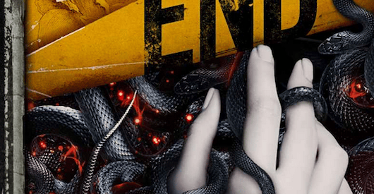
e-Book Cover Design Award Winner for August 2014 in Fiction
James Egan submitted The Living End designed by James T. Egan of Bookfly Design.
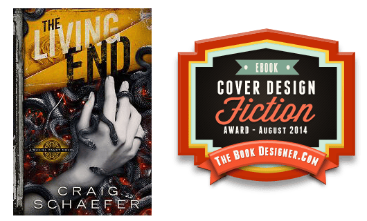
JF: Creepy and beautiful at the same time, with deftly treated typography. And the care the designer has taken with every small detail of this cover is impressive. But it all adds up to a real winner.
e-Book Cover Design Award Winner for August 2014 in Nonfiction
Sarah J Swofford submitted From Ouch! To Ahhh…The New Mom’s Guide To Sex After Baby designed by Damonza. “I needed a non-intimidating cover for my e-book on sex after having a baby. Alisha with Damonza nailed it. The blooming flower is subtle and reassuring, just perfect for a new mom. Thank you for considering this cover.”
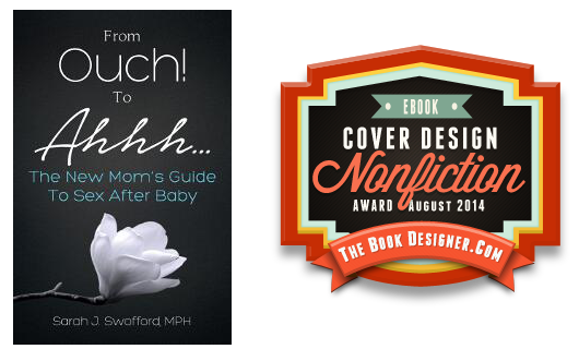
JF: A great treatment for another sensitive topic. The flower is perfect, and the type treatment helps to amplify the message of the title. Really nice.
Fiction Covers
Alexander von Ness submitted The Face Stealer designed by Alexander von Ness.

JF: Really enjoyed the careful coloring and typography on this intriguing cover. And those little hands at the bottom are a great touch to interest us in the story inside.
Alice Sabo submitted Lethal Seasons designed by Alex Storer. “The tornado is to reflect the extreme weather in the novel, but that isn’t the main theme. After discussing it, Alex added some microbes and blood spatter framing the image and altered the title text to infer that a medical/biological issue was important to the story.”

JF: A well put together cover that does emphasize the “weather” aspect of the story predominantly.
Amanda Troyer submitted Harrow designed by Amanda Troyer. “I wanted to hint at content of the book with the use of the rosary, the blood, and the hand placement.”

JF: Nicely creepy, but the “W” in Harrow is hard to read and the author’s name is disappearing.
Andrew Spencer submitted Humanity designed by Andrew Spencer. “This is my first novel and my first foray into utilizing photoshop. The cover imagery ties into elements revealed in the storyline in later chapters in the book.”

JF: The image is a good one for sci fi, but the type is in desperate need of help.
Angela Tavares submitted Hunger designed by Angela Tavares. “We are thrilled to submit the cover of Zoe More’s Hunger, which I designed. I wanted to capture the erotic horror genre, and the sense of passion that the protagonist feels when she uses her pleasurable yet deadly mouth to kiss her lovers. Many thanks! –Angela Tavares”

JF: Terrific graphic impact, one of my favorites this month. ★
Anita Exley submitted Nefertiti’s Heart designed by Ricky Gunawan.

JF: A beautiful illustration and some custom typography really make this work.
Ann Warner submitted Love and Other Acts of Courage designed by Ann Warner. “The main settings for this story about an attorney handling a complex maritime case are San Francisco and Sydney, Australia. I therefore chose to use iconic images for these two locations along with water for the cover design.”

JF: A good concept, but the execution falls short. The combined images don’t make much sense and are confusing, and the top line of the title is difficult to read.
Audie Cockings submitted Little Red Rider designed by Audie Cockings. “I am a gallery represented artist (painter of acrylic, oil and watercolor with pen and ink). I am both author and cover art creator. The original art is watercolor and pencil.”

JF: My suggestion is to partner with a designer who can combine your art with the pro-level typography it deserves, because this just looks like an error.
Avril Sabine submitted Fairytales Retold: The Light Princess designed by Caitlyn Petersen. “Some of the fairytale books I read as a child had marble paper at the front and back of the book. I wanted to recreate that feeling with the covers of my Fairytales Retold series.”

JF: I love marbled paper and used to collect it when in Florence. It’s perfect for endpapers, but just doesn’t work here, fighting with the photographic style of the image. The weak type doesn’t help.
Blair MacGregor submitted Sand of Bone designed by The Cabil Creative Services. “This is the second cover Cabil Creative has designed for me. I knew I didn’t want the usual darkness used on fantasy covers, and am so pleased with the stand-out colors and composition.”

Charlene Newcomb submitted Men of the Cross (Battle Scars I) designed by Travis Miles at probookcovers. “Richard the Lionheart’s Third Crusade serves as the backdrop for this historical adventure.”
")
JF: A strong and attractive cover that implies enough to get us interested. Not sure you really need the red sash but, overall, a very nice job.
Ches Smith submitted Under the Suns designed by Ches Smith. “The target audience, however small, is for anyone who likes sci-fi (space opera) and has an academic interest in religion so I opted for a cover reminiscent of ancient religious iconography with an alien spin.”

JF: I like the charm of hand drawn figures, but overall this cover is ineffective and off base for this genre.
Chris Kennedy submitted Terra Stands Alone designed by Brenda Davis Mihalko (Genesis Graphic Design). “This is the third book of a trilogy, and represents the unveiling of the overall design strategy for the series. The designer’s idea was that the three books could be placed together, and the whole of the series would be greater than the sum of their parts.”

JF: Hard to see how the large emblem implies any story element.
Christopher Malinger submitted Tales to Keep You Awake designed by Eileen Malinger. “This cover was chosen because it add to the suspense and mystery the book has to offer. It is a picture of a ‘Super Moon’ taken through a thick growth of barren trees. The book’s cover applies to three of the seven short stories, but the Moon has always been a tool of imagery concerning mystery.”

JF: The image definitely has “juice” but the typography is very weak for a book cover.
Cindy Hiday submitted Iditarod Nights designed by Jack Hiday. “I wanted my cover to evoke the energy and passion of dog sledding, while foreshadowing the trauma that caused both hero and heroine to use Alaska and the race as an escape.”

JF: I don’t think this photo does what you were hoping to accomplish, and there’s really no reason to torture the title type like that.
Cristy Rey submitted Trail of Dead (Incarnate Book Two)
designed by Sarah Hansen at Okay Creations. “In order to find the right designer, I “shopped” Amazon and Goodreads for compelling, attractive covers. I looked for covers that sold the book instantly. When I saw that Sarah had designed most of the ones I’d chosen, I knew I had to reach out and see if we could work together. Glad I did.”
")
JF: These images have some issues being combined into one since they are stylistically so different, but I really like all the type including that little ornament in the series numbering.
Dane Low submitted Kindred designed by Dane at Ebook Launch.

JF: Hot!
Dane Low submitted The Lies of the Land designed by Dane at Ebook Launch.

JF: Gives me the creeps, and I think that’s exactly what the designer was going for, and I like the way the two big words in the title emphasize what’s in the story.
Dane Low submitted Wylden’s Demise designed by Dane at Ebook Launch. “Tried to keep this Crime & Thriller concept simple but eye-catching.”

JF: Interesting how a limited color palette, like this 2-color cover, can really stand out if it has the kind of graphic appeal of this one.
Daniel Adorno submitted The Blade Heir designed by Sevenlives Designs.

JF: The story element of this cover is very strong, and that’s a good thing. The only nit I would pick is the way so much of the bottom of the cover has been left black (void) so the title appears to be “floating.”
Danielle Burnette submitted The Spanish Club designed by Wesley Gunn. “THE SPANISH CLUB is a YA novel that tells the coming-of-age of 17-year-old Brianna Garrett while on a trip to Mexico. In the cover, Brianna looks through her camera at what she struggles with in the story: friendship, love, and independence. The statue (El Pipila) represents independence.”

JF: Of course, you may know what all this symbolizes, but browsers can’t be expected to. I think there’s too much sky here, and it would have been stronger if it emphasized the people in the cover who are so small here they are almost an afterthought.
Daryl Hajek submitted Blood Blossom designed by Daryl Hajek. “Book title in all caps and red in color, with a pair of red roses with blood dripping from a couple of petals, and author name in all caps and white in color, on a black background.”

JF: Those are roses? The red on black curse strikes again!
David Baird submitted Typhoon Season designed by David Baird. “The cover intends to reflect that this is a fast-moving thriller set in Hong Kong as a typhoon bears down on the city”

JF: It doesn’t work for me, there are many elements that announce it’s an amateur effort. And I’m always amused by “quotes” about how good the book is that are used without any attribution.
David Tatum submitted The Kitsune Stratagem designed by Sensevessel Studio (artwork) and David Tatum (typography). “This fantasy novel features a hunter in a local township’s militia (the male character in the image) and a shape-shifting Kitsune (the female character) who is unable to form clothes as she transforms (explaining why she is nude on the cover).”

Deirdre Saoirse Moen submitted Sunflower designed by Deirdre Saoirse Moen. “I wanted to invoke a 1970 road trip starting in California, the blood the main character (Sunflower) sees, her name in flower form, and the out-of-control way her trip unfolds. I also wanted to invoke a vintage feel and the look, via texture, that the cover was paper.”

JF: I love the concept of this cover, but I wonder why you muted the colors to the point where they whole thing seems a bit grayed out.
Donald Stidham submitted Pieces designed by Donald Stidham. “The cover for Pieces relates deeply to the storyline. Four Parts pull the reader through Hayden, Christina, Ray, and Dougan’s life. The fifth part brings those stories together to create hope for a better future.”

JF: Well, the puzzle overlay has possibilities, but the rather generic image doesn’t really connect us to the story or characters.
Elizabeth Lynx submitted Grading Him designed by Elizabeth Lynx. “The photo is by Ben Heys.”

JF: The book’s title is Grading him but the image is of a woman’s navel, yes? Not sure how that works. And it’s not usually a good idea to use 3 typefaces for 2 lines of text.
Elizabeth Woodcraft submitted A Sense of Occasion – the Chelmsford Stories designed by Christine Wilkinson. “A Sense of Occasion is a collection of short stories about mod girls in the 1960s. The plan was to create a cover that had a retro feel – the orange reflected Penguin books, perhaps the most recognisable book covers of those years, with a photograph-the author-suggesting the emphasis of the stories.”

JF: Not sure how a sliver of an out of focus photo suggests the emphasis of the stories. Are they out of focus also? And the type/layout seems rather corporate for a book of stories.
Eve Silver submitted Dark Prince designed by Henning Doose. “The book is historical gothic romance told entirely from the point of view of the female protagonist, Jane. It is set on the coast of Cornwall and the setting is moody and threatening. The book opens with a scene where Jane stares out as the leaden sky and churning sea as a dead body washes ashore.”

JF: A dramatic and effective cover that uses a good illustration to emphasize the story.
Gabrielle Prendergast submitted Channel 20 Something designed by Gabrielle Prendergast. “The author had a very specific brief and a clear picture in her mind of the brand look for her new NA romance series. We are both thrilled with the eye-catching result.”

JF: This could have gotten confusing considering all the elements involved, but it works. I particularly like the pinkish tone and interesting type treatment. But “Award winning author” is such a generic statement it begs credulity. If you can’t say something specific like “Hugo Award winning author” or “National Book Award winning author” I would suggest leaving it off.
Gabrielle Prendergast submitted Mind Sweeper designed by Gabrielle Prendergast. “The author was looking for a classic urban paranormal cover with a kick-ass heroine and a strong brand for this new series.”

JF: Touches all the bases, well done. Love that over-the-shoulder look!
H.D. Knightley submitted Bright designed by H.D. Knightley.

JF: Simple and strong. The hallucinogenic cityscape and good use of negative space really work here.
Holly LeRoy submitted Street Crimes designed by Cover design by: Carl Graves – extendedimagery. “Street Crimes features a tough a nails female private investigator. I think Carl Graves of extended imagery did a great job.”

JF: It has a lot going for it, but I also think it has 1 too many images, too. Did you really need that one at the bottom?
Ian Sutherland submitted Invasion of Privacy designed by Peter O’Connor at BespokeBookCovers. “I asked Peter to designe my book cover in such a way that it would work for a series, which he did very well. The proof was in the pudding as I then asked him to make a second cover for a prequel novella I launched on the same day.”

JF: At full size it’s much easier to see what’s going on in this cover, but at this size the image is pretty murky. However, it’s a good cover overall with a clear idea of what it’s trying to accomplish.
James Egan submitted Rewinder designed by James T. Egan of Bookfly Design.

JF: A design that engages us with symbolism right in line with the title and genre. And don’t you love that backwards “R”?
James Egan submitted Wilderness of Tigers designed by James T. Egan of Bookfly Design.

JF: A beautiful, captivating woman; perfect-pitch type handling; and an evocative street scene. Not so easy to combine as well as they’re done here.
James Messer submitted Mortal End: A Simmering Pit Of Jiggery Pokery designed by James Messer. “James Messer is a web and graphic designer who has recently turned his hand to book cover design (after being hounded by his wife and friends)! This is the spooky cover for Mortal End: A Simmering Pit Of Jiggery Pokery – a fantasy whodunnit.”

JF: I like the strongly graphic style, but the shapes in the fire that we’re drawn to look at are confusing and I missed seeing one of the characters from the book.
Jan Hurst-Nicholson submitted Mystery at Ocean Drive designed by Dafeenah Jameel. “This is a Hardy Boys-style teen action adventure. The cover was done by Dafeenah Jameel. I would love your comments or ideas for improvement before I go into print with the book.”

JF: This is a case of images not combining well, because the landmass running through the girl’s face is just wrong. Overworked type doesn’t help.
Jan Thompson submitted Thornton in My Side (Jane Austen Upside Down 2): A Pride and Prejudice Meets North and South Parody (An Antebellum Novelette) designed by Jan Thompson. “This is the second book in the Jane Austen Upside Down parody collection, and I wanted to keep the same cover theme throughout the books in the collection, i.e. antique seats of some sort.”
: A Pride and Prejudice Meets North and South Parody (An Antebellum Novelette)")
JF: Lovely, and the branding strategy is amusing and creative.
Janet O’Kane submitted No Stranger to Death designed by Kim McGillivray. “The cover for my first mystery novel was created by Edinburgh-based illustrator Kim McGillivray. Although the book has a rural setting, it’s far from cosy and deals with dark themes, so I chose from Kim’s ideas the one I felt best conveyed this.”

JF: I love the way the designer has used a minimum number of elements, colors, and fonts to create this high-impact, moody cover. ★
Jason K. Lewis submitted Phoenix Rising designed by Deranged Doctor Design. “I worked with the amazing guys over at Deranged Doctor Design to come up with this cover for the second book in my fantasy series ‘The Adarna chronicles’. I asked them to create something that clearly identified the book as part of the series, whilst being eye-catching in its own right.”

JF: Well balanced and unique.
Jennifer FitzGerald submitted The Shadow King designed by Jennifer FitzGerald. “This is Book 3 of The Talisman Trilogy. I designed book 2 and book 3 to tie in with book 1 that was created elsewhere. Adjustments were made to suit the size of B&N.”

JF: The shadow looks very artificial.
John Gibson submitted The Ex designed by John Gibson. “I designed this cover for a coworker. The cover directly reflects the events of the first chapter while setting the mood for the entire book.”

JF: I like the concept and the illustration, but the cover could use more contrast, especially in the title.
Jonah Gibson submitted Speedster designed by Jonah Gibson. “I had this photo of an Auburn Boattail Speedster that I took at a car show several years ago. I’d already excised the car and created a poster. When I finished the book, it seemed only natural to use the poster as a cover. It all just kind of fell into place.”

JF: An odd background choice, a car that appears to be flying, and typography that’s inscrutable and in some cases illegible.
Joshua Danker-Dake submitted The Retail designed by Mary Anna Simon. “The Retail is an everyman satire of the depersonalizing big-box retail grind. Centering on the most relatable modern symbol of retail, the shopping cart, the cover is meant to hint at a parallel between commercialism and religious imagery, particularly that used in stained glass windows.”

JF: Very clever, not sure I would be happy with a title that small though.
K.D. Harp submitted White Lies designed by K.D. Harp. “(2nd TRUE COLORS suspense.) Repeated elements throughout series to build brand ID: image of woman’s shoe with something to represent the protagonist and her story conflict, title font repeats but color matches (black for Blackmail, etc.), subtitling, dual tone custom “vapor” background, series logo.”

JF: Someone call Amnesty International and report a case of type torture.
Kari Nichols submitted Rogue designed by Kari Nichols. “I went through several ideas for the cover and landed on the theme of time. I had to plan out the covers for all three of the books in this trilogy (since this is the first book in a trilogy). And time seemed the logical option for a story about a family of immortals.”

JF: A lovely design that needs more contrast, especially in the title.
Kate Tews submitted Welfy Q. Deederhoth: Meat Purveyor, World Savior designed by Illustrator: Max Graenitz; Cover design: Double M Ranch Design. “Note: I’m the publisher at Opsimath Press; author is Eric Laster. Beyond ensuring that the cover reflects the spirit and content of the novel, we designed it to work in B&W OR color (since some e-readers are B&W only), and for type and illustration legibility even in thumbnails on screen.”

JF: Cool typography and an illustration style that matches perfectly make this a strong entrant. At small sizes, there may be too many elements in the illustration to really make sense of it at a glance.
Katie Cross submitted Miss Mabel’s School for Girls designed by Cory Clubb. “The indomitable and patient Cory Clubb went through almost 30 different proofs with me before I finally settled on a design cover that I loved and adored! I wanted a spell book kind of feel with a design that also reflected the book. This cover did it perfectly!”

JF: I like most of the design choices except the virtually unreadable design. And what about when it’s a thumbnail?
Kim DDD submitted Faraday & Frankenstein designed by Kitten from Deranged Doctor Design. “Author wanted us to redesign an old cover for historical fantasy “Faraday & Frankenstein” and make it more intriguing. It also needed to attract female audience with interest in stories inspired by “real” people & historical events.”

JF: All the elements come together beautifully in this cover, from the gorgeous textures to the well-chosen illustration to the graceful title treatment. Nicely done. ★
Kim DDD submitted Reckoning designed by Milo from Deranged Doctor Design. “Cover re-design for Paranormal Young Adult novel. We wanted to achieve 3 things – grab readers attention right away, show the genre & create mystery vibe. One of Author’s requests was not to show character’s face.”

JF: You hit all your goals with this one.
Kim DDD submitted The Charlatans designed by Milo from Deranged Doctor Design. “Cover design by Milo for post apocalyptic dark fantasy with theology moments. The idea was to create the cover that will contrast the title “The Charlatans”, showing the apocalyptic world but also be attractive and eye catchy.”

JF: Well designed and an effective image composite, but with all that going on I’m not sure you need quite so much texture in the title, it adds a lot of visual “noise.”
Kim DDD submitted The End Of Law designed by Marushka from Deranged Doctor Design. “Author requested detective mystery series “Jack Chandler” branding and cover design, and we decided to go with clean, simple design and strong colors to catch the reader’s eye and “tell” the genre within 2 seconds from seeing the cover .”

JF: Terrific example of genre-specific design carried out with confidence and deceptive simplicity.
Krista Phillips submitted A Side of Faith designed by Jason Reed/Krista Phillips. “This was a joint effort! I came up with the concept and Jason made it pretty! “A Side of Faith” is a romantic comedy for the Christian market, so we were looking for clean & fun with a hint of sass. It is an indie-published novella sequel to traditionally pubbed “Sandwich, with a Side of Romance”.”

JF: A lovely job, although the title seems like the weakest element on the cover compared to the great images that make the cover work.
Laxmi Hariharan submitted The Destiny of Shaitan designed by Peter Ratcliffe. “I wanted the cover to feel mysterious, dystopian and bring out the key symbols around which the story is built – the sharp edge of the sword vs. the rising sun. Death vs. Hope.”

JF: Another solid genre cover, with sensitive typography as well.
LB Clark submitted Smoke & Mirrors designed by LB Clark.

JF: Pretty much announces: “I’m self-published!” And not in a good way.
Liam M. Taylor submitted The Shard Chronicles – Book One: The Naissance designed by Liam M. Taylor & Derek Murphy. “I like the simplicity of the cover; how the eye is drawn immediately to the title, before journeying on a figure-eight cycle to Earth and the author name. Set against blackness, space, gives the images clarity, a visual appeal, and lets the reader know instantaneously in what genre the novel is set.”

JF: Good description.
M. J. Ormsby submitted Missing, Presumed Undead designed by M.J. Ormsby.

JF: Interesting visual, but it’s very hard to use “typewriter” type effectively on book covers, and this one doesn’t make it.
M.M. Justus submitted Repeating History designed by M.M. Justus.

JF: Simple and effective. The designer directs our attention with this atmospheric cover.
Mallory Rock submitted 64 Deaths: An Anthology designed by Mallory Rock.

JF: Seductive, with one of the few type effects (the 3D layering of the title) that’s actually attractive.
Matt Hinrichs submitted Suffer A Witch designed by Matt Hinrichs. “Multi-chapter novel centering around a woman who was made immortal during the Salem Witch Trials of 1692, in danger of being identified by witch hunters in present-day Boston. Attempted to make the cover simple, gothic and romantic; reminiscent of Colonial days yet contemporary at the same time.”

JF: I think it really succeeds, although I would have been tempted to mute the ornaments around the title a bit so the title itself stood out more. Just quibbling, though.
Matthew Mainster submitted Giggleswick: The Amadán Map designed by Lindsey S.M. Loegters. “The cover is fully illustrated, the only exceptions being the word “Giggleswick” in the title and the author’s name, both of which were added digitally. Thank you!”

JF: Great illustration and a cool font choice for the title, but I wonder why the design was allowed to shrink the subtitle so tiny?
Meg Cowley submitted The Tainted Crown: The First Book of Caledan designed by Meg Cowley. “After analysing successful bookcovers in my genre, I redesigned my cover to hold just one focus image, which, when combined with strong, stark typography and complimenting colours, I hope creates an intruiging cover that will draw readers’ eyes to the book in full and thumbnail sizes.”

JF: Yes, exactly, and you can see how well that plan works! This cover shows great focus, contrast, and positioning, the formula for success.
Michael Kingswood submitted Tollard’s Peak (Glimmer Vale Chronicles #3) designed by James F. Beveridge. “Jim Beveridge made my previous Glimmer Vale covers and always did a great job, so I hired him for this one as well. I’m interested to hear your thoughts because I think it’s pretty awesome.”
")
JF: The overall dull tone and lack of contrast subdue an otherwise admirable illustration and composition.
Nathan Barham submitted Fragments: Alora’s Tear, Volume I designed by Isis Sousa.

JF: Nicely balanced and positions itself well within its genre.
Nathan Roten submitted Aegis: Catalyst Grove designed by Damon Za. “My main goal for this cover was to peak the reader’s curiosity with a ‘mysterious’ feel, while at the same time, making it stand out even in a thumbnail view.”

JF: That huge emblem really dominates the cover, but the designer hasn’t allowed that to completely overshadow the human side of the story. It piqued my interest.
Neil Grimmett submitted The Hoard designed by Damon Za. “I wanted Damon to come up with a cover that made the secret world of the novel and the hidden darkness at its heart alluring. I think he got it right.”

JF: Atmospherically, it’s terrific, but I’m not sure I understand the orange stuff in the foreground, and that makes it a distraction.
Paramita Bhattacharjee submitted Family Heir designed by Creative Paramita. “As an unknown predator goes on a killing spree, kelley finds herself drug back into a world that includes vampires, werewolves and big foot. by Sara M Drake”

JF: With this interesting illustration, with lots of elements, the overly worked title seems just a bit too much.
Paramita Bhattacharjee submitted Last Stand of the Legion designed by Creative Paramita. “A thrilling science fiction book by Rod Carstens. Confederation of Independent Systems fleet was caught completely of-guard as the Xotoli suddenly launched a devastating attack.”

Paramita Bhattacharjee submitted Lucky’s Girl designed by Creative Paramita. “Something old is awakened on Grove Island that held Elton Township in its black embrace. A Paranormal suspense novel by William Holloway.”

JF: Some great irony, she doesn’t look very lucky does she? A really good cover with both energy in the background and stillness in the foreground, and a very good choice of font for the title. ★
Paramita Bhattacharjee submitted The Walls of Lemuria designed by Paramita Bhattacharjee. “Story of a survivor , one year after the Purge decimated the planet leaving small bands of humanity scrambled. by Sam Sisavath”

JF: Another excellent design and strong composition that just doesn’t seem to gain much from all the textures and effects applied to the title. Why draw attention to that when there’s such a great illustration here?
Patrick Samphire submitted Courting Magic designed by Patrick Samphire (50 Seconds North). “The author was looking for a cover that fitted with the first three books in her Kat, Incorrigible series. Those books were for children, whereas this novella was set 5 years later and was aimed at young adult readers. We decided to go for a similar feel to the cover, while making the style older.”

Peter “Stoney” Emshwiller submitted Levels: The Host designed by Peter Emshwiller & Margaret McGlynn. “My wife and I created this cover together. She is a graphic designer and I’ve done some illustration work in the past, so it only seemed natural to create the cover “in house” when I finally put my old Bantam books novel up as an ebook. We had a blast and can’t wait to create a cover for the sequel!”

JF: Her training shows, and the angles you’ve used seem perfectly balanced.
Rebecca Chastain submitted A Fistful of Evil designed by Damonza. “This book is an urban fantasy.”

JF: Artful and direct. Notice how the background promotes the woman and focuses at the same time.
Rebecca Ferrell Porter submitted Cairn: A Dragon Memoir designed by Self Designed. “I’ve worked to design both the first book and this, the second in this fantasy trilogy in a professional and branded manner be using the same font (Trajan Pro) and style, but I’m afraid that it doesn’t say fantasy. It was created with Photoshop and InDesign.”

JF: The problem is with your image, which is a very modern photograph that doesn’t connects us in any way to the story. Perhaps find an illustrator you can work with to create art to go with your nicely laid out typography.
Renee Lovins submitted Ink Deep designed by Todd Coss. “This was created for a non-traditional romance, a twist of beauty and the beast, where tattoos play a starring role in the transformation from monster to beauty.”

JF: I like the idea but there are so many equally strong visual elements attention is diffused, and the type is unnecessarily hard to read.
Richard Parker submitted Half My Facebook Friends are Ferrets designed by Jo Malevoire.

JF: Walks away with the title of the month award. In addition, I love the lighthearted and artful arrangement of this cover, which seems perfectly suited to its subject. The carefully chosen and arranged objects pique our interest. My only suggestion would be to make the subtitle easier to read. ★
Richard Parker submitted The Serpent House designed by Richard Parker.

JF: A lot going on, but it works by focusing us on the important action of the woman about to open a door to … what? That’s the hook.
Rita Carla Francesca Monticelli submitted Red Desert – Point of No Return designed by Alberto Casu & Rita Carla Francesca Monticelli. “The background image (sunset in Valles Marineris, a big canyon on Mars) was created by Alberto Casu. All the rest (including the astronaut) is by Rita Carla Francesca Monticelli.”

JF: Disjointed, and a victim of the “pasted-on” look to boot.
RJ Shepherd submitted Forever Man designed by RJ Shepherd, Buckeyegrrl Designs. “Juxtaposing the sexy, mysterious, B&W image of the musician with the bright warm tones of the guitar makes for a powerful pop of color that angles down to lead the eye to the title text. Elements of the book’s SW US setting in Santa Fe, NM are conveyed in the title font and milagro heart icon.”

JF: Nicely done. That guitar really does pop.
Roseanna White submitted Macy designed by Roseanna White. “In this design we wanted to captured the loneliness of the main character, as well as the physical journey that both led her to that solitude and takes her home again.”

Roseanna White submitted Soul Painter designed by Roseanna White. “The goal of this cover was to capture the Gothic feel of the story, hinting at the mystery, history, and hint of romance that fills the author’s novel and voice.”

JF: A lovely cover with lots of mystery but I’d love to see the title stand out from the background more aggressively. The woman’s face, the lightest spot on the cover, draws our gaze, but the title could still be lighter without disturbing that dynamic.
Russ Linton submitted Crimson Son designed by Damonza.

JF: Dramatic and direct, but I’d like to see the title a bit stronger.
Scott Corlett submitted The Red Pearl Effect designed by Troy Ziel / ZielCreative. “Working with my designer, I wanted a dynamic cover that immediately conveyed THE RED PEARL EFFECT’s genre (thriller/action-adventure), that hinted at the subject matter (nuclear terrorism involving a volcanic island), and that, most critically, grabbed the eye as a thumbnail image.”

JF: Interesting how similar this concept is to Crimson Son immediately above. They both work, but Crimson Son integrates the various elements better, creating a cohesive whole.
Sherry Gammon submitted Unbearable designed by Sherry Gammon of WordpaintingCovers. “Unbearable:Published June 2014. The story as about a woman, Tess, and her struggle to survive an abusive husband. It is also about a man, Booker, and his journey to overcome his nightmare past. I feel this cover portrays their struggles beautifully. Thank you MUCH for this opportunity!”

JF: A terrific visual, but I’m not sure the title font is holding up well against the very active and texture-rich background.
Skye Genaro submitted Echo Across Time, Book 1 in the Echo Saga designed by Carol Cover Designs. “The book is a teen paranormal romance. We tried a number of covers using young couples but none of them worked well for my test audience. They liked this concept best overall, suggesting the elements of supernatural power and mystery.”

JF: I can see why your audience liked it. Evocative and mysterious, it makes a great invitation into the story.
Sue Blake submitted Feline Alchemy designed by K A McFadden. “The cover references masks from ancient Egypt that were designed in honour of the cat goddess Bastet, presented in a cubist-style design.”

JF: An interesting and unique piece of artwork, but I have trouble seeing how it represents “A dark fantasy story set in modern-day England, blending paranormal elements with classic horror, satire and warped romance.”
Valerie Chase submitted Full Steam Ahead designed by Valerie Chase.

JF: Solid genre design with obvious appeal and some nice typographic touches that don’t obscure the image.
Angela N. Blount submitted Once Upon an Ever After designed by Revalis. “This cover was a near-perfect representation for the story of a young adult, long distance romance told from the first-person POV of the heroine. The model fits the description of the main character, while maintaining a curious level of ambiguity.”

JF: I agree that the image is appealing but everything else about this cover, from the top and bottom panels to the typography is extremely weak.
Nonfiction Covers
Dane Low submitted What Happened to Paula? designed by Dane at Ebook Launch.

JF: Fantastic atmosphere combined with great visual storytelling. A winner. ★
James Horton submitted Be Happy designed by Miranda Horton. “It’s bright, cute and makes everyone who sees it in person want to pick it up and page through the book. I love that the title comes across like an authoritative command to BE HAPPY, something we’d all like to feel more of.”

JF: Cute and apropos, but the carat (“^”) indicating an insertion should be under the author’s name.
Jan Thompson submitted Writing Days: 52 Devotionals for the 52 Weeks in a Christian Writer’s Year designed by Jan Thompson. “Writing Days is a pocketbook inspirational devotional guide for Christian writers. I wanted a simple design on the cover since I meant this book for iPhone, smart phones, and other small mobile readers.”

JF: A good example of how a strong visual and rational typography can work to the advantage of an author/designer. I do find some incongruity though in the rather seductive “come-hither” look of this woman on a book about Christian devotional writing.
Jeff Gordon submitted 101 Kruger Tales: Extraordinary Stories from Ordinary Visitors to the Kruger National Park designed by Kit Foster. “101 Kruger Tales is collection of true first-hand accounts of hair-raising encounters with dangerous animals in South Africa’s Kruger National Park, as told by actual tourists. The cover is a photo montage made up of over 600 tiny images from photos submitted of the incidents in the book.”

JF: A visually and graphically strong cover. The image is gridded with many small boxes apparently showing other images, which creates a bit too much texture in the background for a small ebook image, but overall quite effective. ★
Jule Kucera submitted Sweet Baby Lover designed by Jelena Mirkovic. “The book is a memoir about love that ended in an unexpected death. However, I didn’t want the cover to focus on the death but instead to present an alternative point of view, that the deceased was not in the ground but in the sky somewhere. I didn’t want it to look sad.”

JF: A creative treatment for a sensitive topic. This is the month for “R”s with meaning.
Katalin Lazar F. submitted Ever in the right place? designed by Gabor Takacs. “This is a true life story from Hungary.”

JF: Might be a success in Hungary, but it lacks all three elements I look for in covers: contrast, focus, and positioning.
Kevin Shorter submitted Breaking Free: How to Be Completely Free from any Addiction designed by babybeardesign and Kevin Shorter. “Elephants are the largest land animals however these massive animals can be held captive by a simple rope and stake. They are held captive by the memory of past restrictions not current weaknesses. This is how most of us are held in addiction. Addiction is not insurmountable—freedom is attainable.”

JF: With 10 other books of varying genres also titled “Breaking Free” I would have suggested using a version of the subtitle as the title, since it has the information people are looking for when they search. Visually the cover is appealing enough although casual browsers may not make the connection between an elephant and your subject.
Matt Hinrichs submitted Farming Soul: A Tale of Initiation designed by Matt Hinrichs.

JF: A beautiful and well-balanced cover that connects effortlessly with the topic of the book, and I especially liked the unique title treatment. ★
Peter G. Engler submitted Your Crystal Clear Career Path designed by Matt Hinrichs. “We (my book midwife Ruth Schwartz and I) asked the designer to include a number of elements on the cover, and he did a great job. The important pieces are clear and look great at a small size (Amazon, etc.) I had given him the staircase idea, but what he did with it was way better than I imagined.”

JF: Makes its points and gets the job done, but I find the “gold seal” paste-on a bit jarring with everything else there is to process on this cover.
Yolande Brener submitted Holy Candy: Why I Joined A Cult And Married A Stranger designed by Yolande Brener.

JF: This cover has possibilities, but I find the typography a bit generic, especially for an incendiary story.
Well, that’s it for this month. I hope you found it interesting, and that you’ll share with other people interested in self-publishing.
Use the share buttons below to Tweet it, Share it on Facebook, Plus-1 it on Google+, Link to it!
Our next awards post will be on October 13, 2014. Deadline for submissions will be September 30, 2014. Don’t miss it! Here are all the links you’ll need:
The original announcement post
E-book Cover Design Awards web page
Click here to submit your e-book cover
Follow @JFBookman on Twitter for news about the E-book Cover Design Awards
Subscribe to The Book Designer Blog
Badge design by Derek Murphy
