

Ed. note: This post (part of the Book Construction Blueprint series) was briefly published on February 2, 2010, and removed a few hours later. After hitting the “Publish” button I realized there were numerous images in the post that needed more than attribution, they needed permission from the rights holder. In this case, that was the Rochester Institute of Technology, which houses the Cary Graphic Arts Collection, from which most of them were taken. I highly recommend this collection for anyone wanting to research earlier eras of book design. Why did it take over 4 years to get it back on the blog? I don’t have a ready answer for that, but I’m grateful to Shelley Sturgeon, editorial director, for arranging the necessary permissions so you can enjoy these delightful book title pages.
Earlier, I wrote about the requirements for your book’s title page, accompanied by two contemporary examples of title pages, both striking and a little unusual.
Part of the fun of designing your own book is having the accumulated history of bookmaking—all 500 years of it—at your disposal for information and inspiration.
Book design rests on its direct links to the past history of books, and the designers and typographers and printers who created them in response to the needs and fashions of the time in which they operated.
More than almost anywhere else, you can see the reflection of these various forces most strongly in the title pages, especially those created for significant projects.
A collection of these title pages could reveal a lot about our cultural history, and you could fill many large volumes with samples, appreciation and anlysis. Here on the blog, let’s take a quick look to get an idea of what people have done with their title pages in the past.
A Look Back for Inspiration
Here is a title page from a treatise on Euclidean Geomoetry, printed in 1544 by the great French printer Simon de Colines, barely 100 years after the Gutenberg Bible.
(RIT Cary Graphic Arts Collection, Rochester, New York)

Click to enlarge
Here are two examples from the seventeenth century, the first by Thomas Roycroft, of London. Note how the typography has started to deteriorate from the quality of the sixteenth century model.

Click to enlarge
(RIT Cary Graphic Arts Collection, Rochester, New York)
This one is from Robert Royston, another London printer, in 1677. Although the typography is better than the Roycroft, it’s still pretty utilitarian.
(RIT Cary Graphic Arts Collection, Rochester, New York)

Click to enlarge
Baskerville and Bodoni: Two Great Typographers and Type Designers
Here’s an example from John Baskerville, the innovative type designer and printer, this from 1761. Baskerville felt his refined typefaces looked best with lots of space around them. They were ideal to accompany the engravings that were the illustrations of the day.
(RIT Cary Graphic Arts Collection, Rochester, New York)

Click to enlarge
From Giambattista Bodoni, in Parma, Italy, in 1775, the title page from a collection of typeface samples. Bodoni’s designs were in many ways the equal to Baskerville’s. In the “modern” letterforms you can see the traces of the fifteenth century scribes whose italic handwriting formed the basis for the earliest typefaces, is now completely gone. The squared-off letters, mechanical variation between the thick and thin parts of the letters speak of the increasing mechanization of production.
(RIT Cary Graphic Arts Collection, Rochester, New York)

Click to enlarge
On to the Nineteenth Century
Here are two very decorative title pages from the nineteenth century. These became popular with improved printing equipment and the fashion of the day. The first is from the New York publisher Derby & Jackson, in 1858.
(Memorial Library, University of Wisconsin-Madison)

Click to enlarge
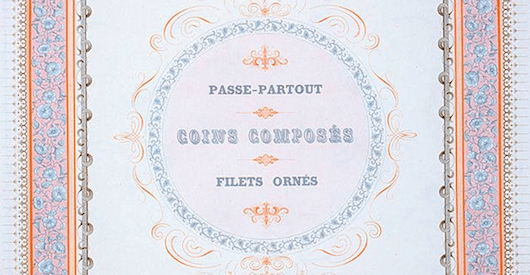
Next is a type catalog of borders and ornate decorations for printers, printed by Charles Derriey in Paris in 1862.
(RIT Cary Graphic Arts Collection, Rochester, New York)

Click to enlarge
Twentieth Century Books
Actually, near the end of the nineteenth century there was a revival of the book arts, and an attempt to return to the humanistic styles of the earliest period of printing. William Morris and his Kelmscott Press were among the first to produce hand-made books of astonishing quality and craftsmanship. This is the title page from his massive edition of Chaucer’s Tales, 1896.
(RIT Cary Graphic Arts Collection, Rochester, New York)

Click to enlarge
There have been many inheritors of the fine book movement that Morris started. As an example, here’s a title page from Officina Bodoni, a fine hand printer in Verona, Italy, printed in 1973. You can clearly see the modernized version of the early Italian typography in this classic treatment.

Click to enlarge
Well, I could go on and on, these just fascinate me. Each title page seems to imply something about the people who created it and the equipment that produced it. Here’s the last one for today. This is the title page of The Four Gospels of the Lord Jesus Christ According to the Authorized Version of King James I published by The Golden Cockerel Press in 1931, and considered one of the greatest achievements in book design of the early twentieth century. It was designed by Eric Gill, and his illustrations are throughout the text. Gill was a gifted type designer, typographer and sculptor.
(RIT Cary Graphic Arts Collection, Rochester, New York)

Click to enlarge
Title pages perform some basic functions. Beyond that, they are the one place in the book where design, typographic artistry, and fashion have a legitimate place. As long as they harmonize with the rest of the book, it’s the perfect place to get creative.
