

Welcome to the e-Book Cover Design Awards. This edition is for submissions during June, 2014.
This month we received:
92 covers in the Fiction category
16 covers in the Nonfiction category
Guest Judge
 I’m very pleased to welcome Cathi Stevenson to The Book Designer as a guest judge this month. Cathi is a freelance writer and book cover designer, who previously worked for a major newspaper writing and editing advertising features. Since 2000, she has been designing book covers through her BookCoverExpress.com website and has created more than 2000 covers for traditional and independent publishers. Her client list includes best selling authors who have appeared on Oprah, Good Morning America,The Today show, Entertainment Tonight and 48-hours. You can visit Cathi’s new site here: www.CathiStevenson.com.
Comments, Award Winners, and Gold Stars
Comments are prefaced (CS: ) to many of the entries, but not all. Remember that the aim of these posts is educational, and by submitting you are inviting comments, commendations, and constructive criticism.
Thanks to everyone who participated. I hope you enjoy these as much as I did. Please leave a comment to let me know which are your favorites or, if you disagree, let me know why.
Although there is only winner in each category, other covers that were considered for the award or which stood out in some exemplary way, are indicated with a gold star: ★
Award winners and Gold-Starred covers also win the right to display our badges on their websites, so don’t forget to get your badge to get a little more attention for the work you’ve put into your book.
Also please note that we are now linking winning covers to their sales page on Amazon or Smashwords.
Now, without any further ado, here are the winners of this month’s e-Book Cover Design Awards.
e-Book Cover Design Award Winner for June 2014 in Fiction
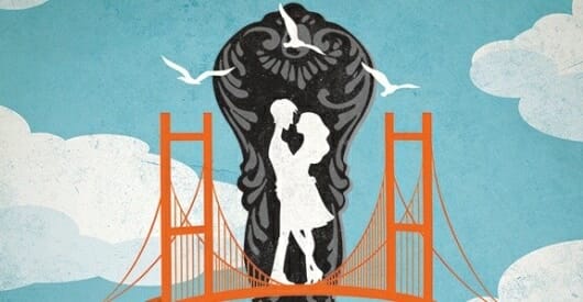
James Egan submitted The Broken Heart Diet designed by James T. Egan of Bookfly Design.
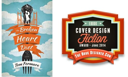
CS: Great cover. The colors work, the illustrations are wonderful. It ties together really well for an awesome result.
e-Book Cover Design Award Winner for June 2014 in Nonfiction
Tracy Kunzler submitted Men & Women: Getting Into Each Other’s Genes designed by Tracy Kunzler. “This is my second book and my first cover design. I used InDesign and an illustration I licensed from iStockphoto.com. I’ve gotten a lot of compliments on it, and I think it’s pretty effective and turned out pretty well, but you’re the expert! Thanks for your consideration! – Tracy Kunzler”
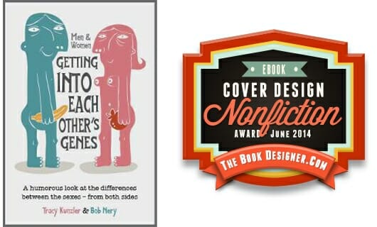
CS: Great illustrations and title treatment.
Fiction Covers
A.R. Williams submitted Sword & Sorcery Adventure: Winter’s Cold Heart designed by Keith Draws.

CS: I think a focus on one main image and a stronger layout for the title would have worked better. It’s too busy and most of it isn’t distinguishable at thumbnail. Sometimes too much is asked of designers.
Adam Ingle submitted Necessary Evil and the Greater Good designed by Adam Ingle. “The book features main characters that are an Angel and a Demon, as well as a skewed view on what is good and evil. I wanted something that evoked the image of a face card from a deck of playing cards, as well as high contrast to drive home the black/white, good/evil, angel/devil concept.”

CS: Great artwork on this cover, but I just can’t read the title at thumbnail. Maybe two partial banners that take up more of the cover? Others will probably disagree. I would definitely pick this up in print, though.
Alexis Fleming submitted Framed and Hung designed by Danielle Maait.

CS: I’m not a fan of that hand poking in off the right or the typography. The strategically placed descender in “hung” is clever though. ;)
Andrew Fielding submitted Hydrogen designed by Andrew Fielding. “Breathtaking—spot on! I think the cover is as my daughter put it, ‘epic’. ”

CS: I like the Art Deco feel, but there’s not a lot going on in the middle. If that middle portion were smaller, or the top portion including title moved to the middle, I’d like it better.
Andrew Fielding submitted Shadows of Marrakech designed by Andrew Fielding.

CS: I love the reds and oranges.
Andrew Fielding submitted The Fabulous Road designed by Andrew Fielding.

CS: The two covers together (this and Hydrogen) are definitely unique and eye catching.
Annette Drake submitted A Year with Geno designed by Daniela of stunningbookcovers.com. “The setting, Alaska, is an important element in this contemporary romance, so the designer used an image of Mt. Baldy for the backdrop. As for the couple, I wanted that intimacy and expectancy of a kiss. I love the cover, and I hope readers will too.”

CS: I think going with one font, increasing the size of “A Year With” and putting that D in “Drake” on the baseline would have improved this cover.
Auralee Wallace submitted Sidekick designed by Danielle Maait.

CS: I like this. The font and colors work really well. ★
Becky Doughty submitted Elderberry Croft: The Complete Collection designed by Becky Doughty. “First published in 4 Volumes as a serial novel (3 monthly episodes per volume), then compiled in one complete collection with an updated cover.”

CS: I like many things about this, but I can barely read the title. I don’t know who the woman is, so she wouldn’t work to sell me the book. Since she’s the one dominating the cover, I need some sense of who she is or what the book is about.
Carol Bodensteiner submitted Go Away Home designed by Jenny Quinlan at Historical Editorial. “This cover says all the right things about the story inside. Geraniums, linen curtains, and a golden tint to the picture speak of olden times/historical fiction. The window says someone is looking out – wanting something – but we can’t see what. The image conveys comfort yet yearning.”

CS: Nice. Suits the genre.
Carolyn Haley submitted The Aurora Affair designed by Carolyn Haley with Leslie Noyes Creative Consulting. “Book is a category hybrid so cover intended for general fiction. Intention is a visually appealing, moody effect to evoke curiosity. Supernatural aspects of story are based in reality so aurora borealis image chosen for its magical and ephemeral quality. Fading tails in font to suggest spookiness.”

CS: Pretty colors. Interesting font. No real focus to the design, though. As Joel would say, “no hook.” At least I think Joel would say that. I’m not getting any sense of what the book is about.
Creative Paramita submitted Tales of a (Mostly) Dead Planet designed by Paramita.
 Dead Planet")
CS: I like this cover. I’m never sure about piles of skulls. Should they be fun? Are they created digitally? Should we be worried? The hand poking up through the title is getting a bit overdone on covers and movie posters, but people seem to like them; I know I do ;).
D.C. McLaughlin submitted Deadly Conversations designed by Heather Anne Kennedy & D.C. McLaughlin. “This is the cover design for my debut vampire novel. I came up with the idea and my friend, Heather Anne Kennedy, created the photo. Being as there is a scene where the characters drink blood laced coffee, I felt this picture was rather appropriate.”

CS: Fresh idea, but the title treatment doesn’t work. The thin, italic font is overwhelmed by the image of the large, heavy mug.
D.C. McLaughlin submitted Wanderling’s Choice designed by Heather Anne Kennedy & Eren Fitzgerald. “This is my YA fantasy novella. I had the idea for the cover and Kennedy & Eren collaborated on the cover. The feather is rather important to the story line and the main character really loves her horse. So the cover idea is a combination of these ideas. I was very pleased with the result.”

CS: The title treatment is weak. I’d make it much larger and perhaps overlap the design elements a bit with the title, so it all comes together.
Dan Arndt submitted Angels & Bullies of St. Aelred High designed by Deborah Bradseth of Tugboat Design. “This is a re-design of a failed cover.”

CS: Nice image. Not sure why the text is flush left, flush right, then centered. Seems a bit confusing. There’s plenty of room on there, so it wasn’t necessary.
Dan Westercamp submitted Awakenings designed by Benni Amato. “The book is a collection of erotic short stories, and I wanted a tasteful cover that would emphasize the self-discovery aspect of the encounters. The panel of three images (each referencing a story) helped convey that this was a collection of stories.”

CS: I like this concept. The two photos in red seem to form an embryo-like image, which is kind of neat. I think that black color block might chop things up into squares and rectangles a few too many times, though.
Danielle Lenee Davis submitted The Protector designed by Danielle Lenee Davis and Deborah Bradseth (Tugboat Design). “I designed my cover several months ago. I recently contacted Deborah Bradseth, of Tugboat Design, and asked if she could do anything to make it ‘pop’ more. I wanted to keep the same photo. Deborah made changes, including increasing the size of the silhouette figure. The old design is on my website.”

CS: This cover definitely has an ominous feel to it. The title and author name really stand out.
David Penny submitted The Red Hill designed by damonza. “No comment – if I need to explain the cover it’s not doing it’s job.”

CS: I really like this. I particularly like the treatment of the title. ★
David Thompson submitted Death on The Mountain designed by David Thompson / Jason Weatherly. “This photo is a stock internet photo grafically adjusted to reflect the sometimes mysterioyus and haunting shroud that looms over the The Great Smokie Mountains and the setting for this story. It grafically represents the story of the novel.”

CS: It’s not bad. It seems like an early 2000s cover to me. I think there’s more that could have been done with the text.
Deborah Jay submitted The Prince’s Man designed by Jennifer Quintenz. “I saw one of author Jennifer Quintenz’s covers on here and loved it. I contacted her and asked who her designer was; turned out she’d done it herself. I’m very grateful that she agreed to do a cover for me, and we designed this together for my Epic Fantasy.”

CS: The title could have been broken and placed on two lines. I think a bit of color would have made this stand out more. Blending around the edges of the figure would have helped make it look like it was part of the scene, rather than just pasted onto the background.
Dianne Harman submitted Blue Coyote Motel designed by Vivek Rajan Vivek.

CS: The font mix isn’t really working. The font used on the author name would have worked on the title, and the title could have been larger and put on two or three lines. The width of the white text above the author name extends beyond the margins determined by the title and the author name, so I would break that and increase the point size.
DJ Edwardson submitted Through the Viscera designed by DJ Edwardson. “This is book 2 in a series. The cover uses the icon and typography from book 1 set against the backdrop for the “Viscera”, the main setting for this science fiction novel. The setting was unique enough that I thought it would make for a nice cover with lots of contrast.”

CS: Nice use of texture.
E.D. Walker submitted Heir to the Underworld designed by Simone Sadie. “I’ve worked with Simone Sadie a couple times and I just love her illustration style. I love the sense of action in their poses, and I think the blue really pops.”

CS: Nice illustration and nice title treatment. The font used for the author name is a bit weak. The thinner strokes vanish at thumbnail. The title font would have worked fine for the author name. The letter spacing around the w in “world” needs a bit of tweaking. It almost looks like two words — unless that was intentional? “To The” is just sort of stuck in there and I find it distracting. I like the image and colors and title font treatment, but think it needs a bit of work to get where it needs to go.
Elise VanCise submitted Don’t Touch designed by Elise VanCise.

CS: Simple, familiar elements. I might try setting that text on the bottom as a strapline using a font that’s a little easier to read, and not quite so casual.
Ella Medler submitted Not Juliet designed by Patti Roberts. “I caught sight of this cover, shared on FB by illustrator Patti Roberts, and instantly fell in love with it. I recognized the Tuscan background right away. The characters wrote themselves a story in my head within minutes. I can’t decide if this is the perfect cover for the story or vice versa.”

Ellen Harger submitted Strong Enough designed by PixelTwister Studio. “My novel, about an aspiring radio DJ, is at the women’s fiction end of chick-lit. I requested a design that reflected this.”

Elliot Warren submitted Buffalo designed by Elliot Warren. “The book cover relates to the main character and his destructive thoughts that, ultimately, lead to the books savage ending.”

CS: I like this, but can’t make out the image as well as I’d like. If the contrast was increased, it would have more impact.
Emily Hemmer submitted Wynn In Doubt designed by Damonza. “The book is about a young woman, Wynn, and her journey to discover the life and secrets of her great grandmother, Lola, and find herself along the way. Lola abandoned her family in 1927 and turned up in a newspaper article in 1931 as the companion of a Kentucky moonshiner.”

CS: Very nice. I’m a fan of this cover style.
Frank McManus submitted ODIUM designed by Frank McManus. “I took this picture and distorted it because ODIUM, the land in the book, is itself distorted, lost, hidden, if you will. The picture shows up well on eBook sites and great as an eBook cover on various ereaders in color and black and white.”

CS: The title is very easy to read, as is the author name. I have no idea what this book is about, though. I can’t make out what the image is, so I’m not sure why the title is crammed at the top and the author name crammed at the bottom to frame a lot of white space and squiggly lines. The image isn’t carrying the book cover, so it doesn’t deserve all that real estate. It might work as a background, but it’s not a feature image. It needs a sub-title or strapline to give the reader a hint about the genre.
Gabrielle Prendergast submitted Ditched Again designed by Gabrielle Prendergast. “This was a new cover for the author’s back-list title. We needed to say fun romance, not too steamy and high school reunion. It was also a duel POV book so I think this layout really helps express that.”

CS: This designer had a lot of text to put on there, and did it well. It has a “movie poster” look to it. ★
Helen Rena submitted Into the Blind designed by Chelsea Starling. “Into the Blind is a YA paranormal novel. It is about a girl who was kidnapped and imprisoned for her gift of omnipotence, hence a keyhole on the cover. Is it enough of a hook? Thank you. I love your cover contest, Joel.”

CS: Is there a reason the ts look like crosses? If that’s an intentional element, I like it.
Inés Galiano submitted Los límites del bosque designed by Inés Galiano. “I have edited myself the cover of my book, using pictures that I took. For the forest, I was in France, in the Dune du Pila. For the girl with the mask, we had to ask for a mask from the World War II.”

CS: Congrats on creating your own images.
J.D. Garrett submitted Sinister Services designed by Jaunita Darlene Garrett Kimbell aka J.D. Garrett. “My full name is Jaunita Darlene Garrett Kimbell. I publish under J.D. Garrett. I created the cover myself using photography done by my daughter and son in law, Mariah D. Alderete and Seth M. Alderete. The original photos were taken in Forest Park, Portland Oregon at “The Stone House”.”

CS: Title could be easier to read. The letter spacing and the color are both working against it. Sharing the S between two words is something you might get away with on a logo, but you’re probably going to start seeing your book listed as Sinister Ervices or Inister Services at some point.
J.R. Rogers submitted Mission to Morocco designed by Dave Fymbo. “The challenge was to depict a suitably generic Moroccan scenic photo with a US Navy blimp. The title lettering and color is a nice counterpoint to the very different-looking foreign scenery which is in fact Morocco while the author’s name in white alerts the reader.”

CS: Ohhh, I like this. It’s different. Title stands out well. Image suits the subject matter.
James Egan submitted The Big Mitt designed by James T. Egan of Bookfly Design.

CS: Almost a gold star. I love this, or at least the part in the spade shape. I have no idea what that form is on the background; the color of the old paper works well, but the lines are bugging me. (I’ve since had another cup of tea and they’re still bugging me).
James Egan submitted Watch for Me by Moonlight designed by James T. Egan of Bookfly Design.

CS: Love the way the designer handled the title layout.
James Minter submitted The Hole Opportunity designed by Paul Shinn. “Paul Shinn is a professional cover illustrator based in London. I’ve worked with for the last four years on a number of book projects.”

CS: I knew immediately this was a UK cover. It’s almost unfair to judge it against US covers because the humor (should I say “humour?”) are not always appreciated on this side of the pond. But the Canadian Commonwealth citizen me appreciates this cover.
Jason K. Lewis submitted Empire under siege designed by Deranged doctor design. “I worked with the guys at Deranged doctor design on the cover for ‘Empire under siege’. The brief that I gave them was that I wanted something ‘light’ and stunning that evoked the story. It had to have a red hawk on the cover. It also had to show it was part of a series.”

CS: Everything works well on this cover. The color, and the decorative font pull it all together. ★
Jennifer Brassel submitted The Curse designed by Danielle Maait.

CS: Simple. Strong. I might have tightened the space between the letters in the title a bit and used thicker strokes.
Jennifer Lewis Williams submitted Highland Games Murder designed by Donnie Light. “This is a mystery novel about a kilt-wearing, bagpipe playing director of a county law library who helps solve the murder of an enemy.”

Jennifer Wells submitted Fluency designed by Jennifer Foehner Wells. “I contracted with artist Stephan Martiniere to make the illustration for the cover. I designed the rest using Pixelmator software on a Mac”

CS: Nice. I like the illustration and the way the title is worked into the design.
Jenny Schwartz submitted Hero Duty designed by Danielle Maait.

CS: Fun cover, but not sure why the water is not horizontal and showing between the characters. His forearm looks really short in relation to his hand (unfortunate photo angle?). I find the arms on both characters to be a bit odd looking.
Jo Clendening submitted An Eagle’s Heart designed by Jo Clendening. “The author wanted a cover that represented many of the birds that are “characters” in his book. I took several high rez images and created the collage, making sure the colours stayed consistent & bright. The heart is hand drawn by me to add a bit of whimsy to the cover.”

CS: Certainly a lot of time and skill went into lifting these birds off their original backgrounds to create this collage.
Jonathan Lyster submitted Oblivion’s Wake designed by Jonathan Lyster. “”Oblivion’s Wake” is a near-future psychological thriller. I wanted a chilling cover, and one that stood out when lined up against other covers on Amazon. Hence the bold colours and font.”

CS: Makes an impact.
K.M. Weiland submitted Behold the Dawn designed by Damonza. “I recently commissioned Damonza to redesign the cover for my medieval historical novel. I wanted to focus more on the characters and their romantic relationship, as well as the dark and turbulent setting of the Third Crusade.”

CS: Nice strong colors. Good font choices. ★
Karla Locke submitted Role Model designed by Karla Locke. “This fun short story was submitted to the Skagit Valley Writers League for their anthology. The author wanted some fun. We wanted to go with a font that had an Adams Family look to it.”

CS: This is a fun looking cover that says “beach read” to me. Not sure why the image is cut off in the middle of the cover like that. It could have bled off the top with the title to the left and the lettering tightened up (move a few butterflies). Don’t like the font.
Karri Klawier submitted Granny’s No Angel designed by Karri Klawiter. “The sequel to “The Second Diary””

CS: Love this cover. Simple and effective. Really like the typography. ★
Karri Klawiter submitted Awaken designed by Karri Klawiter. “The first of The Awakened Fate Series, a YA Paranormal Romance that follows a girl who accidentally discovers she’s part mermaid and is hunted for being an abomination. The author wanted something that visually suited the genre, relatively emotive and wistful, with a touch of dark intensity.”

CS: Her legs look like they belong to another image. To my eye, her legs are not following the lines of her hips showing beneath the dress.
Karri Klawiter submitted Fangtooth designed by Karri Klawiter. “”First there was the Creature From The Black Lagoon…Then there was Jaws…Prepare yourself for Fangtooth.” The author was looking for a classic monster horror look for this cover.”

CS: Okay, this cover just says it all and now I’m going to be afraid to go into the lake all summer. ★
Kaz Augustin submitted The Pirate’s Grand Plan designed by Sandal Press. “One thing I like about self-publishing is that you can easily update the cover when you’re ready for a change! The book is an SF Romance. We were going for a different treatment – a Michael Whelan-type cover. Something that conveyed movement and story.”

CS: Using the same font for the title and author name would have given the layout a cleaner look. But, the design definitely conveys motion.
Kim DDD submitted Selection designed by Milo from Deranged Doctor Design. “Scott Patterson wanted eye catchy cover for his YA SF fantasy dealing with genetic engineering and a girl who hides a secret buried in her DNA. The idea was to create design that will attract female YA readers, but also strongly “state” the book’s (SF) genre.”

CS: Creative idea with braid.
Lauren Hope submitted Hidden Shadows designed by Lauren Hope. “After changing publishers, Hidden Shadows has been re-released as a new edition. I wanted a striking, eye-catching image that evoked mystery and even a sense of unease. I also needed a cover that could be tied together with others for a cohesive, recognizable series.”

CS: The drop shadow and shading make this difficult to read. It could be more eye-catching if the colors were handled a bit differently.
Lazlo Ferran submitted Ordo Lupus and the Temple Gate designed by Omri Koresh. “This Cover was commissioned from Omri Koresh, an Israeli designer and he worked very closely with me (the author) to produce what you can see is a stunning cover for my book.”

Leslie Taylor submitted The Devil’s Violin designed by Leslie Taylor – Buffalo Creative Group. “This was an e-book cover created for the author’s first book. Book is a mystery, with plot twists, sexy heroines, and dark secrets from the past! Photo is stock w/enhancements -Ended up creating a full cover layout as well, for the printed paperback version.”

CS: The title treatment certainly catches the eye.
Louise Forster submitted Home Truths designed by Danielle Maait.

CS: I’m not sure what this book is about. The cover is just too generic.
Mallory Rock submitted After Detroit designed by Mallory Rock.

CS: ★
Marcus Herzig submitted Idolism designed by Andrew Yuuki. “In his design for my Young Adult novel Idolism, Andrew Yuuki tried to combine the two key elements of the story, stardom and religion.”

CS: I like the illustrator’s style.
mark robertson submitted off-key designed by mark robertson. “Juggled the themes of the book in Google images. Had the art work done by Brian Gibson, added a photo by Jack Lowe and had Barry Larking pull the whole thing together.”

CS: The drop shadow on the title and that background photo mixed with the illustration just aren’t coming together for me. I’m getting no sense of unity. Perhaps working with the illustration to make it the feature image would pull this cover together.
medeas fallon submitted The Big Crunch designed by Anna Cleary. “The cover shows three elements – video-game or road at night, grungy concrete and barbed wire, beautiful starry sky – which completely fit the story of a video games inventor whose life is going into free-fall, drives when he shouldn’t have been + ends up in a prison with a starry sky above him”

CS: The title is certainly visible and the texturing adds just the right touch.
Monica Enderle Pierce submitted Famine (Book One of The Apocalyptics) designed by Scott Pierce. “Genre: dark fantasy with a historical setting; photography: ByteStudio Photography; font: Core Circus”
")
CS: Nice. Simple. I like it.
Monica Haynes submitted 1929 Jonathan’s Cross – Book One designed by Monica Haynes – The Thatchery. “For M.L. Gardner’s historical fiction series, I needed to design something that reflected each book individually yet tied together in a cohesive package. I began with “1929 Jonathan’s Cross – Book One” and focused on the straw cross that becomes a source of hope and faith throughout the novel.”

CS: Lots of strong graphical elements on this cover, but the sky isn’t pulling it together. Since a drop shadow is used, and the title is bevelled and almost looks like metal, a metal door or something in place of the sky would have worked better.
Nadia Orenes Ruiz submitted Mississippi Ghost Blues designed by Nadia Orenes Ruiz. “Hi! This is a fantasy book about a mute ghost who enjoys playing blues on his harmonica and all his adventures on The Beyond. I’m the author of the ebook, who also designed some art for it, including its cover. I did all the stuff on my own, even the typeface on the title. Thanks!”

CS: Love the style and the colors. Really like the creative treatment of the author name.
Nancy Madore submitted The Hidden Ones designed by Nancy Madore.

CS: The text is flush left, centered and flush right. Too much “dancing around,” and I don’t see any reason for it. There’s plenty of room.
Nick Thacker submitted The Depths designed by Amelia Chitulescu. “I asked Amy to create a book cover using the same fonts, general theme, and overall appeal of my first novel, The Golden Crystal. In my opinion, she created the greatest book cover ever!”

CS: Nice use of color. “Written by” is not necessary.
Nikki Blue submitted Broken designed by Sara H. Noto. “I gave Sara Noto of Bellanoto Designs, a brief synopsis, explaining that I needed the grit of the story to come through on the cover of the book and this is what she created. She nailed it.”

CS: Creative. Fresh.
NLB Horton submitted When Camels Fly designed by Rebecca Lown. “Writing a humorous suspense novel with a clumsy, middle-aged female protagonist is challenging (unless you’re a clumsy, middle-aged female adventurer). But it’s a snap compared to designing the cover. My award-winning team (that also works with Patterson and Rowling) did a FABULOUS job.”

CS: Nice image manipulation, but I can’t reconcile the scenic mountain photo with the poppies and the sand. I like the lower portion of the cover.
Norma Curtis submitted Holy Bones and Ava Jones designed by Kai Collier-Thomas. “This image is one of three that Kai designed for Holy Bones and Ava Jones. The book is a first-person adventure story written for the pre-teen market and I chose it for the clean design and bold colour. The birds coming out of the glasses represent the supernatural element of this contemporary story”

CS: Title font is difficult to read. The spacing of the letters on the author name needs work. “Norma” almost looks like two words.
P.C. Zick submitted Trails in the Sand designed by Travis Miles. “I had a vision that relates to the first scene of the novel when a sea turtle comes ashore to lay her eggs. I explained it to Travis Miles, and he perfectly captured my mind’s picture.”

CS: The outer glow on the words over “Sand” is making the title difficult to read.
Patti Roberts submitted Nathaniel designed by Patti Roberts. “Author wanted a simple cover portraying a good angel with hot bod and good looks. She chose this cover.”

Patti Roberts submitted Our Forever Summer designed by Patti Roberts. “The author wanted a cove to represent young love spanning over distance and years.”

CS: I Like the cover. Not a fan of the drop shadow under “Forever,” as it makes it difficult to read, but the heart is a cute touch.
Pavarti Tyler submitted White Chalk designed by Mallory Rock. “Literary Fiction dealing with issues of underage student/teacher relationships, counter culture and growing up poor in America.”

Rachel Cole submitted Databyte designed by Littera Designs.

CS: Strong title, easy to read.
Rachel Cole submitted Killerbyte designed by Littera Designs.

CS: Works well with the other book in the series that was submitted (Databyte).
Richard Devin submitted The Third Hour designed by Kelsey Richardson, DRE&MS. “A religious/political thriller with plot lines that include: Govn’t Conspiracy, the Church, Roswell & Time Travel, the cover by Kelsey Richardson of DRE&MS captures the essence of the story with the Vatican and US Senate buildings supporting the title and the “creepy” factor of the ever present eye.”

Robert Bidinotto submitted BAD DEEDS designed by Allen Chiu. “When I needed a cover for the sequel to my vigilante bestseller, HUNTER, I turned again to talented young designer Allen Chiu. Allen hit it out of the park, brilliantly combining original model photography with background elements to capture the violent climax and evoke the genre of BAD DEEDS.”

CS: Many well-executed design elements to like on this cover.
Rue submitted It’s Not My Favorite designed by Anne French. “The original image is a compilation of several archival photos of the wall mural. Each photo had a person or persons covering part of the image, the the images had to be layered together to carefully fill in the missing parts of the mural from one photo with the existing pieces from another.”

CS: I can’t tell anything about the book. It sort of says “poetry” to me.
Sarah Barrie submitted Deadly Secrets designed by Danielle Maait.

Sarah Davenport submitted Hello Stranger designed by Cathrin Machin and Sarah Davenport. “As the book journeys between virtual and natural and manufactured realities, virtual world designer Cathrin Machin and I worked together to illustrate ‘the machine’ – a terrifying system that imitates the nature it has destroyed, from my hand-drawing to the virtual environment where it now exists.”

CS: The cover doesn’t give me the slightest hint of genre. I would have assumed some sort of stalker-thriller until I read the description.
Shauna Bickley submitted Driftwood designed by Andrew Brown – Design for Writers. “The piece of driftwood on the beach plays an important part throughout the book and is central to the final scene, but as Driftwood is a romantic suspense thriller I didn’t want a typical bright beach setting. I think Andrew caught the ‘moodiness’ of the scene brilliantly.”

CS: I love this image, the color, the font. I could have used a bit more of a hint that it was a suspense thriller, though. The sub-title says so, but the title treatment and image sort of say “literary fiction” to me.
Shauna Bickley submitted Lives Interrupted designed by Andrew Brown – Design for Writers. “Lives Interrupted is set in London in 2005. I wanted to place the book firmly in London, and show the disruption that comes with lives being interrupted. Andrew used Gill Sans the classic London underground font as an allusion to the city. The shadowy figure could be any of the ensemble cast.”

CS: Nice typography. Long words can be so difficult to set on a cover.
Skye Malone submitted Awaken designed by Karri Klawiter. “This cover design, created as a custom work by Karri Klawiter, involved the photomanipulation of multiple images from several sources to create a seamless, beautiful image evoking the mystery, danger, and allure of the underwater world in this YA paranormal romance story.”
Stacy Claflin submitted Duplicity designed by Bryan Hufalar.

CS: I like this. I can’t help but think the title could be larger or given a bit more graphical impact.
Steven Whibley submitted IMPACT (The Dean Curse Chronicles: Book 3) designed by Pintado. “The series is geared for MG/YA crossover audience (9-14).”
")
CS: A nice cover for this genre. Without the beveling, the title could have been incorporated into the image as if it was part of the explosion, which might have brought the design up to the next level. The two characters need a bit of work: A cleaner clipping path and feathering would have created a more blended image.
Suanne Laqueur submitted The Man I Love designed by Tracy Kopsachilis.

CS: Interesting, but I didn’t actually see the faces until I went through the covers a second time. Does the prominent blue create a shape with some significance?
Taillefer Long submitted The Boy Chums: Cruising in Florida Waters designed by Taillefer Long. “The concept for the design integrates the original illustration from the cover (I imagine this will evoke nostalgia for those that may be familiar with the first edition of the series from childhood) with Japanese seascape prints: creating a new context for a nostalgic story.”

CS: Nice. Unique.
Tom Swyers submitted Saving Babe Ruth designed by Derek Murphy. “One man will stop at nothing to save kids’ baseball in his town. It’s a thriller based on a true story that makes you angry, makes you laugh, and makes you cheer. Derek designed a cover with typography, color, light and a model’s pose to convey the genre and the wide range of emotions.”

CS: Nicely designed. Is that a safe way to hold a gun?
Tristan Cruz submitted The Space Between designed by Dream Digital Images. “I designed this cover myself in a CAD program called Matrix 8, which runs on top of another CAD program called Rhinoceros. I then rendered it as an actual image in VRAY 2.0 which is built into Matrix. I used Photoshop to do color correction, adding the Title and Author.”

CS: I love the illustration of the woman. I would have liked this cover better without the talisman. If “A Novel” was centered, it would have created a nice line for the reader’s eye to follow to the author name. In its current location, it carries the eye off the cover (and to whatever is beside it: text? Scroll bar?).
Viveka Portman submitted The Private Affairs of Lady Jane Fielding designed by Danielle Maait.

W. Lawrence submitted Syncing Forward designed by Lasse Perälä. “I tasked Lasse Perälä with creating a cover that clearly shows the genre (scifi). The main character is out of sync with time; he doesn’t travel through it, but instead sinks uncontrollably forward. The shattered watch face through which you look is supposed to symbolize his place in time is broken.”

CS: Kind of cool. The text is getting a bit lost, though. Pumping up the title and author name would make this cover pretty awesome.
Wayzgoose Press submitted The New Men designed by DJ Rogers. “We like the ebook better than the print–Createspace requirements forbid any text to touch the edge of the page, so we had to use a border. The challenge for a historical book was to show something accurate (a Ford car from the 1910’s) but still have enough color and vibrancy to be interesting.”

CS: Refreshingly creative.
Xander Weaver submitted Dangerous Minds designed by Lee Roesner.

CS: Nice, solid design that creates an effective cover. ★
Nonfiction Covers
Alexander Ness submitted The Book On Networks designed by Alexander von Ness.

CS: Another strong design, but it looks like a fiction cover to me. Not necessarily a bad thing.
Ava Greene submitted Some Swamis are Fat designed by Ava Greene. “Honest and simple, with a light touch, was the intention. The cool blue and the hot orange hopefully make a strong balance, and the swami is meant to look hand-drawn. It’s a journal, so I wanted the cover to be warm, invitational, and non-commercial.”

Becky Povich submitted From Pigtails to Chin Hairs: A Memoir & More designed by myself. “I came up with the title, photo, font size, spacing, etc. I published through createspace and had a friend help me with the formatting. I used Foto.com for the highlights and picture frame effects.”

CS: Very good first effort.
Chris Chopra submitted The Secret of Slim: Healthy Weight Loss Through Simple Lifestyle Adjustments Inspired by Ayurveda designed by Chris Chopra.

CS: I have no idea what that bone is sticking out of the woman’s hip, but it looks painful.
Debby Gies submitted Meno-What? A Memoir designed by Yvonne Less, www.diversepixel.com. “This book is a humorous take on my journey through menopause. I worked with my artist in choosing an effect of dragons and flames to highlight the issue and the font to convey that it was a more light-hearted read.”

CS: Too many fonts. Too much going on.
Evan Rail submitted Beer Trails: The Brewery in the Bohemian Forest designed by Self. “This long-form nonfiction travelogue launches a series, so I wanted to create a branded logo that the other “Beer Trails” titles can also use. All of my ebooks so far have featured Farao and Farao Black by František Štorm, a typo designer I once interviewed and wrote about. I take my own photos.”

Gerry Fostaty submitted As You Were: The Tragedy at Valcartier designed by Julie Scriver. “Julie Scriver created a cover for As You Were that suggests a newspaper story to illustrate the fact that although the story was certainly newsworthy, it was suppressed by the military and the media at the time. Scriver’s covers are beautiful, compelling, and serve the stories they envelope”

CS: A challenging cover designed by a fellow Atlantic Canadian.
Jason Matthews submitted Better You, Better Me designed by Victorine Lieske. “I’m really happy with the photo, the mood and how it goes with the message within. Victorine Lieske is a pleasure to work with.”

CS: Maybe using script on one or two of the words would have worked, but the top of the cover doesn’t seem to go with the bottom because of the fonts. And too much real estate is given to the path. It’s a nice background photo, but it’s not offering anything as a feature image. The title would have worked better laid out over the front, instead of being used to frame the field — even with the script.
Lindsay Gasik submitted The Durian Tourist’s Guide To Thailand designed by Lindsay Gasik with guidance from Brian Jewett. “After two flopped attempts to hire a designer and blowing my cover budget, I decided to do it myself. My book has a very niche audience so I wanted a cover that obviously expresses what the book is: an off-the-beaten-path travel guide through the orchards and markets of Thailand focusing on durian.”

CS: I have no idea what that thing on the right is, but it doesn’t make me want to visit Thailand. I would either leave it off, or put more of it on there so it can be identified, even by a dulse eating Bluenoser (a popular term for a Nova Scotian, not a reference to a political party), such as myself.
Michael N. Marcus submitted Do As I Say, Not As I Did designed by Michael N. Marcus. “I like bold black covers for small online images. I distorted the pic with Photoshop & Microsoft Image Composer. The title is bold Bookman Old Style with comma kerned. I tried Bookman for my name but the serif face was hard to read when small so I used Calibri. Red frame relates to red on my cheek.”

Nick Finer submitted Explore the Animals and Sights of Yellowstone designed by N.D. Finer. “Photo was taken at Yellowstone National Park”

Rosemary O’Brien submitted BEST Pocket Parks of NYC designed by Rosemary O’Brien. “I created the cover by starting with an idea for an image that was buzzing around my head and whittling it down to a cover that will work for several titles in the series. I used only the green color on the black and white because I thought it looked sleek.”

CS: I like the image. The text layout, fonts and unnecessary use of “by” sort of make it look like a school report, though.
Royal Paine submitted 18 Ways to Kiss Your Payday Loan Lender Goodbye designed by Royal Paine. “I’ve been investing in, and studying, the resources at “TheBookDesigner.com” for months. I finally finished my book, focused on a title, purchased a vector image, opened up Photoshop and went to work. This simple book cover communicates my theme and grabs a potential reader by the throat.”

CS: The font is too casual for the topic. I’m not sure what “By:” is all about. The name alone would have been fine. The lips led me to believe it was romantic humor. The lips combined with the sub-title sent my mind in an entirely different direction. Not sure what’s going on with this cover. I do know I need another cup of tea, now.
Steve Whitman submitted Relocating without breaking a sweat designed by Stoyan Stoyanov.

CS: I keep wanting this to say “Relocate” instead of “Relocating.” I find the layout very passive with no focus. More of a report cover than a book cover, but maybe that’s the intent.
Taillefer Long submitted Naturism in the United States designed by Taillefer Long. “The drawing was selected because it presents nudity in a classy, asexual way. The direct gazes of the models, and the patriotic frame, speak directly to the audience, without objectifying the nudity, but humanizing it and presenting the debate in context.”

CS: Nice colors and textures. There’s no feature element, though. The text is too small and image is too faint.
Well, that’s it for this month. I hope you found it interesting, and that you’ll share with other people interested in self-publishing.
Use the share buttons below to Tweet it, Share it on Facebook, Plus-1 it on Google+, Link to it!
Our next awards post will be on August 18, 2014. Deadline for submissions will be July 31, 2014. Don’t miss it! Here are all the links you’ll need:
The original announcement post
E-book Cover Design Awards web page
Click here to submit your e-book cover
Follow @JFBookman on Twitter for news about the E-book Cover Design Awards
Subscribe to The Book Designer Blog
Badge design by Derek Murphy
