

Welcome to the e-Book Cover Design Awards. This edition is for submissions during March, 2014.
This month we received:
85 covers in the Fiction category
16 covers in the Nonfiction category
Comments, Award Winners, and Gold Stars
I’ve added comments (JF: ) to many of the entries, but not all. Remember that the aim of these posts is educational, and by submitting you are inviting comments, commendations, and constructive criticism.
Thanks to everyone who participated. I hope you enjoy these as much as I did. Please leave a comment to let me know which are your favorites or, if you disagree, let me know why.
Although there is only winner in each category, other covers that were considered for the award or which stood out in some exemplary way, are indicated with a gold star: ★
Award winners and Gold-Starred covers also win the right to display our badges on their websites, so don’t forget to get your badge to get a little more attention for the work you’ve put into your book.
Also please note that we are now linking winning covers to their sales page on Amazon or Smashwords.
Now, without any further ado, here are the winners of this month’s e-Book Cover Design Awards.
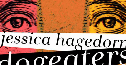
e-Book Cover Design Award Winner for March 2014 in Fiction
Mauricio Diaz submitted Dogeaters designed by Mauricio Diaz. “New cover design for the Ebook version of Dogeaters by Jessica Hagedorn.”
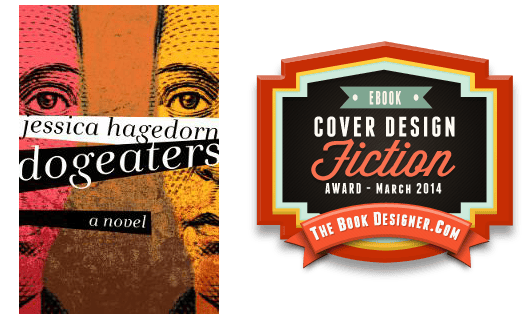 JF: Fantastic. The novel is set in the Philippines, and this cover is striking and memorable in all the best ways. From the mirror images and their intense eyes, to the roiling background to the typography that’s almost bursting out of the frame, everything comes together to create a vivid ebook cover.
e-Book Cover Design Award Winner for March 2014 in Nonfiction
Damon Za submitted Arshavir Shiragian – The Legacy: Memoirs of an Armenian Patriot designed by Damonza.
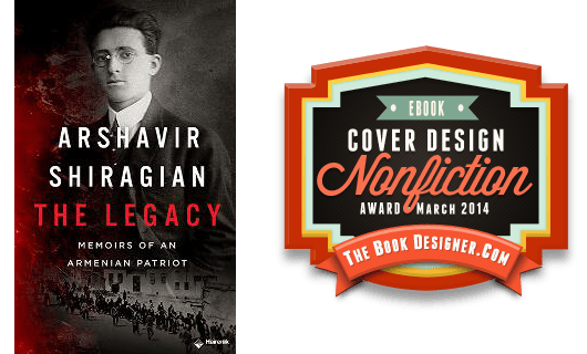 JF: Damon’s great storytelling skill works just as well for nonfiction. Here he gives us a peek at the historical background, an idea of how bloody this story is, and a sympathetic, if nuanced, portrait of the unusual man at the center, bringing history to life.
Fiction Covers
Amy Rowland submitted Dragonkin: Awakening designed by A. Z. Rowland and Joanne Davis. “This cover began with a photo of a Himalayan Griffin. I scanned, cropped, rotated, warped, color saturated the image, and added text for a mock-up cover for a Kickstarter campaign last summer. My friend Joanne Davis helped me create the banner, improve the font coloring, etc. A great collaboration!”

JF: Interesting image, but I would have liked to see a better integration with the typography.
André Klein submitted Learn German with Stories: Karneval in Köln – 10 Short Stories for Beginners designed by André Klein. “design based on old postcards, 3rd part of the series “Dino lernt Deutsch””

JF: A clever and tasteful treatment that may be a bit too complex for this size.
Annette Drake submitted Bone Girl designed by Jason Gurley. “Jason Gurley sent me three covers to choose from, and I chose this one because of the magnificent colors and the dominance of the horse in the front and the mountains in the background. Both these are key elements in the novel. I think the text, while unusual, pulls the composition together.”

JF: An atmospheric cover that, in my opinion, sacrifices too much legibility through the effects applied to the type.
April Margeson submitted Chaos designed by April Margeson.

JF: Um… okay, I get it, “chaos” it is!
Catherine DePino submitted Elliot K. Carnucci is a Big, Fat Loser: A Book About Bullying designed by Patty Henderson. “My middle-grade book addresses bully prevention. The protagonist on the cover is a fourteen year-old whose peers bully him relentlessly.”

Christine Jordan submitted City of Secrets designed by Diane.

JF: A beautiful cover that pulls us right into the story. The stage is set and everything looks to fulfill the promise of the title.
Christopher Gray submitted Dark Nights designed by Tom Edwards. “I worked closely with my designer Tom Edwards to produce a cover that gave a hint of Dark Night’s key plot point (the Multiverse), while at the same time remaining mysterious. Two similar planets in close proximity, with a halo that implies that one just arrived.”

JF: A strong genre cover that lets the illustration do its job.
Damon Za submitted All Hallows Night designed by Kate at Damonza.com.

JF: Damon works his magic on this attractive cover that irresistibly draws us from the painted face to the title. Well done. ★
Damon Za submitted Crimson Night designed by Kate at Damonza.com.

Damon Za submitted Flesh Worn Stone designed by Kate at Damonza.com.

JF: I love the controlled palette, expressive gesture, and integration of the title into the art. ★
Damon Za submitted Serial Murder and Other Neat Tricks designed by Momir at Damonza.com.

JF: Another winner from Damon’s studio, the mixture of good boy/bad boy is the lever on which this cover works. That and the look on the man’s face. Don’t you want to know more?
Damon Za submitted The Profiler designed by Damonza.

JF: Highly effective and psychologically astute. And how about those “windows of the mind”?
Dani Kristoff submitted Bespelled designed by Danielle Maait.

JF: Another example of the designer’s effortless economy in communicating with her genre’s audience.
Debrah Strait submitted The Sweet Trade designed by Harvey Stanbrough/Stone Thread Publishing. “THE SWEET TRADE is a realistic tale of a 17th Century Caribbean pirate.”

JF: Interesting and distinctive style set this cover apart, although it seems the title could be more visible.
Ellie Bockert Augsburger submitted Extra Credit: The Wager designed by Ellie Bockert Augsburger of Creative Digital Studios.

JF: Promises a sexy and sophisticated read.
Ellie Bockert Augsburger submitted Mark of the Wiseman designed by Ellie Bockert Augsburger of Creative Digital Studios. “The author wanted something that would show details of the story on the cover. We also incorporated a symbol (the crescent moon) mentioned several times in the book into the typography. We wanted to give it a Scifi feel without any gore.”

JF: Looks like the (otherwise lovely) title needs some kerning help and, frankly, the illustration left me a bit cold.
Eva Scott submitted Barbarian Bride designed by Michelle Zaiter.

JF: Great storytelling on this cover, and that’s how readers who respond to these specific cues are drawn in.
Everett Wilson submitted Double-Ought Buck designed by Everett D. Wilson.

JF: Impossible to tell what was intended here, but clearly this is a disaster.
Frederick Wysocki submitted The Start-up designed by James at GoOnWrite.com. “The story involves a cloud based software startup and the nephew of a mob related venture capitalist. They are sold for $8 billion, then the murders begin. Thus the young man sitting in a cloud looking prosperous. The blood drips foretell the coverup.”

JF: Nice, does the job.
G. S. Jennsen submitted Starshine designed by G. S. Jennsen. “For the first novel in a space opera trilogy, I wanted to evoke imagery of both the beauty and vastness of space, while keeping the cover elegant and uncluttered.”

JF: And I think you’ve achieved some of that elegance, but I don’t think the heavy type effects are helping.
Ginger Russell submitted Sitara – A Novella Series #1 The Absolution designed by Tiffany Ditton. “Sitara is a sexy dark hero. The first sentence in the book is “Blood never cleans up easy.” I felt that blood would be an important element of the cover design. Overall I wanted to use the elements of red, black and white on the cover. I am thrilled with the clean captivating result.”

JF: Although the image is arresting, it has overpowered everything else, leaving the cover out of balance.
Greg Strandberg submitted Ale Quest designed by goonwrite.com. “James at Go On Write had this as a premade cover. It looked interesting so I wrote a story for it. The man’s a little far to the right because the photo has a crossbow sticking out from his belt, and it just doesn’t look that good (I asked James about it). For humorous historical fantasy, I like it.”

JF: An amusing inversion: writing a story to fit a pre-existing cover. The title itself is pretty funny.
Ian Martyn submitted Ancestral Dreams: The Return designed by Jonathan Bates. “I wanted something that suggested an alien landscape that appears early in the book. We also wanted a slightly ‘old school’ science fiction feel as well as creating a style that could be used in other books (see my other submission ‘Project Noah’).”

JF: I like the distinctive and simple style, but nothing about that square serif font used for the title, says “sci-fi” to me.
Ian Martyn submitted Project Noah designed by Jonathan Bates. “A large part of the book is centred around Mars. We wanted something that reflected that, but had a slightly ‘old school’ science fiction feel to it. Also we wanted to create a style that could be used in other books (see my other submission ‘Ancestral dreams’).”

JF: So, Ian, have you ever played Asterioids? Because your designer has, and this cover is a bit of a homage, yes? (See my comment on your other submission regarding font choices.)
J.J. Foxe submitted Fallen Angel (Episode 1 of The Kingston Chronicles Series) designed by Trisha Cupra. “A supernatural thriller – first in a series – set in a world of daemons, dark magic and murder. The imagery is a merger of a majestic (yet ruined) cathedral with a gloomy forest, from opening scene. The primary focal point is the title “Fallen Angel”. The ‘a’ in ‘Fallen’ looks broken, intentionally.”
")
JF: With such an interesting and strong graphic, I don’t think I would have broken it up with the large dark band across the middle.
J.M. Ney-Grimm submitted Livli’s Gift designed by J.M. Ney-Grimm. “I adore black & white illustrations by Kay Nielsen. I’ve heard from a few of my readers who share that liking, but I’ve noticed that my books with full color art get more page views. Surely there’s a lesson there!”

JF: I don’t find this cover very human or attractive, and don’t understand your logic. Are you going for fewer page views? Why?
J.M. Ney-Grimm submitted Skies of Navarys designed by J.M. Ney-Grimm. “Skies of Navarys is essentially a steampunk tale, although the energy source is energea rather than steam. The cover art is attractive to my eye and suits the story, but I question whether images without people in them are the best choice for fantasy books.”

JF: I agree. The image may be attractive (and that’s subjective, of course) but is it engaging? Have you given us a reason to care? I’m not sure it passes the test.
James Egan submitted In the Company of Thieves designed by James T. Egan of Bookfly Design.

JF: Another strong cover from this designer, where all elements integrate fully into the message to the reader, adding to the impact.
James Egan submitted Wraith designed by James T. Egan of Bookfly Design.

JF: A beautiful combination of illustration, texture, and typography, with flair. ★
Jamie Maltman submitted Brush With Darkness designed by Keri Knutsen, Alchemy Book Design. “I wanted a historical fantasy series cover with: a clear typeface evoking Rome, red color theme, supplied the map portion background, and wanted the ancient brush bringing magic to life, with attacking flames and encroaching darkness. Aiming for a consistent layout for the series going forward.”

JF: Just love the top half of this cover. The bottom half, not so much, it’s very difficult to “read” and just not that interesting.
Jan Hurst-Nicholson submitted But Can You Drink The Water? designed by Liz Tipping. “This book is humorous fiction about a naive working class family who emigrate from Liverpool to South Africa. It was e-published in 2010, but I’m now intending to make print copies and am wondering if I should update the cover. I would appreciate your comments on how well this one does its job.”

JF: Could use an update or a refresh of this concept. By the way, you can leave off the word “reviewer” when quoting a publication like PW.
Jane Harvey-Berrick submitted Lifers designed by Hang Le. “‘Lifers’ is the story of a man recently released from prison whose life is still limited by the isolation he suffers in his small home town. The barbed wire represents the prison of his mind, and the mirror image of the woman below him, the way his life is about to be turned around. Beautiful.”

Jason A. Holt submitted The Dragonslayer of Edgewhen designed by Kristina Gehrmann. “Kristina Gehrmann painted this beautiful illustration and then laid out the title. I love the way the black letters with the white glow remind us of the title character’s striped skin. I gave her specs for the author name and branding stripe. Bookman Oldstyle is an honest font. And I like the J.”

JF: Your title is being bullied by the illustration on one side and your “branding stripe” on the other, exposing its weakness.
Joannah Miley submitted The Immortal Game designed by Pintado. “Hi, I just learned about this contest. What a great idea! Up for submission is the cover of my novel, THE IMMORTAL GAME. Thank you, Joannah Miley”

JF: Beautifully done, with careful and creative typography and a scene that teases us into your story. Nice job. ★
Judy Goodwin submitted Journey To Landaran designed by Katt Amaral and Judy Goodwin. “The image was designed by Katt Amaral, lettering and color adjustments by Judy Goodwin.”

JF: An appealing image, would like to see the type stand out a bit more.
Julie Musil submitted The Boy Who Loved Fire designed by J. Allen Fielder. “The fires in my book are like living, breathing things…almost another character. J. Allen Fielder did a great job of capturing that in this cover. The flames appear to be ominously lapping toward the main character, which was perfect. I also loved the flames within the word FIRE.”

JF: Although a bit overwrought, it is nicely creepy.
Juliet Madison submitted February or Forever designed by Danielle Maait.

K.B. Jensen submitted Painting With Fire designed by Zoe Shtorm.

JF: Good cover for an “artistic murder mystery” but I wish we could have seen her face, too. And the type seems a bit too classical for the overall style of the cover.
K.C. May submitted The Venom of Vipers designed by Carl Graves and K.C. May. “The original cover got a lot of comments that it looked too spooky. As this is a science fiction novel, it seemed to need something more science-fictiony, so I added the man’s face. Still, the book doesn’t get much attention in the marketplace. Maybe it’s the design as a whole? The title? Help!”

JF: There seem to be way too many elements—bits of illustration, textures, lighting effect—to add up to a cohesive, easily-grasped message. And the title doesn’t tell all that much about the story.
Karen Dodd submitted DEADLY SWITCH: A Stone Suspense designed by Ares June. “I believe that once again, cover designer, Ares Jun has done a masterful job of capturing the essence of my book’s theme, setting, and protagonist. Although I told him very little about the story, in just two drafts, he nailed it perfectly.”

JF: It’s interesting that a number of the best covers this month feature figures shown from the back. When handled well, as here, this device can draw us in, taking us in the direction the figure is traveling. This cover combines confident and effective typography with an intriguing, story-based image, a clear winner. ★
Kelly Quindlen submitted Her Name in the Sky designed by Eric Ehrnschwender. “The novel is about two young women who fall in love, and the heart of the novel examines whether or not this is “right” or “natural.” There are frequent allusions to trees and the Garden of Eden in the book. As such, Eric Ehrnschwender designed the cover to interweave two women with two trees.”

JF: Okay, love the idea of the two women, the trees, etc. etc. but where the heck did that arm come from?? The weak title treatment doesn’t help.
Kimberley Brown submitted Trusting a Stranger designed by Danielle Maait.

Kjetil Hestvedt submitted A Night for Screaming designed by Risa Rodil.

JF: Strong art that needs to be brought more into the foreground and combined with a stronger title treatment.
Kjetil Hestvedt submitted Bird Dog designed by Risa Rodil.

JF: An amusing illustration but odd color choices for anything labeled “noir.”
Kjetil Hestvedt submitted Brute In Brass designed by Risa Rodil.

JF: Another example of strong art that needs stronger type for balance.
Kjetil Hestvedt submitted Fires That Destroy designed by Risa Rodil.
JF: 5 separate pieces of type tend to diffuse the energy of the interesting and stylistic art, and scattering them around the cover doesn’t make things any better.

Kjetil Hestvedt submitted Lethal as a Charlie Parker Solo designed by Risa Rodil.

Kjetil Hestvedt submitted Pickup designed by Risa Rodil.

JF: Interesting art style works better here, where the type has been kept under control and allows the playful image to work in conjunction with the title lettering.
Kjetil Hestvedt submitted The Carrier designed by Risa Rodil.

JF: Evocative of 1960s, this one works well perhaps due to the simplicity of the treatment.
Kjetil Hestvedt submitted The Red Right Hand designed by Risa Rodil.

JF: A strong Saul Bass allusion, the strong colors and simple yet idiosyncratic style work well here, and I love the red border.
Lara-Dawn Stiegler submitted Per-Bast: A Tale of Cats in Ancient Egypt designed by Lara-Dawn Stiegler. “Media used: photography, acrylic painting, and photoshop. The cat image is based off of an Abyssinian cat I photographed. The image is inspired by the Gayer-Anderson cat statue which sits in the British Museum.”

JF: Lovely. Downright cat-ivating.
Lilo Abernathy submitted The Light Who Shines designed by Lilo Abernathy. “The photographer for The Light Who Shines is Ivan Phillips. The model is Darlene Nuccio. I, the author, did the typography and oversaw the entire design and execution, including: model selection, wardrobe, props, model expression, photo recoloring, photo special effects, location, etc.”

Maggie Gilbert submitted This is Now designed by Danielle Maait.

JF: Another seemingly effortless cover that checks all the boxes.
Mallory Rock submitted Tears of a Clown designed by Mallory Rock.

JF: Love the playfulness and clear communication of this ebook cover, and the many little touches that make it work. ★
Marilyn Parel submitted The Room designed by Joleene Naylor.

Mark P. Kolba submitted Awakening from the Shadows designed by Mark P. Kolba. “This novel is the first in an epic fantasy series. I wanted a cover that conveyed the strength and determination of the main character as he fights to protect his home from a growing evil (represented by the dragon in the background). And, of course, I also wanted a cover that said “epic fantasy.””

JF: I think it does say epic fantasy, although that dragon is so small and faint it doesn’t pose much of a threat.
MaryAnn Kempher submitted Forever Doomed designed by Kari Ayasha.

JF: No, I’m not going to say it.
Matt Langford submitted Finding Zoe Dawes designed by David Moore. “This cover was designed by Brighton (UK) based artist, David Moore. Based on the Victorian arches along Marine Parade in Brighton, the image perfectly captures the style of old fashioned seaside piers in the UK, something referred to many times in Finding Zoe Dawes.”

JF: All that may be true, but even though I went over to a retail site to see this cover larger, I still can’t make out what it is or what’s going on. I don’t think that’s the result you want.
Michael La Ronn submitted How to Be Bad: A Decision Select Novel designed by Humble Nations (CL James). “The cover matches the theme of my story so well—a woman accidentally makes a deal with a demon and must steal three souls to break the contract. Is the shadow swallowing her, or is the light washing away the shadow? I like it when a cover invokes these kinds of questions.”

JF: Very focused and effective.
Michelle Devon submitted Dream Walking designed by Farah Evers. “Farah Evers is an exceptional ebook designer. She has an uncanny way of knowing exactly what I have in my head. I’ve used her for all of my books, and I just think she deserves some recognition for the work she does so well. I hope others will enjoy her work as much as I and my readers have.”

JF: It’s challenging to use a weak typeface in a strong way, but that’s exactly what the designer has done here on this well-constructed cover.
Mike Fook submitted Thailand’s Sickest – Hell To Pay designed by Roland Roland Ali Suello Pantin.

JF: A good idea that seems to have been left in the over a bit too long.
Neil Grimmett submitted The Threshing Circle designed by Damon Za. “I wanted a cover that caught the mystery of the novel and the sense of the past reaching out with a blood-stained hand of vendetta and betrayal which are at the core of the narrative. I also wanted to show it was set on a Greek island, Crete. I think Damon got it spot on!”

JF: An arresting image.
Nina Hamilton submitted Rescue Nights designed by Danielle Maait.

Phyllis Humphrey submitted Finding Amy designed by C. Humphrey.

JF: A weak cover with too much texture and too little understanding of how to combine these elements.
Quintin Peterson submitted Guarding Shakespeare designed by Quintin Peterson. “The cover features the Folger Shakespeare Library’s sculpture of Puck by Brenda Putnam (1890 – 1975); Photo by Theodor Horydczak (1923 – 1959), taken ca. 1934. The Folger Shakespeare Library is the setting for this mystery/crime story.”

JF: A better understanding of how to use type on your covers will eliminate the need for the “slap it on top of a banner” look.
Rachel Cole submitted Arnco designed by Littera Designs.

JF: Nice use of a typewriter-style font and an image that invites to come in to the house (enter the story).
Rebecca Raisin submitted The Heart of Bali designed by Danielle Maait.

Richard Dela Cruz submitted The Cellar: A Post-Apocalyptic Novella designed by James at GoOnWrite.

JF: I really like the concept and artwork for this cover, but I have no idea why the title was kept so small, or why it wasn’t used to suggest something “underground.”
Rick Veal submitted The Master of Whitehall designed by Rae Monet, Inc. Designs. “This is the first book in my paranormal romance series, ‘The Master of Whitehall’, and was designed by Rae Monet. It depicts Katelyn as a modern, sassy, sexy college senior who meets and falls in love with James, in the background, an old vampire and the real Master of Whitehall.”

JF: Awkward and a bit “pasted together.”
Rick Veal submitted Lexi’s Legacy designed by DCA Graphics. “This cover was designed and completed by Debbie Taylor at DCA Graphics for the second in my paranormal romance series ‘The Master of Whitehall’. It depicts Lexi as a newly turned immortal facing eternity with her maker and best friend, Katelyn, watching over her.”

JF: No idea how this is supposed to relate to the companion cover, above, except they both have attractive girls on them?
Robert DAmato submitted The Last Seminarian designed by Sara Galvis. “The novel, The Last Seminarian, has just receive a 2013 Science Fiction Finalist Book of the Year Award from ForeWord Reviews. Sara designed the cover and has added the official logo from ForeWord. Thank you.”

JF: Congratulations and good luck. Although I shy away from extreme closeups of eyes (more common than you might think on book covers) here, the grid overlay pushes it away from us and lets us know this is a sci-fi treatment.
Robyn Rychards submitted Her Knight in Shining Armour designed by Danielle Maait.

JF: I like the upward-looking perspective here, and the designer’s easy had with typography. Danielle knows her audience very well and delivers just what they are looking for.
Ros Baxter submitted Lingerie for Felons designed by Danielle Maait.

JF: Nice use of a silhouette to communicate the tone of this crime thriller.
Ryan Gladney submitted Nine Lives of Adam Blake designed by Josh Krohn. “Hi Joel -This is the cover to my first novel, Nine Lives of Adam Blake. My friend Josh (a graphic designer) created the cover after reading the book twice and working with me for a month. He did a fantastic job. Hopefully I write another and put him back to work!”

JF: Another example of a good concept with interesting artwork that has overwhelmed the title. If you could bring these more into balance, it might work even better.
S. E Gilchrist submitted Star Pirate’s Justice designed by Danielle Maait.

JF: Danielle Maait shows she can take her skill with romance into the sci-fi arena as well, with this cover.
Sam Lown submitted One Little White Lie designed by Prospera InHouse. “The two bleeding hearts and the background, concrete in the rain, directly relate to the plot, which incorporates a dysfunctional family dynamic and a shocking murder twist.”

JF: I love the artfulness of this cover and the nicely controlled color scheme, but I wish the type was a bit stronger, and all the small text elements, obviously, have been reduced to illegibility. At least it should be easy to read the author’s name.
Shelley Davidow submitted Lights Over Emerald Creek designed by David Lecossu. “The cover was illustrated by French graphic designer David Lecossu, and shows the young heroine, Lucy Wright, as she witnesses for the first time the lights over her father’s 10,000 acre farm in Queensland that plunge her into her adventure.”

JF: Well done, lots of story in this image, and the disabled protagonist is deftly handled.
Sherilee Gray submitted Lone Wolf’s Captive designed by Danielle Maait.

Sherrie Petersen submitted Wish You Weren’t designed by Sherrie Petersen.

JF: Cool title, but this cover demonstrates why pro designers never let incidental elements get in the way of communicating. Here, the various type styles, bands of color, and floating elements are all competing for attention, not joining together in one message.
Slade Roberson submitted Cloudbusting designed by Slade Roberson. “I chose to use a literal, photo-realistic, still-frame setting from the story, but an image that initially feels like a dark, moody, abstract background texture. Minimal, high-contrast typography helps it maintain impact at thumbnail size.”

JF: Yeah, okay, I like the texture and, even though it doesn’t really tell us much you could probably get away with that, but the type treatment looks like it was intended for a book of nonfiction, not an exciting story.
Susan J Kroupa submitted Dog-Nabbed designed by Susan Kroupa. “This is book three about a bed bug detecting dog, which is why there’s a bed bug in the title. The first book was Bed-Bugged.”

JF: Frankly, I find it more impressive that you’ve written three books about a bed-bug detecting dog. Although the cover is somewhat amateurish, it has charm and that’s probably enough.
Tamsin Baker submitted Too Busy For Love designed by Danielle Maait.

JF: Danielle does beefcake. ‘Nuff said.
Vanessa Garden submitted Carrier designed by Danielle Maait.

JF: Combining the fence, the girl and the figure at the bottom could have resulted in a disjointed mess, but here the designer shows how to put them all to use on the same task of creating interest in the reader. Combined with straightforward type, it works.
Nonfiction Covers
Bridget McKenna submitted The Little Book of Self-Editing for Writers designed by Bridget McKenna for Zone 1 Design. “A new cover for a recently revised book for writers. I studied successful covers hoping to combine the most effective elements of graphics and type.”

JF: A good concept and nice type choices, somewhat limited by the difficulty of reading the dark red script on a dark gray background.
Bryanna Plog submitted Misspelled Paradise: A Year in a Reinvented Colombia designed by Bryanna Plog with Wilma la Paglia. “The book is a lighthearted travelogue about Colombia, a country few think of as lighthearted…or a place to travel, so I wanted the cover to draw people in as a place and book they’d want to explore. The design (and title) play with the fact that Colombia is still misspelled by many as “Columbia.””

JF: I think it works well, and the letter helps communicate the “lighthearted” theme.
Charles Danten submitted Slaves of Our Affection. The Myth of the Happy Pet designed by Charles Danten. “I wanted a strong and simple image that says it all!”

JF: Great idea, and an interesting idea for a book, but no, I don’t think it worked as well as it might, it has a very cold tone overall.
Christopher Lascelles submitted Stuffocation designed by Ruby Epsilon. “Stuffocation has a striking and attractive cover that stands out from the crowd. The author’s name has been inserted into the book title which we consider a nice design touch.”

JF: Graphic and effective, showing you don’t need an image if you know how to handle type. You do have a serious number shift in your subtitle, BTW.
Corina Koch MacLeod submitted Idea to Ebook: How to Write a Quality Book Fast designed by Corina Koch MacLeod. “I wanted to see if it was possible to create an ebook cover in a tool that many authors already have: Microsoft Word. I followed Derek Murphy’s excellent tutorial and this is the result.”

JF: Kudos to you and to Derek too, I’m amazed you were able to create this clean, clear, and attractive ebook cover in Word! ★
George McAuliffe submitted Wealth & Wisdom: Timeless Quotations and Comments About Money and Investing designed by Fabrice Frere. “A clean, classic, timeless design; both to attempt to convey the notion of the timelessness of the advice in the book, but also so that the cover would not become dated in 5 years. Wanted a cover that would still ‘work’ twenty years from now. Did not want anything gimmicky or kitchy.”

JF: And I think you got exactly what you wanted, but it would have been even better if the designer had adapted this paperback cover for the ebook.
Gillian Doyle submitted Losing Lisa: Intuitive Investigator, Book One designed by Kim Killion of Hot Damn Designs. “The city lights tie into the look to the website, Facebook and Twitter feed of Intuitive Investigator, Inc. for the true crime series by Deanne Acuña, a Los Angeles private investigator with psychic abilities. “Lisa” is a client who needed to “get lost” in the system to escape a killer–her brother.”

JF: An exciting design for this true-crime thriller.
Kathy Flake submitted What Am I Doing Here? designed by Kathy Flake. “This cover was created using a stock image from iStockphoto. When I saw the British phone booth in the middle of the countryside, I knew I’d found the right image. It reflects my experience here, living in the countryside on the edge of London, slightly out of place as an American.”

JF: Love the design, the humor, and the easy touch with type. But isn’t this backwards? Shouldn’t it be a photo of something like a teepee in Trafalgar Square?
Kjetil Hestvedt submitted Heartbreak and Vine: The Fate of Hardboiled Writers in Hollywood designed by Risa Rodil.

JF: The artist’s distinctive style makes a perfect match in this book about “hardboiled writers in Hollywood.” ★
Kori Miller submitted My life in black and white: A book of experiences designed by Jennifer Carter and Christopher Brown.

JF: An interesting concept that ends up being less than the sum of its parts. Even enlarged, it’s impossible to tell what the illustration at the center is, and the type suffers from legibility problems.
Neha Bharadwaj submitted Fortysomething Father designed by Neha Bharadwaj. “This is an E-book cover to perfectly reflect what one can expect from the book. Its quirky, colorful and with a twist of humour. The illustration on the cover is hand drawn, and then digitally rendered to get the desired look and feel.”

JF: I like the whimsy and graphical effect of the illustration, but since it was designed specifically as an ebook cover, I wonder why the subtitle was rendered so small as to be impossible to read?
Nicole Eva Fraser submitted GPS for New Novelists: Navigating the 5 routes to publication designed by Fiona Jayde Media. “Fiona is awesome to collaborate with, and she delivers phenomenal results! ”

JF: Although the designer is obviously very talented with type and graphics, I find this an odd approach for a practical nonfiction book. Is this what you think of when you think “GPS”? Not me.
Rachel Cole submitted The Kindness of Strangers: Penniless Across America designed by Littera Designs.

JF: An excellent ebook cover that communicates both some of the natural beauty of a long, long walk, as well as a bit of its isolation. ★
Rick Hoover submitted The Mystery of Faith designed by Rick Hoover. “I played around with a picture of the Pantocrator icon at St. Catherine’s Monastery on Mt. Sinai. The magnifying glass seemed the simplest way to convey the approach I was taking in the book – treating the Bible stories like detective case files, where I tried to identify clues.”

Shaughn Marlowe submitted Secrets of an Old Man’s Girlhood designed by Cam Wilde. “Marlowe lived his first 40 or so years as a girl/woman. The silhouettes represent him now walking his own tracks but still leading and guiding the memory of his childhood as a girl. The sunset represents his life’s nearing end (he is 82 now).”

JF: A sensitive treatment of an unusual subject, the designer has solved the problem with style, and I particularly admire the careful typography of the title.
Shoshanah Marohn submitted Exhaust(ed): The 99% true story of a bus trip gone wrong. designed by Shoshanah Lee Marohn.
: The 99% true story of a bus trip gone wrong.")
JF: Well, I think cigarette-smoking armadillos should win some sort of award, don’t you? Kudos for creating an image that will stop browsers out of curiosity, if nothing else.
Well, that’s it for this month. I hope you found it interesting, and that you’ll share with other people interested in self-publishing.
Use the share buttons below to Tweet it, Share it on Facebook, Plus-1 it on Google+, Link to it!
Our next awards post will be on May 12, 2014. Deadline for submissions will be April 30, 2014. Don’t miss it! Here are all the links you’ll need:
The original announcement post
E-book Cover Design Awards web page
Click here to submit your e-book cover
Follow @JFBookman on Twitter for news about the E-book Cover Design Awards
Subscribe to The Book Designer Blog
Badge design by Derek Murphy
