

Welcome to the e-Book Cover Design Awards. This edition is for submissions during November, 2013.
This month we received:
89 covers in the Fiction category
17 covers in the Nonfiction category
Comments, Award Winners, and Gold Stars
I’ve added comments (JF: ) to many of the entries, but not all. Remember that the aim of these posts is educational, and by submitting you are inviting comments, commendations, and constructive criticism.
Thanks to everyone who participated. I hope you enjoy these as much as I did. Please leave a comment to let me know which are your favorites or, if you disagree, let me know why.
Although there is only winner in each category, other covers that were considered for the award or which stood out in some exemplary way, are indicated with a gold star: ★
Award winners and Gold-Starred covers also win the right to display our badges on their websites, so don’t forget to get your badge to get a little more attention for the work you’ve put into your book.
Also please note that we are now linking winning covers to their sales page on Amazon or Smashwords.
Now, without any further ado, here are the winners of this month’s e-Book Cover Design Awards.
e-Book Cover Design Award Winner for November 2013 in Fiction
Siri Weber Feeney submitted Fatty in the Back Seat designed by Siri Weber Feeney. “NPR essayist Prum had a distinct look in mind for Cuss, the learning-disabled protagonist — 1/2 Puck and 1/2 hopeful that he won’t go to jail in the next six months. I illustrated and designed the cover first for an e-book, then print, too. For teens on the younger end of the YA spectrum.”
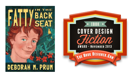
JF: Fantastic, it doesn’t get any better than this. An indelible rendering of the main character could almost become a brand in itself, and the unique lettering adds a hand-crafted feeling to the cover. Leaps off the screen, a real winner.
e-Book Cover Design Award Winner for November 2013 in Nonfiction
Matt Hinrichs submitted Your Wild & Precious Life: Adventures In Conscious Creation designed by Alexandria Zech and Matt Hinrichs. “This design best captured the “you can conquer anything” goal of the book, and the author was very happy with the results.”
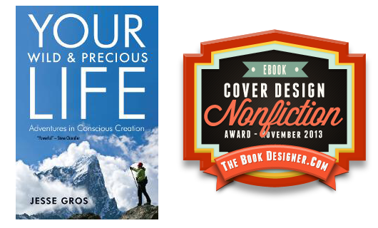
JF: And I can see why. The designer really hits it out of the park with this cover that is both inspiring and beautifully realized. An image that perfectly matches the book’s aspiration, combined with confident typography creates a real winner.
Fiction Covers
A. J. Abbiati submitted Fell’s Hollow designed by Jerry Dorris. “Fell’s Hollow is a dark fantasy, episodic novel. It features multiple main characters struggling to deal with several central plot-lines, but the one common component that ties everything together is the thief-riddled, sorcerer-plagued city itself.”

JF: A beautiful ebook cover rich with texture and in which every detail adds to the overall effect. The whole thing is enhanced by the unique lettering used for the title. ★
Adrienne Thompson submitted Your Love Is King designed by Adrienne Thompson. “Cover art purchased from dreamstime.com. Cover created by the author.”

JF: Like all covers with a white background, this one desperately needs a border to keep it from “bleeding” onto the background. I don’t see much connection between the symbols and, over all, I don’t think the cover tells us anything about the book.
Alandra CL submitted The Sussex Deal designed by Alex Leuschner. “A significant scene near the beginning of the book takes place in an elevator, making it appropriate for the cover. The closed doors of the elevator are meant to make you wonder what is happening behind those doors, providing some mystery. The blood alludes to someone being killed.”

JF: A nice effort that needs some one element to bring it all together.
Alex Rosaria submitted The Weird designed by A.Rosaria.

JF: Beautiful piece of art well suited to this cover.
Alexei Auld submitted Tonto Canto Pocahontas designed by Rose Powhatan. “I worked with artist Rose Powhatan, who shares the same Virginian Algonquian heritage as the protagonist, to create a cover which incorporates their oldest artistic tradition: faceless pictographs on buckskin. The microphone and singing posturing was added for a contemporary twist.”

JF: Just love the way the design of this cover integrates so well with its subject matter. And this is a cover that will stand out from all the “me-too” designs we see over and over again. ★
Amelia Smith submitted Scandal’s Heiress designed by Amelia Smith, with advice from Tara Kenny of Illumination Design Group.

JF: A nice job, although the cover typography seems a bit weak, which is emphasized by the deep drop shadow. A good example of a type treatment that might have been better without the special effect.
Andrew Angelos submitted Where There Be Wolves designed by Andrew Angelos. “I thank you for this site. It’s a great way for first-time authors like me to get a little exposure.”

Annette Gisby submitted The Chosen designed by Ravven. “I’d tried and failed for quite some time to find a model with long white hair to go on the book cover but was having no luck. I wanted a fantasy style cover with a romantic fairy tale feel and I discovered Ravven’s website while searching for fantasy book cover design. I wanted readers to know instantly it was a fantasy novel but also an M/M one and I think she did a fantastic job. Since she was an artist, she painted the long white hair :)”

JF: Lovely job that seems to touch all the bases.
Bee L Kirk submitted City of the Guardians: Introducing Alex Honor designed by Bee L Kirk via Xulon Press. “I wanted a cover that evoked curiosity and suspense. The two characters on the cover are Stilo, the voice of Strength and Rip, the voice of Rage. They represent some of the whispers that are explored in the book. The skyline represents one of the cities that they guard.”

JF: A good effort somewhat undone by the lack of relationship between the two figures and the unnecessarily hard to read title.
Brandy Walker submitted Mary, Meet Dr. Luke designed by Brandy Walker. “One of the designs for a series of Christmas short stories for author Margery Kisby Warder. The author and I decided to try to convey the idea that the viewer was looking into the past. I found that this was easier said than done but, I think that we have created a sense of history with this design.”

JF: A lovely cover that does indeed evoke a historical past.
Bret Norwood submitted Tales of the Credit Card Age: Stories designed by Bret Norwood. “The first thing anyone says is “That’s…uh, not your real card number is it?” While I appreciate everyone’s concern (and implication of how dumb they must think I am), I take this as a compliment. Producing a realistic fake card, although it’s such a simple concept in theory, proved rather hard.”

JF: Graphically clever, not sure if readers will identify this as a book of stories though.
Bridget McKenna submitted Echo Beach designed by Bridget McKenna for Zone 1 Design. “I wanted the sun to be an overwhelming presence, dominating the design and leaving room only for the doomed, outgunned planet Earth on its last day. Not just the sun, but a colossal, swollen monster sun that will soon exceed the boundaries of the solar system.”

JF: And the “bursting” effect is emphasized by the big fat type bursting off the edges of the cover. Hot!
Bridget McKenna submitted Misery Loves designed by Bridget McKenna for Zone 1 Design. “It took a while to come up with just the right model for Misery, who is not so much miserable as deeply petulant. I think this cover art shows her stubborn devotion to her sorrows while revealing an inner toughness that will enable her to change her circumstances.”

Bridget McKenna submitted Red Fuji designed by Bridget McKenna for Zone 1 Design. “For this story about Hokusai, I used a well-known Hokusai painting from 1831. I dropped the type down to let the shape of the mountain carry the viewer’s eye to the information.”

JF: A strong concept, although the busy color palette somewhat obscures the red-on-red title.
Bruce Fottler submitted The Juncture designed by Bruce Fottler.

JF: On book covers, it’s best to leave off the “…by:”.
Carl Grimsman submitted Apache Portal designed by Cover concept by author, digital illustration by David McClellan, typography by Ron Eddy. “I was going for an update on a classic Western movie poster “feel,” while conveying the story’s genres of Western adventure and romance, along with an element of fantasy.”

JF: Despite a number of images that might compete for our attention, this cover manages to bring it all together. This is helped by the clarity and simplicity of the title type and the illustration style. ★
Carlos Moreno submitted Goodbye from the Edge of Never designed by Carlos Moreno. “Cover illustration by Ross Matteson. Art direction and cover design/layout by Carlos Moreno, Auryn Creative. The idea for the design was to convey a more youthful, comic-book style, breaking from the World War Z / Walking Dead look that currently dominates the zombie / dystopian genre.”

JF: Hard to make sense of, however.
Carol Fragale Brill submitted CAPE MAYBE designed by Createspace.

JF: Clearly a step ahead of many covers that simply have type superimposed on a photo. Here, the integration of title and illustration adds another dimension to what might have been a somewhat alienating cover.
Chris Tinniswood submitted TIME HOLES: 13 designed by Chris Tinniswood. “I wanted a close-up detail that would stand out and be atmospheric, too. So, I used a mixture of photography and photoshop to conjure up what I hope is a clear, yet ominous cover image, making the title an integral part of the design.”

Cindy Roland Anderson submitted Discovering Sophie designed by Harbertson Design.

JF: I love the way this cover connects so well to its target audience, and gives us a lot of information along the way. And the designer knows exactly how to focus us on the telling detail. ★
Cora Graphics submitted Darlings of Urban Fantasy (An Young Adult Anthology) designed by Cora Graphics. “Hi, I know and follow the blog since short time but it is very interesting. Thank you for this wonderful initiative. Best Regards Cora”
")
Damon Za submitted Waiting for Romeo designed by Damonza.

JF: Damon shows once again how simple elements, in the right hands, can create an affecting and magnetic ebook cover.
Daniel Klock submitted Fraud at Snowfields designed by Daniel Klock.

JF: A nice idea but a weak execution.
Daniel Silva submitted The Tide designed by D. R. Silva. “This is the first book cover I’ve made for a client. I was a little nervous, but I was given a generous amount of freedom with it!”

JF: Looks like an interesting idea, but the art is so dark it’s impossible to make out what we’re supposed to be seeing. And you might want to experiment with kerning your title.
Dean Crawford submitted Holo Sapiens designed by Dean Crawford. “Designed using GIMP2 freeware design package and various royalty-free imagery blended together. Was aiming for high-impact visuals to really “grab” and entice potential readers.”

JF: Nice job, and the strong colors play to your advantage here.
Derek Padula submitted The Cancelled Generation designed by Derek Padula. “The cover design for The Cancelled Generation is inspired by the Holocaust pins that the Jews were forced to wear in the concentration camps, placed on top of a striped prison uniform. This reflects the book’s content of living during the Nazi persecution in Poland, while being attractive enough to capture the attention of those who do not understand the symbolism. It’s also simple, clean, and direct.”

JF: Not sure how many people will make the connection between the pins and this art, and this cover needs a border around it. There’s also a big imbalance between the art and the title, which looks like it has been shrunk.
Elizabeth McKenna submitted Venice in the Moonlight designed by Lorie DeWorken. “I originally found the stock photo and was drawn to the touch of sadness, longing, and beauty of the model. It fit my main character perfectly. Lorie DeWorken added the moonlight effect and text. I have received many compliments on the cover!”

Emily McDaid submitted Tetherbird designed by Torrie Cooney. “The cover photograph is by A.D. Wheeler. I saw his work on a PBS arts show and I fell in love with his shots, so asked him to tweak an existing photograph to suit the content of my novel, which he was happy to do. Torrie Cooney designed the cover.”

JF: Simple and effective, would have liked to see a stronger title.
Eric Lorenzen submitted Road of Leaves designed by Eric Lorenzen. “Road of Leaves is a fantasy novel. Photo is from Dreamstime (by Leeloomultipass), which I then altered slightly and added text.”

JF: Nice job working with an evocative photo.
Erin Keyser Horn submitted Wings of Thunder designed by Rod Karmenzind. “This is the second book in my YA paranormal series, and it’s the third book Rod has designed for me. It also happens to be my favorite of the three!”

JF: Funny how that white cloud looks a bit like… wings? Not sure all these elements are pulling in the same direction.
Gabrielle Prendergast submitted Betrayed designed by Gabrielle Prendergast. “One of my first professional covers, finally released.”

JF: Okay, I guess, but nothing whatever to set it apart from dozens of others.
Georgina Gibson submitted The Waking Moon designed by Georgina Gibson.

JF: Good example of how limiting your color palette can help contribute to the mood of your cover. And I love the title treatment, well done. ★
Hans Hergot submitted The Moondial designed by Teritori Studios (Henryca Citra). “The illustration features a battle against one of the ice monsters in this fantasy book. It’s interpretive rather than a literal recreation of a scene. That could bother readers who might say, hey it didn’t happen exactly like that. But you’ve mentioned before not to recreate scenes on the cover.”

JF: Well, it’s a very strong piece of art with lots of excitement, although I would have liked to see the title given more attention.
Heather Gilbert submitted God’s Daughter designed by Jon Day.

JF: Can’t go wrong with a simple cover designed to appeal to your genre’s readers.
Imran Siddiq submitted Tyler Nitbone designed by Imran Siddiq. “Tyler Nitbone is a YA Sci-Fi with strong focus on a conspiracy and the fallout of reckless action. I’ve gone for a quirky design that promotes the characters, but leaves much for the viewer to interpret.”

JF: It’s almost coming together (needs a border, or do I repeat myself?) but that orange rectangle really concerns me. A better background treatment might really boost this cover.
J.F. Penn submitted Desecration designed by Derek Murphy. “It was pretty hard to give Derek a good brief – the book has themes of anatomy, body modification, corpse art and the separation of physical body and the soul – but I think he did a great job!”

JF: Wow, creepy and effective, with a nicely stylized title. ★
Jan Ruth submitted WILD WATER designed by Jane Dixon Smith.

JF: Nicely atmospheric, although the title seems to be fighting with the car in the background.
Janelle Stalder submitted Switch designed by Mae I Design and Photography.

JF: An effective paperback cover that could have used a little adjustment for this ebook edition.
jennifer gibson submitted Destiny designed by Jennifer Gibson. “My trilogy series is based on my life growing up with a severe hearing loss and features incredible insights into a silent world. The overall story is about finding courage and inner strength. Stars are a major theme in this book as a symbol of hope. “Find the light within you and let it shine.”

JF: Again, simple and effective.
Jennifer Hotes submitted Four Rubbings designed by Jennifer L. Hotes/Loretta Matson. “Jennifer Hotes did the original paintings, Photoshopped the layers of the cover, created the front/back/spine layouts. Loretta Matson selected the final fonts for all parts of the cover, designed the back cover blurb box, and created final templates for publication.”

JF: A graphically strong cover, I just wish I could figure out exactly what I’m looking at.
Joel Goldhaber submitted Medicine Wheel designed by Joel Goldhaber of Publish Your Words. “The story was set in Sedona, Arizona so the primary cover image was selected from photographs of the area. The stone medicine wheel of the title and the victim’s arm help capture the story in the cover.”

JF: Amateurish and ineffective. Appears to be a story about a dead tree, I didn’t even see the “pasted on” arm at first.
John Hindmarsh submitted Shen Ark: Departure designed by Damon Za. “I thought it would be difficult to design a cover for this story, but Damon delivered.”

Jonathan-David Jackson submitted The Quest for Juice designed by Jonathan-David Jackson. “If you follow the paperback link from the Amazon page, you can see my original paperback cover. I changed it so it would work better as an ebook cover which is a smaller image, by adding more contrast between the text and the background, changing + enlarging the tagline, and moving all the elements.”

JF: One of the few covers I’ve seen where the design was adapted for use on the ebook, and it really made a difference here. However, I don’t see any reason why the author’s name has been flipped sideways. What for? Just a distraction IMHO.
K. Baskett submitted Envelope: Red designed by K. Baskett. “I know red on black is generally a no-no so I will be interested to see if there is any feedback on the way I have decided to implement the color scheme.”

JF: Murky and disjointed, and the red/black combo provides very little contrast.
Kaitlyn Davis submitted Ignite (Midnight Fire Series #1) designed by Kaitlyn Davis. “I’m the author and cover designer! The book is all about love and magic, which I really wanted to get across through an intriguing cover. Thank you!”
")
JF: A bunch of elements, some better than others, that never comes together.
Kay Camden submitted The Alignment designed by Damon Za. “My book is a cataclysmic love story set on a mountain surrounded by conifers. It has magic, warring families, and a powerful celestial alignment. I wanted something dramatic, to capture the vibe of the story, and something simple yet iconic. Damon is a real-life magician.”

JF: It’s got drama, but I wish the title stood out a bit more.
Kaylin McFarren submitted Buried Threads designed by Amanda Tomo Yoshida. “This is an original design by computer graphic designer, Amanda Tomo Yoshida, which was created in one day after a phone conversation involving the story line for Buried Threads. This artist is amazing and knew exactly what I was going for by touching on important aspects of the story.”

JF: A fantastic and evocative illustration that desperately needs better typography.
Kenneth R. Lewis submitted Flight of the Bowyer designed by Kent Lucas. “Flight of the Bowyer is a political thriller set in the rugged wilderness of the Sawtooth Mountains in Idaho. In order to avoid confusion about the story line having anything to do with airplanes, or aeronautical flight, we needed a cover that hinted at what the book is really about: a “bowyer,” a man who makes bows, and arrows, and the “flight,” or distance an arrow travels when shot from a bow. With the dramatic image of a razor sharp broadhead arrow, jutting above the Sawtooths at sunrise, we believe that Krill Press cover designer Kent Lucas has accomplished everything that we asked for, and more.”

JF: A strong cover that serves the book well, would have liked to see the arrow separate a bit more from the background.
Kim Cresswell submitted Lethal Journey designed by Rocking Book Covers.

JF: A very professional cover from a designer who knows this genre.
Kim Kash submitted Ocean City Lowdown designed by Jake Clark. “Jake Clark beautifully captured the girl-adventure hero that I had in mind! It’s the first in a series of mystery novels, and I can easily picture the same concept being applied to more great covers as new installments are published.”

Kit Daven submitted The Forgotten Gemstone designed by Kit Daven. “Thanks to the talented Sean Chappell for his artwork, patience and openness to my design suggestions for the image. Even though the cover feels effortless, the process to getting there was anything but.”

JF: Nice art, but I don’t care for the white background on this cover.
L. R. W. Lee submitted Andy Smithson: Blast of the Dragon’s Fury, Book 1 designed by Dale Robert Pease. “Because this is the first book in a series, I needed something to establish this fact quickly in the mind of the shopper. Dale came up with the header that incorporates the sword, a critical plot element. The header gives it a very professional look while grabbing attention.”

JF: The “crest” at the top is a strong element to carry over in your series.
Latasha Lewis submitted Excuse Me! There’s a Monster in My Closet! designed by Lee Taylor and Kay Casteel.

JF: Lively and fun.
Leona Pence submitted Hemphill Towers designed by Marion Sipe. “Hemphill Towers has three heroines with romantic interests. They reside in the city of Hemphill Towers, but one couple’s storyline takes place ocross the ocean to Italy. Marion Sipe has captured the essence of my book with this cover.”

JF: The crowd doesn’t work for me and, overall, the cover is a bit dull.
Libby O’Loghlin submitted Charlotte Aimes: The Great Alpine Adventure designed by JD Smith Design. “Charlotte Aimes is a YA/teen book set in Switzerland, and much of the action takes place in the Alps, hence the mountainous backdrop. Jane came up with the mobile phone motif because mobile phones and social media feature in the plot. Both stock and Creative Commons (BY-SA) images were used.”

JF: I really like this cover and its attractive heroine, but would like to see the title larger, you probably didn’t need 5 little pictures at the bottom.
Loni Flowers submitted Painted Memories designed by Caol Webb From Bella Media Management.

JF: More of a feint at design, nothing will stand out.
Loni Flowers submitted Taking Chances designed by Carol Webb From Bella Media Management.

JF: See title immediately above this one.
Lucy May Lennox submitted Love In Touch designed by Michelle Marie H. Suan.

JF: An interesting image, but all the type on this cover could use work.
Mallory Rock submitted Sunset Strip designed by Mallory Rock.

JF: A good cover that could be improved by eliminating all the ornamentation on the word “strip” and allowing the illustration to make the point.
Maria Novillo Saravia submitted The Stairwell designed by www.beautebook.com. “Author Mary Silva’s last thriller is about a man’s dreadful discovery in the stairwell of his new house on the beautiful Rhode Island coastline… Part of the story develops on the Narragansett Bay’s surroundings, this is why she asked us to include a picture of the bridge.”

JF: Great job, and a great use of distressed type. Delicious eeriness.
Mark Diehl submitted Seventeen: Book One designed by Rebecca K. Sterling. “I love the barren landscape stretching to a dark horizon and the “Corporate Green” Roman numerals symbolizing the transition from our classical past to our corporate future. The eye reflecting DNA and machinery hints at hidden power structures and the obliteration of all that is wild.”

Mark James submitted A Dark Perfection designed by Mark James/Diana Aguilar. “The cover reflects the ominous nature of the antagonist in this complex political thriller – a serial killer bordering on the Anti-Christ. The looming image of the blood moon over the White House – the juxtaposition of red on white, of evil versus good – is meant to convey this impression.”

JF: It is spooky, not so sure about the rather formal typography.
Michael McCord submitted The Execution Channel: A Political Fable designed by Author concept/Brown & Company design, Portsmouth, NH. “Many thanks for your consideration. I the author) came up with the distressed flag concept with the RA (Real America) logo and Brown & Company did the rest. Best, Michael McCord”

JF: Nicely focused; it works.
Michael McHuff submitted A Lovely Prison designed by McHuff Media NZ www.mchuffmedia.co.nz. “The eBook cover has a black border to prevent fade to background on white backgrounds. I designed this cover myself and I feel it gives a good representation of the core characters and the icy theme. Thanks”

JF: Overall this cover is weak at actually conveying anything much at all about its collection of models.
Mickey Michaels submitted The Diamond in the Onion Suit designed by Mickey Michaels and Lana Castle. “This book is an allegory. Cover idea was mine, executed by Lana Castle with clip art.”

JF: Although you might be able to get away with the casual script used for the title, the Zapfino is completely wrong. It’s out of its normal range of uses, a more formal script battling with a casual one, and not even very readable.
Missy Wilde submitted Into the Summer designed by Missy Wilde. “It’s a cover for an erotica story. The story title works as an extension of the just unclasped bra, thus given the illusion that undressing the girl unfolds the story all along with it. The author’s name is placed similarly to other stories in order to provide for some kind of brand recognition.”

JF: Pretty irresistible, I’d say.
MK McClintock submitted Alaina Claiborne designed by MK McClintock.

JF: A bit overwrought for me, the image composite could use some help, and it’s rarely a good idea to use 3 different script fonts on the same cover.
Murray Kibblewhite submitted The Minke Connection designed by Edder Leyva. “The faces of the two main characters are dominated by the picture of a majestic whale breeching, set against a backdrop of the Southern Ocean”

JF: Nice idea, unnecessarily murky and hard to make out in the end.
Nicki Scalise submitted Prayer for the Dead designed by Rene Folsom/Phycel Designs. “The cover for Prayer for the Dead was a labor of love. I wanted something that captured the moodiness of the story and I think it was done really well.”

JF: I agree. Drama and a clear focus help.
Pamela Kelt submitted The Cloud Pearl designed by Marion Sipe.

Patrick Wong submitted Balancer designed by Damonza. “I wanted a cover which depicts the core concepts of the book without directly showing a scene. The main character is a teenage girl who discovers she has the power to balance life – it mixes symbolic elements of the story– a wildfire, fish, and her light vs. dark choices”

JF: An appropriate title, since the designer has, against all odds, kept all these elements in balance.
Paul Allen submitted Master of Breath designed by Jeroen ten Berge.

JF: Another cover by this same author/designer team took the medal in last month’s awards. Every detail helps to tell—and sell—the story. Nice. ★
Paul Mila submitted Near Miss designed by Create Space/MilaBooks photography. “The book is an underwater thriller/mystery/adventure. Cover photo of a female diver being attacked by another diver with a speargun is the actual diver on whom the fictional adventure is based.”

JF: In the hands of a skilled designer, the photo might have made a really dramatic cover, something that’s pretty much missing here.
Renee Barratt submitted God Said Let There Be Love designed by The Cover Counts – Renee Barratt. “For his debut novel, George G Edwards wanted a cover that made the title the main focus and used the ideas of love and light to illustrate the journey across the world taken by the main character.”

JF: Very cool, beautiful illustration. I love the title and the whole composition, although it would be interesting to see the title in another color.
Ripley Patton submitted Ghost Hold designed by Scarlett Rugers. “This is the second book in my YA paranormal thriller series and by a different designer than the first book, but I think she did an amazing job of making them match.”

JF: A little too quiet for me.
Robert Chazz Chute submitted This Plague of Days, Season II, Episode 5 designed by Kit Foster of KitFosterDesign.com. “When I approached Kit Foster of KitFosterDesign.com about coming up with covers for a horror serialization, he took the idea and ran with it. Each cover had to be distinct but carry a theme. He accomplished both with Seasons One and Two of This Plague of Days. Wonderful artist!”

JF: Yep. Great stuff
Rodney Walther submitted Space in the Heart designed by J Allen Fielder. “Graphic designer J Allen Fielder did an excellent job of capturing the tone of this emotional family drama. The typography of the title seems to especially convey the emptiness of the main characters. And overall, it echoes some of the branding elements from the author’s first novel, Broken Laces.”

JF: The letters have been spaced so much they are at the edge of comprehension, but this is a cover that works.
Ruth Schwartz submitted New & Improved: A Political Thriller designed by Alexandria Zech and Matt Hinrichs. “The author, Peter Engler, already had some definite ideas of the elements he wanted on the cover, and Matt did a masterful job of pulling them all together, down to the right color for the blood on the street sign! I functioned as the “midwife” for this book.”

JF: Combining the pop-art type commercial graphics with more standard thriller visuals gives this cover an interesting dynamic.
S.R. Booth submitted Scinegue designed by Laura Gordon, The Book Cover Machine.

Sally Harris submitted Ruby Marvellous designed by Andrew Brown, Design for Writers. “This bright and cheerful cover by Andrew Brown definitely reflects the tone of this light-hearted, humorous story for 7-9 year olds.”

JF: Looks just right for this young audience.
Sarah Stegall submitted Chimera designed by Sarah Stegall. “Chimera” is about an alien/human shapeshifter living in the Arctic; it is the first novel of an alien-invasion trilogy. The DNA helix echoes the biological puzzle at the heart of the novel, while the captured Earth hints at the coming invasion.”

JF: Great job creating a graphic look that summarizes the themes of the book, well done.
Scot C. Morgan submitted Adamar designed by Paul Pederson. “Cover art is an original work by Paul Pederson commissioned by Scot C. Morgan. Title text and author text design by Scot C. Morgan.”

JF: Beautiful piece of art, but the type has left way too much “negative space” at the top to balance the whole.
Susan Edwards submitted Autumn Dreams designed by Susan Edwards. “Autumn Dreams is book 2 in my Seasons of Love Series. It is a Historical/Paranormal/Native American Romance. The element of an evil spirit in the rock is part of the book.”

JF: Very confused.
T.R. Horne submitted Breaking Mobius designed by Jelena Cedic. “Breaking Mobius is a Contemporary New Adult Romance novel. The cover uses the mobius as a symbolic necklace to show the constraints of remaining in the same cycle of self-destruction. We tried to keep it sexy by using red lips and script that is easy to read and see as a thumbnail.”

JF: Very effective, even with the fussy title font.
Thomas Norwood submitted Perfectible Animals designed by Thomas Norwood. “Hi there Joel, I designed this cover myself using an image from Hybrid Medical Animation who do some amazing work. I’d been looking around for a designer to design something original for my book, but when I saw this image I knew it would be the perfect fit. I’m not a designer but I’ve done a bit of website design over the years and after about 4 days of trawling through fonts and adjusting colors I finally came up with this cover. I hope you like it. Thanks for a great blog by the way. Thomas”

JF: The illustration is interesting, but I don’t think a stencil font is a particularly good match for a sci fi book.
Tracy Tomkowiak submitted Big League Balderdash designed by Tracy Tomkowiak. “My book, Big League Balderdash, is a recreation of the myth of baseball’s origins. Focus on typography, color, form and shape to achieve a balance for the customer’s eyes. Thank you.”

JF: If you think this cover looks like nonfiction, that’s part of the rationale for this book of manufactured myth. Very well conceived and executed, both graphically and typographically. Terrific. ★
Virginia Fox submitted The Dragon Sisters designed by Giorgia Mueller.

JF: Hard to figure out the “offer” here. What’s the book about, what’s the hook?
Nonfiction Covers
Arial Gold submitted Sell Your Novel to Hollywood: How to Write a Novel Hollywood Wants – Marketing Strategies from Bestselling Authors and More, Written by a Hollywood Super Agent designed by BDDesign Online. “The cover is intended to represent the view from the author’s (a Super Agent’s) office in Hollywood.”

JF: A good photo that needs a much stronger type treatment to make a cover with impact.
Bridget Whelan submitted Back to Creative Writing School designed by Simon Avery. “Simon Avery specialises in ebook covers and I am delighted with the clean design he created. Functional and contemporary (no outdated typewriters or quill pens), I feel he really understands the marketplace and how to engage potential readers.”

JF: I totally agree, this cover really uses the ebook cover format to its advantage, and takes a fresh look that will appeal to browsers. ★
Brittany Deal submitted Savvy Girl, A Guide to Wine designed by Tara Long. “This cover was for the first book in the Savvy Girl guidebook series. For the series cover we wanted a logo for Savvy Girl that was fun and sassy but also memorable. We also wanted a clean and elegant design to the cover that not only popped but also said “this is the real deal.””

JF: This cover—which needs a border around it—does a great job of establishing a “brand” for this new series by focusing on its intended readers. ★
Clinton Richardson submitted Richardson’s Growth Company Guide 5.0 – Investors, Deal Structures, Legal Strategies designed by Heather Allison. “This is a guide for entrepreneurs that provides roll-up-your-sleeves counsel on structuring deals and dealing with investors. The cover photo shaped as a bar graph shows the management team of a coal mine in opened in 1923. The mine boss is the author’s grandfather.”

JF: There are so many things to like on this cover, from the careful color palette to the finely-tuned typography and excellent choice of fonts. There’s some graphic confusion from the strong horizontal bar that interferes with appreciating the “bar chart” treatment of the photo (and, of course, it does need a border around it).
Distant Light submitted Social Life-Hacking designed by Nassim Dehouche. “First edition of this dating/social lifestyle design guide.”

JF: A spare look for a book on a rather juicy topic.
Heidi Telpner submitted One Foot In Heaven, Journey of a Hospice Nurse designed by Dan Barr. “When the rights to this book were returned to me, I was ecstatic. I could at last get the cover I’d craved for five years– something clean, clear, crisp instead of maudlin and fluffy. Dan Barr knew exactly what I wanted. I’m thrilled with this cover.”

JF: Very clean and efficient story telling.
JJ Marsh submitted The Triskele Trail designed by JD Smith. “Not a How-To book, but How-We-Did-It, so we wanted an image reminiscent of our own rickety journey through the indie landscape. We also chose this as an image we can adapt for future updates.”

JF: I like the idea, but not the big black circle and slim title type.
Judith Gille submitted The View from Casa Chepitos: A Journey Beyond the Border designed by Dorit Ely. “Cover photo by Bob Weil, author of “The Art of iPhone Photography””

JF: Wow, both cool and hot. Love the typeface, too.
K.M. Weiland submitted Outlining Your Novel designed by Damonza.

JF: Two covers in a series design that emphasizes the “structural” aspect of the title. Clean and clear about what these books offer. And notice the nice outline. ★
K.M. Weiland submitted Structuring Your Novel designed by Damonza.

Kevin Somerville submitted Ad Mad designed by Kevin Somerville. “As this is a collection of the crazy stories from the world of advertising during the seventies and eighties. I tried to capture the craziness in the life of the conceptualizer in the visual. In order to have the thumbnail of the front cover read well in Amazon I kept the title short and simple.”

JF: Nice job, and I like the allusion to Mad Magazine.
Linda Burch submitted Growing Up Borderline: A Mother’s Memoir designed by Linda Burch. “The images of the mother and child represent my daughter and me as she was growing up with a little-known mental illness called BPD. The figures are in shadow because they could represent anyone with her devastating illness. The sunrise represents the beginning of understanding her illness.”

Nicola Furlong submitted Self-Publish Your Ebook in Minutes designed by Nicola Furlong and SerrNovik. “Updated old cover with this lively, fun image by SerrNovik. Hope it conveys how simple epublishing can be. Appreciate your interest and expertise.”

JF: Nothing against you or your book, Nicola, but this is only the latest in a long line of books about self-publishing that are, from a design point of view, disappointing to say the least.
Roscoe Welply submitted The Ultimate Guide to Charlie and the Chocolate Factory designed by Roscoe Welply.

JF: A good looking illustration that’s overwhelming the title.
Rudy Mazzocchi submitted STORYTELLING – The Indispensable Art of Entrepreneurism designed by Ardy M. Scott.

JF: Not the yellow brick road I remember. Mystifying.
Tao Ou submitted Generation Y designed by Pere Ibañez.

JF: This is a book of photography, and the cover will be recognizable to the photographer’s fans.
tatlin .net submitted The Brazilian Jiu Jitsu Globetrotter designed by tatlin.

JF: A lively, fun, and colorful cover perfectly suited to this adventure memoir of a ju-jitsu fan. ★
Well, that’s it for this month. I hope you found it interesting, and that you’ll share with other people interested in self-publishing.
Use the share buttons below to Tweet it, Share it on Facebook, Plus-1 it on Google+, Link to it!
Our next awards post will be on January 13, 2014. Deadline for submissions will be December 31, 2013. Don’t miss it! Here are all the links you’ll need:
The original announcement post
E-book Cover Design Awards web page
Click here to submit your e-book cover
Follow @JFBookman on Twitter for news about the E-book Cover Design Awards
Subscribe to The Book Designer Blog
Badge design by Derek Murphy
