

Welcome to the first edition of the e-Book Cover Design Awards. This edition is for submissions during August, 2011.
Here’s what we received:
36 covers in the Fiction category
4 covers in the Nonfiction category
1 cover rejected because it was designed by me (thanks, Larry!)
I was surprised so few nonfiction books were entered, and I hope we get a lot more for September’s edition. Since this is the first time we’ve run this competition, there were bound to be a few hiccups.
Errors and Omissions
Badge Problems
Apparently due to the bad weather these past few weeks, the factory that produces blog sidebar badges is way behind schedule, so our supply of sidebar badges for the Award winners has not arrived yet. They’ll be here before next month’s contest, and I’ll personally email today’s winners when they come in.
Links? Where are the Links?
Okay, I really wanted to link to each person who submitted a cover. However it seems that I neglected to put that field on the submission form. My bad. I’ve corrected that, so starting next month each cover shown in the Awards post should come with a link.
Award Winners and Listing
I’ve added comments (JF: ) to many of the entries, but not all. It was great fun going through these and I want to thank everyone who participated. I hope you enjoy these as much as I did. Please leave a comment to let me know what you think, too.
Now, without any further ado, here are the winners of this month’s e-Book Cover Design Award.
e-Book Cover Design Award Winner for August 2011 in Fiction
Lara submitted The Life and Times of Mr Grimez in the Fiction category. Design by Andy Fielding. “This is a poetry collection about the Anti Hero Mr Grimez. I email Andy an epic email full of vague words and descriptions of how I want to feel when I look at the cover but not much on what the cover should include. Still he manages to work wonders, producing what I think is this rather lovely cover. More of his stuff can be found at www.andyfielding.co.uk.”
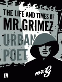
JF: This cover, by a professional designer, embodies most everything that I like about the new generation of e-book covers. It is specifically for the e-book, and does not imitate a print book cover. It’s proportions are different, and the whole visual approach is obviously tailored just for the online world. The limited palette of colors helps to emphasize the design, and the whole tone of the cover appears to represent the dark urban novel by Greg Griffith very well. Really effective, and well done on all counts.
The Life and Times of Mr Grimez on Smashwords
e-Book Cover Design Award Winner for August 2011 in Nonfiction
Leonard Kinsey submitted The Dark Side of Disney in the Nonfiction category, saying “Model: Draven Star, Photographer: Alan Partlow, Designed by: Pentakis Dodecahedron. The cover was designed to work for both paperback and e-book formats. The main consideration was that it looked good as a thumbnail and in B&W. Legibility of the small text wasn’t a huge concern, although obviously the title needed to be legible at any size.”

JF: This somewhat tongue-in-cheek cover does a good job of imitating a pulp cover of the 1960s, and I like the attention to details like using the “Disney” typeface on the author’s name, the color combinations and, if you look closely (you might have to check the cover on Amazon to see this) the background actually looks like an old beat-up paperback. While I usually avoid black on red typography because it can cause serious legibility problems, the humor and shock value of this cover made it a clear winner. (The subtitle, by the way, is “The Anarchist Cookbook of Disney Travel Guides.”)
The Dark Side of Disney on Amazon.
Fiction Covers
Rhonda D. Tibbs submitted Angel’s Blues in the Fiction category, saying “My novel, Angel’s Blues, pub. 2010..”

JF: You can clearly see how important font choices are here. Despite the atmospheric artwork, the title is virtually illegible.
Toni Dwiggins submitted BADWATER in the Fiction category. Design by J. Simmons. “Ecothriller.”

Stephanie Dagg submitted Beat the Hackers in the Fiction category. Design by Caitlin Dagg. “This is great idea to encourage us all to appreciate book covers more..”

Deb Dorchak submitted Bonds of Blood & Spirit: Loyalties in the Fiction category. Design by Deb Dorchak/Blue Sun Studio, Inc. “Hey Joel! This is a fantastic idea. I hope we make the cut!.”

JF: A beautiful piece of artwork combined with suggestive typography makes this an effective cover.
Guido Henkel submitted Curse of Kali in the Fiction category. Design by Guido Henkel, Gary Crump.
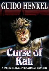
JF: The designers show how understanding and controlling the basic elements of the cover can lead to a dynamic and powerful effect.
Hen House Press submitted Fiction Noir: Thirteen Stories in the Fiction category. Design by Rick Tannenbaum. “An anthology containing thirteen stories, each driven by strong narrative, evocative scenes and a hint of the dark side. Released 8/15/2011 by Hen House Press.”

Julie Wolf Scott submitted First Wish in the Fiction category, saying “In the final stages of editing, I was looking for a new title and digging for inspiration through clip art. Though you can’t see it so much in the the smaller files, there is actually a reflection of the butterfly below it. It was originally either a black and white photo or an albino monarch butterfly. I knocked out the white in the wings and dropped a sunset in behind it, giving the butterfly a fabulous sunset on her wings. This went perfectly with the story, because Desdemona, who is an artist, creates a painting full of butterflies, and each of them displays a part of her life on their wings. You’ll have to scroll down a bit on my blog address I put on here, but it’s the biggest file I have online and shows the work the best. Thanks so much for the opportunity to share it! Julie Wolf Scott.”

JF: A lovely effect that would be even better with stronger typography.
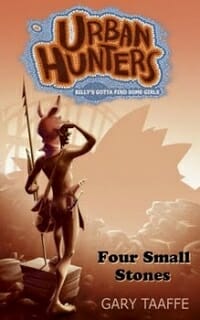
Gary Taaffe submitted Four Small Stones in the Fiction category. Design by Toby Quarmby. “Four Small Stones is Episode 1 in the Urban Hunters series.”
D. Miles Martin submitted Good Deeds in the Fiction category.

Rahma Krambo submitted Guardian Cats and the Lost Books of Alexandria in the Fiction category, saying “Cover designed by Jamila Diallo.”
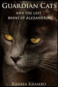
JF: How can you not like this photo? Although the typesetting has been done with care, it needs more emphasis.
Natasha Slight submitted Guardians of the Grimoire in the Fiction category. Design by Natasha Slight. “I had to learn Adobe Illustrator over the summer to do this, but in the end (for a newbie), I think I got something that captures people’s attention.”
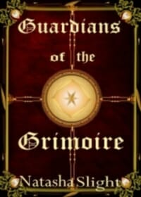
JF: Those Illustrator skills will come in handy, next step would be to study typography.
James Finn Garner submitted Honk Honk, My Darling: A Rex Koko, Private Clown Mystery in the Fiction category, saying “This is designed by the man who also designed my webpage, Airan Wright. I wanted type that could be easily seen in a thumbnail, plus a graphic element or two that suggest the circus ghetto setting. For that reason, I also insisted on bright, almost garish colors.”
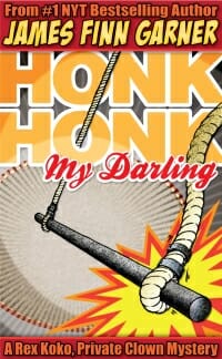
JF: This cover has some of the most sophisticated typography of all the covers this month, and professional-quality illustration. What held it back, in my view, was the difficulty making out what exactly the illustration is, and what meaning it has. Also, having so many strong elements on one cover has led to a bit of graphic confusion.
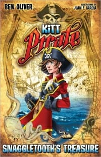
Ben Oliver submitted Kitt Pirate: Snaggletooth’s Treasure in the Fiction category. Design by Guido Henkel/Juan F. Garcia/Thu-Lieu Pham. “Cover of a newly released middle-grade children’s book.”
Roz Morris submitted My Memories of a Future Life in the Fiction category. Design by Roz Morris.

JF: Although I really like the combination of images and color palettes in this cover, there’s a problem with making the “Episode” designation stronger and more prominently placed than all the other type elements.
Karen Pokras Toz submitted Nate Rocks the World in the Fiction category, saying “I did … connect with Deana Riddle from Bookstarter.com & she totally understood my vision. I could not be happier – I hope you agree! ~Karen.”
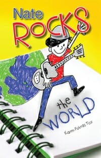
JF: Simple and effective—nice job.
Michael L Shone SR submitted No Smoking 101 in the Fiction category, saying “A “Quit Smoking” adventure story. Set at sea, every cliche know to human beings is presented in an adventure that includes the crew of the ship yacht, “Pamalotta”. Science fiction and cold hard facts move together in Murphy’s Law fashion to have you gripping the rail. . .”

Hen House Press submitted One Way Out: Tommy Pulls the Trigger in the Fiction category. Design by Rick Tannenbaum. “Fast paced crime fiction, filled with suspense, twists and a surprise ending that leaves readers satisfied.”

JF: This cover signals its genre very effectively with in-your-face-graphic and distressed type. But I’m left to work out whether it’s part of a series, which would account for the title: subtitle combination.
Lisa Rivero submitted Oscar’s Gift: Planting Words with Oscar Micheaux in the Fiction category, saying “Oscar’s Gift is a work of historical fiction for ages 8-12. Oscar Micheaux was a film maker and novelist, and the photos used on the cover are historical, public domain photos of Micheaux, a boy in 1900 plowing a field, and a still shot from the silent film, The Great Train Robbery, which is mentioned in the book.”

Tara Woolpy submitted Releasing Gillian’s Wolves in the Fiction category. Design by Pat Bickner. “Photo credit: Tom Nimsgern.”

JF: A lovely and effective cover. Although the type has been done with care, this font will cause legibility problems when it’s reduced. You can see the very thin parts of the letters already starting to disappear at this 200 pixel size.
Catherine Ryan Howard submitted Results Not Typical in the Fiction category, saying “My first self-published novel, to be released mid-Sep 2011. Andrew Brown of DesignforWriters.com (UK) did this for me.”
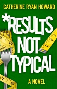
JF: Clearly one of the most professional covers we received this month, this design does everything you want in an e-book cover by creating a strong and unique “brand” for the book and clearly communicating something of the tone as well. (I keep wondering what this cover would look like with a different color background.)
William Mize submitted Resurrection Angel: A Denton Ward and Monty Crocetti Mystery in the Fiction category, saying “I came up with the original layout, stock photo, font, etc. then the beautiful and talented Dominique Facile (her facebook is here: https://www.facebook.com/people/Dominique-Facile/587339116) cleaned it up all pretty.”

JF: This is a good example of a book cover that could work quite well in print, yet doesn’t work very well at all as an e-book cover. Very faint type and an image that will become harder and harder to discern as it’s reduced.
Zaven Babloyan submitted Sudoku from an Old Newspaper in the Fiction category. Design by Dmitry Rastvortsev. “It’s a cover for the crime drama story by Alexey Nikitin (translated from Russian into English).”
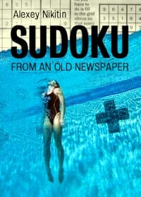
JF: Another strong cover in the crime genre with clean typography and a clear visual message.
Guido Henkel submitted Terrorlord in the Fiction category. Design by Guido Henkel, Gary Crump.
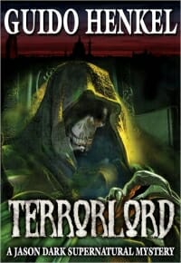
JF: Guido Henkel and Gary Crump again show how they have mastered this type of supernatural cover design.
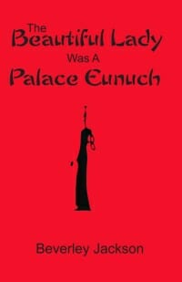
Beverley Jackson submitted The Beautiful Lady Was A Palace Eunuch in the Fiction category, saying “Actually it is historical fiction—lots of interesting information on life behind the walls of the Forbidden City during the reign of the last empress dowager. And some most unusual murders performed by the beautiful actor eunuch who plays only female roles in Chinese operas in the palace theatres and has bound feet. He kills with those 3-1/2 inch feet. Actually kills very evil people who deserve it!!!.”
A.R. Williams submitted The Blessed and the Damned in the Fiction category, saying “Genre: Fantasy, Sub-genre: Dark Fantasy.”

JF: This cover is for a novella (or “novelette” as the cover has it) of about 11,000 words. It’s effective as an e-book cover, but I’d prefer to see the title with more room. Perhaps the author is intending a series that highlights his name instead, a common practice in genre fiction.
Will Entrekin submitted The Prodigal Hour in the Fiction category, saying “Hey Joel. It’s a pre-/post-9/11 time travel novel. A literary sci-fi thriller. ~Will Entrekin.”

JF: Love that Trajan. Entrekin continues to produce good-looking and atmospheric covers for his books.
Dwight Okita submitted The Prospect of My Arrival in the Fiction category. Design by Createspace designer.

William Gough submitted The Terra Nova Quartet: Chips & Gravey in the Fiction category. Design by Bronson Smith. “I’m sending my Quartet—more that 25 years in the writing—First Book published at Breakwater Books in 1984. Bronson did 4 original paintings, one for each cover. And designed a series of spacers that advance the books—a different spacer for each book—all on the same theme. He designed the back cover author photo to reflect the changes in the book-by-book design. In may opinion, he created a work of
visual art & matched totally the inner vision of the Quartet.”
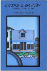
JF: I love series designs, and this one has some terrific art. As with other covers here, very weak typography does not help these covers, and there’s no apparent reason that the layouts vary from book to book.
Christine Frost submitted The Veiled Mirror: The Story of Prince Vlad Dracula’s Lost Love in the Fiction category. Design by Dimas Reyes. “Published October 2010.”

Christina Li submitted We Stand Together in the Fiction category, saying “This book is by Sonya Noble, a 14 year old. It is the first in her clones series. She designed the cover herself through CreateSpace cover creator.”

JF: Although this cover is rather generic, by keeping it simple the teenage author/designer has created something that is, at least, simple and effective.
Ken Davis submitted Where the Dead Talk in the Fiction category. Design by Ken Davis & Mike Bear. “Indie horror novel. I did the layout myself, and the art was done by San Francisco artist Mike Bear.”
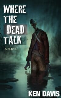
JF: Another terrific and atmospheric piece of artwork. This grunge typeface, Cracked, needs a rest and is in serious jeopardy of overexposure. The cover also includes some faint boxes behind the type that don’t seem to add anything but distraction, but overall it’s quite effective.
Nonfiction Covers
Laura Pepper Wu submitted 30 Day GMAT Success 2nd Edition in the Nonfiction category. Design by 30 Day Books. “We strived to create a cover for ’30 Day GMAT Success’ that conveyed our aim to help GMAT takers feel calm and relaxed about the impending test. The style of the book is warm and supportive, encouraging test takers to feel more ‘Zen’ about the exam. The calendar also reflects the 30 Day study schedule that the guide is based around. Thanks for giving us a chance to enter the e-Book Cover Design Awards! —Laura Pepper Wu on behalf of Brandon Wu.”

JF: While I admire the thoughtfulness that went into this design, it’s difficult to see how browsers will equate piles of stones with test prep. Like many covers here, the designers need more work on their typography.
David Kudler submitted A Joseph Campbell Companion: Reflections on the Art of Living in the Nonfiction category. Design by Richard Patterson. “I love the color in this—both the way it pops and the way it draws your eye into the picture. Wouldn’t work on a print book–too saturated—but for an ebook, it’s lovely. I think.”

Christina Li submitted Defeat Fear Forever in the Nonfiction category, saying “This cover was designed using the free program CreateSpace cover creator..”

JF: Done with the help of template software, this cover has a delicacy that I like, but the title typography is weak, and I keep wondering about the connection of the eagle visual with a book about overcoming fear.
Peggy Trentini submitted Once Upon a Star in the Nonfiction category. Design by Paul Rivera.
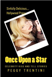
JF: A carefully-designed cover, but I have to say I’ve never seen a celebrity tell-all that was done with so much black. In this case, it seems a bit funereal for the story of a Hollywood ingenue.
Well, that’s it for this month. Thanks for your participation, and be sure to leave a comment to let me know what you think.
