I wrote an article about six months ago about three typeface combinations I really liked. It was in the comments to that post that I met Douglas Bonneville, a designer and typographer who is the proprietor of the BonFX Graphic Design studio near Providence, Rhode Island.
It turned out that Douglas had been exploring the 19 most popular fonts in history, and how they combine with each other. He blogged repeatedly about the typefaces he had identified and showed how they could be combined with each other.
This is a question that comes up often with people trying to design and produce their own books. “What font should I use,” is one of the top 3 most popular questions I get from self-publishers. It’s not always easy to answer this question, and one of the reasons is that most books use two main fonts: one for the text and one for “display”—chapter openings, subheads and similar elements.
You might like Garamond, but the next logical question is, “What font goes with Garamond”? There was no easy way to answer this question. There are a few combinations that seem natural, for instance typefaces from the same designer which show similarities that might lend themselves to being used together, but that’s no rule.
So I was pretty excited to see Douglas’ work, and even more so when he brought together the work he had done and published it as an iPhone app, Font Combinations
Font Combos for the iPhone
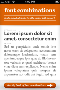
This app ($1.99, iTunes) is a simple and clever way to show hundreds of fonts in combination. The top of the screen has fonts used for display, the bottom fonts used for text. By using the iPhone’s touchscreen you can flick either the top or bottom display to rotate through the available typefaces, showing the two fonts onscreen.It’s fun (if you’re interested in typefaces) and you can hone in on combinations that you particularly like. Here in the screenshot you can see one of my favorite combinations, mentioned in my blog post. It pairs Myriad Bold with Caslon.
Much as I liked Douglas’ iPhone app, I knew he was working on a much more ambitious version of this presentation.
The Big Book of Font Combinations
Now Douglas has pulled together all his research and his prodigious typographic design skills to create a real resource for typographers and anyone who has to work with type.
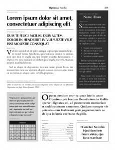
It’s the Big Book of Font Combinations, and it’s available now as a PDF ebook for $24.95. The book is over 370 pages, most of which are devoted to showing how these fonts work together.But Douglas has gone farther than just putting two typefaces together. He’s created a really useful page of samples for each combo, including showing you how the typefaces look:
- In regular, bold, italic and bold italic fonts
- With initial drop caps in both regular and bold variations
- Reversed as white against a black background
- Overprinted on a light tint
- In two different forms of tabular composition
- Centered in a ruled box
This makes for a page that is crammed with information, but in a good way. The book acts both as a type specimen book for these wonderful typefaces, but also as a fascinating resources about how they complement or contrast with each other.
In the sample page above you can see a combination of Optima and Bembo, two typefaces I would never have thought to combine, yet they have an odd harmony. It’s discoveries like this that are the best thing about the Big Book of Font Combinations. Seeing even familiar typefaces in a new way through combinations and the subtle effects one type design exerts on another when close by.
Bonneville includes some useful explanations of how his project took shape, and shares his delightful 29 principles for making great type combinations which includes:
7. Find some kind of relationship between the basic shapes. For instance, look to the letter O in upper and lower case. Round letter O’s and taller oval O’s, in general don’t seem to like each other when creating pairs.
And also:
17. Study and learn the classic typefaces on their own. Print them out and stare at them at lunch. Once you know them pretty well, then think about how they work with other typefaces. You’ll know much more going in to solve your design problem.
Who Is it For?
It might be hard to justify buying this book if you think you will only ever create one book of your own. But fonts are all around us. Many people have never ventured past the Times New Roman and Arial on the font menu of their word processor, and this book might inspire them to present their work in a new way.
And there are new tools spreading on the web and yet to come that will bring much better control of typography to many online experiences. The Big Book of Font Combinations might prove to be a useful resource down the road.
And for designers, typographers or anyone who works with setting text in type, the book is a treasure trove of inspiration and a great addition to your type library.
Image licensed under a Creative Commons Attribution 3.0 License, original work copyright by jm3, https://www.flickr.com/photos/jm3/


