

I bet, like me, you’ve been using Microsoft Word for years.
One of the most common complaints you hear from professional book designers, cover designers, typographers, and some self-publishers is that you can’t create a “real” book in a word processing program like Microsoft Word. I’ve taken a few of those shots myself.
There is another camp of do-it-yourself self publishers who wouldn’t use anything else. Either Word or the open source program Open Office are their preferred tools.
They eliminate book designers and typographic design because they view them as unnecessary expenses. These publishers are in the information publishing business as far as they’re concerned. Their readers want the information, they’ll get it without the need for ligatures, Adobe fonts, or page layout programs.
I think some of these publishers go overboard. It’s almost as if they want to create books that don’t look like any book you’ve ever seen, just to show they can do it.
But quietly, under the radar, at least one author who uses Word but also loves typography was out there. Someone who can make Word jump through hoops I didn’t even suspect were there.
Today you’re going to meet her, Elizabeth Beeton of B10Mediaworx, who writes and publishes under the name Moriah Jovan.
Beeton/Jovan (Jovan from here on out), who is active in the Mormon writer scene, uses B10Mediaworx to publish her own books of genre romance and to provide ebook conversion services to other publishers. And she does her own design and typesetting.
The Design Review of “Stay”
I met Moriah on Twitter, and when I started reviewing self-published and largely self-designed books for Self-Publishing Review, Moriah was one of the first to send me a book, which I dutifully reviewed.

Click to enlarge. Notice how in this elegant spread from Stay, although there is no hyphenation, Moriah has eliminated the usual rivers of word-space gaps typical of word processor typography.
I was surprised at how good the book looked, since I’ve seen a lot of DIY self publishing. Moriah’s book was elegant, the typography was carefully done and sensitive. The few minor quibbles I had with the design did nothing to detract from the lovely look and feel of the book.
Later, I was surprised again to find out that Moriah had done the whole book in Word, and it made me start to question my assumption about the capabilities of the word processor.
Just because everyone else using Word was turning out pages in Times Roman or Palatino that looked primitive to my eyes, that didn’t mean you couldn’t do better.
A Whole New Look for Microsoft Word Typography
I asked Moriah to send me some screen shots of her work. Here’s a spread from Out of the Mount, a collection of 19 plays by a variety of authors:

Click to enlarge.
This is a pretty sophisticated piece of typography. Note the small cap lead ins for the dialogue, and the effective artwork and layout of the display page. Does this look like something you’ve ever seen in Microsoft Word? No, it didn’t look that way to me, either. But there was more to come.
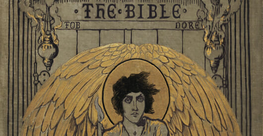
The FOB Bible
Then I got to look at The FOB Bible, and I was really blown away. This book, the work of eight authors, is described as:
The Old Testament re-imagined through poetry, verse, closet drama, e-mail, and short story. At once irreverent, whimsical, sexy, feminist, and poignant.
Here’s a spread in the book shown in Microsoft Word 2000 for Windows. This is Moriah’s preferred platform, and she has the program highly optimized for the kind of work she does in typography and ebook conversions. (She’s still using this program that’s almost 10 years old because her customizations can’t be ported to newer versions.)

Click to enlarge. Note the Word codes and page structure in this view.
Here’s another page I want you to see. Here Moriah is constructing a 2-column spread in Word:

Click to enlarge.
Once again she’s left the codes and page structure showing in this Word view. Here’s a detail:

Click to enlarge. Note Moriah's use of Word Customization
And finally, here’s the page as it looks in the reproduction-quality PDF:

Click to enlarge
The typography is clean and appropriate, there’s an adept use of white space, and a lovely balance on the page. But not only that. These narrow columns are challenging for any typographer. Here she’s managed to get pretty good spacing and tone without the fine tuning and advanced handling of fonts available in InDesign.
Okay, before I stop, here’s one more spread from The FOB Bible, more multi-column goodness from Word:

Click to enlarge
Sure, if you look closely you’ll see lines that are too loose, that would not happen in InDesign or a similar typographic program. But when I look at these pages, I constantly have to remind myself they are from Word.
What Word Can’t Do
Despite Moriah’s artistry, there are still things a word processor can’t do as well as layout software.
- you cannot get the typographic functions of a program like Adobe InDesign in Word
- it’s much harder to get the same effect in Word than it is in InDesign
- you can’t use Word as an output engine in the same way you can use InDesign for reproduction
- no matter how good you get, you’re still using a tool designed for one purpose to do something different
Would I want to do a book design in Word? No, thanks. But that doesn’t mean you can’t do it.
A Few Tips from Moriah
I asked Moriah what tips she would share with other people trying to create great looking books in Word or Open Office. This is what she had to say:
- Styles: Using styles makes your work consistent. Assigning hotkeys and/or building a tool bar to assist you is imperative in streamlining the process. This takes time to set up, but you’ll find the end result a) saves you time and b) saves you grief.
- Macros: If you find yourself doing the same things over and over again, record a macro. Again, this is to streamline your process and to make everything consistent across the text. Assign hotkeys and/or build a tool bar.
- Hidden characters: Watching spaces, tabs, hard returns, soft returns, line breaks, section breaks lets you know why Word won’t let you do certain things and/or how to fix something. At first you will find it disorienting, but once you get used to it, you won’t work without it. Part of this is to use page view with margin lines on.
- Page breaks: Learn how to use section breaks properly. It saves you time and makes running headers much easier to deal with and it will help you not get lost as to which pages are even and odd.
To me, one thing Moriah’s work proves is that the books we see that look bad, only look that way because the author couldn’t work out how to make it look the way it ought to, or wasn’t as persistent as Moriah Jovan, or didn’t know any better. It isn’t because of the tool that was used the create them.
I called this article The Art of Moriah Jovan for a reason: she is a true typographic artist, no matter what tool she’s using. So when people tell you that you can’t make a good-looking book in Word, now you know the truth: you just can’t say that any more.
You can find out more about B10Mediaworx and Moriah Jovan’s books at B10Mediaworx.com and you can connect with Moriah on Twitter at @MoriahJovan
