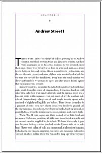
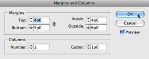
In the chapter opening page you can see the understructure of the page I’ve laid out for this book. The first thing is to note the margins, because the margins determine the type column’s size and its position on the page. Margins are, in effect, where the type is not.
Classical Forms Endure
Studying old models of classical book typography, it’s often surprising to see just how big the margins are. Style today is for much smaller margins, but keeping some of the same proportions from those old models gives your book page a grounding in a harmonious relationship between the dark and light parts of the page.
Although there’s nothing specifically classical about this arrangement, I do have a larger outside margin than the inside margin, and when I’m finished laying out out the pages the bottom margin will be larger than the top margin. You want to keep the inside margin—the one in the gutter or at the binding—smaller than the outside, because when the book is held open this will essentially double in size, combining the inside margins of both pages in a space in the middle of the book.
Ed: Since writing this article, I’ve changed the way I handle margins in books intended for print on demand publication. These books often have “tighter” spines than books printed by offset, and that requires a larger gutter margin to make sure the type doesn’t “disappear” into the binding, which would make the book hard to read. So the point I made here about the margins “doubling in size” is far less important than delivering a book that reads well. For this reason, my inside (or gutter) margins are frequently as large—or even a bit larger in a long book like this one—than the outside margin. The best approach is to set your book up and get a sample copy from the PoD vendor who will produce the book so you can examine it directly. That’s the best test of all.
Did you notice the margin lines in the page layout were a purplish color? Adobe InDesign CS4, which I’m using for this book, usually has the margin lines in red. But because a blue-outlined text box is placed directly on top of the margins, it changes the lines to purple. Pretty cool, huh?
There’s actually a lot of hand work to setting these pages up properly. In this chapter opener there are lots of elements to deal with:
- A chapter number
- Typographic ornament
- Chapter title
- 3-line drop cap to start the chapter
- Small cap letterspaced 4-word run in to begin the text
- Drop folio
In addition, the spacing between all the elements has to make sense, and create a pleasing harmony on the page. I had to experiment with the letterspacing to get a nice rhythm reading it, without the letters floating so far apart they disengage from each other.
The large capital has to be adjusted by hand, because “out of the box” they never line up with both the bottom line and the top line quite right. And the space between the cap and the three lines of type always seems to need adjusting.
Book Page Spreads That Hang Together
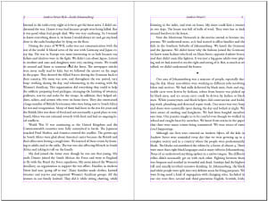
Flip the page and here is the first 2-page spread in the narrative. Because this is a lengthy book, with many long paragraphs, the typographic design seemed even more important. The text type is Adobe Garamond Pro, in my experience one of the easiest-reading typefaces for books I’ve ever used. Myriad Pro does the display duties.A 6″ x 9″ book like this would typically have 31 to 33 lines of type per page, while this one has 38. The Adobe Garamond Pro was set at 10.75 points on 13.50 points leading. My desk is still full of test pages that I sat and read through trying to gauge just how much I could get on the pages of this story without fatiguing the reader.
Note that on the spread, although we are using most of the page, and don’t have the luxury of very large margins, the layout of the type and the type-to-paper relationship is actually generous. The larger outside margins give a sense of spaciousness, and I’ve used the running heads to create some apparent space at the top of the pages as well.
It’s so easy to read that I was actually surprised when I did a quick word count and found I had 877 words on this 2-page spread, comfortably over the 820-word target I’d set for myself to get to a decent book length. For so much text, it works well—and that includes a text break, the rest between subjects or scenes, here marked by an extra space and the use of a small diamond-shaped text ornament.
When Book Design Works, It’s The Reader That Wins
I’m sure this page layout will continue to get tweaked as it passes through the normal approval process, but the basics established here demonstrate that the finished book will be successful. What makes a successful book design? It has to meet at least these criteria:
- The design is largely unnoticeable. It conveys the author’s words without drawing undue attention to itself.
- Typefaces chosen are appropriate to the kind of material in the book, the expected readership, and the necessities of the production process.
- Physical properties of the book and the reader are kept in mind, since the reader will interact with the book as a physical object.
This book is well on its way!
Takeaway: Attention to margins, typefaces, word counts and other details of page layout ensure a book page design that’s appropriate for the unique needs of an individual book.


