


When designing your book cover, it's important to be aware of the current typography trends, among other things. Typography is one of the key elements of a great book cover, and the cover determines whether or not your book can attract readers in the first place.
Choosing the right typeface helps your book cover catch a reader's eye and give them an idea of what it's about. In 2023, book cover typography trends range from bold and modern to classic and elegant. Understanding these trends is important for any author who wants their book to get noticed.
In this article, we analyzed the covers of the most popular books of the year and made a list of the most current trends for you to explore:
Bold Serif Fonts
Bold serif fonts are a strong trend in book cover design for 2023. Serifs are the little strokes or "feet" at the ends of letters. Serif fonts on book covers often aim to present a serious or authoritative image. They're perfect for genres like history, biographies, or any subject where the author wants to establish trust with the reader.
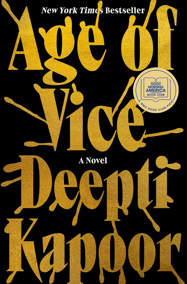
The Wager by David Grann uses a weighty serif font, matching its intense themes, while Age of Vice by Deepti Kapoor's textured serif hints at a complex, layered story. Both covers use bold serif fonts to command attention and promise engaging content.

If you're considering a serif font for your book cover, think about what the style of the letters says about your book. Is it formal? Traditional? Choose a font that matches the message you want to convey. The right font not only draws readers in but also tells them what kind of book they're picking up.

Minimalist Typography
Minimalist typography is about keeping things simple and clean. This style uses basic fonts without extra details and usually has a lot of white space on the cover. It's great for making a book look modern and easy to read. This trend works well for many kinds of books, from novels to non-fiction, because it appeals to a wide range of readers.
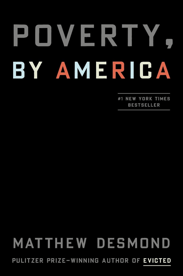
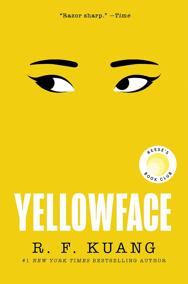
For instance, Poverty, by America by Matthew Desmond and Yellowface by R.F. Kuang are good examples of this trend. Their covers have straightforward fonts and lots of space, which draws attention to the book titles and authors.
To pull off a minimalist typography look, find a balance between keeping it simple and making it interesting. To do this, choose a font that's easy to read but also has a unique style. Also, think about how the white space on the cover can help focus the reader's attention on the most important details — like your book's title.
Sans-Serif Fonts with Clean Lines
Sans-serif fonts are a great choice for book covers, especially for modern and non-fiction titles. These fonts don't have small lines at the end of each letter, giving them a clean and contemporary look.
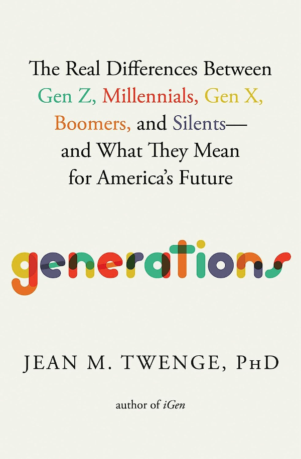
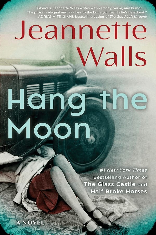
On the cover of Generations by Jean M. Twenge, bold, colorful letters reflect the book's focus on the clear-cut differences between various age groups. Another example is Hang the Moon by Jeannette Walls, which uses a sans-serif font to match the contemporary feel of the novel.
Sans-serif fonts are versatile for print and digital formats. They are clear and readable even on smaller screens, like smartphones and e-readers. When choosing a sans-serif font for your book cover, consider how it will look both online and in print. A simple, bold sans-serif font can help your title stand out no matter how readers are looking at it.
Prominent Typography over Busy Backgrounds
Big, block capital letters on book covers are becoming more popular. These large letters grab your attention right away. When they're set against busy pictures that show things like animals or nature, the cover feels full of life. This design can make someone curious about the book and eager to dive into its pages.
For example, books like Weyward by Emilia Hart and The Berry Pickers by Amanda Peters use this trend. They combine big text with lively backgrounds to promise exciting stories. This style works well for adventure books or any story that takes you to another world. It tells readers that they're about to enter a place that's different and full of surprises.
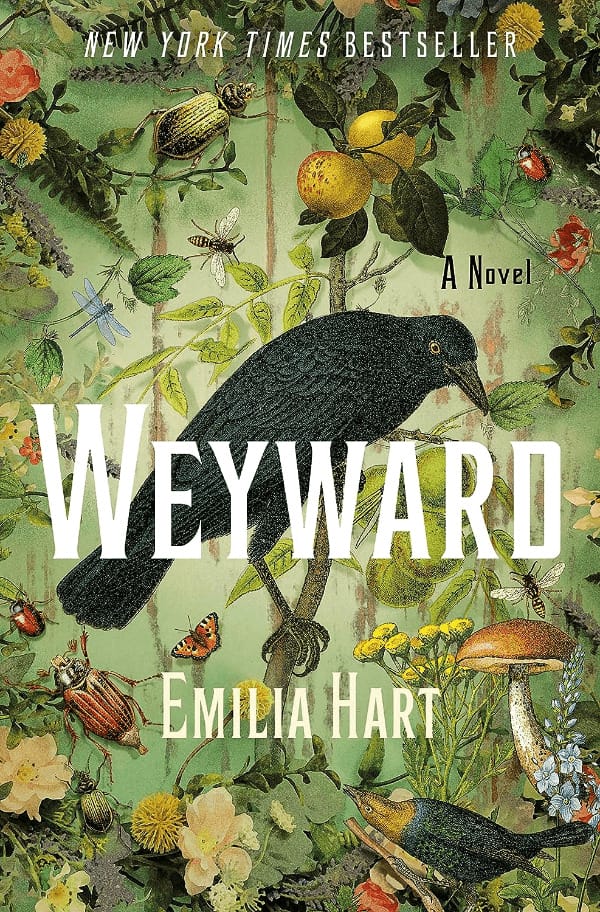
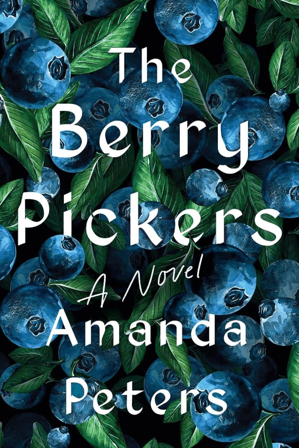
When designing a book cover like this, it's important to make sure the big letters are clear so they don't get lost in the highly detailed background.
Hand-Drawn Letters and Illustrations
Hand-drawn typography adds a personal touch to book covers you can't get from standard fonts. This style often gives a friendly and creative feel, which is great for stories that are meant to feel personal. The unique letters can help a book stand out because they're one of a kind.
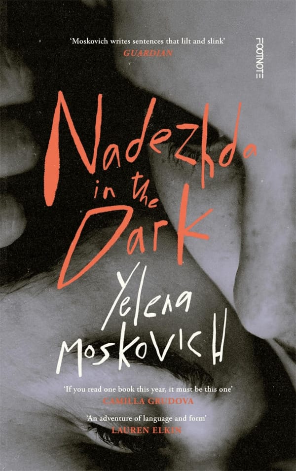
On the cover of Gorgeous Gruesome Faces by Linda Cheng, the title is written in a flowing, cursive style that seems to have been drawn by hand. This style adds a sense of individuality and artistry to the cover. Nadezhda in the Dark by Yelena Moskovich also features hand-drawn lettering for the title, with an irregular, raw look that adds to the mysterious vibe of the book.
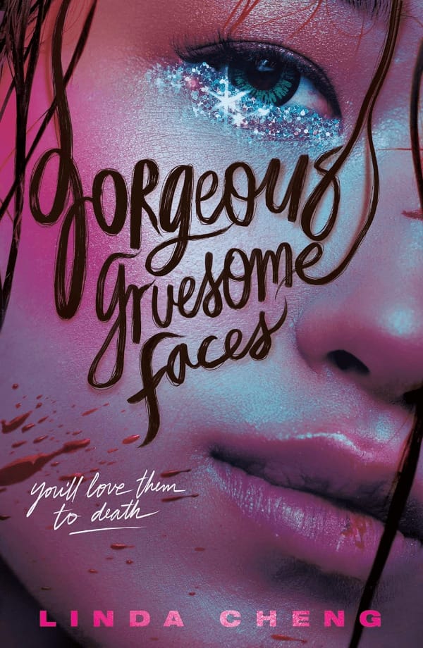
If you want your cover to help reflect your story's personal feel, consider working with an illustrator to create custom lettering. Or, if you're good at drawing, you could make your own letters. This can be a fun way to give your book a look that readers will notice and remember.
Retro Elements and Nostalgia
Typography that looks back to styles from the past can give a book cover a nostalgic feel. This can be a great way to connect with readers who enjoy a sense of history or a blast from the past. Using retro fonts and colors can evoke nostalgia and create a warm, familiar feeling even before they open the book.
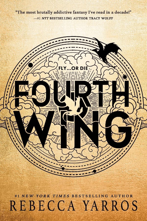
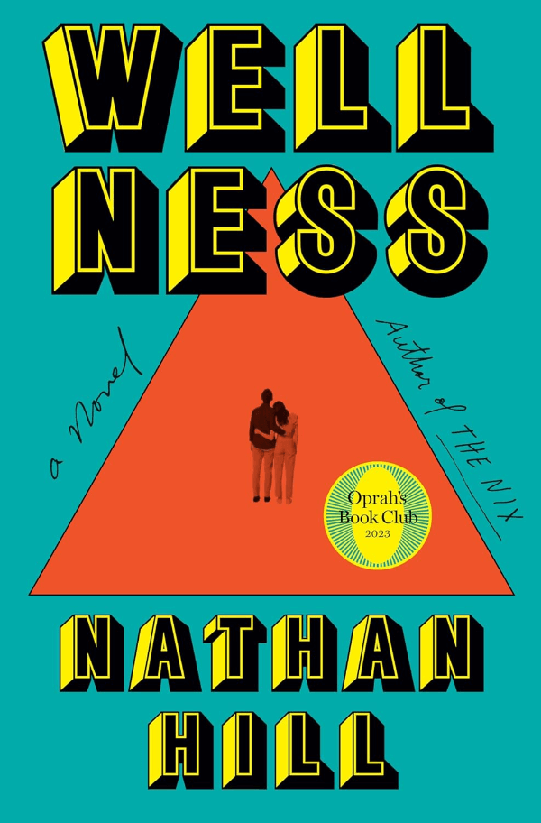
The covers of Fourth Wing by Rebecca Yarros and Wellness by Nathan Hill are good examples of this trend. Fourth Wing has a design that could remind you of old adventure stories, while Wellness uses bold, blocky letters like you might see in old magazines or posters.
To add retro elements to a book cover, look for fonts and colors that were popular in the past (maybe from a certain decade that matches the book's setting or theme). Just a touch of retro can make a modern cover stand out.
No Text Hierarchy
The "No Text Hierarchy" trend on book covers treats the title, author's name, and other textual elements with equal visual importance. Rather than having the title stand out the most, followed by the author's name, this design approach gives every piece of text similar weight. This can create a striking and balanced visual impact.
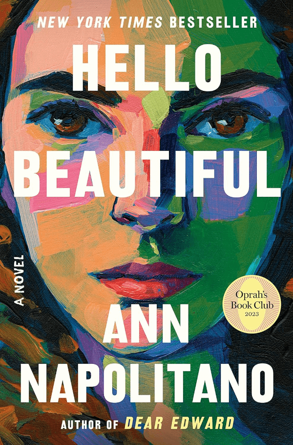
The covers for Hello Beautiful by Ann Napolitano and Romantic Comedy by Curtis Sittenfeld showcase this trend effectively. On both covers, the title and author's name are given equal prominence, creating a sense of uniformity. This draws readers' attention to all the text on the cover at once.
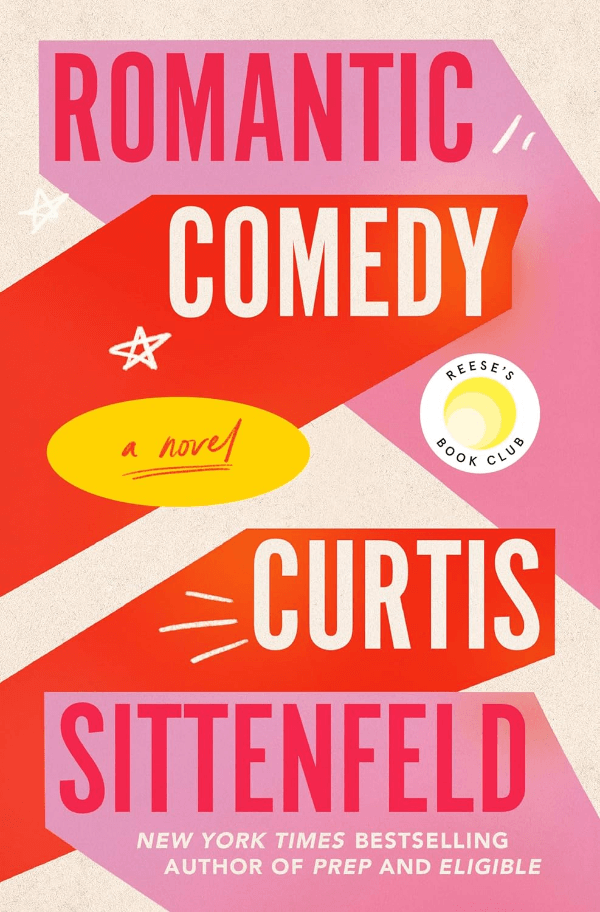
For this to be effective, it's key to ensure that each piece of text is clear and legible. A no-text hierarchy design can make a cover stand out in the book market with its modern and unconventional look.
Final Thoughts
These examples show that many book designs mix different typography trends to look modern. For instance, they might put bold serif and sans-serif fonts on top of busy backgrounds or use simple designs without much text hierarchy. The general direction is leaning towards bigger letters to accommodate digital platforms.
Using typography trends can be a powerful way to connect with readers. Choosing the right typography for your book allows you to tell a story even before the first page is turned. Think about your book and who you want to read it. Then, pick the typography trend that best fits your book's message and readers' tastes. This can help your book stand out in a crowded market and give it the best chance of success.
