

")
When it comes to your book's cover design, you can take an abstract approach or pull story elements directly from your book and use them on your cover.
The challenge of using pieces of your story on your cover is in the interpretation. Books are all about engaging the imagination, and everyone will not envision your story the same way that you do. So, it’s a tightrope walk audience’s expectations on one side and your vision on the other.
Below we’ll take a look at book cover art that offers the best of both worlds—one where both the author and the audience have room for their own interpretation.
Here's what you need to know about thematic consistency in your book cover art:
Below you’ll find original book covers as well as redesigns. The purpose of sharing these is to inspire your creativity. All descriptions provided are publisher descriptions that can be found on the publisher’s website or book outlets.
1. Thicker than Water: A Memoir

Category: Memoir
Description: While on a drive in Los Angeles, on a seemingly average afternoon, Kerry Washington received a text message that would send her on a life-changing journey of self-discovery. In an instant, her very identity was torn apart, with everything she thought she knew about herself thrown into question.
In Thicker than Water, Washington gives readers an intimate view into both her public and private worlds—as a mother, daughter, wife, artist, advocate, and trailblazer. Chronicling her upbringing and life’s journey thus far, she reveals how she faced a series of challenges and setbacks, effectively hid childhood traumas, met extraordinary mentors, managed to grow her career, and crossed the threshold into stardom and political advocacy, ultimately discovering her truest self and, with it, a deeper sense of belonging.
What the designer did right: “Blood is thicker than water” We’re familiar with this common phrase that denotes the feeling of family and the ties that bind us together. We know from the book’s description that this book is personal to author Kerry Washington. Water not only represents transparency, but it can also represent vulnerability, so while the book designer chooses a literal interpretation of the saying, nothing is given away. If anything, it piques our interest.

2. Legends & Lattes: A Novel of High Fantasy and Low Stakes
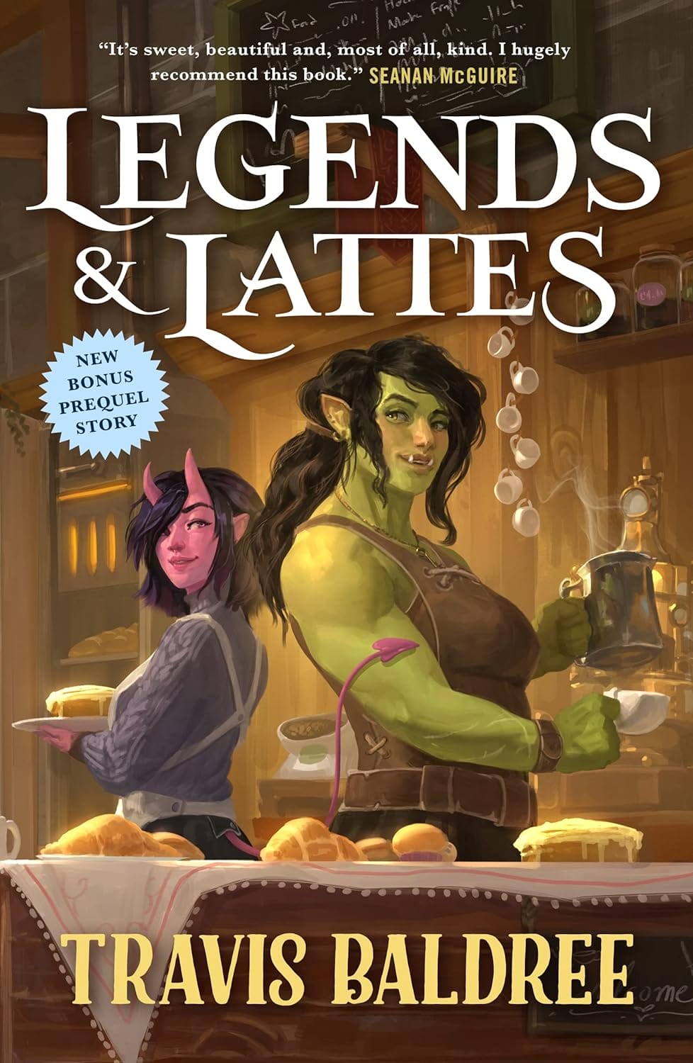
Category: Action and Adventure Fantasy
Description: After a lifetime of bounties and bloodshed, Viv is hanging up her sword for the last time.
The battle-weary orc aims to start fresh, opening the first-ever coffee shop in the city of Thune. But old and new rivals stand in the way of success—not to mention the fact that no one has the faintest idea what coffee actually is.
If Viv wants to put the blade behind her and make her plans a reality, she won't be able to go it alone.
But the true rewards of the uncharted path are the travelers you meet along the way. And whether drawn together by ancient magic, flaky pastry, or a freshly brewed cup, they may become partners, family, and something deeper than she ever could have dreamed.
What the designer did right: Many authors focus on the writing and leave the design work to the professionals; however, author Travis Baldree had design experience, so he was able to tell his designer exactly what he was looking for. He took the bold step to go against generic genre expectations and instead, go with a direct interpretation. He had this to say about the inspiration behind his book cover art and design:
I pine for covers that distinctly convey the vibe of a book. I think modern cover design actually misses the mark here a lot, at least for me as a reader. There are a lot of pictures of swords, the backs of a lot of stock-photo-people, a high-contrast blood splatter, probably more swords, SOME VERY BOLD TYPOGRAPHY, or maybe something artsy and vague. I seldom have any idea how these books ‘feel’ because their covers don’t communicate it to me. I don’t get a vibe. Or if I do, it has nothing to do with the book. They’re pretty, but they leave me disconnected.
Travis Baldree, Author
The author offers his full cover design process along with his notes in this article.
3. A Gentleman in Moscow
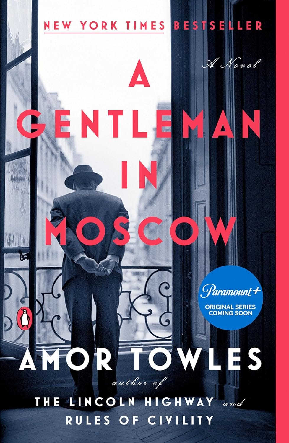
Category: Political fiction, historical thrillers
Description: In 1922, Count Alexander Rostov is deemed an unrepentant aristocrat by a Bolshevik tribunal, and is sentenced to house arrest in the Metropol, a grand hotel across the street from the Kremlin. Rostov, an indomitable man of erudition and wit, has never worked a day in his life, and must now live in an attic room while some of the most tumultuous decades in Russian history are unfolding outside the hotel’s doors. Unexpectedly, his reduced circumstances provide him entry into a much larger world of emotional discovery.
Brimming with humor, a glittering cast of characters, and one beautifully rendered scene after another, this singular novel casts a spell as it relates the count’s endeavor to gain a deeper understanding of what it means to be a man of purpose.
What the designer did right: The image used for the book cover art does a fine job of capturing a moment. We see the back of a man peering over a balcony observing a scene below or perhaps pondering his current circumstance. Whatever he’s doing, it pulls the reader in. The designer could have chosen a less on-the-nose approach, but here it works. You can almost fill in the blanks of the story when looking at this cover.
4. Being Baxters
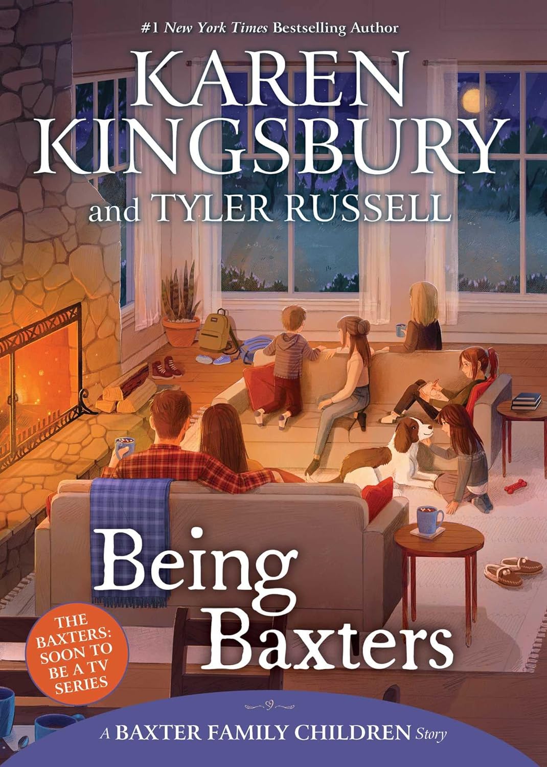
Category: Children’s Christian Family Fiction
Description: Things are changing in Bloomington for the Baxters. When Ashley’s teacher, Mr. Garrett, takes a month off work for the birth of his baby, the intimidating Ms. Stritch takes his place. Ashley tries but can’t seem to crack the new teacher’s tough exterior. Meanwhile, Brooke struggles when a popular girl excludes her at lunch, Erin adjusts to getting glasses, and when Kari is given a dance solo for the upcoming recital, she takes her success a little too seriously.
When Principal Bond announces a new Character Awards initiative, competition breaks out between siblings and friends, until the students forget the point of the awards. Through it all, the town prepares for a major blizzard that Luke worries will cancel his class’s field trip to see the Harlem Globetrotters.
With so many obstacles in their lives, the Baxter Children have the opportunity to remember what being Baxters really means.
What the designer did right: In children’s fiction, having book cover art that pulls images or scenes directly from the story is not uncommon, but when you’re creating a cover that appeals to both children and adults, things can get a bit more complicated. For example, from which scene do you take reference? Do you use real images or illustrations and what tone do you set?
The designer chose wisely by selecting a scene that represents the genre of family fiction, setting a warm tone as well as using both adults and children in the scene.
5. Daughters of the Resistance
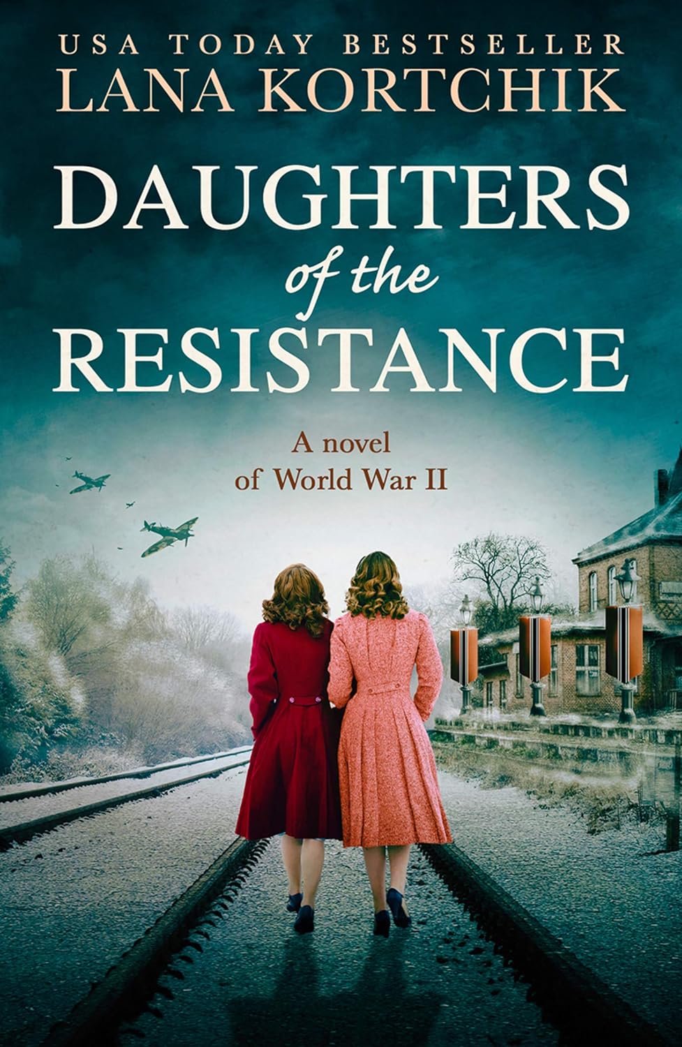
Category: Historical War II fiction
Description: Ukraine, 1943
On a train from Ukraine to Germany, Lisa Smirnova is terrified for her life. The train is under Nazi command, heading for one of Hitler’s rumoured labour camps. As she is taken away from everything she holds dear, Lisa wonders if she will ever see her family again.
In Nazi-occupied Kiev, Irina Antonova knows she could be arrested at any moment. Trapped in a job registering the endless deaths of the people of Kiev, she risks her life every day by secretly helping her neighbours, while her husband has joined the Soviet partisans, who are carrying out life-threatening work to frustrate the German efforts.
When Lisa’s train is intercepted by the partisans, Irina’s husband among them, these women’s lives will take an unimaginable turn. As Irina fights to protect her family and Lisa is forced to confront the horrors of war, together they must make an impossible decision: what would they be willing to lose to save the people they love?
What the designer did right: Since this is a period piece, selecting images that represent the era set the tone. The designer for Daughters of the Resistance pulls in elements of war (fighter planes), friendship, and enemy occupation (Nazis)—contrasting elements that blend seamlessly to tell a story.
Final Thoughts
Book covers are the beginning of every story. If an author is unable to capture a reader's attention with the cover, they will never make it to the story—even if it’s a great one. For this reason, extra care should be given to selecting book cover art and how it is used in the design.
Abstract covers have their place, and genre-specific elements are necessary; however, differentiating your cover from the sea of covers that look the same is what will make your book stand out.
When creating your cover, consider your book’s theme and find ways to pull elements of your story into the overall design. Just make sure that you leave room for your reader’s imagination.
