by Paula Hendricks
We’re lucky today to have a guest post from my friend Paula Hendricks. I met Paula when she was doing a term as president of the Bay Area Independent Publishers Association (BAIPA). Paula, who is the co-author of, among other titles, the Tire House Book, is also a blogger and photographer. She writes today about a recurring problem she faces when reading e-books.
I am a book lover. I love the feel of a book in my hands. I like reading on my couch, on the bus, in bed. I always have a book with me. My basic decorating device is bookshelves with books on them.
I never thought I’d read a book for pleasure on a small electronic device. Was I ever wrong!
 In the last year or so I started reading more library books. Maybe it’s the increasingly high prices of new printed books. Maybe it’s that I realize I don’t need to own everything I love. Maybe it’s that bookstores are disappearing and I like to browse in person.
Another Source of e-Books—the Library
For whatever reason, I’ve started reading ebooks from the library. In part this is because printed books are getting larger. I confess I have never liked hard backed books — they are simply too big for my hands, too heavy to carry around, and are just awkward. My book of choice is the mass market paperback. It fits neatly into my bag and fits my smallish hands perfectly. But more and more paperback books have moved to an awkward tall size that is not pleasant for me.
I don’t have an e-reader and I don’t have a tablet yet. And I can’t imagine sitting at my desk reading a book for pleasure, but here’s the surprise. I love reading ebooks on my iPod, at least most of them.
There is an intimate quality to the experience that reminds me of the mass market paperback. Even the newspaper mobile apps are easier to read on my iPod than the full websites on my laptop. There is less information on the screen, fewer things taking up space. It’s just me and the words. I even make the font smaller sometimes. I love it.
But There’s a Problem: Justified Text
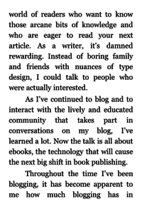
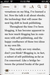
My iPod is small and discrete and the process to get the books onto my iPod is simple. But here’s the rub: many e-books are still being laid out as though they are print books.
For my eyes, the most egregious layout feature is justified text. Because the screen on my iPod is small — 2″ by 3″ (smaller than a standard business card which is 2″ by 3.5″) — it is extremely unpleasant to read justified text. With such a narrow reader there are, inevitably, gaps of white space and odd line breaks to accommodate long words that are not hyphenated. I actively look for ragged right content.
So now when I convert or set up ebooks. I do not justify the text (I leave as left justified) and I put spaces around dashes of all sizes. I also make sure that there is a space after the punctuation that ends a sentence. I recently read a book that had no spaces after many ending periods. It made for an exhausting reading experience.
I’m also looking for ways to standardize this information for readers. This way I, as a reader, will know before buying or borrowing whether or not I can actually read it easily on my ipod.
I now return books that have justified text. And since I have to download them first to find out if they are justified, it’s incredibly annoying and makes me think the author and publisher don’t care about my reading experience.
You may have good design or content reasons to justify your text, but be sure to consider how many people you will not reach if you make it hard to read your book.
Check out Paula’s website (https://www.paulahendricks.com) to find out more about her writing, book designing and photography.
Photo by Dennis.Vu


