


If someone asks you to name some popular young adult fiction writers today, you’d probably mention authors like John Green, Cassandra Clare, J.K. Rowling, and maybe even Louisa May Alcott. But back in the day, S.E. Hinton, author of The Outsiders, was—and still is, in my opinion—one of the best YA fiction authors around, known for her novels set in Oklahoma, where she was born.
Hinton attended Will Rogers High School and graduated in 1966. While still a student, she wrote her first (and most popular) book, The Outsiders, which was published in 1967. The coming-of-age novel revolves around the Greasers, a group of working-class boys, and their rivalry with the wealthier Socs (Socials). The protagonist, Ponyboy Curtis, is a Greaser who struggles with societal expectations and class conflicts.
Because this novel explores evergreen themes of friendship, loyalty, identity, and the impact of social class on individuals, especially teens, it has become a classic among readers who are reminded of the prejudicial systems that existed in their own schools and neighborhoods. In 1983, the novel was adapted into a movie starring Tom Cruise, Ralph Macchio, and Patric Swayze.
It’s been nearly six decades since The Outsiders was first published, and there have been many reprints and book cover designs since then. In this article, we’ll cover the various The Outsiders book covers that have been released.
In this article, we'll cover some The Outsiders book cover designs:
The Outsider’s Paperback Covers
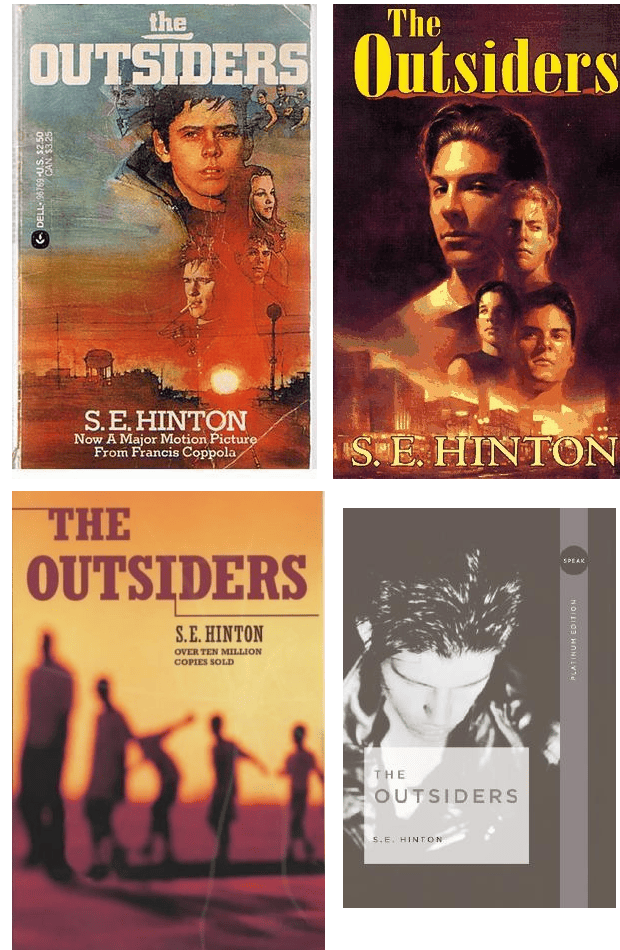
The paperback covers for The Outsiders are some of my favorite covers because they all depict the central theme of the novel: youth. The first three follow a similar concept: bright and dull orange hues, the landscape of a small town, and young (school)boys taking center stage. While you might not guess that the story is set in a school, you’ll know almost instantly that the plot revolves around teenagers or young adults trying to navigate life in their town.
The colors of the first three covers themselves are striking to the eye—especially the first one that depicts a rising sun shining over the town and exposing the contours on the faces of the people illustrated atop it. In contrast, the bottom-left cover shows only the silhouettes of young people, which can trigger curiosity and a closer look from readers who happen upon the book cover for the first time.
Unlike the first three covers, the bottom-right cover is in greyscale and only features a muted image of a young man seemingly looking at the floor. While there’s only a single person on the cover—rather than many people, as in the other three covers—you’re still able to decipher the theme of “youth” that S. E. Hinton based her work upon.

The Outsiders Hardcovers
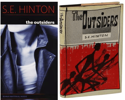
There have been very few hardcovers of The Outsiders, with these two being the most prominent of them. Except for the author's name, the first hardcover is greyscale, much like the last paperback cover in the previous section. This time, however, only half of the young man’s torso is pictured. His face is missing, which is most curious. He is wearing a leather jacket, which in 1988 (when it was created) was regarded as a symbol of rebellion—a core part of this novel.
On the right, however, we see something different. Rather than an image-based cover, the hardcover on the right looks hand-drawn, exquisitely so—as opposed to a cover designed with a specialized tool. The silhouettes of running figures set against a bright, somewhat messy, red background convey the feeling of young people trying to escape danger, akin to what the book’s about.
The Outsiders Anniversary Book Covers
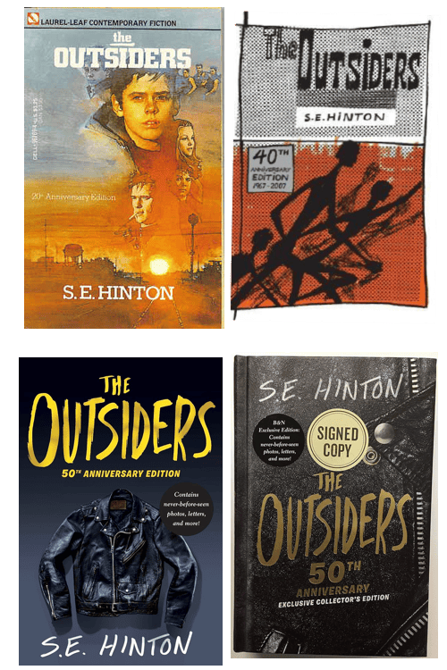
The 20th anniversary of the publication of The Outsiders happened in 1987. The paperback cover used to announce in 1983 that the novel was now a major motion picture was rereleased to commemorate this milestone. Except for the “20th Anniversary Edition” laid over the cover and the removal of the movie announcement, there isn’t much difference between this cover and the 1983 movie edition cover.
The 40th anniversary happened in 2007. There wasn’t a new cover made for this either; the hardcover from 2007 was reused instead, with “40th Anniversary Edition 1967 - 2007” emblazoned on the center-left corner of the cover.
The 50th anniversary, which happened in 2017, however, saw the release of two brand-new, modern-looking, book covers. This time, there were no images of young boys positioned over a bright background that consisted of the rising sun and a town’s shadow. Instead, there were zoomed-out and zoomed-in pictures of leather jackets -- the enduring emblem of stubbornness and rebellion.
To mark the 50th anniversary of The Outsiders, the new book editions contained “never-before-seen photos, letters, and more!”, which was certainly a treat for fans of the book and its movie adaptation.
More The Outsiders Book Covers
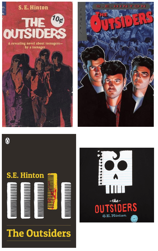
In the nearly 57 years since The Outsiders was published, there have been a slew of covers. Above are four more.
The top two covers follow the themes of the earliest paperback covers in that they have illustrations of young boys on them. In the top left cover, two of the boys are wearing sunglasses, which like leather jackets, denote a defiance commonly found in young people. That defiance is more clearly shown in the top left cover as you see young people in the blue background who appear to be fighting one another.
The cover art on the bottom two book covers is a bit more subtle. On the bottom left cover, we see five combs, four of which are white and conformed, and the last one being yellow, bloodstained, and facing the opposite direction to the other combs. It may not be obvious, but you can probably tell that the yellow, bloodstained comb depicts a clash or revolt of some kind. Also, combs are an integral part of the Greaser culture, as they meticulously style their hair.
The bottom right cover is my favorite The Outsiders book cover. Against the dark background is a note paper, which references Ponyboy Curtis’ love for reading and writing. The impression of a skull on the paper (with the Greaser-type curl) represents the conflict and violence between the Greasers and the Socs -- which is the focal point of the novel.
What You Can Learn From The Outsiders Book Covers
The most common design element in all the The Outsiders book covers we’ve explored in this article is the depiction of teenage rebellion.
In the earlier versions, there were bold illustrations of young boys; in some covers, the boy(s) wore symbolic representations of nonconformity like leather jackets and sunglasses. In later book cover versions, the denotation of defiance was stripped down to become symbolic: pictures of only leather jackets, combs, and skull-impressed notepaper. The later versions were more subtle, but the message was clear nonetheless.
If you’re thinking of releasing a new version of your book’s cover, try to maintain a consistent theme despite the illustrations or symbolism you use. Ask yourself: “At its core, what is my book about?” For S. E. Hinton, The Outsiders was about the vicissitudes of youth—and that showed in all the book covers. Whatever the core concept of your book is, let it shine through all the iterations of your book covers.
If your book eventually has the staying power that The Outsiders has, you can consider cover rereleases and adding more information to newer editions of your books, like what happened with the 50th anniversary edition of The Outsiders.
