


Skill Level: Beginner
Typesetting refers to arranging and formatting text for printing or digital display. The main goal is to make the text readable and visually appealing, ensuring a smooth flow that enhances readers' experience.
Do authors need to know much about typesetting a book? If you're working with a traditional publisher, they'll handle this part of the process for you. However, for self-publishing authors, understanding the basics of typesetting is crucial. This knowledge will help you effectively typeset your book or communicate your needs to a professional typesetter.
In this article, we'll explore what typesetting involves and offer some tips on how to excel at it:
History of typesetting
Typesetting has come a long way from its origins to the digital practices of today. Before the advent of digital technology, typesetting was a manual and labor-intensive process.
Working with a printing press was a meticulous task. Each sentence was carefully arranged on a composing stick—a tool for assembling lines of text. The typesetter used movable type, which are small pieces, each bearing a single character (like a letter, number, or punctuation mark) on its raised surface.
Once the layout was set, the pieces were inked, and a sheet of paper was placed over them. The text was then transferred to the paper by rolling a hand-held roller over it. The typesetter needed to apply the right amount of pressure to ensure the ink spread evenly and the print was clear. The whole process required a high level of precision and skill.
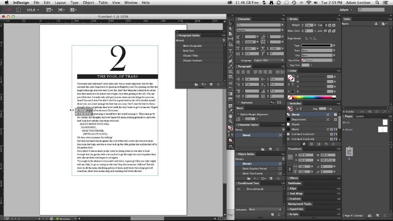
Today, typesetting is primarily a digital process involving software like Adobe InDesign. This shift from manual to digital made it simpler and more accessible to a broader range of creators.
Typography vs. typesetting
Let's explore how typesetting differs from typography. Both involve selecting typefaces, but their focuses are different—one is about aesthetics, and the other is primarily about function.
Typography is the art of selecting typefaces for design. Think of it like picking out an outfit for a photoshoot. It doesn't necessarily have to be comfortable, but it needs to look great. Typographers choose typefaces that are eye-catching and convey the right emotional tone for the message. Their goal is artistic—to make the text visually stunning, which doesn't always mean it's highly legible or readable.
Typesetting is about arranging the text so that it's easy to read and fits well on the page. Comparably, it's like choosing an outfit for a hike. You still want to look good, but functionality is crucial. Typesetters manage the layout, spacing, and alignment to ensure the text is readable and visually engaging.
In short, while typography mostly aims to make a visual impact, typesetting rather focuses on practicality and ensuring the text is easy to navigate and comfortable to read.
Good typesetting vs. bad typesetting
Typesetting plays a pivotal role in how readers perceive your book. Your story might be the most interesting and engaging, but if it's difficult to read (or worse—giving readers headaches!), they aren't likely to finish the book.
Good typesetting is almost imperceivable. It allows readers to dive into the story without paying attention to the design.
Bad typesetting, however, is always noticeable. Things like uneven margins, inconsistent font usage, or cramped text can be distracting. If you ever picked up an interesting book and didn't finish it because it was difficult to read, it might have had bad typesetting.
Importance of professional typesetting
The way your book looks can greatly influence readers' initial reactions and continued interest.
Key features typesetters work on include:
- Trim size: The book's dimensions (for example, 5" x 8" or 6" x 9").
- Margins: The white space surrounding the text that is adjusted based on the book's thickness.
- Fonts and sizes: Selection of appropriate fonts and sizes for different text elements like body text and headlines.
A more detailed page-by-page adjustment process is called "advanced wrangling." While not always necessary, it can help perfect the book's appearance and help it achieve a polished and professional look.
Advanced wrangling includes:
- Avoiding word stacks: Not repeating the same word at the start or end of consecutive lines.
- Avoiding widows and orphans: Ensuring no single paragraph line is isolated at the top or bottom of a page.
- Optimizing hyphens and short word appearance: Preventing hyphens and short words from appearing awkwardly at the end of pages or paragraphs.
- Avoiding rivers: Addressing uneven spacing within lines that creates distracting visual gaps.
- Managing scene breaks: moving scene breaks around to avoid them appearing at the very top or bottom of a page.
Good typesetting uses the right fonts, margins, and line spacing, resulting in a clean, well-organized design. It considers factors such as text alignment, the spacing between lines and words, and the placement of chapter titles and subheadings. All of this contributes to how easily a reader can follow along.
A well-typeset book shows that a lot of care has gone into its creation. This can improve how readers see and enjoy it, leading to better reviews and recommendations.
Typesetting across different media
While all formats require some level of typesetting, it varies greatly.
Manuscripts
For both digital and printed manuscripts, typesetting is mainly about ensuring the text is readable for editing purposes. This generally involves using a legible font, clear headings, and indented paragraphs. The goal here is to facilitate the ease of reading and editing.
eBooks
Typesetting for eBooks, particularly reflowable ePubs, prioritizes flexibility to accommodate screen sizes and reader preferences. Text must adapt to device orientation or font size changes, ensuring eBooks can be read comfortably on any device.
Printed books
Typesetting printed books demands detailed attention to layout and design. This includes choosing the right margins and line spacing and consistently using fonts and page elements. Tools like Adobe InDesign help create professional-quality, print-ready layouts.
Using the right typesetting methods for each format ensures that your text looks great, whether in a manuscript, an eBook, or a printed book. While typesetting manuscripts and digital books can be straightforward, printed books demand more attention. To get a more polished final product, consider getting professional help.
DIY vs. hiring a professional
Choosing between DIY typesetting and using a professional involves balancing costs and expectations. You can often typeset manuscripts and eBooks yourself, as these formats are more forgiving. Printed books demand more attention, so it's worth looking into hiring a professional.
Pros of DIY typesetting:
- Cost-effective: You save money by not hiring a professional.
- Full control: You get to manage every part of the process, making changes and customizing as you go.
Cons of DIY typesetting:
- Steep learning curve: It takes time to learn typesetting software, which can be challenging.
- Potential quality issues: Without the skills of a professional typesetter, your book might not turn out as polished, especially in print.
Choosing the right professional
A professional typesetter can keep your book from looking amateurish, which can make a huge difference in a competitive market. When hiring a professional typesetter, remember that you often get what you pay for.
There are plenty of budget-friendly options on platforms like Upwork or Fiverr. However, these might not always provide the best results, especially for print quality.
If you're looking for exceptional quality, consider hiring a high-end typesetter. The downside of this option is that it requires a significant investment and usually takes more time.
For a balance between cost and quality, consider mid-range professionals from sites like Reedsy. They may not specialize exclusively in typesetting but generally deliver satisfactory results without breaking the bank. This is a great choice if your book doesn't require complex layouts or detailed visual elements.
Whether you choose DIY or professional typesetting depends on your needs, budget, and how much you care about your book's appearance. For many writers, especially those who focus on printed books, hiring a professional is a good investment to ensure their book looks its best.
Typesetting software for authors
In today's digital age, having the right software can make a big difference in how your book looks and feels. Whether you plan to do the typesetting yourself or want to understand the options, here's a simple guide to some of the popular tools you can use.
Adobe InDesign is like the Swiss Army knife of typesetting tools. It's packed with features that allow you to control every page layout aspect, from where the words sit to how the pictures align. It's a professional favorite but can be complex and pricey for beginners. It's worth the investment if you're serious about publishing. Adobe InDesign runs on a subscription model, with prices starting from $22.99 per month.
If InDesign sounds a bit intimidating, there are simpler and more wallet-friendly options:
Affinity Publisher has been around since 2019 and is quickly establishing itself as the more economical option to Adobe InDesign as an industry standard. You can purchase the software for a one-time payment starting at $69.99. InDesign has a small edge over Affinity Publisher regarding capabilities, but they are quickly closing that gap as they continue to make product improvements.
Vellum is great if you're using a Mac and want something straightforward. It's known for its ease of use and produces both eBooks and print books that look clean and professional. Vellum isn't free, though. It costs $199.99 for the eBook version and $249.99 to create print books.
Atticus is a newer tool that works on any device with a web browser and doesn't tie you to one operating system. It's versatile and easy to create digital and print books. You can get Atticus for a one-time price of $147+VAT, which makes it quite affordable compared to other options.
Microsoft Publisher and Apple's Pages are good for authors who want to dip their toes in book design. They don't have all the bells and whistles of InDesign but are much easier to get the hang of. Microsoft Publisher is part of the Microsoft Office suite, which costs $69.99 per year for a subscription. Apple's Pages is free for Mac users and offers enough features to get you started on simpler projects.
Each tool has its strengths, tailored to different levels of experience and types of projects. When picking the right software, think about what you need most. Is it simple, has many features, or has a specific budget? Matching the software to your needs will help make your typesetting journey smoother.
Typesetting tips and best practices for authors
When setting up your book for print, keeping things simple and clear is key. Here are the essential dos and don'ts to help make sure your book looks both professional and reader-friendly.
Dos of typesetting a book:
- Choose readable fonts: For your body text, opt for classic, legible serif fonts like Baskerville or Caslon, and consider a sans-serif for chapter headings to add contrast.
- Use page breaks wisely: Place page breaks to separate chapters and sections to help with readability and navigation.
- Manage white space: Generous margins and spacing between paragraphs are crucial. They improve readability and give your book a polished look.
- Set appropriate margins: Ensure your inside margins are large enough to accommodate the binding. Your outside margins should be slightly smaller to balance the page layout.
Don'ts of typesetting a book:
- Avoid double spacing after sentences: Use a single space after periods, as this is the current standard.
- Steer clear of overly stylized fonts: Too elaborate fonts can be tiring to read over long periods.
- Refrain from using bold or italics: Overusing bold and italics can clutter your pages and distract readers from the text.
- Maintain line spacing: Ensure enough space between lines to improve legibility and prevent the text from looking cramped.
These tips will help you create a book that's easy to read and professionally presented. Just a few adjustments can make a big difference in how your book comes across to readers.
Final Thoughts
Typesetting is a key step in turning your manuscript into a reader-ready book. Whether you handle it yourself or hire a professional, the way you typeset your book will greatly impact its final appearance.
Choosing DIY can be cost-effective and gives you complete control over your project. However, be prepared to spend a lot of time and pay close attention to the details.
Hiring a professional can make your book look more appealing, though it will cost more. Doing so will help prevent mistakes in typography and layout that could impact your book's overall quality.
The decision between DIY and professional typesetting depends on your budget, the complexity of your project, and how much time you're willing to invest in learning the skills needed.
No matter which route you choose, knowing the basics of typesetting is crucial to self-published authors. Carefully consider your options to make the best choice for your book's success.
