


Growing up, my parents were ardent Stephen King fans, and our bookshelves were lined with his books. I remember being intrigued and intimidated by these dark, haunting covers as a child. The unsettling artwork seemed too scary, making me wonder why my parents didn't favor brighter fantasy books. I particularly remember the Stephen King book covers from the 90s that used what I know now is the ITC Benguiat font. This font is now closely associated with King's books in popular culture.
Stephen King's influence extends beyond his stories to the world of book design. His covers, known for thematic depth and evolving design elements, reflect the horror, supernatural themes, and tension in his writing. King's books were published so many times with different designs that it's impossible to analyze them all at once.
The article examines how King's book covers have changed, focusing on three time periods and their most iconic covers to highlight trends:
Early Works (1970s-1980s): The Dawn of Stephen King Book Covers
Stephen King's early book covers from the 1970s and 80s are easily recognized. They usually showcase hand-drawn pictures that match the spooky and tense feel of the stories. These covers are often in dark colors, creating a mysterious vibe.
The fonts used for King's name on these covers are unique and have become part of what people remember about his books. They're not just for style—they help make his books stand out and give a hint of the scary stories inside.
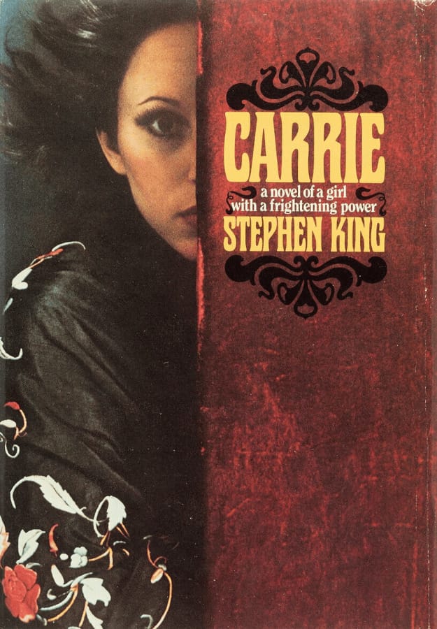
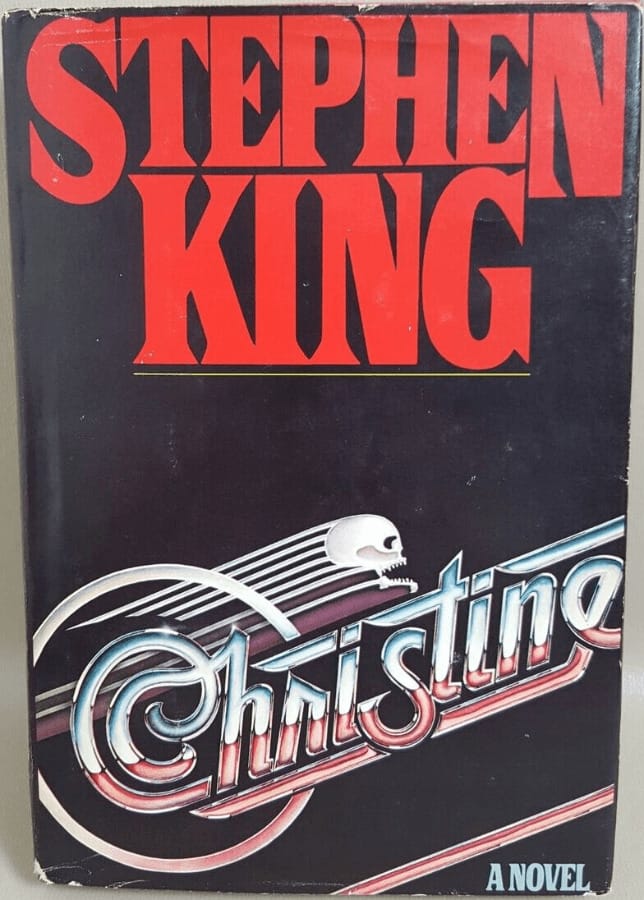
The covers of King's early books show simple but strong images, like Carrie with her face partly showing or the lone car emblem on Christine's cover.
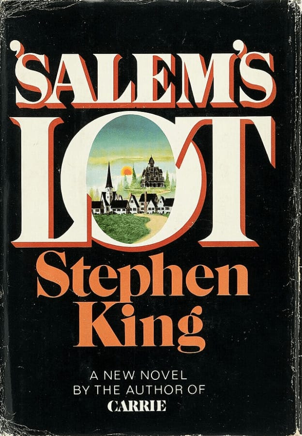
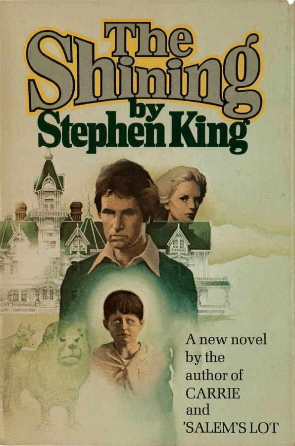
Salem's Lot has pictures of a small town covered in darkness, and The Shining gives us a peek at the lonely hotel.
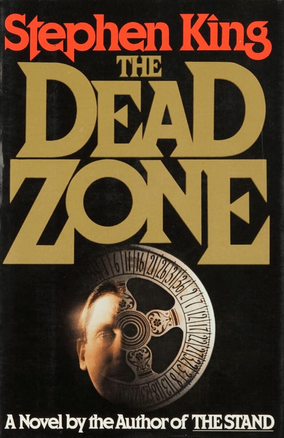
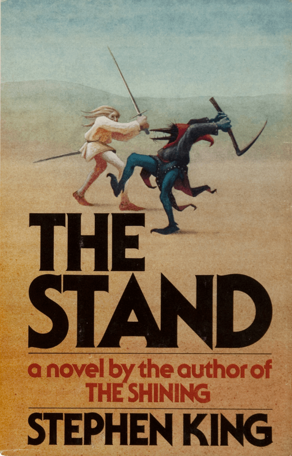
The covers of The Dead Zone and The Stand are detailed, teasing the deep stories inside. These covers draw readers in and hint at the spooky tales to come.
Mainstream Success (Late 1980s-1990s): Evolving Stephen King Book Covers
During Stephen King's rise to mainstream popularity, his book covers evolved significantly. The designs began to embrace a bolder, more graphic style that matched the intensity of his storytelling.
As Stephen King's books became more popular, the cover designs shifted. They started using bold fonts and images that were easy to remember and matched the story inside. These covers were made to quickly grab readers' attention and give them a hint of the exciting story inside, making the books stand out on display.

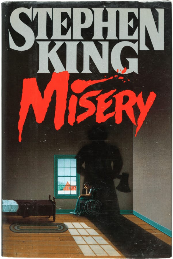
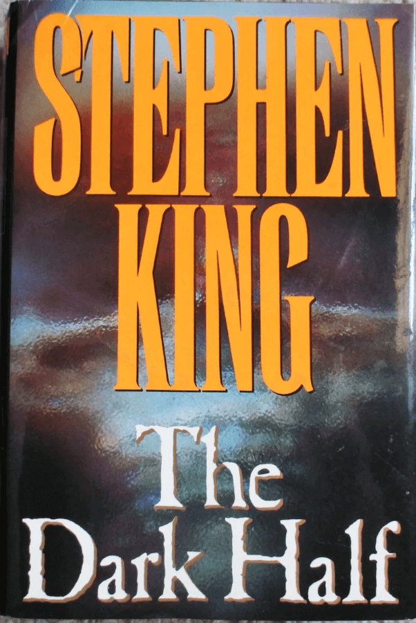
Covers like Misery use shadow and contrast to create suspense. The Dark Half's fractured portrait reflects the novel's split identity theme.
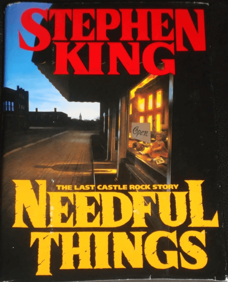
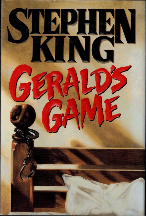
The cover of Needful Things shows a mysterious shop, hinting at a tale of desire and its costs. Gerald's Game portrays a chilling captivity scene, setting up a suspense-filled story.
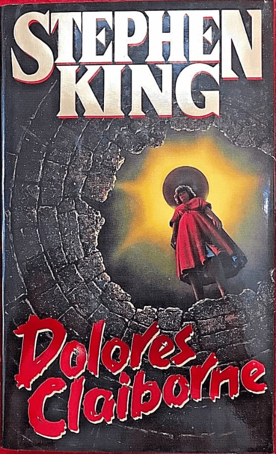
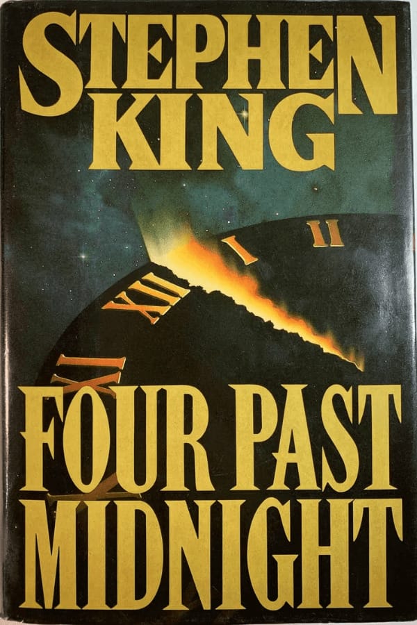
Dolores Claiborne features a lone figure, suggesting a narrative woven with solitude and hidden truths. Four Past Midnight presents a comet nearing midnight, suggesting the thrilling and unforeseen events in the stories.
These designs do more than catch the eye; they establish the mood for the intense and often dark stories King is known for.
Modern and Minimalist (2000s-Present): Contemporary Stephen King Book Covers
In the modern era, the style of Stephen King's book covers shifted to a minimalist approach. This change means that the designs are now more straightforward, with less clutter and more focus on conveying the book's theme with fewer elements.
They use bold colors and modern fonts to quickly draw attention. These designs align with what's popular now, ensuring they stand out.
For example, 11/22/63 uses historical photos and big, rough-looking text, and Doctor Sleep has smoke and contrasting colors to suggest its eerie story.


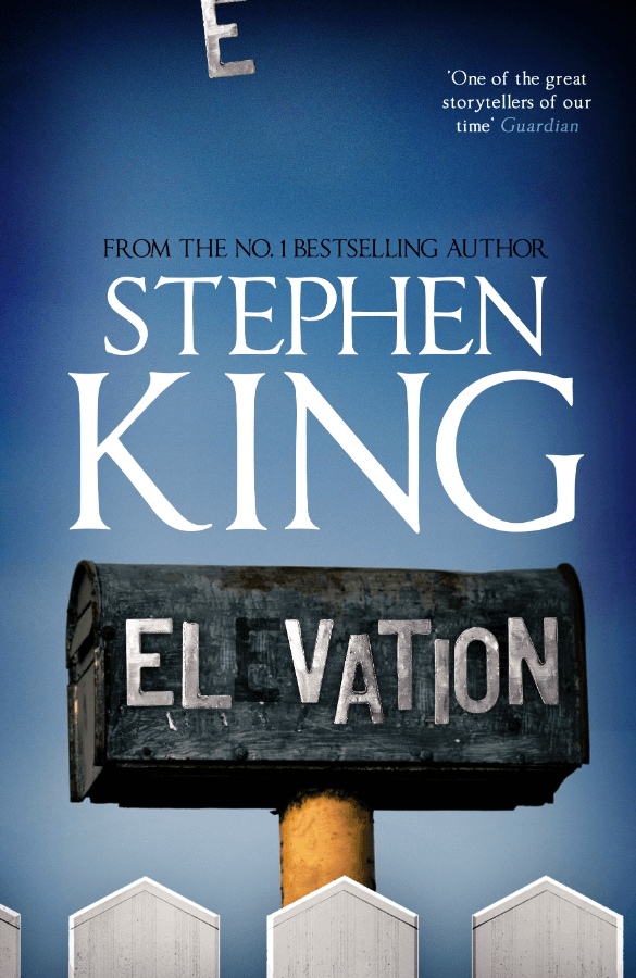
Elevation and Under the Dome use strong visuals to focus on key parts of their stories.

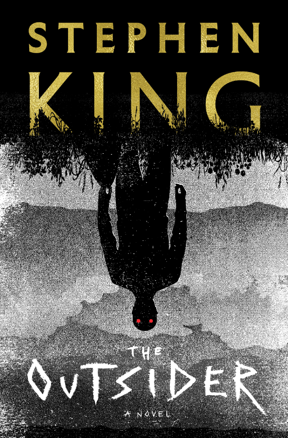
Lisey's Story uses vibrant colors and unique typography to draw the eye. Revival and The Outsider use simple but powerful imagery to create an atmosphere of intrigue and anticipation.


These covers reflect the stories' themes with less clutter and more impact, aligning with contemporary design sensibilities.
Drawing Inspiration from Stephen King's Book Covers
Taking cues from Stephen King's book covers can offer valuable lessons. King's covers have evolved significantly over the years, reflecting a deep understanding of how to grab a reader's attention. In the early days, detailed, hand-drawn images gave a personal touch, suggesting the thrills and chills waiting inside. This approach can inspire you to consider the visual elements that capture your book's spirit.
In the 90s, King's covers shifted to simpler, bolder designs. They would use one strong image and bold lettering to make an impression. This is a good example of how a book cover can say a lot with just a few elements that capture the book's core idea. The trick to doing this is to choose imagery and text that speaks directly to the essence of your story.
Today, King's covers embrace a minimalist approach. They use stark contrasts, vibrant colors, and modern fonts that resonate with current readers. Adapting to contemporary tastes helps Stephen King stay relevant and keep his author's identity. He has found a perfect balance between standing out and fitting in.
Looking at Stephen King's covers shows it's key to keep your cover up-to-date and in line with what readers expect while reflecting your book's unique story. A good cover sets the stage for your story, inviting readers into the world you've created and exciting them to start reading.
