Case Study: Payments Systems in the U.S.: A Guide for the Payments Professional by Carol Coye Benson and Scott Loftesness
Design Brief: The authors are partners in the Glenbrook Consulting Group and give a popular workshop on how the payments systems work. They wanted to translate the workshop experience into a book to expand their reach.
Constraints: Because the authors work in corporate environments they needed a book that looked completely professional while still communicating their material clearly.
Raw Material: After discussion it was decided to redraw all the graphics used in the book to standardize them and get a look that would coordinate with the typography in the book. The authors submitted a well-organized and edited manuscript and supplied Adobe Illustrator files for all artwork.
Production Goal: The authors were interested in using the print on demand distribution model through Lightning Source.
Challenge: Manage the desgin and production of a complex book with sidebars, illustrations, tables and various other extra-textual material, and present the whole package in an inviting and professional-looking book.
Clean and Clear Brings Lessons Home
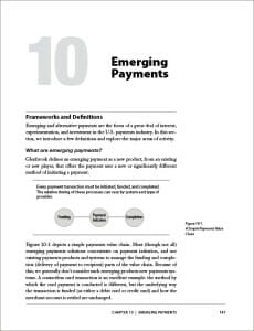
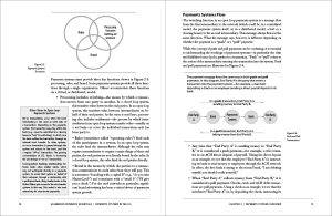
After looking at the trim sizes offered by Lightning Source, we settled on a 7.44″ x 9.69″ book. This is significantly larger than a 6″ x 9″ and would afford a lot of lateral space on the page to accommodate the different elements the authors would use to translate the visuals from their workshops into the confines of a printed book.
Page designs were developed in Janson Text for the basic text font. In most books the text font is the most important typographic decision in the book design process, but for this book that wasn’t true.When it came time to pick the second font, it was even more important. I used the Myriad family. This is a very versatile sans serif design that in its larger sizes makes excellent headlines and display type, but it also excels in other uses.
All the graphics and sidebars were done in variations of this one typeface, with Myriad black, bold, regular, italic, condensed all making an appearance. But because they are derived from the same originals, the variations of Myriad work together well.The result were clean and logical pages helping the student focus on the material at hand. The dropped folios and running feet left the pages open to allow space to lighten the information-dense pages.
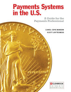
For the cover, although we looked a numerous solutions, we all agreed on a clean straightforward design that features a beautiful photo of an American gold coin, with the typography arranged around it.There are a lot of warnings about doing books with white backgrounds if you want to sell online, since the background may blend unattractively with the backgrounds of a lot of web pages, but sometimes the white background is the only answer, and I think this book makes a good case for keeping its white background.
Conclusion
Publishing a book can be a powerful marketing move for an individual consultant, a coach, or in this case, for a consulting group. Here the authors capitalized on their specialized knowledge and experience at teaching to put together a unique resource for financial professionals. I expect they will continue to expand their product line with more offerings.
Data
Buy Payments Systems on Amazon (affiliate link)
The authors’ Glenbrook Partners website
ISBN: 978-0-9827897-0-4
Size: 7.44″ x 9.69″, 160 pages
Price: $49.95
Typography, book layout and graphics in Adobe InDesign and Photoshop.
Typeset in Janson Text and Myriad


