

If you are a regular reader of The Book Designer, you have probably seen our monthly e-Book Cover Design Awards. These posts showcase many books each month and provide examples of what to do and what not to do when it comes to having covers designed for your own books.
What our e-Book Cover Design posts don't explain, however, are the steps involved in creating a cover from concept to final version. In today's post, Samuel Hawley, author of Bad Elephant Far Stream explains to us the process he went through, why and how he modified his book cover to create the final version for his book. I think you'll find it quite interesting.
Bad Elephant Far Stream is the fictionalized life story of a circus elephant and is based on the true story of the elephant Topsy. It’s a different kind of novel in that it tells Topsy’s story from her own perspective, through her own eyes.
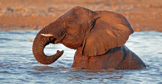
The basic concept for the cover came to me early on. I wanted it to be a close-up shot of an elephant—something right up in her face so we’re looking into her eyes. I thought this would convey the idea that there’s a lot going on inside this animal’s mind—which is where we’re going in the story.
First Draft of the Cover
Here’s my first draft of the cover, with the elephant photo used as-is. You’ve got to start somewhere, so I just slapped it together to see what it would look like. I went with green for the title because it complemented the greenish tinge of the photo, and because it was reminiscent of the green of Topsy’s original forest home.
(Click to enlarge)
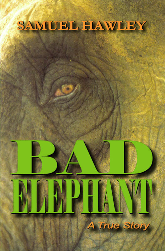
I wasn’t all that keen on the green titles. The color conveyed the green of the forest, but it was also a “safe” color, and that didn’t seem right for a book about a “bad” elephant.
Second Draft
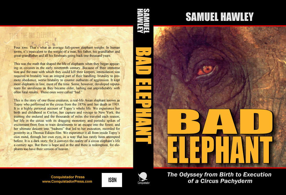
In the second draft, below, you can see that I was starting to play around with an orangey-tan color (for the author’s name). And I’ve added a subtitle, “The Odyssey from Birth to Execution of a Circus Pachyderm.”
(Click to enlarge)
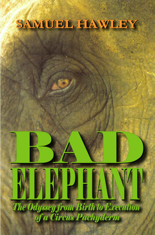
Not much of an improvement, is it?
Round Three
Well, anyway, by this point I was starting to get some ideas. First of all, I went to work on the elephant image in Photoshop, adjusting the colors, saturation, etc. to make it more earthy and brown. Then I used a program called FotoSketcher to turn the adjusted photo into a painting.
I framed the image top and bottom with black bars to convey the impression that the elephant was blocked in, confined in a frame, locked in a cage. I wanted this because the elephant in the story is confined in a circus. I tried adding red lines on the black bars and found that they really improved the look.
I altered the title color to orangey-tan too (it complements the tones of the elephant’s skin, and is also the color of “caution”), and I changed the font to something thick and heavy (I was thinking, “make it elephantine”). By this point I was also starting to think about the spine and the back cover, so I blocked the whole thing out. Here’s the result:
(Click to enlarge)
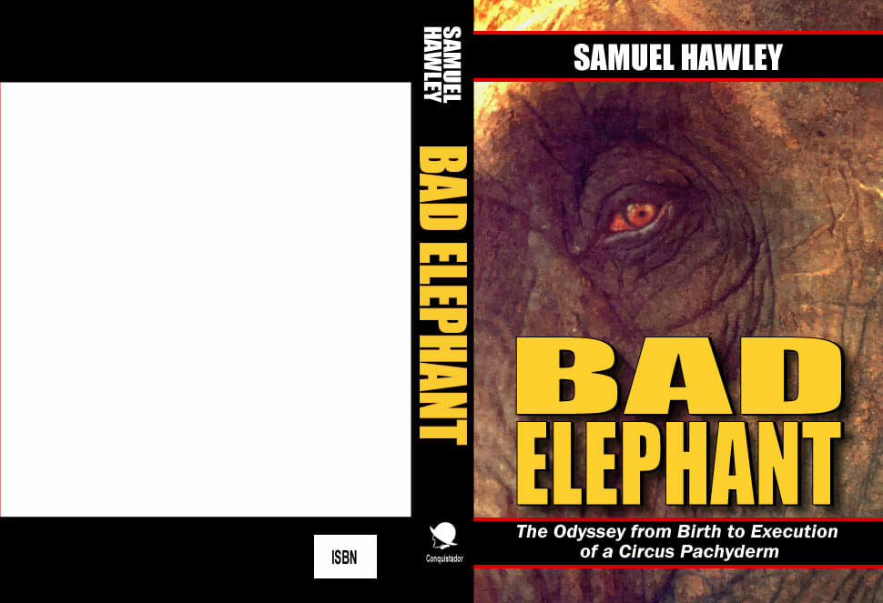
I was much happier with this. It seemed to work. Now it was time to start refining.
Fourth Draft
On the front, I expanded the black bars to go right to the edge of the cover. This looked better, design-wise, and it strengthened the feeling that the elephant was somehow “confined.” I also darkened the color of the title a bit, making it a little warmer. I just thought it looked nicer.
For the back, my initial idea was to use an image of the real elephant Topsy combined with actual newspaper headlines about her attacking someone or otherwise being “bad.” I pasted the elements together like a collage, scanned then and digitally made the resulting image look like old, faded paper. I then slapped some rough text over it to see how it would look. Here’s the result:
(Click to enlarge)
I didn’t like how the back cover turned out. It was too indistinct.
More Tweaking
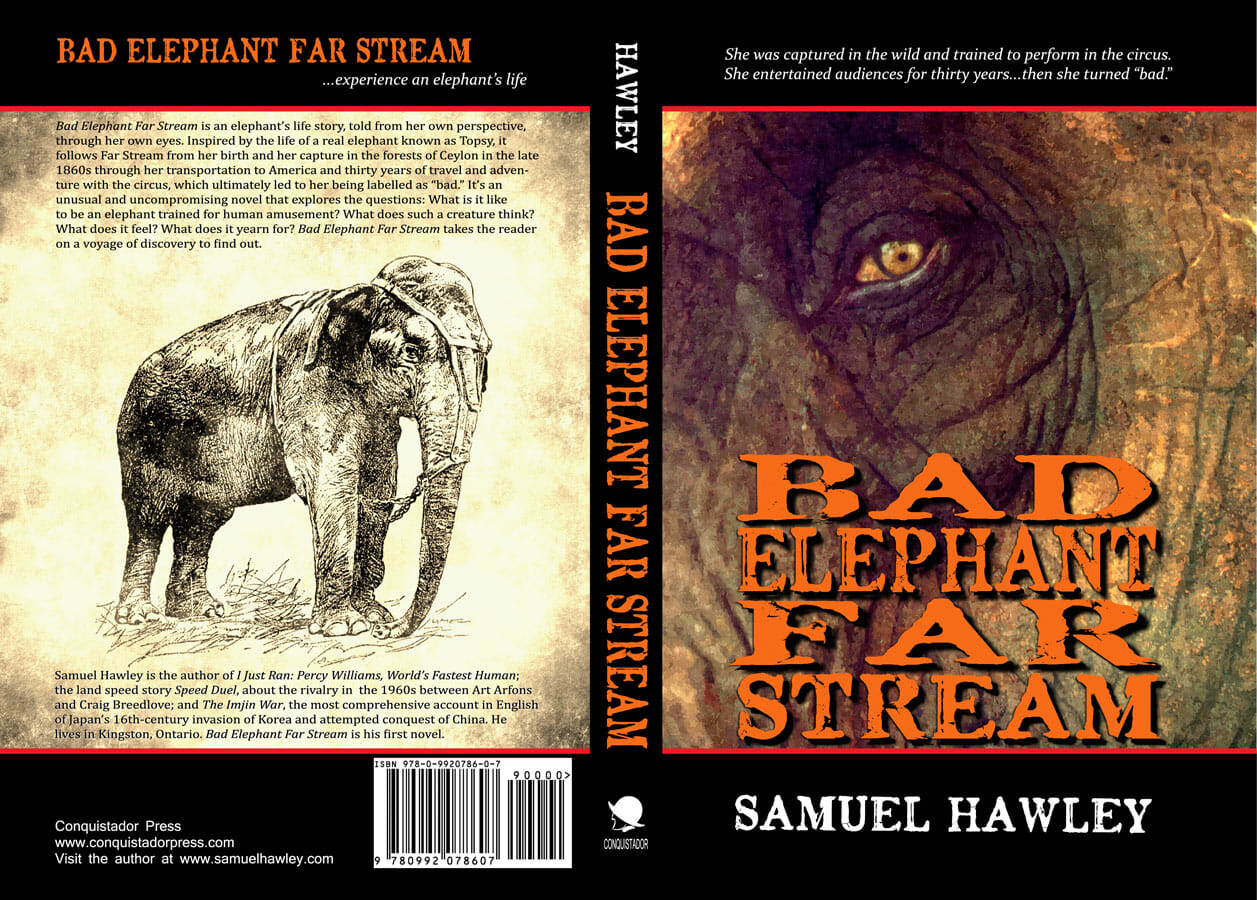
I therefore discarded the collage idea and came up with something different: a nice clear image of the real elephant Topsy in the center (I used Fotosketcher to give it an old-photograph look), with book blurb above and an about-the-author below. This worked much better. I had acquired an ISBN number for the book by the point, so I also inserted it now.
As for the front cover, I changed the title to Bad Elephant Far Stream (special thanks to my writer friend Sharman Horwood for her advice on this) and moved my name to the bottom and put a two-line blurb at the top. I also changed the title font to Chenier. I liked it better because it looked weathered and seamed, like an elephant’s skin—and tattered, suggesting a hard life. I also made the title color more orange (i.e. warmer).
If you look closely, you’ll also note that I changed the color of the elephant’s eye. In her critique of the cover, Sharman Horwood made the good point that the red in the elephant’s eye made her look angry, which was not my intention. (The eye was red simply as a result of the color adjustment I had done in Photoshop to get the browner skin tones I wanted.) So I went back and changed the eye color only. I did this in Photoshop by combining two layers of the image, one with the skin tones I wanted and the second with the readjusted eye color. Here it is:
(Click to enlarge)
This was the cover design I sent to Createspace for a proof to be made. The printed book I received in the mail looked generally good—all except for two things:
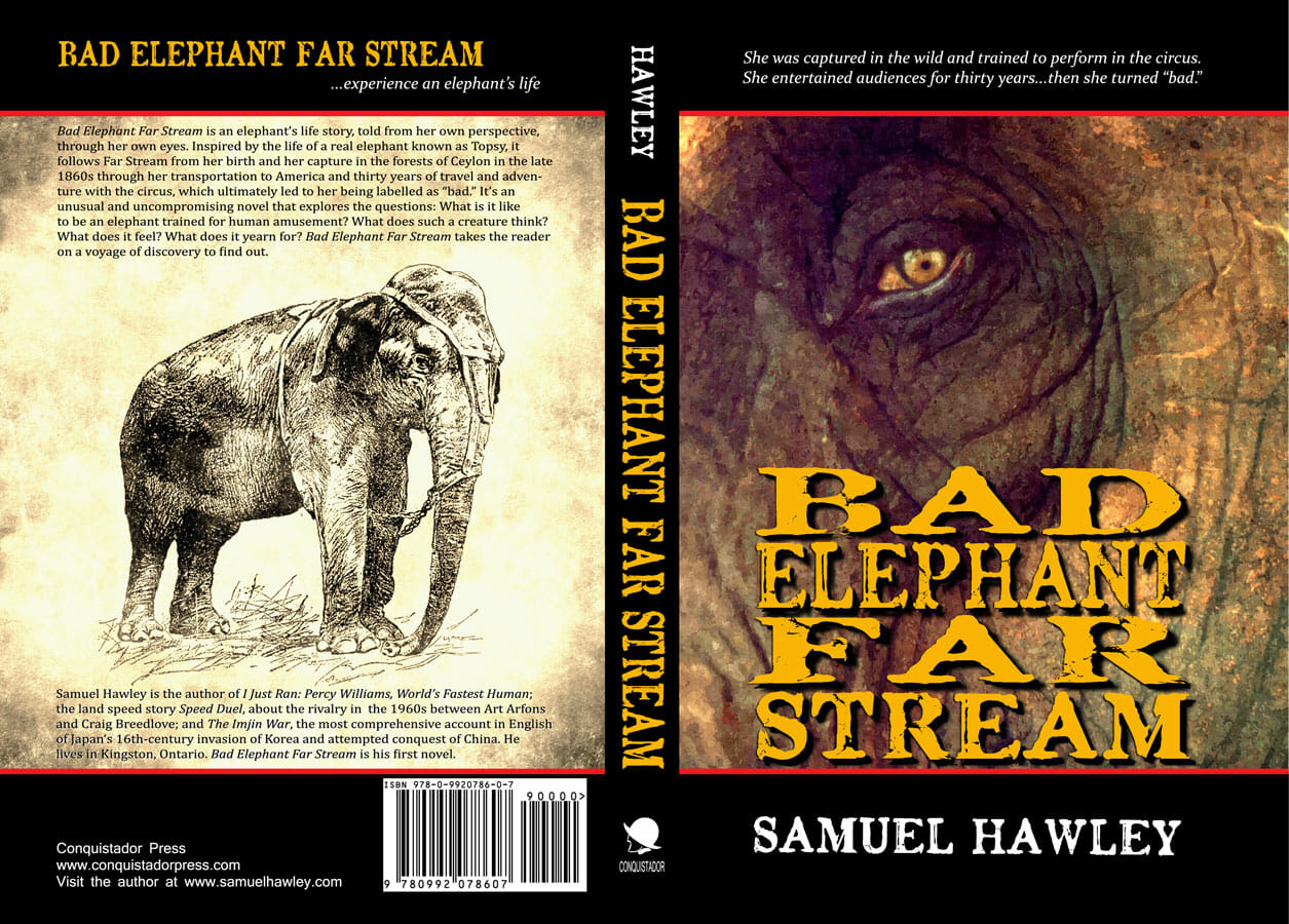
- I didn’t like the orange of the titles on the front, spine and back. The color looked great on my computer screen, nice and bright, but printed on the actual book cover, it didn’t stand out enough. I therefore adjusted it to a brighter yellow.
- The ISBN bar code looked a bit fuzzy. I discovered that this was due to the ISBN jpeg I used not being pure black, but black comprised of a mixture of colors (i.e. C, M, Y and K all turned to 100 percent). I was able to fix this in Photoshop by turning the C, M, and Y to 0 and leaving only the K at 100. This improved the sharpness of the ISBN bar code.
The Final Version of My Book Cover
And voila, the finished cover of Bad Elephant Far Stream:
(Click to enlarge)

Samuel Hawley spent two decades teaching English in Japan and Korea before becoming a full-time writer. His books include The Imjin War, the most comprehensive account in English of Japan’s sixteenth-century invasion of Korea and attempted conquest of China; Speed Duel, about the quest for the land speed record during the jet-car era in the 1960s, and I Just Ran: Percy Williams, World’s Fastest Human, named one of the five “Best Sports Books of 2011” by the CBC (Canadian Broadcasting Corporation). He lives in Kingston, Ontario. Bad Elephant Far Stream is his first novel.
Photo: bigstockphoto.com. Amazon links contain my affiliate code.
