


Romance is a highly popular genre, and so, of course, romance book design is crucial. Whether you write contemporary romance, historical, or fantasy, your romance book design is the first impression your readers receive.
Crafting your cover is imperative to the success of your book. If you spend months brainstorming, plotting, writing, and editing but then skimp on the book design, your sales will likely suffer.
Knowing the following three aspects of romance book design can help you heighten your chances of creating a great first impression:
- Different Types Of Romance
- Common Tropes To Covers
- Fonts, Images, Colors
- Examples
Creativity is subjective, so make the best choice for your novel when employing these tips. However, keeping to industry standards, and maintaining a design that fits your genre, can help build credibility and, ideally, create lasting sales!
When it comes to romance book design, you'll want to consider:
Different Types Of Romance
The romance genre is so popular, and there are so many sub-genres that there is no way to dissect every option in a single article. Rather than try to skim the surface of every genre, we discuss the following three:
- Contemporary
- Historical
- Fantasy
If you write in one of the above genres, take note of what you should include in your cover, as well as what to avoid. If you don’t write in one of these genres, you can still apply these tips to your work-in-progress.
Romance is the umbrella over many sub-genres, so whatever type of romance book design you ultimately go with, these tips can help you color in the lines rather than break design rules you didn’t know existed.
When it comes to romance book design, it’s important to keep in mind that your plot revolves around two or three main characters. Whether you employ a love triangle (such as in The Hunger Games) or pair two dichotomous protagonists together (as in Jane Austen’s Pride and Prejudice), your characters should be the stars of your cover.
Common Tropes To Romance Book Covers
When your potential readers see your cover, you want them to know what type of story they are in for. While tropes are often loved or hated, they can be helpful when used on a romance book cover to communicate exactly what’s inside your pages.
1. Contemporary Romance
This sub-genre often uses models for book covers or a realistic drawings of the main characters. Depending on the plot, the model may be cast in low light, a sunrise or sunset, or even cut off his or her face. This gives an edge of mystery to the story.
2. Historical Romance
Historical Romance book design is similar to contemporary in that it stereotypically uses models or realistic art to convey the protagonists. However, historical romance must keep in mind the era as well as the specific year of the story’s plot. Dressing your characters in historically accurate fashion is crucial, as is any background scenery (such as a cityscape).
3. Fantasy Romance
Fantasy romance book design can be much more free, just like the genre itself. While all three sub-genres often use their protagonists on the front cover, fantasy characters will, understandably, look more fantastic and unrealistic.
Regardless of your sub-genre, romance book covers often use the below tropes:
- Protagonists mostly fill the cover
- A large, sweeping title
- Bold colors that fit the theme
- Emotional poses
With these tropes in mind, let’s move on to the next aspect of romance book design.
Fonts, Images, Colors
If you walked into your local bookstore or Barnes & Noble, meandered over to the Romance aisle, and pulled out a book, what would grab your attention?
Well, you would first likely see an image or realistic drawing of the main characters as we dove into above. You would likely see book cover fonts that lean toward the romantic: A flowing script, curled edges, and a heavier weight to individual letters.
If you continued in your live case study of the cover in front of you, you would then likely notice the colors the designer used. Contemporary romance often uses brighter colors, historical employs more earth tones, and fantasy goes all out whether it is metallic, colors with a sparkly hue, or a glow that seems otherworldly.
How you communicate to readers with your front cover will help them know if they want to open the book to the first page. If they love fantasy, your cover should look out of this world in both a literal and figurative sense.
If your readers love historical romance and you’re writing about the Dust Bowl, employ golds, neutrals, and sand colors.
Again, if you want to draw in contemporary readers, use trending colors, stick to more primary colors and their sister colors, and feel free to use a more minimal script in your font.
Examples
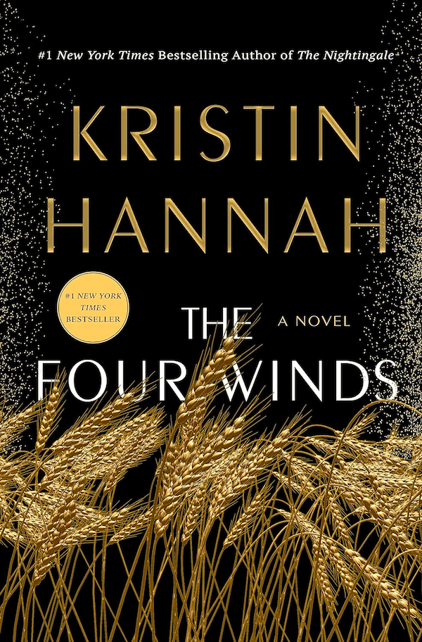
The Four Wins by Kristin Hannah is a standout example of how to use the colors of the historical timeframe to communicate the plot of the book. Hannah’s cover includes black, cold, and white. Three simple colors, but executed in a way that makes you feel the darkness of the stifling air the protagonists must breathe, yet the dusty gold hope of romance on the horizon.
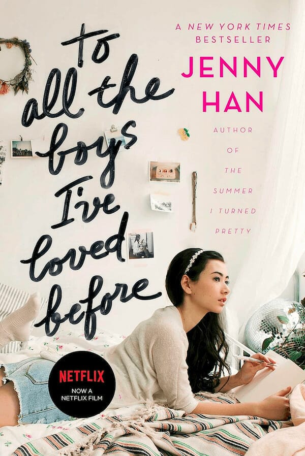
To All The Boys I’ve Loved Before, by Jenny Han, is another great romance book cover example. Han’s cover uses bright pink, neutrals, and other soft hues. While the author’s name is in a simple script, the title is in a flowing, cursive font that takes up roughly a third of the cover.
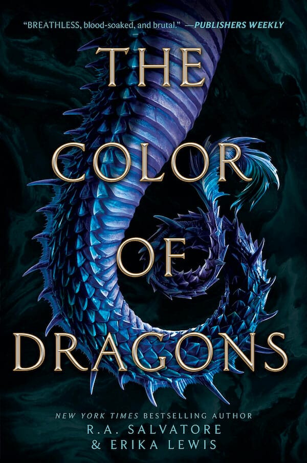
The Color of Dragons, by R. A. Salvatore and Erika Lewis, is a fantasy romance that uses dark, almost black, as a background color and a teal, violet, metallic hue for the tale of a dragon. The title, a light gold, covers the dragon tale in a medieval-looking font.
Romance Book Design: Your Next Step
Designing your own book cover can feel like an overwhelming step, but now that you have an overview of exactly what tropes, colors, font styles, and images to use, you have a launching pad.
Just as writing your book took many drafts, creating the best romance book design for your novel will take edits, restarts, and final tweaks. Don’t expect to fall in love with your first design. It takes time to create the cover that best represents you, your story, and the genre of your book.
That said, have fun with your time spent in design! Make use of platforms such as Canva or the free app Phonto to brainstorm and keep track of your ideas. You never know what idea will stick. Sometimes, brainstorming sessions you thought would bring about the worst ideas actually produce the gem you decide to run with.
And, of course, run your cover design with friends, beta readers, and fellow writers. Don’t forget to remain open to feedback, consider what other writers say, and get back to the drawing board. Your cover is a large player in the number of sales you could land, so take your time.
Best wishes as you embark on your romance book design journey. We can’t wait to see what you come up with!
