


Reading is not solely about absorbing new information; it’s meant to be an immersive experience shaped by the careful and deliberate orchestration of words and visuals on the page.
While stunning layouts are often implemented in magazines, they often don’t take center stage for nonfiction books. That should change.
In this article, we’ll cover what book layouts are, why they matter, and some best practices for creating a stunning nonfiction book layout. We’ll also look at some examples of aesthetically pleasing book layouts to inspire you on your book publishing journey.
Learn everything about designing a nonfiction book layout:
What Are Book Layouts and Why Do They Matter?
Book layouts refer to the arrangement of elements within a book, including text, images, illustrations, and white space. Designing a good book layout involves making decisions on which font styles, sizes, margins, and overall design will be visually appealing as well as functional for readers.
Layouts vary across different genres and can be customized for both print and digital formats. In this piece, we’re focusing on nonfiction book layouts.
Nonfiction book layouts are important for several reasons, including:
1. Readability
A carefully designed book layout enhances the readability of the book. The font choice, size, and spacing between lines and paragraphs all contribute to how easily readers can absorb and comprehend the text without straining their eyes unnecessarily.
2. Navigation and Structure
A good nonfiction book layout helps organize the content of a book logically, allowing readers to navigate the book seamlessly. The chapter headings, page numbers, and section breaks provide visual cues, which make it easy for readers to find specific information and follow the narrative structure.
3. Visual Hierarchy
Effective book layouts have a visual hierarchy that guides readers through the book’s content. This is evident in the prioritization of key elements, such as headings, subheadings, and images/illustrations to direct attention appropriately. A well-structured visual hierarchy emphasizes crucial points and aids the understanding of information.
4. Reader Engagement
A visually appealing nonfiction book layout can captivate readers and enhance their overall engagement with the book. Thoughtful design choices, such as incorporating images, colorful borders, pull quotes, and varied formatting styles, contribute to a more immersive and stimulating reading experience.
5. Brand Identity
For printed books and eBooks alike, the layout is a vital aspect of a book’s overall design and brand identity. The consistent use of colors, fonts, and styling elements reinforced the book’s visual theme, making it more recognizable and reinforcing the author’s (or publisher’s) brand.
6. Aesthetics
Beyond functionality, a well-designed nonfiction book layout adds an aesthetic dimension to the reading experience. Harmonious page proportions, carefully chosen fonts, pleasing color schemes, and meticulous illustrations all contribute to the overall visual appeal of the book—which can enhance the reader’s enjoyment and connection with the content.
Creative Nonfiction Book Layouts
Below are some creative nonfiction book layouts you can take inspiration from as you decide what your book layout should look like.
1. Border + Large Image

This book layout beautifully combines the use of borders, large fonts, images, and columns. On the left page, we see a thick, elaborate-looking border, and within it, a large-sized title and tiny, centered text. The tiny text and the considerable margins on all four sides of the text prevent the border from feeling too overwhelming for readers.
On the right page, there’s no border. Instead, there’s a large image covering over 75 percent of the page, and two-columned text right underneath. The image is clearly meant to be the focal point of the pages and the layout designer did a great job at highlighting that.
2. Centered Text + Sidenotes
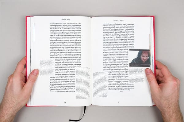
The striking thing about this book layout is the obvious detachment of the sidenotes from the main text. The main text is centered, with wide margins on the left and right side of the text. However, some of the text on both sides of the pages is indented to make space for some sidenotes, which are written in a different, lighter-looking font.
On the right page, the designer incorporated an image into the sidenotes, with a caption beneath it.
3. Two Columns + Embedded Image
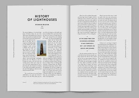
This nonfiction book layout takes the classic two-column, wide-margin text approach, but with a twist: an image of the subject matter embedded right between the columns on the left page. This is a great way to showcase the focal point of a topic without using a large image that takes up much space.
On the right page, there’s a pull quote in the left column that’s written in a bolder font than the main text. The pull quote also has a wider line spacing and occupies the center of the column comfortably.
4. Colored Background
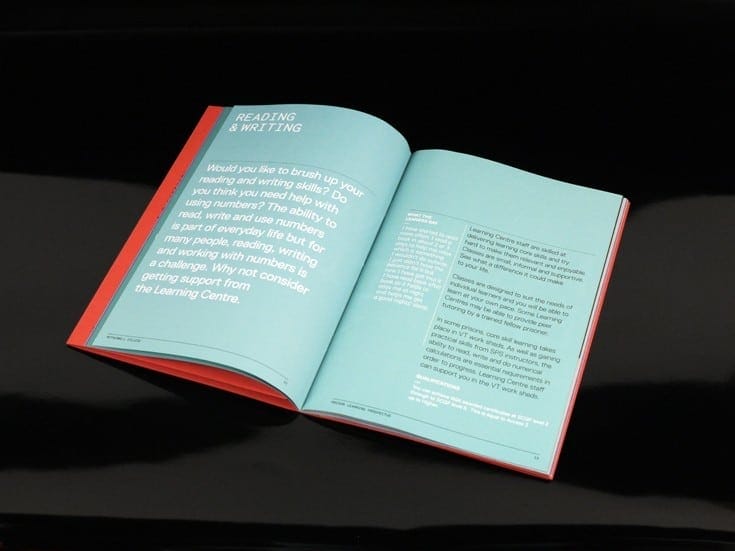
This layout is a deviation from the normal white-background- black-text setup. Instead, the layout designer decided to play with colors: sea green background, white text, and black text. They also played around with the size, margins, and layouts of the text.
For example, on the left page, the white text is pretty large and there’s a tiny margin on the top and left sides. However, the page's right and bottom parts have a wide margin.
On the right page, there’s a large margin at the top of the page, but not at the sides and bottom. There’s also a combination of white and black text with a smaller font size -- except the white text is used in the capacity of a sidebar that provides more context to the main text (which is written in black).
5. Embedded Pull Quotes
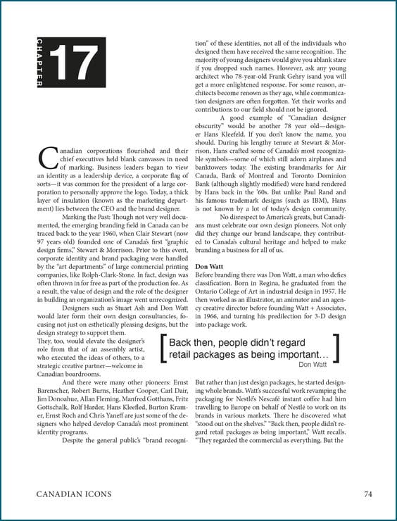
Instead of tucking the pull quote neatly in one of the columns, the layout designer of this book decided to embed the pull quote between both columns -- similar to the embedded image we saw before. As expected, the pull quote’s font is much bigger and bolder than the main text. This makes for better skimming, reading, and comprehension of the passage.
On the left column, the chapter is boldly indicated at the top of the page, and there’s a sizeable whitespace between it and the start of the text. This doesn’t affect the second column, though, which starts level with the indicated chapter icon.
6. 1-Column Chapter Heading, 1-Column Text
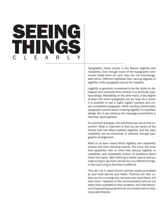
This page is a masterclass in the skillful use of whitespace to help users have a smooth reading experience. At first glance, one can notice that the layout is a two-column one. The right column, however, is empty, save the large chapter title “Seeing Things Clearly”, which combines two different, but simple, font styles and sizes.
The right column, however, has the main text. Although the text itself is a bit tiny and the paragraphs a tad packed, the margins at the top and bottom of the column, coupled with the large margin caused by the unused left column, make it easy for readers to navigate the page.
7. Sidebar Pull Quotes + Images
This book layout uses a bright pink color to differentiate between the sidebar text and the main text. While captions are perfectly in the sidebar, the pull quotes are embedded between the sidebar and the main text, which looks great because of the color contrast.
On the left page, there are two images: the smaller one has bright pink captions beside it, while the larger one occupies the page’s width with no captions. The whitespace used on both pages is both adequate and consistent.
7 Best Practices for Creating a Nonfiction Book Layout
Creating beautiful nonfiction book layouts involves a combination of design principles and practicality. Here are some best practices to keep in mind as you decide the layout of your book:
- Consistent typography. Choose a readable font and maintain consistency in typefaces throughout the book. Use different font weights and styles for the headers, subheadings, and body text to establish a clear visual hierarchy.
- Use appropriate margins and white space. Using adequate margins and white space prevents your book’s layout from feeling cluttered, which enhances readability and comprehension. Ensure that there’s enough space between lines and paragraphs to give your readers visual breathing room.
- Create a clear and cohesive structure. Organize your book’s content with clear chapter and section headings. Use consistent formatting and styling for similar elements, such as pull quotes or sidebars, to create a cohesive structure.
- Integrate images and graphics. Carefully integrate images, illustrations, charts, graphs, or other visuals into the layout as they’re needed. Ensure that these visual elements complement the text, are high quality, and are positioned appropriately to enhance understanding.
- Consistent color scheme. Choose a harmonious color scheme that aligns with the book's subject matter, enhances readability, and highlights key points and sections. Be careful not to use too many colors—especially when they clash—to avoid confusing your readers or evoking the wrong emotions in people.
- Use grid systems. If you’re designing your book layout yourself, using a grid system can speed up your design time, as it acts as a guide that shows you the best way to place, position, and scale your styling elements. So rather than positioning design elements randomly, a grid will help you align text and visuals consistently, providing a professional and structured appearance.
- Test with sample readers. Before finalizing the layout, gather feedback from a small group of sample readers. This can give you valuable insights into the reader experience and help identify any potential issues, so you can fix them before publishing your book.
Design an Effective and Stunning Nonfiction Book Layout
The artistry and precision needed to properly design a nonfiction book layout are remarkable. Not only do these layouts serve as a visual feast for readers, but they also play a crucial role in facilitating a smooth reading experience. From meticulous typography to strategically placed images, the design choices captivate the audience and contribute to the accessibility of the content.
The stunning nonfiction book layouts outlined above are a testament to the fusion of information and aesthetics, inviting readers into a world where knowledge is not only discovered but beautifully presented.
