For some time we’ve been moaning about how bad most ebooks look, the poor typography, the feeble attempts to make ebooks look like printed books, which they do not resemble in any meaningful way.
The litany of complaints from typographers and book designers includes:
- poor tools for working with ebook files
- poor results from automated systems for converting files to ebooks
- lack of ability to create ebooks that are formatted like print books
- difficult and awkward integration of graphic elements
And the generally poor choices of fonts, settings, and control over the reading experience. Everybody admits it’s true, and we all seem to be waiting for something better to come along.
Hold Everything
After I published The Death of Book Design I got an email from Rick Gordon, a graphics professional, about an ePub book he had just completed. He wrote in detail about the processes and procedures he used to format the book and optimize it for viewing on the iPad.
It’s called Marathon: You Can Do It by Olympic runner Jeff Galloway and published by Shelter Publications in Bolinas, California.
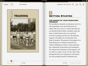
I’m not technical enough to really grasp what Rick was describing, so I asked him to write it up for my blog. While he’s trying to find time to do that, I want to show you the results of his work. Here’s a spread from the book, in the iBooks application:
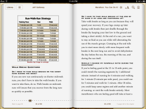
Here’s another spread. iBooks has a great spread display when you turn the iPad sideways, allowing you more of a “book” feeling:
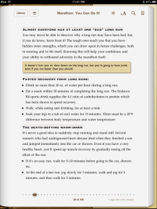
The charts use the iBook’s ability to zoom graphics. When you double-tap the image, it takes up the entire screen. Notice also the careful typography in this ebook, something we usually never see. (And something I never thought I would say.) The fonts are appropriate, balanced and carefully typeset. Here’s a single page so you can see it better:
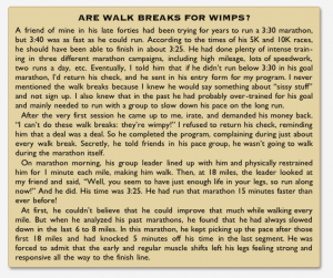
The whole thing—delicate rules, 2-color composition, pull-quote boxes, bullet and numbered lists—hangs together well, just like in a print book design. Is it perfect? No, but I don’t think that’s the point. Look at this text box set in a sans serif typeface:
This is hyphenated, justified copy that looks fine. It’s not as good as you get from InDesign on your print jobs, but it’s a huge step up from the ebook typography we’ve been seeing.
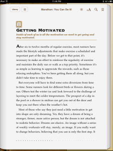
Okay, here’s one more:
I’ve never seen an ebook that looked more like a printed book. Just looking at this chapter opening is oddly reassuring. Perhaps the future of ebooks will include many directions.
One branch of development will see text escape the confines of a “book” that no longer exists in any real way in digital form. Experiments with ways to display text, the ability to publish texts of any length, and texts amplified with other media are all here or on their way.
But maybe another branch of ebook development will include tasteful book typography, on the same road Rick Gordon is traveling with Marathon, but farther along. These ebooks would unabashedly use the materials and conventions of bookmaking to create digital texts that truly are the inheritors of a grand tradition. Now that would be something.
Look for Rick’s post describing the development of Marathon soon. In the meantime, let me know what you think of this book. Do you know other ebooks that come this close to a printed model? I’d love to see them.
Photo by Martineric

