


The best love poetry books bring words and design together in a perfect combination. Everything from the font to the paper complements the verses. When done right, the design isn't just something readers see; it's something they feel, helping your words touch minds more deeply.
This article will discuss how to design the interior of love poetry books, including several book design aspects:
Typography in Love Poetry Books
Typography can significantly influence how a message is received and interpreted. Besides the obvious readability and legibility, your chosen typography can also convey other aspects:
- Your personality and character. Don't you sometimes wish readers could hear your poems read in a certain voice, whether yours or someone else's? Just like people, typefaces also have voices. A whimsical font might convey playfulness, while a stark sans-serif might seem modern and powerful.
- Your tone and emotion. Typography can also communicate mood and emotion. Love poetry books often use elegant script typefaces to evoke feelings of love and romance.
- The poem's pace and rhythm. You can use typography to set the intended speed and rhythm of reading. Dense blocks of text slow down readers, which suits more serious topics. More spacing and shorter paragraphs can quicken the pace and lighten the mood.
- Cultural and contextual associations: Fonts carry historical and cultural connotations. For example, if you want to call to mind the image of La Belle Époque, use a typeface that resembles handwriting from the 19th century.
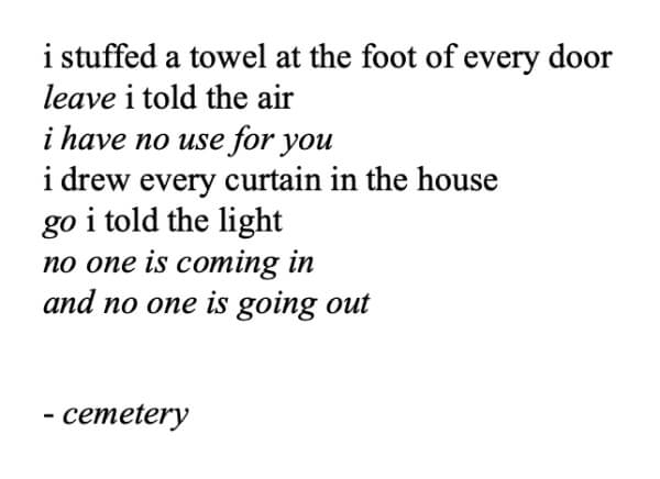
Look at the font used in The Sun and Her Flowers by Rupi Kaur. The minimalist typographic approach reflects the raw emotion of the poems. Sans-serif fonts and the absence of capitalization echo the themes of breaking and healing.
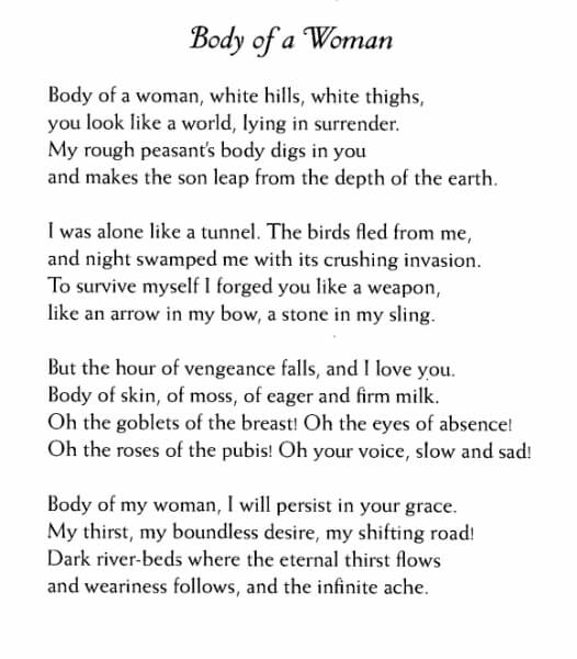
On the other hand, Twenty Love Poems and a Song of Despair by Pablo Neruda uses a more traditional, fancy font to match the classic vibe of his poems.

The Use of White Space and Layout in Love Poetry Books
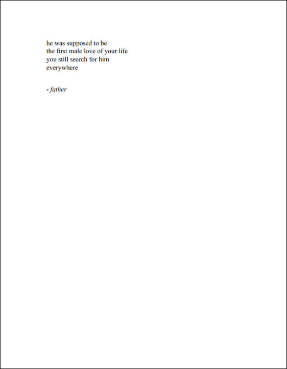
White space is all the empty area around the words on a page. Like pauses in music, it gives readers time to think and feel. Generally, poetry books use a lot of white space to make each word and line stand out more. This practice holds true across various poetic forms, including the concise and minimalist style found in haiku.
In Milk and Honey, Rupi Kaur uses white space to put each word in the spotlight.
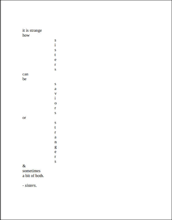
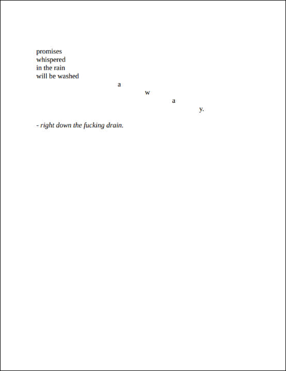
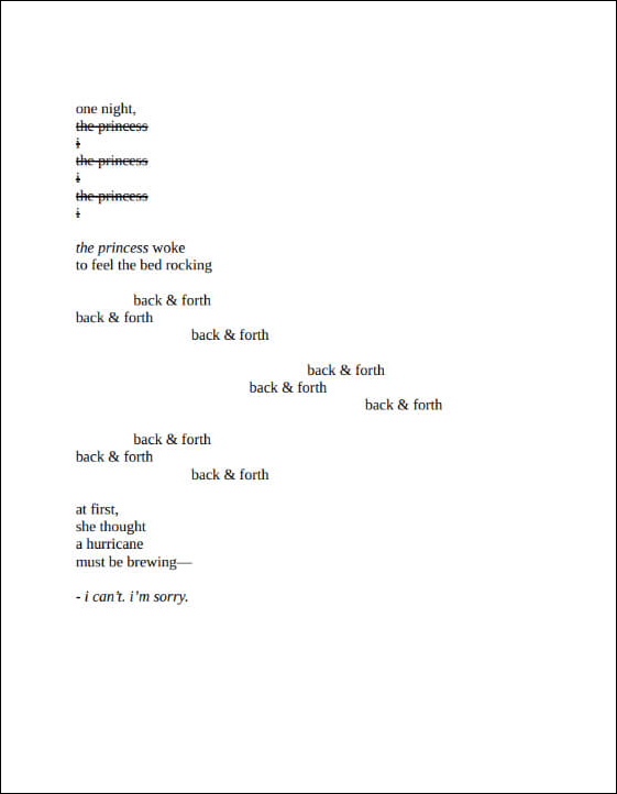
In The Princess Saves Herself in This One, Amanda Lovelace uses the page layout creatively. She arranges her words to guide us through the poem at a specific pace. Some poems are set up to mirror the gentle sway of a bed, while others are spread out across the page, making the words seem as if they are fading or being erased.
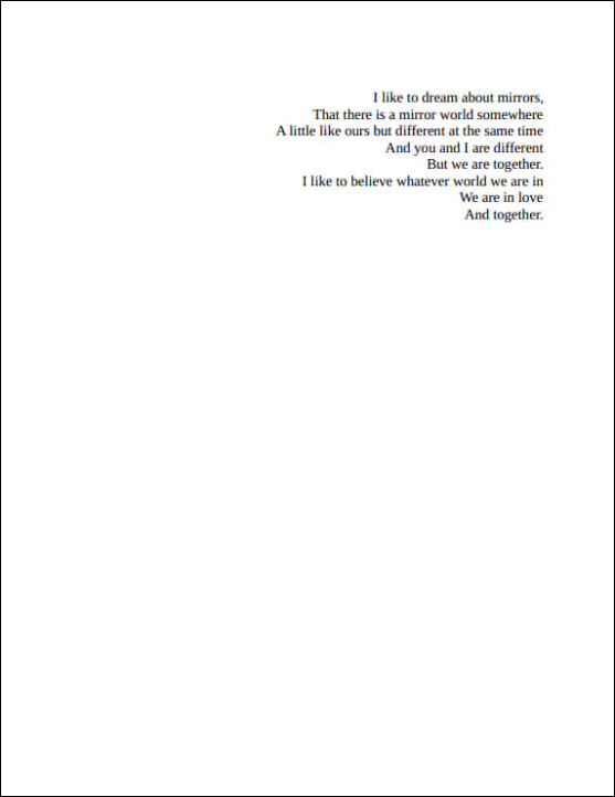
In Pillow Thoughts by Courtney Peppernell, most poems have verses aligned to the left. But in the poem that reflects on mirrors, they are aligned to the right, creating a visual connection to the theme.
Illustrative Enhancements in Love Poetry Books
Illustrations in love poetry books serve two purposes: add visuals to the reading experience and strengthen the book's themes. The artwork can set the tone, create mood, act as a pause, or add non-verbal meaning to the message. As an author, pick a style that matches your work's mood and subject to make sure the pictures are a key part of your poem's story.
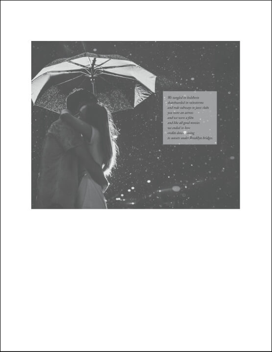
In The Truth About Magic by Atticus, the book features black and white photographs accompanying the poems. These photographs are often stark and vibrant, matching the mood of the writing. Using real images adds authenticity to the emotions conveyed in the poetry.
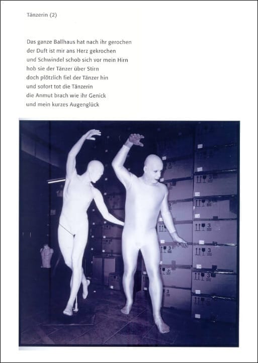
Messer (Knife) by Till Lindemann features intense photos to match the strong feelings in Till's poems. Just like his poetry, the images are often bold and unsettling. For example, the piece about the death of a dancer is accompanied by a weird dancing photo.
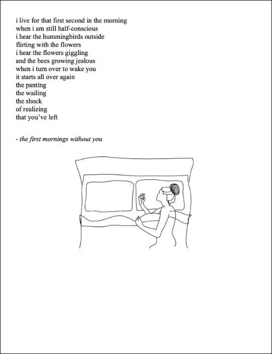
In The Sun and Her Flowers, which we mentioned before, Rupi Kaur pairs her poems with her own sketches. For instance, a poem about the morning following a breakup is paired with a drawing of a woman alone in a big bed. The empty space beside her highlights the loneliness and ache of a lost relationship.
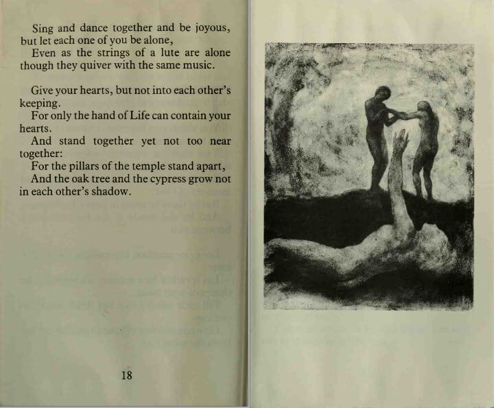
Though not strictly love poetry, The Prophet by Kahlil Gibran includes the author's original drawings, harmonizing with his meditative verses. The illustrations offer a visual pause, allowing readers to contemplate reflections posed by the text.
Material and Sensory Elements in Love Poetry Books
The final aspect of adding meaning to your book with design is incorporating material and sensory elements. Such elements can include:
- Textured papers. Thick, grainy, or embossed paper can create a more intimate and engaging reading session.
- Die-cut pages: Such books offer a three-dimensional aspect to the reading experience.
- Incorporated fabrics. Books may include fabrics like silk or cotton associated with sensuality and love.
- Scented pages. Rarely, artisanly crafted love poetry books include perfumed pages that evoke the poems' themes.
- Interactive elements. Such books require the reader to physically engage with the book: unfold, slide, or manipulate sections.
Books with sensory elements can get expensive, so such features typically appear in limited editions, artisanal objects, or design projects. Let's have a look at a couple of such projects.
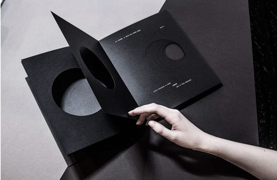
The pages of the book of Charles Simic poems designed by Sophie Loloi feature hand-cut and laser-cut shapes that go deeper into the book, giving a sense of descent into the dream state.
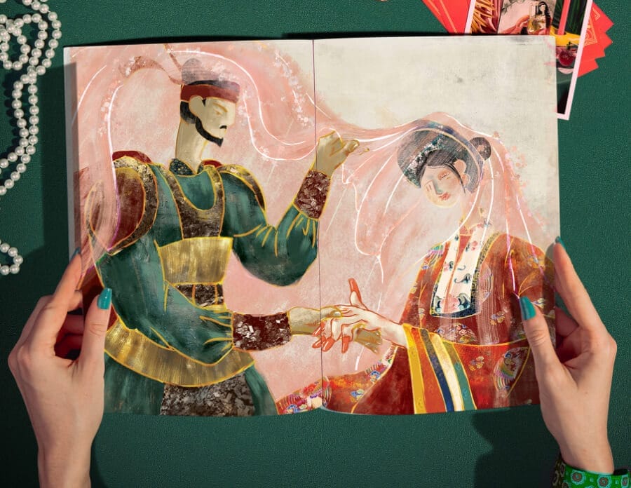
Another example, while not love poetry, is a version of the classic Vietnamese poem "Truyen Kieu" by Nguyen Du, illustrated by Binh Lam. The book is made with thick, glossy paper, adding to the richness of colorful illustrations and a nice tactile experience.
Final Thoughts
A poetry book's design can change how readers feel about the poems inside. Consider creating your love poetry book as a whole experience, where every part of the page works together to make the words even more powerful.
