Spooky stories attract rabid readers of all age groups. While many people will instantly think of adult horror authors such as Stephen King or Clive Barker when the horror genre comes to mind, authors that target a younger generation of horror fans shouldn’t be overlooked by any means. For many people, including yours truly, who developed their love of scary fiction at a young age, R.L Stine will always hold a special place in our hearts. Stine is known around the world for the enduring popularity of his Goosebumps book series.
During the heyday of classic Goosebumps, Stine was truly prolific, with a new Goosebumps book being released every month. One of the things that helped make the series such a resounding success was the eye-catching book covers that accompanied every book. The best Goosebumps book covers managed to be scary but also bold and vivid, making them eye-catching and suitable for their target readership.
To celebrate the legacy of Goosebumps, let’s delve into an exploration of 11 of the most iconic book covers from the series and why they are so memorable.
Let’s take a look at the following Goosebumps book covers for some ideas:
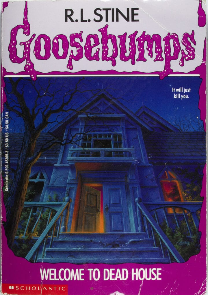
Welcome To Dead House
Welcome To Dead House is iconic for being the first Goosebumps book ever released. Appropriately, its book cover does its iconic status justice. One interesting thing about Welcome to Dead House is it was the first book Stine wrote in the horror genre for slightly younger readers, having previously targeted older teens. As a result, Stine subsequently remarked that he got the tone of Dead House slightly wrong, stating it was more suited to an older crowd.
The illustrated cover for Welcome To Dead House does this terrifying tale justice. The house itself is incredibly sinister, not to mention the scary sight at the window. The book’s tagline also doesn’t pull any punches, stating simply “it will just kill you”. Overall, a suitably scary start to both the Goosebumps series and this list.
Say Cheese And Die!
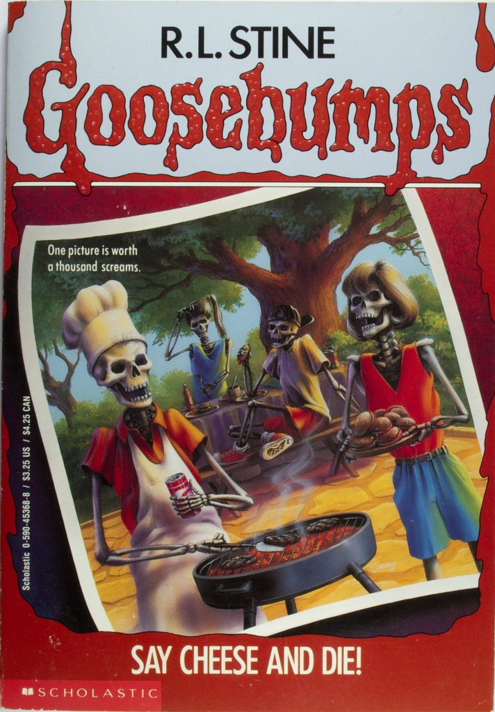
One of the best things about the Goosebumps series is the ability of Stine to create a truly creepy story out of even the most mundane of everyday scenarios. For example, when you think of an old camera, do you feel scared? Probably not, but give Say Cheese and Die a read and then get back to me. This is a classic Goosebumps story (it spawned a sequel, always indicative of a fan favorite) with an iconic cover.
Much like the story itself, the book cover for Say Cheese and Die! Manages to take an everyday scenario and imbue it with darkness and horror. In this case, a wholesome family cookout is anything but wholesome thanks to the fact it’s a family of skeletons doing the cooking. Goosebumps are always slightly playful and humorous, and this blend of horror and humor is perfectly reflected in the cover.
Night of the Living Dummy
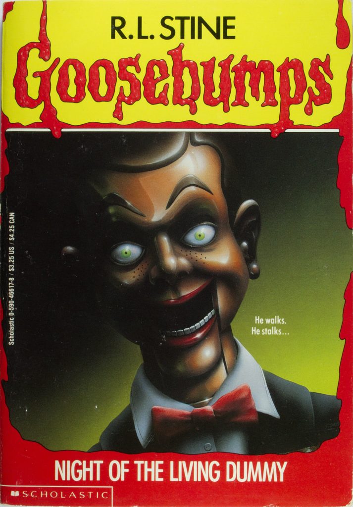
People only casually acquainted with Goosebumps and the world of Stine might well be familiar with the image of Slappy, the ventriloquist dummy featured in Night Of The Living Dummy. This is a book that went on to spawn several sequels. The image of Slappy on the book cover has gone on to become almost the unofficial Goosebumps mascot. So what about this book cover makes it so effective?
I challenge you to spend five or more seconds looking directly into the eyes of the dummy on the cover and not feeling at least a little creeped out. The mixture of realistic detail and cartoon styling is a hallmark of the Goosebumps series and is exemplified here. On the surface, this is nothing more than a grinning wooden dummy, but it’s just so darn creepy. The depiction of the right side of the dummy’s face emerging from the shadow also adds to the visual spookiness.
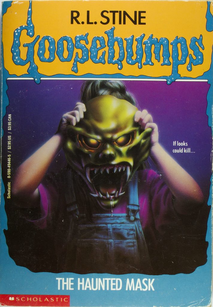
The Haunted Mask
While deciding on the book covers to include on this list, I asked some friends who were also Goosebumps fanatics during their childhood about their favorite covers. I’d say that The Haunted Mask was easily the most common answer for the scariest Goosebumps cover. Take one look at it and you might well agree.
There are two elements of The Haunted Mask’s cover that make it particularly scary and effective. The first is the mask itself. Just look at that thing! Imagine seeing that in real life. No thank you. The second element is the combination of the scary, detailed mask, and the visibly young girl who is wearing it. The juxtaposition of her childlike nature with the eerie mask is particularly effective.
You Can’t Scare Me
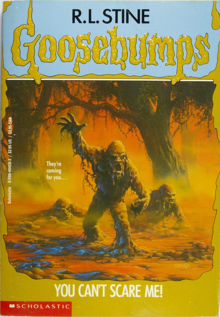
While the story of You Can’t Scare Me itself isn’t typically regarded as one of Stine’s scariest, the book cover is iconic. One thing that makes it especially effective is the use of a more muted color palette than is often found with Goosebumps books. While a lot of Goosebumps book covers use a vivid and almost cartoony color scheme, this is a darker and eerier use of orange and brown.
The main graphic of mud monsters coupled with the title and tagline make for an intriguing book cover that makes a casual browser want to open the cover and delve deeper. The boast of ‘you can’t scare me’ coupled with such a scary image is pretty interesting. Who exactly can’t be scared, and what are these monsters doing their darndest to disprove them? The book cover almost demands you dig in and find out.
The Curse of Camp Cold Lake
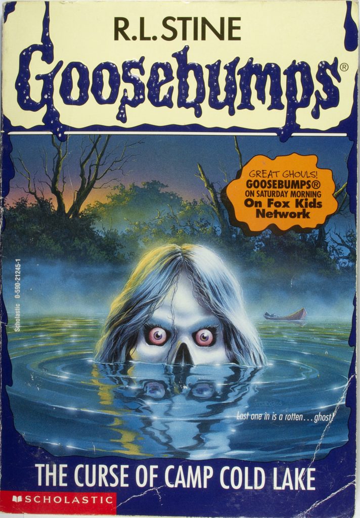
If you were making a list of classic horror story locations, you’d almost be obliged to include a creepy camp of some kind. Ever since Jason Voorhees did his thing at Camp Crystal Lake, it’s hard to associate camps with anything other than horror. I’d like to think that Camp Cold Lake is something of a nod to Camp Crystal Lake, but that might just be wishful thinking.
The cover of Curse of Camp Cold Lake is a prime example of how Goosebumps covers often feature genuinely creepy graphics that are also somehow age-appropriate. The entity featured on the front of this book is both cartoony and suitable for a young readership while also being genuinely unsettling. The fact it’s emerging from the water just makes it even more terrifying.
Attack of the Jack O’Lanterns
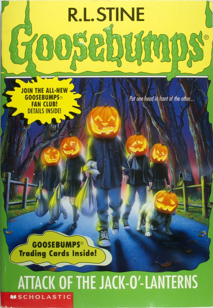
When I think of classic horror-related things throughout my life, Halloween as a kid and the feeling of reading a new Goosebumps book would both be high up on the list for sure. So imagine my joy as a young reader when I came across the cover for Attack of the Jack O’Lanterns.
In classic Goosebumps style, this book cover manages to feature a creepy image, namely an entire group of people emerging from the woods with pumpkin kids, with a playful and humorous touch, namely the pumpkinhead dog. Wouldn’t this make an amazing group Halloween costume? I sure think so!
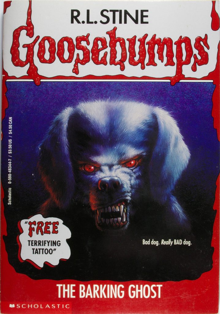
The Barking Ghost
Some Goosebumps stories make use of fairly simple but effective concepts. For example, a scary house where scary things happen. Some are a little more…out there. The Barking Ghost is a prime example. Ghost dogs that can magically body-swap with children? Yep, that’s what this story will be dealing with.
This cover is particularly creepy because it doesn’t try and do too much. Instead, it just features a horrifying dog with scary eyes. Seriously, most dogs, even ugly ones, look cute to me. This one does not. Also, the background gradient color rising from pitch black at the base of the page to purple at the top helps add to the chilling atmosphere.
A Night In Terror Tower
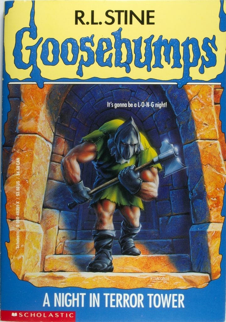
A Night In Terror Tower is known amongst Goosebumps fans for being a departure from common tropes found in the series and introducing elements such as time travel instead. It also manages to retain its trademark creepy feel. This story was so successful it was one of the first books adapted for a live-action TV series.
One reason why the cover for A Night In Terror Tower is particularly scary is due to the sheer brutality and size of the figure featured on the cover. Seriously, look at this guy’s arms and legs. Also, unlike most of the covers, A Night In Terror Tower features a realistic-looking weapon that could do some real damage.
Ghost Beach
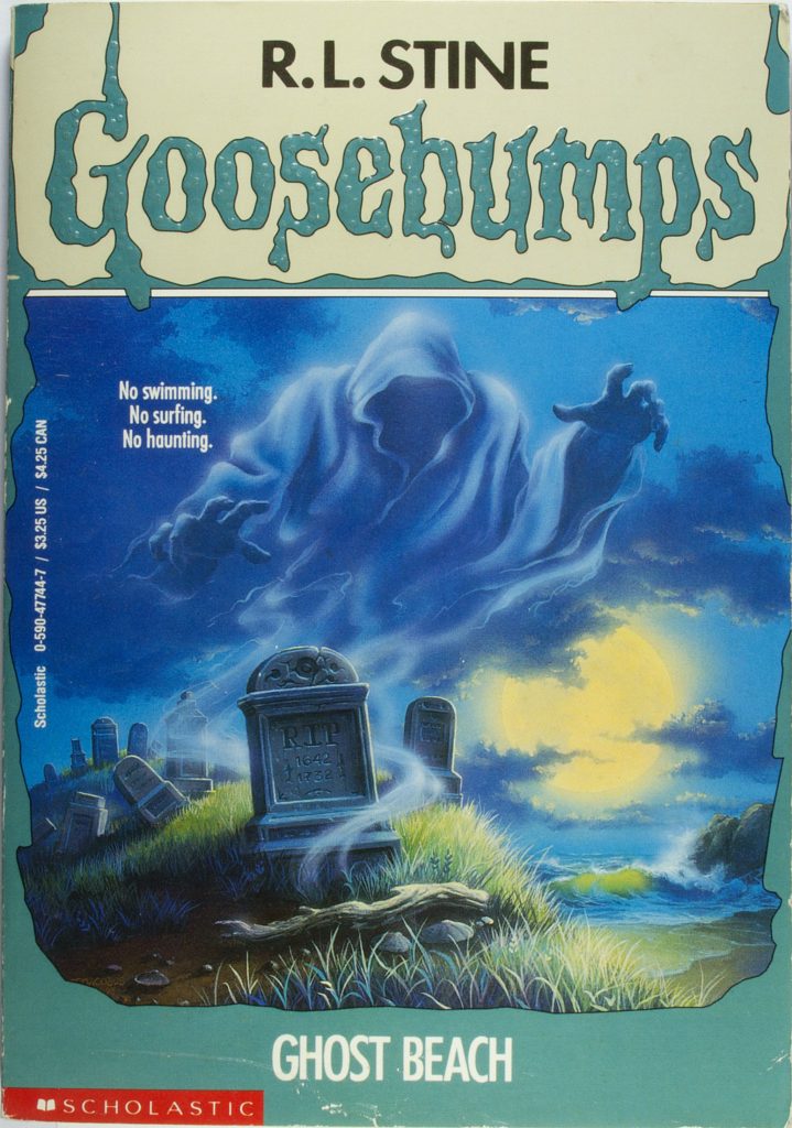
Say what you will about Goosebumps books, but you could not accuse them of having confusing titles. Let’s take Ghost Beach for example. With this book title, you know exactly what you’re getting. A beach that features ghosts. A ghost beach, if you will. Awesome. The simple title is matched by a creepy cover that conveys the tone and content of the book effectively.
The cover for Ghost Beach takes a detour from the usual formula of cartoonish but scary book covers often found in Goosebumps. Instead, we find something a little more akin to the classic illustrations of horror comics from past eras. Much like the title, the cover conveys only basic information. We see a beach and a ghostly figure. The creepiness comes from the general eerie moonlit vibe of the beachside graveyard.
One Day At Horrorland
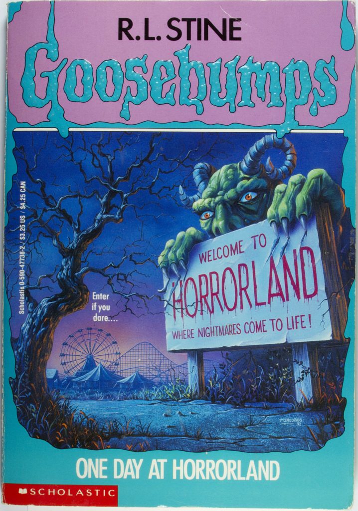
We’ve saved one of the best until last here. Within the world of Goosebumps, One Day At Horrorland is one of the all-time fan favorites, having spawned spin-offs including video games, board games, and even an entire book series set inside the titular horrorland. So what makes this original book cover so effective?
The cover itself is perhaps a little more elaborate than a lot of other Goosebumps books. We have a spooky outdoor setting, a hint of a scary amusement park, and even a large being incorporated into the horrorland sign. Like all good Goosebumps books, the Horrorland cover manages to raise several questions in the mind of a book browser. What exactly is horrorland? What is the scary creature on the sign? And why would anyone go there? Overall, this is one of the most iconic covers in the series.
Are you ready to create your own work of horror?
Hopefully, this exploration of some of the most iconic Goosebumps covers of all time has given you a fun little nostalgia trip as well as getting your creative juices flowing. Do you want to write your own scary book, either for adults or younger readers? If so, why not commit to doing exactly that?
Before you know it, you’ll be ready to choose a horror book cover of your very own!

