


In the world of graphic design, there are certain principles of design that are used behind the scenes to create graphics that are visually pleasing. Among these principles are the Gestalt principles—psychological principles and laws of perceptual organization that describe how we interpret visual data. (They're one aspect of Gestalt psychology.)
That makes Gestalt principles sound way more complicated than they actually are. In fact, you probably encounter them on a daily basis without even realizing they’re there. But the way we interpret visual data in the world around us is heavily guided by these Gestalt principles and the concepts they describe.
There are six Gestalt principles of design we’ll be discussing in this article. They are: similarity, prägnanz (literally “good figure” in German, or simplicity and order in practice), proximity, continuity, closure, and figure/ground. Let’s dive into what each one means and how they can be used in book cover design.
In this article, we'll cover the following Gestalt principles of design and how they can be used in book covers:
First Things First: What Makes a Good Book Cover Design?
Creating a book cover that's visually appealing is only one aspect of good book cover design. Book covers also have to serve the purpose of informing readers of what they can expect within a book's contents, whether it's a novel or nonfiction.
There are certain parts of a book cover that readers expect: the title (and subtitle if it's nonfiction), author name, and some idea of what the book might contain. These parts need to be immediately apparent when a reader glances at a book cover. Hiding vital information can frustrate readers and make them move on to the next book.
But beyond making sure that your book cover contains the basic information readers expect, you also need to make sure that it entices readers to give the book a chance. While we hate to think that our books will be judged solely on their covers, the truth is that if your cover doesn't catch a reader's eye, they're unlikely to pick your book up at all.
Now, on to the Gestalt principles and how they can be implemented in book cover design to create covers that invite readers to learn more.

Gestalt Principles: Law of Similarity
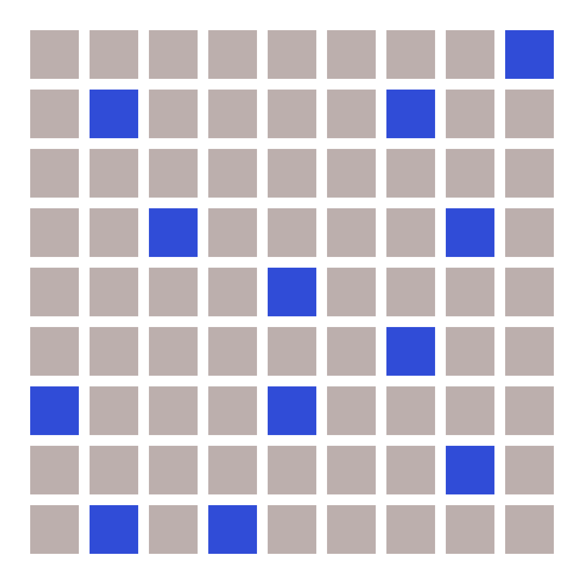
The Gestalt principle of similarity directs that people will group similar things together. For example, if you have a grid that is made up of 81 squares, and 12 of those squares are blue while the rest are gray, you’ll automatically group the 12 blue squares together, regardless of where they are on the grid.
You can use the same principle to create groups on your book cover. Take this example from the cover of Super Sad True Love Story. The same words repeat in the dots on each line, but because there’s a single line of black dots running vertically, the brain reads those dots as a single group.

Gestalt Principles: Law of Prägnanz
Think of the law of prägnanz as being similar to Occam’s razor: the simplest explanation is often the right one. Our brains try to make sense of complex images in the simplest way possible. We automatically look for order in chaos.
This Gestalt principle presents some incredibly interesting opportunities for creating amazing book cover imagery. Just check out this cover for Hex. The cover designer has used flowers to create a skull image. There is no actual skull in the design, but our brains automatically perceive it based on the general shape in which the flowers are arranged.

Gestalt Principles: Law of Proximity
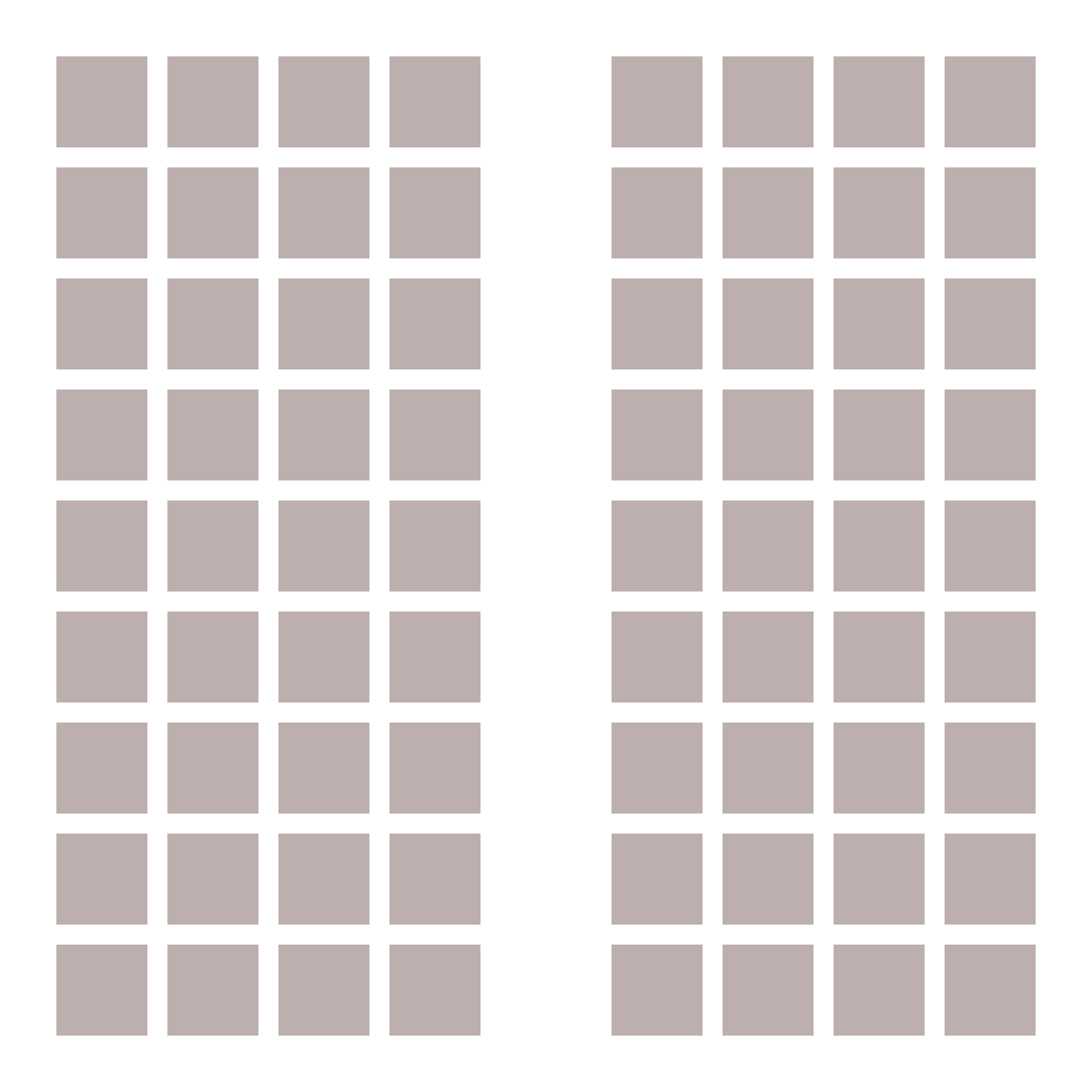
The law of proximity is one of the simpler Gestalt principles to understand. Things that are close together are automatically grouped together. This is especially true if objects overlap within a design. Here's an example of how squares are grouped into two separate groups based on their proximity to each other, even though all of the squares are the same:
Just take this cover for Witches of America as an example. The crow and circle that overlaps it are automatically grouped together, while the other two overlapping circles are also grouped together. This is despite the fact that the colors in the image would suggest other groupings; proximity overrules that.

Gestalt Principles: Law of Continuity
The law of continuity in Gestalt theory is all about the smooth flow and connection of elements. It's like a visual storytelling technique. When your eye follows a line or pattern, your brain likes to perceive it as a continuous and unbroken path.
It's essentially the art of keeping things flowing in a way that makes sense, creating a sense of unity and coherence. It's like connecting the dots in a logical and pleasing manner, making your design feel whole and harmonious. Here's an example of how the Gestalt principles of continuity works, note that your eye follows the lines, regardless of the dots changing color halfway through (your brain interprets each line as looking like the example in the center, rather than being a single color):

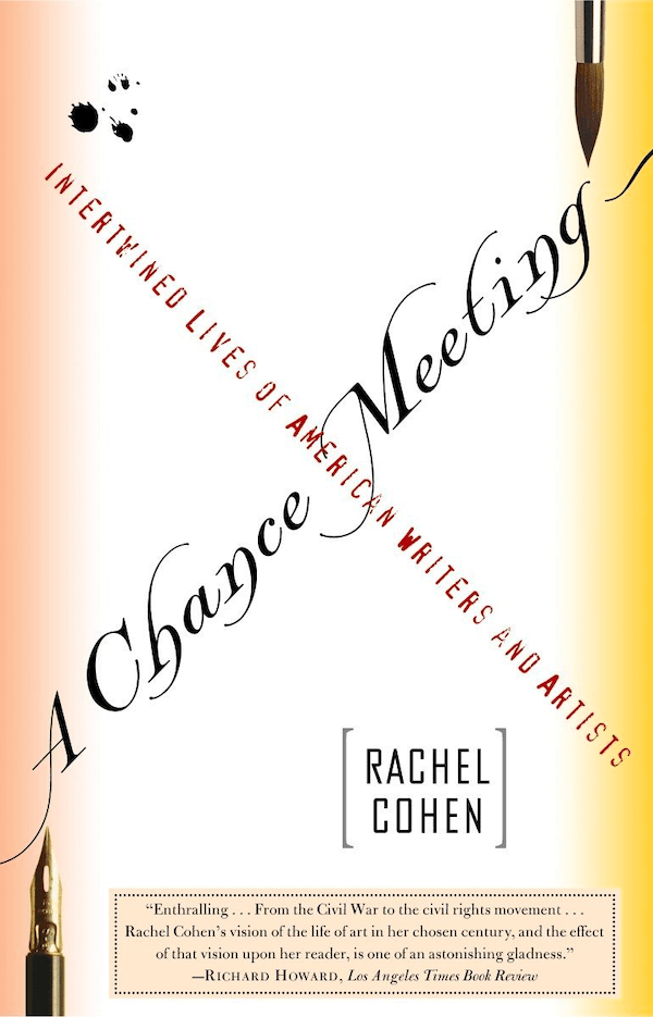
You can see this principle in practice in the cover for A Chance Meeting. Even though the text forms an “X”, the eye follows one line and then the other (and priority is given to the larger typeface).
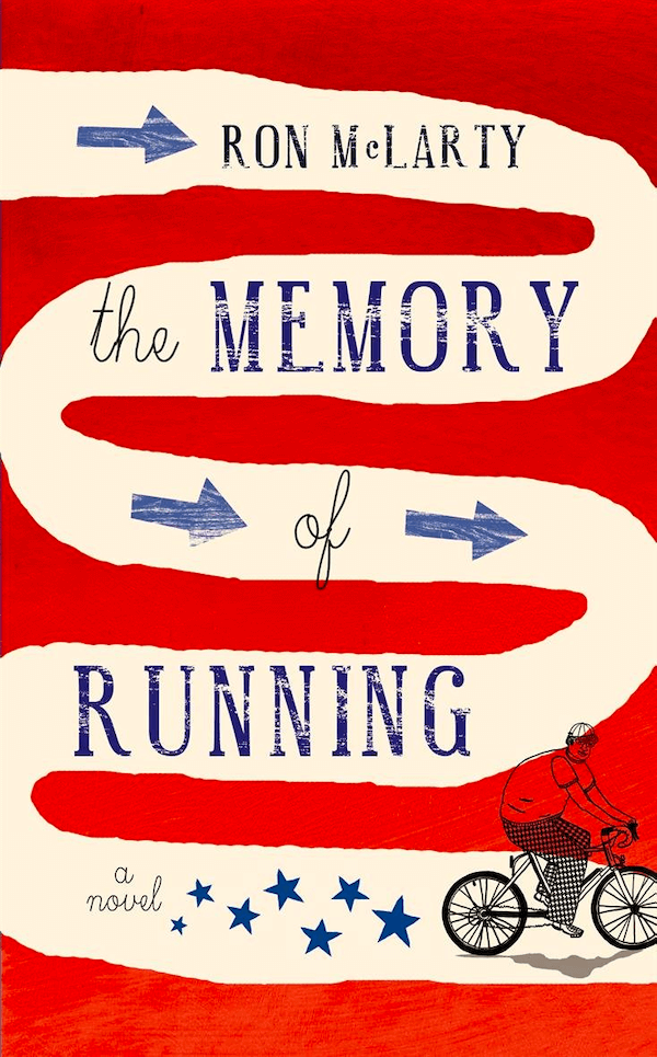
You can also see this Gestalt principle in the cover for The Memory of Running, which makes it a bit more obvious with the white background line linking all of the text together. Between the lines and the arrows, the eye is easily guided over the image.
Gestalt Principles: Law of Closure
The Gestalt principle of closure is another law that can allow for some really creative book cover designs. When an image is broken up, our brains can automatically fill in the missing parts and piece things back together, creating a sense of closure where there is none. This principle is best illustrated in practice.
Take the cover of Day of Empire, for example. There’s a split breaking up the text but it doesn’t impact readability at all.

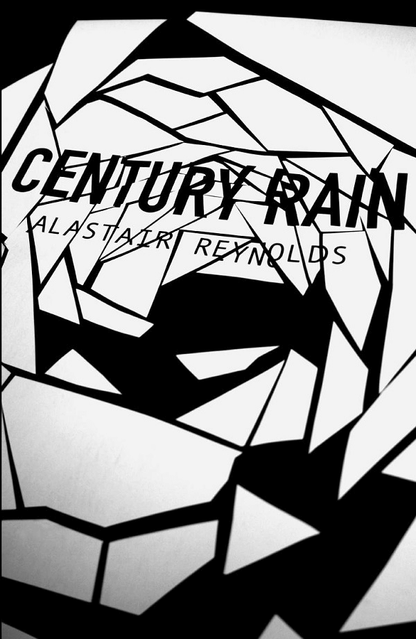
The same is true in the cover for Century Rain. The text is broken up on what almost looks like abstract broken glass, but the brain easily fills in the missing parts and makes the text readable.
Gestalt Principles: Law of Figure/Ground
Figure/ground is the final Gestalt principle we’ll discuss. We see this principle in action often in company logos (like the hidden arrow in the FedEx logo), but it can also be used to create some truly breathtaking cover designs.
Basically, figure/ground is when the shape on an image in the foreground creates a secondary image in the background. Take the cover of The Boy with the Tiger’s Heart. The foreground is a scene of some children standing on a hill surrounded by trees, looking out at a sunset. But this foreground image creates a tiger in the background, further illustrating the book’s title.

Using the Gestalt Principles in Your Book Cover Designs
Using the Gestalt principles listed above can help you create more interesting and appealing book covers. A word of caution, though: don’t go overboard. Use one or possibly two principles in your designs, rather than trying to incorporate all of them into a single cover.
Even the most minimalist book cover designs can incorporate Gestalt principles, as can more maximalist covers. They add interest and visual appeal to your book, making it more likely to catch the eye of potential readers while they’re browsing.
