I had been working on a book with editor Sharon Goldinger of PeopleSpeak. This fiction author is fond of dropping ellipses into his dialogue. Consequently there were hundreds of them in the 300-page book.
Some authors will just type three periods where they want an ellipsis, so it looks like this…
Others, like this author, had learned how to insert a special ellipsis character into their manuscripts, which looks like this…
They look pretty different, don’t they? There were so many on the page, the ellipsis characters were creating an unpleasant pattern that distracted from reading the book. Something had to be done.
But first, have you ever asked yourself…
What Exactly Is an Ellipsis?
Let’s let Wikipedia take it from here:
Ellipsis (plural ellipses; from the Ancient Greek: ἔλλειψις, élleipsis, “omission” or “falling short”) is a series of dots that usually indicate an intentional omission of a word, sentence or whole section from the original text being quoted…. Ellipses can also be used to indicate an unfinished thought or, at the end of a sentence, a trailing off into silence (aposiopesis)…. The most common form of an ellipsis is a row of three periods or full stops (. . .) or a precomposed triple-dot glyph (…). … The Chicago Manual of Style recommends that an ellipsis be formed by typing three periods, each with a space on both sides.
How to Create an Ellipsis Character
Okay, so that’s pretty clear. If you have a Macintosh it’s quite easy to access the special ellipsis character, which contains all three dots together as one.
On Macintosh, press Option then semicolon (;) to generate a fixed ellipsis character like this …
On Windows, you can hold down the Alt key and press 0-1-3-3 on your numeric keypad, or use the Character Map application to insert the ellipsis where you need it.
Anyway, back the the book I was working on.
We ran into so many different situations trying to get all these punctuation marks right, Sharon sat down and wrote me a “cheat sheet” of guidelines about using ellipses. I’m happy to pass it along:
5 Varieties of Ellipsis Use
- When 4 dots are used between two complete sentences or at the end of a quote, they should look like a period followed by 3 equally spaced dots:
- (Between sentences)
in the extreme. . . . It has a rough - (End of quote)
drawing hither the commerce of the world. . . .”
- (Between sentences)
- When 3 dots are used in the middle of a sentence, with or without other punctuation, they should be equally spaced dots:
- (No other punctuation)
in some capacious harbor . . . where the natural advantages - (Other punctuation after ellipsis)
around the cape . . . , we ‘squared away’ - (Other punctuation before ellipsis)
pecks of dried fruit, . . . very acceptable
- (No other punctuation)
Book Designer Confessions
Now, I’ll confess right here that I’m not a fan of the ellipsis character found in some of our type fonts. And I don’t always use it when I’m typesetting books. There are three reasons for this:
- There is no set width or spacing for the ellipsis character, and each designer is free to create whatever kind of ellipsis they like.
- There are times you need to introduce a space or another punctuation character to the ellipsis, which can create some unsightly typography.
- There are other times when you’d like to have more control of the spacing of the ellipsis, particularly when combined with other punctuation, and not be at the mercy of the decision made by the type designer.
You can see how designs for ellipses vary widely in this illustration. The top line is set in 12 point Adobe Minion Pro, the bottom in 12 point Gabriola:

Here’s how the ellipsis character in the Cambria font differs from the Chicago Manual recommendation of spaces and periods:

But with the tools built into Adobe InDesign, we can craft our own custom ellipsis that will conform to the exact look we want to achieve in typesetting.
 The first task is to make sure we’ve constructed the ellipsis properly.
Parts of the Flexible Ellipsis
If the fixed ellipsis character is inflexible, we want to make ours flexible enough to meet our needs.
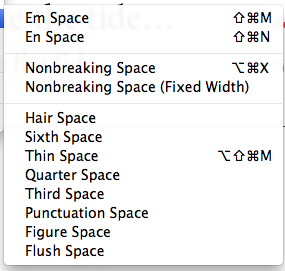
InDesign comes equipped with lots of kinds of word spaces, and this capability is critical to creating an ellipsis that behaves properly.
We never want the ellipsis to separate from the word it’s attached to, and we don’t want any breaks within the ellipsis, leaving some dots on one line and others on the next. That’s a no-no.
So it makes sense to replace the regular space characters with InDesign’s nonbreaking spaces. These make sure the ellipsis won’t break away from the word it’s attached to, and won’t break within itself.
Specifically, we’re going to use the Nonbreaking Space (Fixed Width). This will allow us to create our ellipsis with the exact spacing we need, without the worry that the spaces will flex in size as InDesign adjusts regular word spaces to create a justified line. Here’s what it looks like:

Notice that I left a regular, breaking space at the end of this string. That’s where I want it to break if it winds up at the end of a line.
Now that I have a string made up of individual characters, there’s one more thing I can to do customize it.
Customizing the Ellipsis
In the second illustration above, you can see that the spacing of a fixed ellipsis is quite different from the one assembled from characters. You might think the fixed one is too tight, with too little space between the dots.
But you might also think the assembled one is too loose. We can fix that.
Here is the original ellipsis we just made, and one with a tracking -60. Although subtle, the change is very evident, especially when repeated many times on one page:

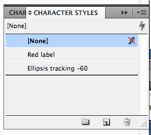
 With InDesign we can capture this tracking setting as a Character Style.
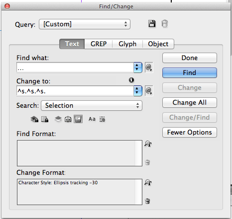
This allows us to use the Character Style (“Ellipsis tracking -60”) in a “Find/Change” operation to replace all the fixed ellipses in the document with this custom-made, hand-crafted ellipsis that will space exactly as we want and break according to the rules:
Book design is made up of an accumulation of details like this, and the tools available to us now allow a level of sophistication and automation that makes smoother, more elegant, and ultimately more readable pages possible.

Although ebooks may be our future, book typography continues to develop in interesting ways. Print books that display this type of typographic work seem like they may be around for quite a while.


