


By Joel Friedlander
Welcome to the e-Book Cover Design Awards. This edition is for submissions during October, 2020.
This month we received:
34 covers in the Fiction category
13 covers in the Nonfiction category
Guest Judge
 We are once again pleased to welcome Tanja Prokop to The Book Designer as a guest judge this month. Tanja was born in Germany, but lives and was raised in Croatia. Her three beautiful daughters and her amazing husband are her biggest inspiration in life. She has an MA degree in German language and literature and philosophy. A few years ago she started her own design company and became a professional book cover designer. She designs covers, and is constantly creating new visual experiences for her clients. Tanja is also a multiple winner of various book cover design contests and has created thousands of covers. You can find her pre-made covers at Book Design Templates, or visit her site at www.bookcoverworld.com.
Comments, Award Winners, and Gold Stars
I’ve added comments (TP: ) to many of the entries, but not all. Remember that the aim of these posts is educational, and by submitting you are inviting comments, commendations, and constructive criticism.
Thanks to everyone who participated. I hope you enjoy these as much as I did. Please leave a comment to let me know which are your favorites or, if you disagree, let me know why.
Although there is only winner in each category, other covers that were considered for the award or which stood out in some exemplary way, are indicated with a gold star: ★
Award winners and Gold-Starred covers also win the right to display our badges on their websites, so don’t forget to get your badge to get a little more attention for the work you’ve put into your book.
Also please note that we are now linking winning covers to their sales page on Amazon or Smashwords.
Now, without any further ado, here are the winners of this month’s e-Book Cover Design Awards.

e-Book Cover Design Award Winner for October 2020 in Fiction
Jovana DDD submitted Lessons Learned designed by Marushka from Deranged Doctor Design. “Thriller book cover design, The Flint Stryker Thriller Series Book 1”
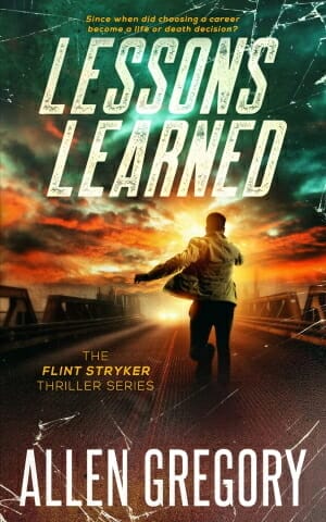
TP: This is definitely my favorite cover design in the series. The typography is spot on. I have always admired Marushka’s color choices. Great work!
e-Book Cover Design Award Winner for October 2020 in Nonfiction
Helen V submitted Hope Inspires Strength designed by MiblArt.
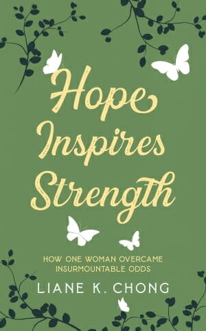
TP: Beautiful work!
Fiction Covers
Amanda Warne submitted The Reluctant Wizard designed by Borja Nekro. “I designed the cover after several sleepless nights. I cannot write a book without the cover. Once I knew what it needed to feature, I seeked a seriously talented dark-fantasy artist, Nekro, and allowed my middle child to model.”

TP: Very intriguing. All design elements are placed nicely. I only wish the title color was more inviting.
Argyro Graphy submitted The Adventures of Bentley Hippo: Inspiring Children to Never Give Up designed by Argyro Graphy. “The image of Bentley Hippo (me, now blind in one eye) with my best friend (who passed away) she struggled with cancer and always lifted my spirits and inspired ME to never give up…It is in her honor. Michael Reyes captured this friendship perfectly”

TP: A beautiful illustration with matching typography. I really like this cover design. ★
Bjørn Larssen submitted Children designed by Bjørn Larssen. “The Tree logo, designed by Brad and Justine Bergman, signifies Yggdrasil – the mythical tree connecting the Norse Nine Worlds. Fire is an ongoing theme in the first book in the series, same as ice will be in the second.”

TP: The structure of this cover is very distinct. Everything works well together.
Brent Shibla submitted Paradise Door designed by Brent Shibla. “The door represents a scene towards the end of the book where the protagonist see’s beautiful colors beyond a door transforming into tulips.”

TP: Every author should take advantage of the power of a good cover design. It should be done by a professional cover artist. A good design sells a good book. Even though the cover doesn’t look bad, it is obvious that this cover was done by someone who isn’t a designer. It simply isn’t appealing and harmonious.
Brian Skillen submitted The Way: Through a Field of Stars designed by Valeria Fox. “The shell and cross is the symbol of the Camino de Santiago which is where the novel takes place. Also, all of the symbols behind it are from a coding system you can still find in the Cathedrals of the Camino. After you have read the book, you can decode the cover using the cipher in the novel”

TP: Always try to keep things simple. Find a simple (not dull) font and start with that. Later, if the cover is lacking that special spark, use a different one to emphasize the title, but don’t use too many fonts in one place because the cover completely loses a professional appeal.
cheryl mackey submitted Exiles & Empire designed by Victoria Faye/Daniel Schofield. “Artist is Daniel Schofield, commissioned digital artist from the UK who created the art 100%. Victoria Faye is the designer, who took the amazing art based on a specific scene from the book and did her text and layout magic.”

TP: The illustration is very appealing and the typography is nicely done. Good work. ★
Cortez Law III submitted THREAT NEXUS designed by Paradox Book Covers. “Invisible Killer font ties into the previous entries in the Atlanta Homicide Squad Series.”

TP: The designer was probably asked to incorporate a few different images, which is done very well. I would love to see a bold and striking title font with a stronger typography approach.
Daphne Self submitted Alabama Days designed by Hannah Nichols. “The yellow two is for Medic Two within the story. The paramedic’s pensive look is the epitome of the main character. The woman is perfect representation for the feisty reporter in the novel. Their stance and proximity represents the closeness & trust of their relationship.”

TP: When a designer has to incorporate two different images into one it is always a huge challenge to adjust them to look like one. Once the implementation is done, try using a color lookup to blend the two together. Here, it is obvious that these two characters are coupled by the designer. I would also recommend a better typography approach.
Deborah Coonts submitted 90 Days to Score designed by Glendon of Streetlight Graphics.

TP: The illustration is very interesting and the idea behind the typography is good. I would only recommend a more subtle approach when it comes to typography. The designer should leave a bit more room around the text so that the whole design can “breathe”.
G.O. Turner submitted The Book of Ruein designed by Tom Jilesen. “While this is the first of 10+ books, I typeset and designed the overall motif with a forward-looking color scheme. Notice the purple banner at the top. Each successive book in the series will shift in hue based upon a prism. Books can be added between based on its time & hue.”

TP: A nicely balanced cover. I wish the typography was more visible and emphasized a bit more.
Gregory Kopp submitted A Child’s Breath designed by Gregory Kopp. “Image encapsulates the subject of the novel.”

TP: This cover lacks a basic professional approach. It should be completely redesigned, while keeping the same elements.
Helen Garraway submitted Sentinal Awaken designed by Jeff Brown Graphics. “The cover is a scene from the book as Jerrol and the Sentinals approach the palace. An encroaching storm changes the light to a weird shadowy yellow as they ride over the rise and the panoramic landscape opens up before them.”

TP: I really like this cover and that additional flare in the title gives the whole cover a magical touch. Nice work!
Helen V submitted Striker X designed by MiblArt.

TP: Amazing work. I love the illustration and typography. Very well done. ★
Helen V submitted Forgotten Honor designed by MiblArt.

TP: A nice cover design with striking elements.
Jen Hennig submitted Blue On Black designed by Mahli. “This is “a ‘grid’punk Wierd West SF novel about cowboys, aliens, and Tesla trains”. Said train’s designer has some interesting–and important–whirly blue tattoos, and the aliens hail from a desert place called the Bruise.”

TP: This cover needs a professional touch. Too many things are going on on this cover. The typography needs to stand out more and be professionally structured.
Jovana DDD submitted Arctic Ambush designed by Marushka from Deranged Doctor Design. “Thriller book cover design, The Flint Stryker Thriller Series Book 2”

TP: What can I say but “amazing work”!
Jovana DDD submitted Hell’s Handmaiden designed by Marushka from Deranged Doctor Design. “Thriller book cover design, The Flint Stryker Thriller Series Book 3”

TP: Another great series design!
Jovana DDD submitted 3001 designed by Milo from Deranged Doctor Design. “Fantasy cover design”

TP: Strong and appealing. Nice work!
Jovana DDD submitted Unchipped: Kaarina designed by Milo from Deranged Doctor Design. “Sci Fi / Post-Apocalyptic book cover design, Unchipped Dystopian Sci-Fi Series Book 01”

TP: Another great cover design with recognizable design elements. ★
Jovana DDD submitted Unchipped: William designed by Milo from Deranged Doctor Design. “Sci Fi / Post-Apocalyptic book cover design, Unchipped Dystopian Sci-Fi Series Book 02”

TP: I really love the colors in this one. Nice job!
Jovana DDD submitted Unchipped: Enyd designed by Milo from Deranged Doctor Design. “Sci Fi / Post-Apocalyptic book cover design, Unchipped Dystopian Sci-Fi Series Book 03”

TP: A nicely balanced and well-designed series.
Judy DuCharme submitted Blood Moon Redemption designed by Hannah at Ambassador International. “The image reflects the suspenseful tone of the book with the darker shades accented by the intense beautiful eyes of the heroine and redness of the moon that displays the title. The beauty of the cover simply draws you in.”

TP: I think that the imagery is nicely picked, but the typography needs to be redone. It is too simply and missing a good structure.
K.C. Julius submitted Portents of Chaos designed by Gwen Shackleton. “All four of the covers of The Drinnglennin Chronicles, my epic fantasy series, were designed by British artist Gwen Shackleton. When I decided on using an “eye” image for my brand, she came up with these beautiful covers.”

TP: I would suggest a stronger title treatment. Other than that, very appealing.
Kyoko M submitted Of Fury and Fangs designed by BRose Designz. “This is one of my favorite covers from my series because I think the contrasting gold and blue is truly gorgeous.”

TP: With a little bit work on the title, this cover would be a winner.
Lara Kinsey submitted Blooming in the Sun designed by Lara Kinsey. “The temple of Venus just under the title is a plot point. The color palette comes from a Victorian-era scarf. The laurel crown signifies a doctorate in Italy, which is a plot point.”

TP: I would only suggest slight title treatment changes. It should probably be a little bit smaller in size.
Lilianne Milgrom submitted L’Origine designed by Lilianne Milgrom. “This is a historical fiction novel about a painting that is too suggestive to use as cover art. I selected a detail of another painting by the same artist that could conceivably portray the model of the painting in question. I selected the font for the title ‘L’Origine’ for its modern, clean feel.”

TP: This cover has a lot potential. My only recommendation would be to make the author name more prominent and visible.
Lucas Pogrzebny submitted The Last Review designed by Azure Midnight Press. “Levin, a film critic (then a detective), wears a navy blue trench coat. He also has hemophobia (fear of blood) and the case he investigates is related to it, as well as to the rouge an actress wears on her lips.”

TP: A nice cover design. I’m not sure that the two fonts work well together, but all in all, appealing.
Matty Dalrymple submitted The Falcon and the Owl: An Ann Kinnear Suspense Novel designed by Lance Buckley. “I love the image Lance chose as the focal point and the title font, which manages to look both modern and retro, giving the cover an understated and classy look.”

TP: I’m all pro-asymmetry, but then it has to be a proper asymmetry. When you have a slightly shifted image or image part, then it has to be placed away from any other aligned object or text, otherwise, it looks off. I would place the subtitle somewhere else so that it doesn’t look shifted, which it isn’t.
RajaRajeshwari N submitted Chronaethion designed by RajaRajeshwari N.

TP: This image is very interesting, however, I would strongly recommend another font for the typography treatment.
Srividhya Lakshmanan submitted Do You See the Giant? designed by Akansha Krishnan. “It is designed to suit the title with animal popping out from the side. Multiple fonts and pastel colors are used on the cover to keep it interesting for children.”

TP: A nicely designed book cover.
Srividhya Lakshmanan submitted The Tooths designed by Akansha Krishnan. “The key characters and the elements of the story are used on the cover. It is a children’s book and so the color scheme is kept bright.”

TP: I would be lying if I said that it wasn’t appealing, but it could use a little bit more work in the typography section.
Sybil Le Pyrmont submitted The Shape of Stars Unknown designed by Lance Buckley. “The image as well as the color palette chosen by the designer are not only symbolic of several significant elements in the book, but they also foreshadow events set to unfold in the sequels. I am in awe of the way Lance managed to translate my brief into such a perfect design!”

TP: I really like this cover design. It really looks nice.
T. A. Bruno submitted In the Orbit of Sirens designed by Daniel Schmelling. “The cover goes from light and dreary. Font used is Kimberley black for the main title. The humans are made tiny in the vastness of the land before them, like ants returning to a hill.”

TP: The only thing this cover lacks is color. I would like to see a splash of color somewhere.
Nonfiction Covers
Aaron Milavec submitted What Jesus Would Say to Same-Sex Couples designed by Aaron Milavec. “A provocative book deserves a provocative cover. My research already taught me that men who hate the thought of gay sex are often surprisingly sympathetic to lesbian sex. So I wanted to find a lesbian couple that were easy on the eyes but not pornographic. My final choice projects the mood. . . .”

TP: The image is very prominent and therefore steals all the attention (which isn’t a bad thing) but the typography needs a lot more work. It is obvious what the title is, but it isn’t emphasized enough. The author name should also be placed better. All in all, there is enough room to make a great cover with all offered elements.
Bozhana Ivanova submitted Tao of Your Game designed by Dragomir Sokolov.

TP: Strong, beautiful and clean. ★
Clay Rivers submitted Fieldnotes on Allyship: Achieving Equality Together designed by Clay Rivers. “The raised fist has long been the symbol for Civil Rights and labor unions. The yellow, black, and gray palette is a nod to Black Lives Matter. The title is set in Futura Medium for it crisp legibility. Minion Display is used for the subtitle to add a human element to the cover.”

TP: I really like the simplicity of this cover design. Nice work!
E Jean Simpson submitted The Big Kid’s Magical Path to Numbers designed by E Jean Simpson. “Inspired by seeing this path that seemed magical and mysterious. I decided to format a book that would entice the very young who want to be seen as big (grown) kids to love numbers using a book formatted like adult, but with the fun and magic of numbers seen through pictures of nature.”

TP: This cover really needs to be created from scratch. Too much is going on on the cover. Too many colors and fonts were used and the textual parts are completely illegible. I would recommend a full make-over.
K.M. Weiland submitted Writing Your Story’s Theme designed by Damonza.

TP: A perfectly structured and clean design. Great work! ★
Kevin Callahan submitted Brothers in Arms: Remembering Brothers Buried Side by Side in American World War II Cemeteries designed by Jerry Takigawa.

TP: A nicely designed cover design!
Kristin Joy Lavin submitted The Butterfly Promise designed by The Book Makers. “Thank you. -KJL”

TP: Given that I was involved in the design process of this cover, I can only say that I tried to balance the background and the title in a good way, so that the whole cover can “breathe”. When you have such a beautiful image, then it isn’t too hard to create a nice cover. It was also a pleasure to work with Kristin, who made our job much easier. I think that this was a great, win-win cooperation.
Mark Pate submitted Sing Like Never Before designed by Mark Pate. “This cover illustration is meant to elicit a bright, heavenly quality to boost the spirit of a vocal performer or teacher who is diving into dense vocal pedagogy learning. The font choices were made to make the text clear and readable on such an intricately illustrated background.”

TP: A nice cover design.
Maureen C. Berry submitted Midlife Cancer Crisis: A Memoir designed by Maureen C. Berry. “The vibrant yellow with the textural element and the teal cup slightly down center draws the eye in. The red slash through the center of the cup offers a dramatic statement to complement the content. I chose a bold font to contrast with the overall literary feel of the cover.”

TP: I love the contrasts here. I would only suggest to keep only one font on the cover. It is also a bit unclear if the word “crisis” is actually part of the title or not.
Sean Leal submitted Consent Is Morality designed by Sean Leal. “The moment depicted on the cover represents a moral quandary problem posed in the book. The whimsical feel of the bright-colored hot air balloon is betrayed by the sharp and sudden appearance of the falling man. The sky blue that compliments the scene sets it apart from other philosophy books.”

TP: All in all not bad at all, but the typography should be restructured.
Sonia Frontera submitted Relationship Solutions: Effective Strategies to Heal Your Heart and Create the Happiness You Deserve designed by Mariah Sinclair. “This design evokes a feeling of peace, freedom and possibility through the use of imagery of a broken heart that is composed of birds. It captures the message of the book that healing is possible for people struggling with relationship troubles.”

TP: A beautiful cover design. ★
Susan Stitt submitted UNSTUCK: How To Unlock & Activate the Wisdom of Others designed by Rick Nease. “The 3D effect on this cover is so good that we have had people actually reach out to touch it when they see the book in person.”

TP: I like the structure of the cover and the 3D effect. A really nice cover design!
Well, that’s it for this month. I hope you found it interesting, and that you’ll share with other people interested in self-publishing.
Use the share buttons below to Tweet it, Share it on Facebook, Link to it!
Our next awards post will be on December 28, 2020. Deadline for submissions will be November 30, 2020. Don’t miss it! Here are all the links you’ll need:
- The original announcement post
- E-book Cover Design Awards web page
- Click here to submit your e-book cover (See New Submission limits)
- Follow @JFBookman on Twitter for news about the E-book Cover Design Awards
- Check out past e-Book Cover Design award winners on Pinterest
- Subscribe to The Book Designer Blog
- Badge design by Derek Murphy
