


By Joel Friedlander
Welcome to the e-Book Cover Design Awards. This edition is for submissions during November, 2020.
This month we received:
32 covers in the Fiction category
8 covers in the Nonfiction category
Guest Judge
 We are once again pleased to welcome Tanja Prokop to The Book Designer as a guest judge this month. Tanja was born in Germany, but lives and was raised in Croatia. Her three beautiful daughters and her amazing husband are her biggest inspiration in life. She has an MA degree in German language and literature and philosophy. A few years ago she started her own design company and became a professional book cover designer. She designs covers, and is constantly creating new visual experiences for her clients. Tanja is also a multiple winner of various book cover design contests and has created thousands of covers. You can find her pre-made covers at Book Design Templates, or visit her site at www.bookcoverworld.com.
Comments, Award Winners, and Gold Stars
I’ve added comments (TP: ) to many of the entries, but not all. Remember that the aim of these posts is educational, and by submitting you are inviting comments, commendations, and constructive criticism.
Thanks to everyone who participated. I hope you enjoy these as much as I did. Please leave a comment to let me know which are your favorites or, if you disagree, let me know why.
Although there is only winner in each category, other covers that were considered for the award or which stood out in some exemplary way, are indicated with a gold star: ★
Award winners and Gold-Starred covers also win the right to display our badges on their websites, so don’t forget to get your badge to get a little more attention for the work you’ve put into your book.
Also please note that we are now linking winning covers to their sales page on Amazon or Smashwords.
Now, without any further ado, here are the winners of this month’s e-Book Cover Design Awards.

e-Book Cover Design Award Winner for January 2020 in Fiction
Ebook Launch submitted Red Right Hand designed by Ebook Launch. “I’ve submitted severeal sci fi book covers this month. This one has a bright palette and leans into the post-apoc sub-genre.”
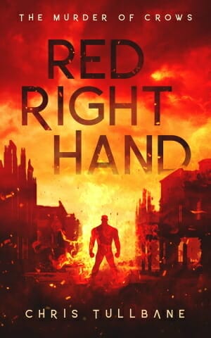
TP: Amazing! Everything is beautifully done!
e-Book Cover Design Award Winner for January 2020 in Nonfiction
Matt Pais submitted Zack Morris Lied 329 Times! Reassessing every ridiculous episode of “Saved by the Bell” … with stats designed by Trent Koland.

TP: A great cover design.
Fiction Covers
Andrene Bonner submitted No Life in Olympic Gardens designed by Mirjana Krasojevic. “This is Book 1 of 2 from a three book literary series. The setting is late 1960s and early 1970s tropical Jamaica. The protagonist is an abandoned nearly illiterate boy.”

TP: The nice cover design.
Andrene Bonner submitted Long Walk to Cherry Gardens designed by Mirjana Krasojevic.

TP: A solid cover design with elements in its right place.
Cathy Cade submitted The Godmother designed by Cathy Cade. “A 15,000-word reworking of Cinderella, told from three POVs: Prince Alfred, Buttons the dog and Cindy-Ella’s godmother. Being no artist but an impoverished pensioner, I started with a Canva template.”

TP: This cover has a lot of potential and it simply looks like it should be tweaked a bit more. The visual features are a little bit all over the place and the textual areas aren’t where they should be.
Chip Conyers submitted Payton Finds His Purpose: A journey of spiritual awakening and Christian rebirth designed by Chip Conyers. “The scene and characters on the cover of this children’s book were hand drawn, scanned and then colored using Microsoft Paint.”

TP: It is pretty hard to read the textual parts on this cover.
David Willison submitted Finding Your Harpy Place designed by Stefanie Dworschak. “Key motifs include the magic artifact, the idea of an arduous journey, and the presence of the two protagonists in the image: a human, and a giant harpy.”

TP: A beautifully balanced cover design. Very nice! ★
Deborah Coonts submitted Deadfall designed by Glendon of Streetlight Graphics.

TP: This cover design is very eye-catching and very well done!
Deborah Stevenson submitted Pugs Wearing Parkas designed by Deborah Stevenson, Morgan Spicer. “Pugs Wearing Parkas is a children’s book in verse. The bright colors and engaging, mischievous expressions are designed to capture the interest of little readers and reflect the lighthearted, fun story.”

TP: The cover is very appealing and genre-appropriate.
Deborah Stevenson submitted Who’s First?: Chicken and Egg Book 1 designed by David Stedmond. “Who’s First? is a silly children’s book series about two indecisive best friends with a penchant for predicaments. The race scene on the cover sets the tone of friendly competition depicted in the story. The comical expressions and bright colors engage young readers.”

TP: A really nice cover design. I like the typography treatment.
Diane McGyver submitted Northern Survival designed by Diane McGyver. “The cover was created in InkScape. The images came from Pixabay.”

TP: The image combination looks very well, however, I would like to see a different typography approach. The two fonts used on the cover don’t work very well together.
Diane McGyver submitted the Salvation of Mary Lola Barnes designed by Diane McGyver. “The cover was designed in Inkscape. The images are from Pixabay.”

TP: Nice colors and image choice. I would only suggest a different font or a combination of fonts for the title and more inviting colors.
Ebook Launch submitted Resistor designed by Ebook Launch. “I’ve submitted severeal sci fi book covers this month. This one takes an illustrative approach and leans into the cyberpunk genre.”

TP: Beautiful work. Eye-catching and very genre-appropriate. Great job!
Helen V submitted The Watcher designed by MiblArt.

TP: A beautiful cover. Very nice typography.
Helen V submitted A Dragon for Christmas designed by MiblArt.

TP: What I like here most is the typography. Nice work! ★
Helen V submitted Wrong Side of The Coffin designed by MiblArt.

TP: Beautiful work.
JL Morin submitted Loveoid designed by J. Caleb Clark. “Thank you for the great contest and site!”

TP: Given that the image is so interesting, a bolder font would probably work better.
Jovana DDD submitted Orson designed by Milo from Deranged Doctor Design. “Paranormal & Urban Fantasy book cover design, Paragon Society Series, Book 1”

TP: Inviting colors and great typography. ★
Jovana DDD submitted Lucy designed by Milo from Deranged Doctor Design. “Paranormal & Urban Fantasy book cover design, Paragon Society Series, Book 3”

TP: A beautifully done series design. Very well done!
Jovana DDD submitted Blood-Mage designed by Milo from Deranged Doctor Design. “Paranormal & Urban Fantasy book cover design, Paragon Society Series, Book 5”

TP: Very nice.
Jovana DDD submitted Tempered designed by Marushka from Deranged Doctor Design. “Paranormal Romance cover design, Et Lapis Sanguis Series, Book 1”

TP: Amazing. I love the title design.
Jovana DDD submitted Escaping Conflict designed by Milo from Deranged Doctor Design. “Post-Apocalyptic book cover design, Island Refuge EMP Series, Book 01”

TP: Great images, beautiful choice of colors. The whole series is amazingly well done.
Jovana DDD submitted Escaping Chaos designed by Milo from Deranged Doctor Design. “Post-Apocalyptic book cover design, Island Refuge EMP Series, Book 02”

TP: My favourite in the series. Very nice!
Jovana DDD submitted Escaping Capture designed by Milo from Deranged Doctor Design. “Post-Apocalyptic book cover design, Island Refuge EMP Series, Book 03”

TP: Nice work!
Julia Tannenbaum submitted Choosing Life designed by Kate Conway.

TP: I would suggest different text placements and maybe a different font as well.
Katie Zaber submitted Ashes and Blood designed by Agata Bukovero.

TP: Beautiful, just beautiful! ★
Kevin G. Chapman submitted Lethal Voyage (A Mike Stoneman Thriller) designed by Bespoke Book covers. “My designer and I went through a dozen different iterations of the knife and the blood before finding the right balance of angle, amount of blood, and the critical 3D-appearing drop! It was important to convey that this thriller is not about a virus or other contagion on this cruise.”
")
TP: Intriguing and appealing. Nice work.
LoLo Paige submitted Alaska Spark designed by Sylvia Frost. “Wildland firefighting is a dangerous profession. And when you combine fire, sabotage, and romance, things get pretty explosive. My cover designer captured the essence by choosing a blend of “danger colors” to depict the hazardous, suspense elements and posing the firefighters for the romance.”

TP: A nice cover design. The yellow in the title seems to be a bit too strong.
Michael Campling submitted A Study in Stone designed by Patrick Knowles. “A sense of place was very important to this book. It’s set in a Dartmoor village, and Patrick used images from Dartmoor to provide the backdrop. He then blended in images to add to the atmosphere and match the genre of cosy crime. Classic typography provided the finishing touch.”

TP: Nicely balanced. A nice cover design.
Morgan Karpiel submitted The Rendezvous in Paris designed by Morgan Karpiel. “The challenge was to create a WW2 Time Travel book with a noir influence. We wanted to lend the heroine a genuine sense of mystery and remind readers of old classic films with the use of light and shadow.”

TP: Overall a nice cover, but there is a disbalance in the title because of the usage of too many fonts.
Nadine Oduor submitted Grandma Talley designed by Milena Vitorovic. “The cover needed to show the respect the child has for her elder, as well as convey a lazy southern day.”

TP: A nice cover design.
Sandy Day submitted Birds Don’t Cry designed by Sandy Day. “A domestic thriller. I liked the idea of having a house on the cover. Setting is very important to the novel. This house seemed gloomy enough without being too horror-storyish.”

TP: I would suggest to make the title a bit smaller, so that the title doesn’t overlap the rooftop. Other than that, the image could be reduced a bit, or the titel should go completely over the whole image.
Shawnee Jones submitted Tiny Tim and The Ghost of Ebenezer Scrooge – The sequel to A Christmas Carol (Children’s Edition) designed by voxillustrations.
")
TP: The image is beautiful, but the typography isn’t following that. Too many fonts and the textual parts are too small.
Nonfiction Covers
Deborah Makarios submitted The Ambition of a Potato designed by Evelyn Doyle (typography). “Which title to use for this best-of-blog compilation was decided when I saw this Barbara Webb image (Pexels license), which I cropped to suit. Evelyn Doyle’s typography treatment gives a sense of the old-fashioned, humorous, somewhat eccentric feel of the compilation.”

TP: The image is very interesting, however, the typography needs to be redone.
Helen Pugh submitted Intrepid Dudettes of the Inca Empire Part 1 designed by Helen Pugh. “The image makes reference to the book’s central themes of lakes, weavings and agriculture (as seen in the potato and corn plants). E.g. The Incas believed their intersex creator deity, Wiracocha, raised the sun and moon from the depths of a lake.”

TP: There are many challenges when a few different images need to be assembled into one. In such cases I always recommend plain backgrounds with strong and visible typography.
Kayla Symone Price submitted PG vs MOCO ” A Memoir of High School Football In the Nations Capital designed by Kayla Symone Price. “The football player that is presented on the front of the book, shows a level of mystery. If you noticed you can’t see his face or identify who he actually is, but you know that he’s looking right at you. The black background intensifies this mystery of the player deeply.”

TP: A nice cover design. I would only like to see an image with the top of the head, or the image should be shifted to the edge, so that it doesn’t look cut off, like this.
Kkmal Hamouda submitted Recreational Mathematics: The Vertical designed by Kkmal Hamouda. “This book is in Recreational Mathematics where everyone like and loves it widely. This book tries to show equal sides and internals in a square as new figures. Additionally, the physics meanings that exist.”

TP: This cover should be completely redesigned. Nothing is visible on this cover and the colors aren’t working well together.
Nancy OHare submitted From Wages to Riches designed by Pressbooks using photograph by Chad O’Hare. “I wanted to have a clean, simple image to hint at the book’s simple and clear lessons. The piggy bank conveys that the book is aimed at a younger audience (young adults starting out)”

TP: If I had designed this cover, I would have placed the author‘s name underneath the image and make the title more visible.
Ruth Maille submitted The Power of Positivity The ABC’s of a Pandemic designed by Praise Saflor. “When I decided on my cover, I felt page “O is for Optimistic” encompassed the entire book. I wanted to represent girls and boys, so I added the little boy to the cover. The children in my book represent children in my daycare/preschool. The earth, Orbit (he has become my mascot), is healing; “love”

TP: A nice cover design.
Wendy Raebeck submitted Silence of Islands — Poems designed by W. M. Raebeck. “The painting on this cover was the one painting of my father’s entire life. He passed on 3 years ago at 95 1/2, and I’ve loved having his collaboration on this book. The book is in print and ebook.”

TP: The image if very nice and there is so much potential in this. The typography needs to be redone.
Well, that’s it for this month. I hope you found it interesting, and that you’ll share with other people interested in self-publishing.
Use the share buttons below to Tweet it, Share it on Facebook, Link to it!
Our next awards post will be on January 25, 2021. Deadline for submissions will be December 31, 2020. Don’t miss it! Here are all the links you’ll need:
- The original announcement post
- E-book Cover Design Awards web page
- Click here to submit your e-book cover (See New Submission limits)
- Follow @JFBookman on Twitter for news about the E-book Cover Design Awards
- Check out past e-Book Cover Design award winners on Pinterest
- Subscribe to The Book Designer Blog
- Badge design by Derek Murphy
